|
| Group |
Round |
C/R |
Comment |
Date |
Image |
| 40 |
Dec 21 |
Comment |
Hey Julie, got a book called "Miniature Life" for Christmas, and I think if you go to the website: Kottke.org, you might get some interesting ideas if you want to continue with your VegitableScapes. I think everyone might get a kick out of this site. |
Dec 26th |
| 40 |
Dec 21 |
Comment |
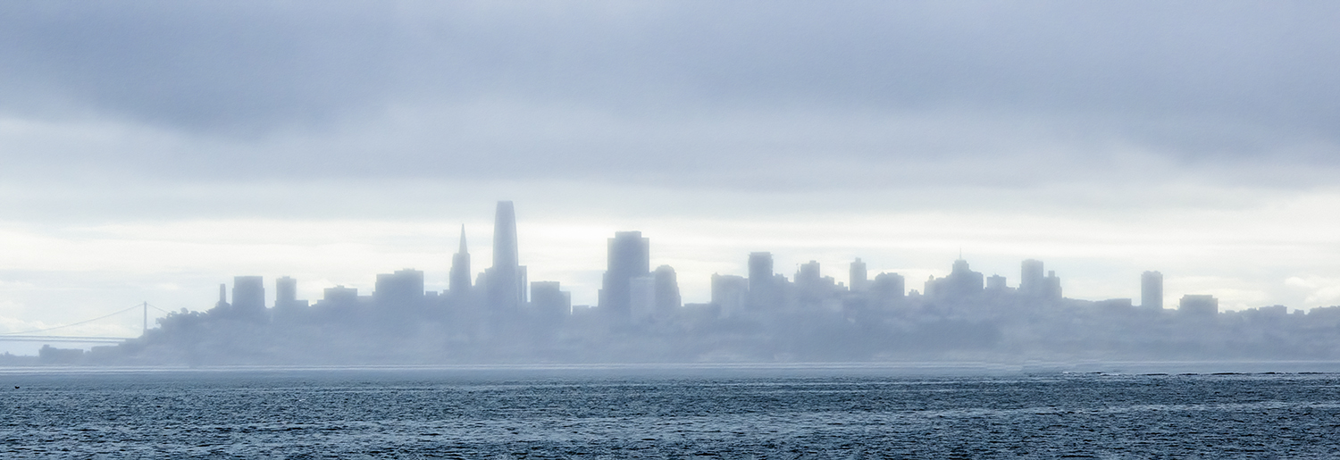
Hey Alison, I agree with Henry. I really like your image and everyone I showed it to said the same thing: WOW! I liked the fog also. Really Cool Image. |
Dec 12th |
| 40 |
Dec 21 |
Comment |
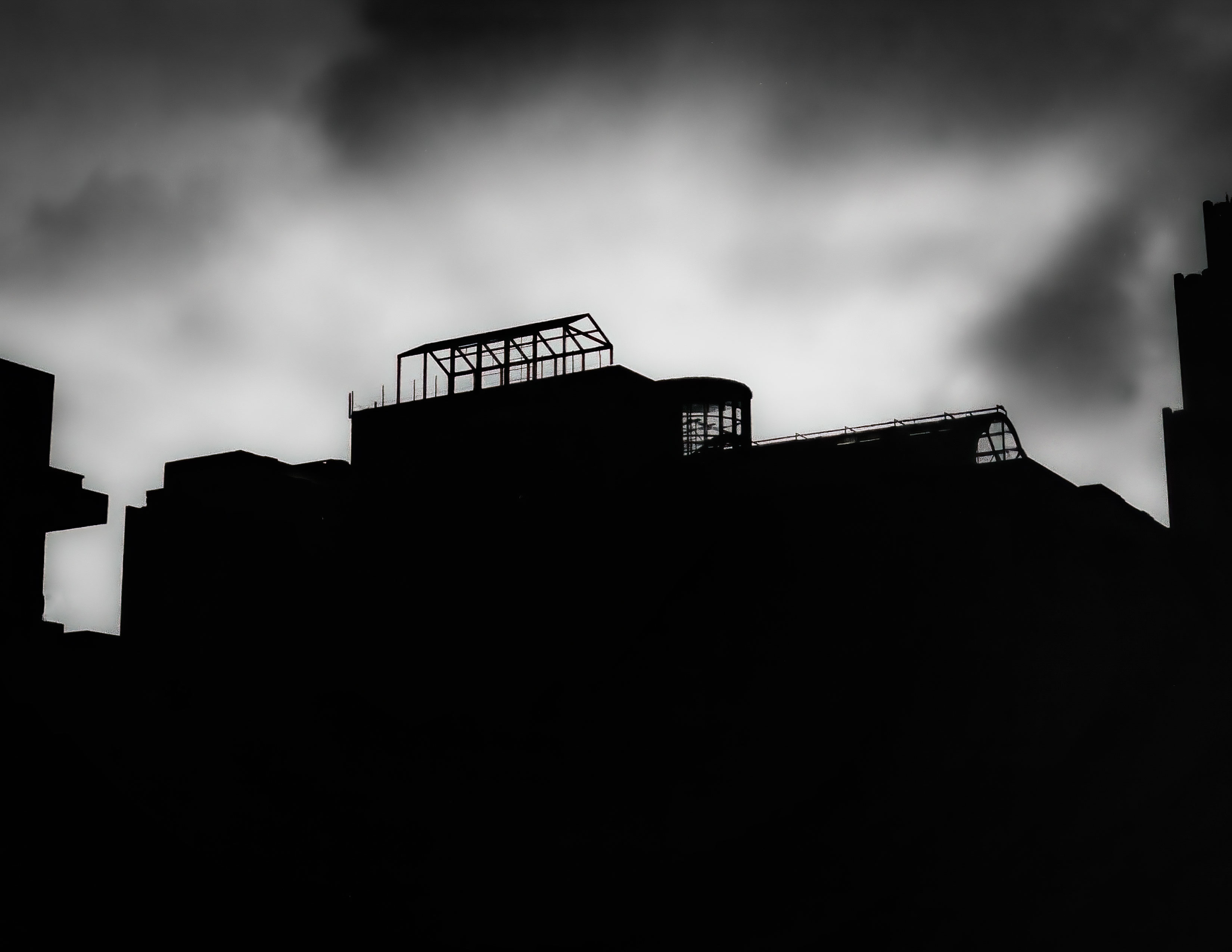
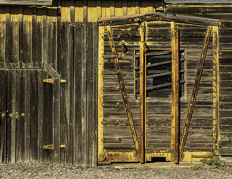
Hey Henry, I totally agree. I did not like the lines or the green trash can. I could probably get rid of the green. I also am not sure about your left crop. If I was going to not crop as tight as I did, I would probably leave in the base of the sculpture in the back. Thanks for making me want to revisit this. Happy Holidays. |
Dec 12th |
| 40 |
Dec 21 |
Comment |
Hey Catherine. Very nice image. it does look like you painted it. Without the original, I am curious if you did any post image editing, and if you did, what did you do. The composition is great and the dark object on the left (maybe a reflection of a tree trunk) hold us into the image. Well done. Happy Holidays |
Dec 3rd |
| 40 |
Dec 21 |
Comment |
Nice Job. You seem to have a nack at this. The only thing I can't believe is that your grandson left three cookies behind. That would never have happened when I was his age. |
Dec 2nd |
| 40 |
Dec 21 |
Comment |
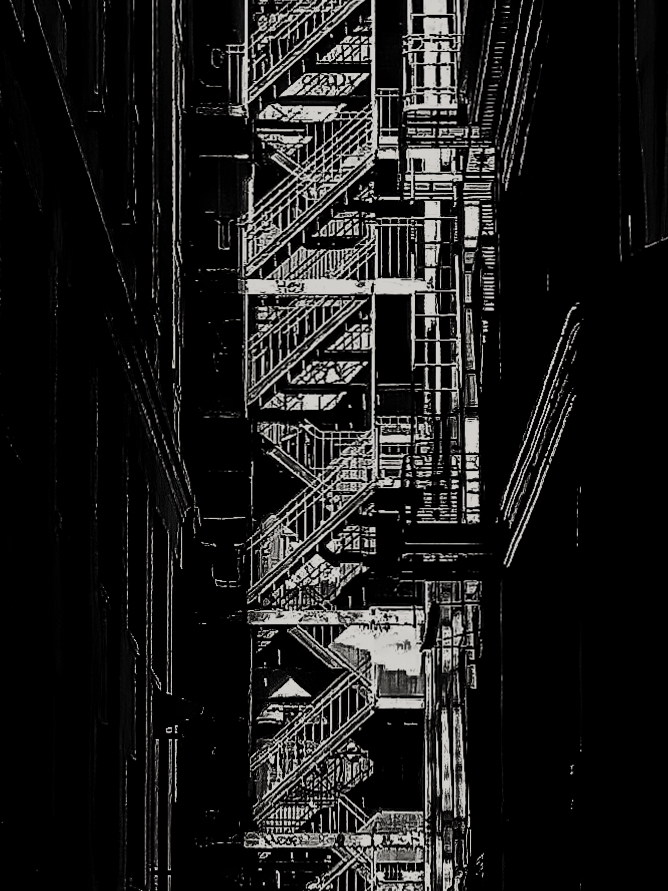
Hey Everybody, Happy Holidays.
I really like this image. I like the background, the foreground, the composition, the gap in the stairs and the fact that it sort of falls into the minimalist category. Not over edited. Very nice! I liked how you talked about your editing process, so we see how different our processes are. Very Nice. |
Dec 2nd |
6 comments - 0 replies for Group 40
|
| 74 |
Dec 21 |
Comment |
A nice, well composed image. Takes me back to my film days when I had to develop film in my kitchen sink, scan the negative, and then clean up the dust and play with it in Photoshop. The detail is very good. The image reminds me of the work of one of my favorite Photographers: Dorothea Lange. I sort of like the detail of the coat in the original. I don't think it takes away from the hands. Nice image. Your image is why I sometimes miss film. |
Dec 4th |
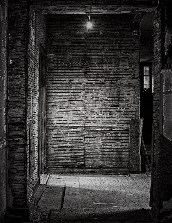
| 74 |
Dec 21 |
Comment |
I tried cropping out the window like you suggested and the room got pretty small pretty fast. I did not get the feel for where the light was coming from and did not get a feel for the size of the room. next time, for my second time using a tripod in over 20 years I will probably use a lower ISO. Grain, old stuff and black and white seem to go together in my opinion. The really cool thing is that you got me to think about all of these things and try some different takes. That is what I enjoy the most about this group. Thank you for making me think more about my shots. |
Dec 4th |
| 74 |
Dec 21 |
Comment |
Hey Arne. I agree with Haru about placement. Maybe the angle was for modesty. The image is very interesting. I think the light ray really makes the difference. I am glad the buildings are there, and the snow, otherwise I would think this was an indoor exhibit. I like the submitted image over the original. |
Dec 3rd |
| 74 |
Dec 21 |
Reply |
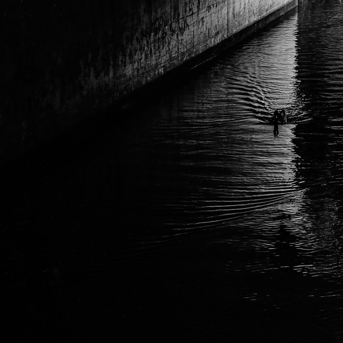
Dick has some good points. some photographers like to keep their images closer to the original and some like to darken everything. Both ways work here in my opinion. Also in my opinion, Dick's second crop works if you want to focus on the water, but there are some interesting things going on in the right portion of the image that got cropped out. The portion on the left can stay or go. this was done in Silver Efex Pro 3. I still think Tracy's submitted image was perfect, in my opinion. |
Dec 3rd |
 |
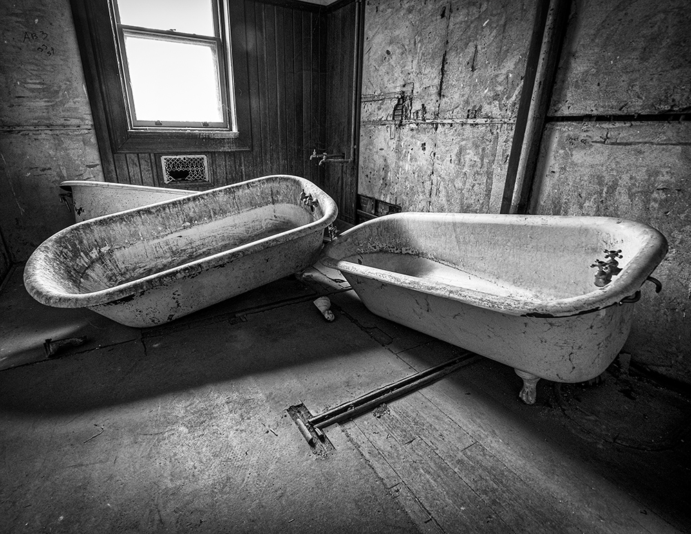
| 74 |
Dec 21 |
Reply |
Hey Dick, thanks for the comment. The image I am hanging in my newly remodeled Guest Bathroom is a color version. I will take a look at it again before I print it. Thanks again. |
Dec 2nd |
| 74 |
Dec 21 |
Comment |
Hey Haru, Happy Holidays,
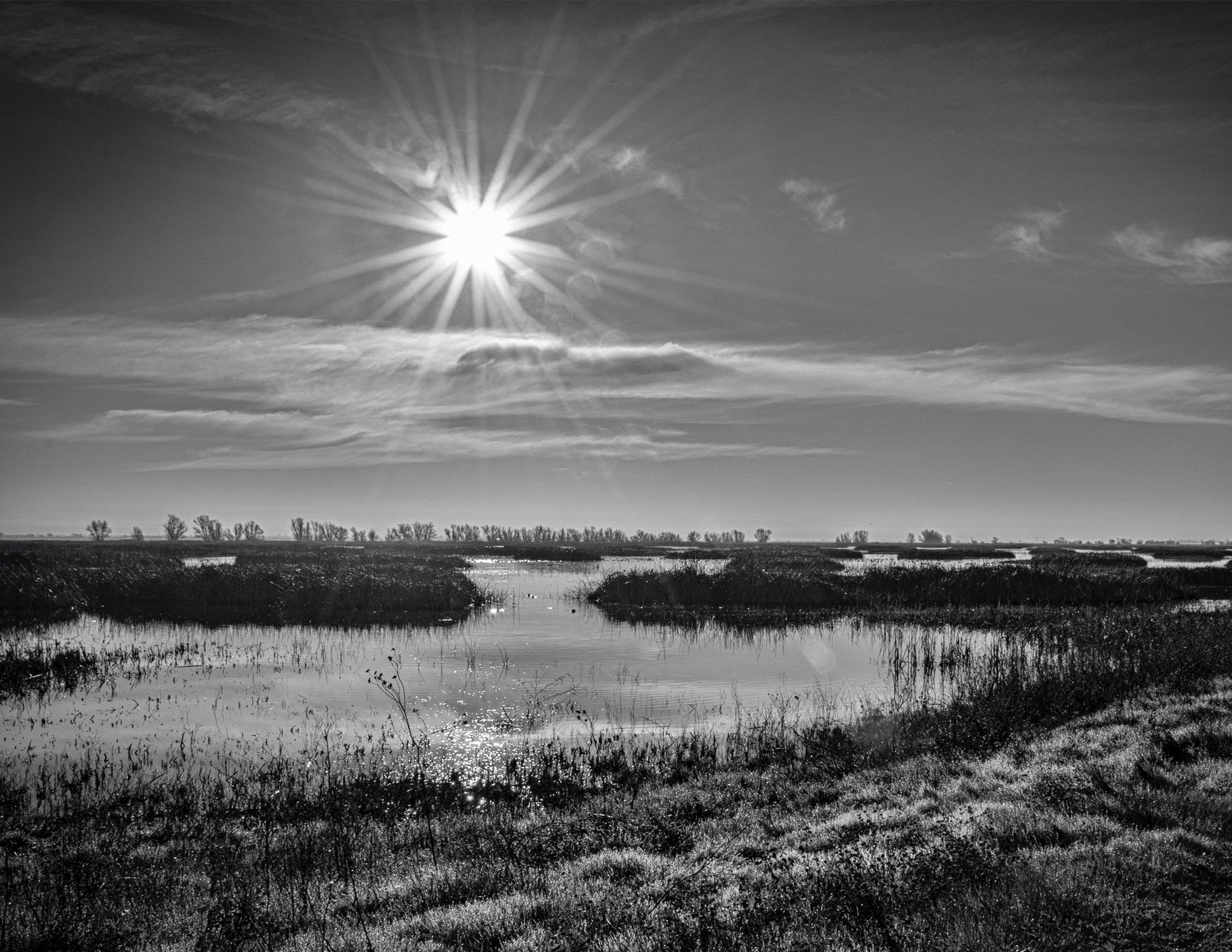
I love your image I feel like I am there. I can hear the wildlife and feel the cold in the air. Black and White was diffinently the right choice here. Just sitting here and enjoying the lake. |
Dec 2nd |
| 74 |
Dec 21 |
Comment |
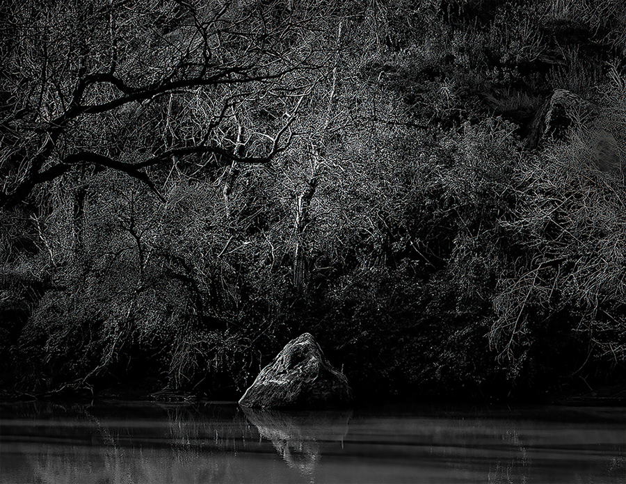
Hey Tracy, Happy Holidays.
In my opinion, you captured it perfectly. Black and White was a good choice here. |
Dec 2nd |
| 74 |
Dec 21 |
Comment |
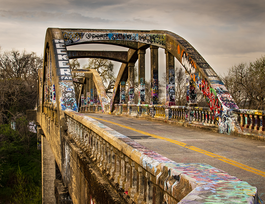
Hey Dick, Happy Holidays to everyone.
Nice shot. I love Idaho. I opened the original in photoshop and then opened Nik Color Efex Pro 4 and ran the image through a ton of filters and I have to say, even though I am a Black and White photographer from way back, I liked the color original better. It seem, in my opinion, to have more depth and the different splashes of color seem to make the image more interesting. There is nothing wrong with your B&W version, but I can feel the warmth of the sun in your original. The Color Efex filter I used was called: Detail Extractor. |
Dec 2nd |
 |
6 comments - 2 replies for Group 74
|
12 comments - 2 replies Total
|