|
| Group |
Round |
C/R |
Comment |
Date |
Image |
| 40 |
Aug 21 |
Comment |
Alison, I could not find the one I worked on so I did this to show you how you can punch up the texture and colors and detail. As Andrew would say, this is way "overcooked". The blue sky is off, and the mountains need to be worked on. I just wanted you to see what can be done with the sliders in camera Raw, or if you use Lightroom, just in the develope module (I haven't used lightroom in years). Hope this helped. So somewhere in the middle, or... really, your shot was fine. I had to crunch this image a lot to put on the site, so it may be pixleated. |
Aug 18th |
 |
| 40 |
Aug 21 |
Comment |
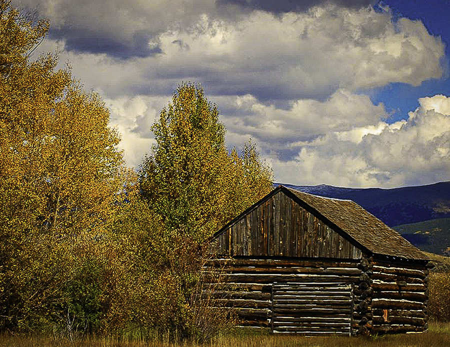
Hey Catherine, Nice image. When I first looked at it, I thought you were trying to focus on the Cabin. I tried cropping just to the left of the tall tree, and just to the right of the cabin. I then read your comment and saw you were trying to focus on the fall colors. I still cropped a little to the right of the cabin to keep your eye from wandering, and some on the left side just to keep a good aspect ratio. I then opened it in Adobe Camera Raw and played around with the sliders; especially texture, clarity, and Vibrance (I never touch Saturation, but that is just me). Everything got more vibrant. It's a nice image... it reminds me of Colorado. mission accomplished. |
Aug 12th |
| 40 |
Aug 21 |
Comment |
Thank you for the feedback. Photoshop does seem to handle the textures and colors better. I had this printed on metal and it really looked cool. |
Aug 10th |
| 40 |
Aug 21 |
Comment |
Andrew's take nailed it. The real story is the guy who can't be bothered. As a street Photographer, you could wait a long time for a shot like this. Don't worry about the bottom of the image, it does not matter what the guy was doing anyway. |
Aug 9th |
| 40 |
Aug 21 |
Comment |
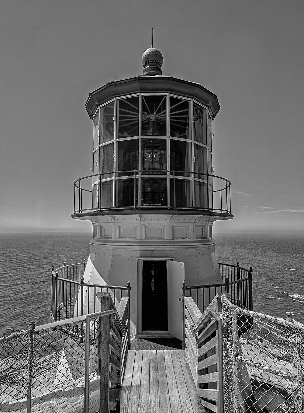
Wow, you are braver than I am. I have never tried Macro, but it sounds like Henry's comments are a big help. I like the Vignetting, and don't know if that is side effect of Macro or not. Anyway, you have inspired me. |
Aug 9th |
| 40 |
Aug 21 |
Comment |
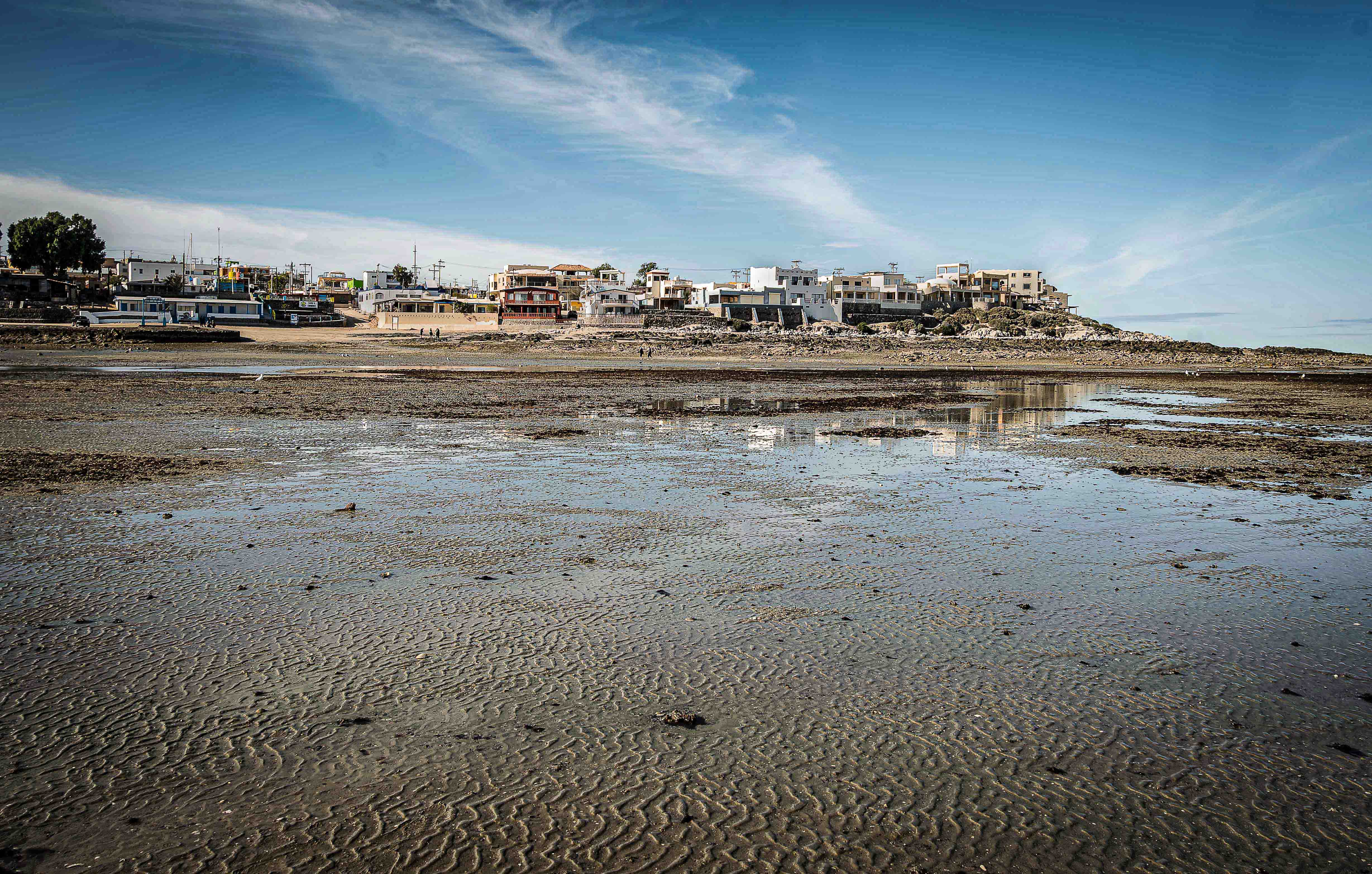
Image makes me want to be there. I agree the sun was a little harsh. It is a good lesson for next time to maybe use an exposure compensation, or maybe try HDR. The sun on the wall of the pier was well exposed. I'm thinking if you cropped the gate in the right side of the image out, you would have lost the rocks and the seagull on the light. The Danger sign sort of bothered me. Maybe your f stop was a factor? I Don't know, but if this is nearby where you live, I would revisit this place again and again. |
Aug 9th |
| 40 |
Aug 21 |
Comment |
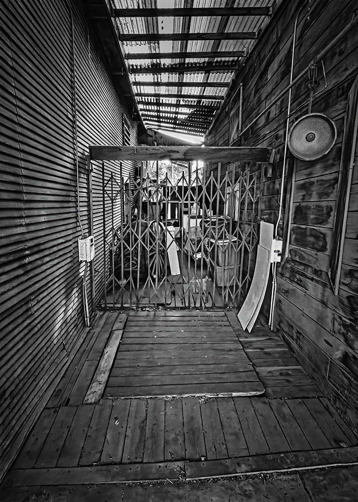
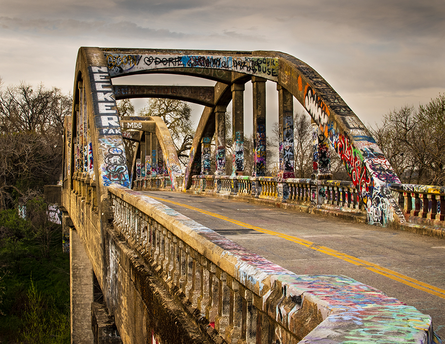
Very nice. The cropping on the top was perfect, and I would have liked a little more foreground, but most of my shooting buddies would disagree. I would not be afraid to punch up the colors and even the sidewalk. It's too bad there was a drink cup behind the fence. I was drawn to it when I first saw the image. You could have cropped it out, or (I know there are a lot of purist out there) you could have taken it out. The bottom line is, if it distracts you, it distracts you. Would make a good image for a series of travel shots for whatever town you were in. Nice. |
Aug 9th |
| 40 |
Aug 21 |
Comment |
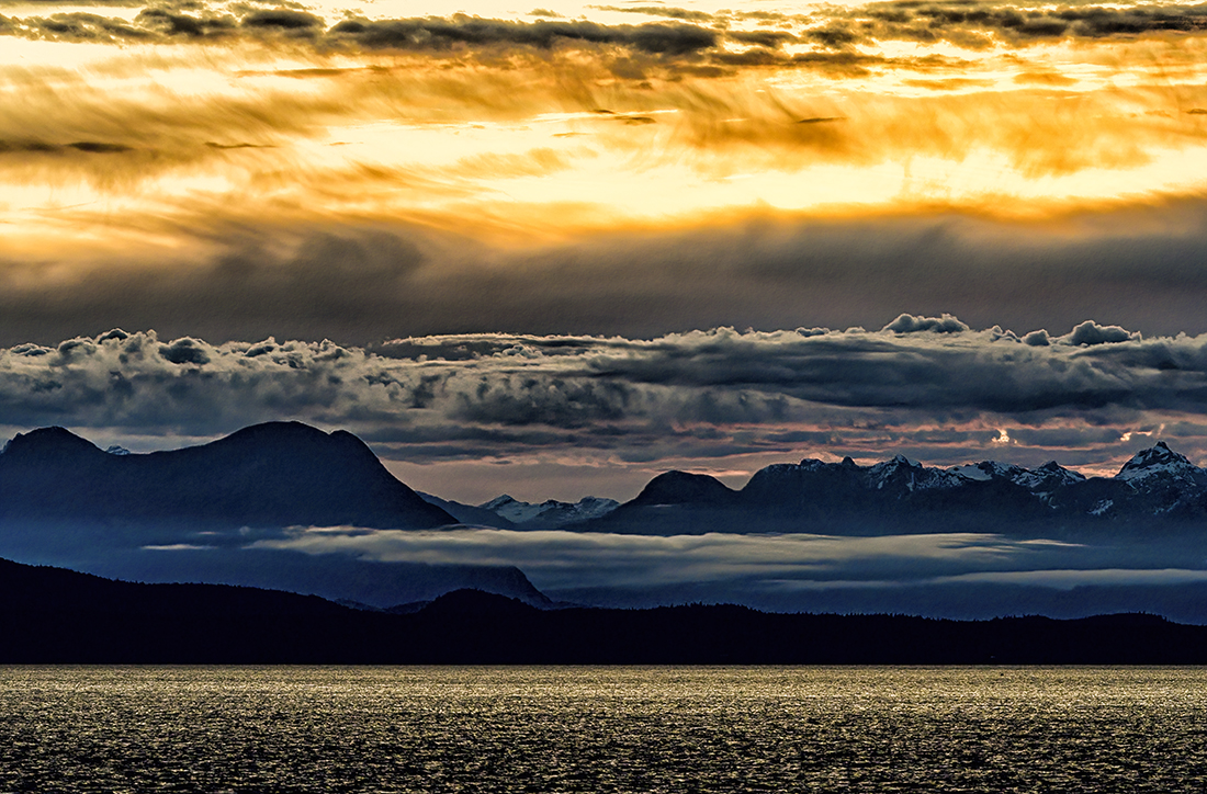
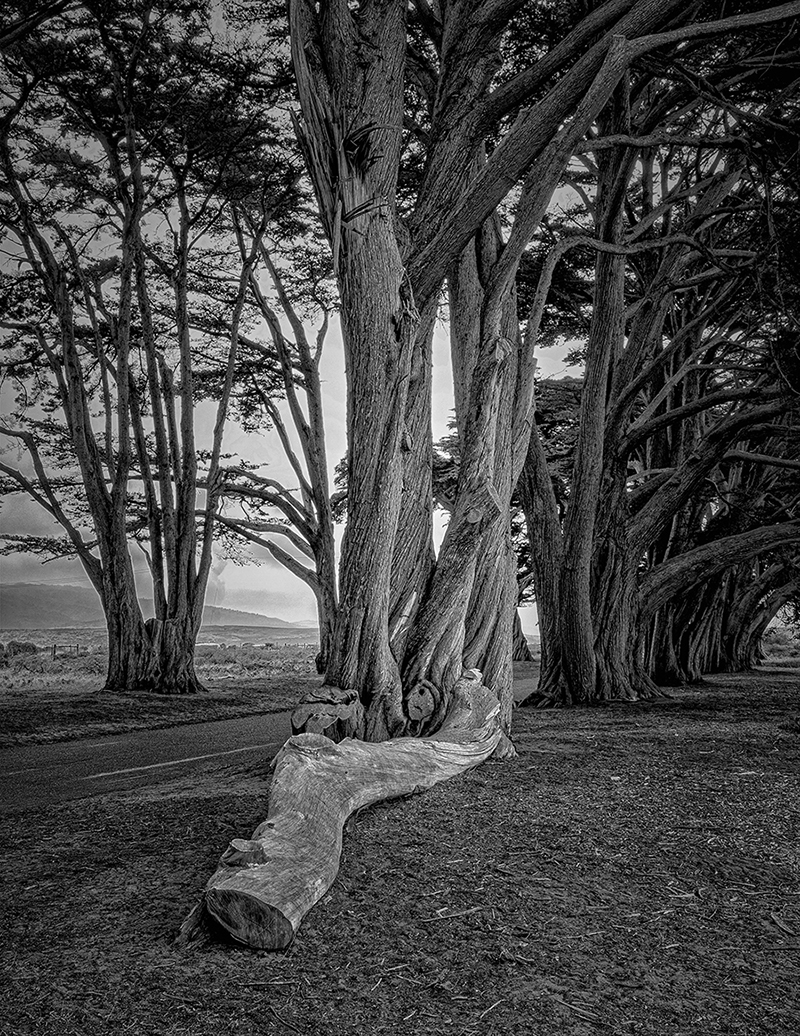
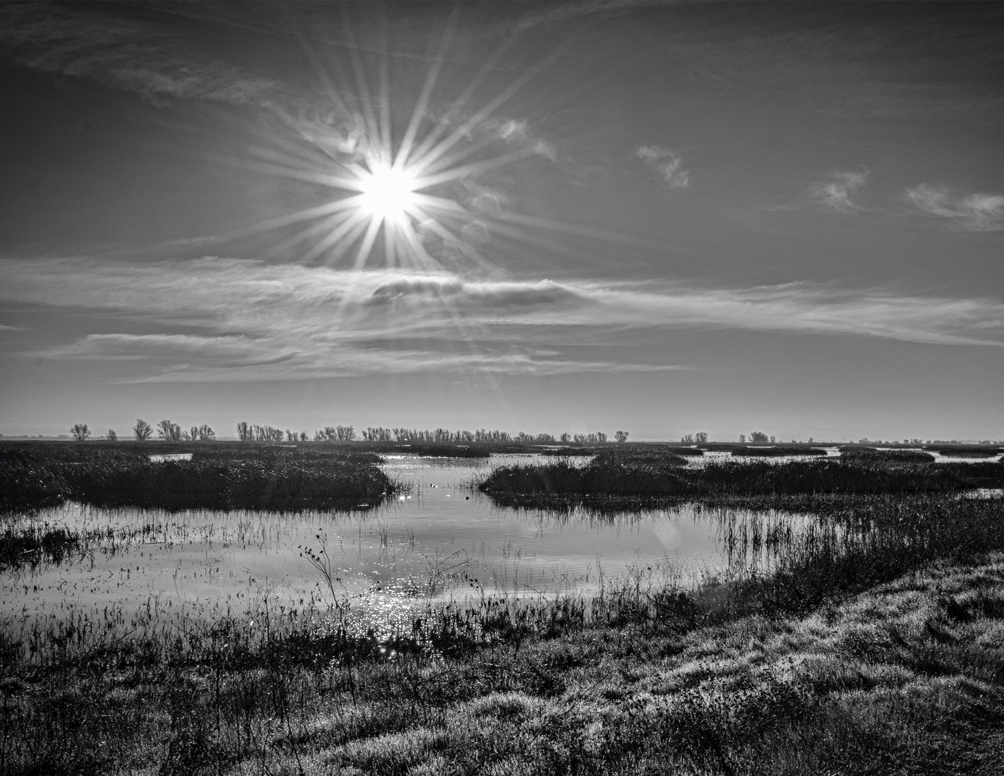
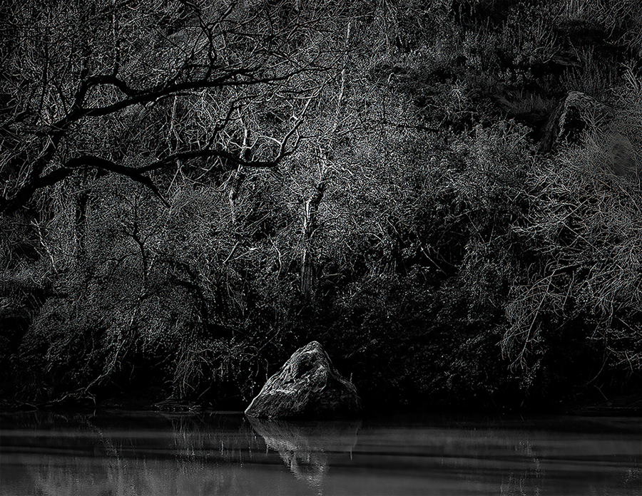
Wow, this is a very nice image. it reminds me of a lake not too far from here, that I have visited in the morning many times. The original image was fine, it just looked like earlier at the lake near me. If I saw this in a gallery, or on your living room wall, I would probably pause and just take it in. Photography is so subjective. Thanks for sharing this image. |
Aug 9th |
8 comments - 0 replies for Group 40
|
8 comments - 0 replies Total
|