|
| Group |
Round |
C/R |
Comment |
Date |
Image |
| 52 |
Mar 26 |
Reply |
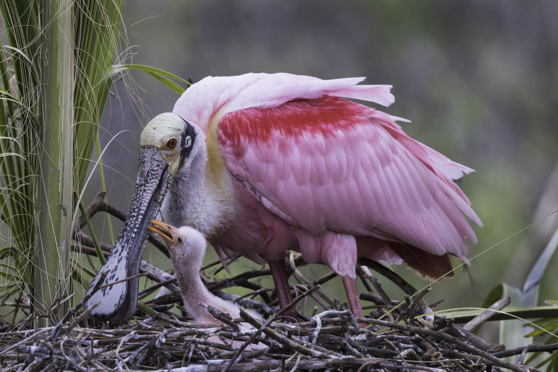
Mike, Here is a crop I can live with. I thought the one suggested by Kathy (by the way, I do not know her) was too "messy" around the edges. I am thinking I would like to use this in PSA Nature Small Prints so I had to leave that think blade of grass in. But ididfollow up and brush in sharpening as you suggested. Let me know what you think. |
Mar 22nd |
 |
| 52 |
Mar 26 |
Reply |
Thanks, Judith. The edited version was made from the same original. Since I removed that blade of grass it is now ineligible for nature, so I do hve two versions of it - one with the grass and one without. |
Mar 22nd |
| 52 |
Mar 26 |
Comment |
I always get excited when I have an oportunity to capture mating birds but then I find they are very difficult to work with in a way that makes an interesting story. I think you have done that very well. There are two things about this image that you might want to consider. The first is that bit of branch sticking into the frame on the right. If you would like to remove it without using a remove tool you could try recropping and rotating a bit. See my visual feedback. The second is a real nit-pick: I thought that the image might tbe improved by eliminating the bit of out of focus foliage below the birds. I think the crop I suggest does a fairly good job of that. I any case this is a well-done image in my opinon so the choice is yours. |
Mar 15th |
 |
| 52 |
Mar 26 |
Comment |
I always enjoy viewing high key images and this one is very artistic in my opinon. As Pam has suggested lightening the back of the Grackle and trying to bring out more detail might improve the image. Try it and see what you think. |
Mar 15th |
| 52 |
Mar 26 |
Comment |
Congratulations on capturing a sharp image of a moving subject from a moving boat! That was a difficult shot. I like the color you have brought out in the water. Like Pam, I think one consideration would be to lighten the bird to make it pop out more. This would also brighten up the eye and give it a more life-like appearance. |
Mar 15th |
| 52 |
Mar 26 |
Comment |
I like the wing position of the hummer and I think you have done a good job of stopping the action of the wings. The tall stem of the thistle on the right draws my eye upward to the bloom and away from the main subject. I played around with various crops and was able to eliminate the distracting stem by going to a 3X4 aspect ratio and tilting the image, but the loss of additional pixels made the image resolution way too low. However, if you would like to eliminate the distracting stem you may want to consider eliminating it altogether using the remove tool in PS. It's up to you as the artist. |
Mar 15th |
| 52 |
Mar 26 |
Reply |
I had to chuckle when I saw that we are both into the Spooonbills this month. You captured the action well in my opinion and everything is sharp, including the eye. While in Florida I captured a number of shots of birds in water with that trail behind them. I always debat how much of that trail to include as I want more space in front of the action and including the trail make it difficult to do that. I see you have chosen to include the trail over the space in front. I feel that shooting down from the perspective of the boardwalk is not ideal, but you have made the best of it, showing the Spoonbill in its natural enviroment. |
Mar 15th |
| 52 |
Mar 26 |
Comment |
Pam, To me this is a dramatic capture of rugged and remote landscape. The sky seems to suggest threatening weather which adds to my overall sense of awe. I feel the image is slightly tilted down to the left. Perhaps this is an illusion, but to me as a a viewer it feels out of kilter. In my opinon the mountains arppear to be soft and hazy. You might consider two steps to see if you think they improve the image: 1.) straighten the image so the line just beyond what appears to be a flowing river is straight; 2.) move the dehaze slider to the right to get more clairty in both the mountains and the clouds just moving in on the right. I am on the fence about the rocks in the foreground. I think they create a fomidible visual barrierr. If you agree with that you might consider cropping at the bottom to reduce their impact. These are merely mu suggestions. Try them and see what you think. |
Mar 15th |
| 52 |
Mar 26 |
Reply |
Hi Tom. I always keep two versions - one that follows the nature editing guidelines and another that is cleaned up. There have been a lot of Spoonbill images on social media lately and I agree - everyone does tend to over-saturate. |
Mar 15th |
| 52 |
Mar 26 |
Reply |
Thanks for your comments, Pam. I won't be able to use this version in a nature category because I removed that grass blade, but I agree teh image is better with it removed. |
Mar 15th |
| 52 |
Mar 26 |
Reply |
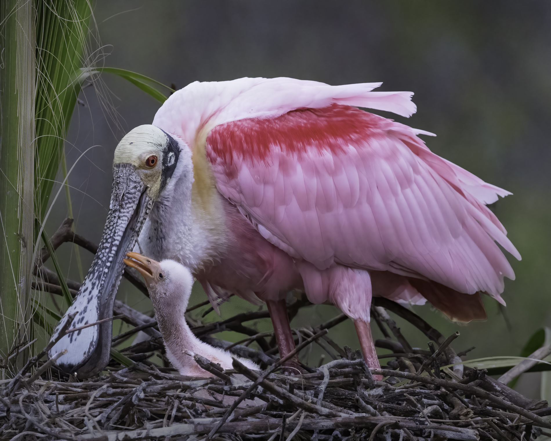
Hello Kathy, Thank you for your comments. Visitors are always welcome in Group 52. Personally, I prefer backgrounds to be simple and uncluttered. Adding the space on the left and bottom to me complicates the image and distracts from the subject. I understand the need to leave space in front of a subject to suggest forward motion, but in this case the subjects are not moving forward. Another thought I have is that in my crop the point of interesection between the adult and the chick where their bills touch is on or very near a power point, whereas with your crop they are closer to the middle of the image. So for me, the composition of my image works better.
Since I posted this image I have revisited it and darkened the backgorund a bit. To me that did improve the image. Here is the version I plan to use for exhibition. |
Mar 11th |
 |
5 comments - 6 replies for Group 52
|
5 comments - 6 replies Total
|


