|
| Group |
Round |
C/R |
Comment |
Date |
Image |
| 52 |
Oct 23 |
Comment |
I too prefer the processed version (although I have not been there, so don't know which is realistic). I think you must have used your photographer's patience to make sure the moving cheetah was in a poisiton that did not merge with the resting one. The only suggestion for improvment I have is to clone out the bright white spot on the right edge of the frame. Good work...I envy you your freedom to travel. |
Oct 16th |
| 52 |
Oct 23 |
Comment |
Maybe because hunting season is approaching and I live near the waterfowl captial of the world (Mississippi River Delta), but this looks like camoflage to me. The greens, golds and browns scream autumn. When I study this image, my eye does not know where to come to rest. I feel a need to find a "center of interest" but cannot determine where it is. I know abstract is more about emotion than substance, but I am not feeling it. On the other hand, you could print this on silk and it would make a lovely scarf! |
Oct 16th |
| 52 |
Oct 23 |
Comment |
I too like the bird, as for me it adds to the nature story. Having only seen these guys in zoos, I can't be sure, but the color seems unnatural to me, so I would vote for desaturating red. I think the monochrome version works well, but would check to make sure you have good tonal range. If you have Silver Efex (in the NIK Collection), there is a bar that allows you to run your cursor across and it lights up the pixels that are in the zone it is over. I do this for all my moncrhome image to mamke sure most of my pixels are not in the midtone range. |
Oct 16th |
| 52 |
Oct 23 |
Comment |
As I understand it, the Peregrine Falcon numbers a dwindling, so lucky you to get this shot. I have two initial reactions: I feel that the subject is somewhat oversharpened, which to my mind gives it an unnatural look. Also there is more space behind the subject than in front leading me to get the feeling that it is looking out of the frame. While the right side of the branch is somewhat interesting, I would crop it to improve the composition. |
Oct 16th |
| 52 |
Oct 23 |
Comment |
Sorry to hear you have had COVID...no fun! Hope you are back to normal now.
First of all, good job getting the eyes of both adults sharp. I like the way the two adults from the little ones and draw my eye to the story. The water is pretty luminous in my opinon. I would consider reducing luminosity using the HSL blue slider in LR. |
Oct 16th |
| 52 |
Oct 23 |
Reply |
Thanks, Ally. I fixed that spot between the tail feathers and tried it in monochrome. See above, |
Oct 16th |
| 52 |
Oct 23 |
Reply |
Judith, There are 4 different levels of polarization in Color Efex. I usually only use the first or second because the 3rd and 4th are sort of surreal. Basically in adjusts luminosity. |
Oct 16th |
| 52 |
Oct 23 |
Reply |
Thanks, Mike. Don't know how I missed that! |
Oct 16th |
| 52 |
Oct 23 |
Reply |
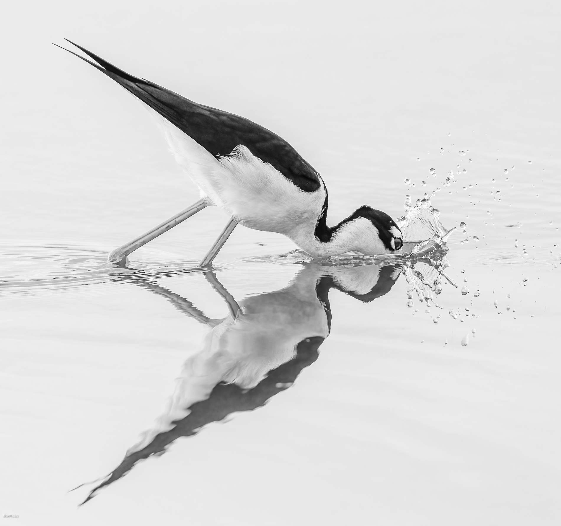
Thanks, Pam. I decided to try it monochrome. I also cropped a bit tighter. I would be interested in knowing what you think. |
Oct 16th |
 |
| 52 |
Oct 23 |
Reply |
Thanks Ann. I don't know how I missed that. Now that you have ointed it out, it seems so obvious to me. |
Oct 16th |
5 comments - 5 replies for Group 52
|
5 comments - 5 replies Total
|