|
| Group |
Round |
C/R |
Comment |
Date |
Image |
| 48 |
May 22 |
Comment |
In my opinion, this image has potential. The brilliant color lends some impact, but it looks to me like there are a few small white areas that are blown out. I would suggest cloing those out or painting over them. Also, for me, the red inner border is a little bit too tight. I always like to see the subject have a little "room to breathe."
I hope my commnets have been helpful. Image analysis is very subjective so this is clearly only my opinon. |
May 16th |
1 comment - 0 replies for Group 48
|
| 52 |
May 22 |
Comment |
This is a fun image. I feel like the owl is paying peek-a-boo with me. In my opinoin, you have done a good job salvaging this image, expecially in dealing with with that background, but I do think some of the green has bled onto the tiny fluffy feathers around the edge of the owl. The fall-off in focus on the lower part of the tree is something that I think takes away from the overall effect. I agree that it would be improved if the DOF on that compositional element was more consistent. |
May 16th |
| 52 |
May 22 |
Comment |
You definitely captured a decisive moment with this particular goose. I think to stop the wing action you would have needed about 1/1250 sec, shutter speed which would have necessitated a much higher ISO. Sometimes wing blurs work, and I think the blur on the upper wing might be an example of that; but, the lower wing blur looks too confusing to me. Something that might improve the image in my opinion would be removal of the dark spot right behind the subject. No matter what, I always have fun shooting birds in action and I will be you did too. |
May 16th |
| 52 |
May 22 |
Comment |
This image gives me a feelng of peace and calmness. The colors work well together in my opinon. The little fish is sharp, and I just love the expression he seems to have on his face (although I know I am anthropomorphizing here). I find the varied textures in this image interesting and visually appealing. Nice work. |
May 16th |
| 52 |
May 22 |
Comment |
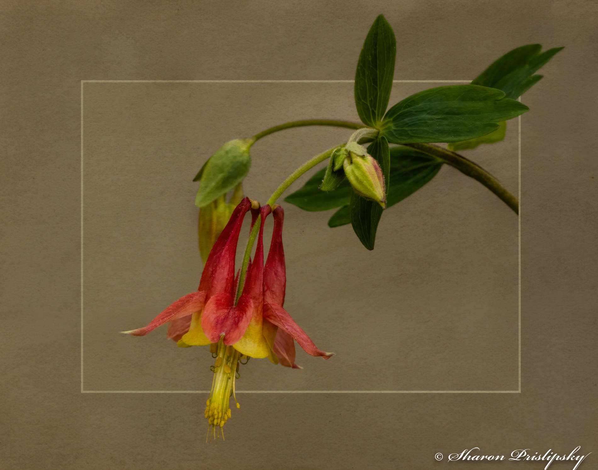
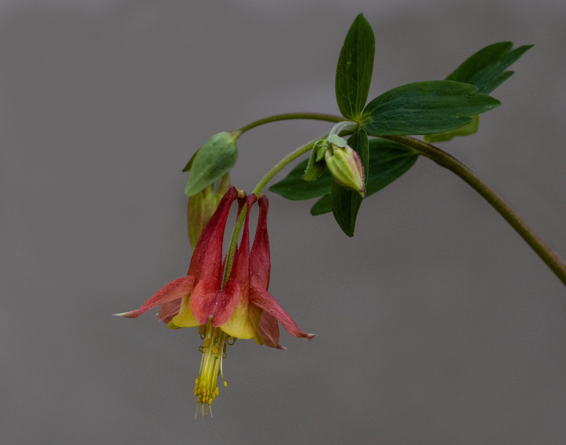
The flower is beautiful and a perfect specimen in my opinion. I think the direction and the quality of the light were challenging which made the light uneven - bright on the top and shadowed on the lower portion. In a situaton like this you might need a reflector to bounce some of the light back up onto the lower portions of the flower. If this were my image I would consider selecting the flower and doing some creative work on the background by perhaps blurring and/or adding a texture to it. |
May 16th |
| 52 |
May 22 |
Comment |
I am very partial to vertical pesentations for this type of image, so like your choice to present it that way. To me, the "robin-egg blue" hue of the sky does not seem realistic (although I feel you pain about the lack of clouds because that is exactly what I experience when I spent a week in and around Yosemite). I would suggest playing with the hue and trying to get it a little more blue and less aqua, and I do think Mike is onto somehting with the luminance issue. Based on my experience, half dome looks just right to me. You have opened up the shadows quite a bit, but I wonder if you could push it just a bit further so the image is not so contrasty? I like the effect of the 10 stop ND filter on the foreground. I wonder if you could have made one image without the ND filter so the exposure would be right on the trees and the mountains on the left and right and then combined it with the filtered image to get everything exposed right. (Hindsight is always 20/20, isn't it?) |
May 16th |
| 52 |
May 22 |
Reply |
I smiled when I read your comment about his being a good notecard image, because that was exactly what I had in mind when I created it. I have been working on a series of native wildflower notecards. Thanks for your feedback - its good to know my idea for this has some potential. |
May 16th |
| 52 |
May 22 |
Reply |
Judith, I have give a lot of thought to your idea about lightening the outer frame. My thinking when I made this imae was that lighter tones tend to come forward and darker colors tend to recede. So I was trying to get the flower and the lighter background to pop out. Clearly you saw this differently. I will try your idea and see what I think. |
May 16th |
| 52 |
May 22 |
Reply |
Thanks for your feedback, Pam. I have been working on developoing a polinator garden with lots of native plants, so I can hopefully use all these suggestions throughout the season. |
May 16th |
| 52 |
May 22 |
Comment |
Bev, I find your comment interesting, particularly because I thought almost all of us who are group administrators have completed the image analysis course. Personally, I always try to find something positive to say when commenting - at least to begin with. As for your suggestion about Marie's work, I am familiar with it, but I believe the choice of backgrounds is a matter of personal aesthetics. The example you shared is ok, but does not suit my personal style. Thanks for taking the time to look at my image. |
May 15th |
| 52 |
May 22 |
Reply |
Hey Mike, I kept thinking about your comment that the flower ws pointing out of the frame, and I thought, "Why not?" You got my creative instincts going and this is the result. Thanks |
May 12th |
 |
| 52 |
May 22 |
Reply |
Good catch, Lisa. You are correct...that is not the correct original, so I will post the righ tone here. Thanks for pointing out those tiny white spots. AS I look at this again, I think I did a pretty sloppy job on the vignette, so I will fix that too. |
May 8th |
 |
6 comments - 5 replies for Group 52
|
7 comments - 5 replies Total
|