|
| Group |
Round |
C/R |
Comment |
Date |
Image |
| 4 |
Feb 22 |
Comment |
The lines are great, and I like they way they almost converge. I think they add asense of great strength, and move my eye smoothly through the image. Persanally, I like the lighter sky in your image as presented. The darker sky introduces too much coontrast for my taste and detracts from the darker tones in the sturctures. |
Feb 17th |
1 comment - 0 replies for Group 4
|
| 40 |
Feb 22 |
Reply |
No, so thank your for that informaiton. I am just preparing to start looking for lodging for that trip. |
Feb 22nd |
| 40 |
Feb 22 |
Reply |
Good deal! We are returning to the UP in OCtober this year. We like the area around L'Anse and Copper Harbor. |
Feb 22nd |
| 40 |
Feb 22 |
Comment |
Hi Cathrine, I am visiting form Group 52 Nature+ at Andrew's request. Your image made me smile as I just returned from a trip to south Florida for bird photography. Pelicans were a frequent choice of subject as they are numerous in that area - not to mention, they are fun to watch. I think you did a good job capturing a decisive moment - good choice of shutter speed to stop the action. To me, the main subject looks sharp. I agree with Mike that it is just a bit underexposed. It is always difficult to isolate a subject. I do not like to have birds at the edges that are partly cut off, so I would recomment cropping on both the left and the right. See my visual feedback. |
Feb 19th |
 |
| 40 |
Feb 22 |
Comment |
Jamie, your image really captured my Michigander's heart. I lived in Michigan for 32 years until retiring to Arkansas in 2009. My husband and I still go back almost every year to see friends and phtoogrpah all the lovely locaitons in Michigan. Not only is the state underrated, but the UP is almost undiscovered by photographers who always frequent the more iconic places.
On to your image. The images evokes a sense of power for me. (Was this perhaps Bond Falls?) I like the perspecitive using diagonal lines which make the image more dynamic. I feel the white balance is off a little. It seems too cool to me. Maybe warm it up just a tad. Lastly, I would really love to see more of the area around the falls. It would put it in context for me and I think it would tell more of the story. |
Feb 19th |
| 40 |
Feb 22 |
Comment |
Hi Julie, I am visiting from Group 52 Nature+ at Andrew's request. First of all, I like that you have included three blooms in your image. I always try to follow "The Rule of Odds" when possible. I believe it makes the compositon more interesting. Secondly, I like that you are experimenting with textures. They can really turn a snapshot into a work of art. My suggeston would be to make a layer mask and remove the texture from the flowers, leaving it only on the background. Another consideration might be to try a texture with a smaller pattern. When I first looked at you image I thought the flowers were growing along a concrete walkway. |
Feb 19th |
3 comments - 2 replies for Group 40
|
| 52 |
Feb 22 |
Reply |
Unlike Trumpeter Swans, Mute Swans are not native to North America. They were brought here from Europe in the 1800's to serve as a kind of "decor" or attraction on large estates. In my experience they can indeed be aggressive toward humans. I have never seen Trumpter Swans behave that way, although most of my observation has been here in Arkansas. When I have seen them in the upper mid-west and Canada they have been very far out in the water. |
Feb 17th |
| 52 |
Feb 22 |
Reply |
Thanks for your input, Judith. See my edit under Mike's comment. |
Feb 17th |
| 52 |
Feb 22 |
Reply |
Thanks for your comments, Lisa. See my edit under Mike's comments. I do not think there is a problem with the 1.4 teleconverter. I just returned from a 2 week trip to the Everglades and south FL and used the converter again there. I have my back button set for perched birds using the 9 points and the star button set for flying birds with eye detection. This seemed to work well, and any lack of sharpness in my images was clearly the fault of the ophotogrpaher. With the 2.0 teleconverter you loose too much light, and probably the widest aperture attainable in f/11, so I would avoid that. |
Feb 17th |
| 52 |
Feb 22 |
Reply |
Thanks for your helpful advice, Pam. See my edit under Mike's comments. |
Feb 17th |
| 52 |
Feb 22 |
Reply |
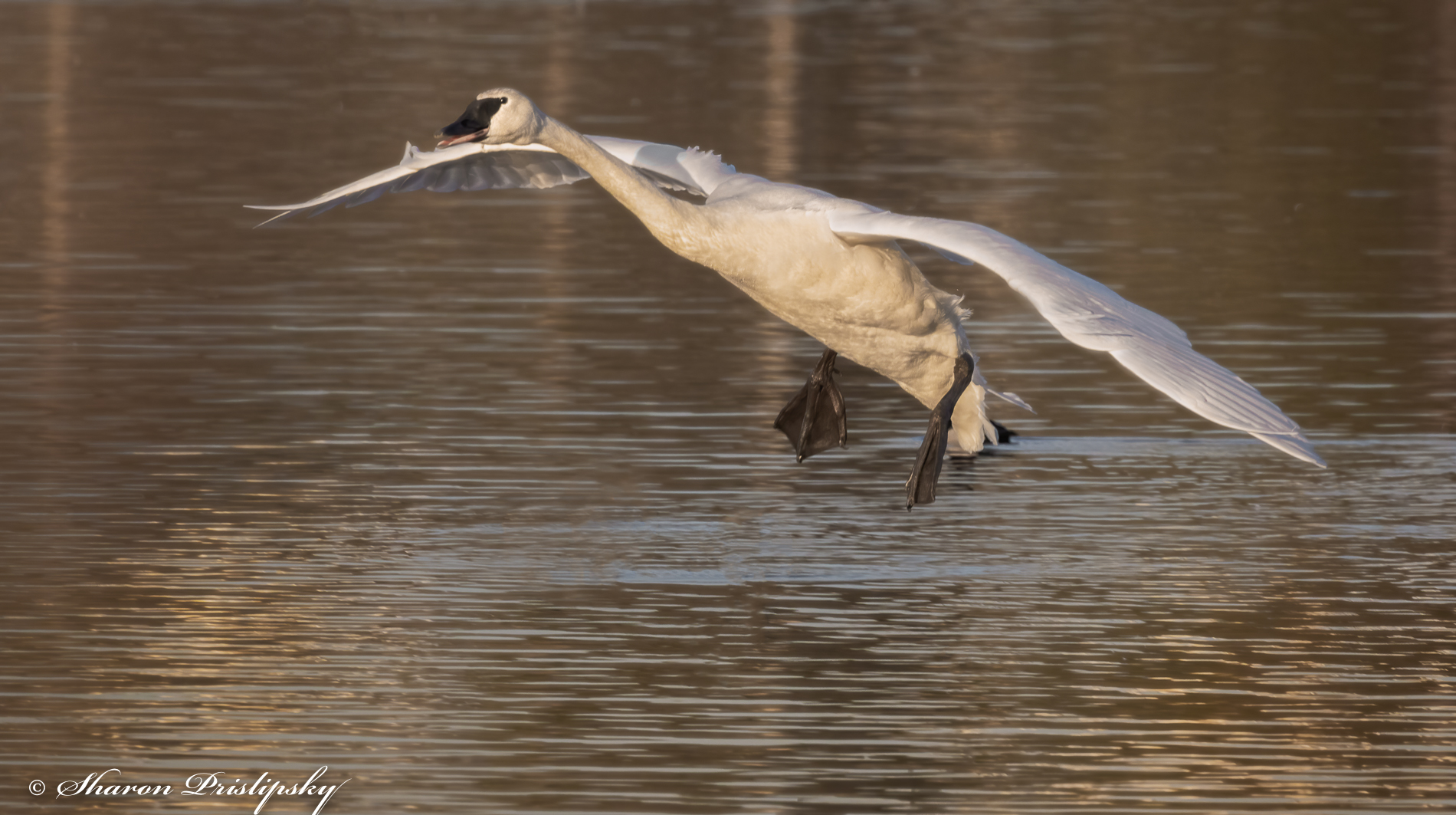
It looks like the consensus is to remove the duck and add back the gold tones in the foreground, so here is my edit based on the group feedback. I plan to try for a Bronze Portfolio Distincton titled, "Back From the Brink." The Trumpeter Swans were once endangered, but conservationists have helped increase their numbers to a level where they are now safe from extinction. I hope to use this image as part of a 12 image portfolio. |
Feb 17th |
 |
| 52 |
Feb 22 |
Comment |
I literally could not "make heads or tails" of this when I first saw it. It is definitely mysterious. It appears that you were shooting almost at the water level to get this perspective. I am reluctant to score it because I think it depends on who your intended audience is. As a nature image I would give it a relatively low score - even though it is sharp and the pastel blue color is very visually appealing. I like the water color effect you have achieved in the foreground. If I were to see this in an art gallery I might score it higher. I know this isn't much help, but it is your artwork, so the most important factor is whether or not you like it. |
Feb 13th |
| 52 |
Feb 22 |
Comment |
To me this looks like stained glass window, or one of those glass window ornaments. You are definitely thinking "outside the box." I do not think this is an abastract since it is so easily recognizable, but you have taken something common and made something entirely new. Very creative. |
Feb 13th |
| 52 |
Feb 22 |
Comment |
When I look at this image I think of some ancient fossils I have seen. I like the blue-green cast the water has created. I agree with Pamela that more "pop" would help enhance the image. I would also try to increse contrast and amplify the balcks. |
Feb 13th |
| 52 |
Feb 22 |
Comment |
Two things I think are working well in this image are the color palette and the interesting textures you have captured. In my opinion, the shark is so small that although it is distinct, it does not really hold much interest. I believe I would consider a significant crop, perhaps with a portrait orientation, putting the sharp on the lower right power point. |
Feb 13th |
| 52 |
Feb 22 |
Comment |
Like the others, I believe that eliminating the trees on the right enhances and simplifies the image. I also find the curves on the left, which are evident in Mike's crop very attractive. Am I correct in assuming that you shot this at a focal distance of 400mm? I think the telephoto created some nice compression. In my opinion a little more contrast to amplify the blacks and make the trees stand out more would be something to consider. |
Feb 13th |
| 52 |
Feb 22 |
Comment |
I think this is a nice portrait of the Horned Grebe. It appears to me to be sharp and in my opinion it is a good exposure. Like Mike, I try to shoot at the widest possible aperture my lens will allow. In addition to making it possible to reduce the ISO it increses the possiblity of getting nice bokeh beyond the subject. For me, these kinds of images do not need much post processing, but I routinely add polarizaton and dynamic contrast which enhance the image without making it look unnatural. |
Feb 13th |
6 comments - 5 replies for Group 52
|
10 comments - 7 replies Total
|


