|
| Group |
Round |
C/R |
Comment |
Date |
Image |
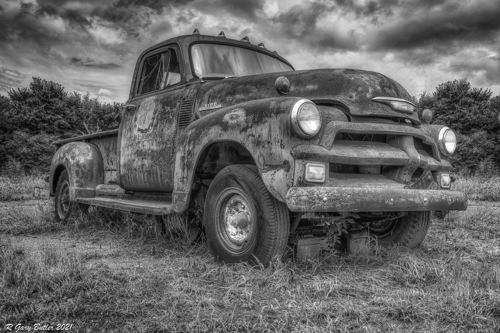
| 4 |
Sep 21 |
Comment |
First of all, let me say that you did a great job minimizing what I remember as a pretty cluttered background. I think you were wise to check the tonal range in Silver Efex Pro. Sometimes I find in my images that although the contrast looks good to my eye I do not actually have white whites and black blacks.
I looked at all the suggested edits and liked the image better as more drama was added. So I took the liberty of processing your image (the one you posted as the edited versions, not the original) in, PS Createive Cloud. The first thing I noteiced is that you have some sensor dust spots in the top left, so Iremoved those. Then I made a solid black layer and chose the soft light blending mode and reduced the opacity to 35 percent. Then I moved it over to Color Efex Pro 4 and added subtle glow also reduced to 35 percent. My last step was to increase the exposure on the headlights, running lights, front wheel hub and the hood emblem by a little over one stop. I think this preserves the tonal range even though the image itself is more low key. In my opinon it is a good image so it is just a matter of personal taste. Let me know what you think |
Sep 14th |
 |
1 comment - 0 replies for Group 4
|
| 35 |
Sep 21 |
Comment |
Debbie, I really enjoy looking at this image. I have one IR image where I managed to get this color pallette and I have never been able to replicate the effect. I think the two-track works to lead me back to the barn and that lovely quilt design. I also see that there is some detail inside the barn to visually explore. The sky has plenty of interest but does not overwhelm the scene. I'll bet this will be a winning image for you. |
Sep 16th |
| 35 |
Sep 21 |
Comment |
One of my IR conversion cameras is also 590nm and I often get those tones, which are unnatural, but I like them. For this image, I believe your choice to go to monochrome was good, and it appears to me that you have good tonal range. I guess this was a shack to start with, but what a shame it has been abandoned since it looks like an idyllic location. It makes me want to go camping again. |
Sep 16th |
| 35 |
Sep 21 |
Comment |
You have captured a lovely waterscape and a nice reflection. I am amazed that this ws captured with an aperture of f/4 since it looks very sharp all the way to the back. To me, the rocks in the foreground are not helping the image. I can see the temptation to use then as part of the framing of the mirror-like lake, but in my opinon they feel mrore like a visual barrier. I agree with Julie that the cyan cast feels somewhat unnatural. I would try to bring out more blue tones. |
Sep 16th |
| 35 |
Sep 21 |
Comment |
I like the silhouettes and give you high marks for staying until the light was almost gone to create this simple but interesting image. I believe you could crop about 20 percent from the bottom and still peserve that lovely "S Curve." I see a slight halo around the edges of the rocks. You can use the clone toll in PS on darken to eliminate that.
I hope to visit you all form time to time and see what great IR images you are creating. |
Sep 16th |
| 35 |
Sep 21 |
Comment |
I think this is a lovely scene - one no photographer could pass up. There is so much to look at. My eye follows the river bank back to the bridge where the water seems to end - but wait, it that more wat just beyond? The structure is interesting, so my eye wanders back there too. I think the foliage is well done and your selective adjustments have given it texture and depth. Finally I notice the sky which has detail, but a softness that adds interest without competing with all the other lovely compsitional elements. I find this image very visually appealing and I think your postprocessing decisions are spot on. |
Sep 16th |
| 35 |
Sep 21 |
Comment |
You seem to have a knack for finding these interesting old structures. I like the textures in this image and feel that is its strength. I also like the sepia treatment - you night even add a border that nakes it look like an old snapshot. Ihave two suggestions. One is to do some selective dodge and burn. In my opinion that would give the image more depth. My other suggestion is to remoe the little could or layer in another sky with a few more clouds - as long as there is not so much going on in the sky that it competes with the real subject. |
Sep 16th |
6 comments - 0 replies for Group 35
|
| 52 |
Sep 21 |
Comment |
I think you have done a masterful job with the background. This is a somewhat low key image, but for me it has just enough color to make it grab my attention. The process you described is exactly what I would have done. In my opinion the result is quite artistic. |
Sep 15th |
| 52 |
Sep 21 |
Comment |
Judith, I see that you made this image with a very wide aperture which results in a very shallow depth of field. I am curious about that choice. Lisa has made a good observation about smaller aperture and calculating hyperfocal distance by focusing about one third of the way into the scene. However, you may have been trying for another effect, so that is the basis of my curiosity.
I like the way you have brought out the color in the foreground. I see the graininess in the sky and to me it is is a bit bothersome. Like Mike, I am a big fan of th entire NIK Collection and find Color Efex Pro 4 a very valuable tool. But you could also create some very artistic looks from this image in Topaz Studio. It is just a matter of personal taste. |
Sep 15th |
| 52 |
Sep 21 |
Comment |
As a child I learned to intensely dislike chickens - long, story; but as a photographer I think they are potentially very interesting subjects and can even be presented artistically. I am not sure what your intentions for this image are, but if you are considering entering it in any type of Nature Exhibition, keep in mind that feral animals are not permitted.
Having said that, I think there is a story here. The space you have allowed gives the subject some context, and I like the way the focus drops off behind the subject. |
Sep 15th |
| 52 |
Sep 21 |
Comment |
Without your title and some explanation I would have taken a long time (maybe forever) to figure out what is going on in this image. However, like Mike, I enjoy the mystery so would go with the tighter crop. I think it is sometimes good to have the element of mystery since it tends to keep your viewer engaged longer. Your processing has brought out the texture and the color nicely and it adds significantly to the impact. |
Sep 15th |
| 52 |
Sep 21 |
Comment |
Lisa, when you pull down just click in the middle of the selected area, not on the"handles" that appear on the edges. That way the whole selection will come down. You will probably have to do some touch up work at the edges of the selection to make it blend in. I too see this image as being much more engaging as a panorama. I lobe the colors and think they are the star of this image. |
Sep 15th |
| 52 |
Sep 21 |
Comment |
I think the color palette in your image is lovely. Color is the element that gives this image impact. Most of the lines are horizontal which to me gives the scene a calm, pastoral feel. I am a bit uncertain about what you intended as the center of interest and where you wanted the viewer's eye to come to rest. I think adding this kind of information to the description of the images we post really helps the group to give better, more targeted feedback. It appears that your choice of aperture gave you sharpness all the way to the back. Wide angle lenses sometimes create vignetting when a polarizing filter is added. I agree with Mike's suggestion about cropping. |
Sep 15th |
| 52 |
Sep 21 |
Reply |
Thanks, Mike. I see what you are going for. Those are good suggestions. |
Sep 15th |
| 52 |
Sep 21 |
Reply |
Thanks for youyr comments and suggestions. I have alredy added catch light to the eye and brightened it as much as I feel it is possible without damaging pixels. (See my reply to Ally.) I think the crop idea is a good one for digitial versions of this image. |
Sep 15th |
| 52 |
Sep 21 |
Reply |
Thanks, Gary. I know a lot of people think these birds are green and red rather than irredescent, so they don't realize how the quality and direciton of the light can change their color. Tht bird and the flowers were totally in the shade. |
Sep 15th |
| 52 |
Sep 21 |
Reply |
Thanks, Lisa. The trees and shrubbery ws actually a long ways off - maybe 30 feet. When shooting with a long zoom lens you get compression which blurs the background significantly, so that was a factor too as I was at 560mm. I have already brightened the eye as much as possible - see my reply to Ally for further explanation. |
Sep 15th |
| 52 |
Sep 21 |
Reply |
Thanks, Pam. Several of you have suggested a tighter crop. Originally I was thinking of this image as a canvas gallery wrap so I was trying to preserve as many pixels as possible. I think I will make a copy and crop it tighter to use for digital only. |
Sep 15th |
| 52 |
Sep 21 |
Reply |
Thank you for your comments and suggestins. I have already brightened the ey to the point wher if I push it further it creates strange looking pixels that are quite obvious (at lest to me). So I am afraid the eye is as good as it can be. |
Sep 15th |
6 comments - 6 replies for Group 52
|
13 comments - 6 replies Total
|


