|
| Group |
Round |
C/R |
Comment |
Date |
Image |
| 35 |
Jul 21 |
Comment |
The butterfly, including both wings, is tack sharp. Nice work. For me, there is too much foliage in the image. I would consider cropping to a sqare if you have enough pixels to do so. I would also consider choosing Original 2 and making the entire background monochrome - just leaving the butterfly in color. Normally, I like selenium toning, but it seems odd to me when I know the subject to be natureally very warm in color..
|
Jul 12th |
| 35 |
Jul 21 |
Comment |
Fo me, this image has a feeling of emptiness and desolation - something I often think about when crossing the Great Plains by car. I like where you placed the tree in the frame and I think the diagonal line of the tracks adds a touch of strength and dynamism. My only thought - and this would be if there was an opportunity to recapture the scene - would be be finding a perspective that did not have the tracks going off on the edge of the frame. It feel to me like my eye is being pulled away rather than staying in the scene. |
Jul 12th |
| 35 |
Jul 21 |
Comment |
This is a georgeous structure and you have captured it well in my opinion. I like the perspective you chose and the way it has created a soft diagonal line against the horizon. The sky compliments the buidling and I believe the tonal range is very good. I would not change anything about this. |
Jul 12th |
| 35 |
Jul 21 |
Comment |
The color in this image looks very natural to me. It evokes a feeling of springtime. However, I think the dark sky does not work with it. Debbie may be onto something with her suggestion of a sky replacement. Have you considered cropping a bit from the bottom? I think a more panoramic presentation would improve the composition. |
Jul 12th |
| 35 |
Jul 21 |
Reply |
Thank, Gary. I generally do not like table-top set ups but curiosity led me to try this. I haven't tried it in any exhibitons yet, but maybe I will now. |
Jul 11th |
| 35 |
Jul 21 |
Reply |
Thanks, Angela. Visitors from other groups are always appreciated. IR can be risky - lots of folks just do not like it, but I think it gives us the opportunity to be more artistic. I am not sure what the future of this image is; hopefully, it will do well in exhibitons.
|
Jul 6th |
4 comments - 2 replies for Group 35
|
| 40 |
Jul 21 |
Comment |
Hi Catherine. I am from Group 52 and I am visiting several other groups this month to see what is going on. I am amazed at this close up look at the chicks of Brown Pelians, who I am used to seeing only in the juvenile and adult stages of their lives. Your focus appears to be sharp and I see catch light in the eye of both individuals. It is really hard to analyze how an image might be improved when so little information is provided by the maker. Right away I begin to wonder what lens you used, what aperture setting (a wider aperture might have given you a little more bokeh thus making the background less distracting), how much this image is cropped,etc. Also, I wonder what you mean when you say you are using a little more PS. Have you set white and black points, and done color correction, or have you done more to improve the image, such as cloing out distractions? I would love to know more - we can learn from each other if we share. |
Jul 11th |
1 comment - 0 replies for Group 40
|
| 52 |
Jul 21 |
Comment |
I usually choose a bi-color filter from Color Efex Pro or OnOne Effets. But you could use 2 separate filters and mask/blend the images. I have never done the latter but I think it would work. |
Jul 12th |
| 52 |
Jul 21 |
Reply |
I was thinking of a bi-color filter, but I believe you could do it either way. If you used 2 separate filters you would have to mask and paint it out on parts of the image, or you could blend 2 images. I usually choose a bi-color filter from Color Efex Pro or OnOne Effects. |
Jul 12th |
| 52 |
Jul 21 |
Reply |
Pam, I see the edited image did not get posted the first time, so here it is. I hope the visual feedback is helpful. |
Jul 12th |
| 52 |
Jul 21 |
Comment |
I think you captued this pair at exactly the righ time and place. Their silhouetted forms against that blazing sky just scream "Old West" to me. I wanted the house to be more distinct, so I tweaked the white and black points, pulled the shadow slider down, then added contrst and clarity in LR. Finally, I added a warm polarizing filter in OnOne Effects. This is just my idea of how to present this - you are the artist. What do you think? |
Jul 12th |
 |
| 52 |
Jul 21 |
Comment |
I am thinking that is this is an "Air Plant" which I have seen down in the Everglades. The coin gives my a sense of the size of the flower, but other than that does not add to the image, in my opinion. Perhaps it would be more interesting if standing on its edge - I wonder if you could have moved it? The specular highlights in background are bright and draw my attention away from teh flower. Think toning down the background and perhaps adding some blur to it might help keep my eye on the flower which is your center of interest. |
Jul 12th |
| 52 |
Jul 21 |
Comment |
I had to look close to realize there were three of them! It is easy to see who is dominant! At the very center of the action where the two heads are close together appears to be a bit soft. I am guessing a little faster shutter speed combined with a bit higher ISO might have made a difference, but that is just a guess since you have not specified your settings. I think the suggestions as to futher darkening the background would improve the image and help tell you story. |
Jul 12th |
| 52 |
Jul 21 |
Comment |
The color palette in your image is very nice, in my opinon. I like the silhouette and would not try to open up the shadows - in fact I night consider going the other direction. My only other suggestion would be to saturate blud and play with blue luminance - move the slier to the left and see what you think. Well done. |
Jul 12th |
| 52 |
Jul 21 |
Comment |
Thanks for clarifying your aperture setting. I was at first very puzzled by how you accomplished this at f/2.8; not only is it sharp front to back, but I have never been able to capture a sun star with an aperture wider than f/16. I would have been out trying to replicate yuor success at that!
I find the pastoral feeling created by this image very pleasing. I also like the tiny window into the meadow beyond the foliage. My only suggestion -and this is just something I would try if it were mine - is to add a graduated warming filter at the top or a warm/cool filter with the cooler tones at the bottom, both of which would need to be at a low opacity level. I think that might just make the image pop even more. |
Jul 12th |
| 52 |
Jul 21 |
Comment |
I think you caught the sunset at exactly the right time to produce beautiful light and color. Also, having visited the Palouse in June a few years ago, I believe you chose the right lens to capture this scene - the way the telephoto compresses the image is lovely, Ithink.. To me it appears a bit hazy. Also, in my opinion the fallow area in the foreground does not help the image. I hope you do not mind that I took a stab at editing your image. First I set white and black points, then moved the Dehaze slider to the right until I thought the contrast and clarity looked correct to me. Finally, I cropped to a panoramic view. This is just my idea about how to present this scene. Try it and see what you think. |
Jul 12th |
 |
| 52 |
Jul 21 |
Reply |
Thanks, Judith...I just love the interpretation you provided! I am glad you are in our group because you think outside the box. That is a valuable asset. |
Jul 11th |
| 52 |
Jul 21 |
Reply |
Thanks for the suggestions Lisa. I did a re-edit based on feedback from you and the others who have commented so far. Let me know what you think. |
Jul 11th |
| 52 |
Jul 21 |
Reply |
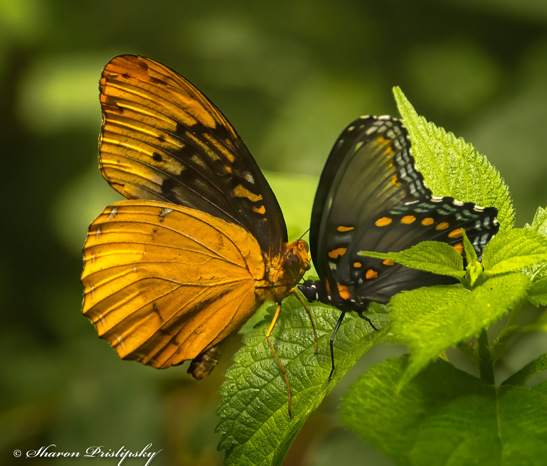
OK, Mike...I have thought about this quite a bit - how to preserved the image for NAture competition and still address some of the issues you pinted out? I still do not want to amputate the back portion of the wing of the one on the right - to me it looks like the photographer made a mistake while shooting. I took the image into Viveza and tried to sharpen up the wing edge and the leaf but that added a great deal of noise. So back in LR I just brushed in contrast and sharpness. Pushing it any further just degrades the quality of the image. I also cropped closer hoping that would focus the viewer on the story. Here is my second try. In Nature they say the story outweighs the technical, so the question is whether I have a strong enough story to compensate for the flaws. Let me know what you think. And oh yes - you are correct that butterflies tend to have erratic flight patterns but what I like is that they keep returning to the same flower or leaf. |
Jul 11th |
 |
| 52 |
Jul 21 |
Comment |
Thanks for taking the time to try to work with this image, Mike. As you know the removal of the leaves will disqualify this image from Nature competitions, which I regularly compete in through Gulf States Camera Clubs Council, so that is not something that works for me. I do understand that you did not like the leaf overlapping the wing of the Red Spotted Purple, but this crop does not improve the image in my view. I believe that for such a severe crop to work at all it would have to be cropped to just the heads and torsos of both butterflies, so it owuld look like an untra close up. I may go back and try that if I still have enough pixels. |
Jul 9th |
8 comments - 5 replies for Group 52
|
13 comments - 7 replies Total
|


