|
| Group |
Round |
C/R |
Comment |
Date |
Image |
| 3 |
Feb 21 |
Comment |
Hi Ruth. I took this trail once a good many years ago, but in a different season. I love the green and blue palette youc aptured and the reflection is lovely. For me the what makes this image interesting is the way the leading lines converge on the tiny human figure. It shows the viewer the scale of this canyon. Nice work.
If you have not seen the Februry Journal yet, you are the featured volunteer this month. I am sure your PSA friends and colleagues will want to see that. Thanks for all you do for PSA. |
Feb 1st |
1 comment - 0 replies for Group 3
|
| 35 |
Feb 21 |
Reply |
Funny thing...that is not snow. It ws 60 degrees on that day just a few weeks ago. At the moment however, it is under at least a foot of snow - very unusual for central Arkansas. |
Feb 18th |
| 35 |
Feb 21 |
Comment |
I am always looking at my images to find the "image within the image," and I think you have done that brilliantly here. The bright beam of light directs my eye precisely toward the bananas. It is only when I click on your image to see the larger version thaat I realize the texture you have applied. I think it works well here. Thanks for explaining your post processing. I can't wait to try that! |
Feb 14th |
| 35 |
Feb 21 |
Comment |
I feel like I want to go sit there and enjoy a glass of wine. The toning you achieved seems perfect to me as the blue is so restful. Thanks for the suggestion about the neutral filter. I will explore that. You have captured nice detail and good tonal range in my opinion. I think Julie's suggestion about the crop has merit. |
Feb 14th |
| 35 |
Feb 21 |
Comment |
This is an excellent example of why we need to look closer at the ordinary things in our environment - not just now when we are so limited in subject matter, but always. Good job finding this and imagining what could be done with it. I like the curved lines of the stone work. I just wish more of it was infocus. |
Feb 14th |
| 35 |
Feb 21 |
Comment |
I am enjoying all the different textures you have captured in this scene. The tonal range is perfect in my opinion, and the composition using the diagonal line works well for me. My only suggestions would be a slight crop at he bottom and the right. This may be a nit pick, but for me, small bits of foliage sticking into the image from the edges are not helping and I think could be eliminated without ruining the lovely reflections.. |
Feb 14th |
| 35 |
Feb 21 |
Comment |
I think the color work you have done here is very appealing. Tline of the creek leads me smoothly through the image to the lighthouse, which i feel you have placed perfectly in the frame. Personally, I am thinking there is a little too much foreground. My suggestion would be to crop up to almost where the dark diagonal ends at the right edge of the frame. I guess I am thinking it would be nore like a 5X7 aspect ratio rather than 4X6. Try it and see what you think. |
Feb 14th |
| 35 |
Feb 21 |
Reply |
When I do a high key image I always think of your work. Thanks for the suggestions. I will work on those banksa bit more. |
Feb 14th |
| 35 |
Feb 21 |
Reply |
Thanks, Helen...good suggestion. I will work on those aeas a bit more. We are expecting snow this week - very rare in this area - so maybe I will get a chnace to see what IR does with snow. |
Feb 14th |
| 35 |
Feb 21 |
Reply |
Thanks, Gary. More adventures in desperately seeking a subject. |
Feb 8th |
5 comments - 4 replies for Group 35
|
| 40 |
Feb 21 |
Comment |
Julie, I am from Group 52 Nature Plus (Mike is in that group too - not group 51 LOL). I find this shot amazing since I have only once in real life had the opportunity to view a bat up close and personal with all this detail. The sharp detail and the catch light you captured in its eye make it appear very alive for me. The lighting is perfect in my opinion. I think Mike's suggeton of adding background texture is worth a try if you want a more artistic image. |
Feb 7th |
1 comment - 0 replies for Group 40
|
| 48 |
Feb 21 |
Comment |
For me, the vibrant color in this image makes it a standout. The filter you chose is very impressionistic in my opinion, and I think it adds a new level of interest. I also like the way you have cropped it. A new season of blooms is almost here, so you are going to have a lot of subject matter to work with in the coming months. I will look forward to seeing what else you create. |
Feb 6th |
1 comment - 0 replies for Group 48
|
| 52 |
Feb 21 |
Comment |
In my opinion you have captured this irredesdcent bird at exactly the right moment. The wind display is beautiful and I could spend a long time looking at it. I had to look very closely to find the eye. I wonder if there is a way you could put some light on it so that it is more apparent? For me, the crop is a tiny bit too tight at the top left - just a nit pick. This is a beautiful caopture and I have no other suggestions for improvement. Nice work, as usual. |
Feb 13th |
| 52 |
Feb 21 |
Comment |
For me, the multiple textures in this image are a WOW factor. It all looks sharp and I think it has good tonal range. I feel that monochrome was an excellent choice. I also like the crop that Pam suggested. I am so glad you decided not to skip round and instead presented this lovely image. |
Feb 13th |
| 52 |
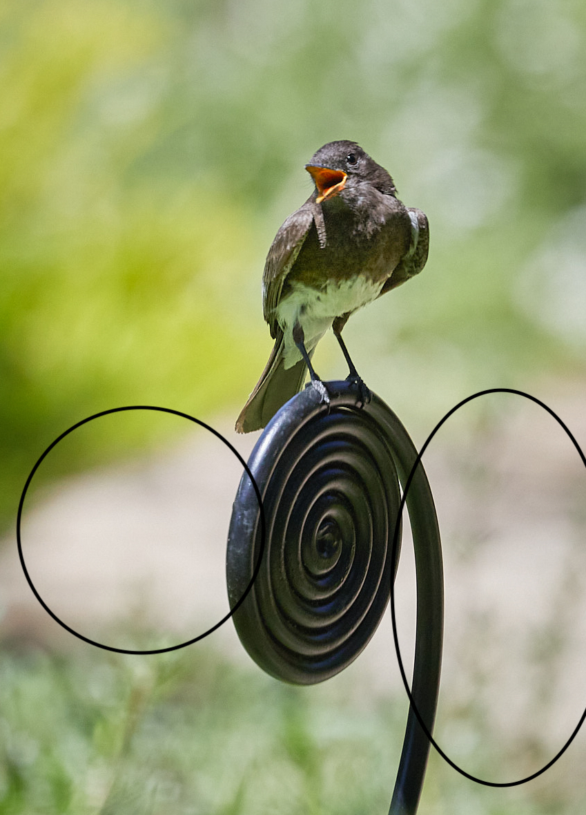
Feb 21 |
Comment |
I like the sense of activity I get from the bird's pose and the open beak. I love to hear the call of our Eastern Phoebe so I can image how this one sounds. For me the bright white areas I have indicated on the attached visual feedback are somewhat distracting. I would suggest trying a luminosity mask to tone down these areas. I also think Mike's suggested crop works as it eliminaes the out of focus leaves at the bottom. |
Feb 13th |
 |
| 52 |
Feb 21 |
Comment |
How lucky you are to have been able to visit this beautiful location. I agree with you and the others that waming iup the face of the mountain is a very nice enhancement. I am generally partial to square crops and use them a lot, but for me a vertical crop for this image would add to the sense of the great height and grandeur of the mountain. I do like the crop with less sky at the top, so to acheieve a vertical would mean cropping in at the sides. Would you consider cropping as indicated on my visual feedback if you have enough pixels? |
Feb 13th |
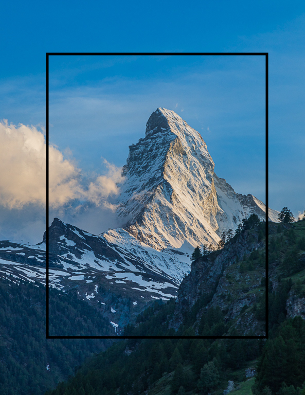 |
| 52 |
Feb 21 |
Comment |
For me, the way you cropped the sky out turns what may have been merely a snapshot into something more special, so good choice in my opinon. In your image as posted,one of the first things I noticed was the pine branches protruding into the image on the left. This is a persona nit pick I know but I always try not to have branches that are not connected to a tree trunk or anything else that is visible extending into my image. So, having said that, I prefer the crop that Pam has offered. I like keeping the snow at the bottom because the curve has a nice organic feel for me. I think you did a good job getting teh correct white balance for snow. Did you do a custom white balance in camera or adjust in post processing?
WE are excited that we are supposed to have measurable snow here in Central Arkansas this week. We have not had snow for a long time and I have a location in mind that I hope will make a good winter postcard type scene. We shall see. |
Feb 13th |
| 52 |
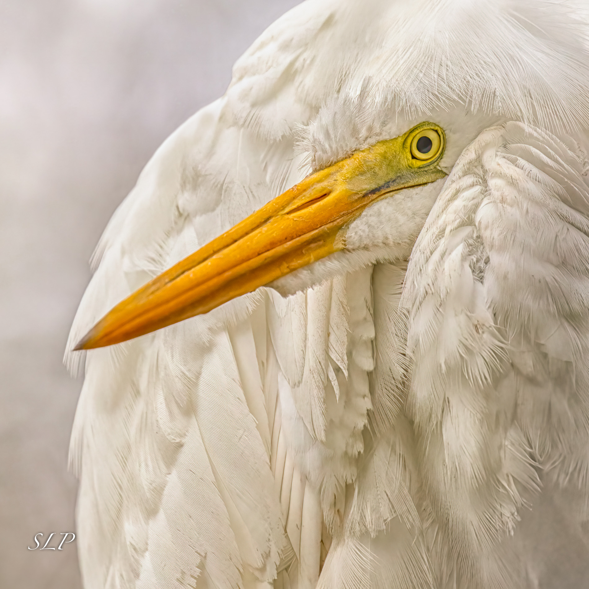
Feb 21 |
Comment |
The first thing I notice is how alive this hawl appers in your image. The sharpness of the eye and the catch light combined with all the detail in the feathers makes me feel that the bird is about to pounce on some prey. Your choice of aperture created a terriffic background in my opinion. I prefer the vertical crop, but as Pam has said, a bit more space above the head would be helpful. Well done. |
Feb 13th |
| 52 |
Feb 21 |
Reply |
Thanks, Pam. It's funny how pristine he looks in the image. He was quite dirty in reality. |
Feb 13th |
| 52 |
Feb 21 |
Reply |
I seeyour points. Hereis a dfferent edit of the same image. Your thoughts? |
Feb 6th |
 |
6 comments - 2 replies for Group 52
|
| 88 |
Feb 21 |
Comment |
To me, this is a great American scene and I think the painterly look you have given it is wonderful. I would not change a thing about it, but I would frame it and put it on the wall if it was mine. Nice work. |
Feb 6th |
1 comment - 0 replies for Group 88
|
15 comments - 6 replies Total
|


