|
| Group |
Round |
C/R |
Comment |
Date |
Image |
| 35 |
Dec 20 |
Reply |
Thanks, Debbie. This is an image I have overlooked for quite some time, but I guess it is worth putting some more effort into. I will followup on suggestions and see where it goes. |
Dec 13th |
| 35 |
Dec 20 |
Reply |
Oh, that explains it! I need to read more carefully I guess. Thanks. |
Dec 13th |
| 35 |
Dec 20 |
Comment |
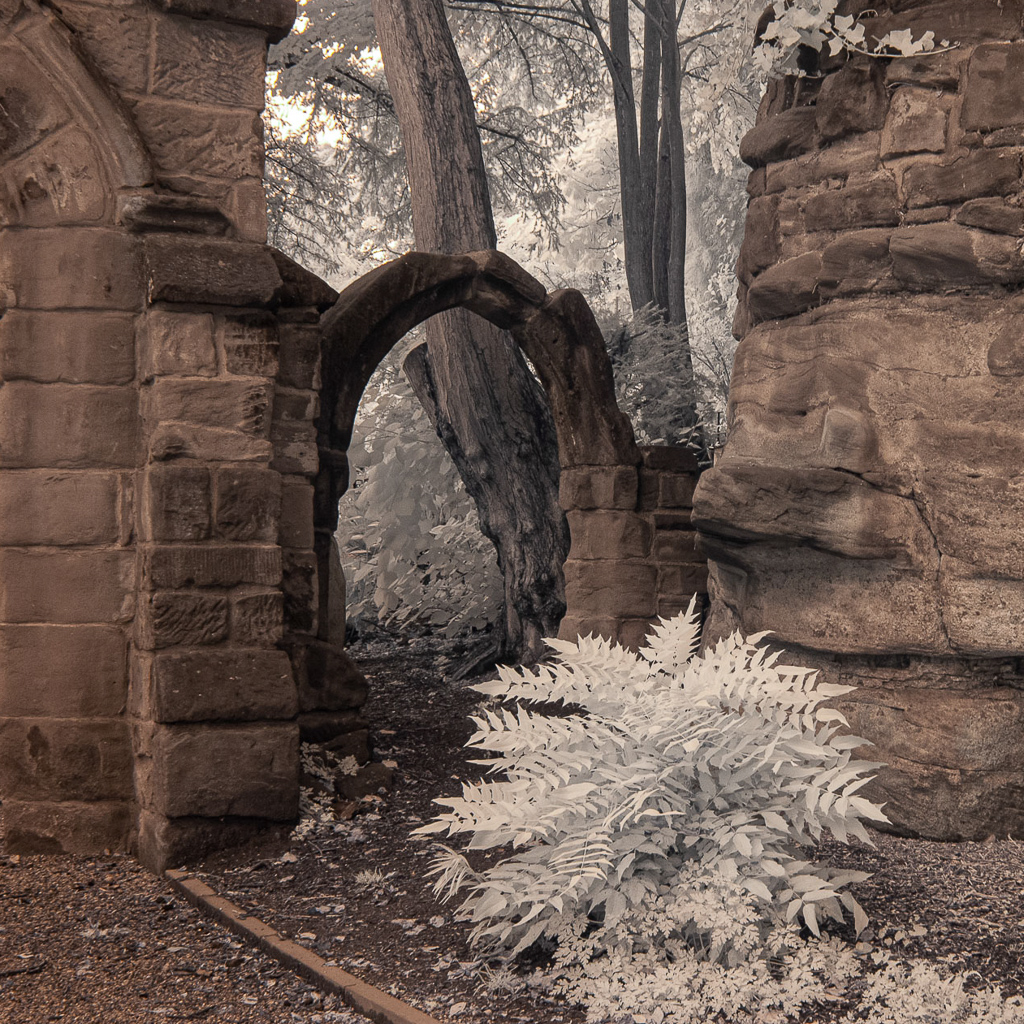
I want to live here! What a lovely property this is. I think the dreamy look you gave it adds to my feeling that is would be a place of peace and comfort.
On the other hand, there are so many barriers between me and Nirvana that I feel I could never get there. I think it would be wonderful if you could contact the owners and get permission to go onto the property. I am wondering what it would look like shot from further to the right and perhaps from a low angle. Your post processing skills are terriffic and I know you could do a lot with this subject. Good luck. |
Dec 13th |
| 35 |
Dec 20 |
Comment |
I relly like this image, but I immediately saw it as a square crop. See my visual feedback. The area on the right holds little interest for me. Beyond that, your post processing as usual is spot on. I would be very proud of this image if I were you. |
Dec 13th |
 |
| 35 |
Dec 20 |
Comment |
What an interesting structure! I will keep this in mind if I ever get to travel north again to see family in PA and NY (just kidding - I really am more hopeful than that comment sounds).
To me, this image seems like what I cometimes call "a diamond in the rough." I feel it has a lot of potential but needs some selective dodge and burn to bring out the interest it contains. As I study it, I tend to think I would consider cloning out the two upper clouds and cropping on the left to eliminate the last three windows on that side. I hope you will keep working on this and perhaps share your results in a future round. |
Dec 13th |
| 35 |
Dec 20 |
Comment |
I love the simplicity of this image. I am one of thos who always likes to see odd numbers, so I would consider cloning out the smallest mushroom at the bottom. The smooth curved lines draw my eye upward through the image, and the softness of the clouds provides a nice contrast to all the texture in the tree trunk. In my opinion, the sky looks a little bit grainy and I would suggest running Topaz AI DeNoise or similar noise reduction program. |
Dec 13th |
| 35 |
Dec 20 |
Comment |
Oh, so funny...I had the same first thought as Terry - Norfolk, VA, USA? You can tell we are Americans can't you? Very parochial.
There is a lot of interesting texture in the foreground and on the building, so for me the relative softness of the clouds is an asset not a liability. I read all the comments and gave it some thought. I tend to go with Stuart's idea that the tombstone in the bottom right is the real star of the image. My thinking is to crop some on the left which would minimize the slight torque of the building then selectively lighten and darken some areas to bring the viewer's eye right to that beautiful cross.
|
Dec 13th |
| 35 |
Dec 20 |
Comment |
I think this is a great scene and it works well in IR. I would have guessed it was the Alabama Hills, but I know the rock formations in Joshua Tree are very similar. I really like the sense that there are three layers of interest here - the flat foreground with the shrubs, the rounded roacks and then all that terriffic drama in the sky. I agree with Helen that your post processing is spot on. Nice work. |
Dec 13th |
| 35 |
Dec 20 |
Reply |
Thanks, Stuart. I certainly love that part of the country and hope I can go back some day. This scene is a bit off the beaten path, but I think we took those back roads at your suggestion, so thank you for that as well. |
Dec 13th |
| 35 |
Dec 20 |
Reply |
Thanks, Helen. I will consider your idea about the water. |
Dec 13th |
| 35 |
Dec 20 |
Reply |
Terry, I am not seeing what you apparently observe in the clouds - but my eyes are old LOL. I do like the suggestions you and Gary offered as to the foliage, and will follow up on that. |
Dec 13th |
| 35 |
Dec 20 |
Reply |
Thanks, Gary. Good suggestion. I agree with you. |
Dec 5th |
6 comments - 6 replies for Group 35
|
| 40 |
Dec 20 |
Comment |
I think the interacton between the birds provides a good nature story. There is a slight convergence which is generally to be avoided, but in this case there is not much overlap, so in my opinion it is acceptable. I always like the water to be blurred in bird photos; the height from where you shot and the distance from the birds to the water below created a distraction free background.
I see that another member has suggested the use of a polarizer. I never use a polarizer for bird photography because it slows the shutter speed a bit and may requre a higher ISO which introduces the noise factor; although the light appears to have been so bright here that you may have gotten away with using one. I almost always apply polarization in post processing usind NIK Color EFex Pro.
For me, the crop is little too tight. I think a bit more space around the subjects would give them breathing room and help increase the sense that they are in motion. Due to the size of the image I can't tell if there is a loss of detail in the breast aresa of the birds. One thing that I have learned is to use spot metering and meter on the whites. With averaged metering the camera will overexpose the whites causeing blown out areas and loss of detail. |
Dec 17th |
1 comment - 0 replies for Group 40
|
| 52 |
Dec 20 |
Reply |
In the detail panel in LR under sharpening: LR has some automoatic presets so unless you have eliminated those, you will probably have to move the top slider to the right as little as possible - just a tiny click to get the other tools. The radius is usually set at 1.0 which I think is ok, but I move the detail slider down to just under 1.0. Then hold down the option key and space bar and move the masking slider to the right. You will see that the image turns to black and white so you can see the edges really well. Try not to go over 50 with this...stop when you see clear edges. |
Dec 13th |
| 52 |
Dec 20 |
Comment |
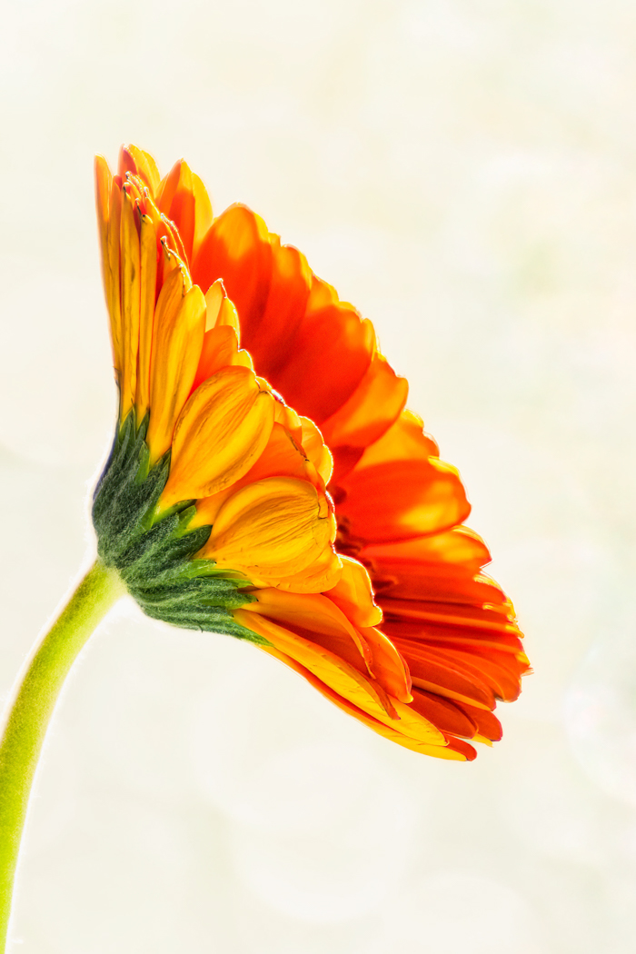
Personally, I think it is perfect! The ripples at the bottom help tell the story of the bird being over water, and I like the extra bit of space at the top. I would not change one thing about this. I am certain it is a winner! |
Dec 13th |
| 52 |
Dec 20 |
Comment |
Judith, I hope you don't mind that I couldn't resist playing around with this image. I cropped, pulled down highlights and moved the black slider to the right. I used the clone tool in LR to remove most of the yellow spots on the green background then did some edge sharpening in the detail panel. Lastly I added a dark vignette. Just my ideas. See what you think.
|
Dec 13th |
 |
| 52 |
Dec 20 |
Comment |
I think the wing position and the spread of the tail feathers are very good. I can see that the focus is sharp and it appers that you have captured a bit of light in the eye, which always makes the subject look life-like.
In my opinion it is too bad this was captured in such harsh light. I find the specular highlights on the water very distracting. You might try some luminosity masking as see if that helps. |
Dec 13th |
| 52 |
Dec 20 |
Comment |
I love his expression! Is he bored, or considering pouncing on something? Viewers will never know.
I agree with the comments made by Mike and Pam. I have often replaced eyes and it is very easy. I believe doing so would really make this subject look alive. Also, the transform tools in PS are easy to use if you decide to open his eye a bit wider. I think your friend is right, but keep in mind that these alterations would make this image inelligible for most nature competitions. In Nature, the story is more important than minor technical issues. I often keep two versions of an image, one that I have maipulated, and those are entered in PID or PPD competitions where most anything goes. Then I keep a realistic version for Nature. |
Dec 13th |
| 52 |
Dec 20 |
Comment |
I guess we are all in the same boat...trying to work on our photography while staying safe. Hopefully the zoo was not too crowded this time of year.
The thing I like best about this image is the contrasting colors. Those oranges and blues always work well for me. I also enjoy the detail in the feathers and the smooth reflection in the water. It would take some work, but I believe I would try to remove all of the debris spots on the water and make it entirely smooth. I think this would enhance the effect of the beautiful reflection. As for the crop, I think cropping more on the top is a good idea If you think Mike's version is too severe, why not consider leaving a tiny bit more space and then just cloning on the left so it is all water rather than seeing any of that edge? |
Dec 13th |
| 52 |
Dec 20 |
Comment |
Like Mike, I don't see the tree as being a problem; however, I do like your idea of using one of the images that has shorter shutter speed to mask the clouds and add drama. For me, the composition works well including the various layers and the road leading me into the scene. I like the texture in the road and the grass. If you can pull more detail out of the clouds I think it would add interest and make this a terriffic image. Well done. |
Dec 13th |
| 52 |
Dec 20 |
Reply |
Thanks, Pam. He deginitely had an attitude, so I was glad that there was a pasture fence between us. |
Dec 13th |
| 52 |
Dec 20 |
Reply |
Thanks, Ally. I didn't notice that repeating pattern in the foliage so I appreciate you pointing it out. |
Dec 13th |
| 52 |
Dec 20 |
Reply |
Thanks, Mike. I wouldn't have thought of that, although I often look at my landscape images to try to see if there are other images within the larger one. |
Dec 13th |
6 comments - 4 replies for Group 52
|
| 88 |
Dec 20 |
Comment |
It looks to me like you have captured the sunrise at exactly the right moment The sun star is sharp and the orb is still close enough to the horizon to avoid a large blown out area. In my opinon the composition works well with the river leading into the background, taking my eye directiy to the the sun star. The fall colors are appealing and the contrast with the blues really works for me. Well done. |
Dec 4th |
1 comment - 0 replies for Group 88
|
14 comments - 10 replies Total
|


