|
| Group |
Round |
C/R |
Comment |
Date |
Image |
| 6 |
Sep 20 |
Comment |
I passing through from groups 35 and 52 and your image caught my eye. I think you have done an excellent job with the focus stacking. All three blooms appear to be sharp. The background bokeh is lovely in my opinon. I am curious about the lens you used. Macro or zoom and what focal length? |
Sep 10th |
1 comment - 0 replies for Group 6
|
| 16 |
Sep 20 |
Comment |
This is another eye-popping image, Bogdan. If only I had thought to visit your part of the world before the pandemic! I thlight you have captured on the mountains is in my opinion spectacular. |
Sep 13th |
1 comment - 0 replies for Group 16
|
| 28 |
Sep 20 |
Comment |
I am just wondering through from Groups 35 and 52. The Glade Creek Mill is a favorite subject of mine. You are lucky to have gotten there when there was a good flow of water and apparently not a lot of other photographers getting into your scene. In my opinion you have achieved your goal of creating alternative reality with this effect. It really distorts the structure, and I find that a little disconcerting, but the color is good and I like the way you emphasized the foreground. |
Sep 13th |
1 comment - 0 replies for Group 28
|
| 35 |
Sep 20 |
Comment |
I remembered that you had submitted another image of this home some time ago, so I went back into previous rounds to find it. This version is much more interesting than the last one. The lines of the trees and the soft clouds in the sky and the shadows on the lawn feel to me like they are radiating out from the cneter - a pleasing effect in my opinon. Also, the colors you have produced work well I think. Very nice job. I am curious if this is a rework of the original capture or if it is an entiredly different image. |
Sep 13th |
| 35 |
Sep 20 |
Comment |
I think these old phone booths have enough interest to stand on their own, but the lights on the side really add something special. I also believe it was worth the effort to add the color. I admire your patience and the foresight to do it on many layers. Nice work. |
Sep 13th |
| 35 |
Sep 20 |
Comment |
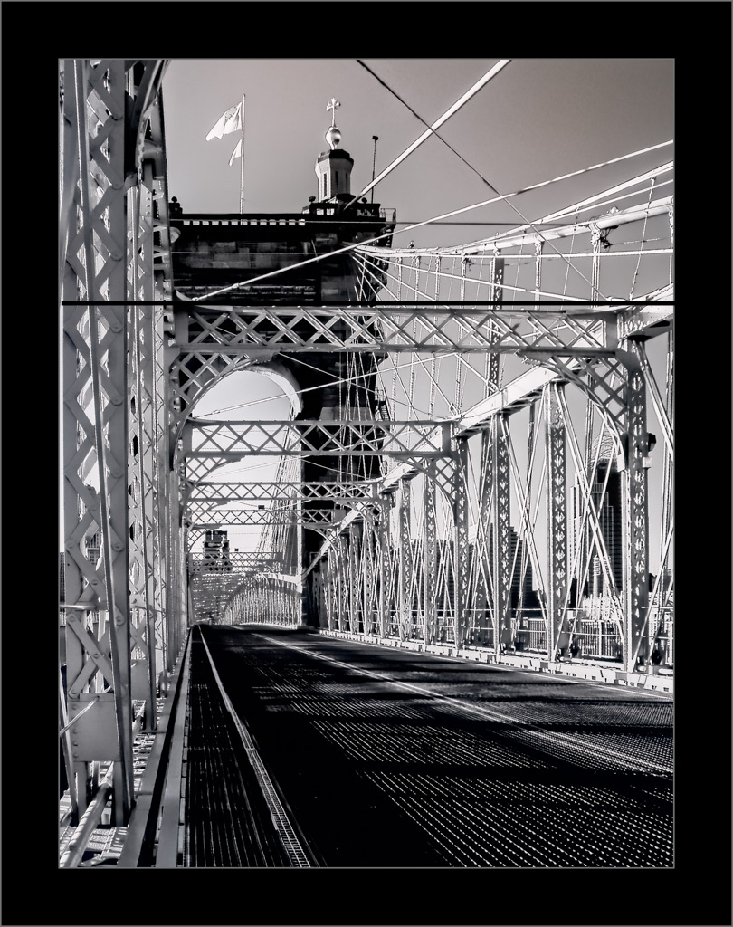
I grew up in Pittsburgh and have always been attracted to images of bridges like this one that cross our great eastern rivers. I think your post processing is excellent - good tonal range and enough detail in the dark, shadowed areas. I also think that the image would be stronger if cropped from the top. See my visual feeedback and decide what you think. |
Sep 13th |
 |
| 35 |
Sep 20 |
Comment |
Like you I enjoy using my 15mm Fisheye lens, but seems like others are often disoriented by the effect. I am thinking your camera was at eye level, and I wonder how it would look if you got down low and tilted the lens up. It would likely accentuate the curvature. I find that the closer I get the more interesting the compositions with the Fisheye are. Even before reading Helen's comment I decided I like the bottom half of the image best.
I have experienced a very high straight-line wind and they can be terrifying. I am glad you did not have more serious damage. |
Sep 13th |
| 35 |
Sep 20 |
Comment |
This image reminds me of many scenes I have come across in the American west. The sky is threatening and full of tension, yet the landscape is at peace. In my opinion your post processing produced a very good tonal range. The soft diagonal of the fence line works well for me. I think you chose a good perspective. I feel I am led into the scene whereas shot from another angle the fence coud have been a vusual barrier. |
Sep 13th |
| 35 |
Sep 20 |
Comment |
Sturart, I could not resist playing around with your image. I hope you don't mind. In PS I added a white layer, chose Soft Light blending mode and reduced that opacity to tone the color down. I added a curves layer and adjusted the midtones. Then Inbn LR I applied a gradient filter and darkened the foreground, an cropped a bit. Last, I ran it through Topaz AI Denoise. Let me know what you think. |
Sep 13th |
 |
| 35 |
Sep 20 |
Reply |
Thanks for the encouragment, Helen. I am going to try a small print on Hahnemuhle William Turner. |
Sep 13th |
| 35 |
Sep 20 |
Reply |
Thanks, Stuart. Henry David Thoreau said, "It's not what you look at that matters, it's what you see." |
Sep 11th |
| 35 |
Sep 20 |
Reply |
Thanks for that information, Jerry. |
Sep 6th |
6 comments - 3 replies for Group 35
|
| 40 |
Sep 20 |
Comment |
Hi Henry, Andrew has asked me and some members of Group 52 Natue Plus to comment on your image this month. My first thought is that you have captured a classic image of a Great Blue Heron in flight. In my opinion it is well exposed and very sharp right down to the detail in the feathers. Looking at the original I see that you have had to do fair size crop. Thank goodness that MarkIII has enough megapixels to make it work. For me, the clouds seem to compete with the beautiful heron for attention. Personally, I would prefer to see it on the plain sky, which I would desaturate as much as possible. |
Sep 16th |
1 comment - 0 replies for Group 40
|
| 52 |
Sep 20 |
Reply |
I think we all have worked well together and helped each other grow as photographers. I can't tell you how many times you and the others have made suggestions that took my image from being average to acceptance or better in an exhibiton. |
Sep 13th |
| 52 |
Sep 20 |
Comment |
I think the focal length was perfect for this image. For wildlife I always like to see the focus fall off right behind the subject as it does in this image. Nice work on the hot spots, but I would consider cloning out the two bright areas top left. Your flash worked well, and I do not see any evidence of it in the eyes. I have been shooting hummingbirds with flash using high speed sync at 1/4 compensation. I would like to know what flash adjustments, if any, you used for this image. |
Sep 13th |
| 52 |
Sep 20 |
Comment |
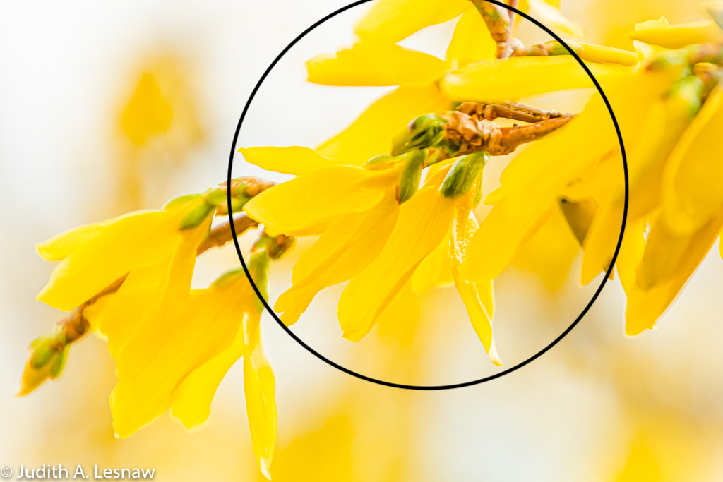
For me the "party" in this image is in the center area (see my visual feedback) and the rest of the image just pulls me away from that part - especially the little twig that leads my eye upward and out of the frame. I would consider a fairly significant crop. I like the brightness of the image, but I think using tihe clarity slider in LR to pull out a little more detail would be something to try. |
Sep 13th |
 |
| 52 |
Sep 20 |
Comment |
You have shown that there is a strange beauty even to disaster; that is hard to contemplate as the news from the western US gets worse by the day. While I hope the fire never comes as close as this to your home again, one idea you might consider in the event you have these conditions again, is to make 3 exposures at 0, +2 and -2 exposure compensation and merge them to HDR in Lightroom. As an alternative you could capture an image before sunset when the hills are better lit then capture another like this one after sunset and merge them in PS. Either way the final image would have the correct exosure in both the foreground and the sky. Stay safe. |
Sep 13th |
| 52 |
Sep 20 |
Comment |
To me, this image is very visually pleasing. Although it was lovely as presented I think the edit you made based on Mike's suggeston further enhanced it. As you know I am a big fan of square crops for flower images, and I believe it works well here. In my opinon, this is well done. |
Sep 13th |
| 52 |
Sep 20 |
Comment |
I think the ND filter was a great choice. I always appreciate the soft look of long exposure for water scenes. Your previsualization of a dreamy landscape resonates with me. Since you indicated you are using OnOne, I opened your image in that program and played around with it. I used local adjustment to lighten the land area and bring out detail, but found I could not open up the shadows more than just a little - still I thought the added detail there was a plus. I also applied a glow using the Dreamland filter at about 25-30 percent and it futher enhanced that soft dreamiy appearance. I liked it. Try it and see what you think. One suggestion I did not try but you might want to think about is seeing if you can bring out any more detail in the sky. |
Sep 13th |
| 52 |
Sep 20 |
Reply |
Thanks, Pam. I have been more often using a long zoom lens to photograph flowers because I lke the bokeh it produces. In this case I was also helped by the fact that the background (which is water) was far back from the subject. As opposed to Water Lilies which grow on lily pads, the Water Lotus tends to be on a long stem, well above the water level. |
Sep 13th |
| 52 |
Sep 20 |
Reply |
I have recently started applying Topaz AI deNoise right after I download and set what and black points and I do believe that the results are much better. |
Sep 6th |
| 52 |
Sep 20 |
Reply |
Thanks Jamie. You are probably used to seeing water lilies around here. The lotus flower is on a stem above the water and is much larger. It has that seed pot in the middle that is different from the water lily. These were growing at Holla Bend near Dardenelle. |
Sep 5th |
5 comments - 4 replies for Group 52
|
15 comments - 7 replies Total
|


