|
| Group |
Round |
C/R |
Comment |
Date |
Image |
| 35 |
Jun 20 |
Reply |
IR is a lot of fun and gives me a lot of cretive options. My huband thinks it is terrible - but then he was born without an creative gene in his body something he admits). CLir is not Topaz Clear. It is a whole separate program developed by Blake Rudis and another photographer from the UK whose name I have forgotten. When you purchase it you get training program with it, but I have preferred to just learn by trial and error. I think you can just google CLir and find it, but if you can't let me know and I will send you a link via email. You should still have my email address. It hasn't changed. |
Jun 23rd |
| 35 |
Jun 20 |
Reply |
It was a 100mm prime lens with a minimal focal distance of 8 or 9 inches. I got as close as I could. Since I did not have to worry about issues with the background I was able to stop it down to F/16, so I did not need to focus stack. |
Jun 19th |
| 35 |
Jun 20 |
Comment |
Wow! The butterfly as rendered here looks like a glass ornament. I have to keep reminding myself that it is a real live monarch. For me there is too much white foliage which draws my eye away from your center of interest. I believe I would consider removing that little bit of spoiled blossom or foliage just below the butterfly as well. I like the color you have applied to the flowers; it does indeed create a delicate feel in my opinion. I have been heavily focused on butterflies these last few weeks but never considered trying then in IR. You have inspired me. |
Jun 14th |
| 35 |
Jun 20 |
Comment |
This looks like a pleasant place to hang out - and not too many people there! I smile at your description of how you are experimenting with CLir. I am doing the same thing, and for the time being just try a lot of things until I get something that appeals to me. I am hoping that I will eventually learn which choices suit my style and zero in to learn how to use those particular tools to their full potential.
Having said all that, I like the color palette you chose. I do agree wth Debbie that cropping off the parking area on the right would make the image more visually pleasing for me. I need to practice your blending technique in PS. Everytime you mention this I think I will work on it and then forget to follow up. |
Jun 14th |
| 35 |
Jun 20 |
Comment |
I like the way you have used leading lines to draw my eye into the scene. I think leaving some of the grasses in the foreground was a good choice; that area sort of anchors the image for me. I also like where you are going with color, but I feel the blue is too intense. The feeling of this scene is one of calm and peace, but the blue jumps out at me in a way that interferes with that feeling. The artistic rendering you created is one I find very pleasing. I think those colors are lovely and I enjoy the water color effect. |
Jun 14th |
| 35 |
Jun 20 |
Comment |
For me this image is about shape and texture. You must have chosen a time of day that offered nice side light. I feel that the image has a lot of mid-tones and the shadows appear to have deep blacks, but it looks to my eye a little short on pure whites. I am wondering if you can boost the contrast a little bit or do some targeted adjustments to get more tonal range. I also believe I see a halo on the horizon, which, in my opinon should be removed.
I have been using Topaz AI DeNoise and find that with AI Clear I can elimnate noise without loss of detail.
|
Jun 14th |
| 35 |
Jun 20 |
Comment |
My friend and mentor, Jamie Konarska Davidson, is a very much into this type of image which she refers to as Wabi Sabi. Wabi Sabi is a Japanese aesthetic that finds beauty in impermanence. I think this is a great example. Your high key presentation works very well for me. I like that you have been able to eliminate harsh shadows. The falling petal is a nice touch, I think. For me it adds interest and a dynamic quality that I usually do not find in still life imags. I like this a lot. |
Jun 14th |
| 35 |
Jun 20 |
Comment |
What a great old barn structure in a beautiful setting you have found! It looks to me like it was meant for IR. In looking at images such as this one, I always find myself seeking a visual route into the scene.In my opinion, the fence presents a visual barrier that I have to work hard to cross so that I can enjoy image. I believe cloning out just the gate part would really improve the overall image. Then the roadway would lead me right to your center of interest. |
Jun 14th |
6 comments - 2 replies for Group 35
|
| 52 |
Jun 20 |
Comment |
I did not realize that the Anhinga's also displayed breeding plummage. I guess I have never seen one at the right time. This bird is a lot more attractive dressed in these colors that those that I am more familiar with. I love the action you captured. Everything about the subject is tack sharp and the background is soft with not distracting elements and lovely harmonious colors. I cannot think of any way to improve this. |
Jun 14th |
| 52 |
Jun 20 |
Comment |
This is a fun image. I think he looks like he has been living in the heat and humidity of Arkansas at this time of year. I agree with Mike that the color looks a bit off - I would say a little too blue-green in my opinion. I believe I would play around with it using the HSL panel in lightroom to tweak individual colors and get it to a more natural color palette. For me, the crop is a little too tight. I think this fellow needs more room to breathe. |
Jun 14th |
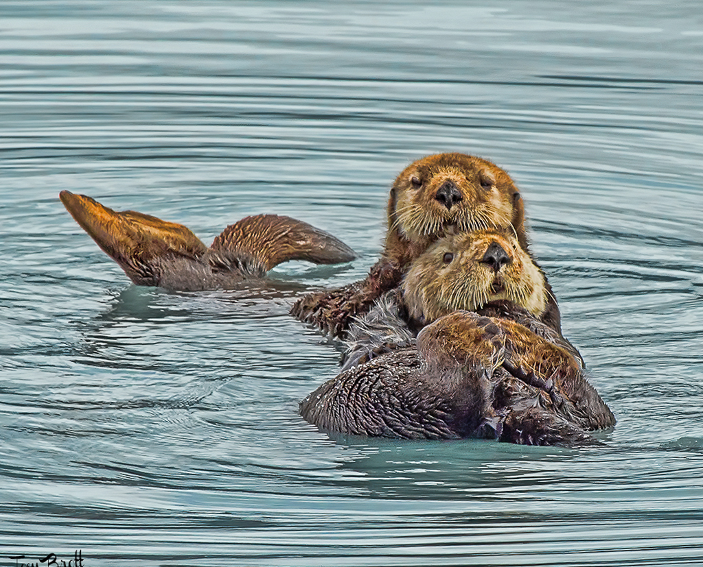
| 52 |
Jun 20 |
Comment |
Some years ago I sat on the edge of that bay and watched the otters, but did not own the lens I needed at that time., so I am jealous. This is a lovely image. The light must have been just right, the color of the water is pleasing and it appears that the subjects are looking right at your lens. I had the same reaction as Mike about the ripples suggesting it is tilted, but I think it is important that the otters appear straight. I was curious to see if I could fix this using the Guided Upright tool in LR Transform. See my visual feedback. |
Jun 14th |
 |
| 52 |
Jun 20 |
Comment |
Good job catching this activity! I would love to be able to get a picture of even one frog (I have a water garden and lots of frogs, but have never been able to get a decent shot). I think darkening the water is a good suggestion because it puts more of a focus on your subjects. Other than that, I would not change anything. |
Jun 14th |
| 52 |
Jun 20 |
Comment |
In my opinion this is a very restful image. I like the softness of the water and the color palette is pleasing to my eye. I'll bet you were able to make a lot of different compositions in this place. I am interested in your choice to put dynamic contrast only on the rock and mask it out on the water; I assume applying it to the water would have interfered with that soft look. I may not have tough to do that, but will keep it in mind for the future. |
Jun 14th |
5 comments - 0 replies for Group 52
|
11 comments - 2 replies Total
|


