|
| Group |
Round |
C/R |
Comment |
Date |
Image |
| 35 |
May 20 |
Reply |
I have done MANY workshops with Mark and Jamie and feel like they are old friends. I did a Roan Mountain workshop with Jamie and Les Saucier 3 or 4 years ago and that was great too. Due to Covid-19 I am not planning any workshops this year. Maybe you and I will meet up at one of them sometime in the future. Interestingly, Debbie Perez and I were online friends for years and then finally met up at a Mark/Jamie workshop two years ago. |
May 16th |
| 35 |
May 20 |
Comment |
This is a beautiful scene and your post processing has given it an almost other-worldly appearance which I find very appealing. At first I too thought the church needed to be straightened, but of course that would make the tree tilt. We just have to decide what part of the image needs to be straight, and I believe you have made the right choice. I am wondering if the slant of the church was created by the distortion of your very wide angle lens? I am another one who just "clicks on something" in CLir, but I was thinking this treatment might be "retro?" In any case it works, and I can see why this image has been a winner for you. |
May 16th |
| 35 |
May 20 |
Comment |
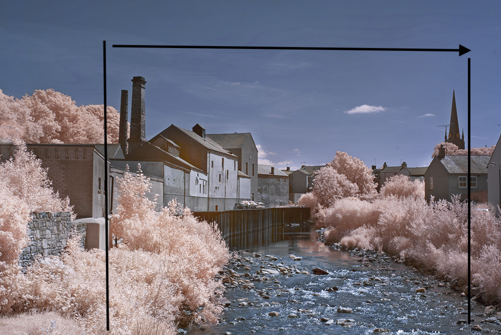
I absolutely love the color palette. The leading lines of the stream draw me into the scene and there is a lot to look at throughout it. However, I would actually advocate for a much tighter crop than the others have suggested. See my visual feedback. Of course it is a matter of personal preference, but it seems like I am always looking for a composition within a compostion and this one lends itself to that kind of thinking. |
May 16th |
 |
| 35 |
May 20 |
Comment |
This is a very interesting sturcture and the surrounding foliage adds texture in constrast to the smooth architectural surfaces. I am sort of picky about not wanting strong shadows across any part of my images unless they add to the story, which I do not feel they do here. So my suggestion is going to sound pretty radical: clone out the shadows on the columns; then copy the left side of the steps where there are no shadows, move it to the right and flip it horizontally. I know this is a personal preference, but as it is I find the shadows distracting me from the simple beauty of the structure. |
May 16th |
| 35 |
May 20 |
Comment |
I think you have captured this from exactly the right perspective, giving my eye a visual path under the huge , spreading branches right into the back of the scene. In my opinion this is perfect material for IR. (Now, I have to ask if you were on a Pawley's Is. workshop with my old mentor Mark Hilliard? He is the photographer who got me started in IR and I still follow him.) The only critique I have on this is that the leaves look a bit oversharpened to me. Perhaps brushing in just a little negative clarity on them would correct that. Or Julie's suggestion for adding Galmour Glow would also take care of that issue. |
May 16th |
| 35 |
May 20 |
Comment |
I think that scudding clouds such as you have captured in this image are generally very nice in infra red; however, this looks to me like a very busy image and in this case I feel the clouds are competing with the other details in the scene. For me the fact that the structure was photographed in a way that gives it a slight tilt is a strength. In my opinion when photographing architecture and other man made structures straigtening them makes them less dynamic and therefore less interesting. Your post processing has made the most of this scene. I believe the sepia was a perfect choice and adding the frame gives it the appearance of an old photograph. Overall, I think it has a lot of interest and is well done. |
May 16th |
| 35 |
May 20 |
Comment |
I think you have chosen a worthwhile subject, but I want to walk into this scene a little farther for a better look at it. It appears to be just beyond a little rise in the teraine which obscures the bottom of the structure. In my opinin if you have enough pixels to crop in tighter it would simplify the scene. I believe increasing contrast would make it appear a little sharper, but I am also thinking that since the image is already soft focus maybe adding some glow in Silver Efex Pro2 would add interest. If you have the newest verson of NIK by DxO near the bottom of the presets in there is one called Dark Glow that might just make this image more visually appealing. |
May 16th |
6 comments - 1 reply for Group 35
|
| 52 |
May 20 |
Reply |
Thanks for your suggestions, Pam. See my edit above under Mike's comments. |
May 16th |
| 52 |
May 20 |
Reply |
Thanks for your suggestions, Lisa. See my edit above under Mike's comment. |
May 16th |
| 52 |
May 20 |
Reply |
After reading yours as well as Lisa's, Pam's and John's comments I increased the exposure in the bottom left, and brushed some additional light onto the tail. Then I darkened the bottom right corner so it seemed balanced to me. I also reduced the exposure on the green leaves to the right of the bird. Here is my edited version. |
May 16th |
 |
| 52 |
May 20 |
Comment |
The wonderful thing about photography is that there is always something new to learn. I especially appreciate that now as our travel is so limited. For me the sky and the water do not work together. The tones are too different so I feel it has an unnatural look.
This image is unique - at least to me. I find myslef wondering if you could split it right down the middle of the lighthouse, copy and flip the left side and create a mirror image? I saw an image by J.R. Schnelzer where he did that with grain bins and I have been itching to try it myself. On this image I think it would create the impression that the viewer was looking at the curvature of the earth. I like the layers of interest you captued and I think you got the color just right. |
May 15th |
| 52 |
May 20 |
Comment |
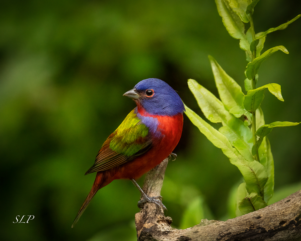
I think the backlighting gives this image impact. It makes the plant luminous and brings out all the texture in the leaves. It is really a monochrome image - all green with a broad tonal range. I am thinking that there are several compositions within this composition, including some possibilities for a nature abstract. The only tiny flaw I see is the little brown spot at the bottom - not a big deal. |
May 15th |
| 52 |
May 20 |
Comment |
I feel like the female is saying, "Oh my gosh, is that tiny bug the best you have to offer?" Maybe he is winking because he has a bigger gift in store just outside the frame. Now that I have had a little fun with this, I think you captured a decisive moment here. The cropped off legs are not an issue for me. Initially, I did not see teh bug - your title tipped me off to look harder. I would lighted it to separate it from the bird's feathers which seem to be the same color and texture. I agree that there is a slight halo on the male. It should be easy to deal with. In my opinion, the background could be darkened using the tone curve and pulling down the mid-tones. You might also want to try to desaturate just a bit and reduce the luminance of green. |
May 15th |
| 52 |
May 20 |
Comment |
A nice nature story, I think. I like the background treatment - it looks Monet-ish to me, and effect I generally find pleasing. In my opinion the shadow is very strong, so I wonder if it could be lightened up a bit, especially where it falls across the back of the bird. I would like to see a bit more detail there. |
May 15th |
| 52 |
May 20 |
Reply |
I am sorry for this error. Actually, I did not forget to add it, but when I went back and substitted the second image you sent it must have wiped out the description I previously put it. A lesson for me...always check the page before I am done. |
May 15th |
| 52 |
May 20 |
Comment |
I like the silky look of the water as it comes over the falls. Just below where it meets the stream bed again it is much softer, and for me, if a little more contrast and detail could be brought out in that area it would improve the image. I think you made a good choice to leave the flat white sky out of the frame. I see Pamela's point about the sliver of dark at the bottom, and now that it has been pointed out I would also suggest removing it. But it is only a tiny little distraction. I always look for good tonal range in monochromes, and I think you have achieved it. |
May 15th |
| 52 |
May 20 |
Comment |
I am a big fan of high key images, and this looks to me like an excellent example. If it were mine I would print it on canvas as large as possible and hang it on my wall. I like the perspective and the sharpness. It's beautiful in my opinion. Don't change a thing. |
May 15th |
6 comments - 4 replies for Group 52
|
12 comments - 5 replies Total
|


