|
| Group |
Round |
C/R |
Comment |
Date |
Image |
| 2 |
Apr 20 |
Comment |
I think you have a nice composition here. The soft background is very visually appealing. For the flower on the right, the sharpness falls off a bit. It might be possible to sharpen this are somewhat using the adjustment brush in LR. Contrast and clarity both could add to the sharpness.
Was your flash on camera or off? I am thinking that a white reflector positioned above the flower cluster and bouncing the light off of it might have gotten all five blossoms sharp. Something to experiment with/. |
Apr 8th |
1 comment - 0 replies for Group 2
|
| 11 |
Apr 20 |
Comment |
This image really took me back in time. I have taken this train trip on two occasions, but both in beautiful weather, so this moody foggy scene gave me something to think about. It made me contemplate the miners that passed this way in terrible conditions. I really like the way you have positioned the locomotive in the scene. It looks to me that you have good tonal range. All of this is wonderful, in my opinion, but the story this image tells is what drawns me in to the scene and makes me linger. |
Apr 8th |
1 comment - 0 replies for Group 11
|
| 13 |
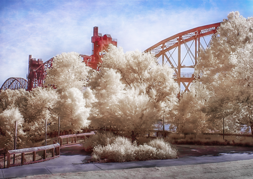
Apr 20 |
Comment |
OK, are you hooked on infra red yet? I like the contrast in this image. The sky adds a lot on interest for me. The more I look at this the more I wonder if it would work well with a more panoramic aspect ratio. Perhaps crop the bottom to just below the pyramid structure. Infra red gives us so many artistic possibilities that I never get tried of it. |
Apr 8th |
1 comment - 0 replies for Group 13
|
| 15 |
Apr 20 |
Comment |
I think you have done a great job of capturing this fleet of shrimpers. I shot this same scene a few years ago and I like the color and the smoothness of the water in your image much better than what I was able to capture. The only thing about this that I might consider changing is the boat that is cut off on the left. I would consider cloning it out, along with the mast and the structure just behind it so that there is a little space between the last boat on the left and the edge of the frame. |
Apr 13th |
1 comment - 0 replies for Group 15
|
| 17 |
Apr 20 |
Comment |
Personally, I find this image to be absolutley beautiful and artistic. I like the juxtaposition of the spiny cactus with the wonderfully delicate flowers. Your skillful post processing in my opinion has produced an image that looks to me very much like fine art. i would not suggest changing a thing about it. |
Apr 13th |
1 comment - 0 replies for Group 17
|
| 35 |
Apr 20 |
Comment |
Mission San Xavier is one of my favorites among an number Spanish Missions I have had the pleasure of photograping. I must admit that I don't currently have in my catalogue any exterior shot I like as well as this one, but not for lack of trying. The depth of field looks perfect to me. I feel like I could walk all the way through the arch and into the next courtyard. To me it looks like you have captured the entire tonal range. I also admire your patience in waiting until you had some drama in the sky.
It is great to have you in our group and I look forward to seeing more of your work in months to come. |
Apr 16th |
| 35 |
Apr 20 |
Reply |
I think you have made a good suggestion. I have edited my image to darken the lower portion (by the way, I applied this suggestion to another image I have been working on and it improved that one as well). Here is my edit. As I was working on this I noticed the figure partially hidden behind the first clump of folliage. It appears to be a hunter with a gun. I hadn't noticed it before, but I am pretty certain it is a statue not a real person. |
Apr 14th |
 |
| 35 |
Apr 20 |
Comment |
I think this image has a strong story to it; I keep looking at it and wondering about the person or persons who use these boots and garments. I think the perspective you chose which produced those diagonal lines is a very strong compositional choice. It looks like you have produced excellent tonal range using the LR tools. I have fooled around a bit with duo-toning in LR for my monochromes. It is just one more way to achieve an interetesting and unique look. |
Apr 13th |
| 35 |
Apr 20 |
Comment |
The color palette in this image really appeals to me. I am also struck by the sharp detail you have captured in the moving boats. The bright light may have helped, but I am guessing you had a fairly fast shutter speed for this one. Your work on the folliage appears to me to be natural and effective. My only suggestion for this image would be to add a vignette. |
Apr 13th |
| 35 |
Apr 20 |
Comment |
In my opinion, this image has an interesting play of light and shadows. The way the light filters through the palm fronts appears to soften it in my opinion, creating a very inviting look. For me the brighter spot at the top left, is a minor distraction. I would suggest cropping from the top to just below that light spot which I believe will help keep the viewer's eye in the image. |
Apr 13th |
| 35 |
Apr 20 |
Comment |
The thing I notice first about this image is that it is full of textures. I think the perspective you chose creates some very nice diagonals that in my opinon add strength to the image. My only suggestion would be to do some dodge and burn and/or bump up the contrast. I would like to see more dark/black tones. |
Apr 13th |
| 35 |
Apr 20 |
Comment |
When you post one of these vinyard images, I always study it in detail. I wish I could have gotten to Sonoma on our trip to California last fall; I guess we will have to come back - unfortunately it will not be any time soon.
For landscape images, I think what works best is to have something of interest in the foreground, the middle ground, and the background. This image definitely has middle and background interest for me, but the foreground not so much. So, like the others, I think a crop would help. I like the tonal range and the lines that lead me into the background. Lotts of people think a human figure adds interest to a scene, and yes, I guess it does tell a story, but I think this image has enough to look at that adding a person may not be necessary. |
Apr 13th |
6 comments - 1 reply for Group 35
|
| 37 |
Apr 20 |
Comment |
I am visiting from Groups 35 and 52 and your image caught my eye immediately. I love the drama of the sunset and the strong leading lines. I also like the low key effect, because for me it creates a mood. I admire your patience in waiting for the sun to be gone so there are no blown out highlights in the sky. To me, this is very well done. |
Apr 20th |
1 comment - 0 replies for Group 37
|
| 40 |
Apr 20 |
Comment |
To me you have captured a sharp, compelling image of the Puffins. In my opinion the plain sky is perfect. Adding clouds just introduces an element that competes with the Puffins for the viewers' attention. I am wondering if you were burst shooting and have other images in this series in which the birds on the front (left) side do not converge quite so much? Strict nature rules do not allow any manipulation that changes the "truth" of the situation; however, you could make a duplicate of this and remove the cluster of birds on the left. You would still have the one behind, but I personally do not find that to be a major issue. This duplicate would be more artistic. You may even consider desaturating blue and bumping up the exposure to get a white background. This is just a way to achieve another perhaps more artistic look. It woudl give you two different interpretations. |
Apr 13th |
| 40 |
Apr 20 |
Reply |
The festival you are referring to is at MaGee Marsh. Unfortunately it is cancelled this year - like everything else. I went to it last year. They have a terriffic boardwalk and if there is a fall-out of birds you can see many species. In overcast conditions the understory is very dark, which means extrememly high ISO to get a fast enough shutter speed. But the biggest problem there is that people come from all over the world. It gets extremely crowded making it difficult to move around and get good shots. If you decide to go at some future time, my advice is go at the end and plan to stay after the actual festival ends as the crowds will diminish somewhat then. |
Apr 13th |
1 comment - 1 reply for Group 40
|
| 48 |
Apr 20 |
Comment |
This is a fun image,Jamie. I like seeing the moon in front of the pelican, especially as it goes much better with your title. If you want the eye to be sharper, I would suggest an easy way to accomplish this would be to enlarge the image then use the radial filter in Lightroom, and just select the eye and a tiny area around it. Bump up contrast, clarity and saturation a bit, being carful not to make it look unrealistic. |
Apr 13th |
1 comment - 0 replies for Group 48
|
| 52 |
Apr 20 |
Reply |
Actually, that is a leaf. I wish it was a bird. I have already manipulated this enough that is will not be suitable for a nature competition, so I appreciate your pointing this out. |
Apr 13th |
| 52 |
Apr 20 |
Reply |
Yes, that is what I am thinking. My eye sort of wonders around in the branches but doesn't find a place to come to rest. My thinking is that you might want to direct the eye downward to the beautiful ground covering. I think Mike's suggestion is worth trying as well. |
Apr 13th |
| 52 |
Apr 20 |
Reply |
I agreer with you completely on the green. I went back and desaturated it and lowered teh luminosity. I am not sure about your treatment of the water, though. To me, it looks too blue. I lke my water to be white. I will give it some more thought. |
Apr 8th |
| 52 |
Apr 20 |
Comment |
As always, you capture is wonderful to look at in my opinion. This is another species that has angel wings and monster face, but its lovely color sort of makes up for that. Personally I prefer the cooler tones in the original. I think your crop and removeal of the distracting elements simplifies the composition nicely. I t looks like you did a bit of straightening as well which I think is a good idea. So, overall, for me it is a great image but if it were mine I would go back to the origianal color palette. |
Apr 7th |
| 52 |
Apr 20 |
Comment |
You found a perfect specimen and your captured it in sharp detail in my opinion. When shooting flowers I try to go with the widest possible aperture. So I start at about f/5.0 and take lots of shots moving the aperture down a stop at a time. Later, after downloading, I choose the one I think has the best balance of sharpness and bokeh, but usually it is at f/6.3 or lower. To my way of thinking the shadow is the biggest issue with the background. When shooting flowers, I like an overcast day. If the sun is out, I look for a specimen that is shaded and if that is not possible I either use a difuser or I position myself so that the flower is shaded by my own shadow.
For this image I think you might try to darken all the brighter parts of the background. If you crop to a square aspect ratio you will have less of that to deal with which I htink might make the job a little easier. |
Apr 7th |
| 52 |
Apr 20 |
Comment |
To me the image is sharp and I believe you have captured every bit of the detail, which makes the Litte Blue look very realistic. I feel as if I am looking right down the throat of that fish. Since you did not post an original I am curious about how close you were able to get to the bird - or did you decide to crop this way?
Your depth of field is perfect in my opinion. I think the background color is pleasing and it is soft enough to eliminate distracting details.
You are furtunate to live so close to Ding Darling. I hope it remains open to visitors to at least drive through. |
Apr 7th |
| 52 |
Apr 20 |
Comment |
Wow! I think this is a great capture. It looks to me like the eye is very sharp, as are the feathers. I think the diagonal of the wings adds strength. The background could have been very distracting with all those branches, but in my opinion the depth of field is perfect and the bird stands out well. Congrats! I would not change a thing. |
Apr 7th |
| 52 |
Apr 20 |
Comment |
Your first sentence says it all, Lisa. How fortunate we are if we live in places where nature is accessible to us. For me, the soft colors in this image are very appealing. The tree appears to be quite old, and although I know spring is not as advanced where you live as it is here, the fact that I see no leaves at all make me wonder if it is alive. The new life springing up below it for me is a good juxtposition of ideas.
I feel that the upper two thirds of the image are pretty chaotic, so I thought about how to deal with that. My idea is to try to selectively lighten and darken various branches to try to direct the eye - perhaps toward the trunk. In my mind composition is the process of making order out of chaos. I think this image has a lot of potential, and I want to encourage you to work on it some more. |
Apr 7th |
| 52 |
Apr 20 |
Comment |
This image grabbed my attention immediately because of the color and the luminosity. I just bought a flexible lens hood with the intention of going to a major aquarium to try to photgograph this kind of subject - alas, that isn't happening any time soon. But am interested in learning all I can. I could look at this image all day.
For me the composition works well. My eye travels down the diagonal formed by the nettle on the left and then upward to the smaller one. Technically, it looks very sharp and detailed which is impressive if they were moving. Did you have any problems with lighting or reflectons from nearby exhibits?
I cannot make any suggestions for improvment. I would be delighted if I was able to capture an image like this. |
Apr 7th |
6 comments - 3 replies for Group 52
|
| 55 |
Apr 20 |
Comment |
The sidelight you captured is beautiful and in my opinion the color is lovely and natural. To me the antlers blend in with the branches in the background, making it hard to separate out what is part of the elk and what is part of the forest. I would suggest using the adjustment brush in LR to carefully lighten them, especially the ones on the right. Then use the same tool to darken the upper part of the background. My only other idea about this would be to try to push the Dehaze slider a little to the right., Try it and see what you think. I sure hope the situation improves enough by fall so that we can get another chance to photograph these magnificent creatures. |
Apr 13th |
1 comment - 0 replies for Group 55
|
| 56 |
Apr 20 |
Reply |
Well, thank you so much for that honor. It makes it really special for me that you chose it and did not know it was mine. |
Apr 20th |
| 56 |
Apr 20 |
Comment |
Very creative, Nancy, as your work always is. The color palette and the dreamy look are very visually appealing to me. I miss seeing your work on a regular basis. You always inspire me to try something new. |
Apr 20th |
1 comment - 1 reply for Group 56
|
| 60 |
Apr 20 |
Comment |
I thought I would pay you a visit and see what you are up to these days. I find this image very creative and fun to look at. The blue and orange make it pop in my opinion. The lighting is very nice too I think. |
Apr 20th |
1 comment - 0 replies for Group 60
|
| 88 |
Apr 20 |
Reply |
I think you have taken this in the right direction. In my opinion, the added contrast and the vignette work well to make the image pop and keep my eye traveling back along the water to the point where all the lines converge. |
Apr 13th |
| 88 |
Apr 20 |
Comment |
For me this composition works very well, drawing my eye into the background where the cliffs merge. I also like the effect you achieved in the water - to my taste just the right amount of softness. I am totally unfamiliar with the photography of Cynthia Taft, but in my opinion this image needs more contrast. The small jpg files we post make it hard to be certain, but I think there are not enough dark tones. The whites are fairly bright, but if you were to selectively darken some areas the whites would pop even more. You could do that in NIK Viveza, or take it into Silver Efex Pro and add filter that boosts the contrast a bit.I would also suggest darkening the corners to keep the viewer's eye in the scene. In my opoinion it is a good landscape image and worth the time it would take to enhance it. |
Apr 8th |
1 comment - 1 reply for Group 88
|
24 comments - 7 replies Total
|


