|
| Group |
Round |
C/R |
Comment |
Date |
Image |
| 35 |
Jan 20 |
Reply |
Stephen, thanks for your comment. I was very reassured that you were able to see the story in this image. It is always my primary goal to try to evoke in the viewer something of the feeling or the story that captured my attention in the first place. I also think your suggestion about adding texture is an excellent idea and will follow up on it. I really appreciate you for taking the time to provide me with some additional feedback. |
Jan 23rd |
| 35 |
Jan 20 |
Comment |
Stuart, that is probably the most helpful feedback I have ever gotten from a study group. And I am certain you are correct. Too often we try so hard to be nice that we lead our fellow photographers in a direction that is not helpful. We have to learn to be more critical without being offensive You have done a good job modeling that. |
Jan 15th |
| 35 |
Jan 20 |
Reply |
I will be in touch. |
Jan 14th |
| 35 |
Jan 20 |
Reply |
Great! I will let you know as soon as we nail down the dates we will be there. |
Jan 14th |
| 35 |
Jan 20 |
Comment |
I was drawn to this image as soon as I saw it and I think your post processing (as usual) is very effective. The branches do not bother me so much because they feel like they are part of the story of why this boat is abandoned in this particular place. I think the diagonal lines are strong compositional elements and the sky adds some drama.
BTW I have been seeing your water lilies on FB and they are lovely. They make me want to come to your area for a photo shoot. |
Jan 14th |
| 35 |
Jan 20 |
Comment |
I have had a hard time deciding about this and looked at it for quite a while. I have finally concluded that the amount of blur does not work for me. However, I think this could be part of a composite image if your combined it with the original and selectively made some areas distinct and other less focused. I think it could be quite creative. Probably it would be a lot of work, but might be very intriguing. |
Jan 14th |
| 35 |
Jan 20 |
Comment |
I was drawn to this image as soon as I saw it. I think what pulled me in was the color and luminosity. It does indeed have a dreamlike effect in my opinion. I think it would keep a a viewer engaged for a long time trying to determine what is going on here, so good on impact. I am glad you told us how this was done. It is very creative and something I would like to explore. |
Jan 14th |
| 35 |
Jan 20 |
Comment |
I too find these old graveyard scenes compelling. I like the way the lines of the stone borders converge right at that interesting cross grave stone. It is well positioned in the frame, in my opinion. I might suggest eliminating the partial gravestone on the right edge either by cropping or cloning. I think your post processing is spot on. |
Jan 14th |
| 35 |
Jan 20 |
Comment |
I like the color toning you have achieved here. I someitimess find the orange that we get in the sky with IR disconcerting, but here it work well for me. In my opinion you were correct to include the entire reflection rather than cropping it at the bottom. I would suggest cloning out the white dots that appear in the water. My mentor, Mark Hilliard, taught me to always denoise my IR images as soon as I do the RAW conversion and to me that has proved to be good advice. |
Jan 14th |
| 35 |
Jan 20 |
Reply |
Thanks for your input, Helen. You are probably correct about the siding not being old. The door is not that old either, but I tried to rough it up to look like it was less contemporary. I know you are an expert with monochrome so I appreciate your advice. |
Jan 14th |
| 35 |
Jan 20 |
Reply |
Thanks for your comments, Julie. Yes I did tone this image in soft sepia. I just forgot to mention that. I worked with this over a period of time and tried several differnt post processing technique, so it was easy to leave something out. |
Jan 14th |
6 comments - 5 replies for Group 35
|
| 52 |
Jan 20 |
Reply |
You are a fast learner! I think the way you have edited that image makes it much more visually appealing. |
Jan 27th |
| 52 |
Jan 20 |
Reply |
Got it. I wasn't sure since OnOne also has Camera RAW. |
Jan 23rd |
| 52 |
Jan 20 |
Reply |
So, are you saying you did this in Adobe Camera RAW? |
Jan 23rd |
| 52 |
Jan 20 |
Reply |
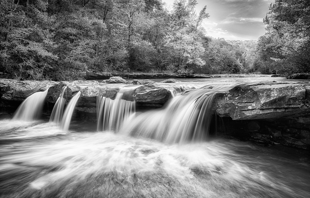
Thanks, Judith. The water was way too deep there to get into it, but there is a flat rocky ledge almost down at the water level. With a a bit of careful maneuvering I was able to get down there. I think the comments this month have really helped me improve this image. I am looking forward to seeing how it will do in competition. |
Jan 22nd |
| 52 |
Jan 20 |
Comment |
I think the title of this image should be "Showoff." You have dfinitely captured this bird in a unique position. Whatever you did in post processing softened the water nicely in my opinion. The depth of field works well for me and the bird appears to be quite sharp. I would be curious to know how you think the de-noise program in Topaz compares to Define in NIK. I recently heard someone say that the Topaz was better, but I have not had an opportunity to try it. |
Jan 14th |
| 52 |
Jan 20 |
Comment |
I see what compelled you to capture this image. Gulls have a way of appearing to be mocking us sometimes. In my opinion, this is a complicated image and it will involve a lot of work to get it right. I agree with most of the suggestions others have made, so will not repeat them. One question I had though was whether or not you were burst shooting. When shooting birds in action I always set my auto focus to AI Servo and multiple shots. If you capture more frames there is a good chance you will get one where the compositon works just right. |
Jan 14th |
| 52 |
Jan 20 |
Comment |
Those darn birds like to turn away from the lens when they do something cool! You caught him just in time so I can still see enough to make this an intereting shot. Tack sharp as your image always are, I think. You certainly are skilled at getting the correct exposure on white birds in my opinion. I agree with the others about lightening up the leg on the left. The water background works well for me and I can see nothing else about this image that I would suggest changing. |
Jan 14th |
| 52 |
Jan 20 |
Comment |
The color palette in this image is one that always appeals to me. I too prefer the vertial orientation - as I mentioned in my comment to Lisa I tend to seen things that way. It is unfortunae that you lose the puffy cloud with the vertical presentation. In my opinion this image definitely has the feel of early winter. To me the image appears sharp and your post processing has brought out some lovely color without over saturating. |
Jan 14th |
| 52 |
Jan 20 |
Comment |
This looks to me like a pleasant fall scene and one you could also return to in other seasons. Personally, I prefer the vertical orientation - but that is something I am always drawn to for my own images. It is amazing how I will be shooting with others and I am the only one who ends up with that orientation. I find myself wondering how this image would look if it had been shot from a lower perspective - perhaps even down at the water level - something to consider for the future maybe. The image looks sharp all the way through to me, and I think the light was sudued enough to bring out very nice color. |
Jan 14th |
| 52 |
Jan 20 |
Comment |
It looks to me like you have captured a great nature story. I love the look the snake is giving the heron. I'll bet the heron beat the snake to death before consuming it. Did you get any shots of that? I find the color palette is very pleasing and realistic. The heron must have been quite close to the background vegetation which must had made it hard to get more blur. For me, the most distracting thing about the background is the bright white streaks, so I think darkening the background would help a lot. OnOne is one of my go to post processing choices, but I do my RAW conversion in LR. What I like about OnOne is how easy it is to mask. I think if you went into Effects and selected dynamic contrast you could easily paint in reduced reduced exposure and contrast on the background area. |
Jan 14th |
| 52 |
Jan 20 |
Reply |
Thanks for your comments, John/ Everyone seems to agree on this one. I have tried to tone down the bright area you indicated. If you see that I have missed any of the areas that seem too bright please let me know. The edited is posted with my reply to Pamela. |
Jan 11th |
| 52 |
Jan 20 |
Reply |
Thanks, Lisa. Everyone seems to agree on this one. I have tried to tone down the bright area you indicated. If you see that I have missed any of the areas that seem too bright please let me know. The edited is posted with my reply to Pamela. |
Jan 11th |
| 52 |
Jan 20 |
Reply |
Thanks, Mike. Everyone seems to agree on this one. I have tried to tone down the bright area you indicated. If you see that I have missed any of the areas that seem too bright please let me know. The edited is posted with my reply to Pamela. |
Jan 11th |
| 52 |
Jan 20 |
Reply |
Thanks, Pamela, and welcome to our group. I appreciated your suggestions. I have tried to tone down the bright area you indicated. If you see that I have missed any of the areas that seem too bright please let me know. |
Jan 11th |
 |
6 comments - 8 replies for Group 52
|
| 88 |
Jan 20 |
Comment |
First, I really like the color palette you have captured here. It is warm with nice contrast and not overdone in my opinion. I feel like I am invited to walk down that street. Your treatment of the sky brings out some detail in a way that is realistic. I think you have brought color, line form and texture together in a pleasing way. To me it is more than a travel photograph; it looks like a piece of art. |
Jan 15th |
1 comment - 0 replies for Group 88
|
13 comments - 13 replies Total
|


