|
| Group |
Round |
C/R |
Comment |
Date |
Image |
| 2 |
Dec 19 |
Comment |
It looks to my like you had exactly the right exposure to capture the drama of the steam cloud without blowing out highlights. I think I prefer the crop as you have it so that we see the entie cloud.I would bet this will do well in the next PJ competition. |
Dec 18th |
1 comment - 0 replies for Group 2
|
| 35 |
Dec 19 |
Reply |
Thanks for your comment Stuart. When I first made this image what I liked was the way it seemed to me that the dead tree did stand out from the background, so I was surprised that others saw it differently. I remember saying at the time that I felt those trees were meant for IR. That is such a strange a beautiful location it is hard to do it judtice. |
Dec 23rd |
| 35 |
Dec 19 |
Comment |
My first reaction was the same as what all the others have said...for me the fence presents a visual barrier. I read you explanation and understand why you feel it is important to the scene, so I guess whether or not to include the fence sort of depends on your intended audience. For example, if you were doing a photo essay about segregation, or if it was a photo journalism piece, it would be very important to include it. On the other hand, if you are working toward an artistic presentation, it does not work as well in my opinion. I think the trees are very interesteing and you have brought out the detail in them quite well. Because you have presented this in monochrome, it really speaks to me of a by-gone era. I wish segregation was really long gone from the U.S. but I fear it still haunts us. |
Dec 16th |
| 35 |
Dec 19 |
Comment |
This is a beautiful scene and you have captured it well in my opinion. I find the golds and blues very pleasing; however, the green is not working for me. Maybe Julie is on to something with her suggestion about making it more subtle. I find myself wondering if it would not be better if they were white. Lots of options here and you are a master of post processing, so I would bet you will hit on just the right treatment for those trees. |
Dec 16th |
| 35 |
Dec 19 |
Comment |
The lanterns are an intersting subject and the diagonal placement works well I think. I too find the backgroudn somewhat distracting and would suggest darkening and perhaps adding some blur to it. I wish you wouls have told us about your post processing. To me it looks like the color toning in your final image is a bit blue; I believe I prefer the warmer gold tones of the original. |
Dec 16th |
| 35 |
Dec 19 |
Comment |
To me your choice to center the destroyed home amid the debris was a good one, especially since the diagonal lines radiating out are repeated in the clouds. It gives me a feeling that this home is just about flying apart (which is exactly what must have happened). I have seen quite a few images from your area showing the massive destruction, and in my opinion this is one of the best. It really tells the story and your post processing works well. |
Dec 16th |
| 35 |
Dec 19 |
Comment |
After viewing this image and reading your description, I am amazed you were able to capture such depth of field at f/8. I find the wall that winds its way back into that beautiful valley very interesting and I want to spend time looking around back there. I am not so certain about the wall on the bottom left. To me, it takes up quite a bit of real estate and adds a lot of weight in that area giving it a bit of an unbalanced feel. I studied it and tried to figure out some way to eliminate a bit of that wall but it seemed to me that any attempt at cropping would eliminate something important to the scene. I think you have tone a good job with tonal range and I would bet this image would do well in a Travel Division exhibition. |
Dec 16th |
| 35 |
Dec 19 |
Comment |
I really like the color toning of this image. It has a calm, peaceful feel in my opinion. I was thinking that you might try a 16:9 aspect ratio - more of a panoramic - with a little less foreground. I just got the CLiR panel and I hope I can come up with somehting as good as this to share with the group in the near future. |
Dec 16th |
| 35 |
Dec 19 |
Reply |
I will take another look at original No. 1. As a Christmas present to myself I purchased the CLiR Panel so maybe I will work on it with that software, although the effects are much less dramatic with the Deep B&W conversion I used. |
Dec 11th |
6 comments - 2 replies for Group 35
|
| 40 |
Dec 19 |
Comment |
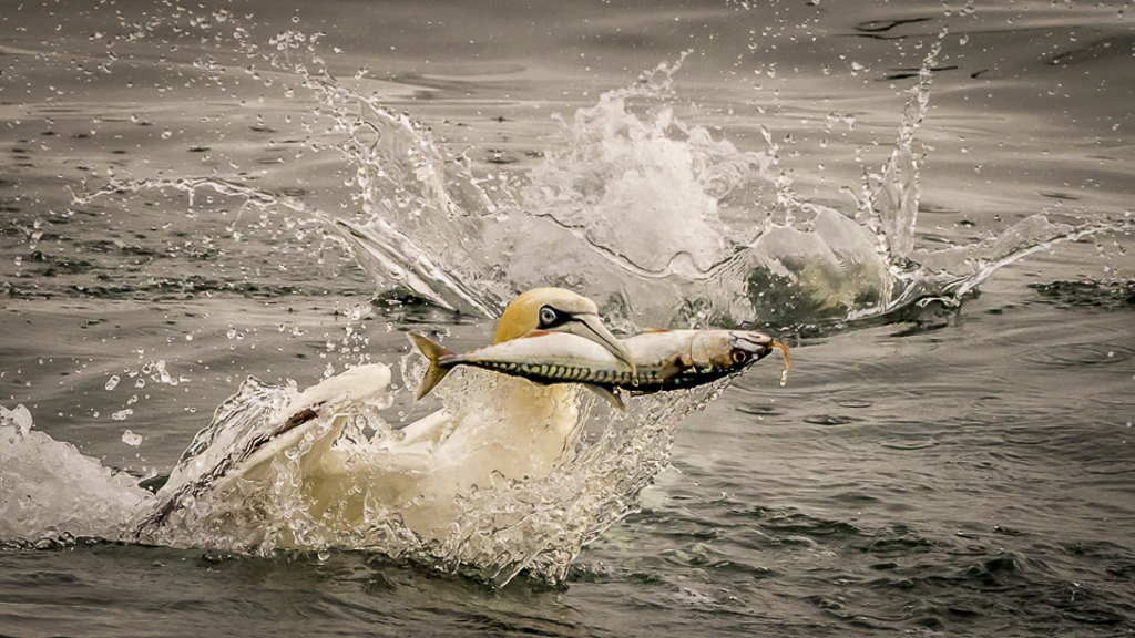
Andrew, in my opinion you have a strong nature story. That is always important in assessing a nature image and sometimes it even outweighs technical imperfections. The bird and the fish look to me to be a bit soft and I think there is some loss of detail in the highlights. I pulled your image into LR and selectively toned down the highlights and added contrast and sharpness to the bird's head and the upper part of the fish. In the HSL panel I increased saturation and decreased luminence for orange and blue. Finally, I added a vignette. As for cropping I do not think you can crop any more without losing something important. It is good that you have a little more space in front of the bird than behind it so as to give the impression of forward motion. Take a look at my visual feedback and see what you think. |
Dec 4th |
 |
1 comment - 0 replies for Group 40
|
| 48 |
Dec 19 |
Comment |
You used the camera you had with you and got nice results! Watch for an artifcle by Rad Drew in the January issue of the PSA Journal. He is a professional photographer who does outstanding things with his iPhone. In the article he discusses lots of apps and shows examples of how he uses them creatively. I'll bet you will get hooked on using that iPhone. |
Dec 18th |
1 comment - 0 replies for Group 48
|
| 52 |
Dec 19 |
Reply |
Hi Mike...Welcome back to the USA. Let me explain a little more where I am coming from with my suggestion. Last month I had the honor to be a judge for the monochrome section of the S4C International Exhibition. I was amazed by the quality of the top scoring monochrome images and resolved to try to make my own monochomes meet that standard. I don't have any exhibition results yet, so can't say for sure if I am on the right track.
I like the Radience filter in the Glow section of On One. There is a similar effect in Topaz Studio2. If you don't have either of those you might want to try Reflector Effects in Color Efex Pro. It lets you control the intensity and direction of the light. I think this is a fine image but thought it might be even better with a little bit of "zing" added. |
Dec 18th |
| 52 |
Dec 19 |
Comment |
To me this image is well-composed. I hope you re ready for different suggestion: I would boost the contrast a bit and add a little radiance. I am curious if you used one of the recipes in Silver Efex or if you went with the default. |
Dec 17th |
| 52 |
Dec 19 |
Comment |
To me, the main objective would be to get the hawk to pop out from the background. I like the seed pods, but would crop the ones at the top. All the bright light blue in the upper part tends to pull my eye up there and away from the bird. I think it would be possible to select each seed pod and brighten and saturate so that you keep some of that lovely color they add. If this were my image I would aim at an artistic rendition rather than following strick nature rules, which would then allow me to remove the branch that goes acrossthe torso, the diagonal one that isfirst one on the right and the one above his head. I also think that adjusting the tonal curve and then adding some dynamic contrast would greatly enhance the image. |
Dec 17th |
| 52 |
Dec 19 |
Comment |
I think this is a good nature story...most often you see these critters running away and all you get is butt shots. Too bad they chose the bright light of mid-day to have their battle, but then maybe you wouldn't have had a chance to capture it. We have to take what nature gives us, I guess. I think desaturating and lowering the luminance on the green would help make theviewer focus on the antelope. |
Dec 17th |
| 52 |
Dec 19 |
Comment |
I really like the way your second version pops. I always find blues and oranges very visually appealing. At first I thought that this was a stitched panorama, but if that is not the case I think you made a very good decision to present it in this aspect ratio. I have not suggestions as I think the image is quite well done as it is in the edit. |
Dec 17th |
| 52 |
Dec 19 |
Comment |
You certainly got the bee nice and sharp in my opinion. It looks to me like there are some artifacts in the background that resulted from the healing and cloning. Those could be smoothed out pretty easily I think. The falloff in sharpness at the bottom might be minimized by a dark vignette. Since the flowers are so bright I believe that might also help keep the viewer's eye on the bee. |
Dec 17th |
| 52 |
Dec 19 |
Reply |
Thanks, John. That is a good suggestion. Went back the image and did as you suggested and I can see that there is improvement. |
Dec 17th |
| 52 |
Dec 19 |
Reply |
Thanks, Lisa, but I do not have any more space on that side. I suppose I could add canvas, but then you know it would not be acceptabel in Nature. These little buggers don't always give us time to compose the shot the way we want it. |
Dec 17th |
5 comments - 3 replies for Group 52
|
| 88 |
Dec 19 |
Comment |
I like the way you have cropped this - you have the fishing boat in just the right place in my opinion. For me, the trees and the reflection are where the party is, and they really pop (I am a sucker for that amped up Velvia look). The lines in this image are mainly horizontal, and for me, that creates a peaceful, idyllic feeling which I think is why people enjoy fishing. |
Dec 18th |
1 comment - 0 replies for Group 88
|
| 89 |
Dec 19 |
Comment |
It looks to me like you have captured wonderful detail in the butterfly and the lavendar flowers complement the muted tones in the subject very well. In my opinion you have placed the subject perfectly in the frame. I think the f/9 gave you good bokeh. Would you consider removing the green stripe in the lower right corner? Of course that would make it inelligible for Nature competition so you would want to preserve this version as well. |
Dec 18th |
1 comment - 0 replies for Group 89
|
16 comments - 5 replies Total
|


