|
| Group |
Round |
C/R |
Comment |
Date |
Image |
| 2 |
Oct 19 |
Comment |
In my opinon your choice of settings for this capture was spot on! This must have been in side light, maybe coming from the left? I like the way it puts just a little bit of rim light on the top of the butterfly's wing. Compositionally, I see several soft diagonal lines that converge to bring my eye to the head of the butterfly - and it is happily tack sharp. The color palette speaks to me - my favorite combination of hues because I find them so calming and peaceful. In my opinion you have framed this up well. I think it is definitely wall-worthy. |
Oct 6th |
1 comment - 0 replies for Group 2
|
| 13 |
Oct 19 |
Comment |
In my opinion you pushed that shutter button at exactly the right moment. When the sun gets down to the horizon it disappears really fast but if you shoot too soon you get burned out highlights. So I congradulate you on your patience! The colors work well for me. You have the horizon well placed in the frame. I can't quite make up my mind about the dock. I feel that I would like to see a little more of it and perhaps at a different angle. To me the tree does not work. I think that the tree and the reflection might have been a nice compositional elements but I would need them to be more in the frame, definitely not cut in half. Since you live there, I'll be you can do it again. |
Oct 6th |
1 comment - 0 replies for Group 13
|
| 35 |
Oct 19 |
Comment |
I feel that this is a good documentary image; however, to make it more artistic I would do several things. First, for me there is too much folaige in the foreground, so a crop would help. Secondly, I think I would like those palm trees to pop out from the background foliage more; and third, I would try to extract more detail from the sky.
You have probably heard me go on and on about Eliott Porter's photography in the past - he was great with intimate landscapes, so I am always looking for scenes that have potential for that. This looks like one of those places where one might make a very interesting intimate landscape image. |
Oct 13th |
| 35 |
Oct 19 |
Comment |
This is a fun image, and the artis tdefinitely captured a feeling or emotion. I like the way you have positioned the sculpture in the frame and the color toning seems just right to me. Having said all that, I have some difficulty appreciating photographs of someone's else's art. I think that only works if we add something of our own to the image (other than the way we post process it) to create a work of art that is new and different from the original. |
Oct 13th |
| 35 |
Oct 19 |
Comment |
Right away I notice the textures in this image, so I ask myself, what is the photographer trying to say here? I like the idea of using the fence posts but I feel that there should be something of interest framed between them or in the space between the wires just to the right... something more to keep me engaged. I think you have captured good tonal range and it looks pretty well focused all the way back. |
Oct 13th |
| 35 |
Oct 19 |
Comment |
For me, the part of the image that is most interesting is the church, so I want to see more of it . The bottom third of the image presents a barrier keeping my eyes from getting to the church. Once I get past the line of shrubbery, the curved wall helps me get there, but the structure on the right seems to me to take up too much real estate. I find the sky interesting; however, in my opinon the bit of tree branches in the top left corner should be cloned out...they do not seem to me to be attached to anything, so I feel they do not belong in the scene. I agree with your thoughts about stopping doen the aperture to get better depth of field. I think the sepia toning is a good choice for this subject. |
Oct 13th |
| 35 |
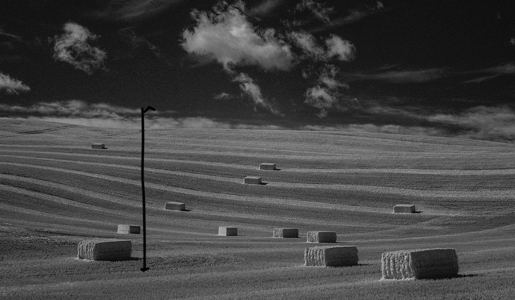
Oct 19 |
Comment |
I am puzzled by the settings you chose for this image. To me the scene, where the only thing that could have been moving was the clouds, would not have led me to choose such a fast shutter speed. Also, thinking about depth of field, it seems like an aperture between f/11 an f/16 might have produced a sharper image. Looking at the composition I feel the strongest part of the image is on the right so would suggest cropping it as indicated in the visual feedback image I am submitting. |
Oct 13th |
 |
5 comments - 0 replies for Group 35
|
| 48 |
Oct 19 |
Comment |
I don't know...I think different people prefer different color palettes. I persoanlly tend more toward bllues and greens. So it is a matter of personal taste. |
Oct 7th |
| 48 |
Oct 19 |
Comment |
Very artistic, Jamie. I am a big fan of images with strong graphics. Have you tried it in other color palettes? I am thinking a lot could be done with this. |
Oct 7th |
| 48 |
Oct 19 |
Comment |
Neil, the first thing I notice is the triangle shape formed by the artist's arms and body position. I find this to be a very strong compositional element - looking at master works of art I see this shape used a lot. She appears to be very intent on her work. Her body art is very attractive. I wish I could see more of what is in her left hand...is it a box of chalk? The light appears to be coming from a side window on the right and it has brought out the detail in her tattoos and in her hand. You monochome conversion is well-done in my opinion. |
Oct 6th |
3 comments - 0 replies for Group 48
|
| 52 |
Oct 19 |
Reply |
Thanks, Lisa. This viewpoint is not anywhere near the lodge. In fact, we had to drive about 45 minutes to get to it, so it is not photographed as often as the scenes from the Bright Angel walk (which was crammed with people the entire time we were there). Thanks also for the positive feedback on my PSA work. |
Oct 13th |
| 52 |
Oct 19 |
Reply |
Thanks, John, both for the recognition and for the comments on this image. I was able to address the haze on the right a bit after reading Tom's suggestion, but I did not take it completely out. Like you, I feel that it is actually an element in the scene and many people who have visited there would expect to see it. |
Oct 13th |
| 52 |
Oct 19 |
Comment |
The first thing I noticed about this image was the shape, just as you have suggested. But my next thought was that this would make a good silhouette image. So, my idea would be that unless you can pull more detail out on the head and torso of the monkey, I would completely darken it. Then I would make it a monochrome image.
I have a similar shot from the New River in Belize and I have worked and worked on it without success, so I am not sure my suggestions have any merit. Too bad he didn't turn his head and look at the camera. |
Oct 6th |
| 52 |
Oct 19 |
Comment |
Your explanation made me smile. I can't tell you how often I have found a cool subject to shoot but forgot to think about changing the settings! I really like the way you always look at things from an artist's point of view. It is something we should all be working toward. I also love it when someone includes a cultural reference to works of art, music or literature. I have done that on occassion, but you remind me that I need to think about it more.
I like the colors in this image and I think you have framed it up very well. On the other hand, the subject matter does not have much impact for me. I guess I am just not a dead bug enthusiast. But kuddos to you for noticing this little nature story most of us wouold have stepped over, or maybe stepped on. |
Oct 6th |
| 52 |
Oct 19 |
Comment |
I never get tired of seeing these creatures in flight and I really like the wing position you have captured. The bird is tack sharp, as your images always are. For me, the bird does not pop out from the background enough, making the whole image have a somewhat flat appearance. I would try to add some light to the bird if it can be done without losing feather detail, and I would make the water less luminous.
I will be in your area the last part of February and hope to meet up with you again if possible. |
Oct 6th |
| 52 |
Oct 19 |
Comment |
Gulp is right! I always wonder how they manage to swallow a catch that big. I feel like choking just thinking about it! This is another strong nature story from you. Both the bird and the fish are sharp in my opinion. The head is turned ever so slightly causing the eye to be a bit shaded. You may want to lighten that area a little so they eye is more obvious. I really would like the water color to be less muddy brown. I think if it were mine I would apply a colored filter to the water area only and see if I could change the hue to something more harmonious with the blue feathers. |
Oct 6th |
| 52 |
Oct 19 |
Comment |
Lisa, both the final and the original images are quite small, so it is difficult to assess the technical aspectss of your post processing. I zoomed in quite a bit and I do not see any sign of tracks where you worked on the background...so good for you! I like the fact that the head, eye and antennae are so sharp as is the flower. I also find the color palette restful and pleasing. You might want to consider repairing the wings so that you have a perfect looking specimen. |
Oct 6th |
| 52 |
Oct 19 |
Comment |
Like Lisa I was wondering about your choice of ISO. The mid-day light was already working against you and you did not need a fast shutter speed. Waterfalls are tricky unless the sky is overcast or the falls are in shadow (this one is in shadow early in the morning from my experience). However, if you had a 10 stop ND filter or some stackable ones in your kit, that may have done the trick. As for post processing reducing luminosity was probably helpful. You might also try to apply graduated NP to the landscape area at the top. This image is one that will always remind you of your trip, but for me, it is not a show-stopper. Galen Rowell once said, "Sometimes you just have to murder your darlings." I'm not saying to trash it; you might want to keep it, but just for yourself in my opinion. |
Oct 6th |
| 52 |
Oct 19 |
Reply |
Thanks, Jamie. We were in California and i did not make it to the conference, but I was honored to be recogized anyway. |
Oct 1st |
| 52 |
Oct 19 |
Reply |
Thank you, Tom. I did dehaze. In my opinion, you can only push that so far without loss of quality. I think I may be able to do a little more on the right, but the left side is as good as I believe it will get. The Grand Canyon is always hazy in summer and fall. We had hoped to get there later, and I started trying to make a 2019 reservation for a cabin in August of 2018 only to find that the only 3 consecutive days available before the North Rim closed for the winter were in early September! |
Oct 1st |
6 comments - 4 replies for Group 52
|
| 55 |
Oct 19 |
Reply |
I sort of have a reputation in my own group for liking the 1:1 crop, so take that into consideration. But I really like this image a lot cropped this way. For me it makes it into an image with some things that detract from it into a real eye-grabber! |
Oct 6th |
| 55 |
Oct 19 |
Comment |
Wow! I love the eye-popping color in this image. I wish I could see the original to get a better idea of how your post processing changed it. The bee is tack sharp and I think you have placed it in the perfect position within the frame. For me the entire right third of the image is out focus and detracts from the gestalt of the image. I would suggest cropping that portion out - maybe make the aspect ratio 1:1, but keep the bee on that power point. The bloom in the top left is also out of focus; sometimes that is ok, but the bee and the leaves around it are so sharp that the out of focus part feels disconcerting to me. In my opinion the image would be better if you could crop out or clone out that bloom. |
Oct 6th |
1 comment - 1 reply for Group 55
|
| 63 |
Oct 19 |
Reply |
I understand what you are saying about how close the subject is to the background being a factor and I agree with you. But my point is that when the background is close to the subject you can use a higher ISO and a wider aperture and still get the subject entirely in focus and have a nice bokeh effect instead of a busy background. What you could try is setting up in your yard using a small toy or object the size of a butterfly and experiment with increasing ISO and opening up the aperture until you get a feel for how it works. We use one of those stuffed birds that they sell in the state park gift shops for this kind of experimentation. |
Oct 8th |
| 63 |
Oct 19 |
Comment |
The butterfly and the flower are very sharp and the colors work well together. You managed to find a perfect specimen! That is not always easy to do, so I know you must have worked hard. You have not indicated the camera settings, so I wonder about aperture and ISO. As presented, the background is quite busy, which for me is distracting. I am thinking a more wide-open shutter along with a higher ISO may have solved this problem and given you a bokeh that wouold make this image a stand out. |
Oct 6th |
1 comment - 1 reply for Group 63
|
18 comments - 6 replies Total
|


