|
| Group |
Round |
C/R |
Comment |
Date |
Image |
| 2 |
Jul 19 |
Comment |
I think you have nice leading lines and good color in this one.To me it feels like you have captured a sense of place. This would be good for the Woodlands print exhibit. |
Jul 5th |
1 comment - 0 replies for Group 2
|
| 9 |
Jul 19 |
Reply |
Oh boy, do I understand. Before I get down low I always consider how I am going to get back up! |
Jul 14th |
| 9 |
Jul 19 |
Comment |
Having seen the IR version of this, I believe I prefer the color. One suggestion that I think might simplify the image, presuming you have a chance for a do-over, would be to bet down low so as to eliminate the parking lot in the background. I am not sure if I am seeing a bit of a downward tilt to the right or a some wide angle lens distortion, but either would be easy to correct. I really like the color which I am sure has been brought out by your masterful post-processing skills. |
Jul 12th |
1 comment - 1 reply for Group 9
|
| 13 |
Jul 19 |
Reply |
In my opinion your edited version works much better. Maybe another winner? |
Jul 15th |
| 13 |
Jul 19 |
Comment |
This street car is an interesting subject - it looks like a mini compared to ones we see in the US. Your image appears to me to be sharp and the color is very appealing. The partial car on the left is for me a distraction. It might work if we saw the entire vehicle, but as it is, I would crop it out or clone it out. |
Jul 12th |
1 comment - 1 reply for Group 13
|
| 21 |
Jul 19 |
Reply |
Well said! |
Jul 15th |
| 21 |
Jul 19 |
Comment |
Yes...I am inspired! I was surprised to read your description and find out that the paint running down was actually realistic and not a special effect you added. I keep looking at this and seeing more things I would like to try. Very cool capture. |
Jul 12th |
1 comment - 1 reply for Group 21
|
| 35 |
Jul 19 |
Comment |
The color in this image is very soothing. What I like about the statue is the organic feel of the circles and curved lines. I am in of the same mind as Stuart about photographing other people's art. I try to avoid doing it...we have run into numerous problems when this kind of image is submitted to the Journal. You would not believe how much stuff is protected as intellectual property.
Now that I have said that, the image I posted this month is also protected. i would never be able to publish it or sell it. But even if you can only make personal use of this image it is well done. |
Jul 20th |
| 35 |
Jul 19 |
Comment |
Well, now that I have gotten back to this I see the problem you were referring to in a previous email I think this is a result of the confusion between us over what use you wanted me.o different sets of images you sent me. I am not going to try to correct this now as it is so late in the round, but I am sorry for the error.
You difinitely have a personal style that is very appealing and soothing to me. I love the glow you have applied and it works well with the soft colors. To me this is a lovely image and an excellent example of the artistry that can be achieved with IR. |
Jul 20th |
| 35 |
Jul 19 |
Comment |
I think you chose an excellent perspective. I like the fact that you have not shown the base of the statue. It is almost as if this person had just been turned to stone. I also like the bronze tones in the original. I have to agree with Stuart. There are a lot of issues with photographing someone else's art. For example, this image could never be published. And unless you added something else to the image perhaps by compositing there would be issues with even displaying it in a gallery. |
Jul 20th |
| 35 |
Jul 19 |
Comment |
To me this is a beautiful reflection. I am always partial to panjoramic crops, so for me, this works. My only suggestion would be to apply a neutral density filter and darken the sky. |
Jul 20th |
4 comments - 0 replies for Group 35
|
| 48 |
Jul 19 |
Comment |
I am a great fan of photos that tell a story, and I think you have one here. To me, the look on the subject's face tells me he covets that car. In my opinion, darkening the area around the man in the window as well as the whole windshield would cut down on distraction, but I do not think blurring is would look realistic. It feels like I am inside the car. Have your tried it in monochrome? |
Jul 12th |
1 comment - 0 replies for Group 48
|
| 52 |
Jul 19 |
Comment |
Mike, am surprised to find out that you sometimes look down! I thought your eyes were always on the sky. This is nice nature portrait. I'll be it has greeting card potential. Very sharp as always. |
Jul 15th |
| 52 |
Jul 19 |
Comment |
A couple weeks ago I spent quite a lot of time trying to capture bees in flight, so I know how challenging this was. One of the things that I found was that if I could get them on a flower that was more shaded I got better results. For me that bright light and the shadows it creates are not appealing but that is personal preference. (I also know the bees are more like likely to be in this bright ligiht, but every so often...)
I too wonder about the crop. It just feels like it should be horizonal to me. |
Jul 15th |
| 52 |
Jul 19 |
Comment |
This is a really fun image. I can only image what this critter was thinking. The tilt seems really obvious to me so I would definitely correct that. The palette here is on that I find very appealing and, as always for your image, it is tack sharp and very life-like. |
Jul 15th |
| 52 |
Jul 19 |
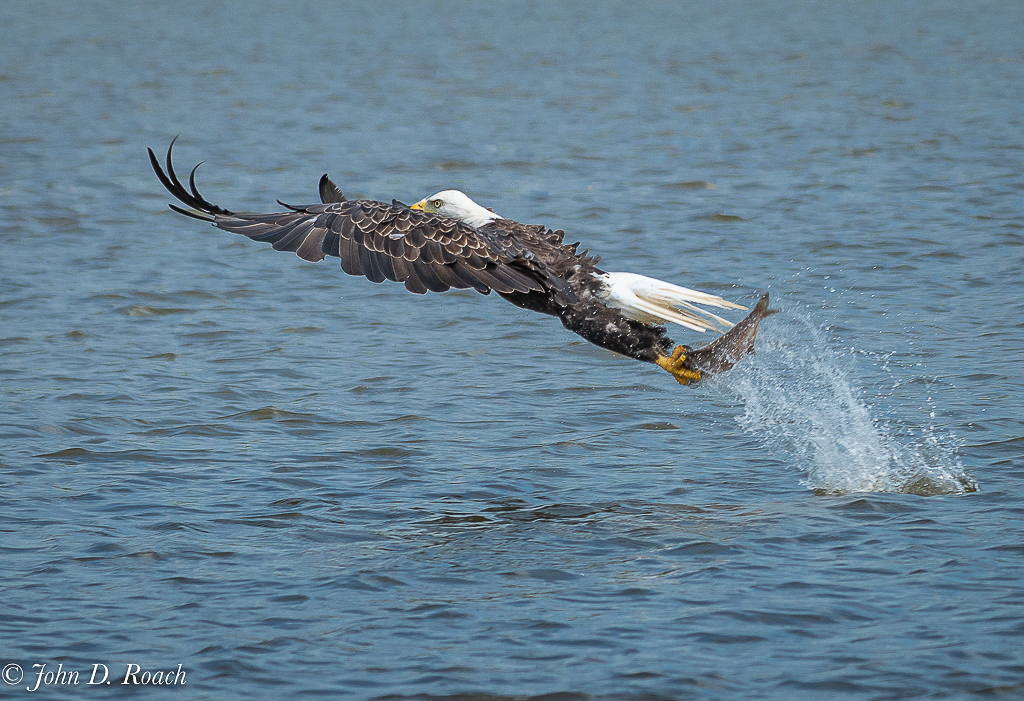
Comment |
I believe this is a great action shot and it definitely has a strong nature story. My only suggestion would be to try to lower the luminosity of the water a little then readjust the white point. |
Jul 15th |
 |
| 52 |
Jul 19 |
Comment |
I thibk this is a nice capture of a beautiful subject. I am impressed that all the water droplets appear sharp. For me the very dark empty space on the bottom right takes away a little of my enjoyment. Would you consider cropping in a bit more on that side? |
Jul 15th |
| 52 |
Jul 19 |
Comment |
I am having a terrible time deciding about this image. For starters, as others have said, I do like the color and luminosity of the original. I also think that you have done a good job capturing layers of interest. However, at first it seemed like there was too much foreground; then I realized that part of the image is your subject. So my conclusion is that the foreground needs to be enhanced much more. The decaying logs lead me into to the distance, but that is not where you title suggests you want me to focus. I am trying to learn luminosity masking in PS so played around with that, but apparently I have not mastered that technique yet. I wish I could be more helpful... |
Jul 15th |
| 52 |
Jul 19 |
Reply |
I know that everyone who suggested removing those distracting elements is correct, but I am not sure this image is worth the effort. There isn't a lot of nature story in it so I really don''t think it has a future outside the trash bin. |
Jul 15th |
| 52 |
Jul 19 |
Reply |
I see your point about the exposure. But as for removing the second more blurred set of flowers, I may try that, but of course that kind of revision would disqualify it from the nature competitions. I compete in the Gulf States Council monthly competitions and they are equally as rigid about that kind of thing as PSA's Nature Division. |
Jul 4th |
6 comments - 2 replies for Group 52
|
| 63 |
Jul 19 |
Comment |
I agree - this one is a keeper. The color for me is lovely, everything is sharp and I really like your composition. |
Jul 12th |
1 comment - 0 replies for Group 63
|
| 88 |
Jul 19 |
Comment |
For me this image has a strong WOW factor. I think your post-processing has given it a real color pop and a glow. There is a lot to look at here and I could wander around in it for a long time. |
Jul 1st |
1 comment - 0 replies for Group 88
|
17 comments - 5 replies Total
|


