|
| Group |
Round |
C/R |
Comment |
Date |
Image |
| 35 |
Apr 19 |
Comment |
This reminds me of a day trip I took on a boat through the Everglades a few years ago. I love the effect that Topaz has produced in the clouds, but I feel like it is a bit overdone on the trees. I too always pull back on those effects, but I wish there was a way to apply them more selectively. I have tried to make two copies of an image in Topaz, one with the effect I want in one area and another with the way I want it to appear in a different area. Then I put them in PS as layers and blend them. It is a lot of work. One other thought I have is to crop at the bottom so we see less of the water which does not have much interest - oh, and eliminate the sign. |
Apr 20th |
| 35 |
Apr 19 |
Comment |
This is simply eye-popping beautiful. I think the color palette is fantastic. I also really like that the sheep in the front is looking right at the camera. My only suggestion would be to crop about half of the sky at the top and make it more of a a panoramic. |
Apr 20th |
| 35 |
Apr 19 |
Comment |
I feel as though I could walk right into this image - and I want to because I imagine that there is a great view on the other side when I reach the top. I think I would crop at least half of the walkway leading up to the steps, maybe up to where the little shrubs are, since there is not much interesting in that portion of the image and all the drama is closer to the top. I like the clean, crispness of this scene. |
Apr 20th |
| 35 |
Apr 19 |
Comment |
This is a fun image. The masks they are holding are not pictures of theselves, and as far as I can see they are also not pictures of anyone else who is in the group. So I keep looking at it and wondering, "What is the story here?" For me anything that hold a viewer's attention that way is a good image. The perspective you chose works well in my opinion and your monochrome conversion seems like a good choice. My only suggestion would be to eliminate the lady on the far left, as she does not seem to be involved in the game, or the story. |
Apr 20th |
| 35 |
Apr 19 |
Comment |
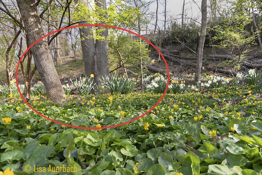
As soon as I saw this I thought you must have shot it in the U.S. rather that in the UK. We seem to have so many of these old wooden one room church buildings and I am very glad that many are being preserved. I have been working on a collection of images that I call "That Old Time Religion" and this one would fit in perfectly.
I like the composition with the two tree trunks as framing. The high key treatment you have used on the foliage is, in my opinion, good, but I feel it causes the structure to look a little washed out. I would consider working selectively on the church to get it to pop out from the background. More contrasting tones would be my first thought, but it might take some experimentation. |
Apr 20th |
| 35 |
Apr 19 |
Comment |
The Joshua Tree makes an interesting subject and I cannot wait to get the opportunity to try make some images of them. From this image it appears that they come in all different kinds of shapes. For me, the image would work better if the tree were not so centered. The centered presentation would be effective if there was more symmetry but I do not see that. The cyan in the clouds does not add to the scene in my opinion. I am thinking this image would work well in monochrome, probably black and white, but I would also consider sepia to give it an "old west" feel. |
Apr 20th |
| 35 |
Apr 19 |
Comment |
I removed the power lines in PS. I just do not think that LR is up to the job for those kinds of issues. I did the noise reduction using the brush in LR. It did ok, but I think the control points in NIK are probably better. As for the bright area in the sky, I was trying to create the impression of a beam of light shining on the front of the church. I worked and worked on it in PS but could not create the beam like appearance I was after. Thanks for the feedback. It is always helpful. |
Apr 15th |
7 comments - 0 replies for Group 35
|
| 52 |
Apr 19 |
Comment |
Wow, Mike! You capatured it just right, in my opinion. I love the way he is all "ruffled up." I am a big fan of white backgrounds as I really like the artistic look it provides. I think this could be in an Audubon field guide. I have no suggestions for you - you are the master. |
Apr 20th |
| 52 |
Apr 19 |
Comment |
The strong graphic lines and the color palette in this image are very appealing to me. I am amazed that at an ISO of 2000 I do not see noise in the image. Did you do any noice reduction in post processing? The star in the water droplet just puts this image right over the top! For me, it is a winner. |
Apr 20th |
| 52 |
Apr 19 |
Comment |
How nice to see as well as capture an image of a rare bird. Like Carol, I wondered if you really shot this at 1/100 sec. or if that is a typo. Either way, the bird is tack sharp and the detail on the fish he caught is also remarkable. The background is pretty bright and contrasty for my taste, so one thing I might consider if it were mine would be to darken the grass areas then decrease saturation and luminosity. Someone once told me that since green is the easiest color for humans to perceive, those two generally need to be reduced. I don't know if that is universally true or not, but I always consider it when post processing an image with a lot of green in it. Try it and see what you think. |
Apr 20th |
| 52 |
Apr 19 |
Comment |
The feeling I get when I look at this image can only be described as "intense." I always wish I could see, for just a moment, what the world looks like from their eyes. They eyes and expression (if eagles can be said to have one) for me tell a story. My only suggestion would be to remove the twigs protruding from behind on the right side of its neck. |
Apr 20th |
| 52 |
Apr 19 |
Comment |
Lisa, something I have tried to remember when I come across one of these eye-popping scenes is "Go in tight and then go in tighter." This idea is best illustrated by the work of Eliot Porter and his "Intimate Landscapes." For me. when a scene is as busy as this one, the more intimate view helps to simplify and draw attention to the parts of it that are truly the stars of the show. I put your image into LR and attempted to edit it to show you what I am thinking, but by the time I did that with an image as small as the ones we post, the resolution was very poor; so am attaching a marked up version of your image to show you where I think the interest lies. In trying to edit it, it seemed to me that there is some detail lost in the bright areas at the top, so I would suggest using the gradient tool in LR to darken it a bit.
I hope this is helpful. I definitely see why you were drawn to this scene, but I am thinking that your sense of its beauty is overwhelmed by its business. |
Apr 20th |
 |
| 52 |
Apr 19 |
Comment |
The wing position and the sharp eye are, in my opinion, perfect. Then I notice that the feet are also quite sharp, while the body and tail are a bit soft. It is very difficult to get absolutely every part sharp, but in my opinion, you got the most important parts just right. I have been shooting BIF with exactly the equipment you used here. I have found that a shutter speed of 1250 sec. is the very lowest that will work, so I generally go to at least 1600 or sometimes up to 2400, but I set the ISO at 800.
From a composition standpoint, I think you need some branches to provide context and story, but I would consider removing the ones that appear as if they are growing out of the head.
I think this is a great shot, and you should be proud of it. I would love to be able to get an eagle in flight. I have watched one or two birds for long periods of time and then missed the takeoff, so I know this took a lot of patience as well as skill. |
Apr 20th |
6 comments - 0 replies for Group 52
|
13 comments - 0 replies Total
|


