|
| Group |
Round |
C/R |
Comment |
Date |
Image |
| 35 |
Nov 18 |
Comment |
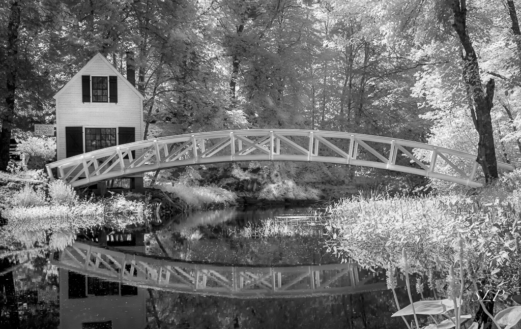
The house is very nice, but for me the trees are the stars of the show. Howeer, I would crop some of the foliage on the left so that the focus is more on those twisted trunks. It looks like you have used some glow - an effect I am fond of - and you have done it at a pleasing level. So often those effects are overdone and in my opinion ruin an other wise nice image. Your post processing is masterful as always. |
Nov 18th |
| 35 |
Nov 18 |
Comment |
Adorable children, but for me the color in this image is a bit "off putting." I know that is strange coming from me, because I reallu like faux color infra red, but to me the pinkish orange does not feel right for this image. I wonder what it would look like if you swapped the color to blue? I also agree with the suggestions about darkening the background. |
Nov 18th |
| 35 |
Nov 18 |
Comment |
I think the foliage is lovely and the detail on the tree trunks to the right is very nice. It is interesting how subjective all this is. Helen finds the cloud a nice element, and in my opinion that patch of sky is a distraction. I would suggest cropping just below it. Stuart likes to see a person or object in the distance to add interest, but I think it is fine as is. I heard a TED Talk about beauty and the speaker said that Americans generally like to have a person, or animal or a building in a landscape image to find it beautiful. To me that is not important but maybe I am outside the norm on that. Bottom line, it is your art and your vision. Overall, nice work. |
Nov 18th |
| 35 |
Nov 18 |
Comment |
Monument Valley is always a subject I find interesting. If you are planning to go again, consider staying at the lodge on the Navajo Reservation. The view from there is quite dramatic. Also, you would have the opportunity to shoot at sunrise and sunset - not right for infra red, perhaps, but great for color photography.
To me, there are two areas in this image that are so bright they detract from the appreciation of the rock formations. One is the foreground, which could easily be cropped to the base of the plant which would result in a more panoramic presentation. The other area is the rock formation far right which I feel would benefit by lowering the exposure (you can brush it in with the brush tool in LR) by at least one full stop and adding some clarity to bring out the detail. |
Nov 18th |
| 35 |
Nov 18 |
Comment |
I think you have made a good choice by going in tight. It helps me, the viewer, to focus on the center of interest without all that foliage that adds little interest. In my opinion, it was worth the hike.
I sometimes like image borders; however, the bright white tends to take my eye to the edges. My suggestion would be to consider a dark border toned to approximate the darker tones in the image. |
Nov 18th |
| 35 |
Nov 18 |
Comment |
What a cool structure! I find the way you can see through the columns and the gazebo behind quite interesting. To me it looks like there is a little lens distortion, particularly lon the column closest to the left side. I think that could be corrected using the Guided Upright tool in LR. Also have you considered eliminating the shadows it the foreground? In my opinion they do not add interest. Just a suggestion, so you might try it and see what you think. |
Nov 18th |
| 35 |
Nov 18 |
Reply |
Thanks, April. I followed up on the suggestion both you and Helen made. See above. It looks much better to me now. |
Nov 12th |
| 35 |
Nov 18 |
Reply |
I belive you were right. This certainly simplifies the image. Thanks, |
Nov 12th |
 |
| 35 |
Nov 18 |
Reply |
That is a good suggestion and I will try it. Thank you. |
Nov 12th |
6 comments - 3 replies for Group 35
|
| 52 |
Nov 18 |
Reply |
The more I have looked at this image the more i thought the original one I posted was better, so thanks for your encouragement to go back to it. |
Nov 28th |
| 52 |
Nov 18 |
Comment |
Oh, no! I did it again, didn't I? Sorry about that. I always check to make sure the image is posted but I do not always re-read the text. I will make note of that.
Now that we got that out of the way, Mike, you have to stop this. You are causing me to be positively driven in order to try to keep up with you! Now I have to buy a lightening trigger! To me this is a wonderfully strong image with a great nature story. It has the quality I am always after and always preaching to others about - IMPACT - in spades. |
Nov 14th |
| 52 |
Nov 18 |
Comment |
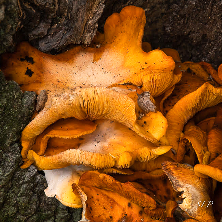
Sharon PrislipskyIt looks like you have captured the whole tonal range in your monochrome version, but I too actually prefer the color image. To me, it is much more interesting. However, I think it would be improved by going in tighter. The tree bark on the left does not add anything and the semicircle of bark on the bottom right only serves to distract me. I cropped it to a square, reset the white and black points and bumped up the contrast a little bit. See what you think. |
Nov 14th |
 |
| 52 |
Nov 18 |
Comment |
I really like the soft color palette of this image. I am glad Lisa caught that flower in the bottom corner - I can't tell you how often I have shot similar scenes and not noticed one or two soft flowers until after I printed it. Very frustrating. I only have one suggestion, and this is based on a personal preference so you my accept or reject it; it is that I do not like to see lines that go to the edge of the frame because it takes my eye out of the scene. I was thinking you might add a little canvas at the top with just sky. Do a content aware fill and then clone out the flowers and stems. Just a thought. |
Nov 14th |
| 52 |
Nov 18 |
Comment |
Yes, indeed the Cormorants are clowns and you captured some cool behavior in this image. If you had not reposted your edit, the changes you made are exactly what I could have suggested. I will look forward to seeing you Egret images soon. |
Nov 14th |
| 52 |
Nov 18 |
Comment |
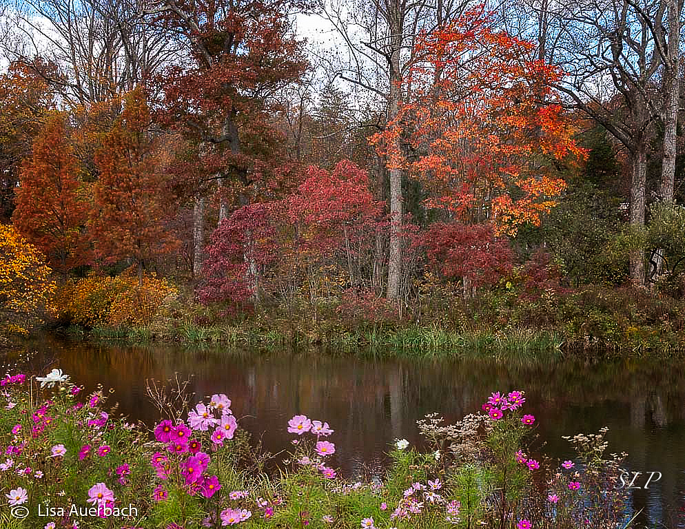
This is such a beautiful scene I want to hop into it. One of the things I most enjoy about it is the juxtaposition of the fall color with almost summery looking flowers (are they Cosmos?). I could not resist playing around with it to try to make it pop. Here is what I did: In OnOne I added a Dynamic Contrast layer at 60% opacity (this could also be done in Color Efex); I made a curves layer and pulled the mid tones down just slightly; I added a rich glow at 40% opacity (could use Glamour Glow in NIK) and a vignette which is center spot. Take a look at the visual feedback and see what you think. You might want to also crop as Mike suggested. |
Nov 14th |
 |
| 52 |
Nov 18 |
Comment |
To me this image is well-composed. I like the perspective you chose and the way it created that diagonal. I have an image shot in the same location with the sand running down, but I was "straight on" so it is not nearly as strong as your image. I do not see bothersome noise at least in this small version. When you first sent this I thought that when making my comments I would suggest some slight exposure adjustments, but the others have beaten me to it. I agree with them so will leave it at that. |
Nov 14th |
| 52 |
Nov 18 |
Reply |
Thanks, Mark. I appreciate you taking a lot at it and will follow up on your suggestions. |
Nov 11th |
| 52 |
Nov 18 |
Reply |
I believe you are right. Thanks for the suggestion. |
Nov 4th |
6 comments - 3 replies for Group 52
|
12 comments - 6 replies Total
|


