|
| Group |
Round |
C/R |
Comment |
Date |
Image |
| 35 |
Oct 18 |
Comment |
I see that there is a clear path for my eye to wander to the back of the image through three or four different layers, all of which hold some interest for me. It doesn't look quite straight to me. I would try to level it along the line formed by the top of the large pot or the roof line toward the back. I love the sepia tone and the contrast between the smooth floor tiles and the roughness of the stone. |
Oct 16th |
| 35 |
Oct 18 |
Comment |
I think the headstone in the foreground is interesting especially because it is leaning in the opposite direction from the others. I wonder how that happened? For me, though, it is so dominant that it forms a visual barrier between me and that lovely church. That is a terriffic sky which adds a lot of interest to the scene. I have a personal bias against having branches that are not clearly connected to anything protrude into images. I would suggest eliminating the foliage on the left and that branch sticking down top left. The only other thing I would think about is getting rid of the shadow that sticks in on the right side. |
Oct 16th |
| 35 |
Oct 18 |
Comment |
This is a fun image. I know that all the parks are jammed with people in the summer and it is tough to get a scene without them, so you have made the best of it. I like that the tourists are in groups of 3. Did you do that on purpose or was it a lucky shot? I would suggest cropping a tiny bit on the left to eliminate that bit of rock and a little more on the right to just past the first two rocks. Adding a vignette would help keep my eye in the scene. |
Oct 16th |
| 35 |
Oct 18 |
Comment |
I certainly get a sense of place when I view this image. I'll bet living there was/is a lonely existence. I like the reflection in the water, but the sky is so empty it seems to limit my overall enjoyment of the scene. Do you ever swap skies? It is not hard to do. I keep a little collection of interesting skies in my catalogue for situations like this. |
Oct 16th |
| 35 |
Oct 18 |
Reply |
I think you made some great suggestions, Helen, and I will try them out. |
Oct 11th |
4 comments - 1 reply for Group 35
|
| 52 |
Oct 18 |
Reply |
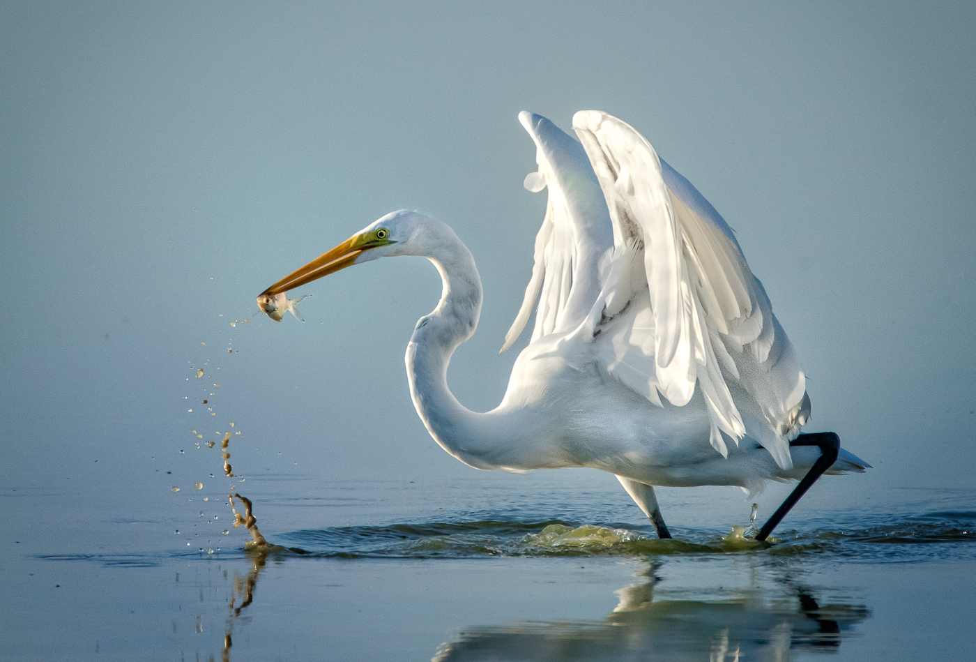
Oh, you are right...I have a bad habit of not picking the correct original, but they were shot withing seconds of each other so you can see what the lighting conditions were. I know you are a stickler about loss of detail in white feathers, but it seems to me that even if you meter on the bird in some lighting conditions that is inevitable. In nature, usually the story is more important than the technical as long as the technical flaws are not significant. |
Oct 22nd |
| 52 |
Oct 18 |
Reply |
Adorama has a discount offer on photo books going right now. I keep saying I am going to do one and I have lots of ideas, but I never get around to it. I think the vignette is just fine. |
Oct 16th |
| 52 |
Oct 18 |
Comment |
That white on white always grabs my attention. You are a master and this looks to me like a winning image in anyone's estimation. Just lovely in my opinion.
By the way, when you are home and have more time please tell me about how you captured the bat image. |
Oct 16th |
| 52 |
Oct 18 |
Comment |
For me the colors and the direct gaze of the deer work well. I understand your fascination with photographing subjects in the fog, but in this case the very soft effect on the deer just makes it look out of focus. If the effect is truly from the fog and you have good focus on the deer, I would suggest dehazing the deer using the adjustment brush in LR. I would try to get the eyes as sharp as possible. Finally, for me, there is a lot of foliage on the right that does not add interest. I would crop at least up to the yellow flowers that are next to the deer. |
Oct 16th |
| 52 |
Oct 18 |
Comment |
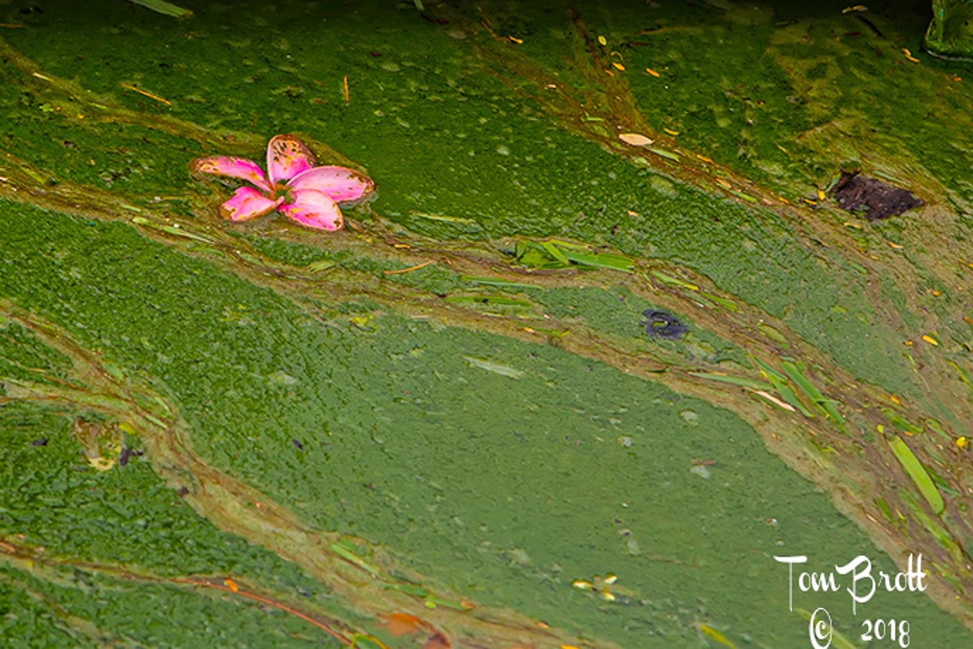
I think this is a good visual for the damage the red tide has done in your area. I love the colors and the diagonal lines. Although the hand of man is acceptable in this group, I do not feel that the dock adds anything to your story. I tried a crop and while I was at it I brought the shadows up just a tad and boosted saturation. See my visual feedback and see if you like it. Its just something to consider. |
Oct 16th |
 |
| 52 |
Oct 18 |
Comment |
John...this is for me another image in the tradition of Eliot Porter...an intimate landscape. I like the diagonals, but my preference would be to crop a small amount from the left to eliminate that triangular shape in the top corner where we see just the leaf bed. Otherwise, I think the twigs frame your subject quite well. |
Oct 16th |
| 52 |
Oct 18 |
Comment |
The first things I noticed were the harmonious colors and the diagonal line which leads my eye to the shell. For me the water at the top of the image looks too bright, so I would make an adjustment layer and darken it, perhaps reduce the contrast in it as well. I think John's suggestion about opening up the shadows is a good one. My final thouhts are to darken and boost the saturation on the shell. If this image is not headed for a nature competition I think you might consider cloning out the white highlight on the shell.
If you are heading more toward an art image, I think adding a texture would be something to try. |
Oct 16th |
| 52 |
Oct 18 |
Comment |
The expression says it all and the eyes are staring me down. I wonder if he sees egg on my face or something? He seems shocked. I think you did a great job with focus. I noted John's suggestion about stopping it down but with the extender on maybe f/8 was as wide as you can go with that lens (I used to have that lens, but now I forget.) Regardless, I do not find the background overly distracting, for me the vignette holds my eye in the image. I hope your are doing a photo book from this trip. You should enter it in the photo book contest - you have some great images. |
Oct 16th |
| 52 |
Oct 18 |
Reply |
Mike, I don't know if you ever say that online color perception test, but as I recall, women of a certain age have difficulty with yellow. So maybe that is why I can't see what you are seeing. (This is not a joke!) Nevertheless, I did desaturate that area, so you will have to tell me if it still looks yellow. I also liked your idea about the crop. Here is my edited version. Thanks for the help
Also, congrats - I see you had a winner in the Chapters Showcase, correct? |
Oct 11th |
 |
| 52 |
Oct 18 |
Reply |
Larry, thanks for visiting our group. I hope you come back often. Some of us have been together for 5 or 6 years, so we know each other pretty well. It is a great group.I appreciate your positive feedback.
|
Oct 11th |
6 comments - 4 replies for Group 52
|
10 comments - 5 replies Total
|


