|
| Group |
Round |
C/R |
Comment |
Date |
Image |
| 35 |
Sep 18 |
Comment |
I always try for a sun star when possible and in this case it makes your image more than just a tree. Now it is about the beautiful light as it streams through the branches and the Spanish Moss. Your post processing is perfect in my opinon, so I would not change a thing.
I agree with the others that this is a winner so congrats. I am looking forward to getting more into Topaz but am waiting for a sale which should be coming up soon as I recall. |
Sep 12th |
| 35 |
Sep 18 |
Comment |
To me this image is very visually appealing. The receding perscctive draws me right back to the buildings. But for me the star of this is that beautiful sky. The grasses to the left and right do not have much tonal range in my opinion. I hate to suggest this because you are a master at post processing, but would you consider some targeted dodge and burn to get a little variation in those areas?
Also, thank you for that suggestion of adding the 50 percent gray layer you made for Stuart's image. I immediately saw how that would benefit a couple of images in my catalogue and went right to PS and tried it. So I learned something cool I can use in the future. |
Sep 12th |
| 35 |
Sep 18 |
Comment |
What a great setting - it is positively romantic! The first thing I thought when I opened this image is that it is over sharpened. It has too much of a "gritty feel" in my opinion. You have nice contrast with what appears to be the whole tonal range, and I think it is well-composed. |
Sep 12th |
| 35 |
Sep 18 |
Comment |
Sorry for that mix up. Any time that happens just email me because I can fix it easily. Since comments have already been made I will leave it alone for this time, but do not hesitate to call stuff like this to my attention in the future.
This is a great travel image with an interesting story. I think I agree with Helen and Julie about the crop. One other "nit pick" is the herder on the left. For me, he is way too close to the edge of the frame - almost out of the story altogether. I would remove that figure or if you have another image in this series look for one where he is more in the frame. |
Sep 12th |
| 35 |
Sep 18 |
Comment |
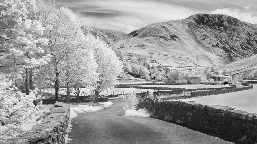
This is a lovely pastoral scene. I wish I could visit. I like this image so much that I could not resist playing around with it some. I hope you are not offended.
I think a good monochrome has to have black black and white white in it if you know what I mean. I looked at it in Silver Efex and saw that it was missing those tones on either end of the histogram. I darkened the foreground and the stone fences on the right as well as the hedgerows. For the little cluster of buildings tucked back there I darkened it slightly and add some clarity. I am providing some visual feedback for your consideration.
I know this is not the high key look that is characteristic of your style, but I think it pops a little more. See what you think. |
Sep 12th |
 |
| 35 |
Sep 18 |
Comment |
Backroads often produce treasures like this one! I think the way you have darkened the sky works well for this image. I noticed the wire right away. To me the scene looks a little bit two dementional, especially in the foliage. I think Helen's suggestion for a little dodge and burn work woul make that pop. In my opinon it is well composed. I see you haven't cut off any gravestones. I will always look for that in my images from now on since you have called my attention to it. |
Sep 12th |
| 35 |
Sep 18 |
Reply |
Thanks Helen. I am thinking of renaming this image "What Dreams May Come." Do you remember the movie with that title starring Robin Williams? It is a pretty strange story, but I remember scenes from it that look very much like IR although it is faux color. Anyway, I appreciate your feedback. We shall see where this goes. |
Sep 12th |
6 comments - 1 reply for Group 35
|
| 52 |
Sep 18 |
Comment |
You captured the personality of this bird perfectly. They are one of my favorite species and never fail to entertain me. Your presentation is artisticyet natural in my opinion. The only thing I would consider is saturating the colors of the bird just a tiny bit.
Now, I have a question for you...I have some Great Egret images in my catalogue that I go back to time and time again and cannot make a decision about. What puzzles me is the band of light reflected from the water on the wings. I have hesitated to use those images because I am not sure how that would be perceived by viewers, especially those who may not have experience shooting bird images in that kind of lighting conditions. Have you had any feed back from judges or potential buyers of your work that would enlighten me? |
Sep 12th |
| 52 |
Sep 18 |
Comment |
For nature images the context is somewhat important in my opinion. My first thought when I opened you image is that the black background eliminates any possible information a viewer would glean about the environment. So I would make the black vignette perhaps larger and not quite so dark. I couldn't resist playing with this - I hope you don't mind. I changed the crop, gave it some dynamic contrast and a tiny bit of glow. Then I changed the yellow hue to make it pop and saturated green and yellow. Finally, I darkened the corners. It's just another thought...you are the artist, so it should reflect your vision, not mine. |
Sep 12th |
 |
| 52 |
Sep 18 |
Comment |
As I said in reference to my own image posted this month, I am developing a strong interest in Eliot Porter's "intimate landscapes." This is an excellent example, very characteristic of Porter. The bokeh is perfect in my opinon and I find the warm colors very appealing. I would not change a thing about it. |
Sep 12th |
| 52 |
Sep 18 |
Comment |
This image has strong horizontal lines which for me gives a sense of peace. The mist is a very nice element and helps the viewer get the feel of the early morning light. I am not sure where the center of interest lies. I think the "party" in this image is mostly on the left, so if this were my image I would crop just before the prominent rock on the right. I would also consider enhancing the sky some and try to bring up more blue. However, that said, you are the artist and it has to be your vision, not mine. |
Sep 12th |
| 52 |
Sep 18 |
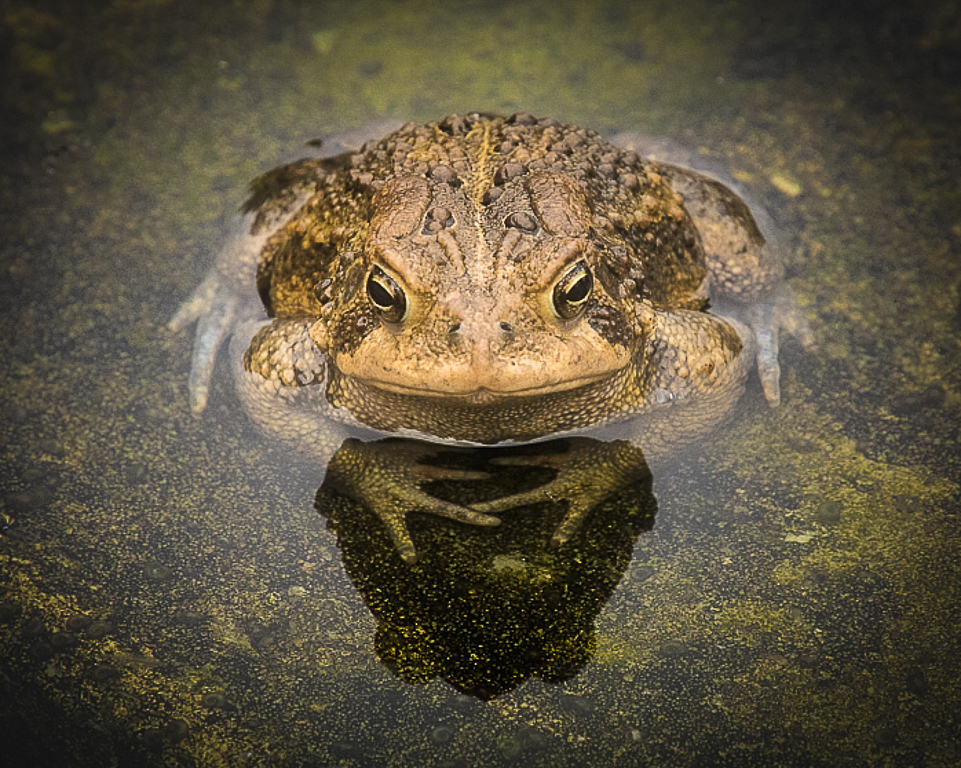
Comment |
I think the crop worked well from a composition standpoint. You have eliminated all the major distractions and put the eye in what for me is exactly the right place. Good that you had the 300mm - I don't know if he is poisonous, but I wouldn't want to get any closer!
I think you have gotten some good suggestons from Mike and Oliver as to how to enhance it, but I cannot make up my mind about that closer crop. To me it feels like something important has been amputated. In any case this is as good as it get's for a snake! :) Nice work. |
Sep 12th |
| 52 |
Sep 18 |
Comment |
This is an image that captures and holds my interest. I always look for lines and shapes and I like the way the kits are positioned in a circle - very organic and it keeps my eye right where you want it. I think the lens fall off in the background is perfect, but in my opinion the whole background is a little too bright. One thing I like about Mike's suggested edit is that the background is about as bright as that shadow on the left kit's face, so it makes the shadow less obvious to me. What are your plans for this image? I think it would do well in nature exhibitons if you are so inclined. Also, it seems like you are getting a good crop of wildlife images. Why don't you consider a book and put it in the PSA photo book competition next year? |
Sep 12th |
| 52 |
Sep 18 |
Comment |
Thanks for the suggestions, Mike. I definitely will do something about that twig. Unfortunately this is the shot and it has not been cropped so I think my only choice would be to clone them out. Iwill mess around with it and see what I think. |
Sep 7th |
| 52 |
Sep 18 |
Reply |
Thanks, Lisa. I shot this back at the beginning of May and have been "pondering" it ever since. I liked it a lot, but I felt it may not resonate with anyone else. Knowing that it had some impact for you makes me more confident about including it in my exhibit. |
Sep 7th |
7 comments - 1 reply for Group 52
|
13 comments - 2 replies Total
|


