|
| Group |
Round |
C/R |
Comment |
Date |
Image |
| 35 |
Jul 18 |
Comment |
My first reaction was - "WOW! That sky..." Then I see all that lovely detail in the foliage. Your post processing workflow is the same as what I do. The tonal range looks perfect to me. I agree with Helen's suggestion to crop from the bottom. I can't wait to see more of your images. |
Jul 17th |
| 35 |
Jul 18 |
Comment |
I was captivated by this image the minute I saw it. I love the misty background which sets the stage for this fairy house. I do not think the artistic effect is too intense - but then you already know I like the Topaz Impressions. I want to keep looking at this and would walk right into the scene if I could. You set a high standard for us. |
Jul 17th |
| 35 |
Jul 18 |
Comment |
I find this image very appealing. To me the curved lines in juxtaposition with the diagonals add a lot of interest. You captured a lot of detail in the sky. Normally I do not care for branches sticking down into an image, but in this case I think you have used the to create a natural frame for the scene. The only thing that I wonder about is the dark triangle on the bottom left. I would try cropping just above it and see what you think. |
Jul 17th |
| 35 |
Jul 18 |
Comment |
I think this is a good choice of subect. I tested the tonal range in Silver Efex Pro 2 and I see that you have got black blacks and white whites - in my opinon commendable! For me, the post on the left does not work and so I would eliminate it. I think increasing the exposure on the boardwalk pier just a bit would help direct the viewer's eye into the image. The vignette is too intense for my taste - it makes the sky look somewhat unnatural. |
Jul 17th |
| 35 |
Jul 18 |
Reply |
I made several different shots each 3 exposures. I moved the tripod just a tiny bit each time. Now that you have called my attention to it, I think the 3 originals - while they had the same settings - might be from a slightly different set. Thanks for your suggestions on the edits. Hope you are feeling better. |
Jul 15th |
4 comments - 1 reply for Group 35
|
| 52 |
Jul 18 |
Reply |
Thanks, John. I did look at the way you had the labeled, but apparently I did not understand it correctly.
|
Jul 17th |
| 52 |
Jul 18 |
Reply |
Yes, and I did not mean it as a criticism but was hoping for some intellectual exhange which you have provided. I no longer do The Arcanum because I thought I had maxed out with the person with whom I was working. Recently I have been in a DSG Fine Art Study Group and just finished sending an email resigning from it for the same reason. Different leader, but once you know that person's workflow and artistic biases it is time to move on I think. As I said to Lisa in my comments, I think there are a lot different opinions and many of the them are valid. |
Jul 17th |
| 52 |
Jul 18 |
Reply |
I like your re-edit of the flower and I think you have to be true to your own vision of what the image should look like. Just remember that bright areas around the edges will draw the viewer's attention from the main subject. I always try to think about what it is I want to communicate with the viewer and make sure that is where I put the emphasis. There are a lot of ideas about what makes a good image and many are equally valid. |
Jul 17th |
| 52 |
Jul 18 |
Comment |
I think this is a wonderful capture of the sunset just after the sun has sunk below the horizon. I congratulate you on your patience - I often see photographers walk away once the sun is down and miss this glorious light. For me the foreground is too dark, so I think opening up those shadows a bit is a good idea. I particularly like the texture of the bench and since it is your subject - per your title - lightening it as you have in the re-edit works well. I used to participate in The Arcanum and the master photographer I worked with always wanted to see an open path for the viewer's eye to wander to the back of the image. In this case, the rocky wall would be a barrier, but to me, it does not present a problem. I wonder if you have heard critiques such as that and what you think about it from a compositional standpoint? |
Jul 17th |
| 52 |
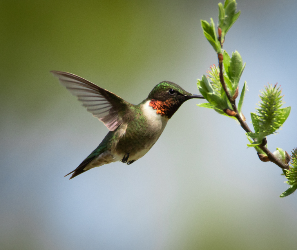
Jul 18 |
Comment |
For me this is a beautiful bird portrait. Whatever is sticking out of its beak does not bother me at all. From an artistic perspective the black background works well, although I have been told that judges and juries in nature competitions prefer to see some of the context. That may not be your intent with this image, so it may be irrelevant. Personally, I like the artistic presentation. |
Jul 17th |
| 52 |
Jul 18 |
Comment |
The bee is nice and sharp, but darn these critter always give us butt shots, don't they? Still there is a nature story here. I think there is too much vibrance in this image. Perhaps that is what has created the unnatural effect on the right. I would suggest resetting the vibrance slider then going to the HSL Panel in Lightroom and desaturating and lowering the luminance of magental and green. I think finishing up with a vignette would improve the overall look of your image. |
Jul 17th |
| 52 |
Jul 18 |
Comment |
I like the white sky version the best although I think it should be cropped a little closer (I know - I hate to throw away pixels too!). The Topaz version looks to me like it has added too much yellow and also, I think it has produced some artifacts along the bottom edge or the bird.
I have some Sandhill Crane against a plain white sky images that I used this same effect on. It is artsy and I have used it for decorative purposes, but I find that bird photographers have a very difficult time accepting that kind of work. However, as we have both said in the past - it is your image and it should be done in a way that appeals to you. |
Jul 17th |
| 52 |
Jul 18 |
Reply |
John, I wondered if I had them in the correct order when I posted them. If you send more than one original try to number them for me so I get it right. |
Jul 17th |
| 52 |
Jul 18 |
Comment |
In my opinion, whether or not you clone out those spots depends on what your intention is with this image. Because I am usually striving for something that would qualify as fine art, I always clone out imperfections. It this is intended as a nature image that is a different story. If this were my image, I would reduce the luminance of the green leaves at the top and add more dark vignette. My final thought would be to try adding a subtle texture layer. That may not be to your taste, but you might try it and see what you think. |
Jul 17th |
| 52 |
Jul 18 |
Comment |
OK, I tried to form my own opinion after reading your description but before looking at what others have said, so here goes: The HDR looks very natural to me, but I think it needs a bit more "pop." My first attempt at doing that would be to add some dynamic contrast. However, I then wonder if that will make the shadow on the small waterfall at the center too contrasty, so my thought would be to do it in a layer and mask out that part of the image. I like the way those smaller rocks on the right circle around and point back to the falls that are your main subject but I am not sure the cascade on the left adds to the scene. Maybe try cropping on the left and see what you think. I think this image has a lot of potential and if it were mine I would try all the suggestions offered and see if any of them appeal to you.
One more thing...after reading the comments I agree with Mike and John that f/22 does not produce as sharp an image as you would get with wider apertures. |
Jul 17th |
| 52 |
Jul 18 |
Reply |
Thanks, Mike. I know how to do that but I am trying to avoid steps that would keep me out of nature competitions. Our club is part of the Gulf States Camera Clubs Council and we do nature every other month (alternating with photo journalism - ugh!) Its a small club so I always try to have something to enter. I might do a version using your suggestion though for a gallery exhibit that is coming up. |
Jul 12th |
| 52 |
Jul 18 |
Reply |
Lisa, I have re-edited based on all the suggestions. See above. Let me know if you think this works any better. |
Jul 12th |
| 52 |
Jul 18 |
Reply |
John, I have tried to take all the suggestions into account. See my edit above. Any improvement? |
Jul 12th |
| 52 |
Jul 18 |
Reply |
I have gone back to the original and tried to follow all the suggestions. Some things just cannot be fixed, but I did what I could, so here is the second attempt. |
Jul 12th |
 |
6 comments - 8 replies for Group 52
|
10 comments - 9 replies Total
|


