|
| Group |
Round |
C/R |
Comment |
Date |
Image |
| 35 |
Jun 18 |
Comment |
Since I was there with you, I know how much thought went into this image. It was a busy scene and you obviously figured out what to leave in and what to leave out - a key to good compostion and story telling. My first thought when I saw this was that it could be cropped on the right, and I see you have done that. I like your last version a lot. I did not test it to see if you had the full tonal range, but it looks pretty good to me. I do not think the blacks are too heavy. Nice work. |
Jun 17th |
| 35 |
Jun 18 |
Comment |
First of all, I like that you have posted all the exposures that made up your final image and I intend to follow suit in the future. Secondly, I have never even attempted an HDR hand held - were you a sharpshooter in a previous incarnation? Very impressive. I think the tiny bit of motion you are referring to has produced a rather nice soft effect. I like this image very much. |
Jun 17th |
| 35 |
Jun 18 |
Comment |
I think you have a nice crisp monochrome image here, although it does not jump out at me as IR. Clearly, I do not understand the symbolism so the explanation above helps me figure out what is going on in the image to some extent. I feel that the composition would work better if the monk statue was to the right of the wheel, but since I was not there that is kind of a "nit pick" comment. Thailand is obviously a very special place. |
Jun 17th |
| 35 |
Jun 18 |
Comment |
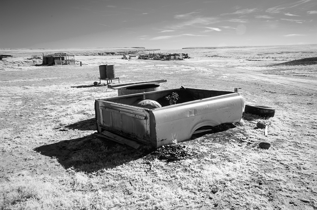
I have spent quite a bit of time wandering around back roads in New Mexico and I think you have found an interesting subject here. I am guessing that you have a 665nm conversion which allows orange and yellow light to come in. But I am not sure what you mean about orange and yellow channels as the channels are only Red, Green and Blue (RGB). Did you do a "channel swap" in Photoshop and then convert to monchrome or just start with a hue and saturation layer to get this effect? If you have not used the channel swap layer, you might want to go back to the original and try that. Then adjust contrast so you have white whites without blowing out the highlights and black blacks without losing detail in the shadows. I think it makes for a crisper monochrome. I am attaching visual feedback. See what you think. |
Jun 17th |
 |
| 35 |
Jun 18 |
Comment |
This looks like it could be in Arkansas - right down the road from my home. I think you chose a good subject, and one that has a sort of pastoral feel to it in my opinion. I have come to realize that the white vignetting usually does not work as it takes too much detail away. What I usually do is, after applying that filter in NIK, create some control points around the edge and reduce the brightness to bring back some of the detail. I do think the sepia works. |
Jun 17th |
| 35 |
Jun 18 |
Comment |
Stuart, I hope you don't mind me playing with this a little bit. I like the calm feeling of this image a lot as well as the crystal clear reflection. I did not think the water line looked quite straight so I pulled it into light room and found it was slanted down toward the right just a little. I straightened it and cropped on the right. Then I went to the HSL panel in LR and clicked the button to check the hue. Sure enough, the blue registered as purple. So I moved the purple slider to the left and adjusted the blue luminance. Of course this is all a matter of personal taste, but check my visual feedback and see what you think. |
Jun 17th |
 |
6 comments - 0 replies for Group 35
|
| 52 |
Jun 18 |
Reply |
My best sellers have been landscapes that could be anywhere. People think it looks like someplace else in the US where they have been or somewhere that they grew up. Some of my florals have been successful too - mostly ones I would not consider putting on my own wall - they buy because the color goes with their decor. Go figure. If I make enough to buy a new lens each year I am happy. |
Jun 18th |
| 52 |
Jun 18 |
Reply |
So glad to find someone in the group is familiar with Porter. I agree with the assessment that he is sometimes tonally flat. My inspiration taken from him though is more the notion that after I look at the big picture I need to look closer.
I was not referring to competition. I exhibit in a couple of galleries and I had the idea that you did also. My experience has been that there is a difference between what might sell and what I would hang on my own wall. Then, of course, there is an even bigger difference between what I might hang on my wall or what might sell, and what a competition judge might like. So it sort of depends in my opinion on who the audience is. I do compete in PSA, but once I get that PPSA (soon I hope) I am done with that rat race. |
Jun 18th |
| 52 |
Jun 18 |
Comment |
I am so into long exposure landscapes and this one really resonates with me! I just purchased a Breakthrough 10 stop ND filter for my upcoming trip to Maine because this is exactly the type of image I have in mind. I like your final version because the colors are what I want to see in a sunset. I prefer the lavenders to the blues in the sky. I like the way the cloud seems to point to the pier. I did notice the tiny something on the horizon and thought it might be best to remove it. Are you planning to print this image? I think it would look great on metallic paper. |
Jun 17th |
| 52 |
Jun 18 |
Comment |
I see the look you were after and I applaud you for having the ability to previzualize what could be done with this tattered leaf. I also very much like the colors. For me, the white lens fall off is a bit too strong, especially since it makes the top edges of the leaf fad away. I also think that the portion of another leaf in the top left sort of over-complicates what is basically a clean, simple image. This is one of those images I that for me have a lot of potential. If it were mine, I would try some other treatments and see what else can be done. |
Jun 17th |
| 52 |
Jun 18 |
Comment |
Two for one - how lucky can you get? My first reaction is that the color is lovely and the birds stand out from the background nicely. Everything is sharp and all eyes are, in my opinion, full of life. Nice work. |
Jun 17th |
| 52 |
Jun 18 |
Comment |
I find this scene calming and the walkway leads my eye to the back of the image. I wonder what I would find if I continued down this path. I think, as I indicated in Lisa's image, that what you do with this in post processing has a lot to do with your final intentions for the image. If you are considering this for a gallery show, in my opinion it needs some selective dodge and burn to add a sense of depth and dimension. If you intend it for your own wall, I think you should try to preserve it the way you remember it.
Now, having said all of that, I want to share one of my current photographic interests: I recently became enamored of the work of Eliot Porter, specifically his "intimate landscapes." One of my summer goals is to look for those type of shots. Often I find that there are compositions within compositions. Maybe this scene has more possibilities if you have enough pixels to try some other crops. Just a thought - I often try to concentrate on something like that just to keep the creativity flowing. |
Jun 17th |
| 52 |
Jun 18 |
Comment |
What a lucky woman you are! I have tons of these arond the water garden in my yard, but rarely see them (their sounds are almost deafining at night) except when they hop into the pond. I see that some folks have referred to it as a frog, so I asked my frog expert (my husband) and he says it is likely a Bull Frog. I actually like both versions of this image. The cropped one appeals to me because it draws my attention to the eye which is tack sharp. The other showing the environment is also interesting. I think it will depend on what you intend to do with this image, and who the audience will be. I see the point about toning down the blue in the rock to make a more natural look, but from an artistic standpoint, I like the color. |
Jun 17th |
| 52 |
Jun 18 |
Comment |
Carol, you have captured a great moment here. I'll bet your adrenaline was flowing when you saw this happening and knew you could capture it. As Mike said, my comments will be mostly "nit picking." At first I thought both animals had their eyes closed but then I zoomed in and saw that the zebra in front has his open. I wonder if it could be brightened up a bit so that it is more obvious that it is open? I probably would not have noticed any halo effect since I was so captivated by the story, but after reading what others have said, I only see it at the top on the left zebra. In my opinion, darkening the background a bit would make them pop even more. No matter what you decide this is a great image. |
Jun 17th |
| 52 |
Jun 18 |
Reply |
That is a good suggestion, Carol. I will try it. |
Jun 17th |
| 52 |
Jun 18 |
Reply |
Thank you, Judith. I am not familiar with Durer, but will look him up immediately. I always appreciate art references as I think that studying great artists is a key to good photography. |
Jun 5th |
6 comments - 4 replies for Group 52
|
12 comments - 4 replies Total
|


