|
| Group |
Round |
C/R |
Comment |
Date |
Image |
| 35 |
Dec 17 |
Comment |
I think you have made excellent use of diagonal lines. Although this is a nature image it has strong lines and a range of tones from dark to light. If this were my image, I would crop the sky out as there is very little interest there. I would also boost the contrast to give it more pop. |
Dec 17th |
| 35 |
Dec 17 |
Comment |
I like this image a lot and think you have done a masterful job with the post processing (as always). I have been considering purchasing Photomatix Pro and I believe you have just helped me decide. I can only think of one thing that in my opinion would improve this image. That would be to crop about half of the space to the right of the arch. Can you tell me the process you used to remove the sharpening effect from parts of the image? Was it done with a separate layer in Photoshop? |
Dec 17th |
| 35 |
Dec 17 |
Comment |
Of all your travel images that I have seen, I think I like this one best. I think you have chosen a wonderful perspective, captured a really nice sky and your post processing is spot on. I would not change a thing. |
Dec 17th |
| 35 |
Dec 17 |
Comment |
I like the way you have used diagonal lines to add strength to this image. The tonal range looks very good to me - dark blacks and bright whites as well as good mid-tones. I looked at the possibility of cropping on the left, but the drawback for me it that it moves the (fake) water tower close to the center which doesn't work for me. I would however crop at the top as the sky has not detail and is not of much interest to the viewer. |
Dec 17th |
| 35 |
Dec 17 |
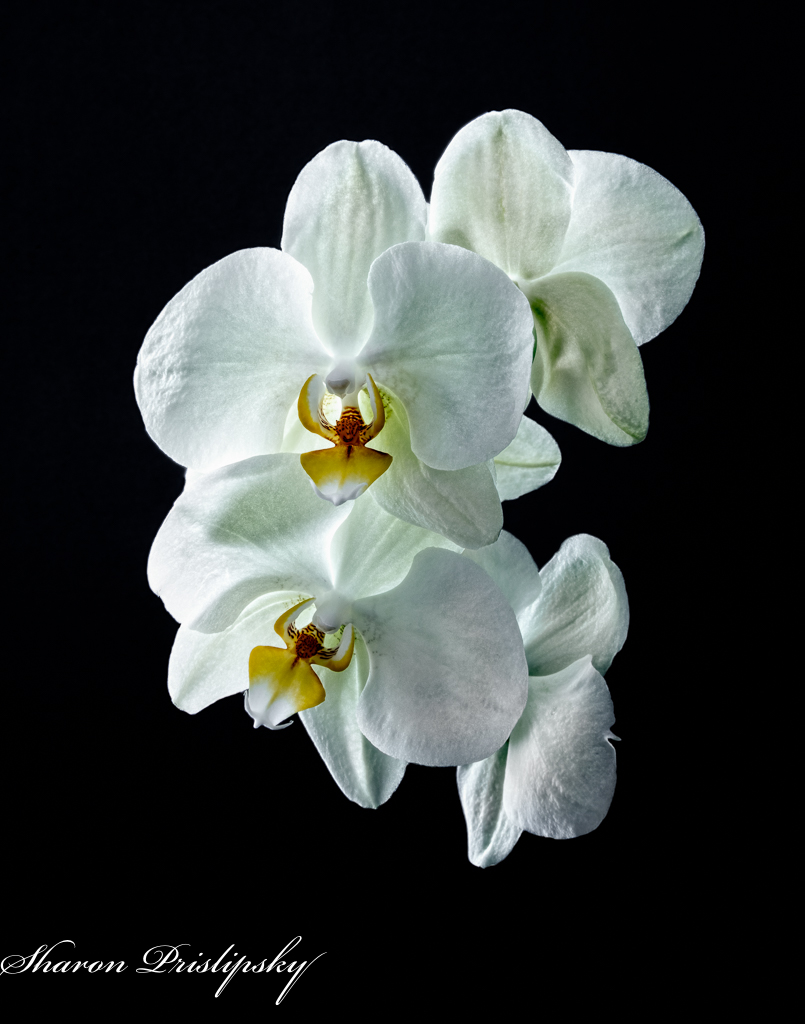
Reply |
Thanks, Julie. I used diffused natural light from a window behind the flower. I will definitely let you know how this does. I plan to use both the IR and the color image I shot with my 5DMIV in different competitions. Taking into account that it will be different judges on different days, I think if I enter serveral different ones I might get a sense of which is more appealing. I am attaching the color version just for you to get a sense of the difference. I sent it to Print of the Month for December. I will send the IR in January. |
Dec 11th |
 |
| 35 |
Dec 17 |
Reply |
The image on the right is the original. |
Dec 7th |
4 comments - 2 replies for Group 35
|
| 52 |
Dec 17 |
Comment |
Oh Mike, only you could show us an ordinary gull with a starfish in its beak! What fun this image is! The light on the bird is great. You did not say, but I am guessing you darkened the background, correct? I try not to read the comments before I make up my mind about an image, but in going back to review, I think Carol has made a good point about adding at the top, although I like the lines at the bottom, so I would not crop there. |
Dec 17th |
| 52 |
Dec 17 |
Comment |
This image just screams, "Merry Christmas" to me. It will make a great greeting card. However, for a larger print, in my opinion it is too soft. I am guessing it was shot through a window which would account for the softness. Also, due to the flat light which we get with overcast skies, there is no catch light in the bird's eye. That perhaps could be added with the rotary tool in LR - try making a tiny circle and increasing the exposure in it. I definitely think this image is work keeping for a greeting card. |
Dec 17th |
| 52 |
Dec 17 |
Comment |
It is difficult to find a tree with this much character, so right away I want to study it closely. I think the flash worked well for you, but I do agree with the others that it needs some work on the sky to balance out the color. Good luck in the competition. Let us know how this image does. |
Dec 17th |
| 52 |
Dec 17 |
Comment |
John, this is a lovely scene with fantastic contrasting colors. The birds in the foreground add interest without taking away from the beautiful reflection. I happened to see the monochrome version of this shot on the PSA Facebook page and I thought it was very nice as well. In fact, maybe I liked it better, but then I am a big fan of monochrome. The leading lines work quite well to draw my eye into the scene. |
Dec 17th |
| 52 |
Dec 17 |
Comment |
Lisa, this is a tranquil and nicely lit scene and you have managed to capture several bird species in addition to the horse. I can't help wishing you had waited until the horse raised its head to shoot, but then the birds might not have been there. I guess we take what nature gives us. I think that cropping from the top and the right would help the viewer focus more on the wildlife. For a fine art image, I think it needs more o"pop" so I would increase the contrast a bit. You might also want to try adding a texture at a very low opacity. This looks to me like a diamond in the rough. |
Dec 17th |
| 52 |
Dec 17 |
Comment |
Carol, I think you have captured a very pleasing scene. Everyone loves horses, and I have found that horse pictures often sell. If you had not explained what you did I would have guessed this was a composite image. The reason I say that is that the edges around the horse look too sharp to me which I think is the hardest thing to deal with in composite. The eye is sharp and the pose of the horse is, I think, good. However, in my opinion, the watercolor effect detracts as it makes the horse's body look too soft. Also, if it were mine, I would not blur the background edges so much. On the other hand, the overall composition and color are good, so maybe if you are so inclined going back to the original and trying some other post processing strategies would be worth the time and effort. |
Dec 17th |
| 52 |
Dec 17 |
Reply |
Thanks, Carol. I have already pushed the clarity and sharpening as far as I can without breaking pixels. I wish I had that Canon 600mm prime my husband uses, but alas, I don't have the upper body strength to handle it. Maybe in my next life. |
Dec 10th |
| 52 |
Dec 17 |
Reply |
Thanks for that idea, Mike. I had a dillema here - if I take that stalk out it is no longer eligible for nature competition. I think decreasing the contrast and clarity on it is the way to go. |
Dec 10th |
6 comments - 2 replies for Group 52
|
10 comments - 4 replies Total
|


