|
| Group |
Round |
C/R |
Comment |
Date |
Image |
| 35 |
Nov 17 |
Reply |
Thanks, Nelson. After reading most of the comments I worked on it some more. Here is the latest edit. |
Nov 21st |
 |
| 35 |
Nov 17 |
Reply |
You will have a good time at Old Car City. I went to the Palouse last summer (flying cross country, so could not take the IR camera as the additional weight would have been impossible for me to carry). Anyway, I got into a whole lot of old cars out there in places where they had been parked to allow photographers to isolate one or two at a time. Had lot of fun and got some good images of them - not to mention the fantastic landscapes. Maybe I will get over your way in the spring. |
Nov 18th |
| 35 |
Nov 17 |
Reply |
I have been fooling around with the suggestions the others made about cropping and have not been satisfied with the result. I think I like your idea best. Thank you. |
Nov 18th |
| 35 |
Nov 17 |
Reply |
Thanks, Helen. I have considered what the others said about cropping...now with your suggestion of cloning the branch, I think I can make that work. |
Nov 17th |
| 35 |
Nov 17 |
Comment |
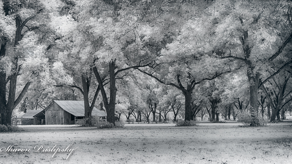
An interesting old barn and the mix and match pattern of the facade keeps me looking around the structure to see what else is there. I am thinking that you might be able to open up the shadows on the roof just a bit so more detail is brought out. Otherwise, I think this is a good capture in bright contrasty light. I'll bet this is a subject that could be shot in various ways to create many different compositions. If I lived nearby I would try some close up shots as well. |
Nov 16th |
| 35 |
Nov 17 |
Comment |
The tree is a very strong compostional element and the strong diagonal for me lends a sense of strength and security. I think the area to the left of the tree is not helping this image and so I would suggest a crop on that side. The horoizonal lines on the right add a feeling of peacefulness which works well for the subject matter. If this were my image, I would clone in grass to cover the roadway. For me, the pale color is helping the image. My personal preference would be monochrome for this image. |
Nov 16th |
| 35 |
Nov 17 |
Comment |
I presume this is a Buddhist Temple and a very interesting one. I feel like the lens distortion causes it to appear to be leaning backward. This could be easily straightened in LR, but I fear you could lose the Buddah statue and end up with the spire too close to the top of the frame. I find that I must always remind myself to give my subject more room when I am shoot wide angle so I can straighten out these distortions. Good you are going back - we so rarely get a chance to go back and try these shots again using new learning. Can't wait to see what images you bring back from your trip. |
Nov 16th |
| 35 |
Nov 17 |
Comment |
What a fun quirky image! I like your creative interpretation and choice of colors. If I had a seaside cottage I would buy this and hang it on my wall. Very cool. |
Nov 16th |
| 35 |
Nov 17 |
Comment |
I too thought the shrubbery was rocks at first. I think there is a great deal of interest in this image. My eye follows the pathway up toward the house and then - oh look! There are two tiny people back there. I want to live here, but I would have to hire a gardener. I like the detail in the sky and the balance provided by the tall tree. Nice work. |
Nov 16th |
| 35 |
Nov 17 |
Comment |
I like the panoramic presentation. The strong horizontal lines create a sense of stasis and restfulness. For me, the horizon being right in the middle cuts the image in half, which I think is always an issue, buteven more so in a panorama. I could crop the sky and also crop off the right just at the end of the line of trees that are in the middle distance. |
Nov 16th |
| 35 |
Nov 17 |
Reply |
Thanks for those suggestions, Arnold. That makes sense to me and I will follow up. I would like to use this image in competition but felt it was lacking something. This may be it. |
Nov 8th |
6 comments - 5 replies for Group 35
|
| 52 |
Nov 17 |
Comment |
I love when I get an opportunity to capture action such as this...too often deer are running away from us instead of doing something interesting. As usual, your focus on the eye is tack sharp. However, I have to admit that I had to look closely at the area above the deer's back and the point where the mouth is on the tail to really see what this image was all about. I am making a point of forming my own opinions before I read what others have said, but I agree that the subject does not stand out enough from the background so I am not getting the full impact of what is going on in this image. But I'll bet you know how to address that. |
Nov 16th |
| 52 |
Nov 17 |
Comment |
The colors you have captured in this image are beautiful. For me, the specular highlights in the background are a pretty big distraction - one that is hard to avoid when shooting up into trees. My eye wants to leave the subject and go directly to those bright spots. Also, the tiny blade of leave overlapping the main subject in the foreground takes away from the overall presentation, but could easily be removed. For this type of subject I think it is important to find the most perfect specimen possible, and then clone out other imperfections as best we can. |
Nov 16th |
| 52 |
Nov 17 |
Comment |
Looking at your original I see you did a masterful job of bringing out the drama in the sky. The foliage looks fairly sharp considering your have stopped it down so much , and that tiny boat gives me sense of how far away into the distance I can see. Even with all that drama in the sky, for me the horizon it a bit to close to the center, so cropping a bit from the top would improve the composition in my opinion.
Just for future reference, the "?" symbols in your text above occur when you double space. For some reason, the web sight wants us to only single space within our text. |
Nov 16th |
| 52 |
Nov 17 |
Comment |
It looks like you had much better fall color than we did in Arkansas this year. Echo Lake seems to be a good place to keep an eye on through the seasons. The blues and oranges in this image are very complimentary - I always like that combination of hues. Compositionally, you have a stong horizontal line which gives me a sense of peace and restfulness, however, I feel that there is too much water. Including that much of the water might work better if the surface was calm and there was a good reflection but, here the ripplies disturb that sense of calmness I mentioned. So, I believe that cropping from the bottom to the point where the water is smooth and presenting this as a panoramic type image would give it more impact. |
Nov 16th |
| 52 |
Nov 17 |
Comment |
I like the almost monochrome look of this image. The detail in the feathers and the sharpness in the eye make me feel that the bird is alive and just waiting to pounce on some prey he has in sight - a sense of impending action even though it is still. Unless you are going to enter this in a Nature competition, my suggestion would be to clone out some of the smaller branches to reduce the "clutter" of the background. The main branches work well to frame the bird, but for me, the smaller branches are distracting. I made a point of commenting before reading what the others have said, but now that I look back I think Mike's edit is what I had in mind. |
Nov 16th |
| 52 |
Nov 17 |
Reply |
Thanks for that input, John. Personally, my style also tends to run to vivid, I especially like the sky in the first one and cannot seem to replicate it using other methods. So now I have to make a decision as to which way to go. I had not thought of metal, but I think that is a great suggestion for this image. |
Nov 11th |
| 52 |
Nov 17 |
Reply |
Carol, thanks for your comments. Apparently you and Mike are on the same wavelength. Will you please take a look at the new version I posted below Mike's comment and read the explanation I gave him. I would value your input on this version as opposed to the the first one. |
Nov 10th |
| 52 |
Nov 17 |
Reply |
I think you made some good points, Mike. I have a different work flow, but I tried to accomplish what you suggested. First, I tried making the HDR using LR and PS. AS long as I used 3 exposures it looked pretty much the same. With just the middle exposure lost a lot of the color in the sky. So I ended up doing it with just 2 exposures. Then I selectively desaturated the rocks. I did the final processing in OnOne 2018. I think I like this version better, but would value your opinion. |
Nov 10th |
 |
5 comments - 3 replies for Group 52
|
11 comments - 8 replies Total
|


