|
| Group |
Round |
C/R |
Comment |
Date |
Image |
| 35 |
Sep 17 |
Reply |
Maybe my use of the term, "tone mapping" is incorrect. However, I am finding that I often can get a better image from the middle of the three exposures I typically make by using local adjustments in OnOne along with some of the filters and presets I have available there. I certainly am not going for the "grunge" look except for some of the vintage vehicle images I collect. If we could get together some time that would be great. |
Sep 30th |
| 35 |
Sep 17 |
Reply |
Mike, are you familiar with the film simulations in OnOne Photo Raw? I think they do exactly what you are describing with the DxO film pack. |
Sep 28th |
| 35 |
Sep 17 |
Reply |
More and more I have been using only one image and doing a lot of tone mapping, etc. to create the HDR look. I have also spent a lot of time trying to learn OnOne this summer - a monumental task because there is so much there - which has helped me get better at increasing the tonal range in images. With regard to the IR, do you have any clues about deciding what ISO to use (I never go over 400)? I know that when shooting in aperture preferred mode it's a mathematical formula and I can get the same image with different combinations of settings as long as I pay attention to depth of field, but it often seems like increasing the ISO to 200 or 400 gets me a better result. I hope that question makes sense to you. |
Sep 28th |
| 35 |
Sep 17 |
Reply |
When I look at the jpg preview on my LCD screen it is b&w. When I combine the 3 exposures for the HDR image I get that little bit of pink. I think that is where color is introduced. I get the blue when I do the channel swap. You are way more experienced than I am, and I am only guessing about this. Does that explanation make sense? |
Sep 20th |
| 35 |
Sep 17 |
Comment |
The first thing I notice is the graininess which you have explained was done with some deliberation on your part. OnOne has many film simulations available and I wish I had your film background so I could use them effectively - for now it is mostly trial and error. Thanks for pointing out the "man" in the shadows. I probably would have overlooked that.
Since this may be an ongoing project for you I think I would try shooting from a perspective to the right and perhaps lower. In my opinon it would give the image more depth. I also think it might be worth opening up the shadows on the right side of the porch - I want to see more details of this interesting old house. |
Sep 16th |
| 35 |
Sep 17 |
Comment |
I think you made a good choice to alter the hugh and saturation. I like the soft feel of this scene. The huge trees add strength. They also direct my attention upward and I notice that the sky above them does not have much detail. I would consider cropping about half of the sky above the trees and brushing in some clarity and detail in the white clouds if possible. Since I am not familiar with the area I had to look hard to figure out where the wall was. I wonder if darkening that just a bit would help the viewer take in the whole scene? |
Sep 16th |
| 35 |
Sep 17 |
Comment |
In my opinion, the blue is too intense for the overall peacefulness of the scene. Two things that might be worth a try are altering the hue and saturation of the blue and cropping at the bottom. I am thinking this would crop nicely as a panorama which would eliminate the part of the water that is ripples. For me the ripples also somewhat take away from the ambiance. Those are pretty personal reactions, i know, but something to consider. |
Sep 16th |
| 35 |
Sep 17 |
Comment |
I think you have captured a very nice tonal range and the drama in the sky is to ne very pleasing. I have been watching cattle in the field near my home and thinking about doing then in IR and you have provided me with the incentive to try. in this particular imag i think they add nicely to the story you are trying to tell. I also like the title. I sense that the horizon is tilted slightly, so you may want to check that. Overall I think this is a visually pleasing image. |
Sep 16th |
| 35 |
Sep 17 |
Comment |
To me this looks like a pencil sketch, a treatment I like. I find the soft colors pleasing. The round window at the top takes my attention away from that lovely door. I am guessing that the door is where you want my eye to come to rest since you framed it so nicely with the trees. I think it would keep my eye there if you would darken it somewhat and brush in some detail. |
Sep 16th |
| 35 |
Sep 17 |
Comment |
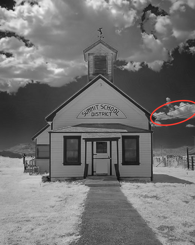
I think your choice of a symmetrical presentation for this structure is good. I checked the tonal range and see that you have data in all the quadrants, but I still felt like it should be just a bit brighter. I brought up the shadows some and cropped from the top. The electrical wires and whatever that is on the roof edge where I circled were a distraction for me. If the image were mine I would clone them out as they do not seem to go with the era in which this structure was built and occupied. Otherwise, this looks to me like a keeper. |
Sep 16th |
 |
6 comments - 4 replies for Group 35
|
| 52 |
Sep 17 |
Reply |
The same to you, friend. Hopefully it will be a productive fall for both of us, |
Sep 28th |
| 52 |
Sep 17 |
Reply |
Richmond is a beautiful area and I would love to get back there sometime...it has been quite a while. We are heading off to the Michigan UP at the end of next week. Hope we are not too late for fall color. Last year it developed later than usual and this year it looks like it is ahead of schedule. No matter what there are still those beautiful lakes to photograph! |
Sep 28th |
| 52 |
Sep 17 |
Reply |
Thanks for commenting on this image, Nelson. It is really hard to get a good "nature story" rather than just a portrait of an animal. I shot hundreds of images this particular morning and only a few had interesting action. So it was partially luck that resulted in this image. |
Sep 28th |
| 52 |
Sep 17 |
Reply |
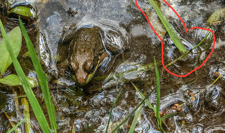
I see your point about that blade of grass contributing to a sort of frame. What I was thinking was that the smaller blades below it point me toward the frog but the one on top leads my eye out of the frame. The very small hot spots could be removed with the healing brush in PS, but the larger ones may require some cloning. I would use a soft brush and reduce the opacity to about 65% and then select the pixels I want and brush them in. You could also try using the clone tool on darken and see which works best. What you have to watch out for it clone "tracks", so enlarge it and make sure you have smoothed them out. Of course, removing anything other than by cropping makes the image inelligible for nature competitions, so I guess it depends on what you plan to do with this image. |
Sep 18th |
| 52 |
Sep 17 |
Comment |
What can I say? The composition is very appealing to me and the position of both subjects works well. I especially like the way the lines in the tree bark lead my eye to the foxes. The aperture you used gave you what looks to me to be the best possible DOF. (My husband has that camera and lens and I wish I did too, but it is just too heavy for me.) The color tones are very harmonious. All in all, I think this is a real winner. |
Sep 16th |
| 52 |
Sep 17 |
Comment |
I have been trying to capture a frog image in the pond in my yard for years but they are pretty elusive. Sometimes I hear them but they stay hidden or jump before I can press the shutter button. So good job!. For me the blown out highlights are a distraction. You could try to tone them down or even carefully clone them out. It might help to crop as in my visual feedback below which would eliminate some of the work. I would also get rid of the vegetation I have circled as it detracts from the composition. I think you have placed the frog well within the frame, even with the crop. I would do a levels and curves adjustment layer then perhaps add a subtle vignette. |
Sep 16th |
 |
| 52 |
Sep 17 |
Comment |
So I won't be seeing any more of those winter scenes that remind me of Michigan? As it happens my extended family is from the Richmond and Louisa County area, so maybe you will show me some other familiar locations.
These colors are so restful - blues and greens always work for me. I like the curve of the shoreline and the clear reflections. This looks like a place you could return to in almost every season and capture a nice image. To me, the sky seems to have a bit too much cyan, so I would move the hue slider to see if I would get more blue. I think cropping a little from the bottom to eliminate the vegetation on that edge would also help with the overall impression of this place.
OK...I wrote my comments before reading Mike's and Carol's, but I see we are thinking similarly. Whether or not you alter this image, I think you have found a worthy subject, one that you will be able to do a lot with. |
Sep 16th |
| 52 |
Sep 17 |
Comment |
Congrats on capturing a strong nature story. I like the way you have placed the "point of conflict" between the seals at such a strong point in the frame. You might consider applying a graduated ND filter if you have it available in your post processing software and adjusting it to transition just where that rock above the seal on the right is. I think that if this were my image I would also try it in monochrome. You might have to boost the contrast but I am thinking this would make a good black and white. |
Sep 16th |
| 52 |
Sep 17 |
Reply |
You are absolutely correct. That is the original of anotther image in this series. Don't know what I was thinking! Thanks for your comments. |
Sep 14th |
| 52 |
Sep 17 |
Reply |
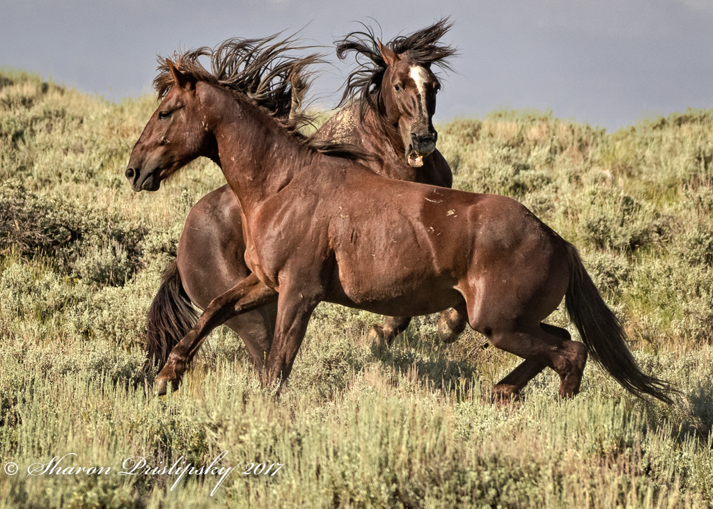
Thanks, Carol. Photographing wild horses has been on my bucket list for a long time. We were lucky to find these. It had rained the night before and water collected in large pools along the gravel road. Since the area is so arid, the horses were congregated around these temporary water holes. I'll see what I can do about lighting up that eye. Good suggestion. |
Sep 12th |
| 52 |
Sep 17 |
Reply |
I hope the fact that you are commenting on images already means that you are not having to evacuate your home. Thanks for the suggestions. I used the clone tool on darken to get rid of that halo on the grass. The 1:1 crop is much too tight so this was the best I could do. |
Sep 9th |
 |
4 comments - 7 replies for Group 52
|
10 comments - 11 replies Total
|


