|
| Group |
Round |
C/R |
Comment |
Date |
Image |
| 35 |
Apr 17 |
Reply |
Now that I have the enhanced black and white conversion I am going to try to replicate this effect. I will let you know how successful (or not) I am. |
Apr 17th |
| 35 |
Apr 17 |
Reply |
You have a great sense of humor. I can see what you were thinking. I will have to give your idea about slowing down the eye some thought...it's not the way I naturally see it, but it may work in this situation. I always say that if I show an image to 20 different people I will get 20 different opinions - all of them valid. Thanks for explaining your take on this. |
Apr 17th |
| 35 |
Apr 17 |
Comment |
I really like the blues and browns in this image. I keep looking at your original. You have explained what you did with the chair - which I find really beautiful, but I keep wondering if the brown is just a result of the channel swap of if you did something to enhance it. Your post-processing skills are obviously top notch and I think I could learn a great deal from you. |
Apr 16th |
| 35 |
Apr 17 |
Comment |
For me, this is a very interesting piece of art. I like where you have placed the sculpture in the frame and the contrast works well for me. I am curious about the issues involved in photographing someone else's art. I work with the PSA Journal and we have had some legal issues with photos of sculpture and even architecture in some some instances. Have you encountered any issues of that sort? As always, your postprocessing is exceptional and overall, I like this image. |
Apr 16th |
| 35 |
Apr 17 |
Comment |
In my opinion, the goal of a landscape image is to create a path for the viewer to enter and move through the image. The fence is a problem for me in that regard, but once past it the path works quite well. I also noticed that the horizon line is in the middle which, for me, cuts the image in half. I am glad that you added some interest in the sky. |
Apr 16th |
| 35 |
Apr 17 |
Reply |
Thank you for these comments. You are getting at something I have been thinking for some months. I was introduced to IR by an American fine art photographer who does a lot of faux color. When I first saw his work I too was a bit unsettled, but the more I looked at his images, the more I liked them. I do not mean to suggest that I am capable of creating anything like the quality of work Mark does, but it did make me look at things in a different way, which is why I got the 590nm conversion. Also, the subject matter where I live is very different from what you have described. For example, in southern U.S. it is not uncommon to see homes painted pink, blue, green or even lavender. I appreciate that you have expressed your personal reaction. I always say that if I show my work to 20 different people I will get 20 different reactions. That is fine with me; when I react to someone else's work I always try to keep in mind that mine is only one of the reactions they will receive, so I make an effort to express it in personal terms, as you have done here. Thanks for explaining. It will help us understand each other better in the future. |
Apr 15th |
| 35 |
Apr 17 |
Reply |
Thanks, Julie. I agree with you about choosing a different perspective. Unfortunately, this is a formal garden and visitors are not permitted to move off the pathways, so I had little choice. I really do not like the tree in the middle of the scene and tried to crop to get it out of the "bull's eye". Every spring I try to get a good image that includes that Redbud, but they tend to grow in the most difficult places. Oh well, it gives me a challenge...maybe next spring. |
Apr 11th |
| 35 |
Apr 17 |
Reply |
I did not take your comments as derogatory at all. I think you are one of the better commenters in our group because you always make it clear that you are stating your opinion. I understand that all of this is very subjective. What is of interest to me is how different the British aesthetics are. I think we are all influenced by the color palates in our environment.The south and western parts of the U.S. are very sunny and colorful. I just returned from a trip to the southwest where the rocks are red and gold and the skies are big and blue. Here in the south we have a lot of swamps and bayous where the water is green. So I naturally look for color. My newest conversion camera is enhanced black and white, so perhaps I will be capturing images that are more natural looking to Brits. Rest assured, no offense was taken. |
Apr 11th |
| 35 |
Apr 17 |
Comment |
I really like the composition and the way you have used the elements in this image. To me, however, it appears to be very soft. It also appears to have a very narrow tonal range. Because the composition works so well, if it were mine, i would try to selectively lighten and darken various areas and increase the structure or detail to give it some "pop". |
Apr 10th |
| 35 |
Apr 17 |
Reply |
Helen, I read your comment early this morning and I have been thinking about it ever since. I guess I am as puzzled by your reaction to the color as you are by the color itself. The colors in this image are not much different from how they exist in reality. The pink tree is a Redbud which blooms profusely in the American south. The water is a little lagoon, and is actually green from algae. The bright yellow-greens are early spring color. I did not do the channel swap which would have resulted in more golds and teals. Of course I have increased saturation a bit, however, not in my opinion, excessively, although if you think it should be less contrasty I might try that. I also applied an oil paint filter, but I do not think that changed the colors, only the texture. The camera I used captures a bit of the visible spectrum at 590nm. So, my question is, are these colors not typically found in your area in early spring? I have visited Ireland, but it was in fall and to me everything looked Emerald green, just as it is supposed to. I have not had the opportunity to visit the English countryside, although I would like to do that. I will be very interested in your response. |
Apr 10th |
4 comments - 6 replies for Group 35
|
| 52 |
Apr 17 |
Comment |
When you sent this image in I was immediately struck by the oriental feel of it. I think it is both the soft background and the minimalism of it that created this impression. the bird is tack sharp and the colors are lovely. I would not change a think about it. |
Apr 13th |
| 52 |
Apr 17 |
Comment |
When I first looked at this image I immediately reacted to the colors which are lovely. The second thing that caught my attention was the shadows, which I think detract from the overall image. I keep two different sets of diffusers in my kit and use them regularly. i too have been in several workshopswith Mike Moats an I think his advice about lookin for the specimen that is "different" from the rest. |
Apr 13th |
| 52 |
Apr 17 |
Comment |
This is a fine portrait of an Egret in breeding colors. To me, it seems a bit over sharpened. I would not have thought of tilting it a bit, but I am aa big fan of diagonal lines, so I like Mike's suggestion. I think it would add strength to the image. |
Apr 13th |
| 52 |
Apr 17 |
Comment |
For me, the right formula seems to be about twice as much room in front of the subject as behind to give it the maximum impression of forward motion. So I would crop a bit on the right. |
Apr 13th |
| 52 |
Apr 17 |
Comment |
I think your choice of settings was spot on. The eye and beak are tack sharp. I like the lighter background. I think that adding some space in the foreground might improve the composition. For me, the bird is too close to the front of the image - almost like it is about to step forward and out of the frame. I would just add some canvas. Otherwise, a great image. |
Apr 13th |
| 52 |
Apr 17 |
Comment |
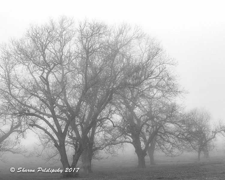
I love foggy images. This one is very "moody" which really appeals to me. I had a completely different idea, however, which I formed before I saw what the others have suggested. I thought it needed more contrast and definition. I worked on it in LR, increasing contrast and clarity and setting white and black points.
i added more fog using Color Efex Pro 2. I also cropped a tad on the left. I hope you don't mind that I edited it rather than just making suggestions. |
Apr 10th |
 |
6 comments - 0 replies for Group 52
|
10 comments - 6 replies Total
|


