|
| Group |
Round |
C/R |
Comment |
Date |
Image |
| 22 |
Nov 25 |
Comment |
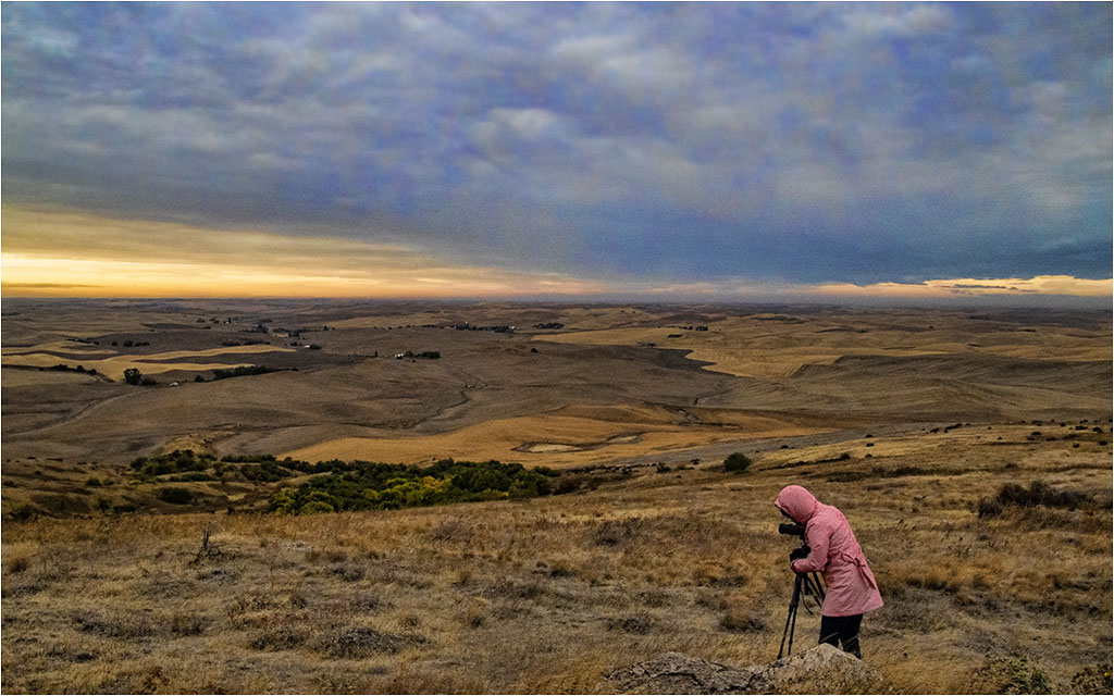
I find it hard to comment on this one. I know Mike only uses LR which cannot do composites. We are a study group and doing new projects and trying new software is recommended.
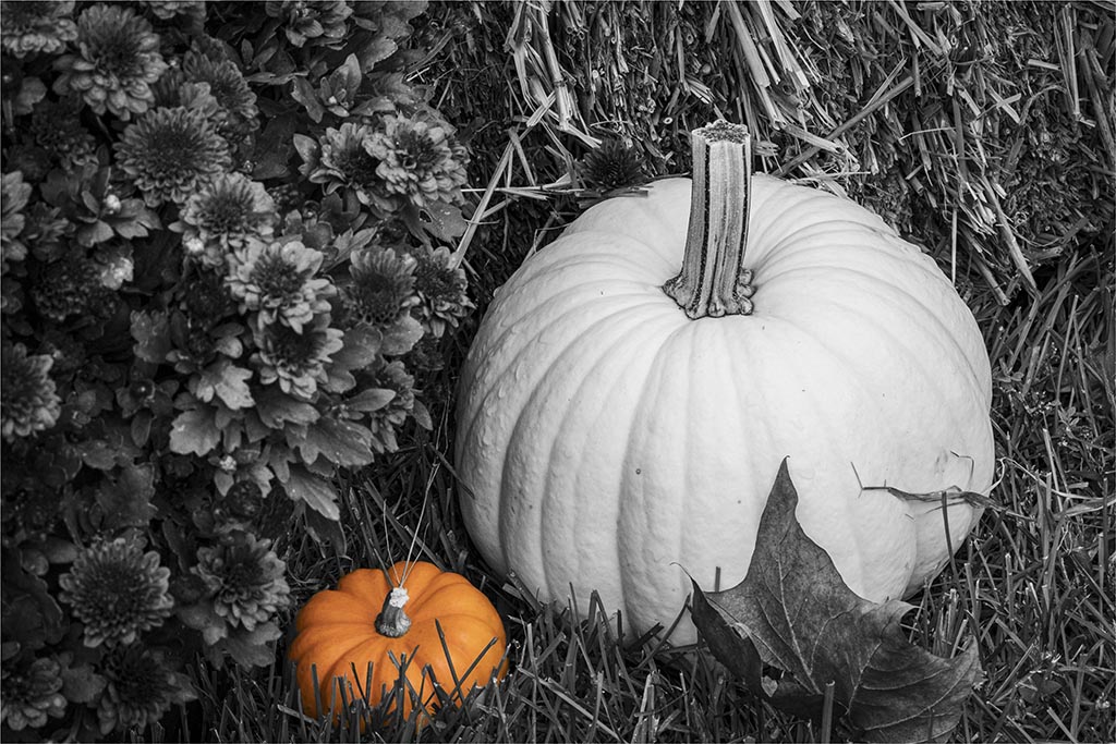
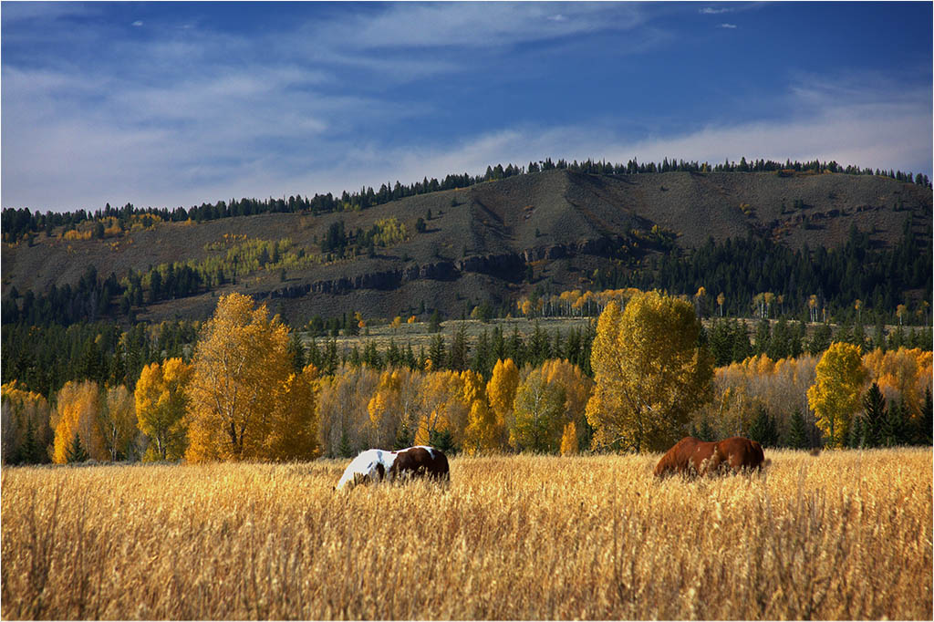
It is a nice scene but to me, doesn't have a big impact. Other than some cropping, I don't see much difference from the original. |
Nov 18th |
| 22 |
Nov 25 |
Comment |
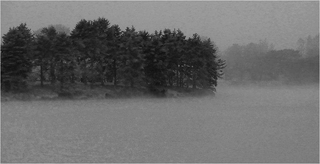
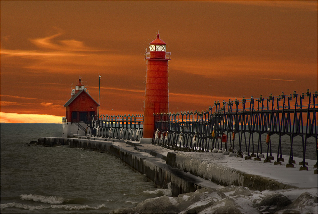
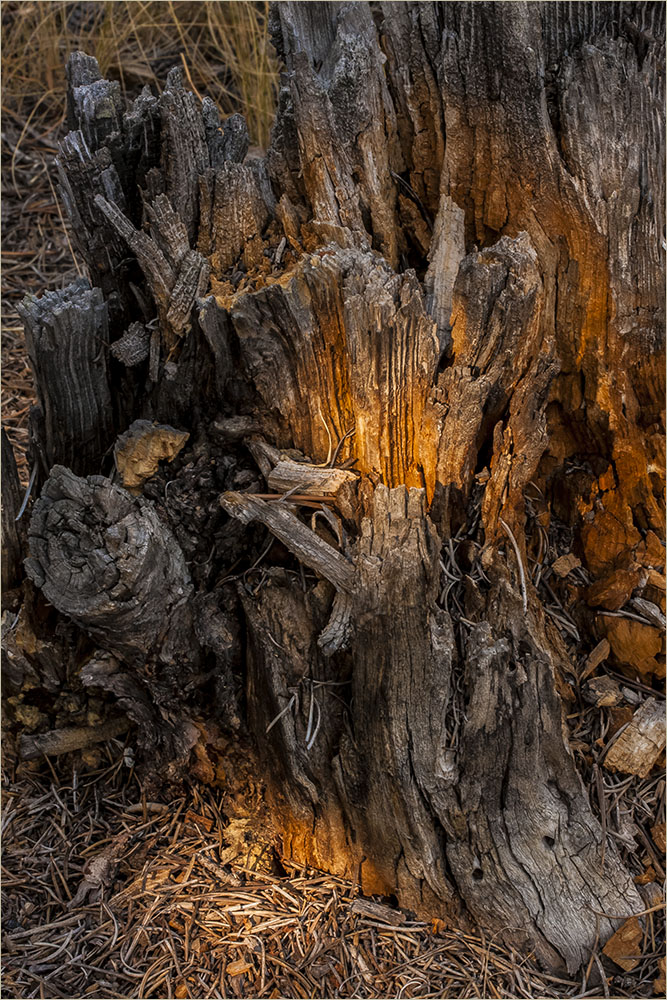
Very interesting. I like the ice-like appearance. I agree it should go to PSA for the Journal. Great job. |
Nov 18th |
| 22 |
Nov 25 |
Comment |
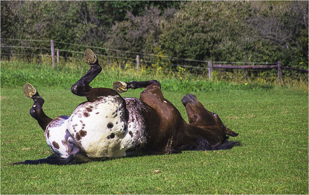
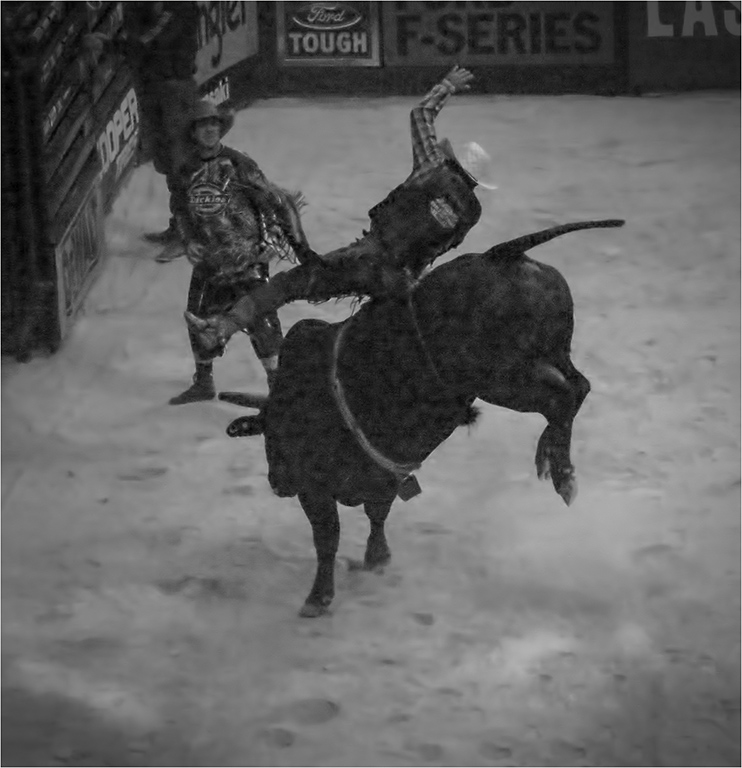
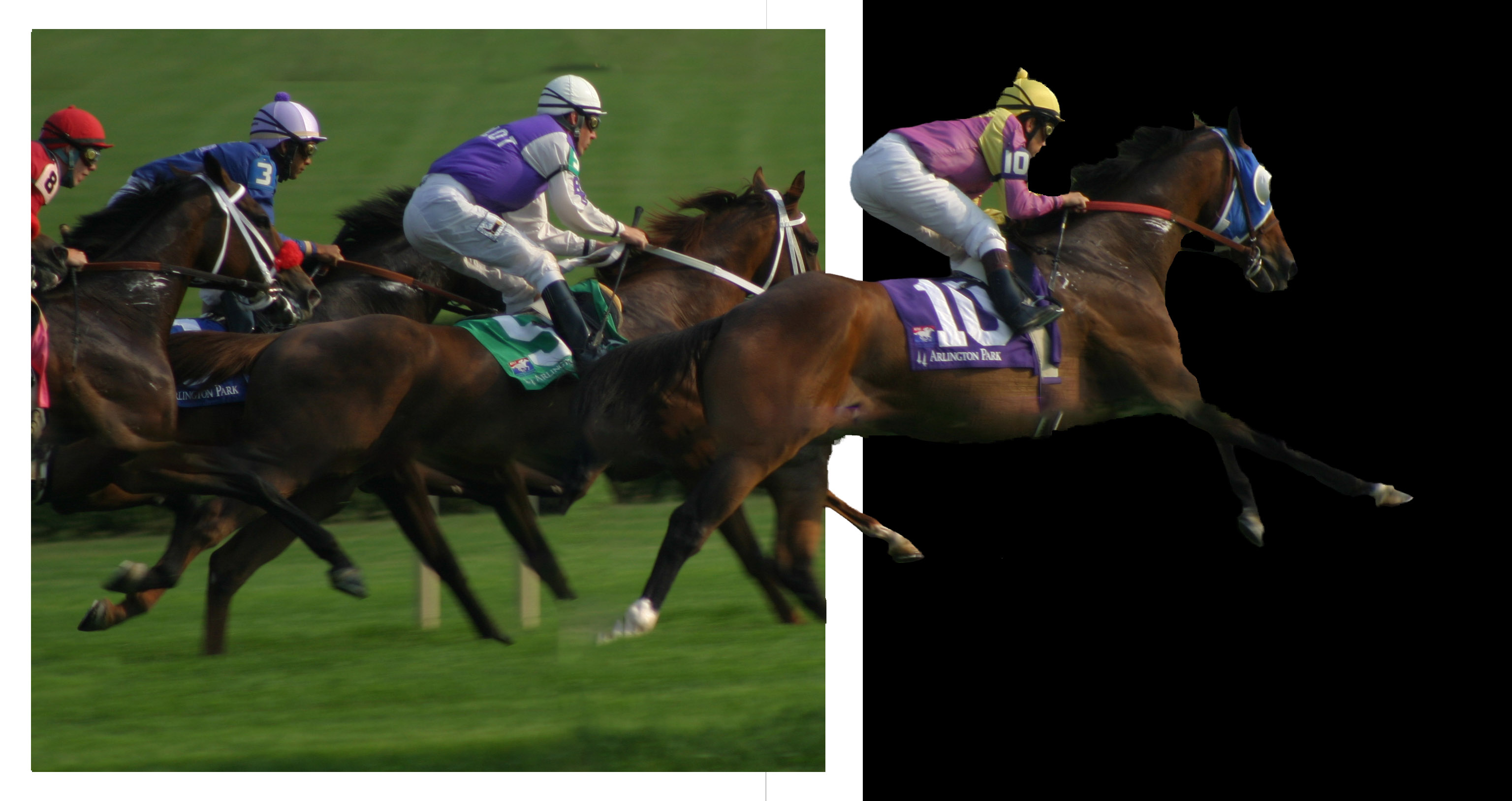
Very good! Reminds me of my riding days. The background is nicely muted and the horse and rider sharp. The sequence is done very well. I'm going to disagree with Peggy about the horses. On a shiny horse (and most of them have sleek skin when showing), the light will make changes to the coloring. |
Nov 18th |
| 22 |
Nov 25 |
Comment |
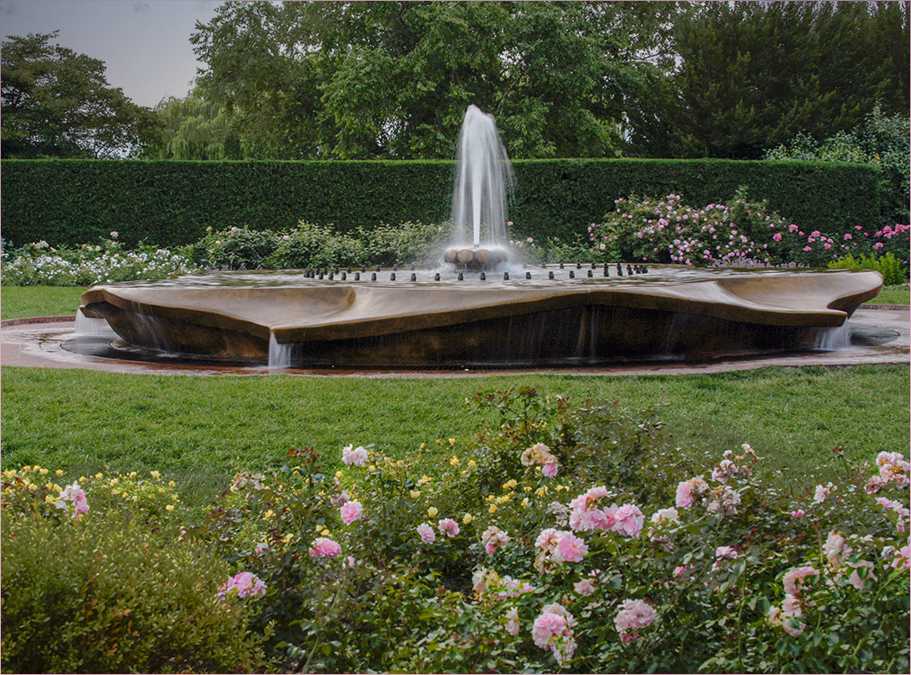
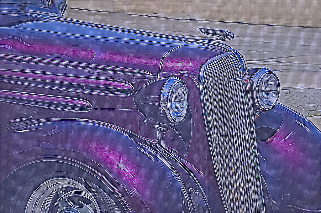
Interesting. I agree with Jerry about the blue. I feel the fountain might be a little over-sharpened. Perhaps reducing some of the blue tone in the fountain might make it more realistic? |
Nov 18th |
4 comments - 0 replies for Group 22
|
| 80 |
Nov 25 |
Reply |
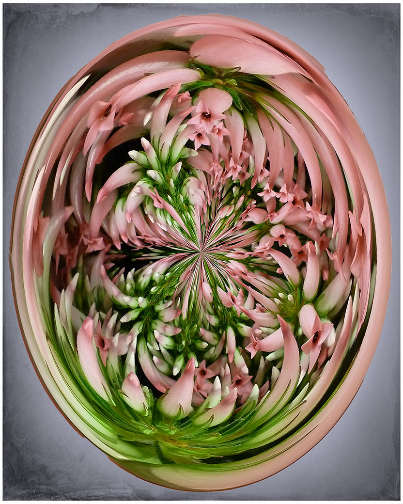
Yes it is a filter in PS - I should have started with Filter, Distort, then Polar Coordinates. There will be 2 choices below the image: you want to choose Polar to Rectangular. Say OK. Go to Image and Image Rotation-Rotate 180 degrees. Go back to Polar Coordinates and choose the first option.
If you create an Action, it will be so easy to try it on any image - even if the image seems unusable. Sometimes you get some surprising results. I usually try my action before tossing questionable images.
|
Nov 20th |
| 80 |
Nov 25 |
Reply |
Can't wait to see what Kamal does once he upgrades to 2025! |
Nov 17th |
| 80 |
Nov 25 |
Comment |
Tried a little cloning and color changing. It still resembles the other main flower but perhaps a little better? |
Nov 17th |
 |
| 80 |
Nov 25 |
Reply |
Yes but that can be changed. The easiest would be to change the center point of the image but that would change the whole way it works. I will probably try to change the color or burn it in a little. |
Nov 17th |
| 80 |
Nov 25 |
Reply |
You will be amazed at what's happened since CS6! |
Nov 17th |
| 80 |
Nov 25 |
Reply |
Notifications are in trouble and it is being worked on. Recommended you check periodically until fixed. |
Nov 17th |
| 80 |
Nov 25 |
Reply |
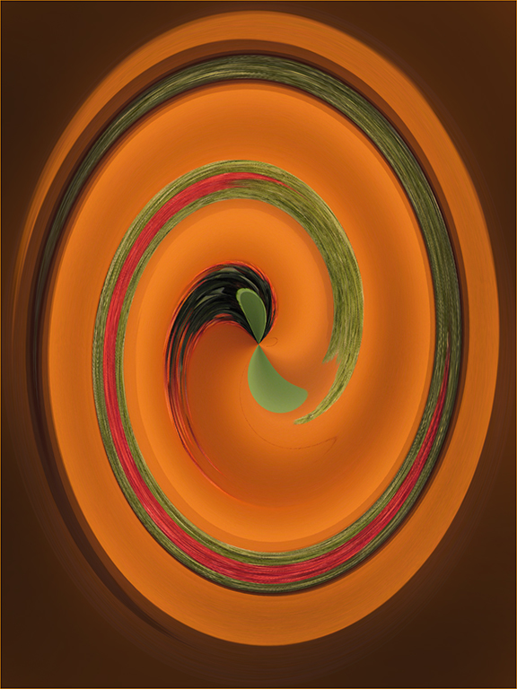
I like to try the "warp" on throw aways too. You never know what you'll get. Varying the center spot can change the whole image. The center point will become the outer portion and the outer portions become the center-which is why the greens ended up in the center.
BTW - does anyone know how to get the center point to actually show? It used to when I made a selection but I can't seem to find it. Sure helps when you want to pick a color and get the center point on it. |
Nov 12th |
| 80 |
Nov 25 |
Reply |
Time for Kamal to upgrade his Photoshop? :) |
Nov 12th |
| 80 |
Nov 25 |
Comment |
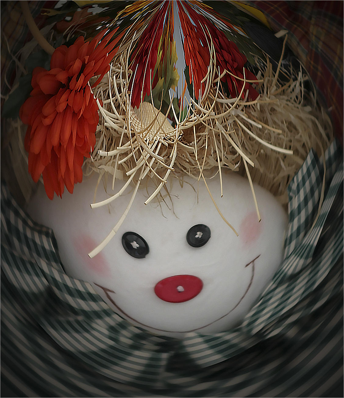
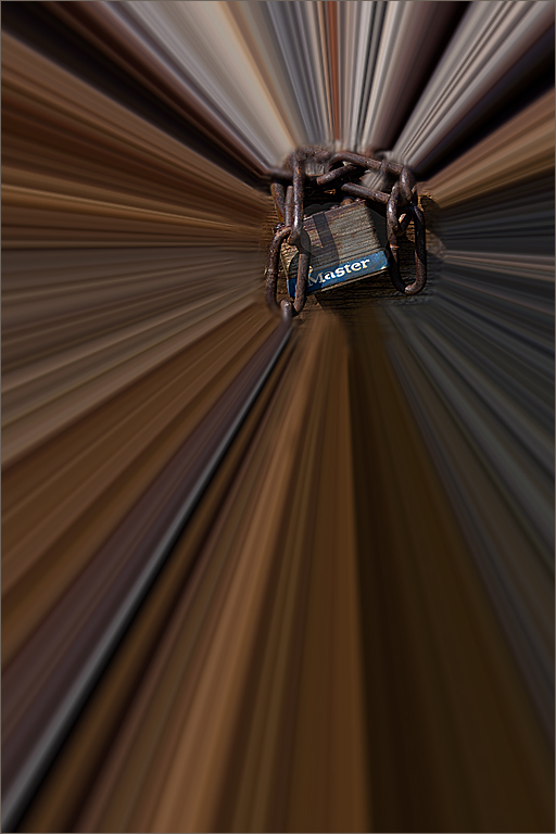
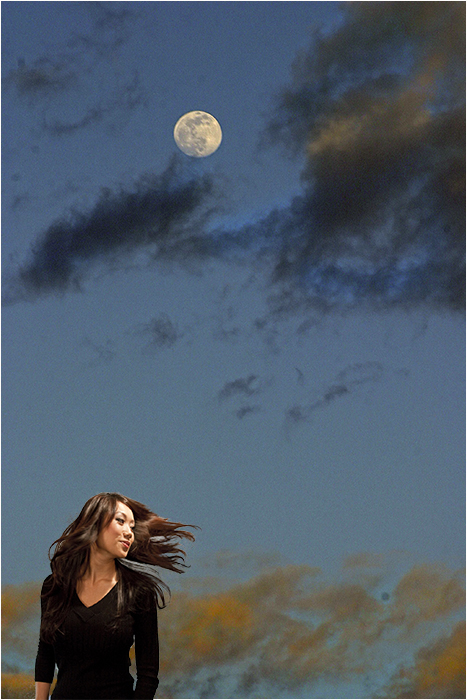
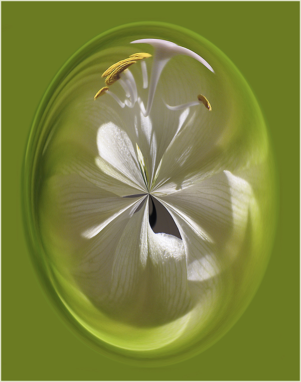
It's an interesting concept. I think I'd like to see a little more black in the lower right corner. It might make it look more like the moon. I rather like the original better. Hope you don't mind if I copy your idea for a future image. :) |
Nov 7th |
| 80 |
Nov 25 |
Comment |
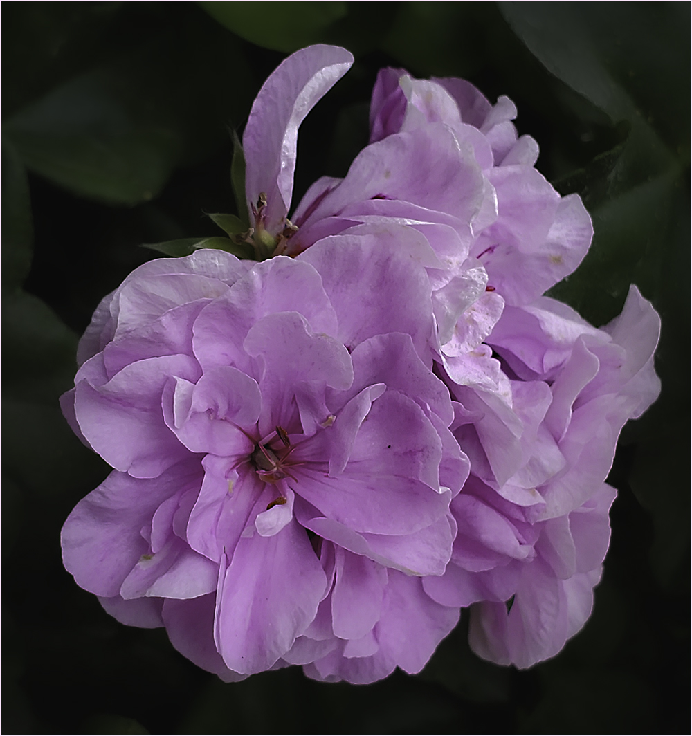
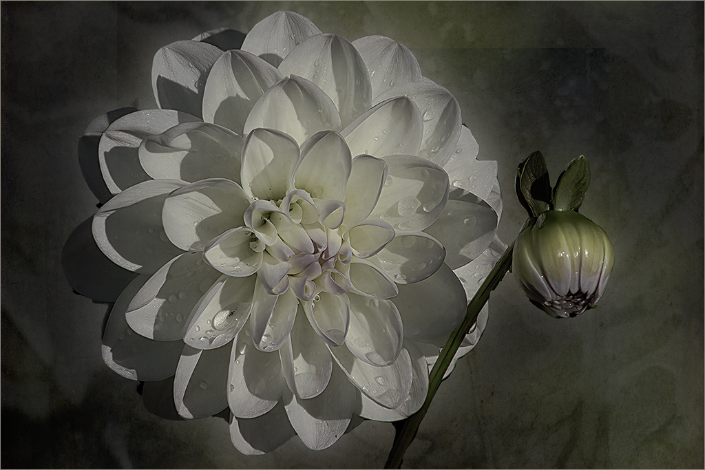
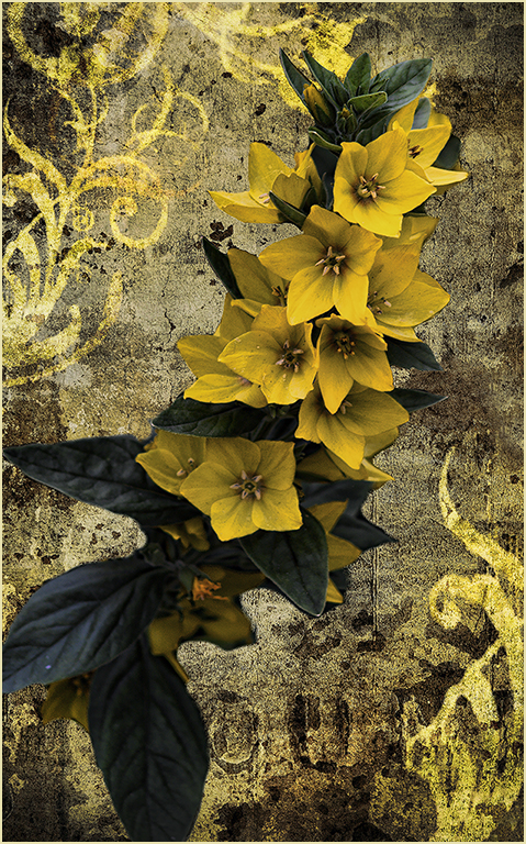
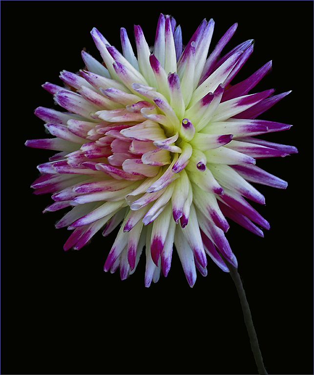
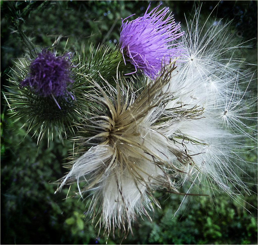
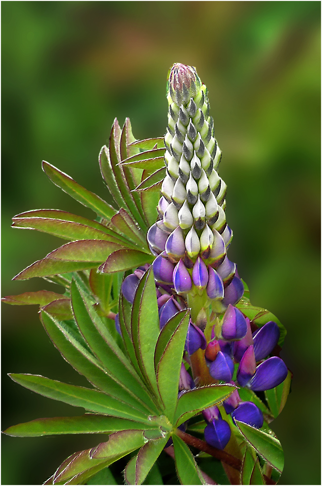
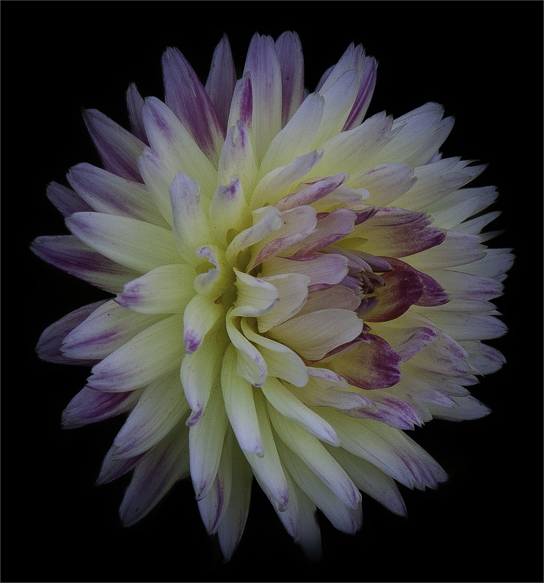
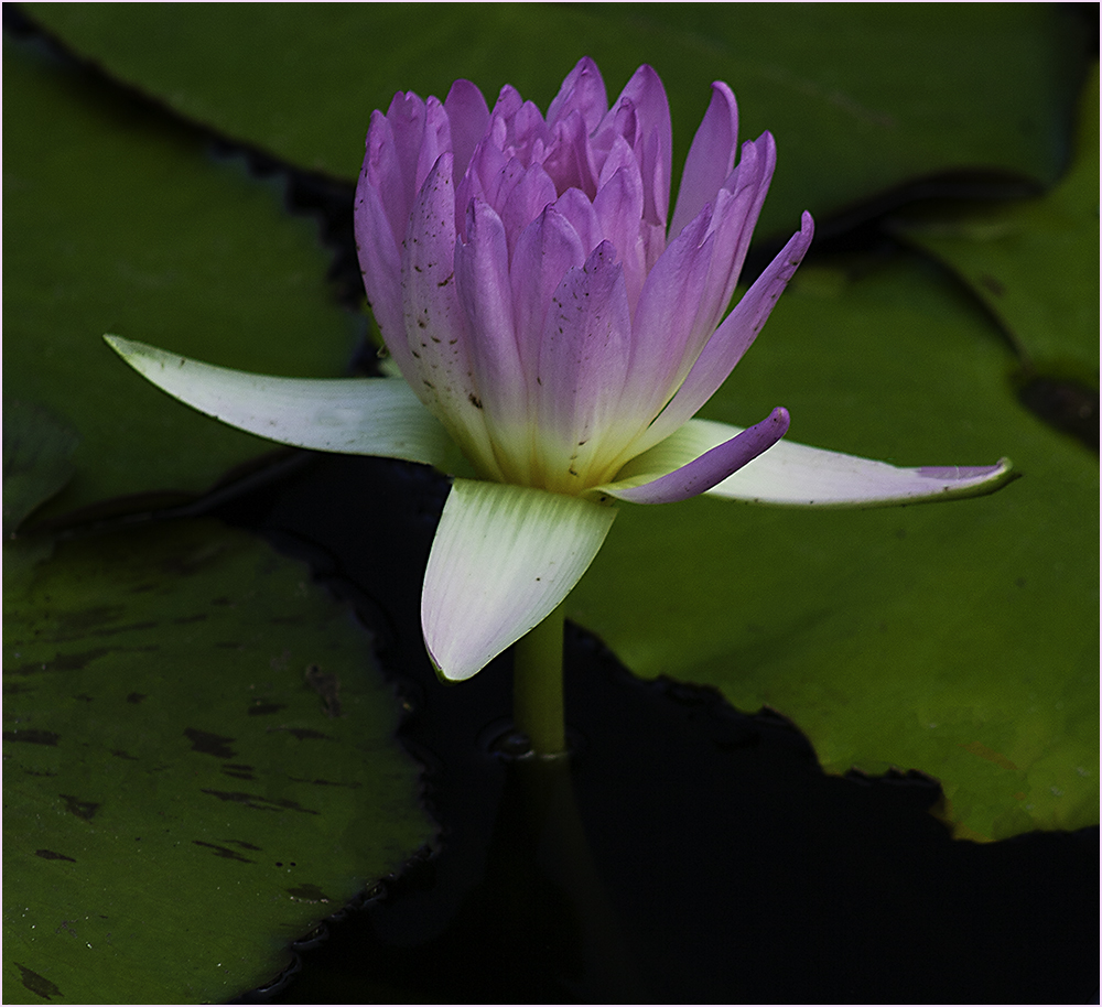
Another stunning image! Love the change of position of the flower. My only picky comment is that I wished you had not cropped so tight on the bottom. |
Nov 7th |
| 80 |
Nov 25 |
Comment |
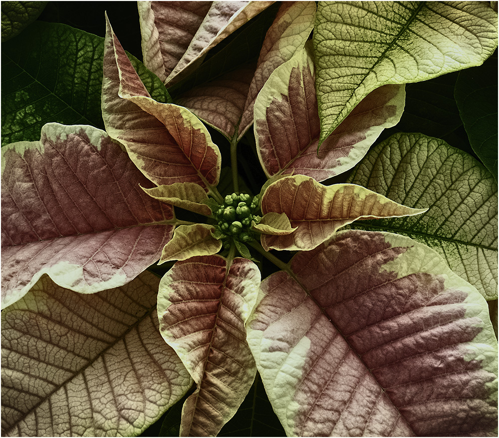
The concept is good and I feel you did a good job of processing it. I do think there is took much green on the right. I took the liberty to try an alternate idea. Cropping the image down to nearly square, I did a flip horizontal to face the rose the other direction and gave it a little sharpening. Also removed the tiny light green spot that was by itself in the upper right. |
Nov 7th |
 |
| 80 |
Nov 25 |
Comment |
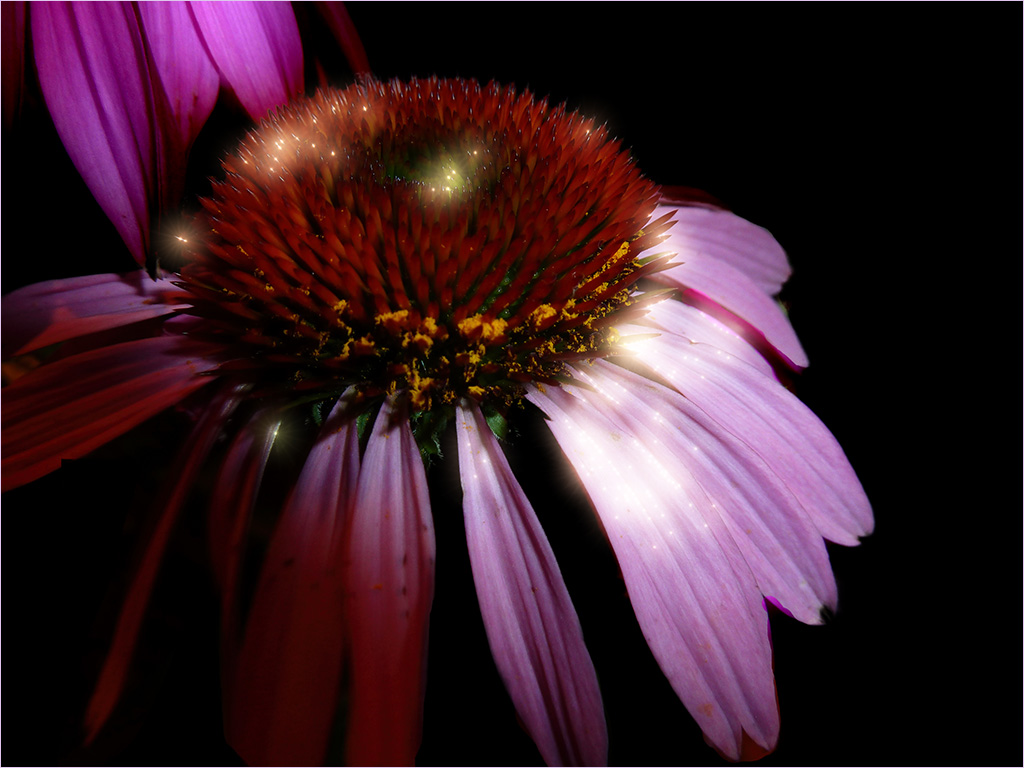
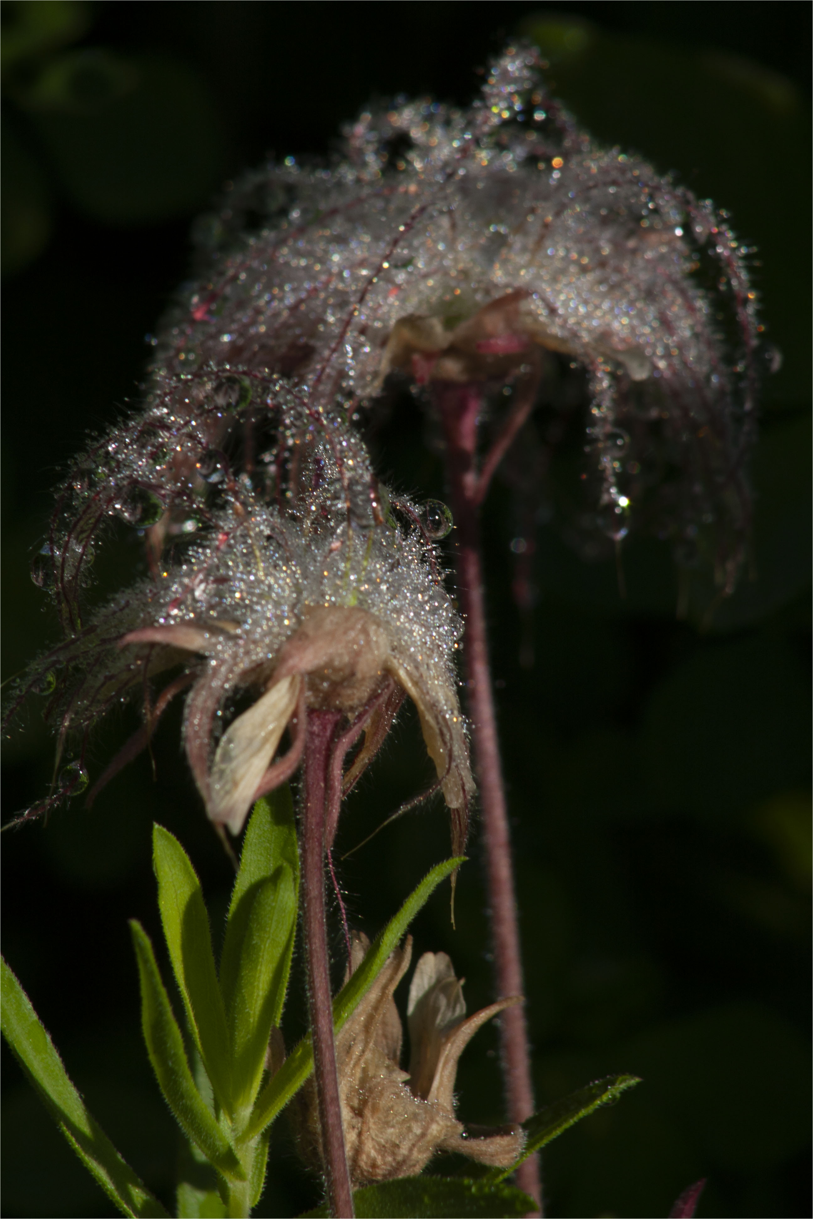
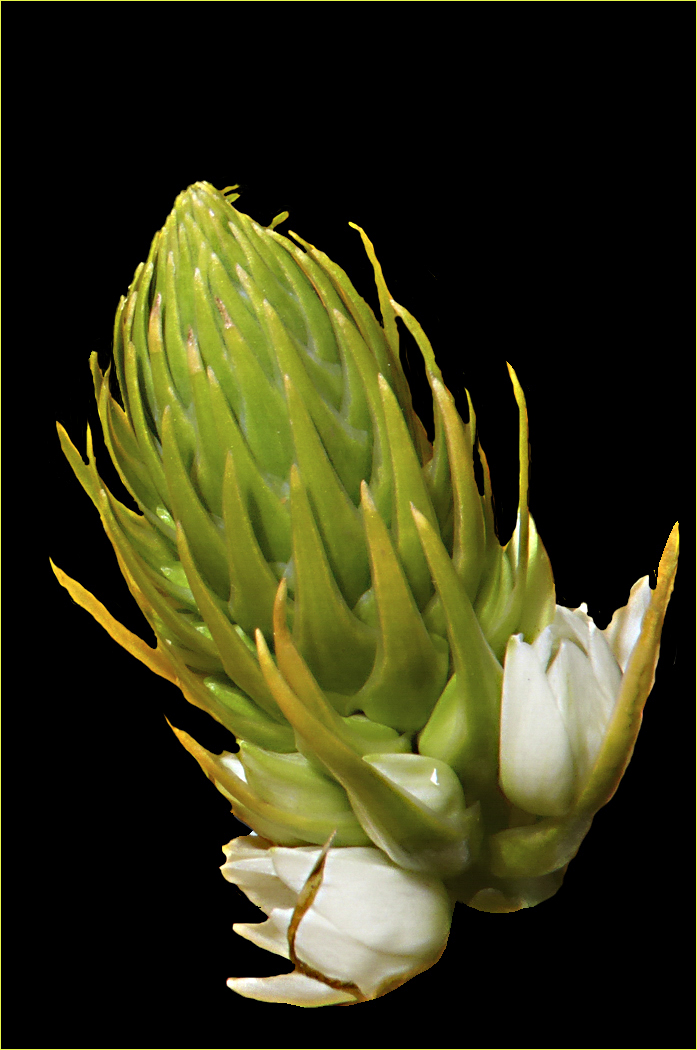
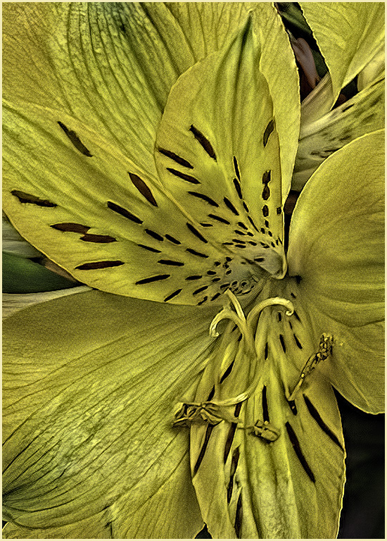
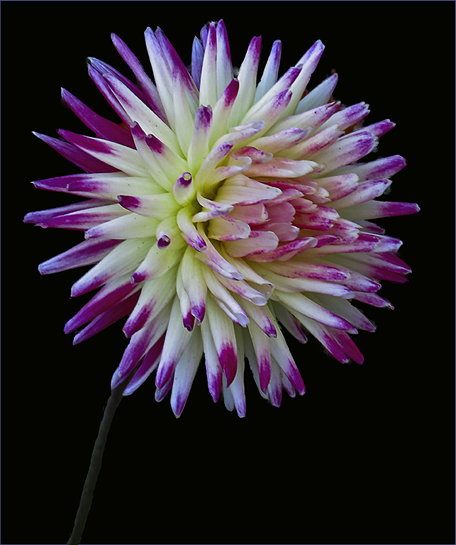
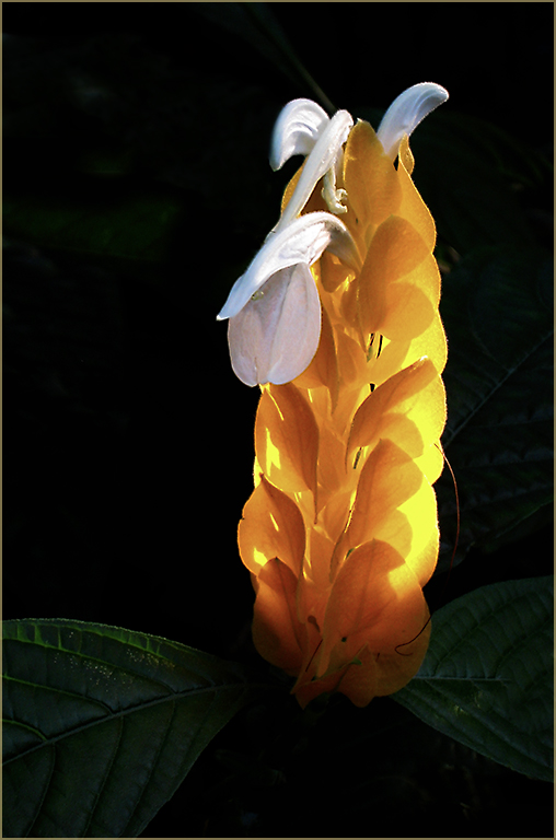
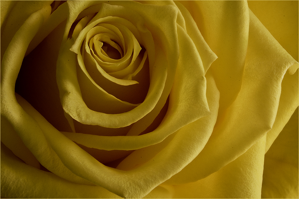
This is a very striking image. The stem looks good to me. Love the sharpness and coloring of it. I do wish a very light gold stroke were present so as to contain the image on the black background of the site. Super job though! |
Nov 7th |
| 80 |
Nov 25 |
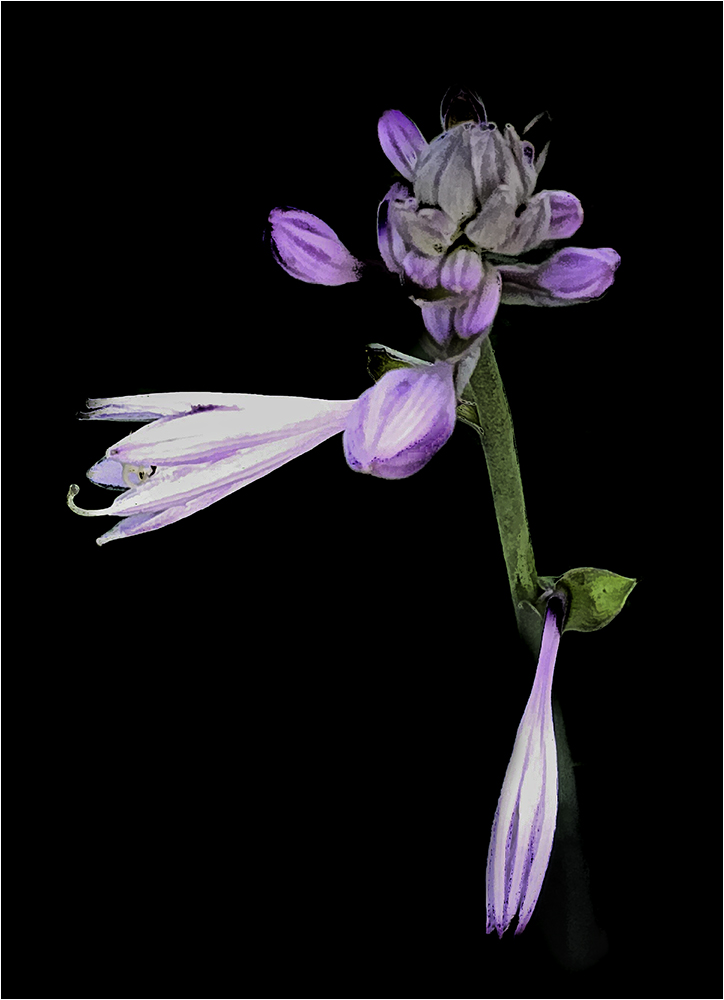
Comment |
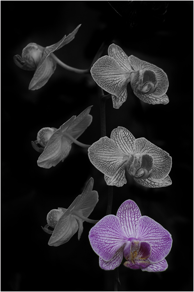
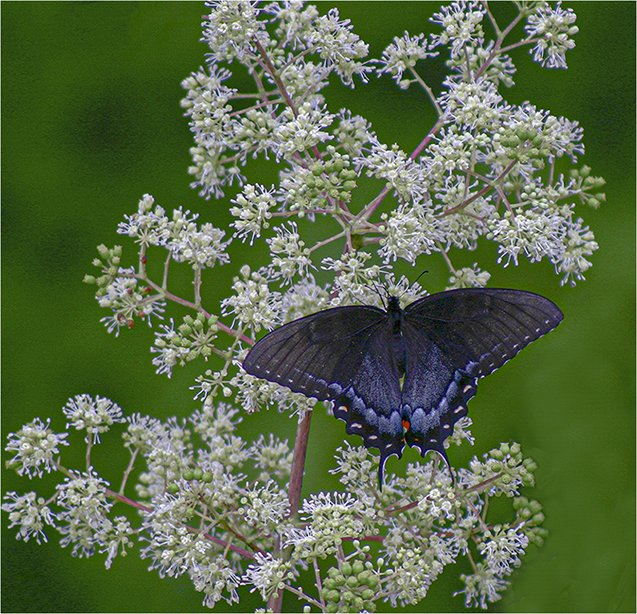
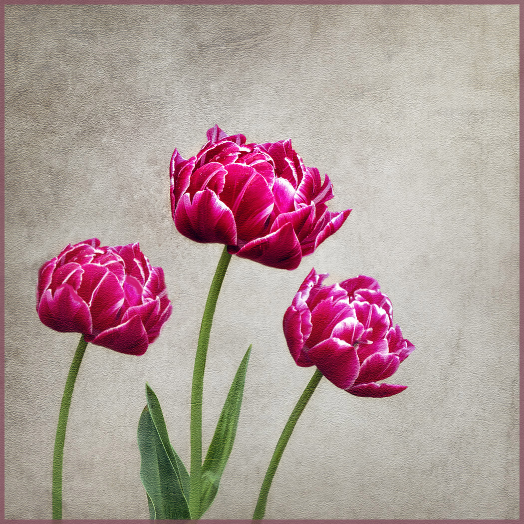
Very nice! I like the way you thought to add the third flower. The background is good too. To be picky - Perhaps removing one or two petals from the lower left flower would make it less looking like a copy? |
Nov 7th |
| 80 |
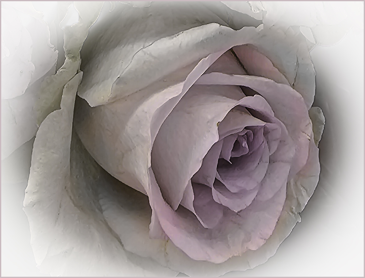
Nov 25 |
Comment |
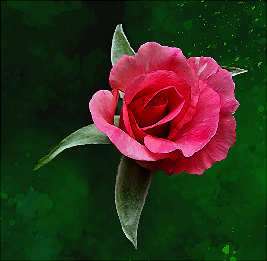
The background is nice and could be used for a lot of different ideas. To me, the rose looks sort of transparent especially on the left side - like it was painted in. I'm thinking that putting a rose with dew on that background might look better? It will be fun finding subjects to put on that background. |
Nov 7th |
7 comments - 7 replies for Group 80
|
11 comments - 7 replies Total
|