|
| Group |
Round |
C/R |
Comment |
Date |
Image |
| 22 |
Jul 25 |
Reply |
Thanks Peggy. Looks much better. I was pressed for time so I pretty much just wanted to get something up. |
Jul 21st |
| 22 |
Jul 25 |
Comment |
Interesting. To be picky, I'd like to see the shadows removed especially around his head and right arm. |
Jul 19th |
| 22 |
Jul 25 |
Reply |
If it was morning...sailor take warning. I've seen a red sky at morning twice in my life and they weren't beautiful mornings. :) |
Jul 19th |
| 22 |
Jul 25 |
Comment |
I like the story but would also like to see more of the cemetery. I rather like the fringe of branches at the top of the original. It could use a little contrast perhaps and some sharpening. |
Jul 19th |
| 22 |
Jul 25 |
Comment |
I agree with Joe on the trailing vehicle. For me, I'd like to see a color difference between the car and the background. It is an interesting capture though. |
Jul 2nd |
| 22 |
Jul 25 |
Comment |
I like the monochrome one best I think. The saguaros seem to stand out more. Not sure if I would crop the tree as I think it adds to the framing of the mountain. |
Jul 1st |
4 comments - 2 replies for Group 22
|
| 80 |
Jul 25 |
Reply |
Thanks for the tip! |
Jul 21st |
| 80 |
Jul 25 |
Comment |
It is a very nice image of the rose. I'm going to disagree with the right side being distracting. For me, my eye gets drawn to the out of focus leaf on the left and the white spot next to the rose. I like the sharpness on the right side. |
Jul 19th |
| 80 |
Jul 25 |
Reply |
I like the stroke for this one. |
Jul 13th |
| 80 |
Jul 25 |
Comment |
I wish I could see an original of sorts but I realize you are stacking them. I find it very heavily weighted on the right side and with no stroke to show where the end of the frame is on the left. It just sort of flows out to the blackness on the left for me. The flower just seems "harsh" in color and tone to me and not natural. I do appreciate your attempt on what is probably a difficult subject. |
Jul 6th |
| 80 |
Jul 25 |
Comment |
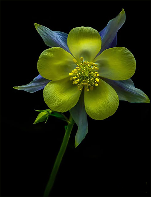
Stunning! To be very picky, I'm not sure I like your initials in the bottom corner. To me, it draws my eye away from the flower. Maybe fade it out some? Also I feel the stroke could be a little thinner or perhaps the blue from the flower? It seems a little heavy and sort of takes my eye away from the flower. Very nice though overall.
My attempt. |
Jul 6th |
 |
| 80 |
Jul 25 |
Comment |
It's an interesting image. Personally I'm not sure I like the blue tone and I'd also like to see some of the stem. I wish this had a stroke - very thin but enough to keep the sunflower from just floating. |
Jul 6th |
| 80 |
Jul 25 |
Comment |
The background is muted well and to me, sets off the flower. The stroke used confines my sight to the flower instead of wandering outside the frame. Very nice! |
Jul 6th |
| 80 |
Jul 25 |
Comment |
I like the twirl effect and the water on the flower. I find the bright pink of the background distracts me from the flower itself. Perhaps changing the color to a muted green or toning down the brightness of the pink? |
Jul 6th |
6 comments - 2 replies for Group 80
|
10 comments - 4 replies Total
|