|
| Group |
Round |
C/R |
Comment |
Date |
Image |
| 22 |
Jun 25 |
Comment |
Very nice work on the coloring. As Peggy says, it's stunning. I'm wondering if leaving a little more of the brown foreground would give it more depth? Beautiful image though. |
Jun 30th |
| 22 |
Jun 25 |
Comment |
Nice capture! I agree with Peggy about the sharpening. I feel the tail almost seems cut off at the bottom. Perhaps a little less sky and a tad more fence? |
Jun 30th |
| 22 |
Jun 25 |
Comment |
Interesting idea. I'm a little bothered by the top where it just seems to me to be cut off. Not sure what was there in reality. |
Jun 30th |
| 22 |
Jun 25 |
Comment |
I agree with all of the comments. With the background removed it would be even nicer. I'm not liking the flowers that are cut off on the edge and bottom but it is very colorful. |
Jun 30th |
| 22 |
Jun 25 |
Comment |
Quite interesting. I like the way the trees almost seem like rain pouring down when I first look at it. Nice job. |
Jun 30th |
| 22 |
Jun 25 |
Comment |
For me, there is a little too much foreground and maybe sky. I took the liberty of cropping it some to close in on the boat and the falls more. |
Jun 30th |
 |
6 comments - 0 replies for Group 22
|
| 80 |
Jun 25 |
Reply |
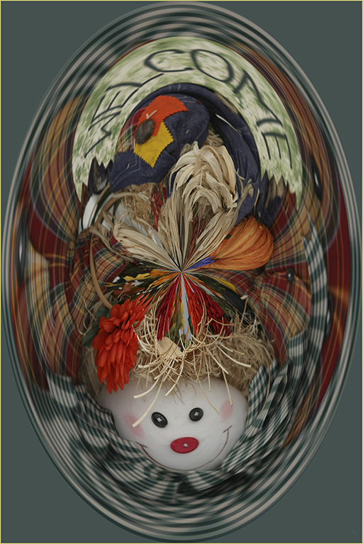
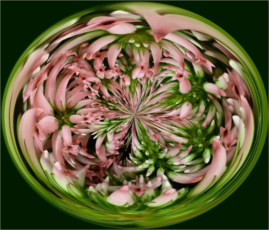
Make an Action for it and then you can try over and over really easy. Moving the center point can sometimes drastically change the image.
You can check Group 22's "About Group 22" and at the bottom are some newsletters I wrote. April 2011 I think has the Polar Coordinates item. |
Jun 14th |
| 80 |
Jun 25 |
Reply |
I like your comment on the "point of view". It seems that most of our comments seem to be about the processing and not about looking at a subject in different ways before shooting. Thanks for the reminder. :) |
Jun 12th |
| 80 |
Jun 25 |
Reply |
Thanks Nadia. It's pretty easy and if you make an Action for it, it's really easy.
No, you don't need multiple flowers. You can do it with almost anything. Before I get rid of some images (unless they are really bad), I will "warp" them to see what I get. You never know what will show up. |
Jun 11th |
 |
| 80 |
Jun 25 |
Comment |
Both of them are really nice. The fade makes the image nice and soft to me. Hard to tell which one I like better. There is a small dark spot on the right side petal that I think is a little distracting and could be removed. Otherwise I think it's perfect. |
Jun 8th |
| 80 |
Jun 25 |
Comment |
Pretty as usual. It appears the vignette is dark on 3 corners but the lower left is more white. I'd like to see it darker. |
Jun 8th |
| 80 |
Jun 25 |
Comment |
I'm guessing these come as a pair? Composition-wise, having items in pairs tends to make the eye go back and forth so having an odd number is usually better. I would like to see the background muted or faded out more as for me, it tends to be distracting. It is a nice job on the flowers though. |
Jun 8th |
| 80 |
Jun 25 |
Comment |
Very nice. The colors work well together. I'm going to disagree with Rich on the background. I think it mutes the stem and puts more emphasis on the flower. |
Jun 8th |
| 80 |
Jun 25 |
Comment |
Hard to make any different comment than what Rich made. It's a stunning image. Composition is great as is the background. Great job. |
Jun 8th |
| 80 |
Jun 25 |
Comment |
Very cool! The colors are so vibrant. The one marked "original" is nice too. Good job on both. You can control some of the outcome on the polar coordinates by the crop and placement of the center point. |
Jun 8th |
| 80 |
Jun 25 |
Reply |
Thanks Rich. If you don't want an egg, try cropping to a square. The center will be the color of the background so you can control that with your crop. I haven't figured out how to get the center marker to show up as I used to have. Anybody with ideas, I'd be happy to know. That center marker is a big help in determining what color will be the background. |
Jun 8th |
 |
6 comments - 4 replies for Group 80
|
12 comments - 4 replies Total
|