|
| Group |
Round |
C/R |
Comment |
Date |
Image |
| 22 |
May 25 |
Comment |
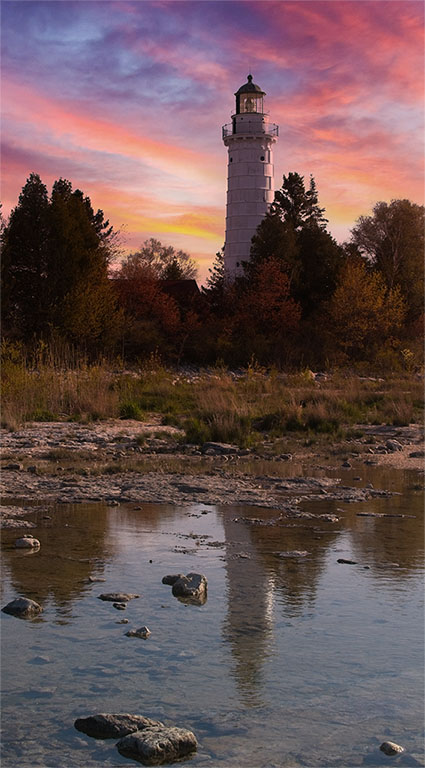
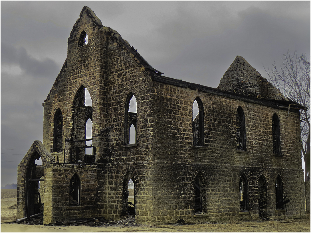
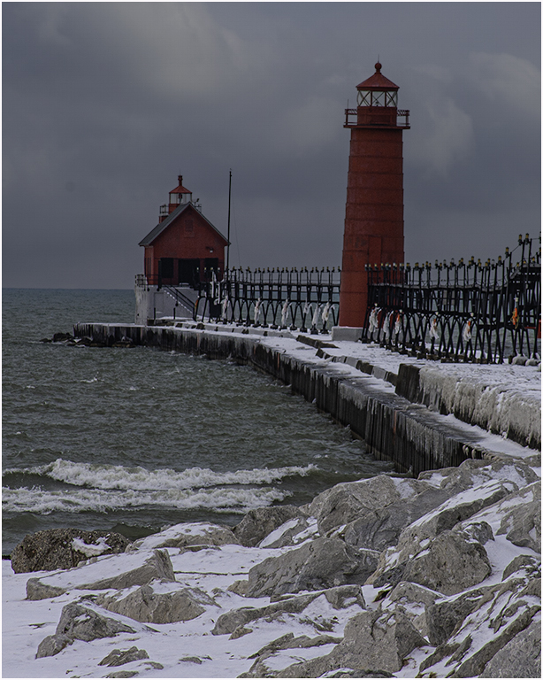
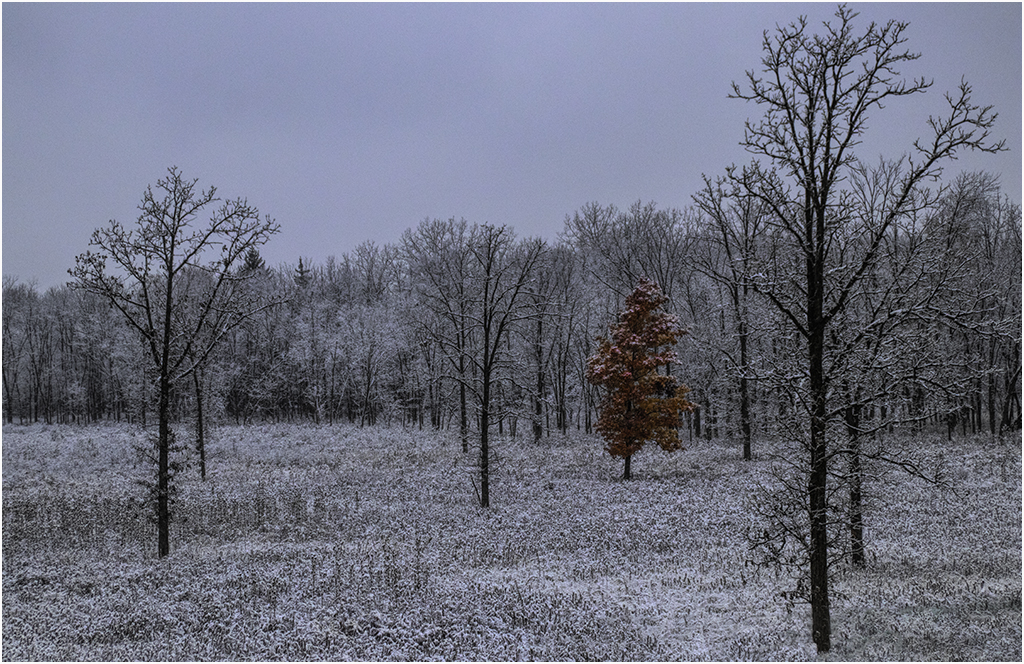
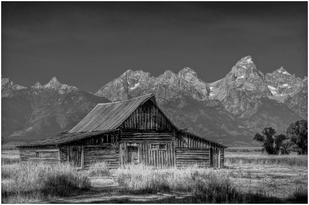
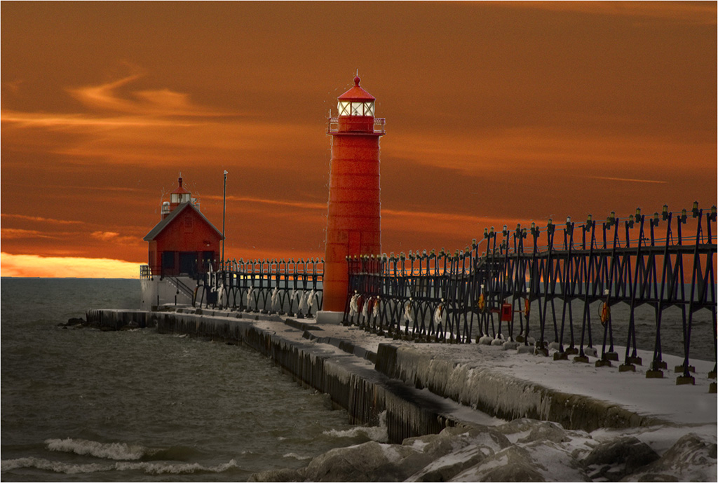
I'm going to disagree about the crop. I like the way the sky seems to add to the coldness of the image. To crop it would probably put the building more centered and I like the position it is in now.
The trees look a little "over-sharpened" to me. The trees in the original have a softer feel. I would maybe keep the original and just do the building like the final. |
May 21st |
| 22 |
May 25 |
Comment |
The image appears quite "flat". Here is my version though I like Jerry's version as well. |
May 21st |
 |
| 22 |
May 25 |
Comment |
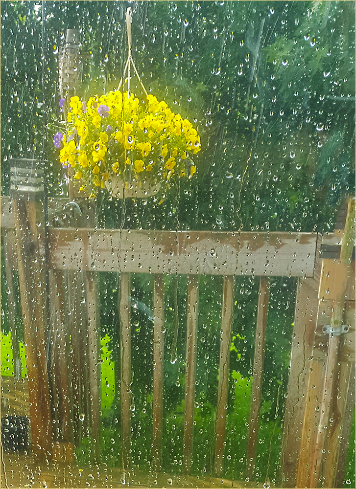
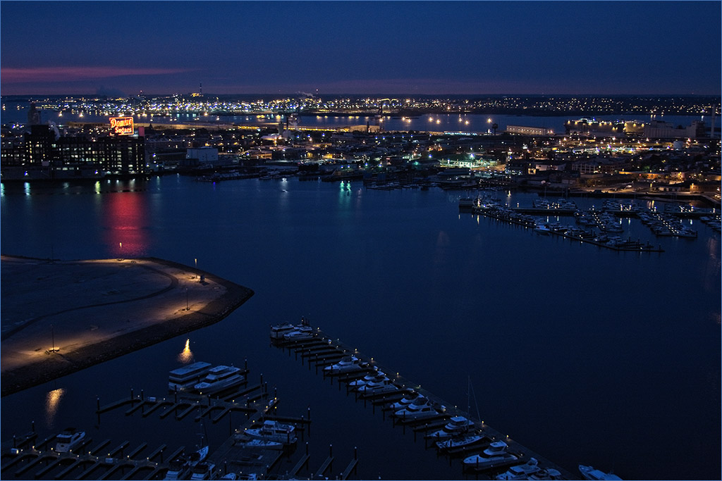
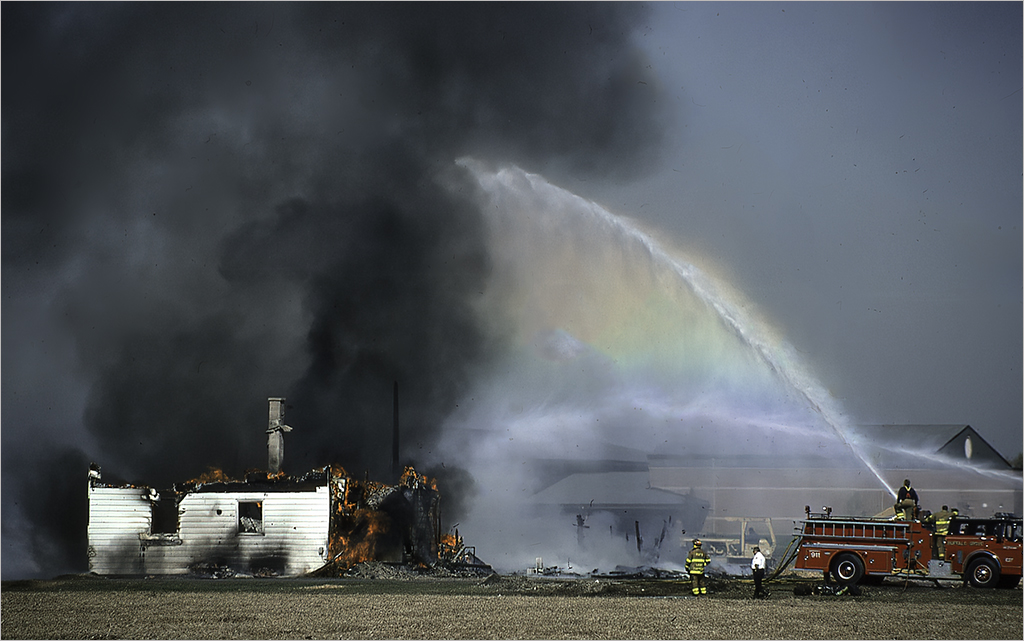
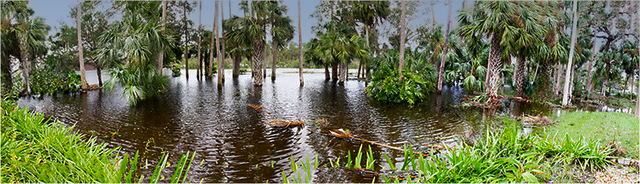
It's a nice "record shot" of the flooding. I agree with Al that it could use some saturation. I did some adjustments in brightness and contrast in PS and also a sky replacement. |
May 21st |
 |
| 22 |
May 25 |
Comment |
This appears to possibly be a rain-wrapped tornado. You were lucky if you only got some rain out of it. Interesting capture. I did see the halo effect on the poles. |
May 21st |
| 22 |
May 25 |
Reply |
They appear to be mostly cumulus and perhaps Altocumulus. |
May 21st |
| 22 |
May 25 |
Comment |
Very interesting capture. I might have commented that two bolts make my eyes go back and forth however that dark cloud by them makes like a 3rd item. Great job! |
May 21st |
| 22 |
May 25 |
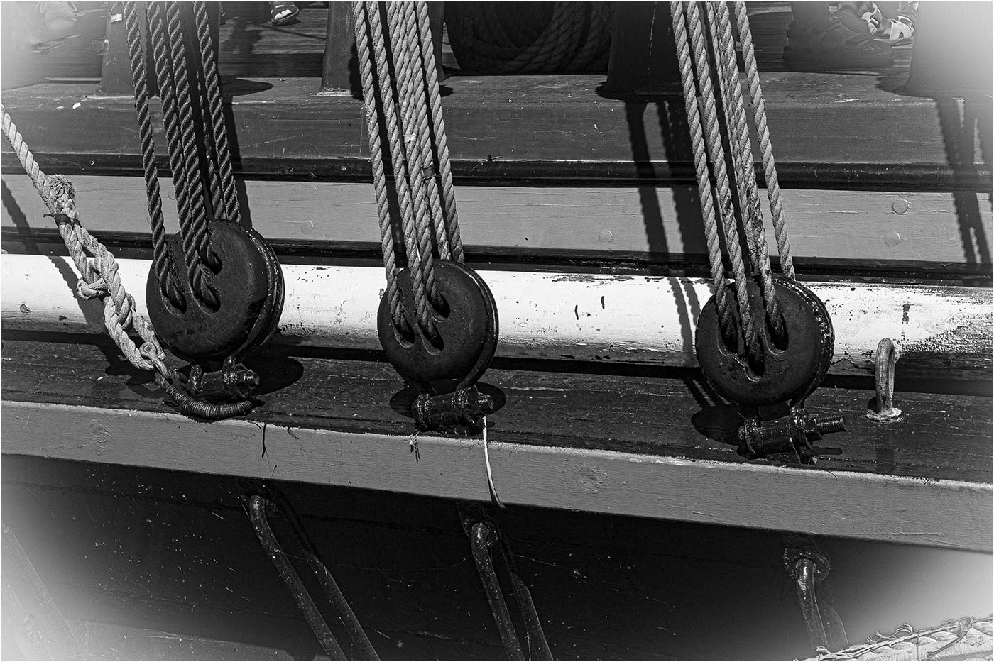
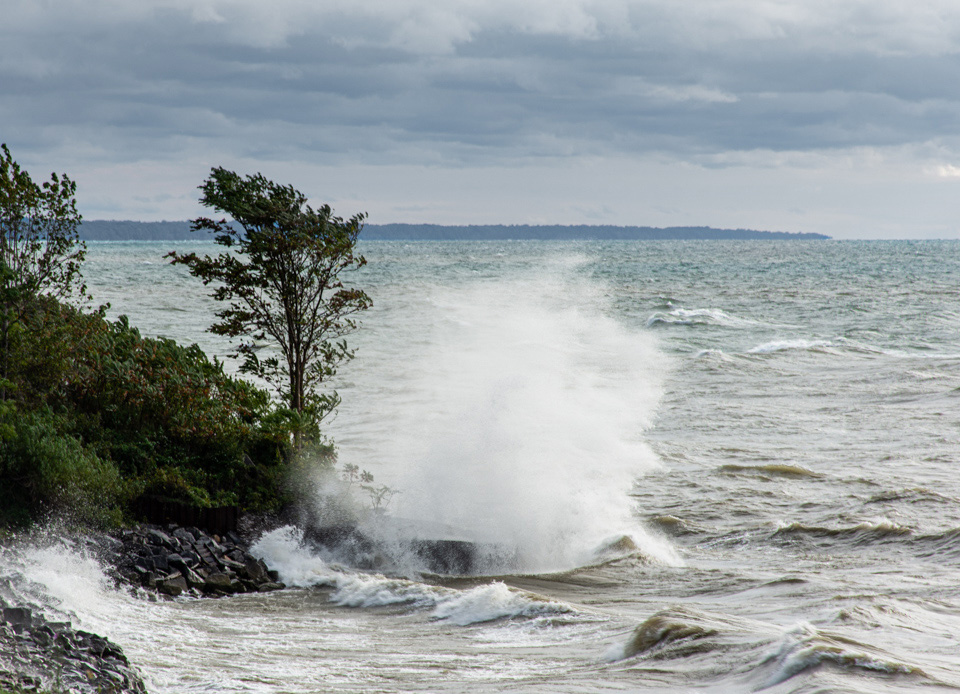
Comment |
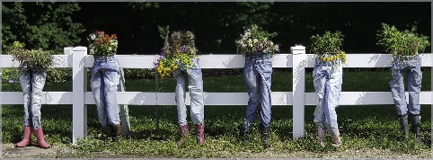
I agree with Al regarding removing the chairs and stuff on the left side and some off the bottom so as not to center the wave. I do like the enhancement you've given to the sky as well. |
May 21st |
 |
6 comments - 1 reply for Group 22
|
| 80 |
May 25 |
Reply |
Thanks Nadia. I didn't notice the twig either until I saw the comments. |
May 21st |
| 80 |
May 25 |
Reply |
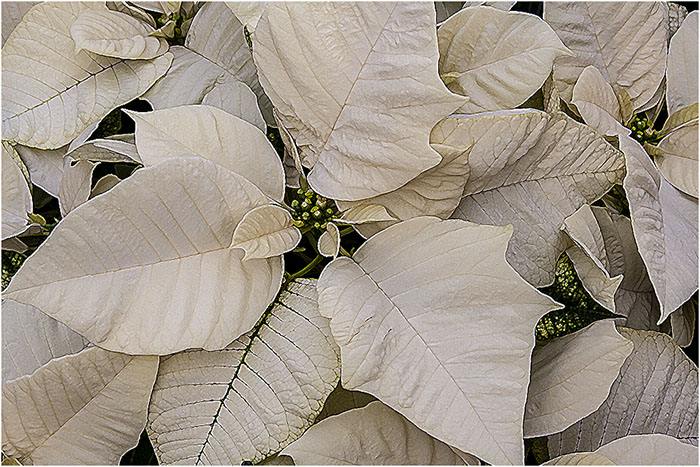
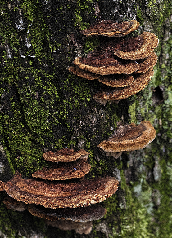
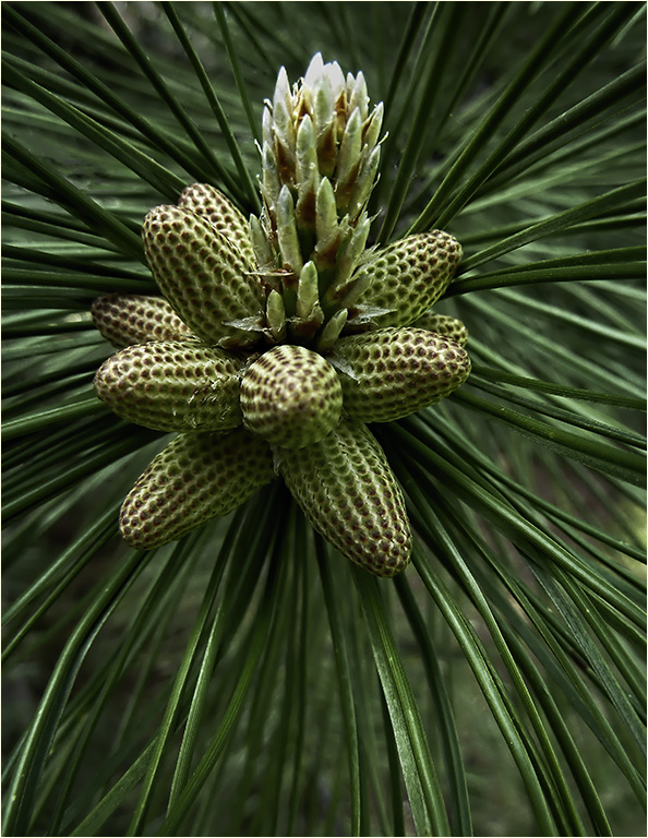
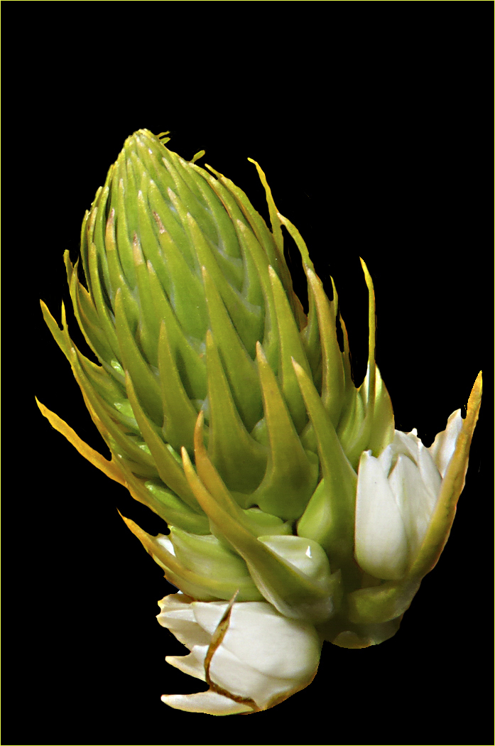
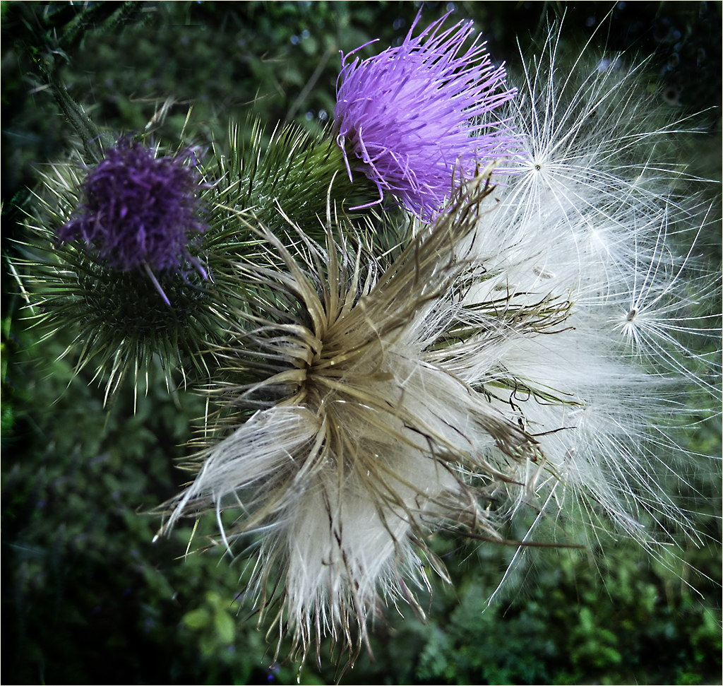
Thanks Rich. The cropped color version didn't quite do what I wanted. I had thought about perhaps coloring the baby pine cones toward the bottom but that, most likely, would have upset the composition. |
May 21st |
| 80 |
May 25 |
Reply |
Thanks Syed (or is it Kamal you go by?) |
May 21st |
| 80 |
May 25 |
Reply |
So many new things in PS and LR I need to learn. Thanks for the rework! |
May 21st |
| 80 |
May 25 |
Reply |
They were comfortable..getting a little worn now. :)
I agree about the twig..should have been removed. |
May 21st |
| 80 |
May 25 |
Reply |
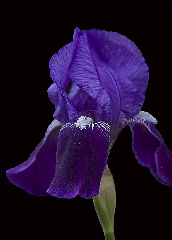
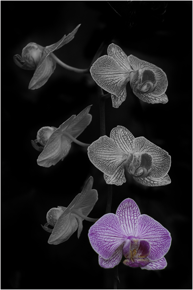
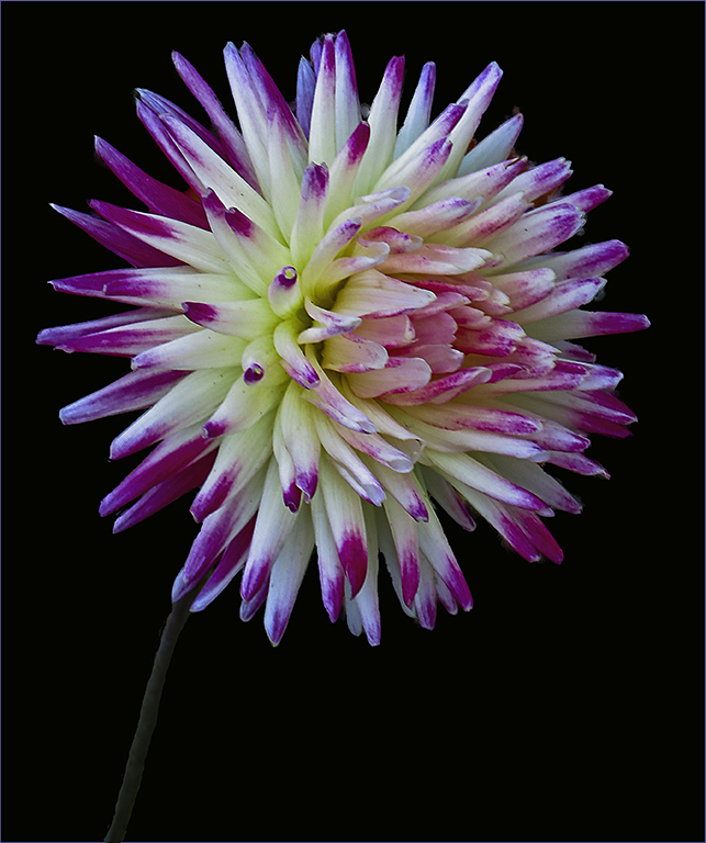
Nice rework. Normally you get "criticized" for have items touch or get cut off by the edge but here it works quite well.
To get back on the stroke idea - if someone were to put this image in without a stroke, you would see all black background and part of the flower cut off. On Doug's rework here, you can tell it's intended because of the gray background. On black it would just look cut off. |
May 21st |
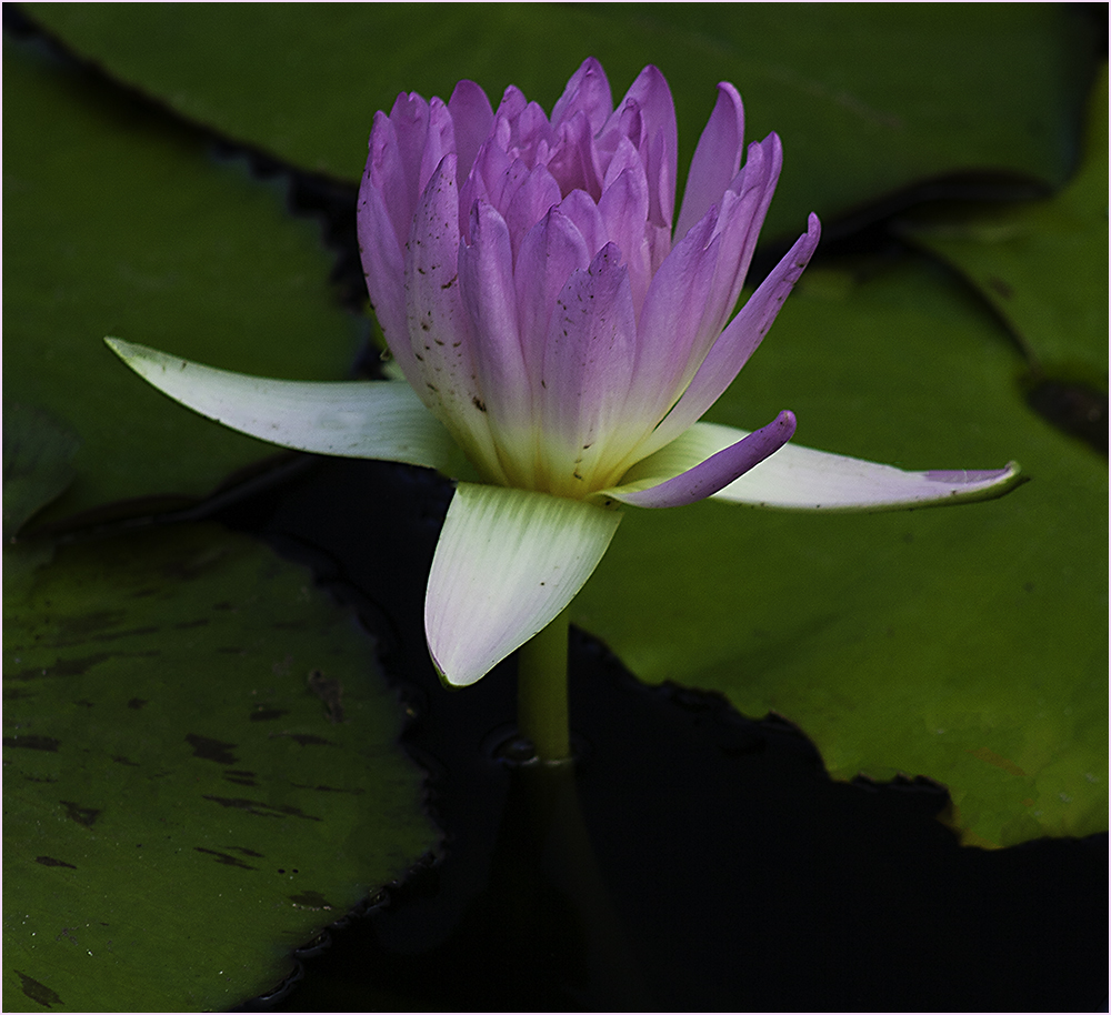
| 80 |
May 25 |
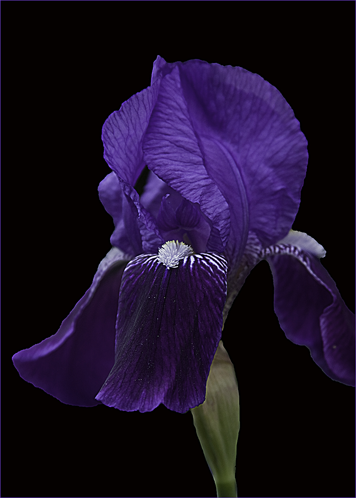
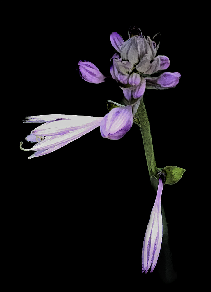
Comment |
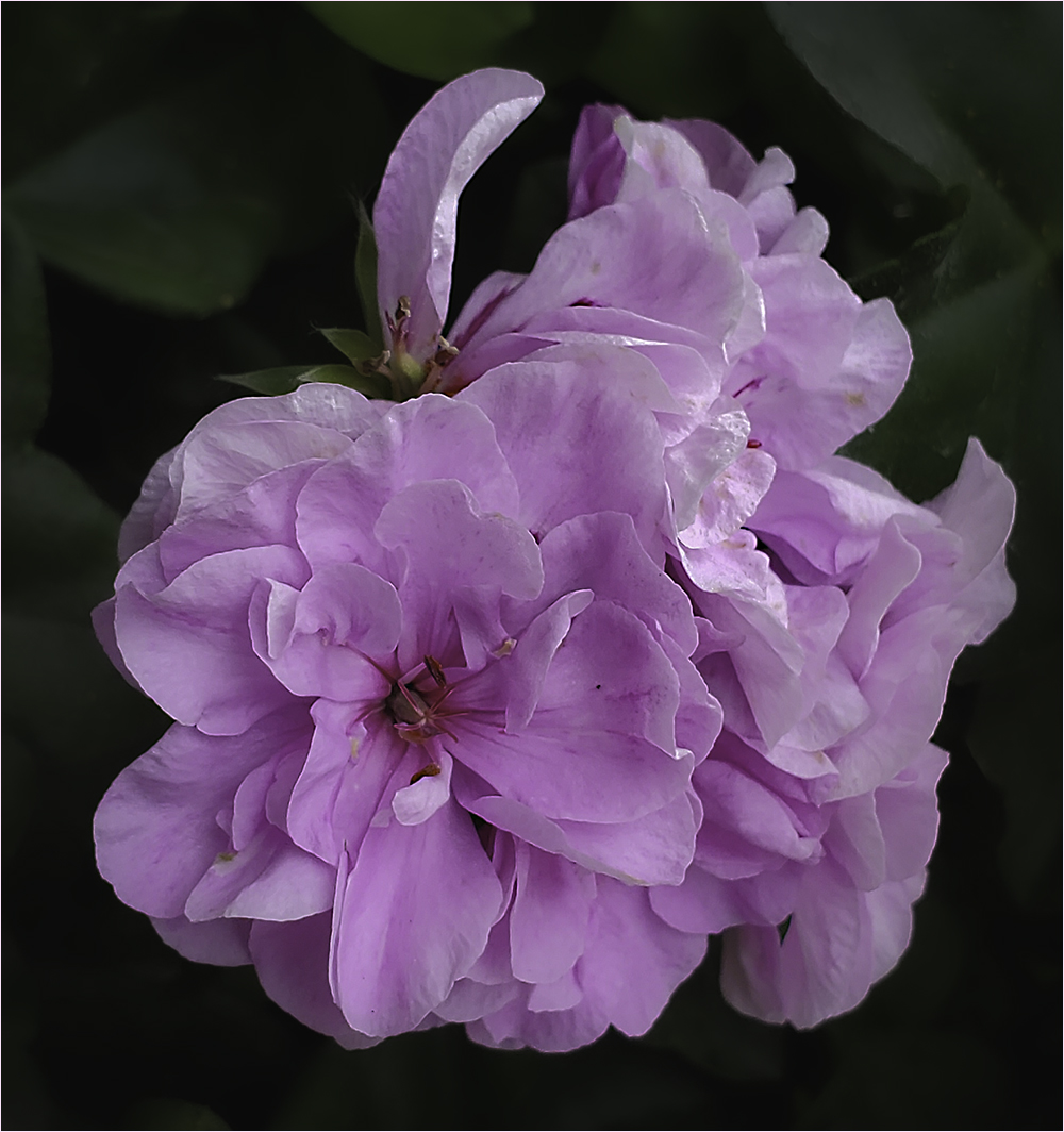
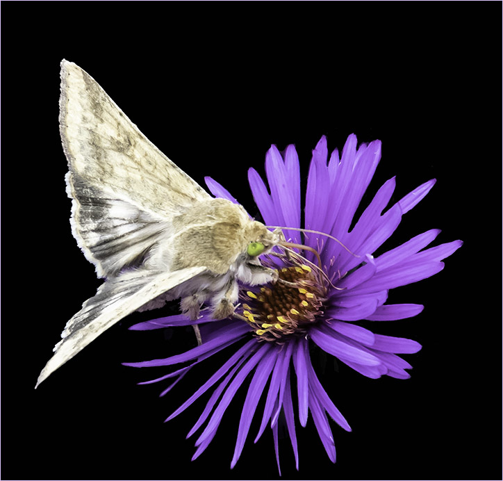
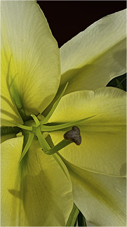
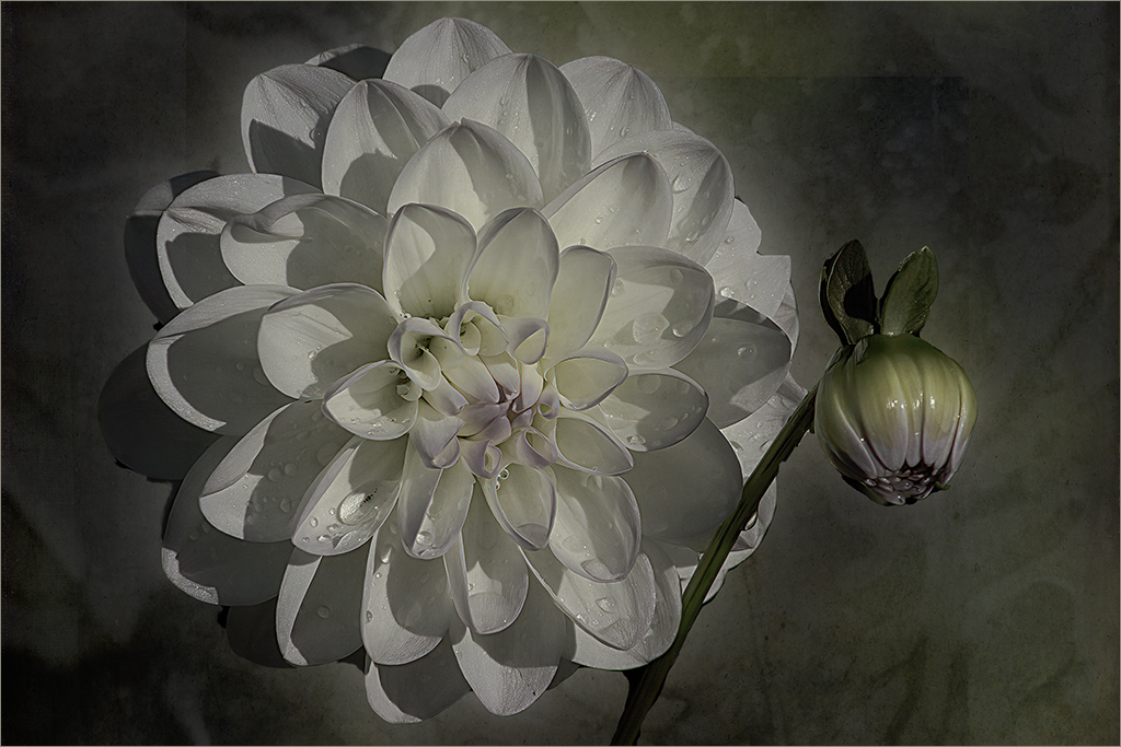
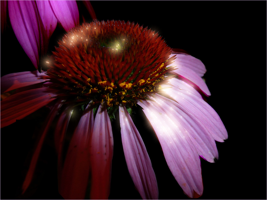
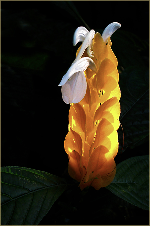
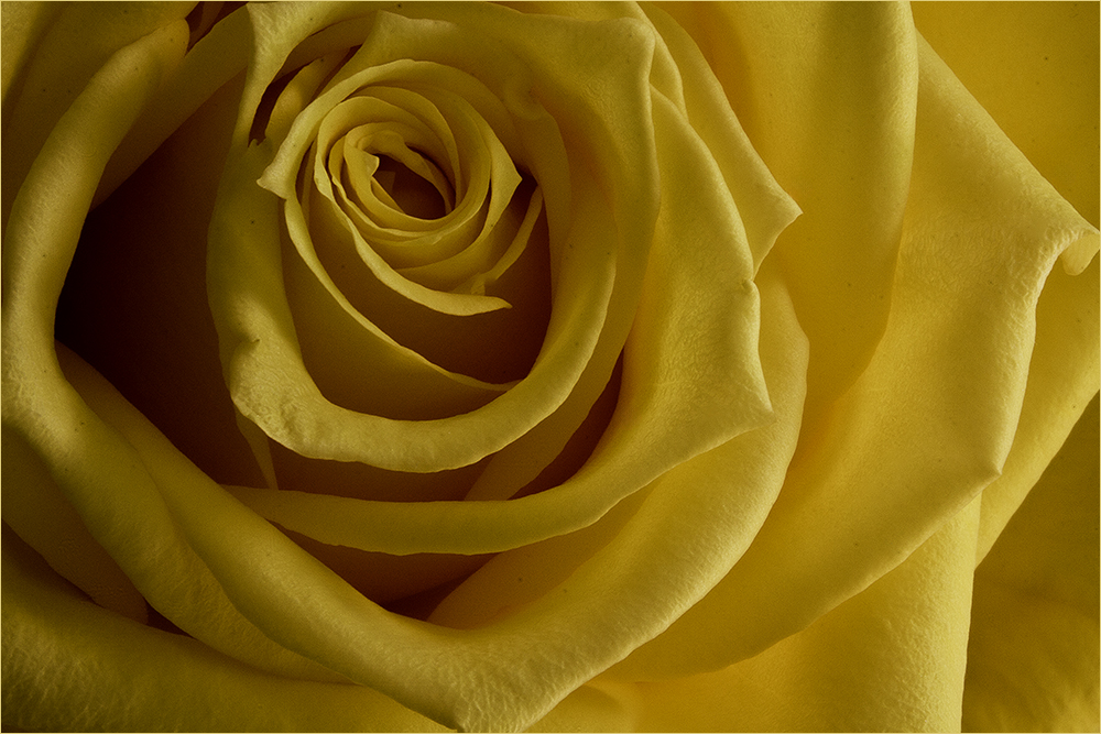
Interesting lighting-very dramatic. My eye goes back and forth between the flower and the green petal on the right. This is another one that I feel needs a stroke to contain the image instead of having it float on a large black background. |
May 21st |
| 80 |
May 25 |
Comment |
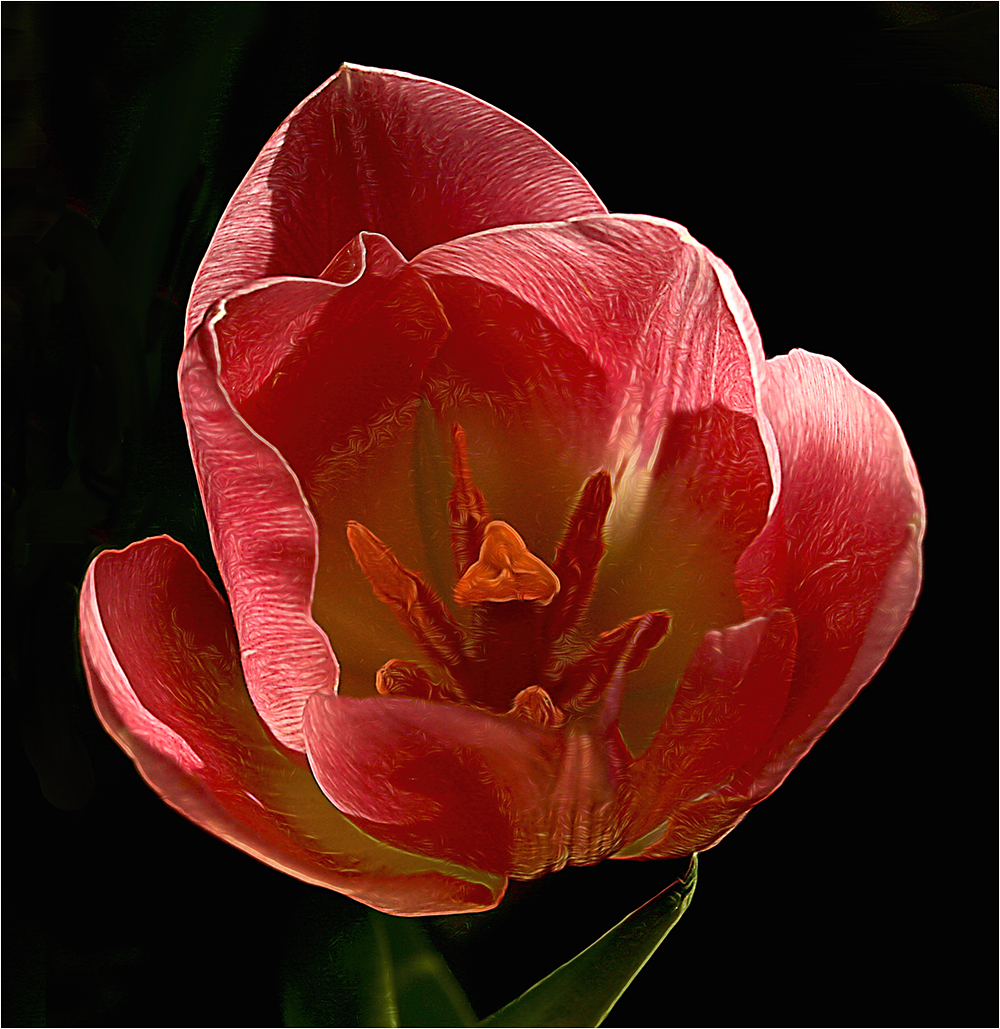
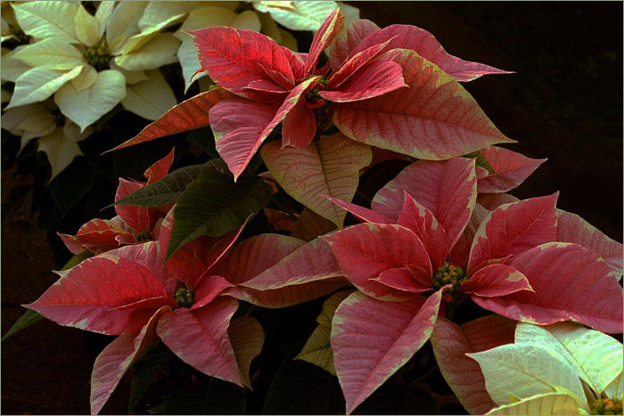
Another beautiful image from Ingrid. My only picky comment would be perhaps cropping the left to remove the pink area? I do like Doug's version as well - or perhaps a light vignetting? |
May 21st |
| 80 |
May 25 |
Reply |
Nice - perhaps a little lightening of the stem? |
May 21st |
| 80 |
May 25 |
Comment |
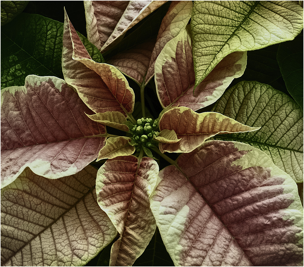
I'm going to agree with Nadia about the background. Perhaps a light green to help bring out the color of the flower. I know you are working hard to learn more and you are doing nice work. However, I would like to see a different type of background. The last few have been the same or very similar. Perhaps it's time for an upgrade from CS6? :) |
May 21st |
| 80 |
May 25 |
Reply |
I like the way you have done the red/green coloring. Nice re-work. |
May 21st |
| 80 |
May 25 |
Comment |
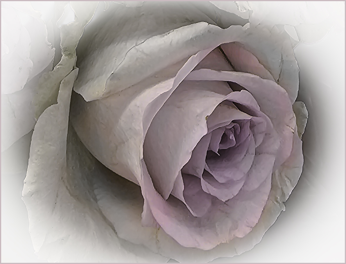
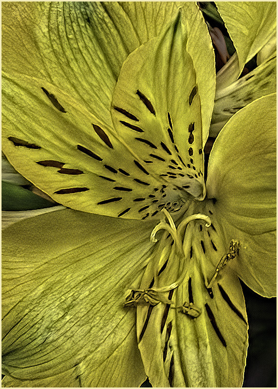
Your composition is great and the overall coloring is quite calming. I feel the image is too soft but perhaps that was the intention. Not one of my favorites of yours though. |
May 21st |
| 80 |
May 25 |
Comment |
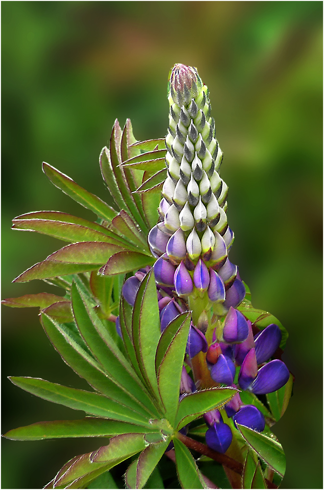
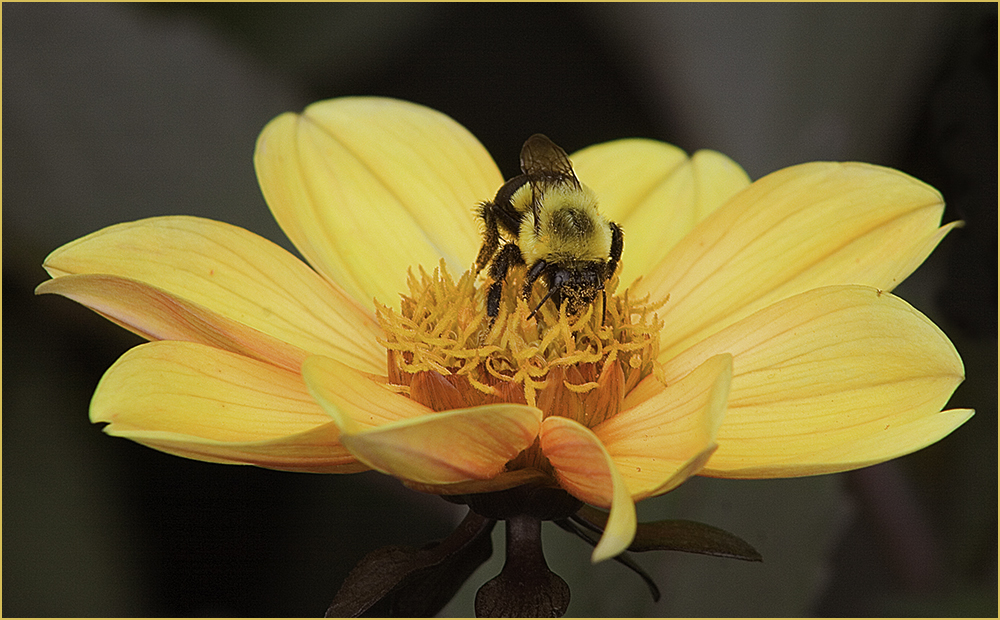
I'm going to agree with Doug - the green leaf is distracting though the color does add to the image. Because there are two items, my eye goes back and forth between the two and the green leaf seems to be floating...not attached to anything. However, it is a beautiful image and I love your backgrounds. Good work! |
May 21st |
| 80 |
May 25 |
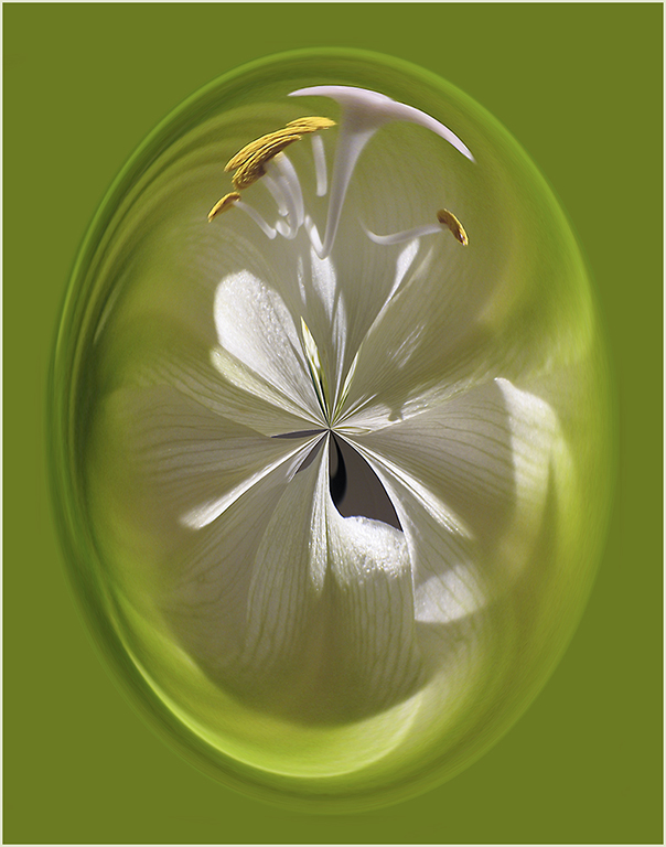
Comment |
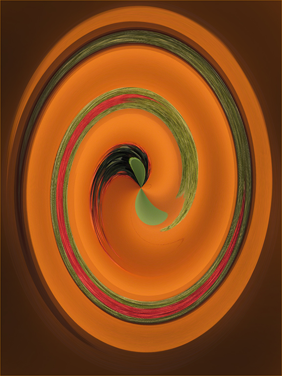
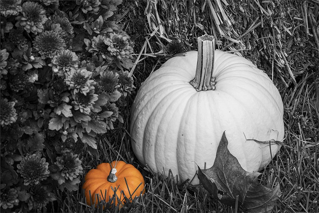
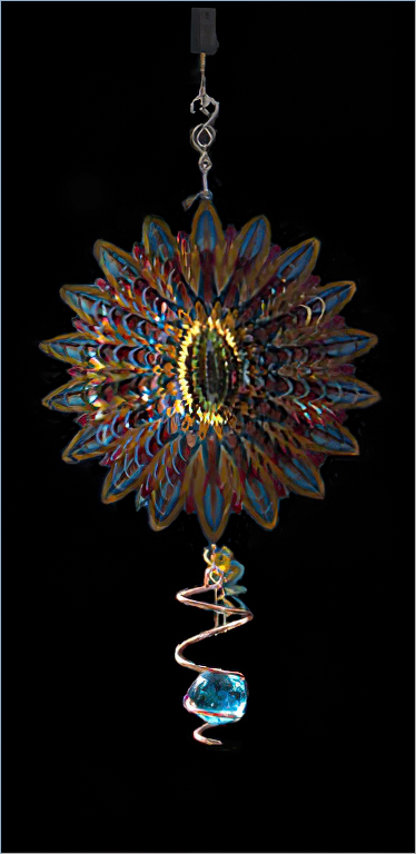
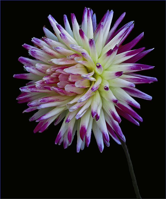
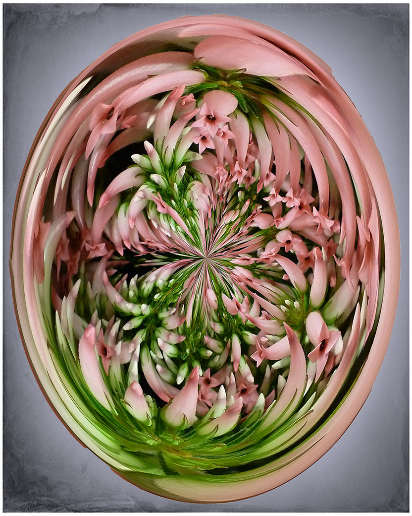
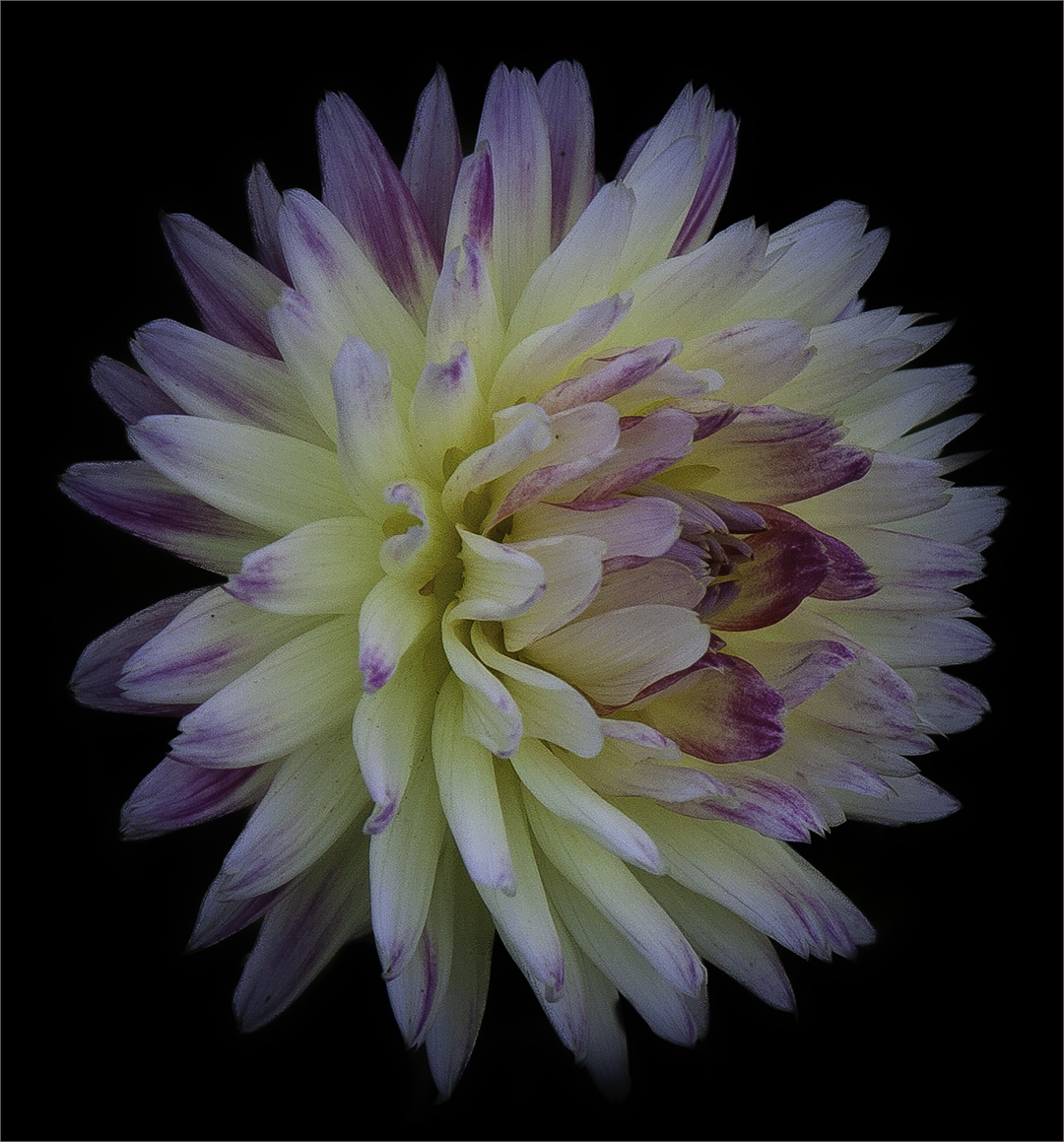
The swirl is beautiful. The colors are vivid against the black background. I would like to see a stroke around the image. When I look at your image, my eye goes out the left and out the right compared to the reworks that have the gray background which seems to contain the image. It wouldn't have to be a big stroke. Also perhaps remove the small white spot on the upper left that seems to be floating by itself? Overall though-very nice. |
May 21st |
| 80 |
May 25 |
Reply |
Thanks Bob - I just gave it the general "family" name as Blue Spruce is a member of the Pinaceae family. Glad I don't have to be perfect on the names because there are some flowers and plants I don't know. :) |
May 17th |
6 comments - 9 replies for Group 80
|
12 comments - 10 replies Total
|