|
| Group |
Round |
C/R |
Comment |
Date |
Image |
| 22 |
Apr 25 |
Reply |
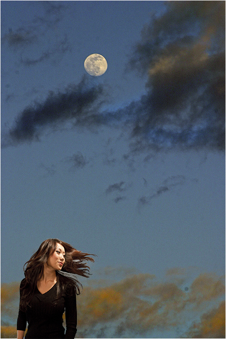
I think if I moved the frame it would lessen the effect of an out of border as her nose would be the only part outside. I agree about the catch light. |
Apr 23rd |
| 22 |
Apr 25 |
Comment |
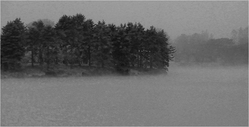
I had forgotten we had newsletters when I first started as admin. Check About Group 22 and at the bottom are links to the newsletters that were done - and Out of Border is one of them.
|
Apr 22nd |
| 22 |
Apr 25 |
Comment |
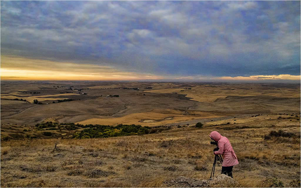
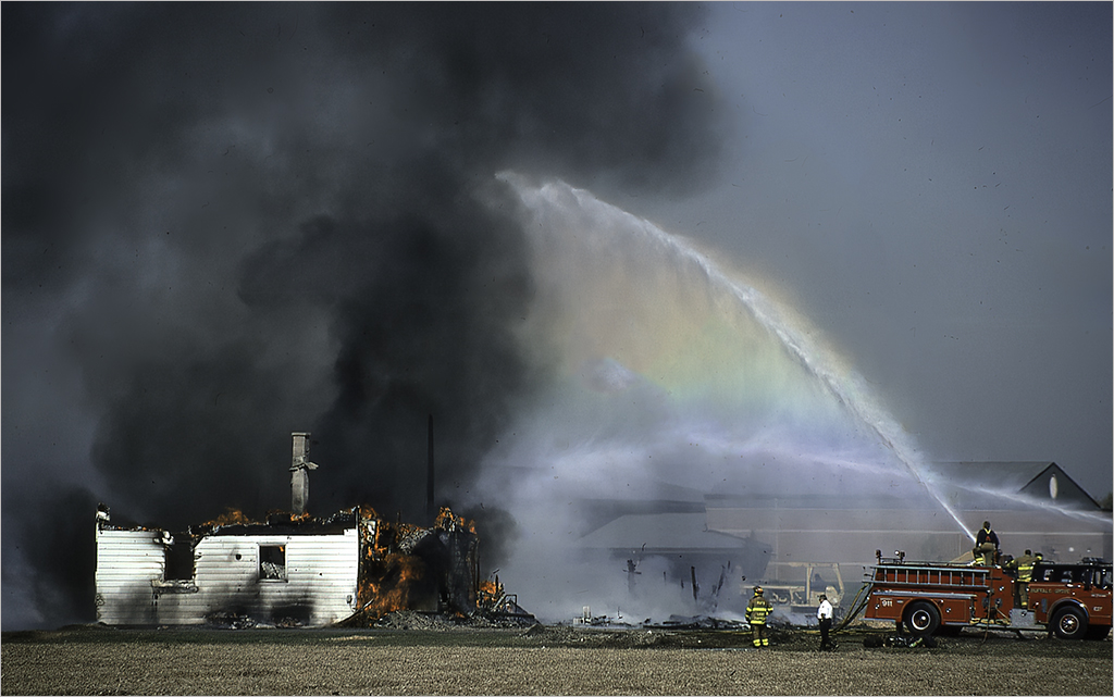
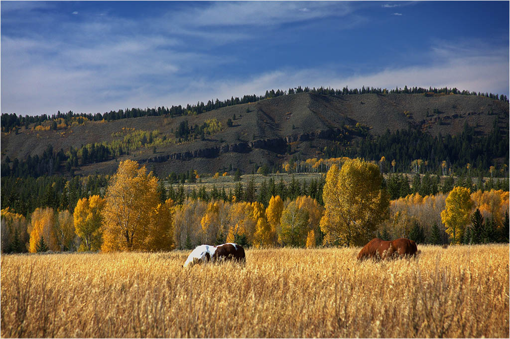
I like the improvements. Not sure if that's a person on top of the rock but it does seem to give perspective to the size of the rock. I'm not a big fan of the light flare. For me, the first look was rather impressive but then it seemed to big and also is not coming from where the light source would be - which seems to be the dark cloud at the horizon. It is, however, a nice improvement from the original. |
Apr 14th |
| 22 |
Apr 25 |
Comment |
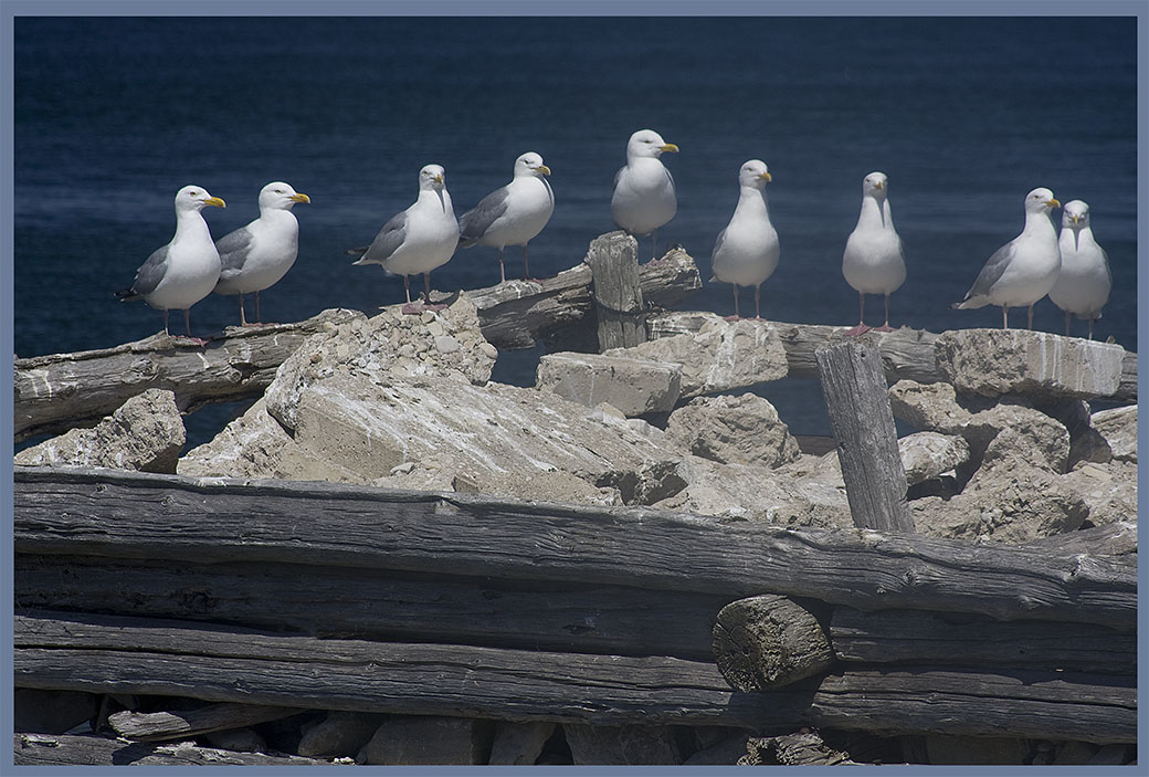
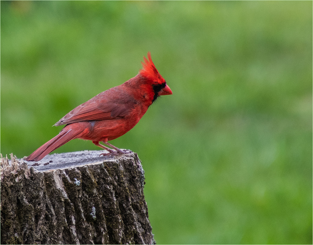
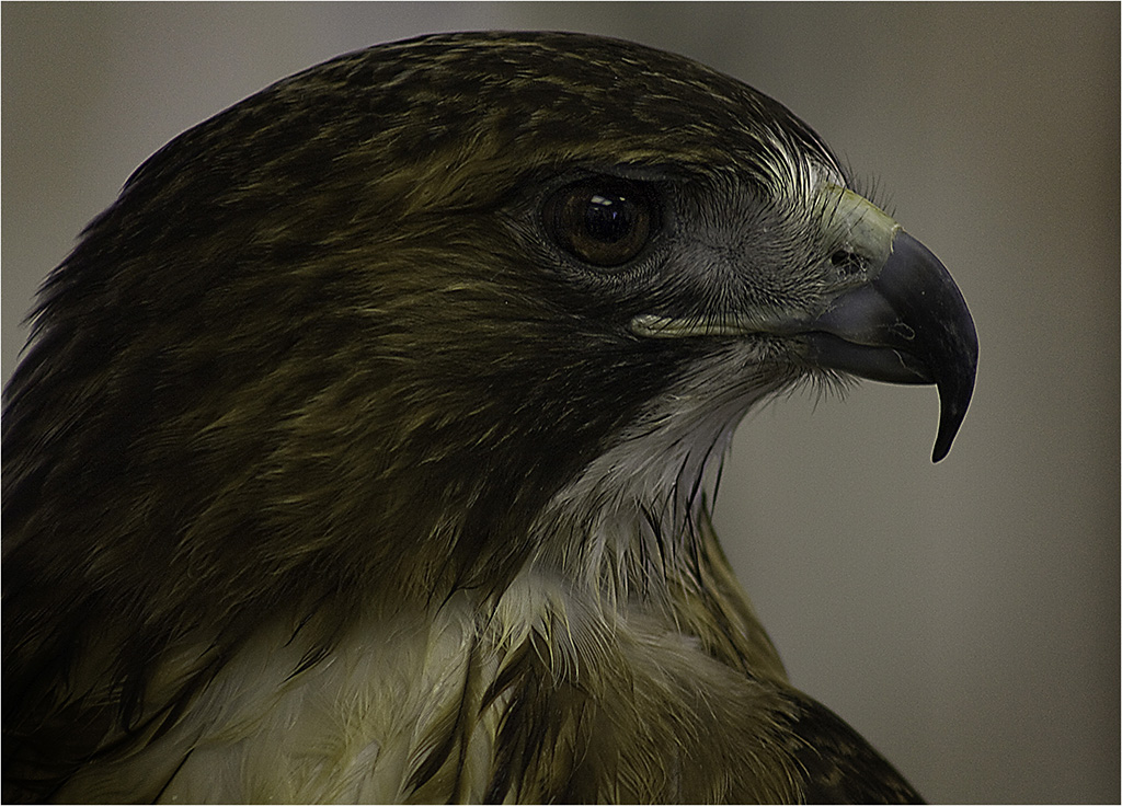
Good capture. Birds always fly away when I try to take a picture. :) I was looking to maybe off-center him a little by cropping the right more but I like the details in the fence post on the right. |
Apr 14th |
| 22 |
Apr 25 |
Comment |
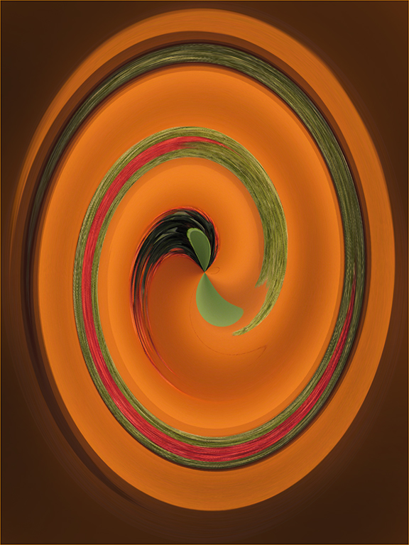
Not sure what you meant by creating a rim around the mountain but I like what you've done with increasing the vibrance and details in the image. Good job. |
Apr 14th |
| 22 |
Apr 25 |
Comment |
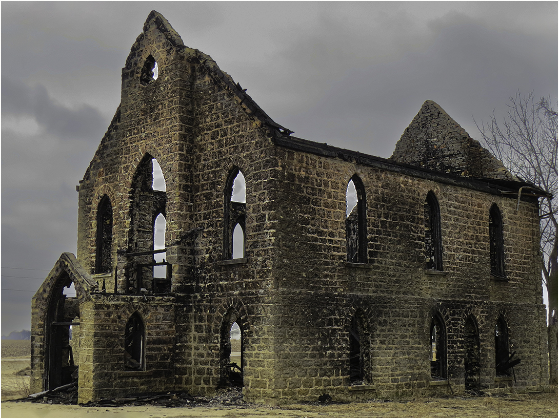
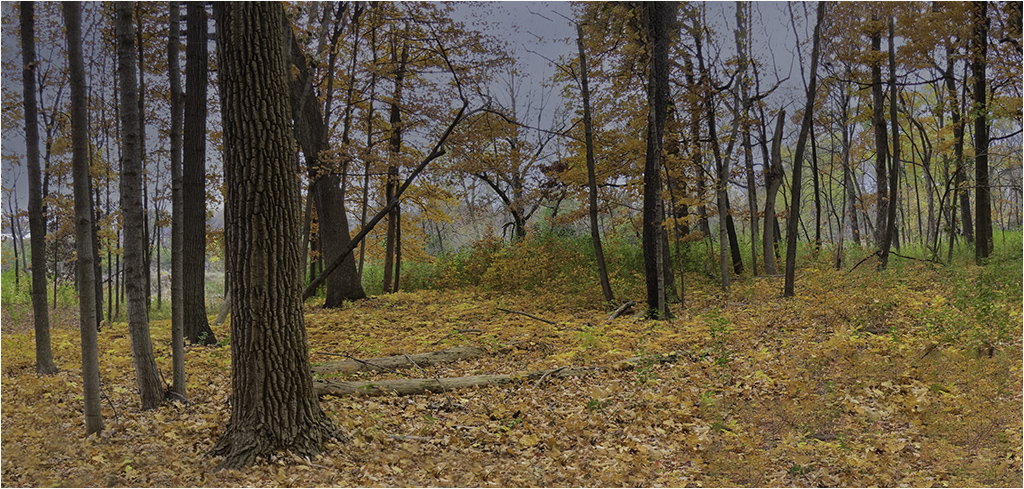
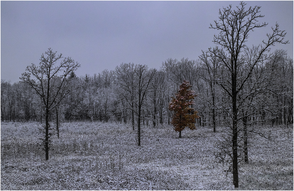
I agree with both Mike and Jerry. Great job in taking the mundane to the interesting. |
Apr 14th |
| 22 |
Apr 25 |
Comment |
The coloring of the sky and the star in the helmet were so striking to me that at first I didn't see the artist painting. Nice capture. |
Apr 14th |
| 22 |
Apr 25 |
Comment |
Interesting image. I agree with Jerry about the umbrella being distracting. |
Apr 14th |
7 comments - 1 reply for Group 22
|
| 75 |
Apr 25 |
Reply |
Would like to get in touch with you as I am in the Chicago suburbs as well. |
Apr 14th |
| 75 |
Apr 25 |
Comment |
While I'm not sure this is a true monochrome, it really doesn't matter as it is a very nice image of a very cold looking leaf. Nice job. |
Apr 14th |
| 75 |
Apr 25 |
Comment |
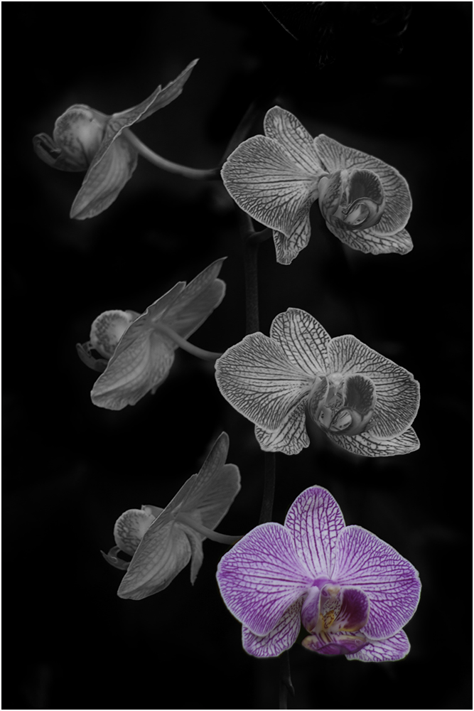
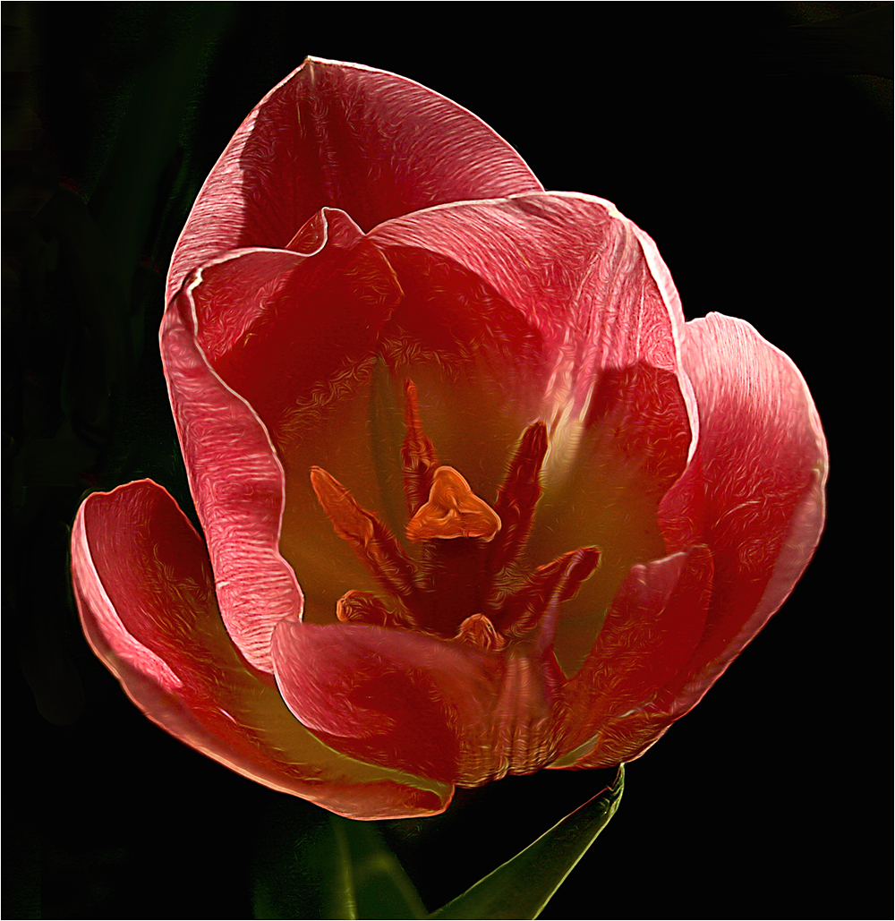
I agree with Murphy. It's a stunning image. The only thing I would change would be the stroke. I think something thinner and perhaps in the coloring chosen from the flower itself would be more pleasant? Glad to see you stroke your image though. |
Apr 14th |
| 75 |
Apr 25 |
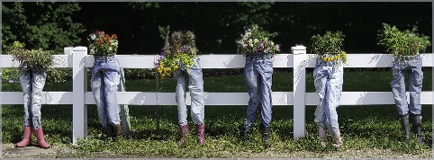
Comment |
Interesting composition. For me, I see the two plants in front first then a sweeping curve from the bottom to the left side. The fence then provides the break between those two views. Very peaceful looking. Nice job. |
Apr 14th |
| 75 |
Apr 25 |
Comment |
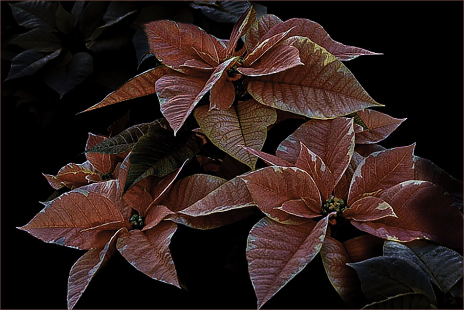
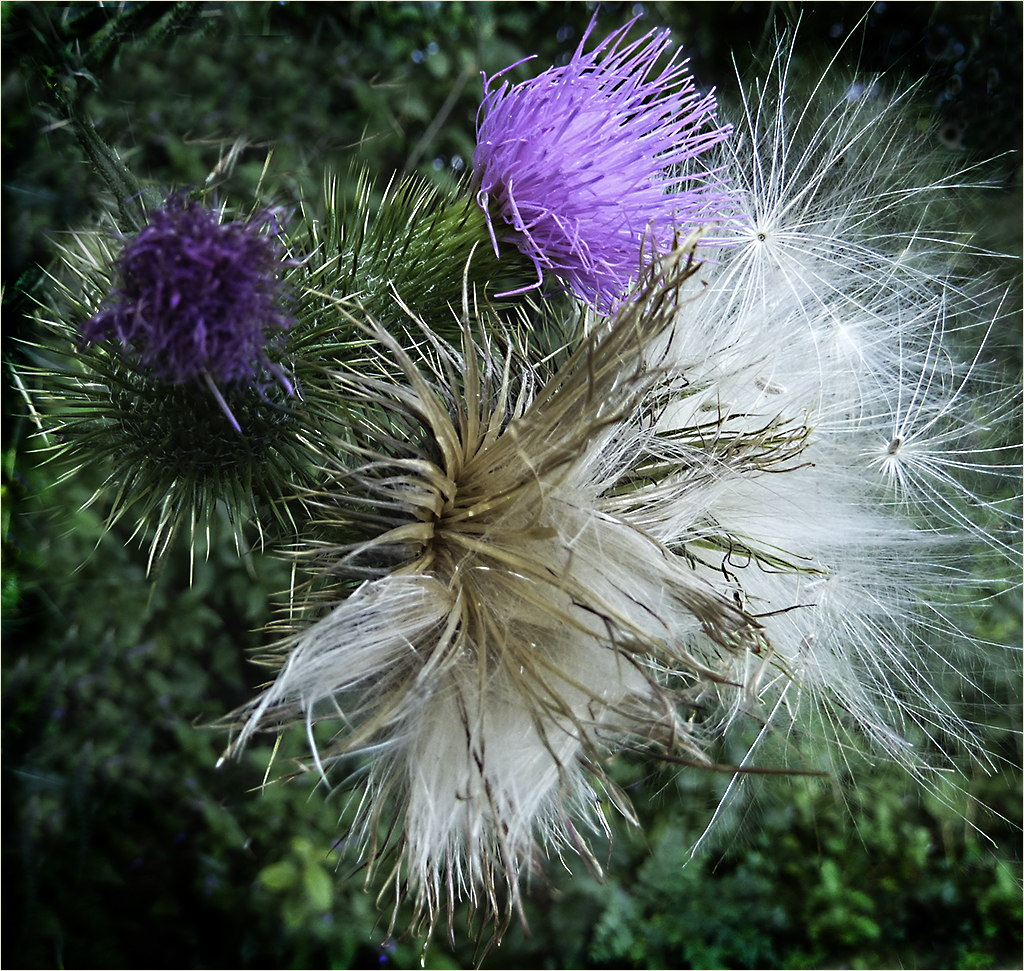
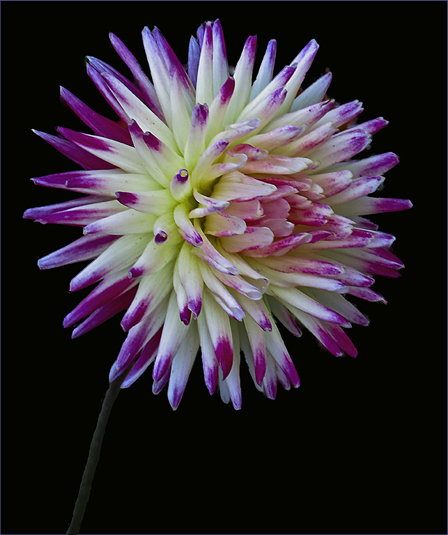
Nice extraction - perhaps a little more saturation? I like that you used the thin stroke to set the image off the black background. |
Apr 14th |
| 75 |
Apr 25 |
Comment |
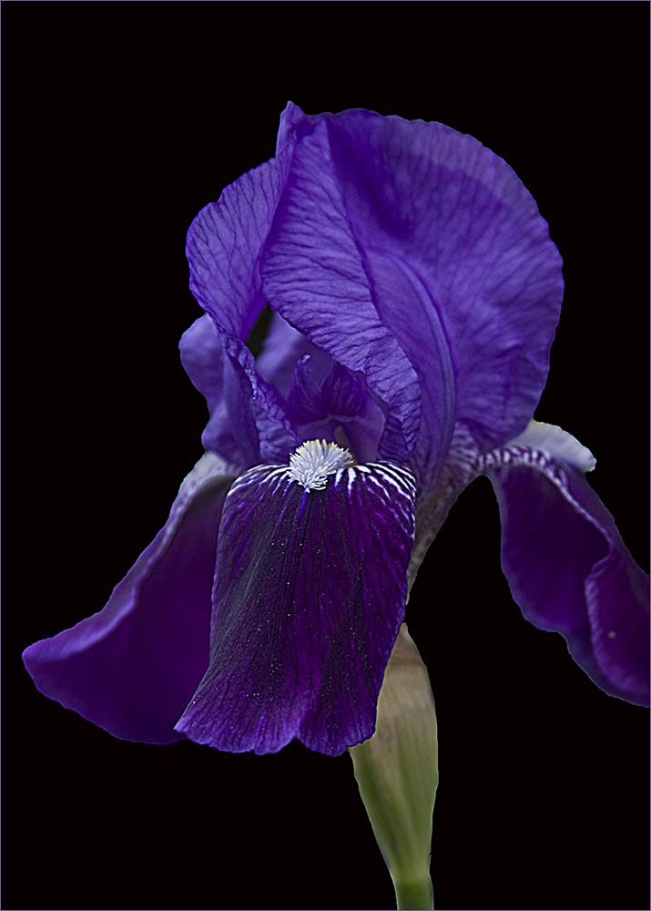
Lovely Lily is right. Very nice image. It is so striking that the secondary one doesn't bother me. I would prefer to have the two white pieces on the very right edge cropped out. |
Apr 14th |
5 comments - 1 reply for Group 75
|
| 80 |
Apr 25 |
Reply |
Thanks Nadia. |
Apr 21st |
| 80 |
Apr 25 |
Reply |
I'm going to disagree about the light petal. It sort of drags me into the whole image very quickly.
Thanks for the link...I would like to try it too. |
Apr 20th |
| 80 |
Apr 25 |
Reply |
Please don't remove the stroke! I think it works great with the image. |
Apr 20th |
| 80 |
Apr 25 |
Comment |
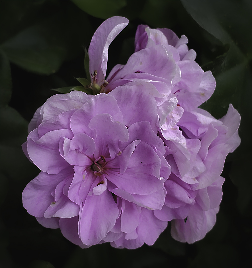
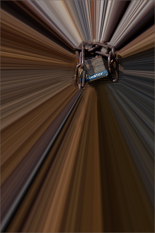
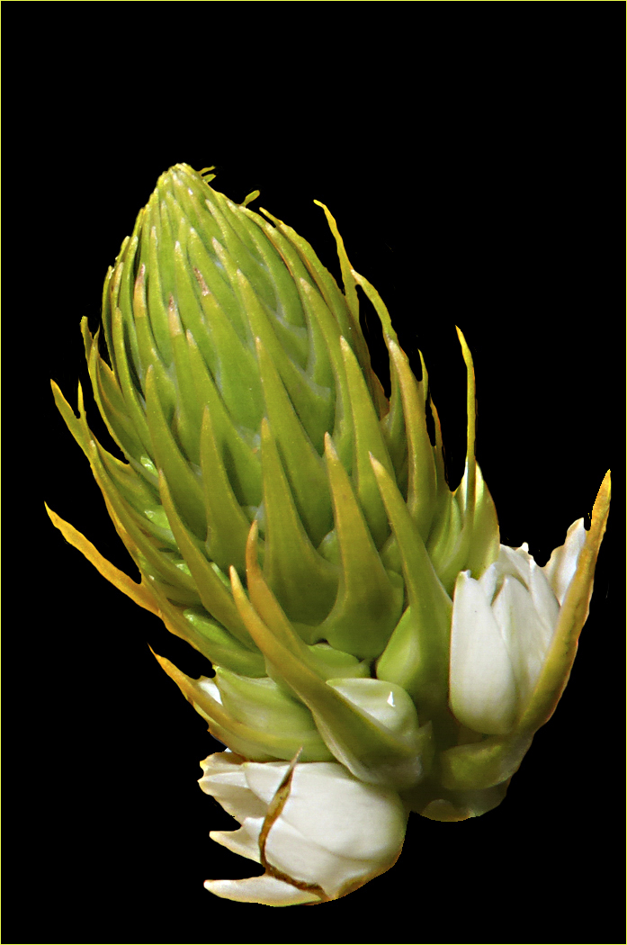
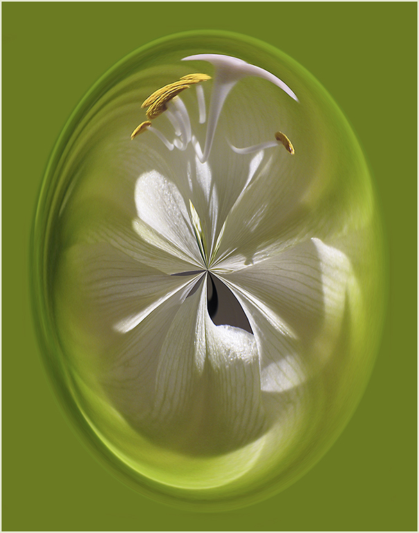
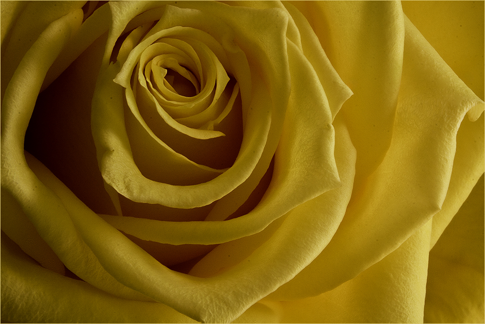
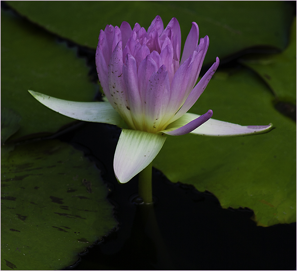
It's a pretty little flower & I like the white light in the flower which actually takes my eye off the white in the background. I'm a little bothered by the flowers on the right side even though they are blurred out. I gave it a try of cropping them out and adding a stroke to the image. I noticed that on the gray background of the comments I should have chosen a different stroke color or a bigger stroke. |
Apr 14th |
 |
| 80 |
Apr 25 |
Comment |
I agree with Bob on the composition. Personally I'm not a user of Lensbaby so I don't understand all the nuances of it. So what I'm seeing is about 2/3 of the image not in focus and the petal that is doesn't quite make sense to me. I think the background also distracts from the flower. Perhaps a different color or lighter green? |
Apr 14th |
| 80 |
Apr 25 |
Comment |
Also - your stroke just sets this image off wonderfully. Not big enough to be a border but enough to set it off from the black background of the page. Good job. |
Apr 14th |
| 80 |
Apr 25 |
Reply |
Thanks Bob. |
Apr 14th |
| 80 |
Apr 25 |
Reply |
Thanks Ingrid. Unfortunately it was a funeral for my pastor's 3 year old son who died of a glioblastoma (brain tumor). |
Apr 14th |
| 80 |
Apr 25 |
Comment |
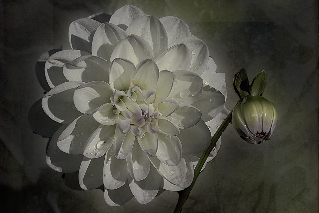
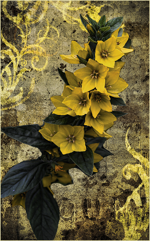
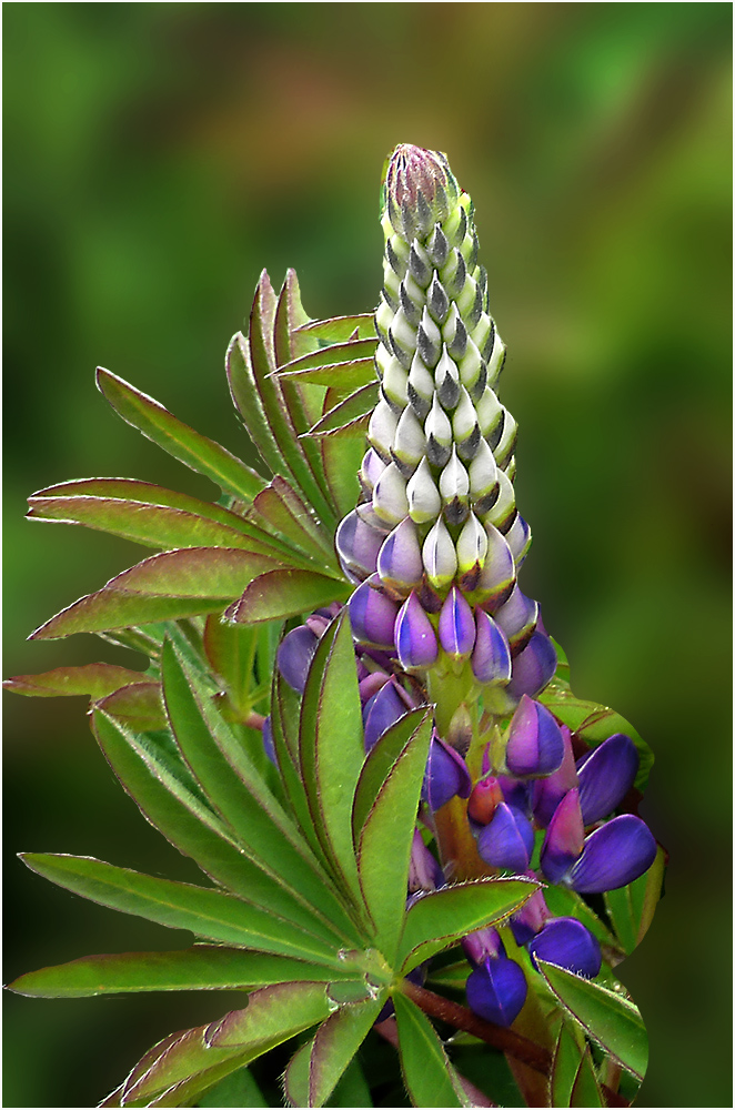
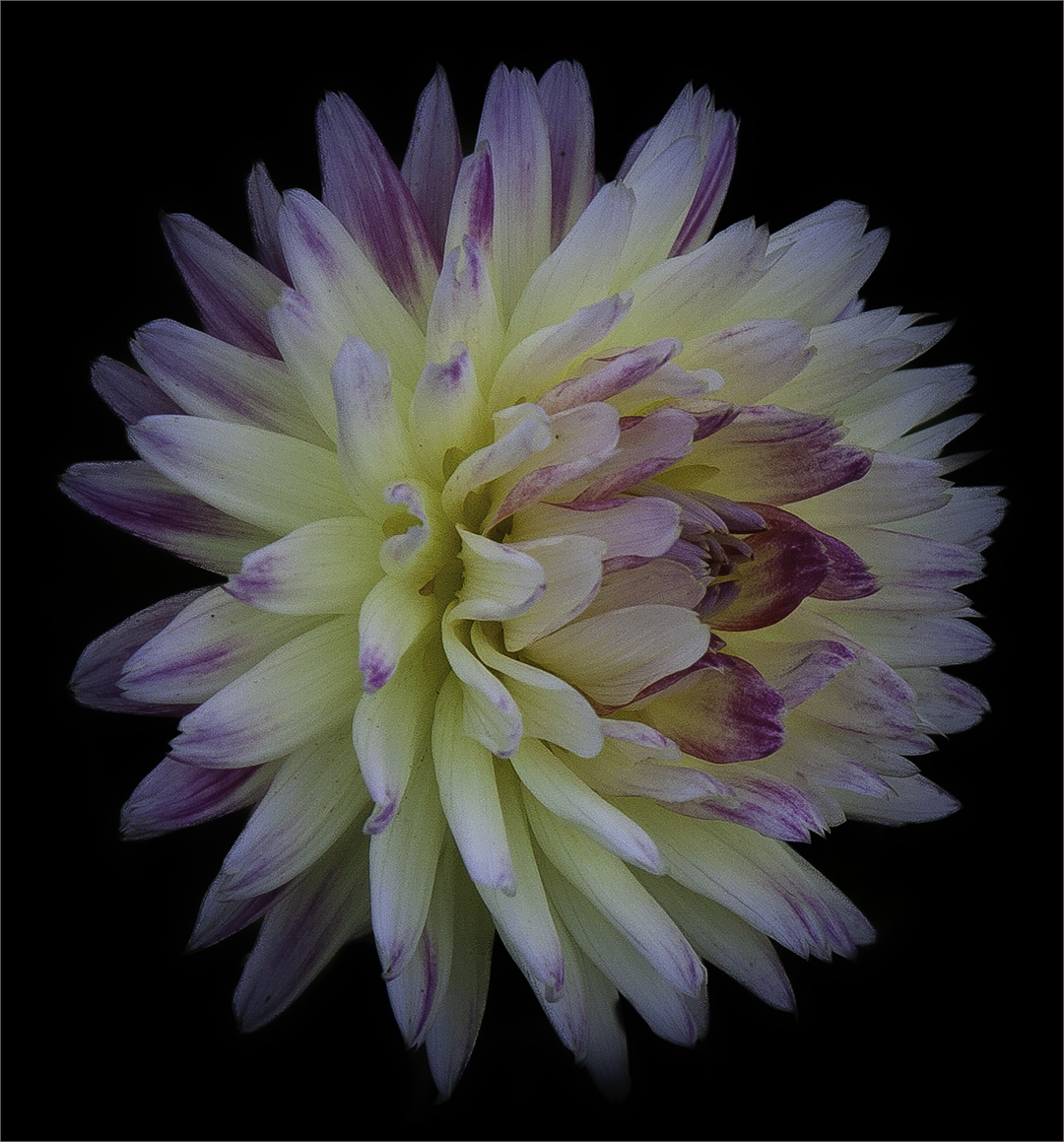
Thanks Rich. This was taken at a banquet. The outer petals were pulled back which gives it that look. |
Apr 12th |
| 80 |
Apr 25 |
Comment |
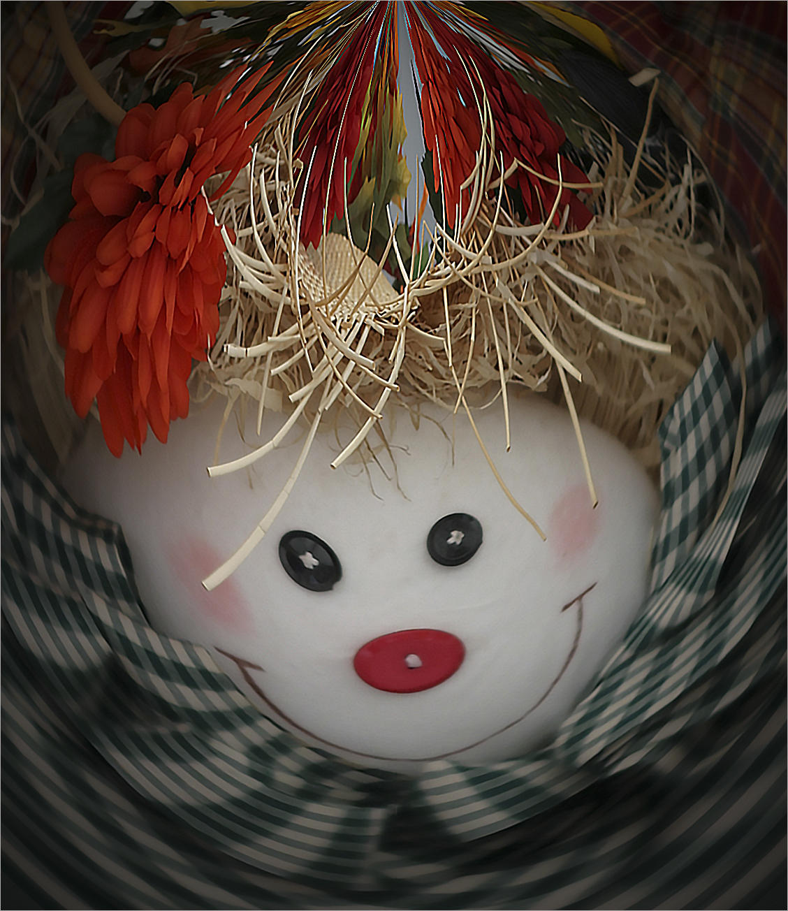
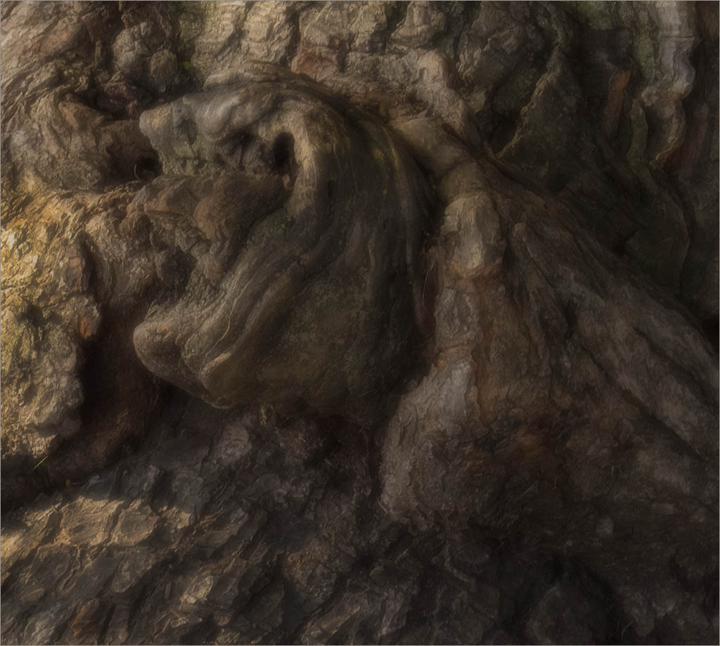
I laughed out loud. So cute and funny. I agree with Rich regarding the creativity. Perhaps taking a little of the background off the top? I'm of two thoughts-one that it would make the whole subject too centered or two-the face would be less centered. It's still a great image. |
Apr 6th |
| 80 |
Apr 25 |
Comment |
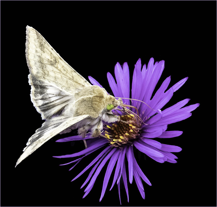
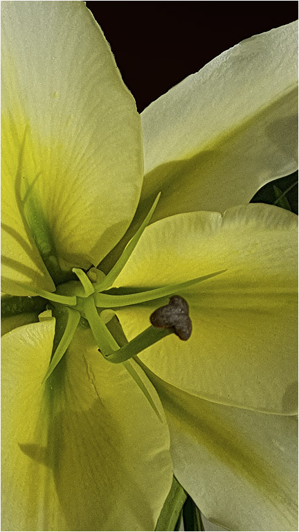
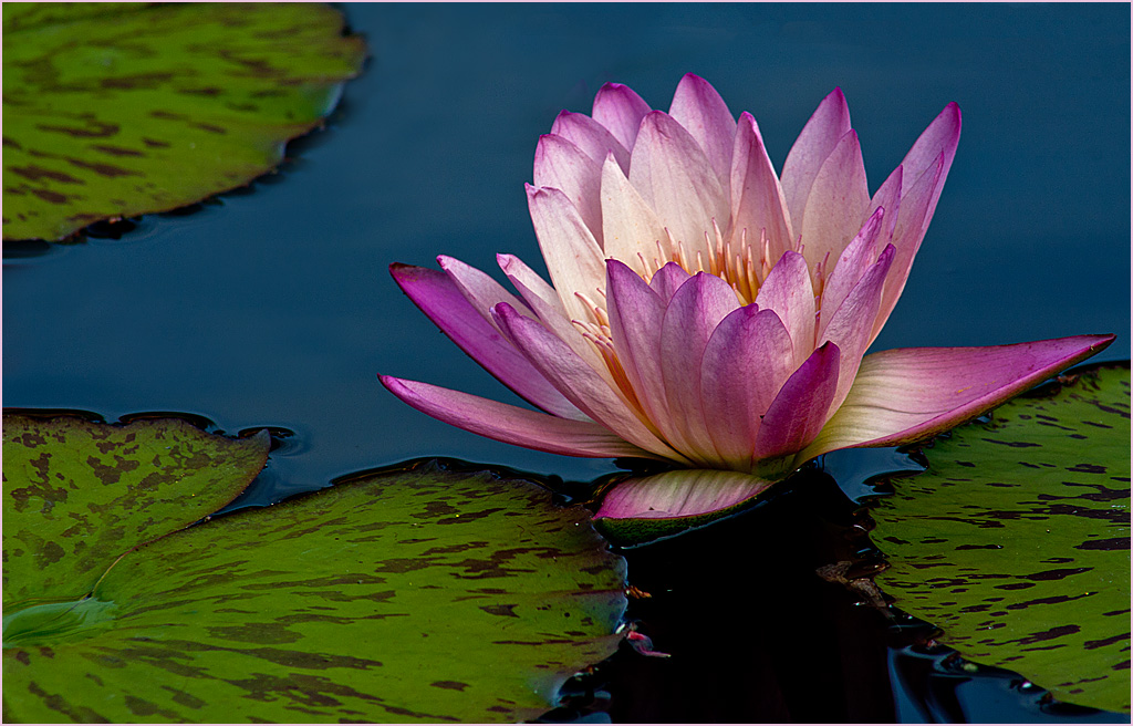
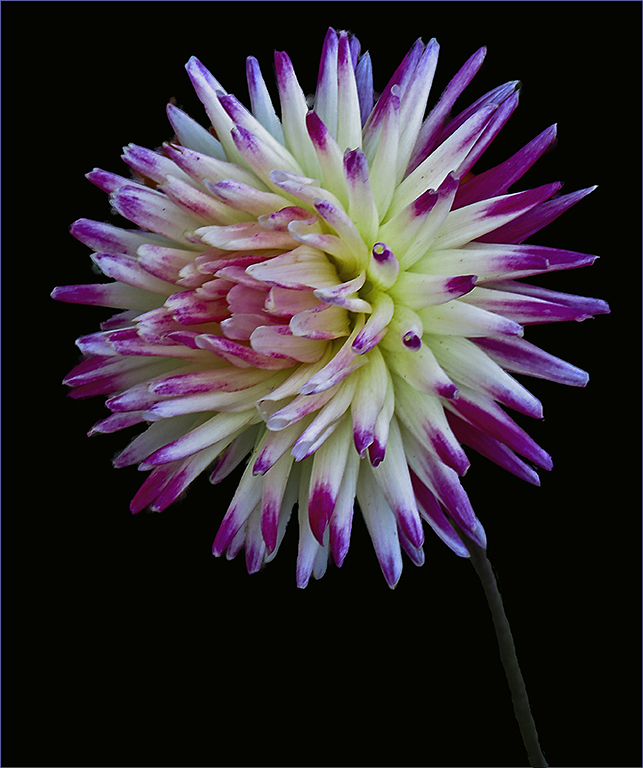
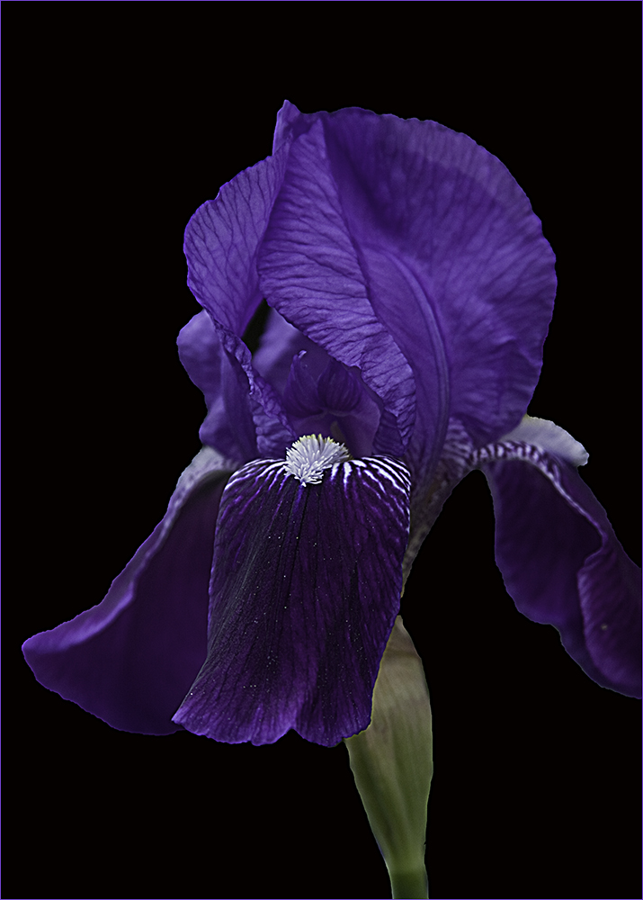
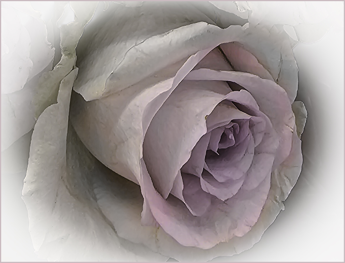
Absolutely stunning! I love the background you've created and the flower is amazing. If I want to be really, really picky - I'm seeing a little part of the background on the right side of the Iris that looks a bit "rough". It's sort of a craquelure effect that is stronger there than on the left side. |
Apr 6th |
| 80 |
Apr 25 |
Comment |
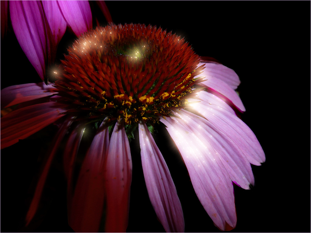
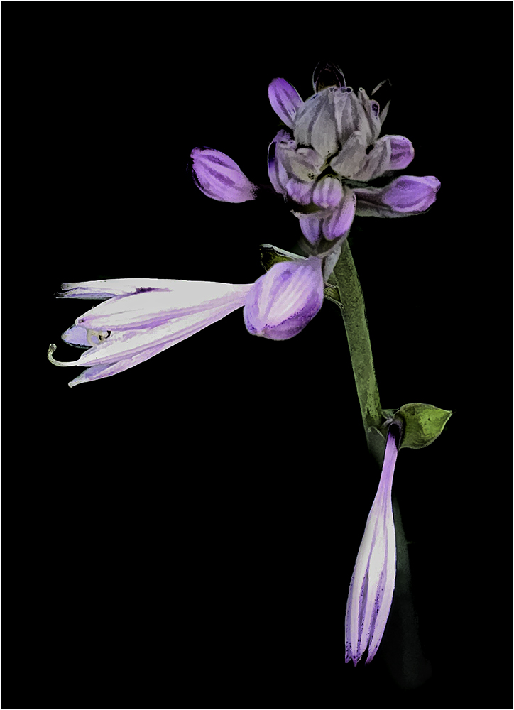
Using the motion blur does a nice job of toning down the yellow spot of the background flower. The subject does stand out. Nice work. |
Apr 6th |
7 comments - 5 replies for Group 80
|
19 comments - 7 replies Total
|