|
| Group |
Round |
C/R |
Comment |
Date |
Image |
| 22 |
Jun 24 |
Reply |
Is the wandering a good thing - or bad? |
Jun 28th |
| 22 |
Jun 24 |
Comment |
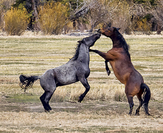
I cropped this down to the horses and I think, for me, I like the vastness that the background offers in Kaylyn's image. Good action - yes it could be a little closer but it's a great capture. Nice job. |
Jun 26th |
 |
| 22 |
Jun 24 |
Comment |
I like the positioning of the horn a little off-center. The details are shown off nicely with the textures used. Good job! |
Jun 25th |
| 22 |
Jun 24 |
Comment |
Nicely done. I agree that there could be more space in front to let the car move into but it's hard. Great capture. |
Jun 25th |
| 22 |
Jun 24 |
Comment |
Interesting antique auto shot. I'm debating if the black background is best or not. I think it's right - just thought maybe something lighter would make the back seat area stand out more. |
Jun 25th |
| 22 |
Jun 24 |
Reply |
Thanks! Now that you mentioned that...it doesn't look like a peony. :) |
Jun 25th |
4 comments - 2 replies for Group 22
|
| 80 |
Jun 24 |
Reply |
I agree - the change of position makes it stand out even more. |
Jun 20th |
| 80 |
Jun 24 |
Reply |
Even more stunning! Nice work. |
Jun 13th |
| 80 |
Jun 24 |
Reply |
Thanks Rich. He was so dark I didn't take the time to focus on the head. I'll have to look more carefully next time. :) |
Jun 11th |
| 80 |
Jun 24 |
Comment |
Interesting composition and coloring. To be picky, there are 3 (maybe 4) little white spots along the brown part just below the right lower anther. They might be pollen but they seemed more noticeable to me. Overall, very nice though. |
Jun 11th |
| 80 |
Jun 24 |
Comment |
Nice coloring. You don't say which filter you used as it appears to have an effect on it. I took the liberty of doing a little cropping to focus more on the flower. Overall it's an interesting rendition. Good job. |
Jun 11th |
 |
| 80 |
Jun 24 |
Comment |
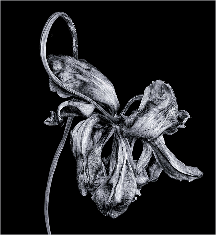
I like the B/W rendition. It's quite sharp and detailed. One thing I found interesting is that I like strokes around borders, especially when the background is black. So I tried it with a stroke. Interestingly, with the stroke, the image is more centered. For some reason, the composition seems better without the stroke - perhaps because my eye is making the frame? Anyway, it's a nice looking image. |
Jun 11th |
 |
| 80 |
Jun 24 |
Reply |
Perhaps a stroke around to close up the image? The top left orange portion leads me out the left side. |
Jun 11th |
| 80 |
Jun 24 |
Comment |
I'm never sure how to interpret an abstract but the colors are good and it's different. |
Jun 5th |
| 80 |
Jun 24 |
Comment |
Very nice image. Personally, I would like to see the left side yellow/orange part of the background be black as the rest of the background is black. Overall though beautiful image. |
Jun 5th |
| 80 |
Jun 24 |
Comment |
Beautiful - stunning. The only critique I would have is with the red marks on the left side portion of the flower. |
Jun 5th |
6 comments - 4 replies for Group 80
|
10 comments - 6 replies Total
|