|
| Group |
Round |
C/R |
Comment |
Date |
Image |
| 22 |
May 24 |
Comment |
Nice image. My eye travels from the top stones down to the bottom - just like the water flows. |
May 16th |
| 22 |
May 24 |
Comment |
For me, I would prefer seeing the original with some rather minor corrections. As Peggy noted - the green area on the left side is too green. Maybe it's my monitor or my eyes but again it seems over sharpened slightly. It is a beautiful scene. When I was there it was overcast and rainy so I didn't get many great shots. Glad you got a nice one. |
May 16th |
| 22 |
May 24 |
Comment |
I'm going to agree on this one regarding the water and the bridge. For me, and perhaps it's just Al's style, it appears too sharpened and almost looks painted to me. |
May 16th |
| 22 |
May 24 |
Comment |
I guess it's my day to be in opposition to almost everyone. :)
I'm seeing this as the water being too blue and the trees being too green. I'm not sure what Al means by adjusting the texture - perhaps taking the sharpness down some? Overall it's a pleasing image and nice softness of the water. |
May 16th |
| 22 |
May 24 |
Comment |
I'm going to disagree with Peggy about the sky. I think to cut that off, it leaves a bunch of dark rocks at the top. I like the way it balances out the falls and that big rock gives me some idea of the terrain.
While I love the shot and the pano, it seems a little too sharpened for me. I do agree about the people - they add that sense of depth to the image and you really get the sense of the immensity of the falls.
|
May 16th |
5 comments - 0 replies for Group 22
|
| 80 |
May 24 |
Reply |
PS: I didn't try to work on the bottom leaves that are showing a little too green. Maybe an area for you to practice? Good luck. |
May 12th |
| 80 |
May 24 |
Comment |
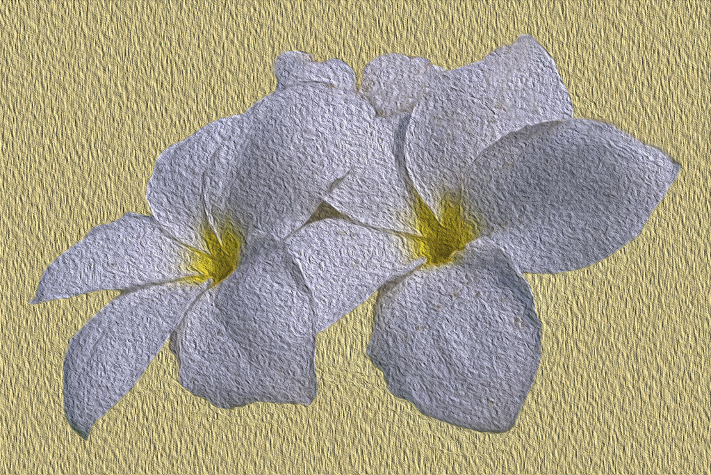
Nice work on the texture - it is a pleasing image. I removed the brown spots by using the clone tool - which should be in CS6. Choose the clone tool, choose your brush size - those parts that are near the background will probably require a smaller brush. To pick the area to clone, find the spot you wish to use and hold down the ALT key (Command? on the MAC?)
Then paint the area you want to change. The clone point will move as you brush so be aware of what it's picking up. |
May 12th |
 |
| 80 |
May 24 |
Comment |
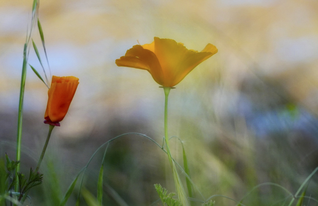
I like the coloring and the softness of the background. I tried cropping a little to get rid of some of the bright grass. Pretty image though - nice job. |
May 7th |
 |
| 80 |
May 24 |
Comment |
It's always hard to find fault with your images. This one is stunning. I love the detail and the sharpness.
I do think the stroke is a little large. Perhaps it's made as a border but to me, it takes my eye away from the flower. Also, there are white lines outlining the stem that seem a little odd to me. Overall it is a spectacular image. |
May 7th |
| 80 |
May 24 |
Comment |
I agree with Bob's comments. Also, it's hard to shoot flowers on a windy day. Since there is no original, I'm guessing this was as shot? It is a nice capture under the conditions. |
May 7th |
| 80 |
May 24 |
Comment |
I like the texture for the background but if it is an overlay with the flower, then not so much. It seems the original has a nice sharpness and color to it that it appears to lose on the final. Perhaps crop a little off the right to make it less centered? |
May 7th |
| 80 |
May 24 |
Reply |
I see that now - you are right. Thanks. |
May 7th |
| 80 |
May 24 |
Comment |
Very colorful and fun image. I'm not sure I like the top left. Perhaps consider removing the top hot pink portion that touches the border? |
May 7th |
6 comments - 2 replies for Group 80
|
11 comments - 2 replies Total
|