|
| Group |
Round |
C/R |
Comment |
Date |
Image |
| 22 |
Apr 24 |
Reply |
I think that is Peggy's edit. |
Apr 24th |
| 22 |
Apr 24 |
Comment |
There should be a way in Lightroom to make her eye more prominent and lighter. It's a good capture of the relationship of the two. |
Apr 13th |
| 22 |
Apr 24 |
Reply |
Joe - did you mean angles? :) |
Apr 12th |
| 22 |
Apr 24 |
Comment |
Interesting image - lots of things to look at. I rather like the original's bottom as the final seems to cut off some of the plants. To me, it gave a sense of scale more than the final. |
Apr 12th |
| 22 |
Apr 24 |
Comment |
I like the use of the B&W here and the cropping. The sharpening is giving the "gritty" look that seems to fit the action. Nice job. |
Apr 12th |
| 22 |
Apr 24 |
Comment |
I'm going to agree with Peggy - I like the original coloring better. It seems to me to be a little over-sharpened. Overall though it's a nice shot. |
Apr 12th |
4 comments - 2 replies for Group 22
|
| 80 |
Apr 24 |
Reply |
Thanks. True...for the nature entry. |
Apr 14th |
| 80 |
Apr 24 |
Reply |
Thanks Ingrid. |
Apr 13th |
| 80 |
Apr 24 |
Comment |
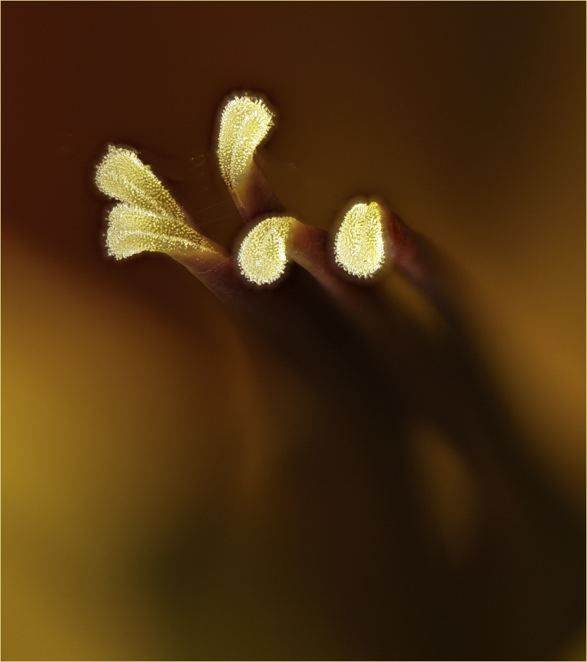
I'm a little conflicted about whether I like this - or not. I sort of thought the original let me know it was a flower - looking at it as someone who might not be familiar with plants - since the inside of the flower was showing more. It is interesting though.
I agree with Bob about the cropping so I gave it a try. |
Apr 13th |
 |
| 80 |
Apr 24 |
Comment |
Bob pretty well summed it up. I also love the colors and sharpness - especially in the petals. Another great image from you. |
Apr 13th |
| 80 |
Apr 24 |
Comment |
I agree with Bob about the cropping. I hope you don't mind "re-works" in this group. Here is what I envisioned with the crop and removing the bright spots.
Overall I like the colors and the capture of the reflection in the water. |
Apr 13th |
 |
| 80 |
Apr 24 |
Comment |
OK, I guess I will "nit"... :) I like to see a "stroke" on most images - especially ones that have a black or dark background. To me, it keeps my attention on the flower and not wandering outside. Overall I like the image.
I'm curious as to the use of Gaussian blur - was it to give softness? |
Apr 13th |
| 80 |
Apr 24 |
Comment |
Beautiful! I love the choice of the textured background. The color of the flower is striking. Regarding the dark spots - to me, it appeared as a vignette and helped to draw my eye toward the flower. Upon closer look, perhaps you were referring to the dot on the left? |
Apr 13th |
| 80 |
Apr 24 |
Comment |
Interesting idea and I love the complimentary colors. I wonder if cropping a little off the top and some of the right side would place the subject a little more off-center. Overall, very nice. |
Apr 13th |
6 comments - 2 replies for Group 80
|
10 comments - 4 replies Total
|