|
| Group |
Round |
C/R |
Comment |
Date |
Image |
| 22 |
Mar 23 |
Comment |
Beautiful shot. I'm going to agree with Kaylyn about the clouds. I feel they are part of the overall beauty of this image. I took a little of the brightness down and added a little saturation. Hope it isn't too much. |
Mar 20th |
 |
| 22 |
Mar 23 |
Reply |
Yes - congrats to Mike for being in the Members Showcase.
Thanks for visiting, Marge. |
Mar 17th |
| 22 |
Mar 23 |
Comment |
Great capture. It does really tell a story of bonding. Maybe back off a little on the eyes but not a lot. I liked the catch-light in the eyes but it is, perhaps, too much. |
Mar 9th |
| 22 |
Mar 23 |
Comment |
At first I thought the couple in the center might be better but in looking at the original with the car, I do think it looks better with them off to one side. Interesting view though. |
Mar 9th |
| 22 |
Mar 23 |
Reply |
For me, it was the sky that produced the most mood so I'm glad you left it in. I'm not in favor of the reversal as I want my eye to go out of the frame to the right - and also, it isn't true to the scene. |
Mar 9th |
| 22 |
Mar 23 |
Comment |
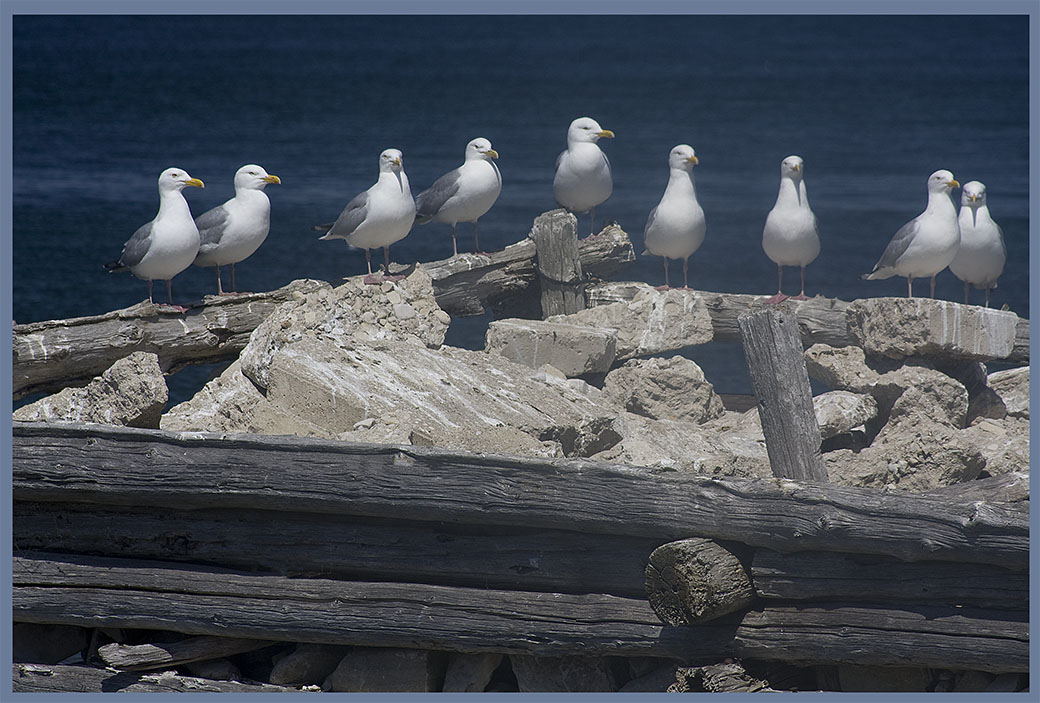
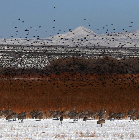
Interesting capture - that's a lot of birds!
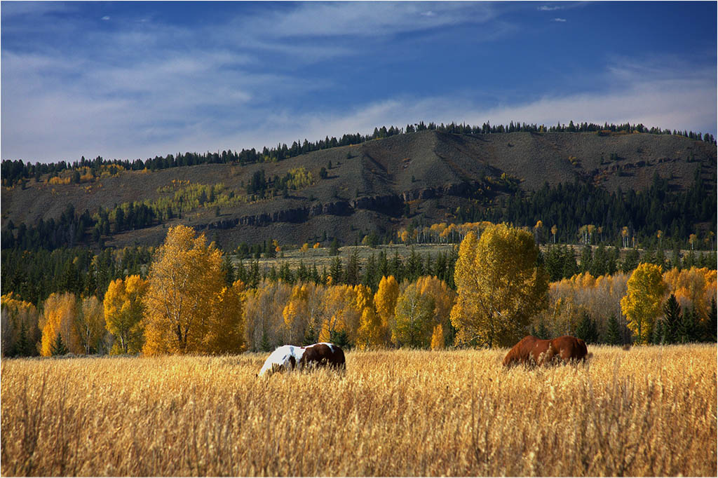
I went the other way with this. I like the sky and mountain along with the birds and grass. To me, there isn't a real central point of interest as I see competing subjects with the ground birds and the birds in flight. So I felt I created a sense of layers with the sky, birds in flight, grass, birds on ground and the snow at the bottom. |
Mar 9th |
 |
| 22 |
Mar 23 |
Comment |
I agree with Mike - I would like to see less orange, a little more light from the window like the original and less from the walls and such and a little more white in the snow. However it is a good rendition. Nice job. |
Mar 7th |
5 comments - 2 replies for Group 22
|
| 61 |
Mar 23 |
Reply |
Nice - thanks! |
Mar 30th |
| 61 |
Mar 23 |
Reply |
I almost said I liked the second bug but the more I thought about it I decided against it. So I'm conflicted too.
|
Mar 21st |
| 61 |
Mar 23 |
Comment |
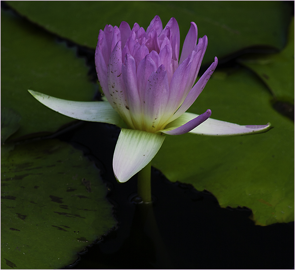
Amazing what you can get from an image that seems nonde. Great job. Colors are great.
I'm a little distracted by the other bug on the pad and also by the white spots below the right petal by the water. Picky, picky...I know. :) |
Mar 21st |
| 61 |
Mar 23 |
Reply |
I agree with David's rendition too. Maybe Randy meant is was cropped too close? Crunched? |
Mar 21st |
| 61 |
Mar 23 |
Reply |
You might find it will get you better scores at club too. :) |
Mar 21st |
| 61 |
Mar 23 |
Comment |
I'm going to present an opposite view (don't I always :).
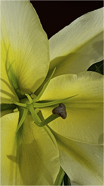
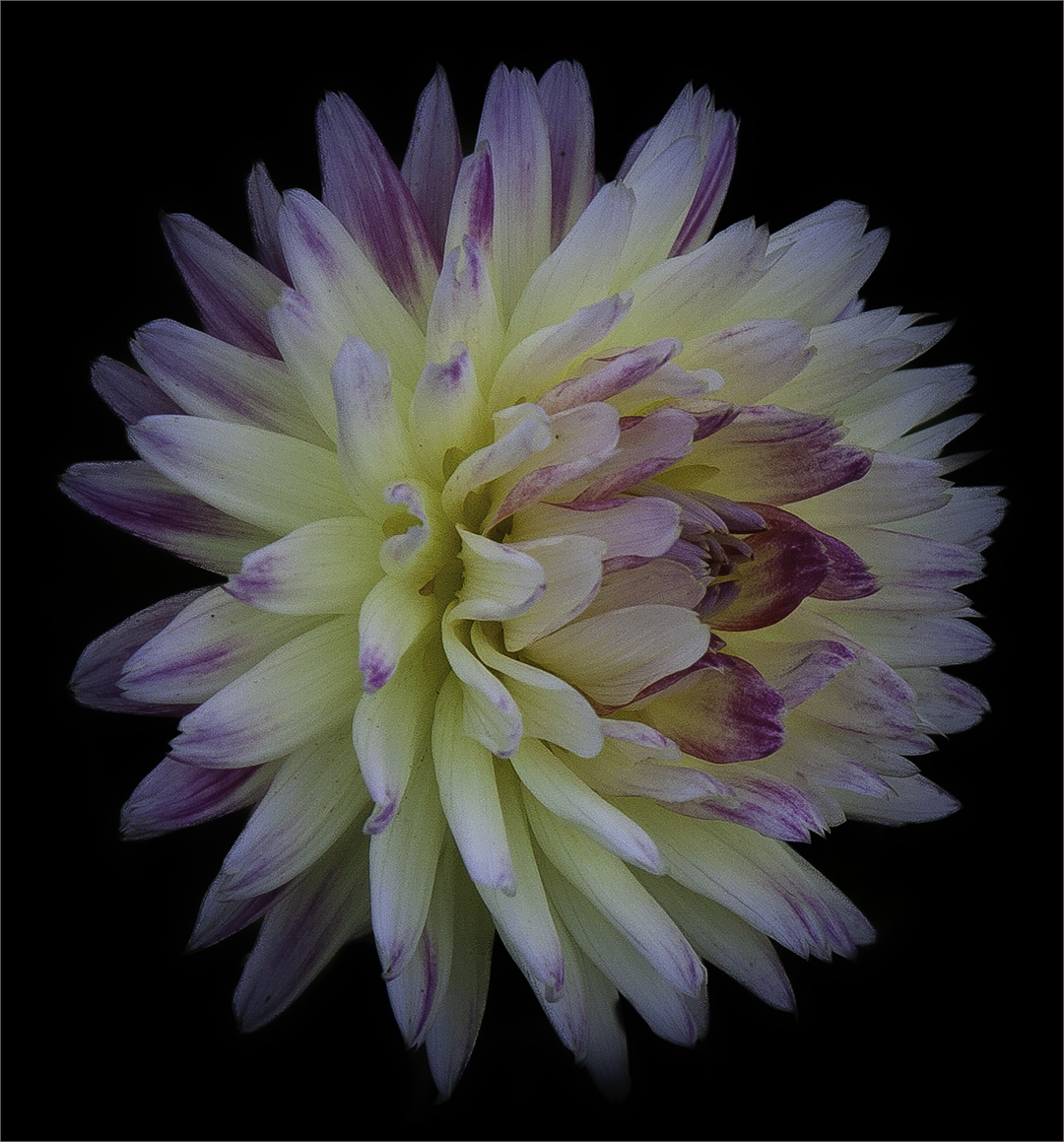
In relation to the pod, my eye sees 3 items - the center of the flower, the blue of the petals and the pod on the left. I don't find it that distracting though I guess it could be. I rather like the Final instead of the black on the reworks. The petals seem too have rather sharp edges to me when put on the black. I like the way David did the final though perhaps for a wall hanging the reworks might do better. They are all good. Nice work. |
Mar 12th |
| 61 |
Mar 23 |
Comment |
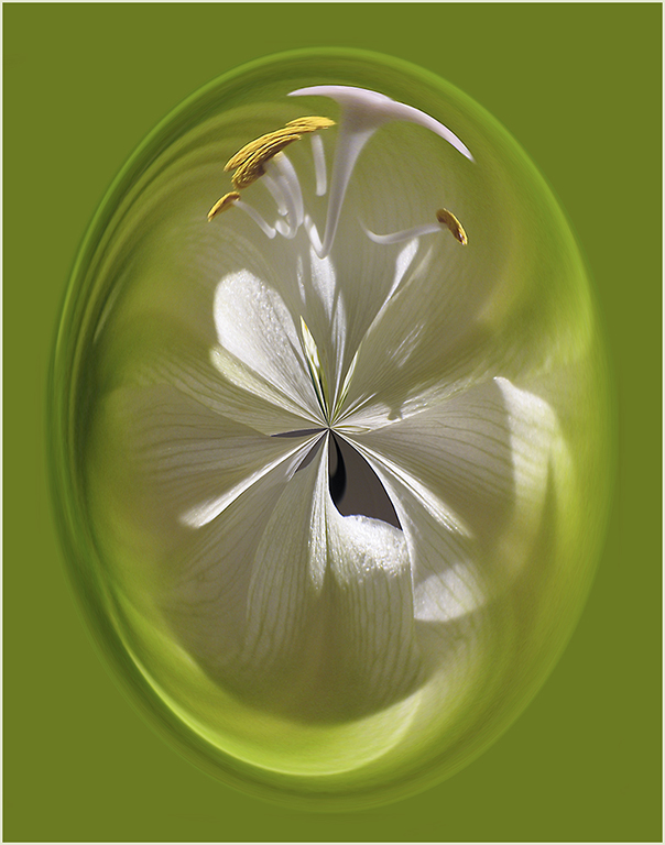
I'm going to agree with Randall on the stem - I would like to see a vertical with more of the stem showing.
I tried masking the flower by selecting Subject (had to add in the stem), making the background black and using the blend mode of Luminosity on the flower.
It's an interesting capture to work with and there are many possibilities. |
Mar 12th |
 |
| 61 |
Mar 23 |
Comment |
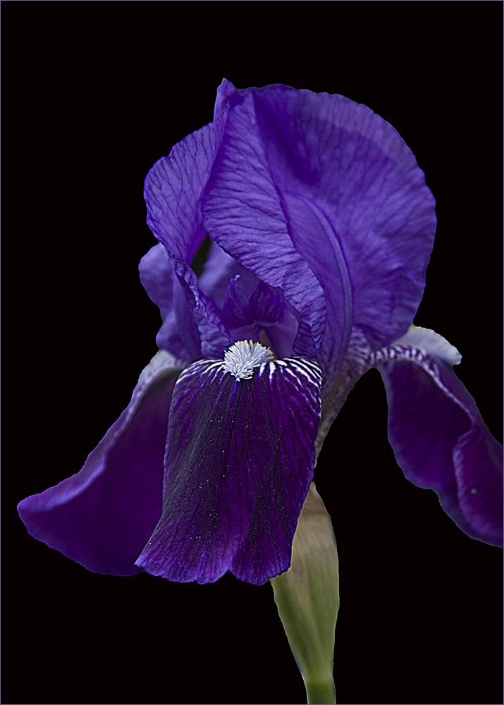
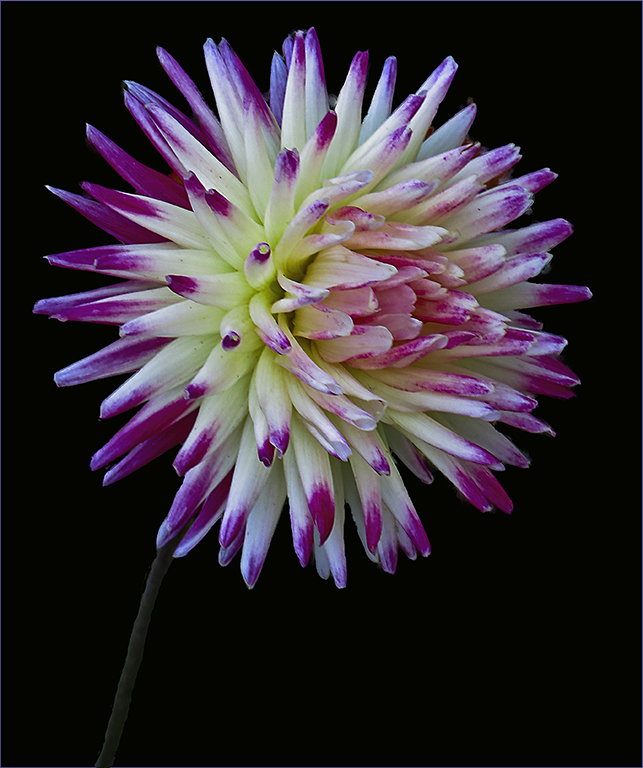
Stunning! To me, I rather think the white background makes it stand out more but maybe my monitor is not as bright as Randall's. I moved it over to my brighter monitor and I still think it works well. Might also be interesting on a black background. My only negative comment is that the lowest petal seems a little distorted - like some of it is missing. I think it's just the way it's folded back perhaps. Anyway, great work. |
Mar 12th |
| 61 |
Mar 23 |
Comment |
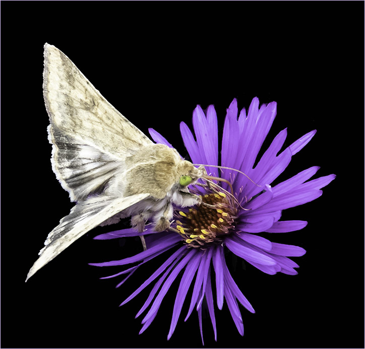
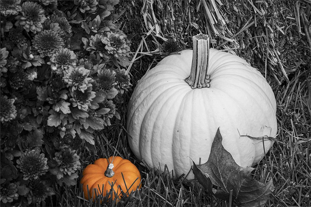
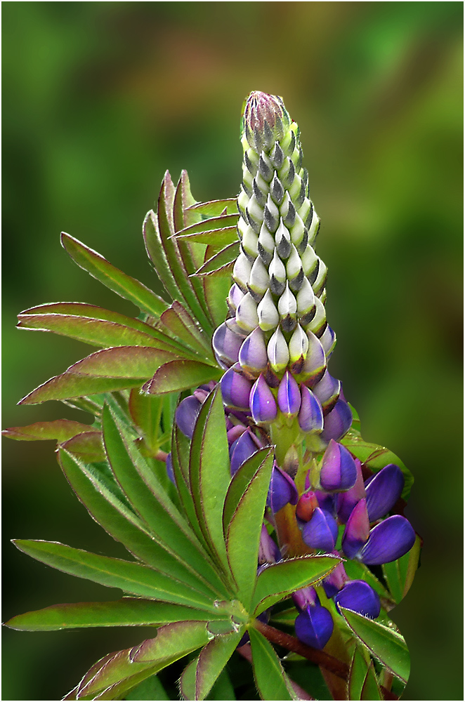
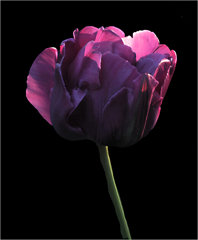
I also like the colors here. My feeling is that the moth sort of detracts from the flowers in this case. It adds a 4th element to the three blooms. If you were to do what Randall suggests, I would like to see the left flower removed leaving the two flowers and the moth. While the border is colored nicely, I feel the red is so wide that it detracts from my view of the image. Glad to see that you use the stroke though - many don't. |
Mar 12th |
| 61 |
Mar 23 |
Comment |
Lovely! The B/W does make it stand out. I like the way the light rims the leaves. I'll get on my soapbox about adding a stroke though. It would confine my view within the image instead of letting it travel outside the borders. |
Mar 8th |
| 61 |
Mar 23 |
Reply |
Hi David - she did say she used the Skew tool. :) |
Mar 8th |
6 comments - 5 replies for Group 61
|
11 comments - 7 replies Total
|