|
| Group |
Round |
C/R |
Comment |
Date |
Image |
| 61 |
Dec 22 |
Reply |
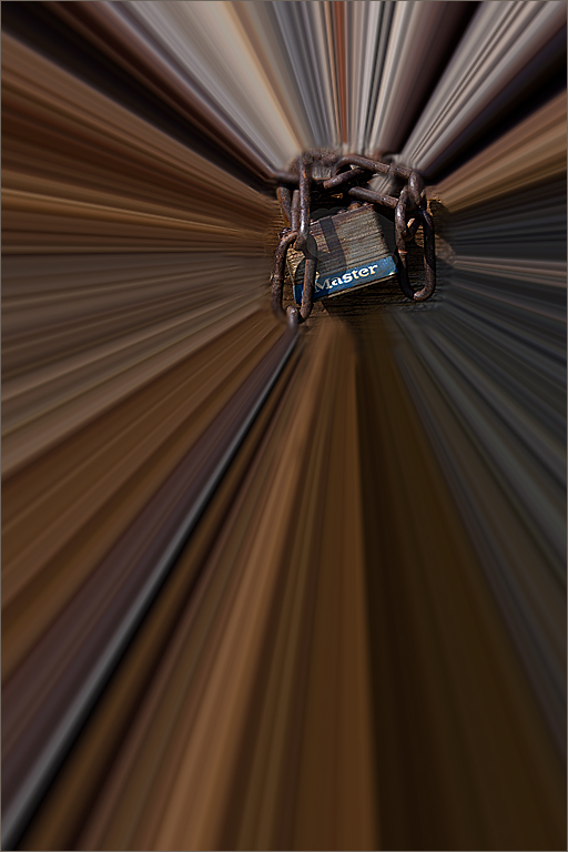
I think it was mentioned on one of the comments this month about the Stroke having a few selections. I use the "inside" setting for mine. I tried using "outside" but did not see a stroke at all. This might be what the issue is if you added a stroke and it doesn't show up. |
Dec 30th |
| 61 |
Dec 22 |
Reply |
I forgot that there are 3 ways to select the type of stroke. Thanks David for the reminder. I think I use either Center or Inside. You can also combine them (I think) with different colors and sizes to create a frame. |
Dec 15th |
| 61 |
Dec 22 |
Reply |
Gene - go to Linda's version of David's image and click to enlarge it. You will see what the stroke does for the image. The amount of pixels determines how wide the stroke will be. Depending on the size of the image when you make the stroke, you may need more - or less. I usually start with 2 pixels and if it doesn't show well, I'll go back and make it bigger. Hope this helps. |
Dec 13th |
| 61 |
Dec 22 |
Reply |
A stroke is simply a line around the image - like a thin border. You create it in Photoshop using Edit and then Stroke.
First - select the entire image (marching ants around the whole image) then go to Edit and select Stroke. The window will open giving you choices as to size and if you want a particular color. It's pretty easy once you try it a couple of times. |
Dec 13th |
| 61 |
Dec 22 |
Reply |
Linda is very good using the Stroke (PS - Edit menu). I've noticed that it is missing from many of our images. I would suggest always trying a stroke (around 2 pixels) especially on a black background. If you don't like it, you can shut off that layer or delete it and show the image without it. |
Dec 8th |
| 61 |
Dec 22 |
Reply |
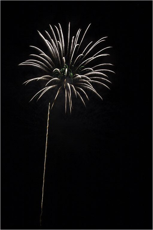
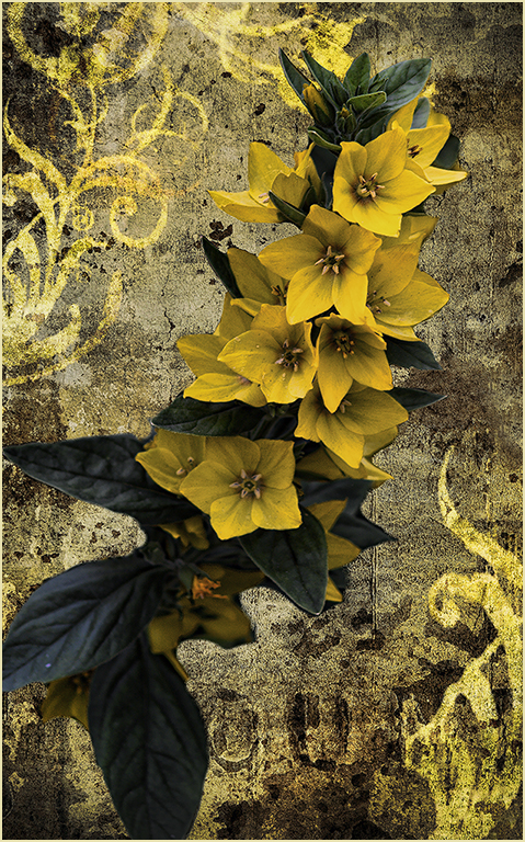
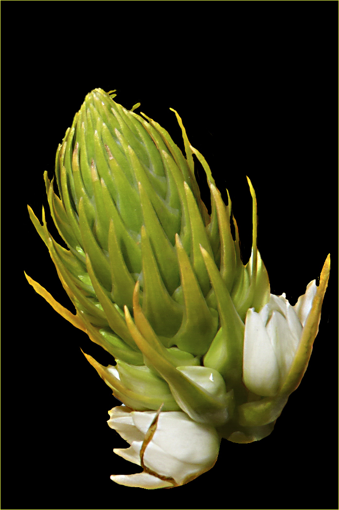
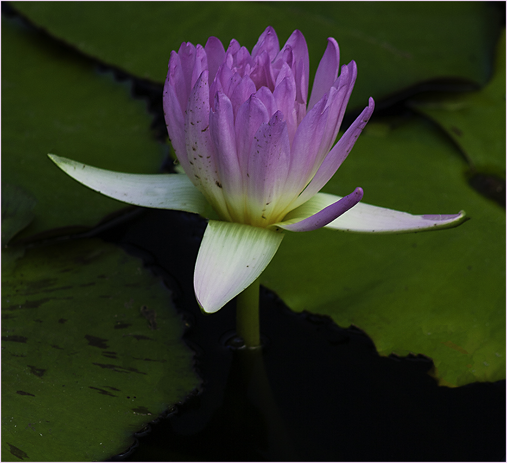
I like the way it looks reversed. |
Dec 8th |
| 61 |
Dec 22 |
Reply |
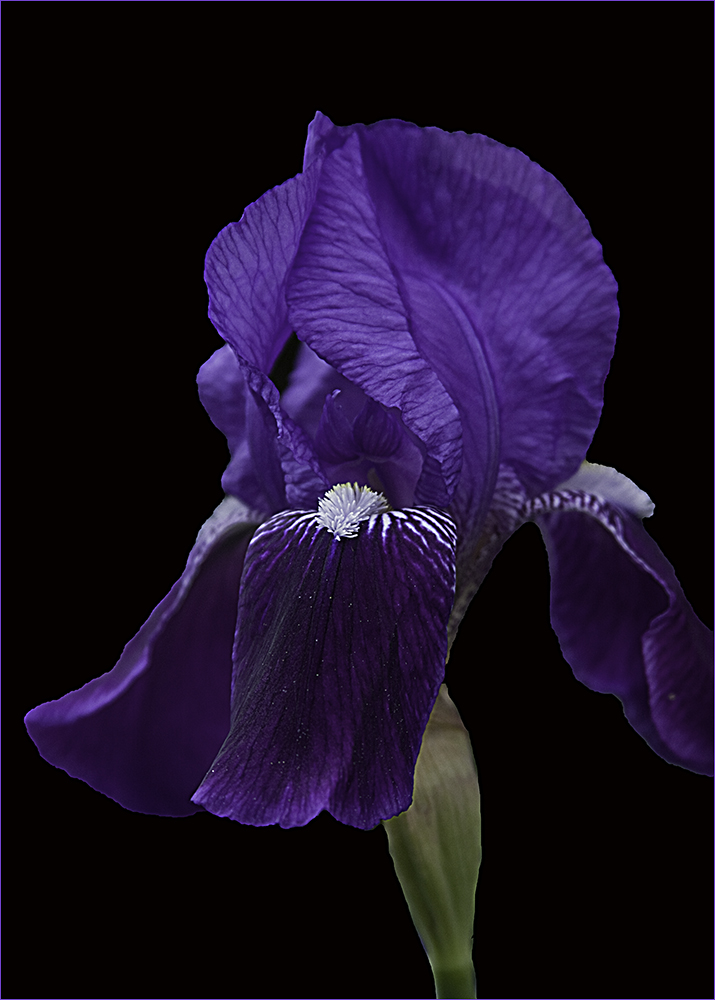
Interesting - however to me, I think it loses the sharpness and starkness of David's image. |
Dec 8th |
| 61 |
Dec 22 |
Reply |
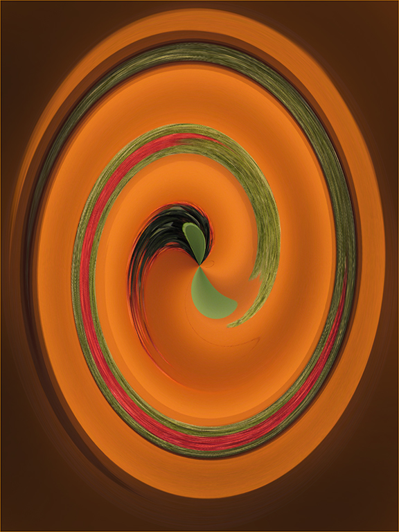
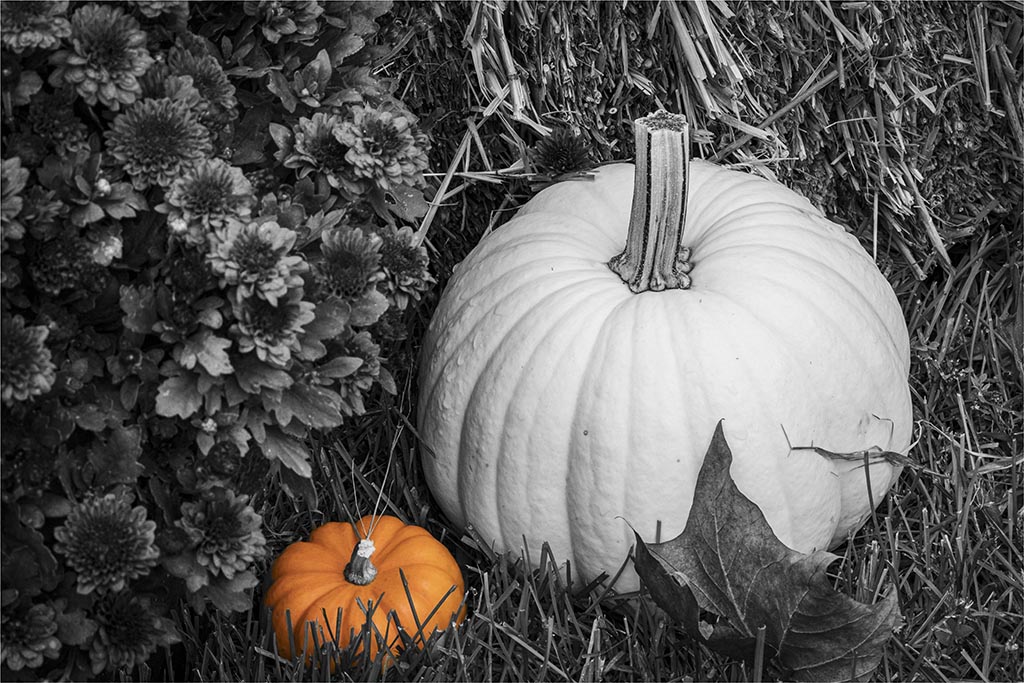
Maybe - I like the starkness. I tried bringing in the stem and darkening it and adding a stroke to the whole image. You do lose the starkness adding the stem though. You can't see the additions in the comments unless you open the image. |
Dec 8th |
 |
| 61 |
Dec 22 |
Comment |
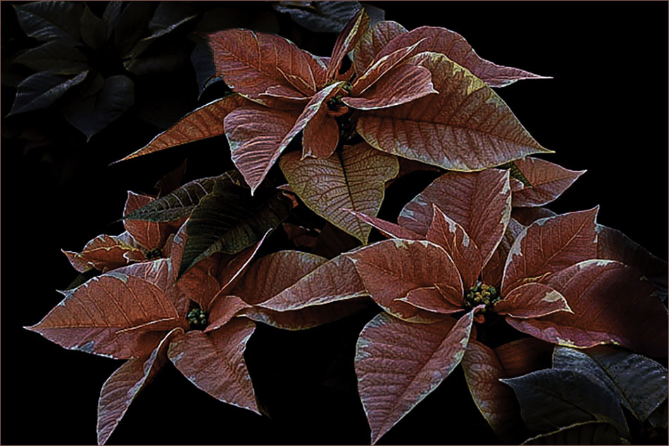
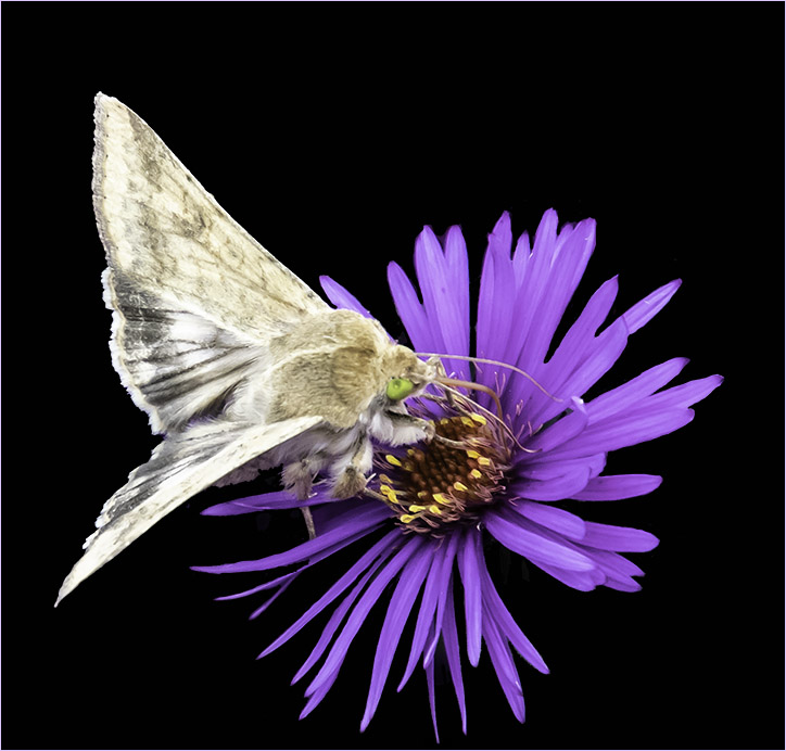
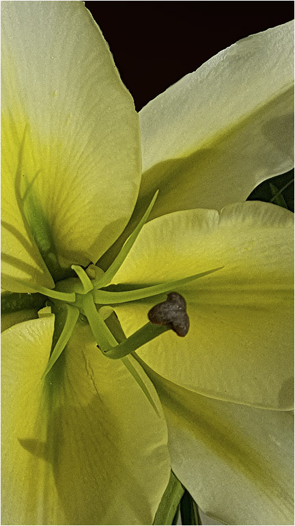
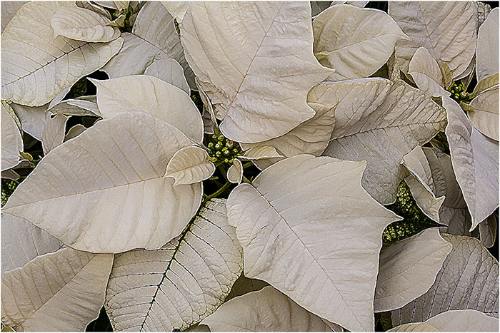
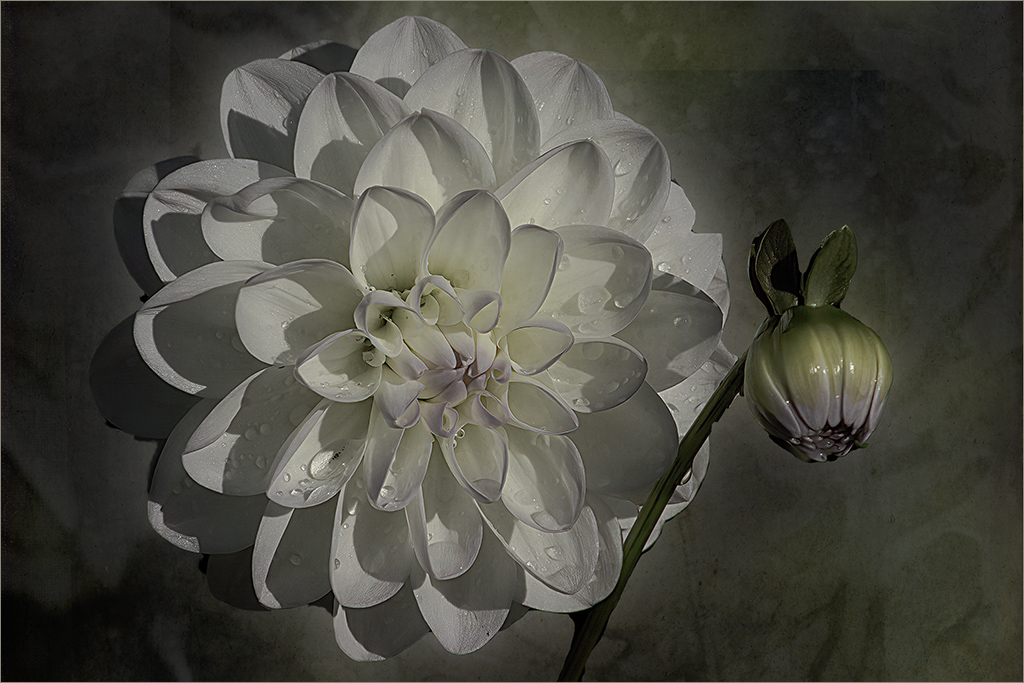
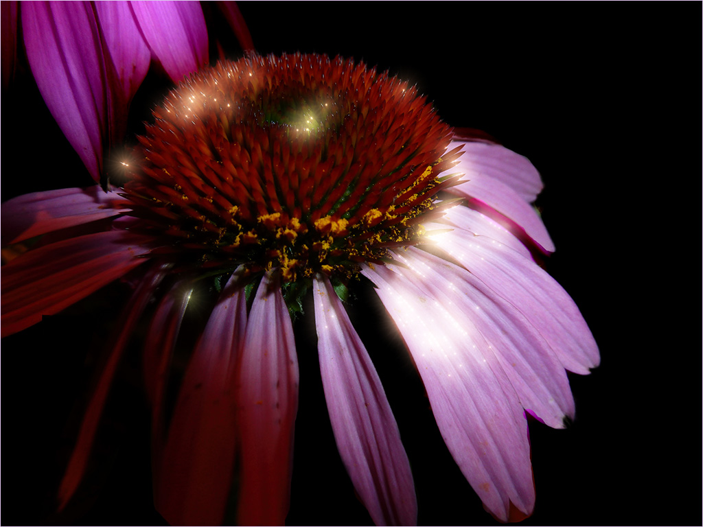
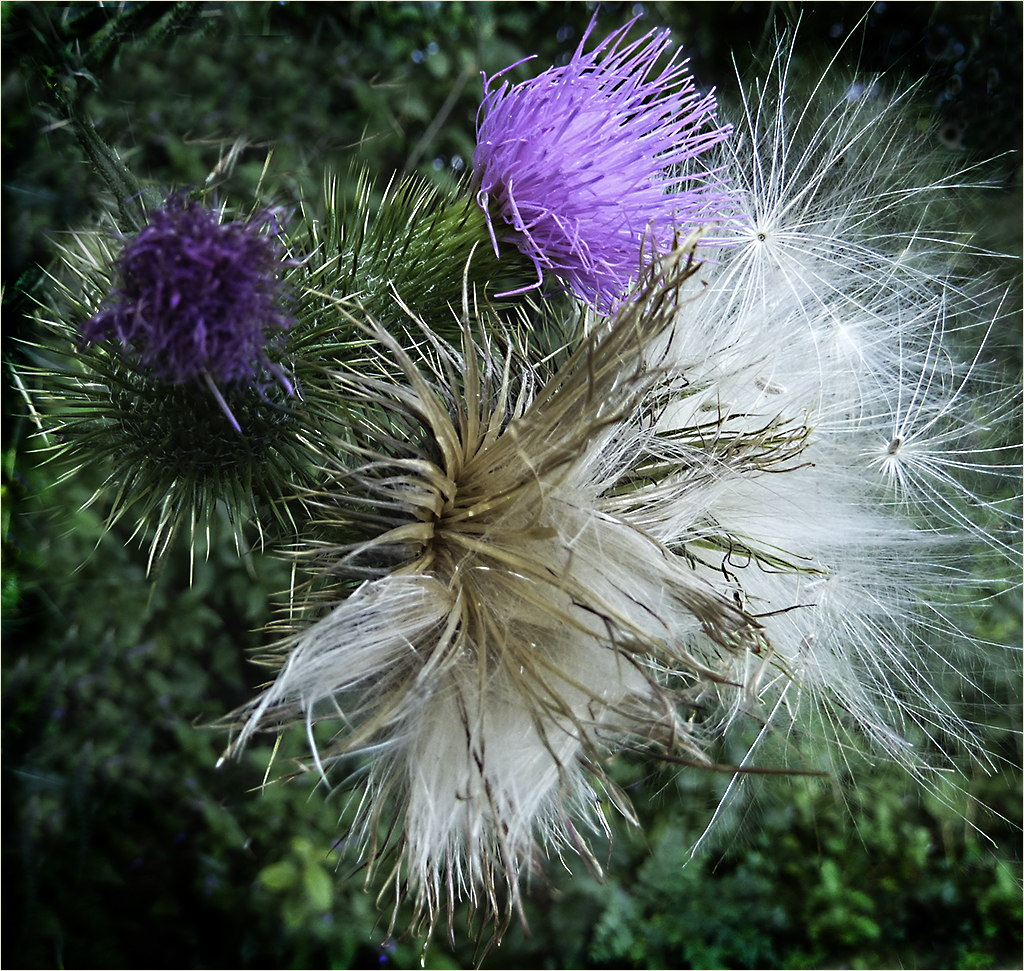
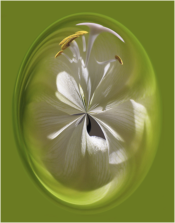
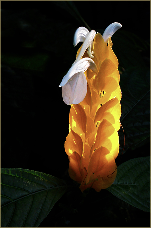
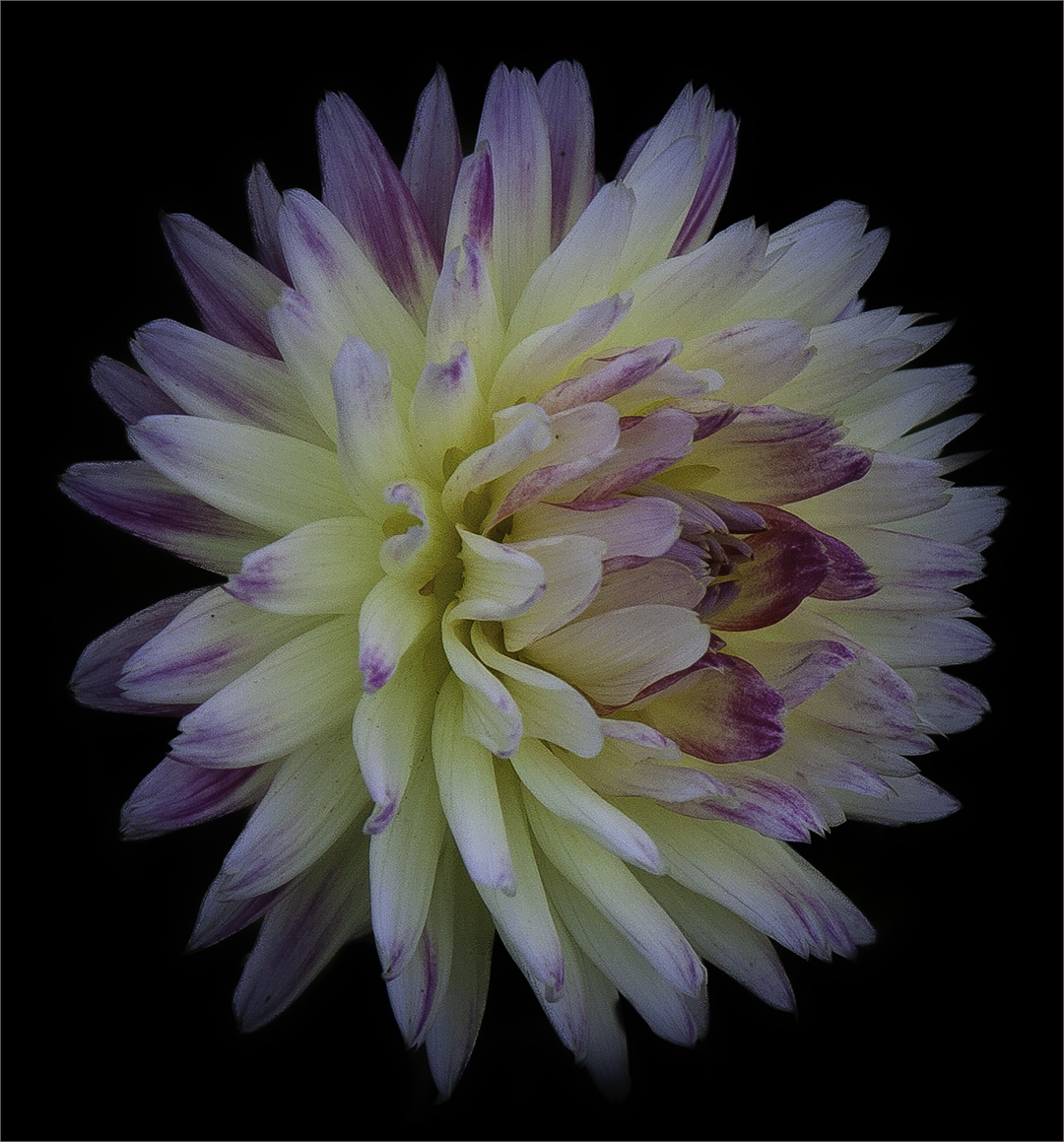
Beautiful - so stark on the black background. I think I would like to see the stem - or maybe it's just a blade of grass that could look like a stem - included so it isn't floating so much. It's a great image though. Makes me think I could reach out and touch it as it appears so life-like. |
Dec 8th |
| 61 |
Dec 22 |
Comment |
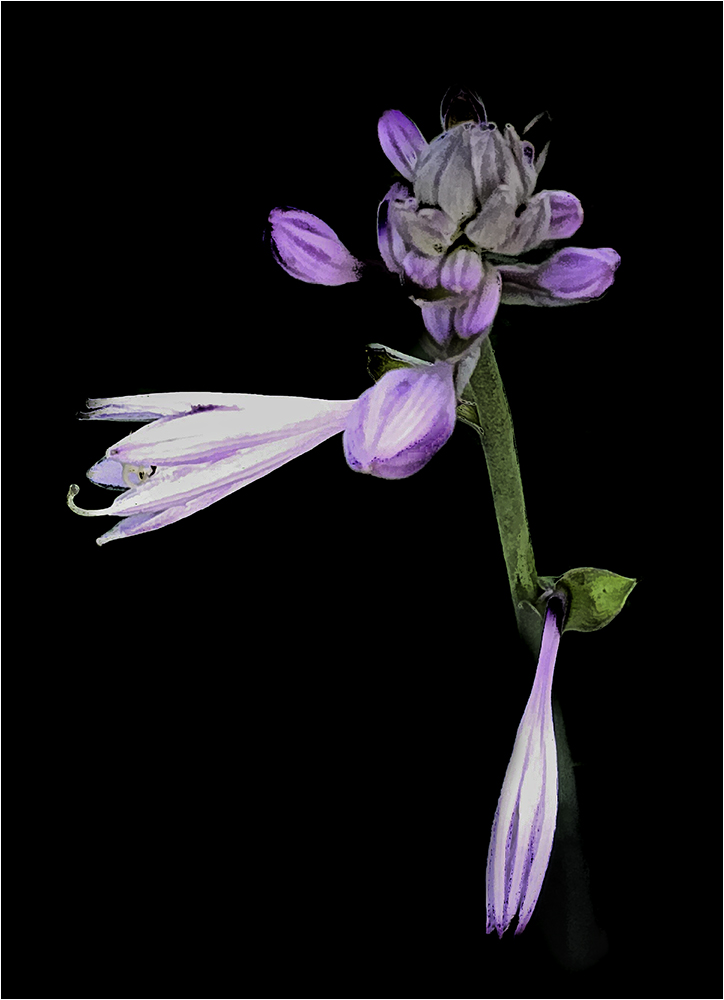
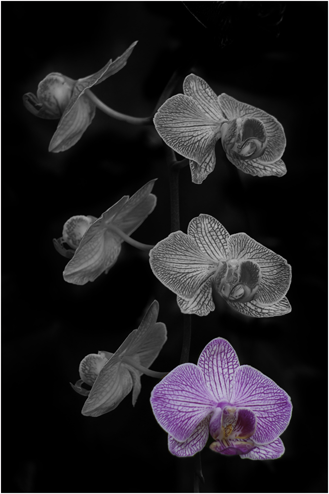
I think this one would be interesting on a black background. Would be interested in finding out more about how you created this look. Very nice. |
Dec 8th |
| 61 |
Dec 22 |
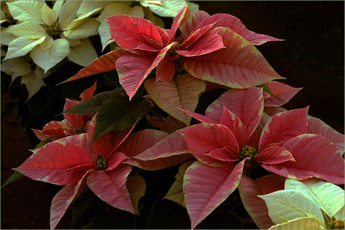
Comment |
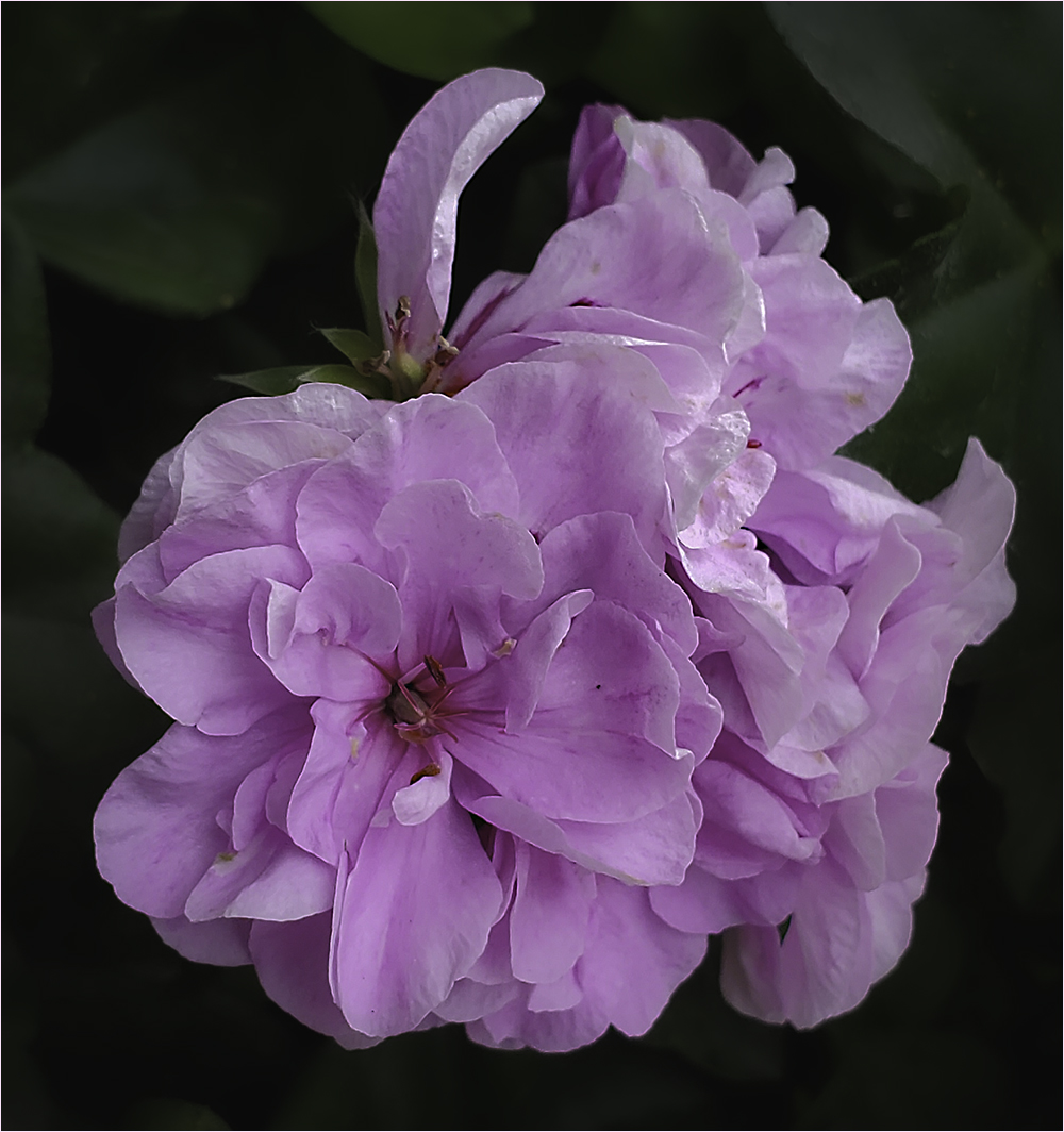
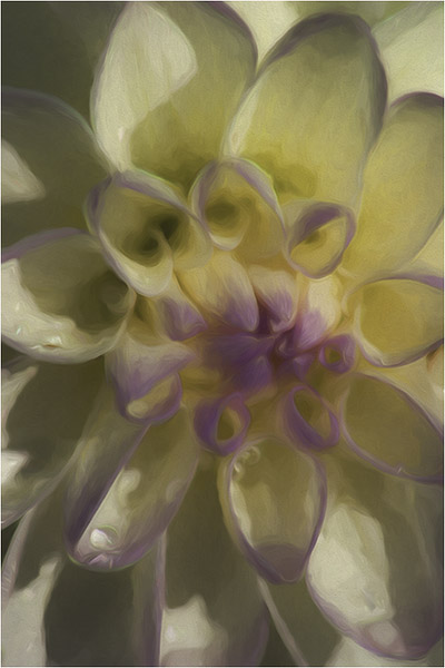
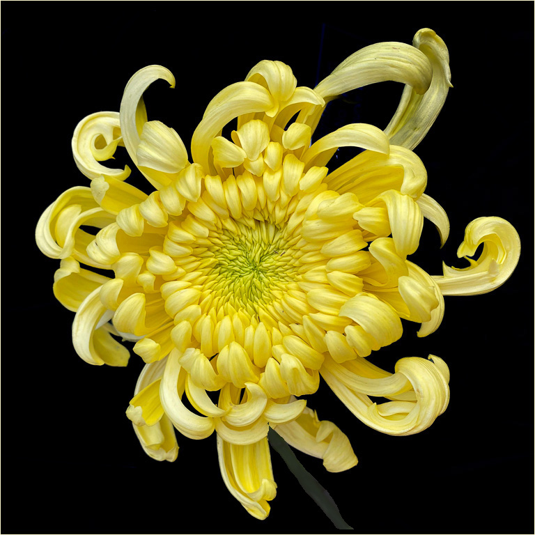
I'm going to disagree with Randall about the crop. I think it might crowd the flowers too much. Love the image but thought perhaps the background could be a little lighter. After giving it a try, I think this background works nicely. Nice work! |
Dec 8th |
| 61 |
Dec 22 |
Comment |
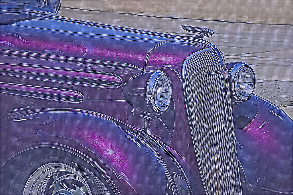
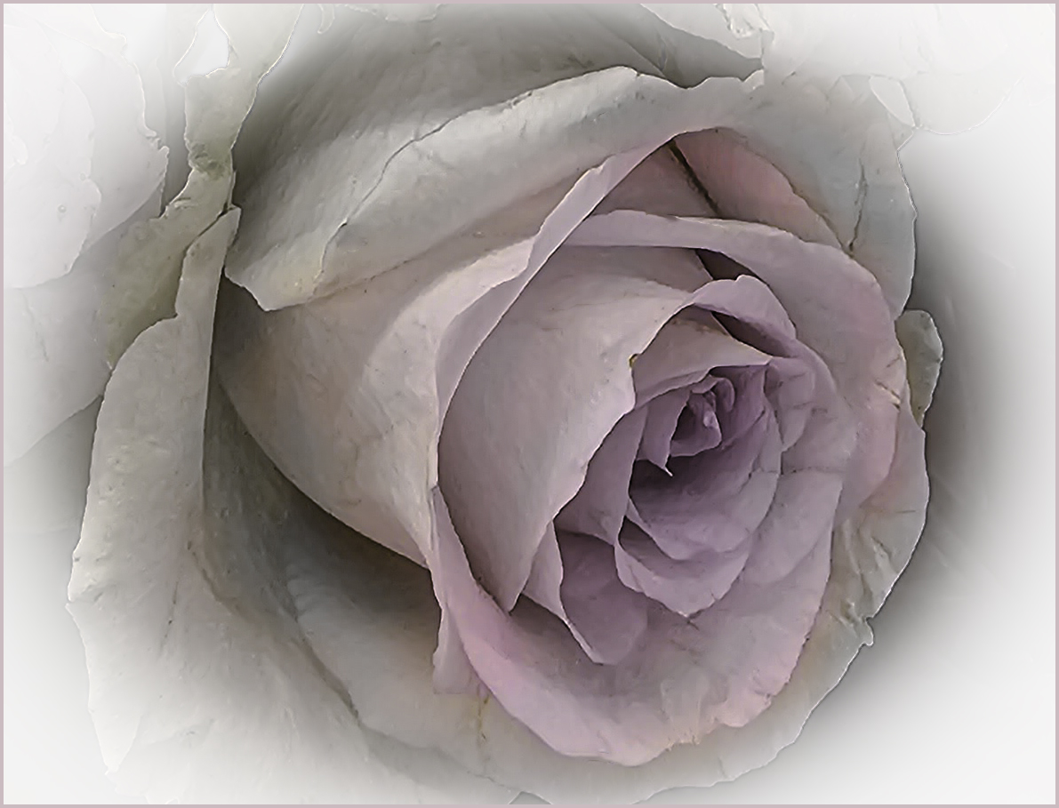
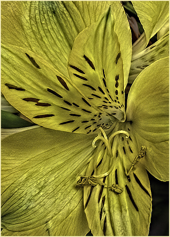
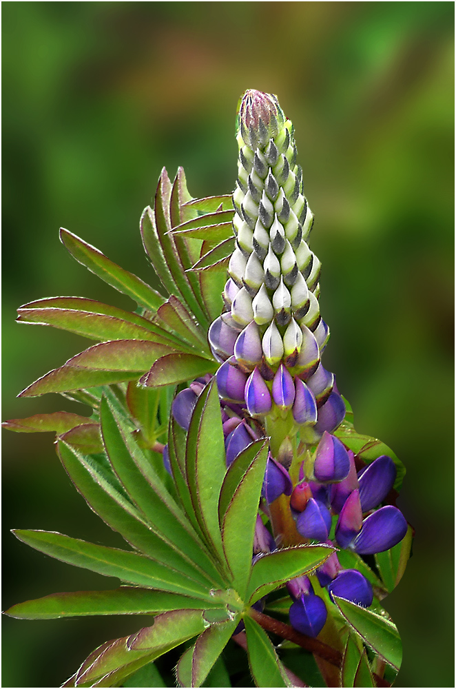
I like the composition of this image as the green leaves break up the two large flowers. It appears that you may have used a filter to make this more painting-like? The framing is pleasing as well. |
Dec 8th |
| 61 |
Dec 22 |
Reply |
Thanks David. I think you're right - perhaps it does look a little too detailed. |
Dec 1st |
| 61 |
Dec 22 |
Comment |
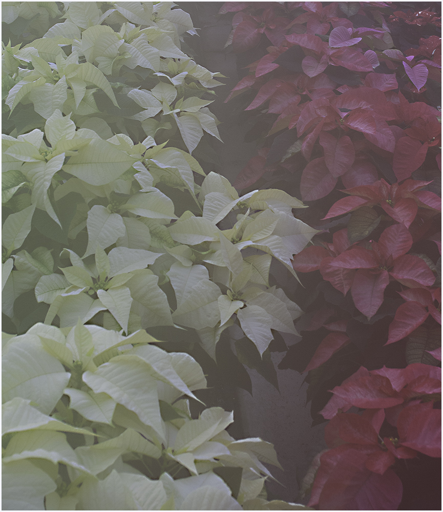
I was thinking the same as David regarding the integrity of the flower's shape but I do like what you've done. It would not qualify as a "nature" division image but it is striking. The petals appear to be dancing. Nice work. |
Dec 1st |
| 61 |
Dec 22 |
Comment |
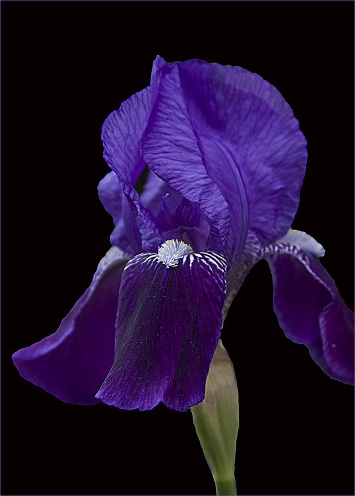
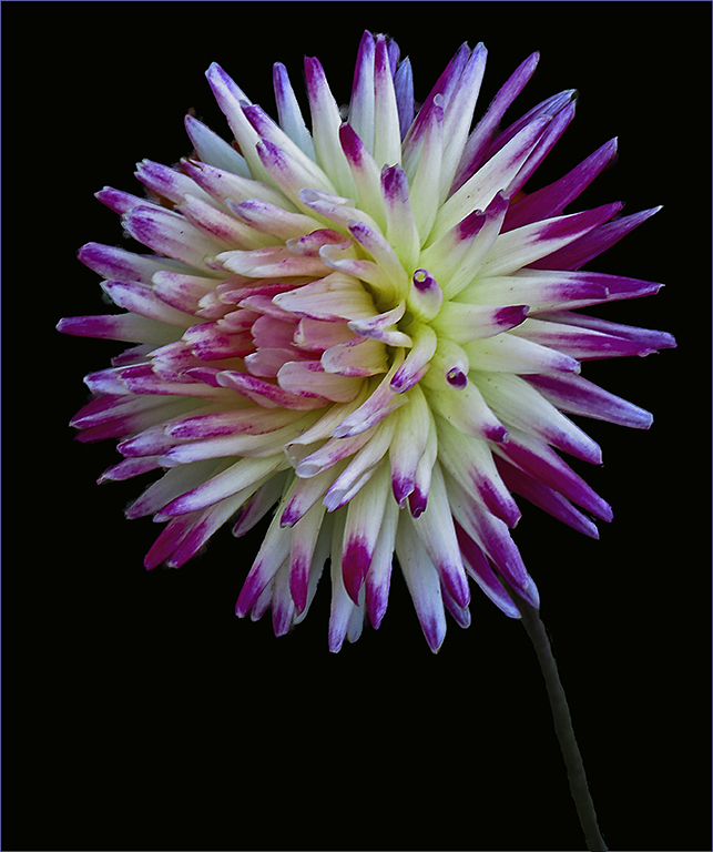
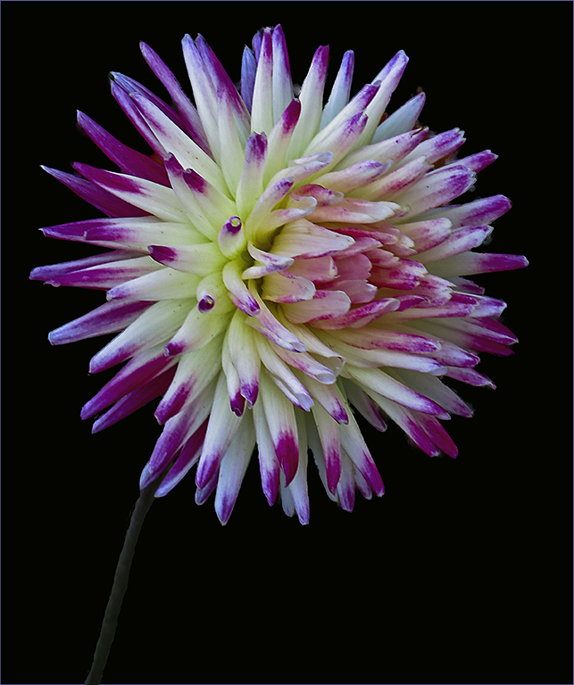
Nicely done. I agree with David with the colors. The only suggestion I would make is to Stroke it - maybe with a very small light orange stroke. To me, that would make a border that keeps my eye on the flower instead of blending into the black. |
Dec 1st |
6 comments - 9 replies for Group 61
|
| 65 |
Dec 22 |
Reply |
Thanks, Al. Looks like you have a good group here. |
Dec 7th |
| 65 |
Dec 22 |
Reply |
I try to visit one a month. There are a lot of great images out there...even if you don't make comments. |
Dec 7th |
| 65 |
Dec 22 |
Comment |
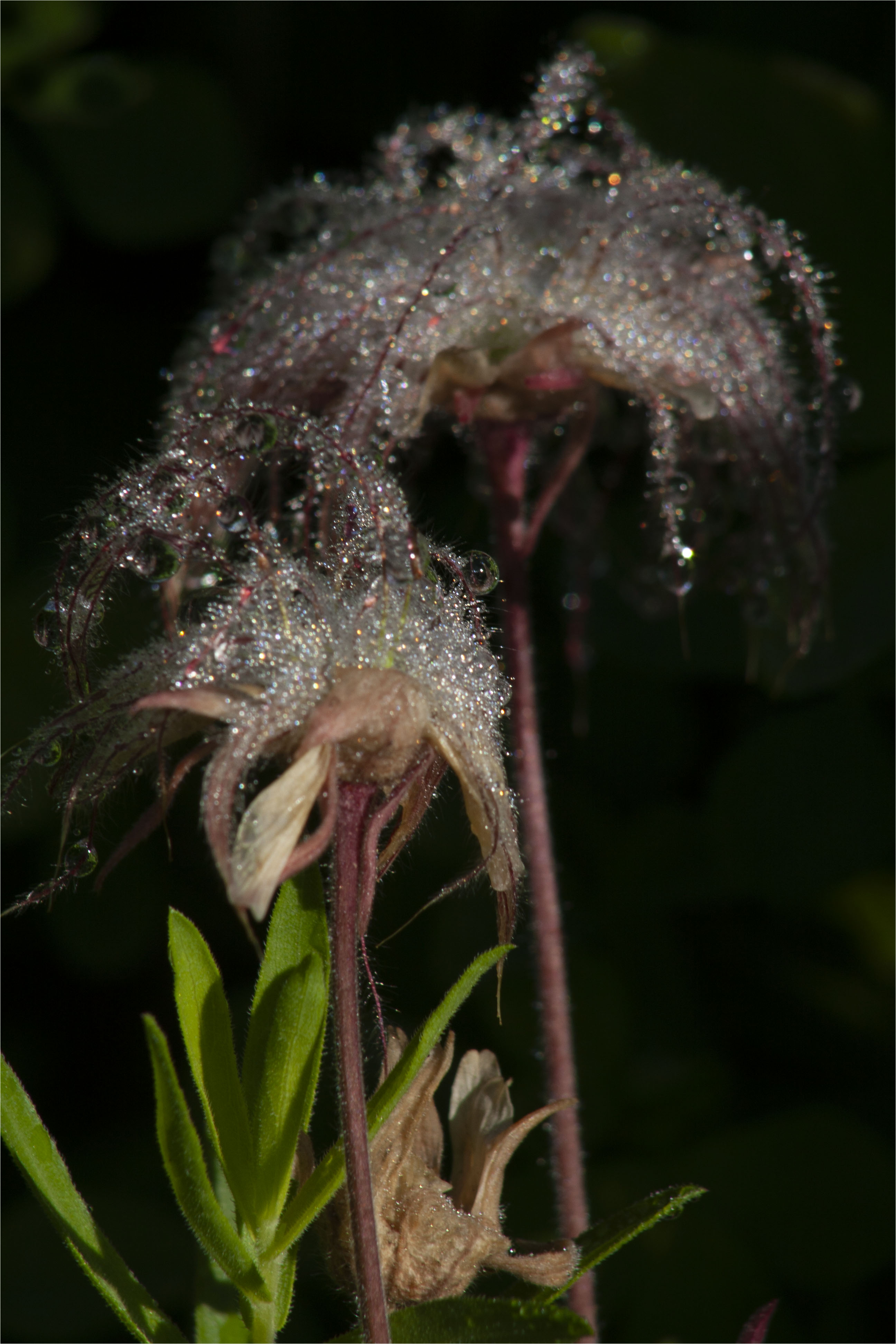
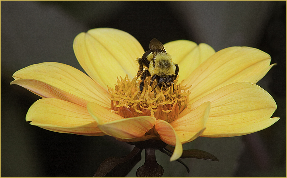
It's a soft view which is pleasing, especially since the image is not quite sharp. I'm not sure I like the way the stem was treated by the background. It looks to me like it's going over the stems though it might be the way the hairs on the stems are going. |
Dec 4th |
| 65 |
Dec 22 |
Comment |
The flower "spoke" to you very nicely. Beautiful image with good composition and a nice softness. Good job. |
Dec 4th |
| 65 |
Dec 22 |
Comment |
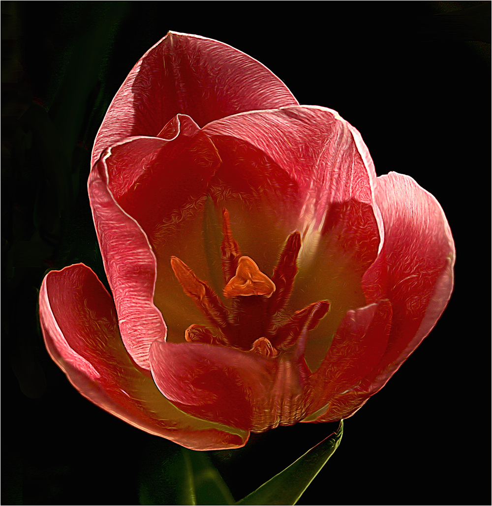
I like the way you have focused more on the tulips and I like the colors. They are nice and vibrant. I'm not sure I like the way the flowers on either side are cut off by the border-especially on the right. I almost think I like the whole group in the original minus the green leaf on the left and the stems on the right. |
Dec 4th |
| 65 |
Dec 22 |
Comment |
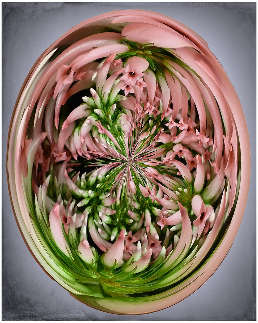
Chose this group to visit this month at random and this image stuck out. I love the colors and the impressionist effects. Good job. |
Dec 4th |
4 comments - 2 replies for Group 65
|
10 comments - 11 replies Total
|