|
| Group |
Round |
C/R |
Comment |
Date |
Image |
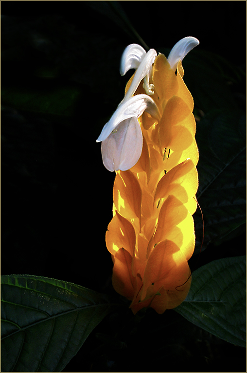
| 1 |
Nov 22 |
Comment |
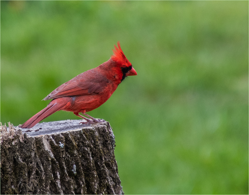
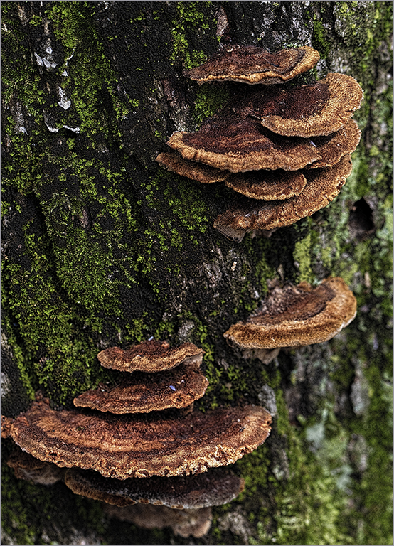
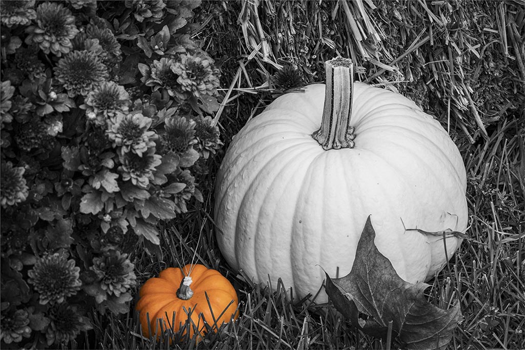
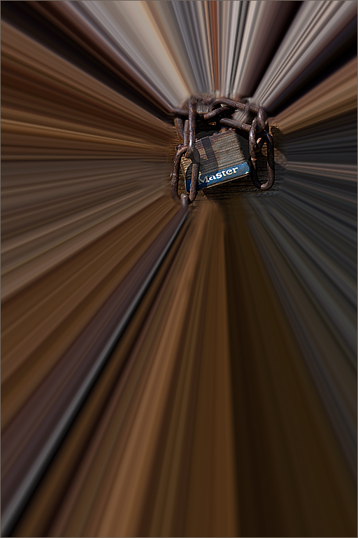
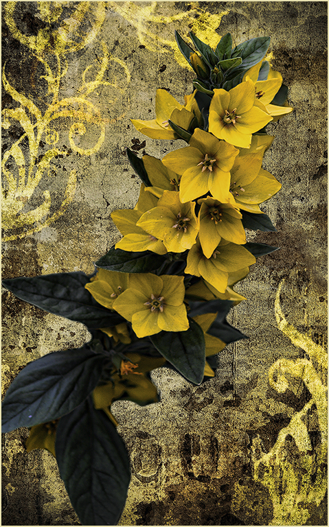
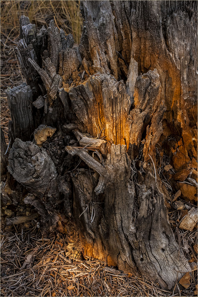
Interesting image. Love the way the focus puts your eye right on the stem. Nice capture. |
Nov 25th |
1 comment - 0 replies for Group 1
|
| 22 |
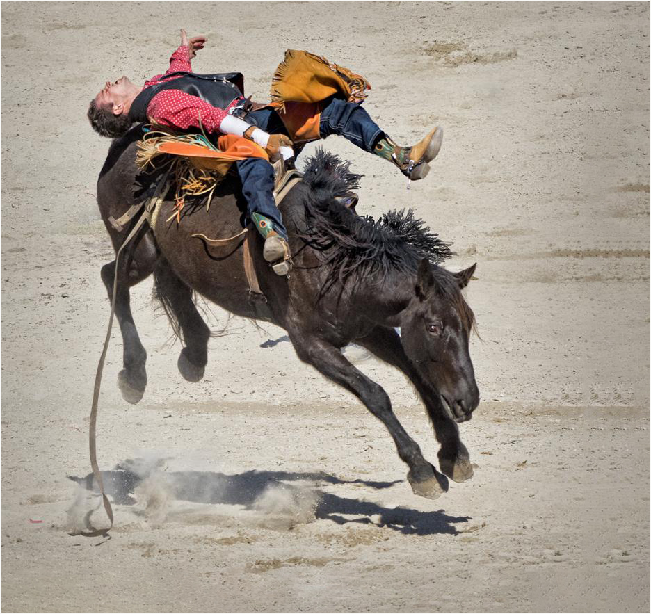
Nov 22 |
Reply |
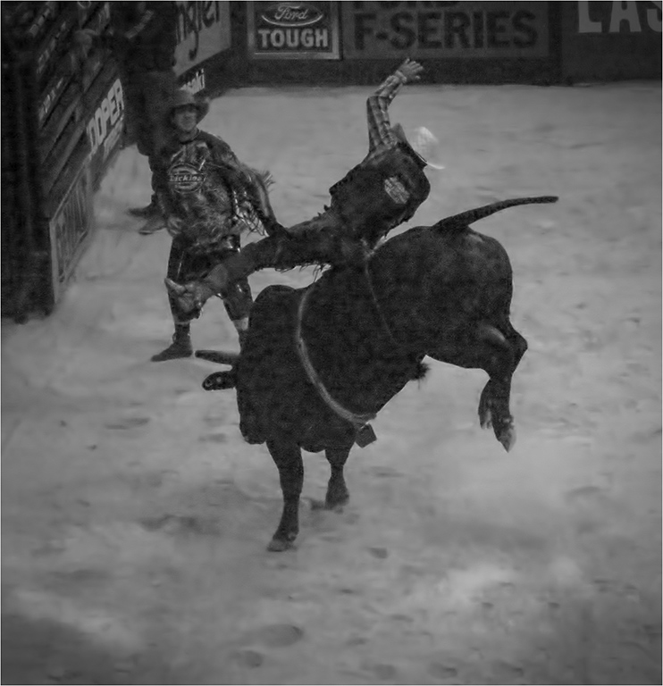
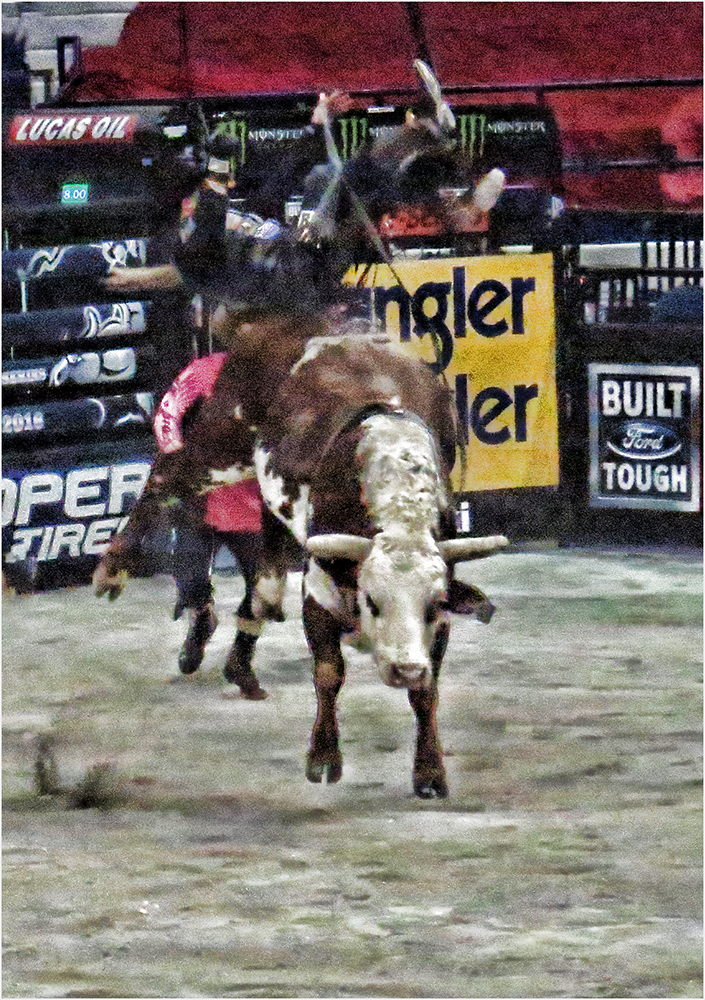
To me, the horse and rider tell it all. Unless you've never seen a rodeo, you would assume there are people in the stands and that it's a rodeo. This way I see the expression in the rider's face and the horse's too. |
Nov 22nd |
| 22 |
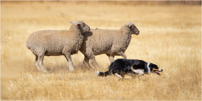
Nov 22 |
Reply |
Mike would probably know best but to me, it looks like the sheep are already back on their haunches because they know the dog is about to cut them off. |
Nov 19th |
| 22 |
Nov 22 |
Reply |
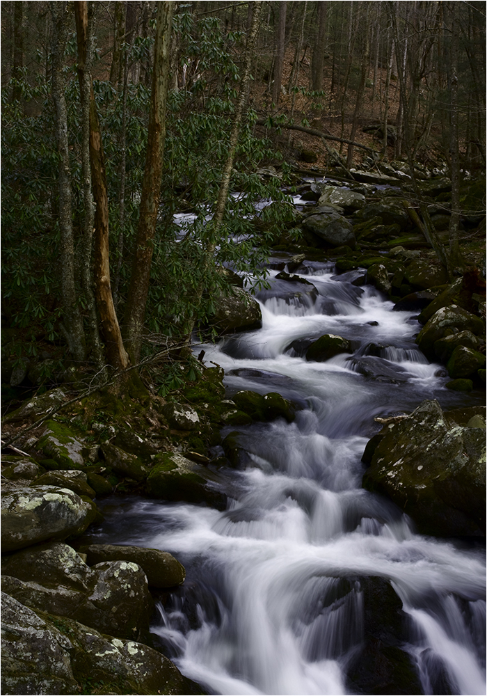
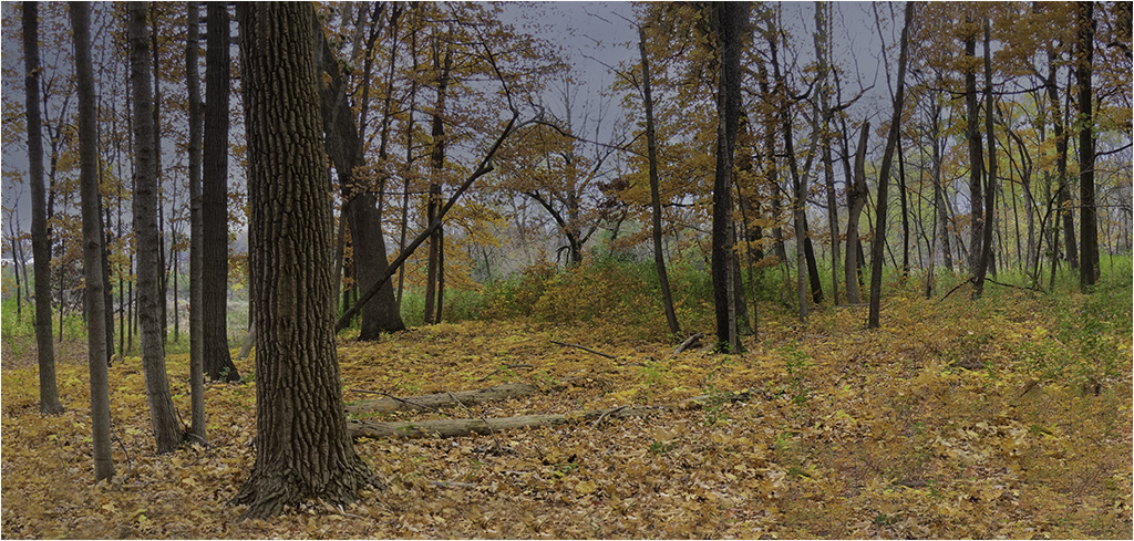
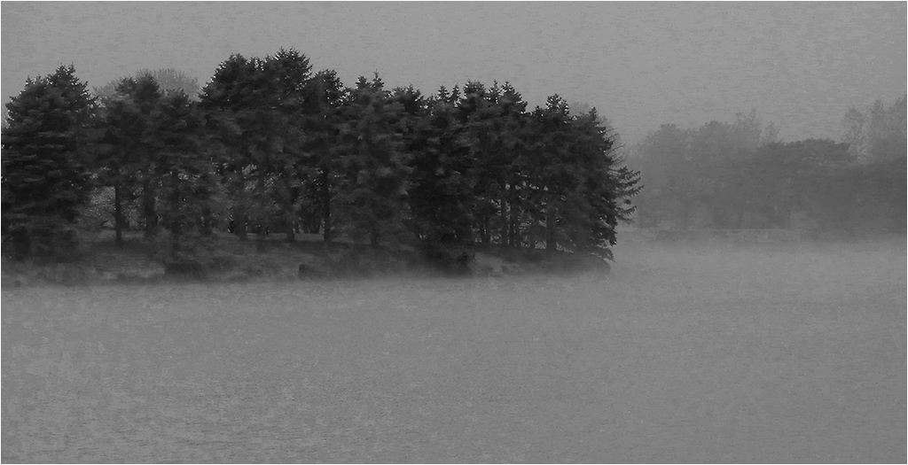
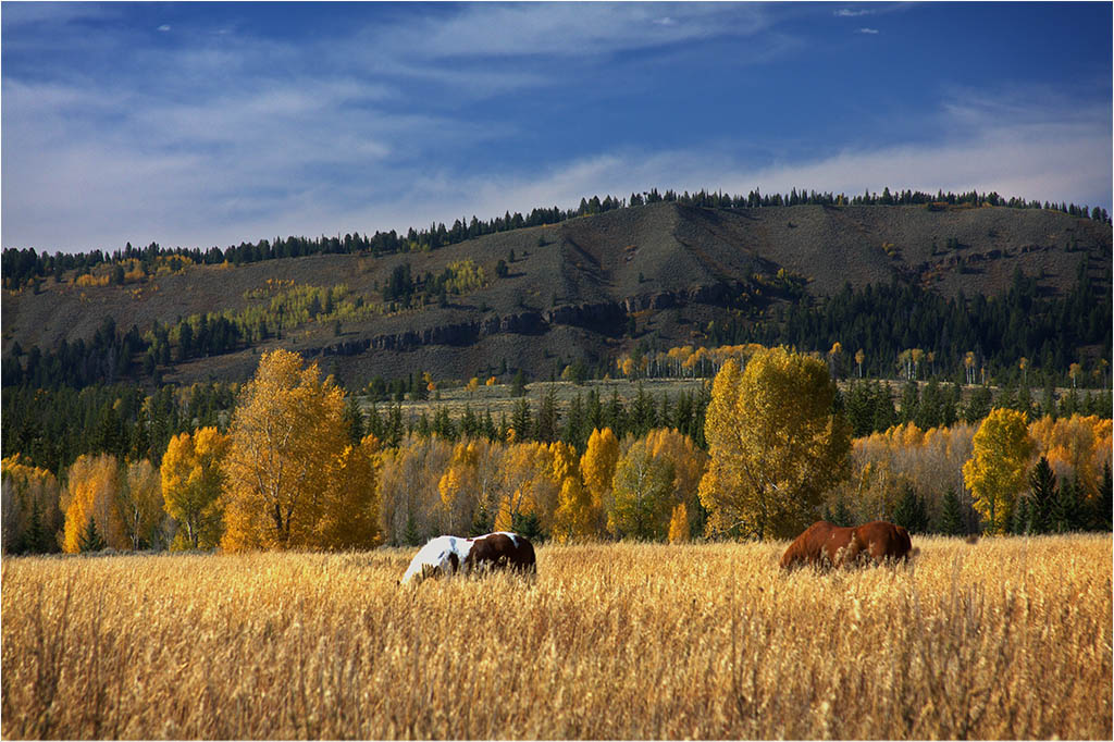
You are right about getting it to look "right". From a subject standpoint, I like your remake. It's probably close to one of the single images of the pano. I was trying for the expanse of the forest floor but it is lacking in many ways. |
Nov 14th |
| 22 |
Nov 22 |
Reply |
Al, do you work with Content Aware? Sometimes it takes multiple tries but it usually works pretty well. Blurring the background might work depending on how well you do selections. Give it a try and let's see what you come up with. :) |
Nov 14th |
| 22 |
Nov 22 |
Comment |
Here is cropping the trees and taking the rear sheep out. |
Nov 14th |
 |
| 22 |
Nov 22 |
Reply |
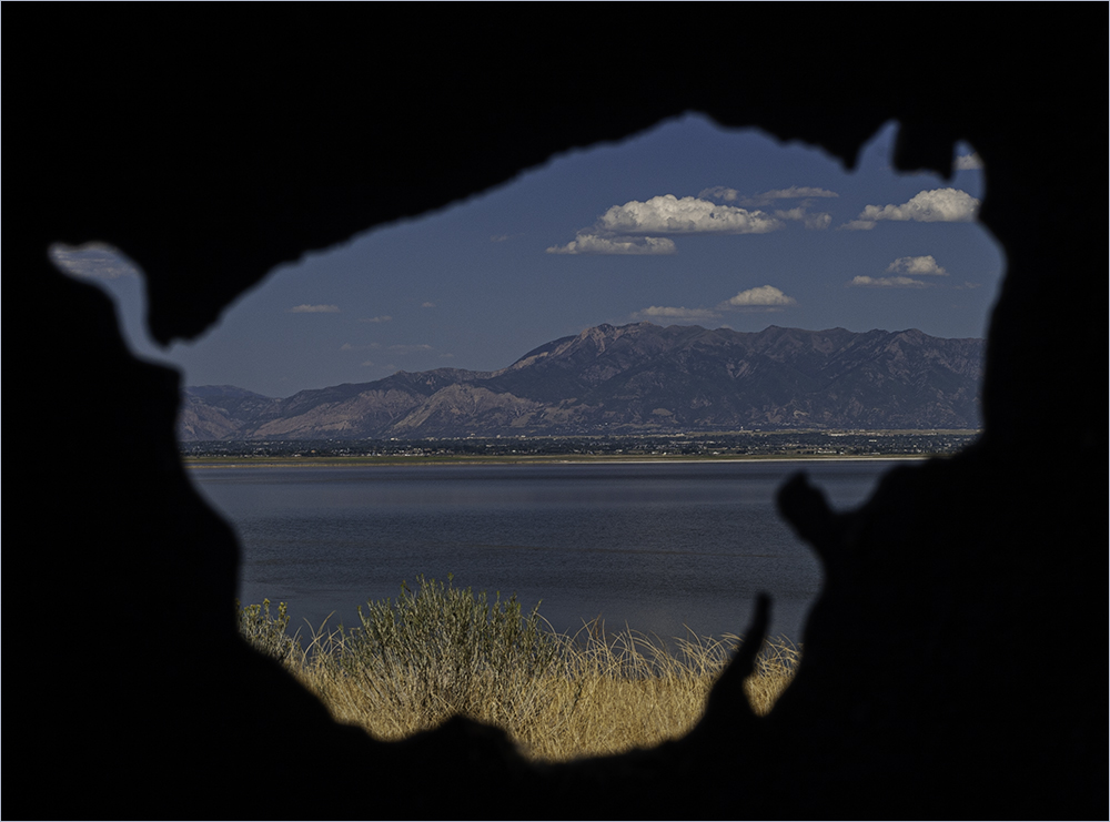
Maybe have added a piece of the top of a lamppost from another pix even if not yours? |
Nov 12th |
| 22 |
Nov 22 |
Comment |
Good capture. I guess I'm in a disagreeable mode today. :) I like the trees in the background and wouldn't crop. To me, it gives more of a sense of depth in the image. As for the markers, it almost makes it look like a race between the dog and the sheep - and that is the finish line. However, they really did need to be removed. I think the sharpening Joe gave it makes the sheep look "crisper" as well. |
Nov 10th |
| 22 |
Nov 22 |
Comment |
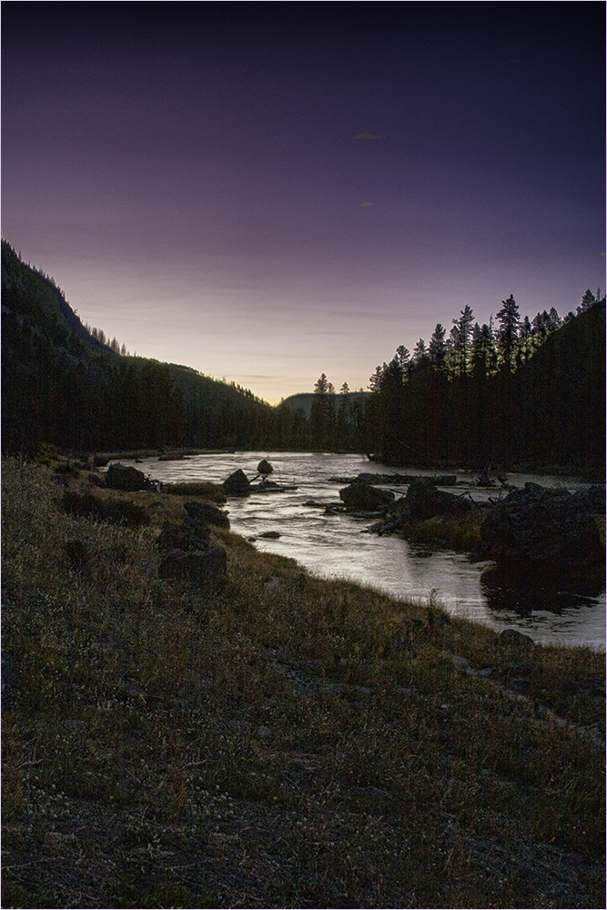
The concept is interesting. I didn't care for the cut off pole so I cropped and let the pole kind of exit into the blackness. I decided to flip it as you usually do and decided I kind of liked it that way. Selections can be hard especially with what you were working with. They look pretty good though. Nice job. |
Nov 10th |
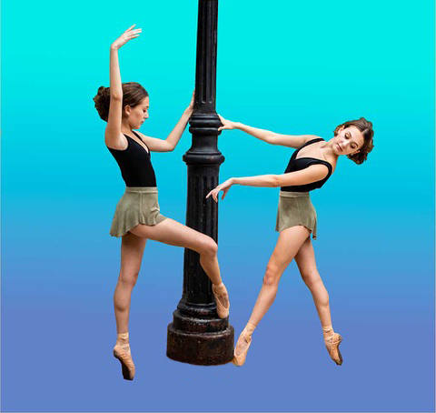 |
| 22 |
Nov 22 |
Reply |
I'm not sure I like the flip in this one. To me, Al's image has the river going back toward the colorful trees whereas this one doesn't seem to have the same effect for me. Nice artsy version though. |
Nov 10th |
| 22 |
Nov 22 |
Comment |
I like this capture. I think Joe's flip does make it look better. Good job - both of you. :) |
Nov 10th |
| 22 |
Nov 22 |
Reply |
I can never get the photo to look like what I saw. At this point, it was past peak and I agree there is no clear focal point - except in my head. :) |
Nov 10th |
| 22 |
Nov 22 |
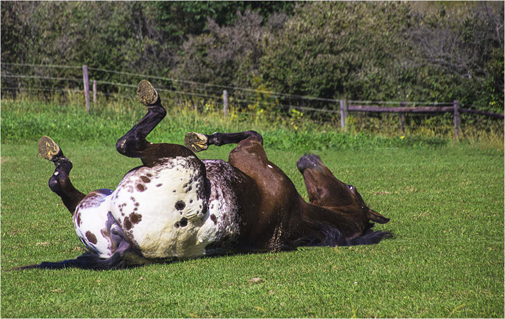
Comment |
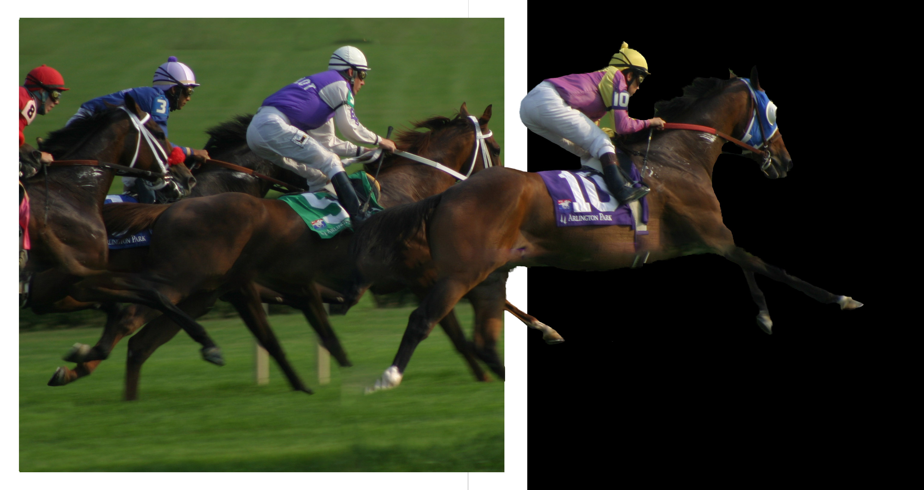
I agree - excellent capture. I added some canvas to the right side and bottom and used Content Aware which worked nicely. Probably could have added more. I like the catch light you apparently added in the horse's eye as I don't see it in the original. Nice touch. Great work off the original. |
Nov 10th |
 |
| 22 |
Nov 22 |
Comment |
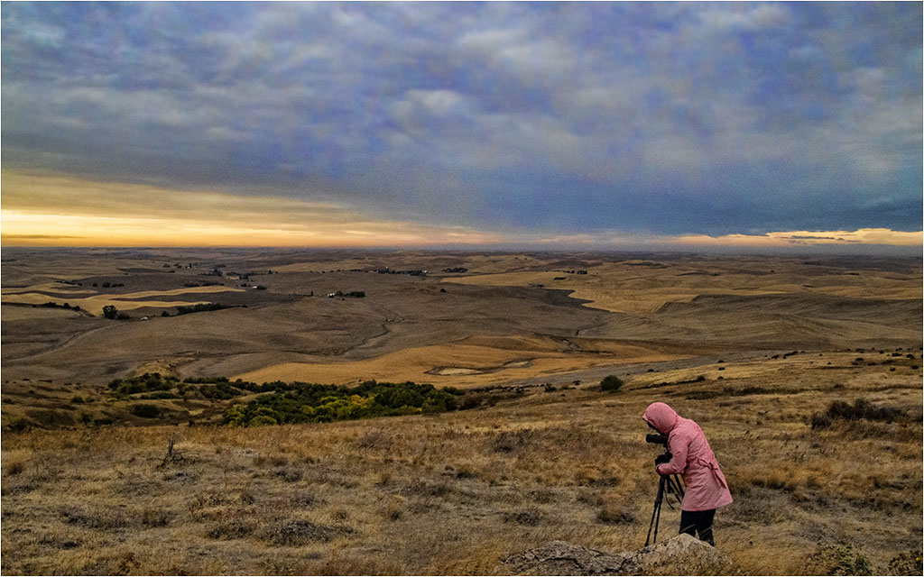
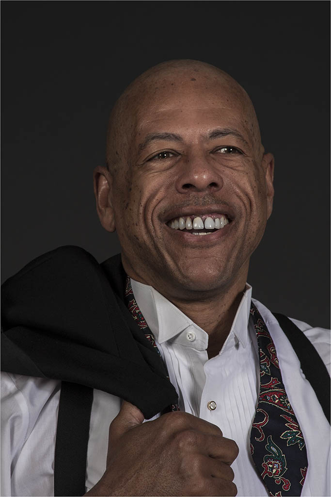
I'm going to disagree with Joe. I don't know how you would crop from the background except from the top but that background, to me, is part of the speed look. His face could be brightened some. Joe - do you have a rework of your suggestions?
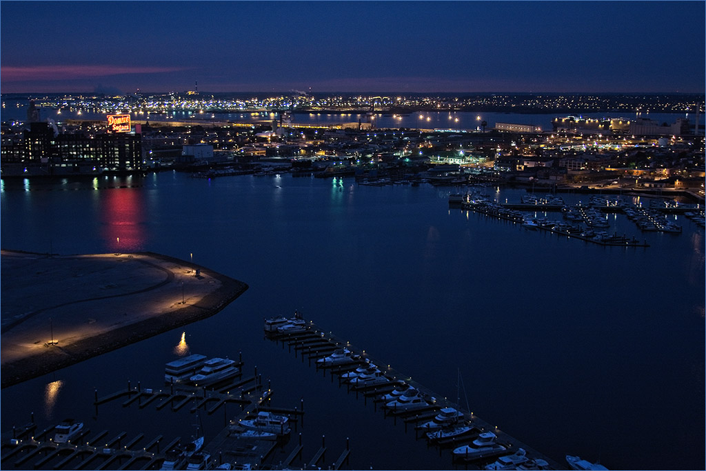
Having driven this stretch of road, it's an interesting area to take photos as long as you aren't moving because they tend to want to run you down if you are too slow. :) |
Nov 5th |
| 22 |
Nov 22 |
Comment |
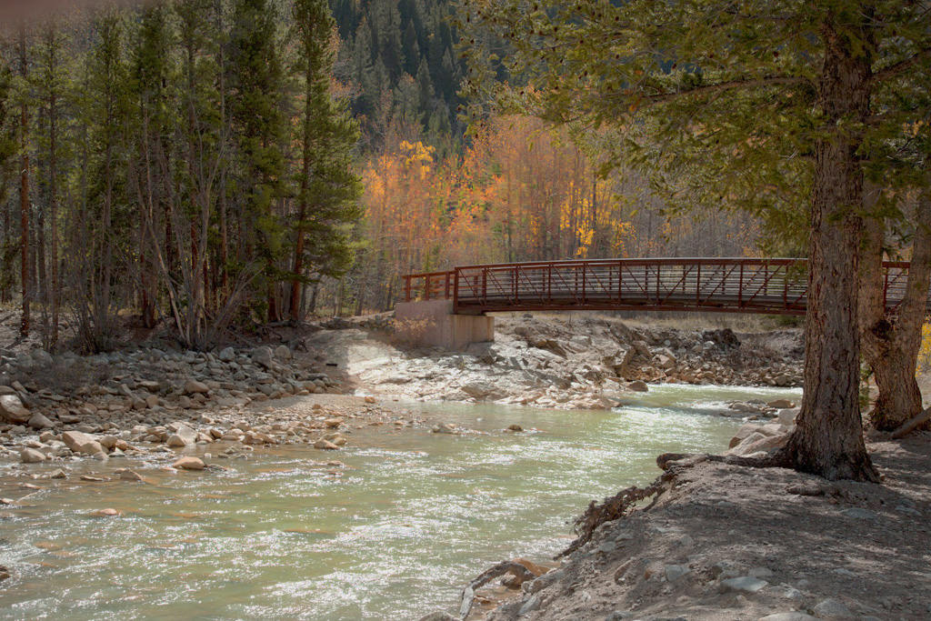
I agree with Mike - it's too yellow. You don't mention if you used an artistic filter but your images almost always seem to be more "artsy" that photographic. There are times when that is good but I like the original - with some modifications.
I feel the composition is very good and the trees anchor the bridge nicely at either end. I took a stab at keeping the original realistic while trying to lighten it and add some saturation. |
Nov 2nd |
 |
7 comments - 7 replies for Group 22
|
| 37 |
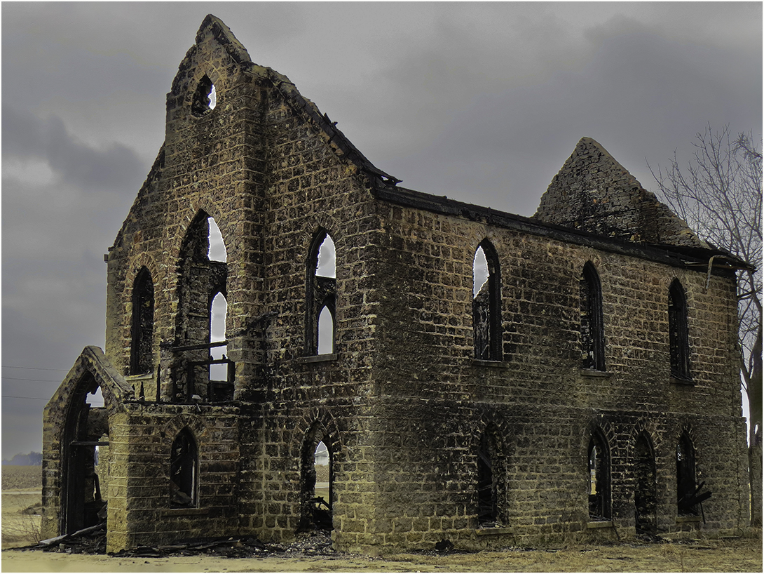
Nov 22 |
Comment |
"This house is privately owned and access is prohibited" is what I got for translation.
I like old derelict buildings. I agree with Lee Ann about the curved road and I like the sky you put in - it adds to the mood. Very nice. |
Nov 14th |
| 37 |
Nov 22 |
Comment |
I see nothing has changed with Howard...always nice images. :) I rather agree about the sky and the grass at the bottom left. Tried my hand and both. |
Nov 14th |
 |
| 37 |
Nov 22 |
Comment |
I agree it's a wonderful capture. The reactions of the people are quite mixed. I would like to see a little more room for the coaster to move into but otherwise it's a great shot. |
Nov 14th |
| 37 |
Nov 22 |
Comment |
I feel this might be one of those times when the eye sees something but the camera just doesn't do it justice. I like Lee Ann's rework though. I would like to see a stroke on the image to kind of keep it from merging into the background. |
Nov 14th |
| 37 |
Nov 22 |
Comment |
Hard to tell about the "train" - it could be as the curve is there and maybe it is just coming around the curve. While the photo appears not to be too sharp, in this case I feel it adds to the mood. Quite interesting. |
Nov 14th |
| 37 |
Nov 22 |
Comment |
Hope you don't mind a visitor...I love the colors and in this case, the centering of the house and the shoreline. To me though (and I realize there isn't much you could do) I find the reflection too "blurry". I like the crop that Bob did to take out the house on the left. Overall, nice job. |
Nov 14th |
6 comments - 0 replies for Group 37
|
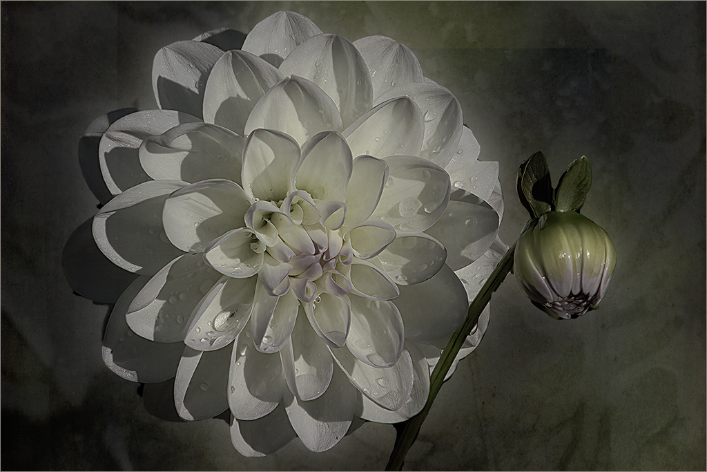
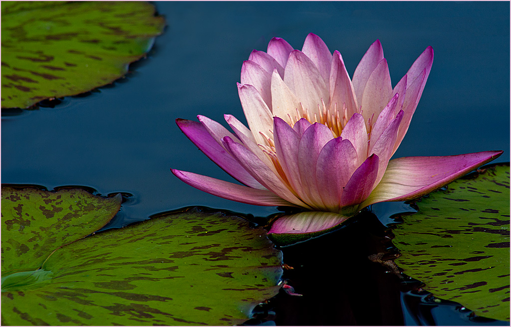
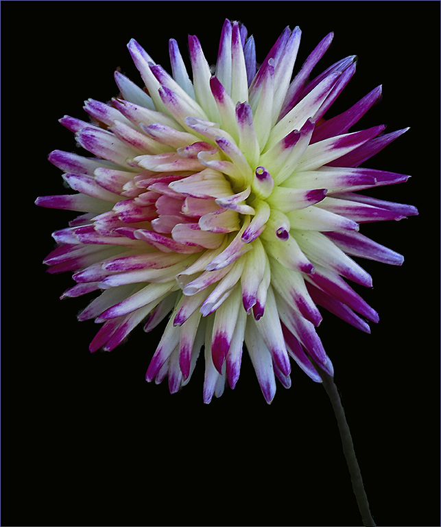
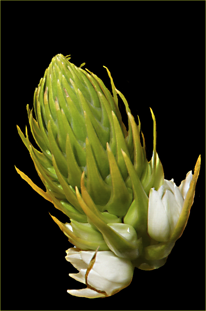
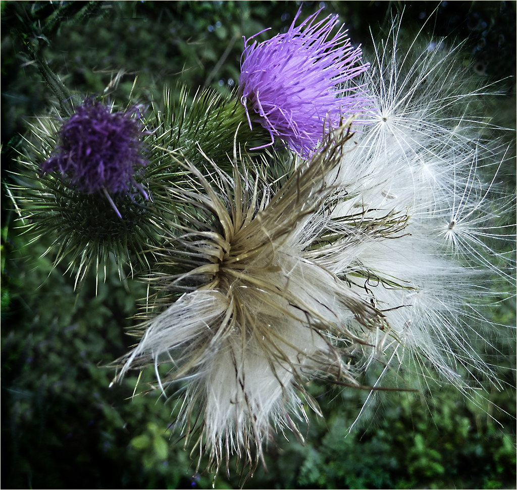
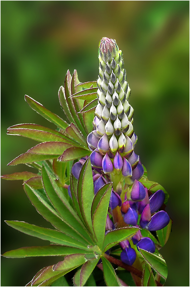
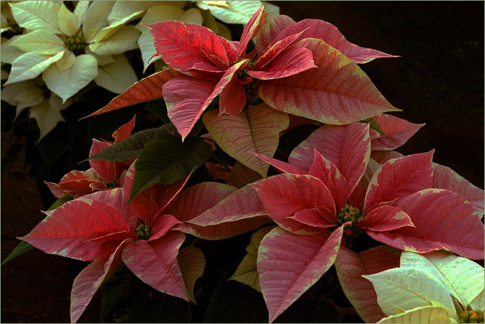
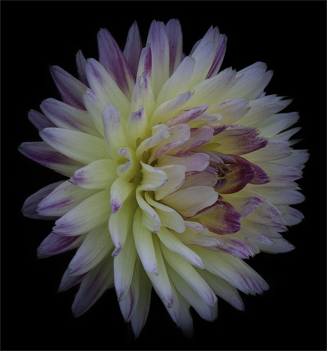
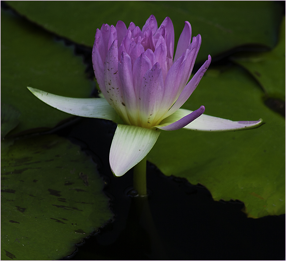
| 61 |
Nov 22 |
Comment |
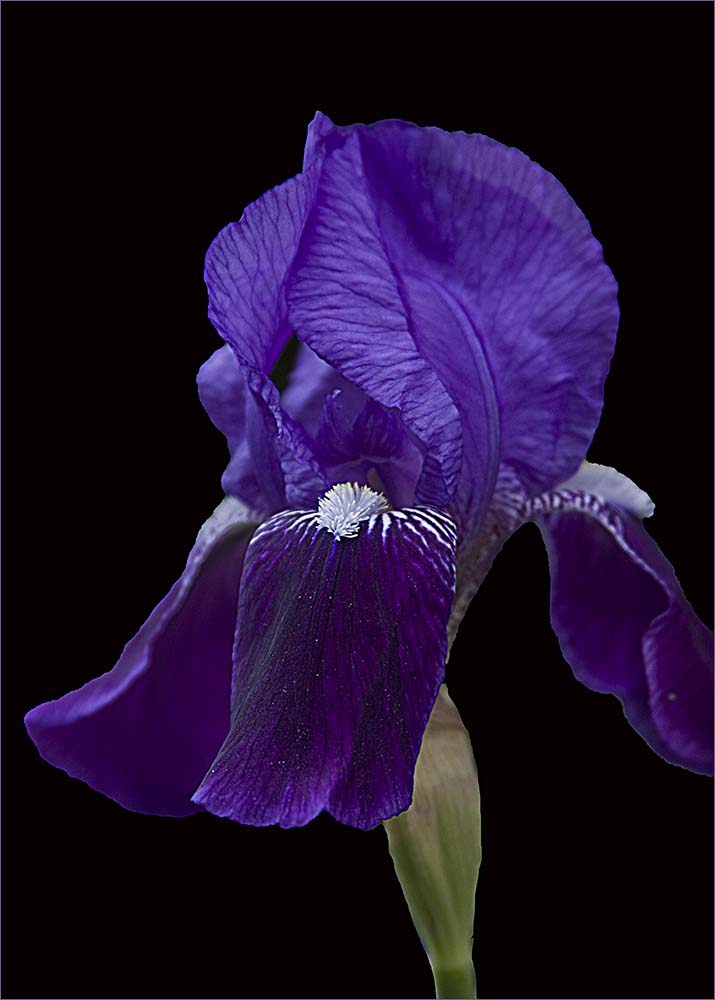
I think both versions look good. I like the way you cropped so as not to have one petal touching the edge. To me, the curvature of the petals lead me into the center. Nice job. |
Nov 10th |
| 61 |
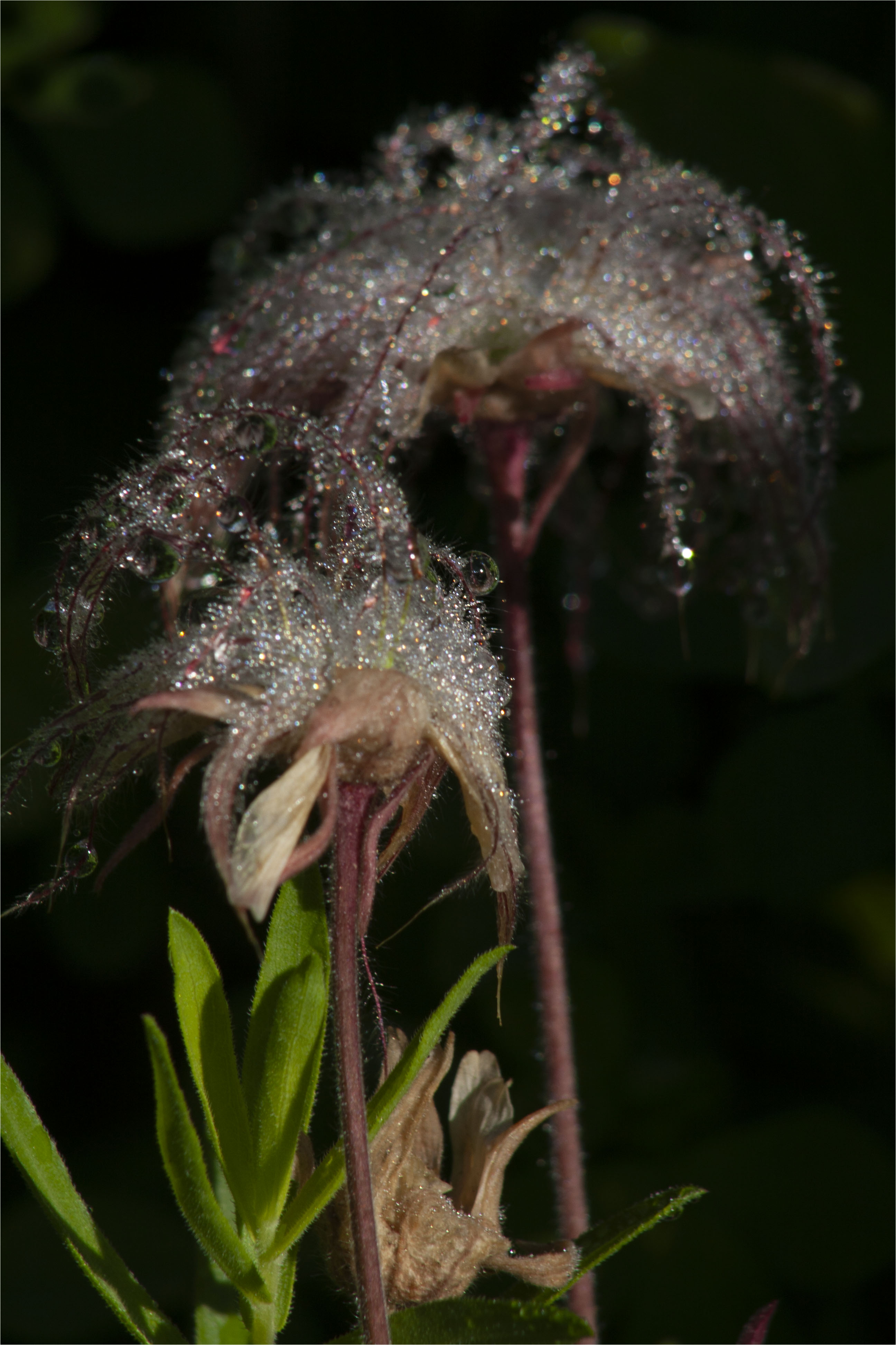
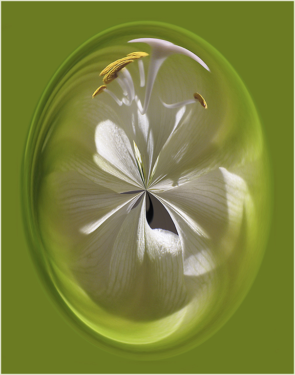
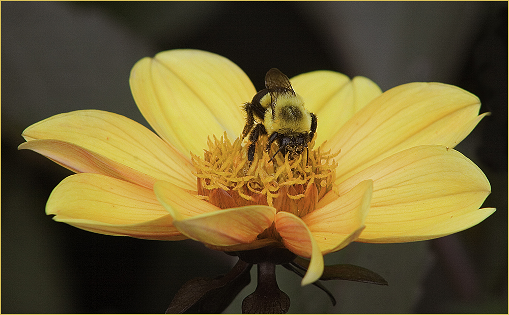
Nov 22 |
Comment |
Beautiful image. Like David, I like the pattern of the petals. I didn't really notice the shadows and when I looked at the image again, they don't really bother me. To me it adds some depth and brightness. Most of the time the diffused light is best for flowers but I like this one a lot. To be really picky, I do notice a few little white spots that catch my eye. |
Nov 10th |
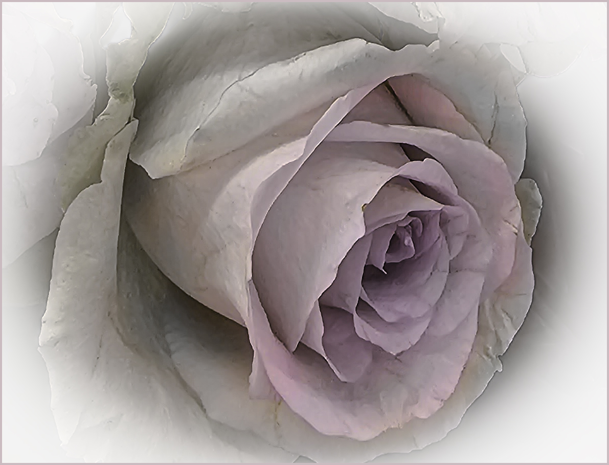
| 61 |
Nov 22 |
Comment |
I like the effects of the Topaz and I will disagree with David about the white spots. It seems to be a little snow on the ground to me. While the original fits the title, the texturing loses the dew on the petals. I like the original as well with perhaps a little brightening and saturation. Both are a nice job. |
Nov 10th |
| 61 |
Nov 22 |
Reply |
I agree about the white edges. I hope I saved the original PSD file but am having issues finding it. I need a better structure system for my files. :) |
Nov 10th |
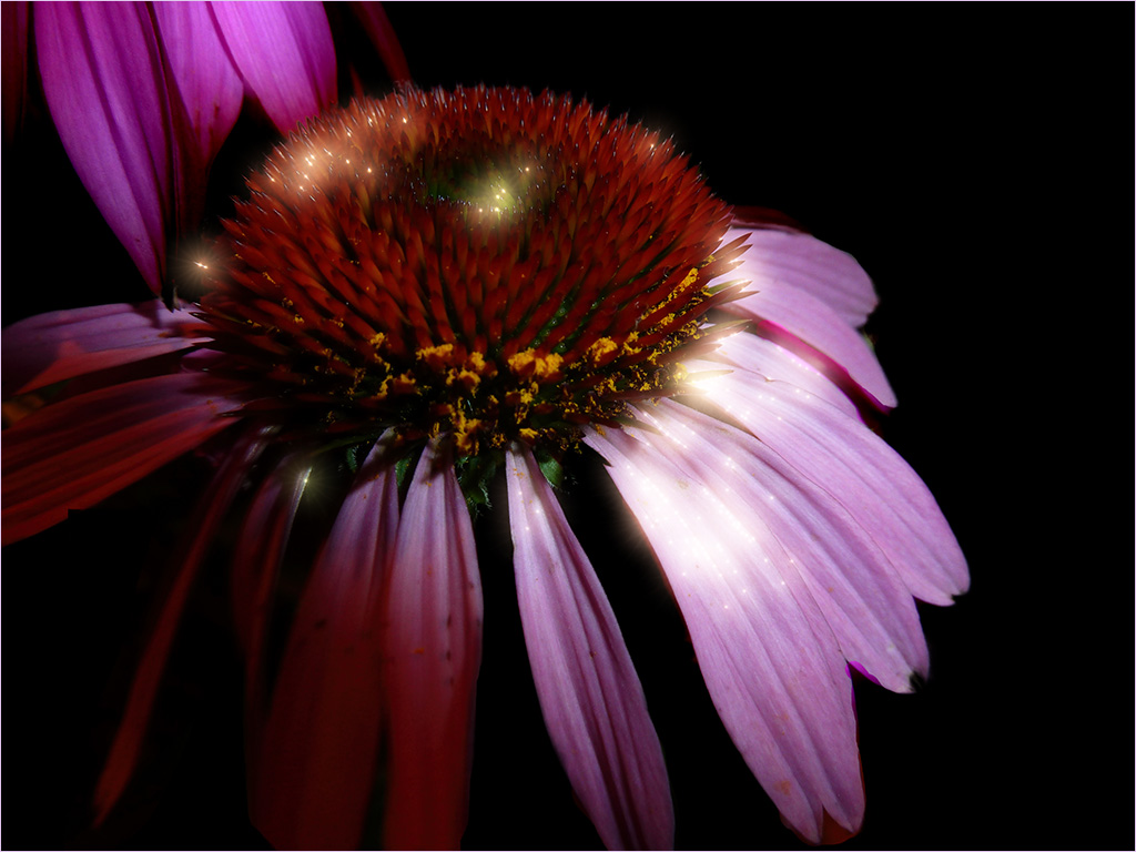
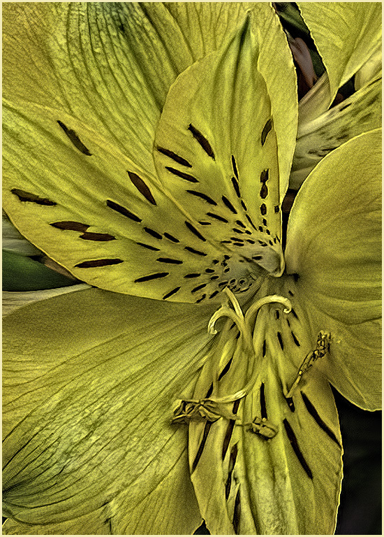
| 61 |
Nov 22 |
Comment |
I like what you have done with the Sunflower. It's sharp and the background compliments it. I agree with Randall about the bright pink - it could be burned in a little. Good job! |
Nov 10th |
| 61 |
Nov 22 |
Comment |
I like the angle you put it at and I agree about the sky. You might try taking some sky pictures and then finding one that would fit for Sky Replacement. You can add your own images to those collections. You can also do adjustments within the Sky Replacement tool to brighten, darken, change color temp etc. |
Nov 10th |
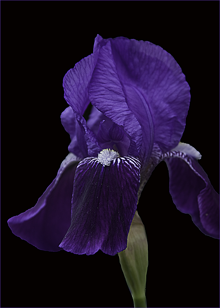
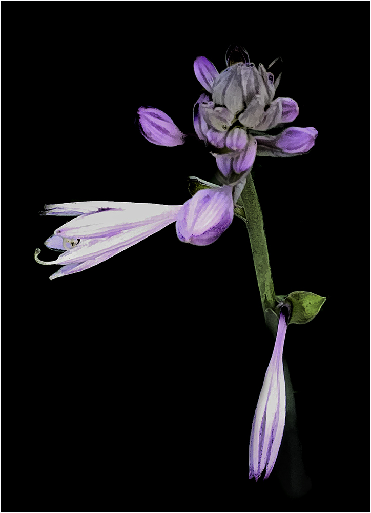
| 61 |
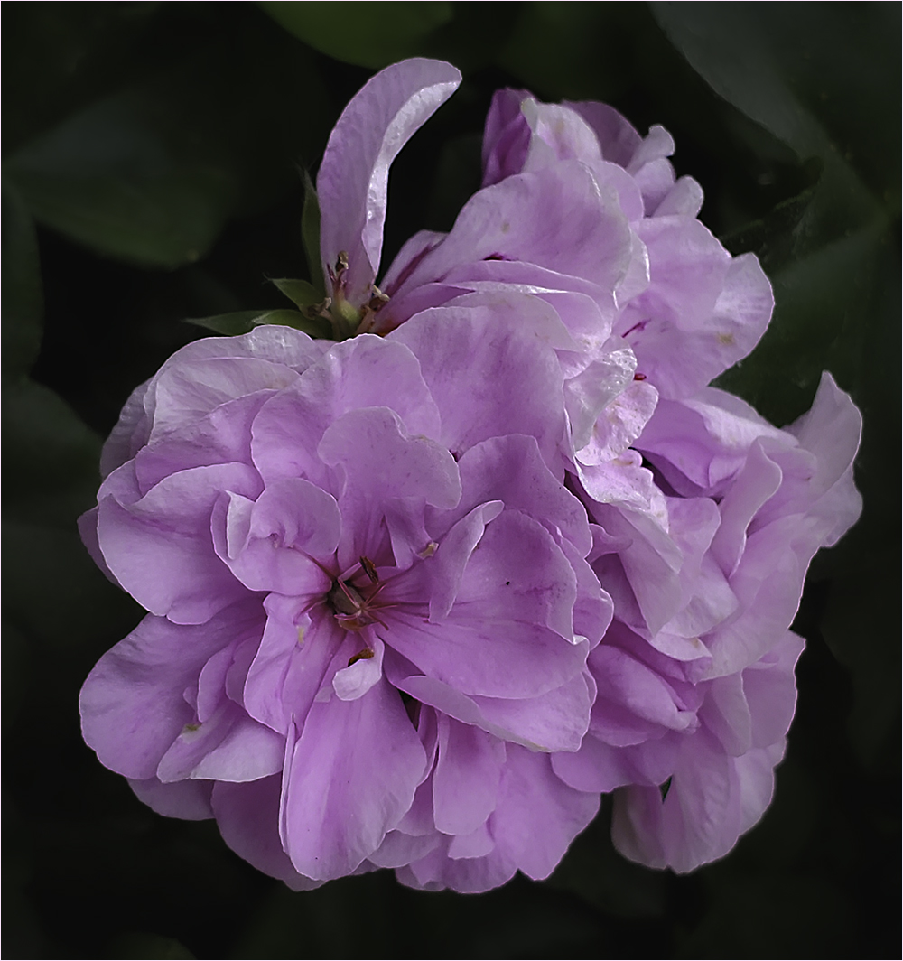
Nov 22 |
Comment |
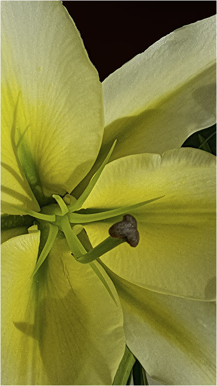
I like this image the way it is. To me, the petal coming over the stamen seems to be caressing it and makes the image less static. I don't know if I would want it much brighter as it has a calm feeling for me. Good job. |
Nov 10th |
6 comments - 1 reply for Group 61
|
20 comments - 8 replies Total
|