|
| Group |
Round |
C/R |
Comment |
Date |
Image |
| 22 |
Sep 22 |
Reply |
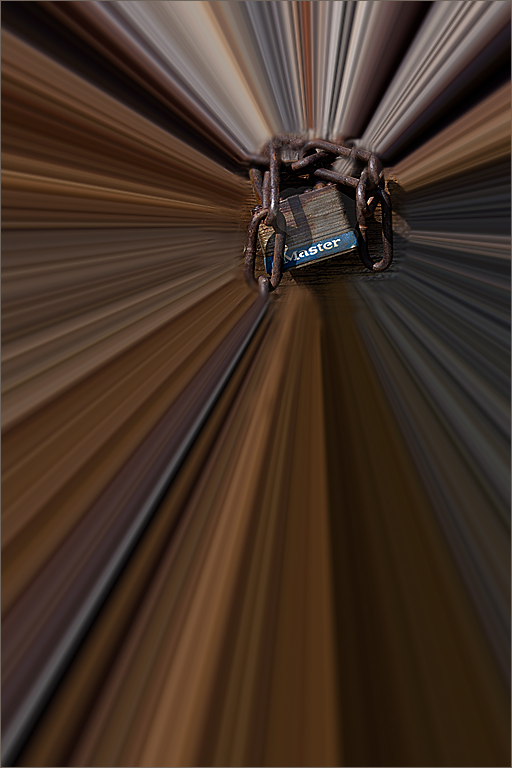
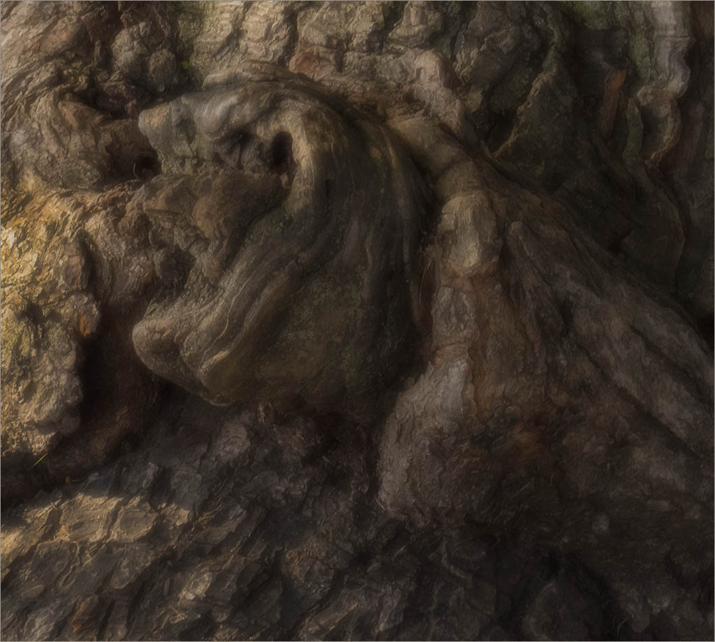
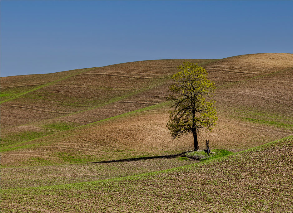
The more I look at that pump I start to wonder if it is there to water the farmer or perhaps even to water the tree. I stay with my feeling that it is part of the story. |
Sep 16th |
| 22 |
Sep 22 |
Comment |
Nice crop and cool pattern. Love those Giraffes. To be really picky, I see a little area on the lower neck of the top giraffe that looks like it could be cleaned up a bit. Otherwise nice job. |
Sep 11th |
| 22 |
Sep 22 |
Reply |
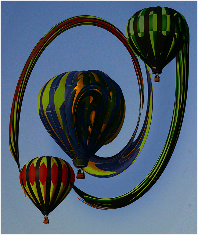
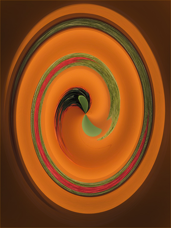
Thanks Al. I have an action written for the Polar Coordinates so I can easily do Ctrl F12 and it will perform all the steps instantly. (any key combinations can be used for the action - you choose) You can take any image and do it before deleting. You never know what you will come up with.
I will probably make one with the Twirl first and then Polar as it makes an interesting image. |
Sep 11th |
| 22 |
Sep 22 |
Comment |
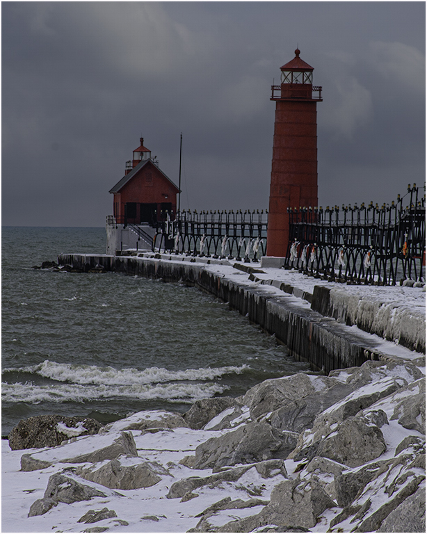
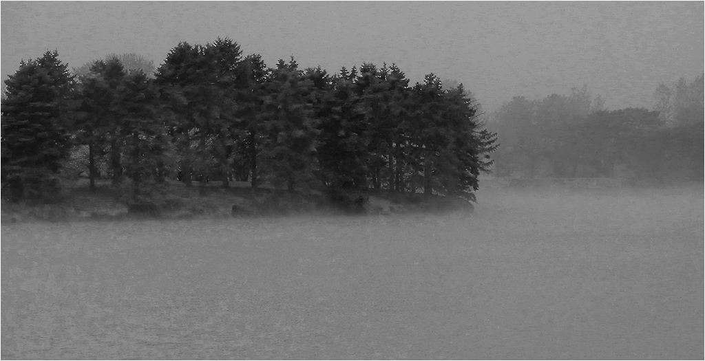
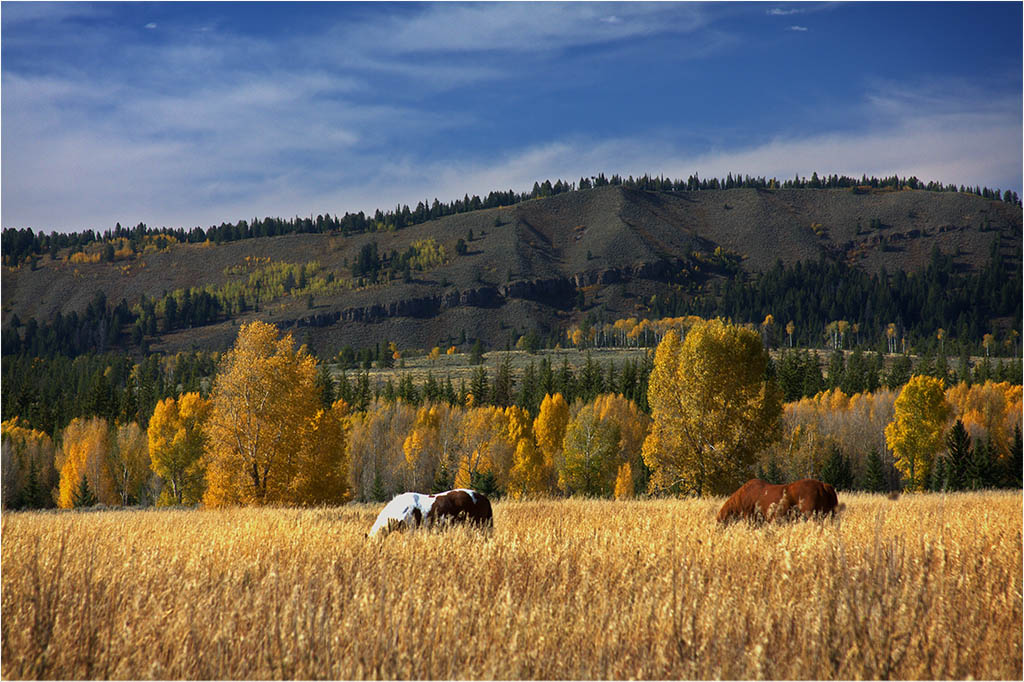
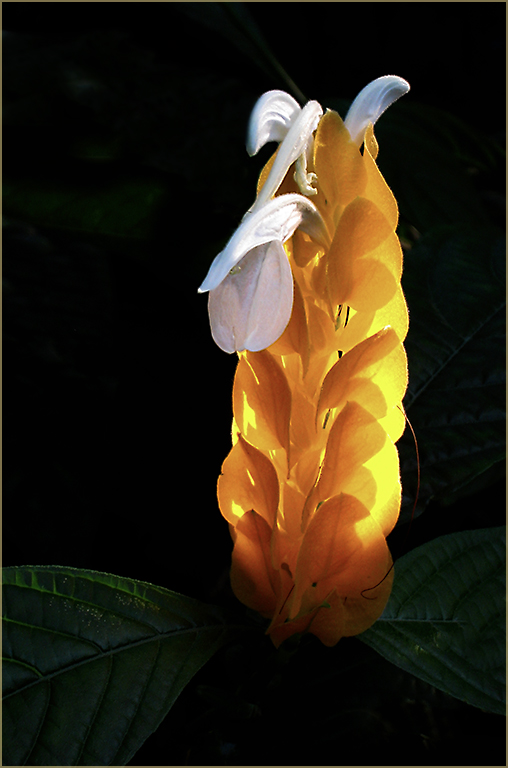
I was in the mood to play around today. I feel those clouds on the horizon draw my eye away from the tree. I also like the pump in the picture as it kind of fits the story. The well would be waiting for the rain. I didn't find it distracting. I also cropped a little off the right to make the tree a little less centered.
Overall it's a very nice capture and your details brought out the hills. |
Sep 7th |
 |
| 22 |
Sep 22 |
Comment |
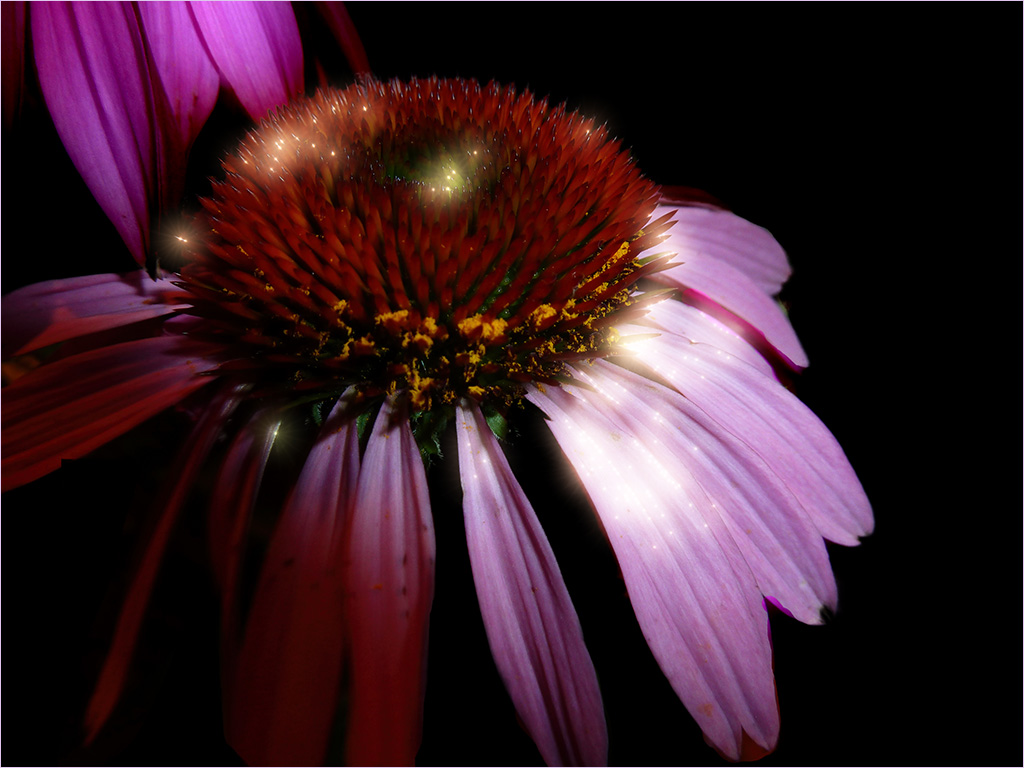
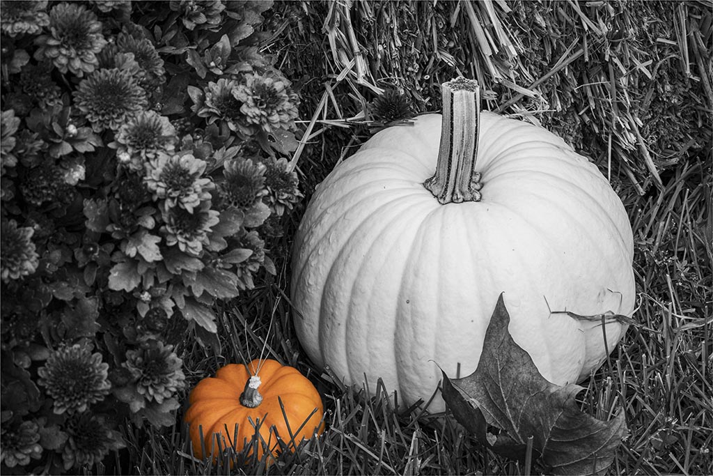
I agree with Joe on the upper right corner. That blue sticks out to me and my eye is drawn up there. Not sure if LR has a clone feature but perhaps you can change the blue to the orange like the other butterflies? I don't think it would stand up in a competition though artistically it would make a nice wall canvas as Joe says. |
Sep 6th |
| 22 |
Sep 22 |
Reply |
I did the Twirl first and then Polar. |
Sep 6th |
| 22 |
Sep 22 |
Comment |
Interesting work. Did you try Select Subject? I couldn't resist trying something though I realize it wouldn't fit the Magic Walk format. When I used Select Subject it gave me a pretty good selection. There were a few spots to tweak like the leashes and some of the dogs but overall pretty accurate. |
Sep 5th |
 |
| 22 |
Sep 22 |
Comment |
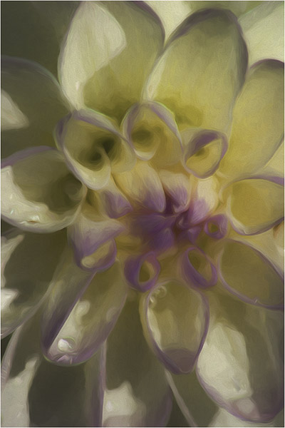
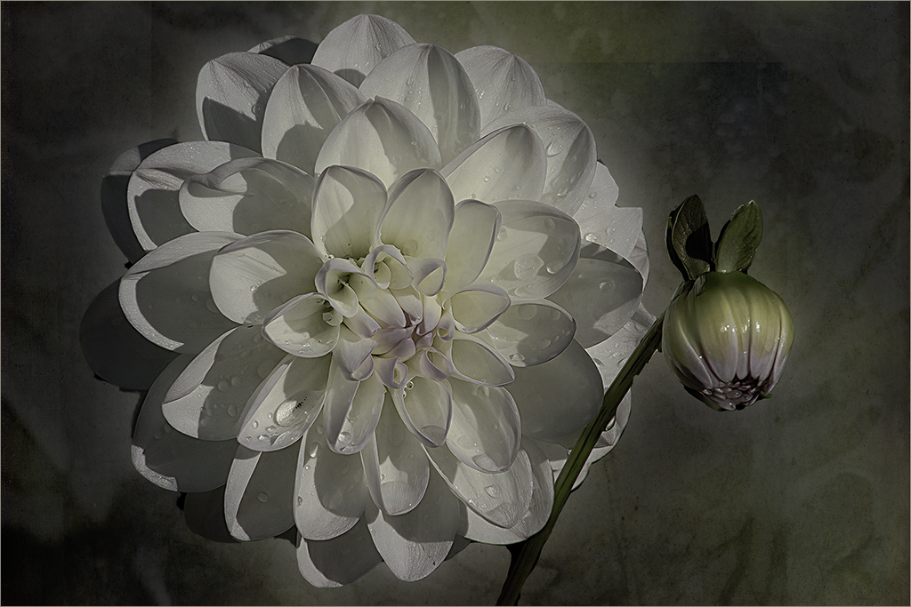
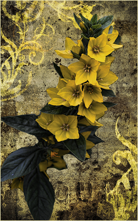
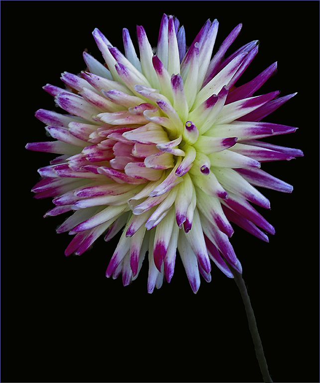
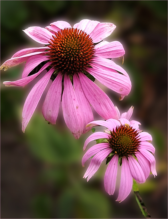
Very nicely done. I feel the background adds to the flower as Jerry mentioned. To have left the original leaves in might have been an issue as they have some shiny lights on them.
I have to admit I have not tried focus-stacking. Would you be willing to write up a little "tutorial" on focus-stacking? I can put it in the information section. |
Sep 4th |
| 22 |
Sep 22 |
Comment |
While I don't see a total center of attention, I like the way you have cropped this and presented an overall view of this entrance. Colors are nice.
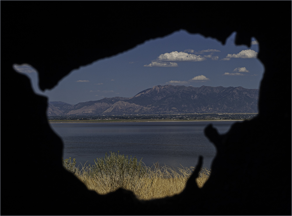
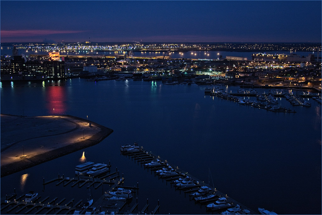
Did you do this in HDR or use a Filter? I've noticed most of your images have a sort of "artsy" look - like a painting rather than a photograph. Not that this is necessarily a bad thing. I feel it works well for this image. |
Sep 2nd |
6 comments - 3 replies for Group 22
|
| 61 |
Sep 22 |
Reply |
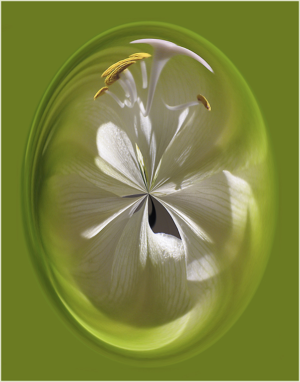
I'm going to disagree with Shirley on this one - I feel the upper right and lower left set each other off. To me, removing the upper right would need to remove the lower left as well. Thoughts? |
Sep 16th |
| 61 |
Sep 22 |
Comment |
I think I have the same issue as with Linda's remake of Ingrid's image - it looks too "floating". I'm going to try and bring out the stem a little more. |
Sep 16th |
| 61 |
Sep 22 |
Reply |
I think if the stem in Linda's image was brought out perhaps the black background wouldn't make it look like it's floating? |
Sep 16th |
| 61 |
Sep 22 |
Reply |
Thanks Ingrid. It's an idea that seldom occurs to me as well but seemed to stand out for this image. :)
If you put the flip on a layer, you can easily turn it on or off or even delete the layer so I am trying to get into the habit of flipping everything just to see how it works. Of course images with words don't flip well but flowers do. |
Sep 13th |
| 61 |
Sep 22 |
Reply |
Thanks for visiting, Bob. Good point - I should have lighten up the stem. |
Sep 11th |
| 61 |
Sep 22 |
Comment |
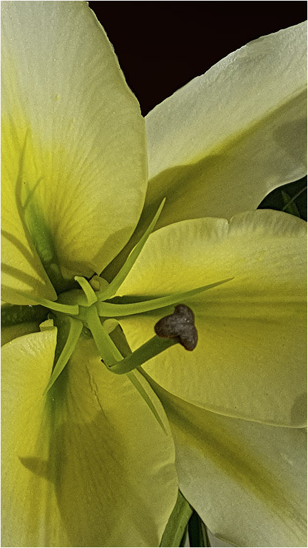
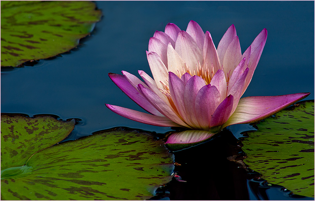
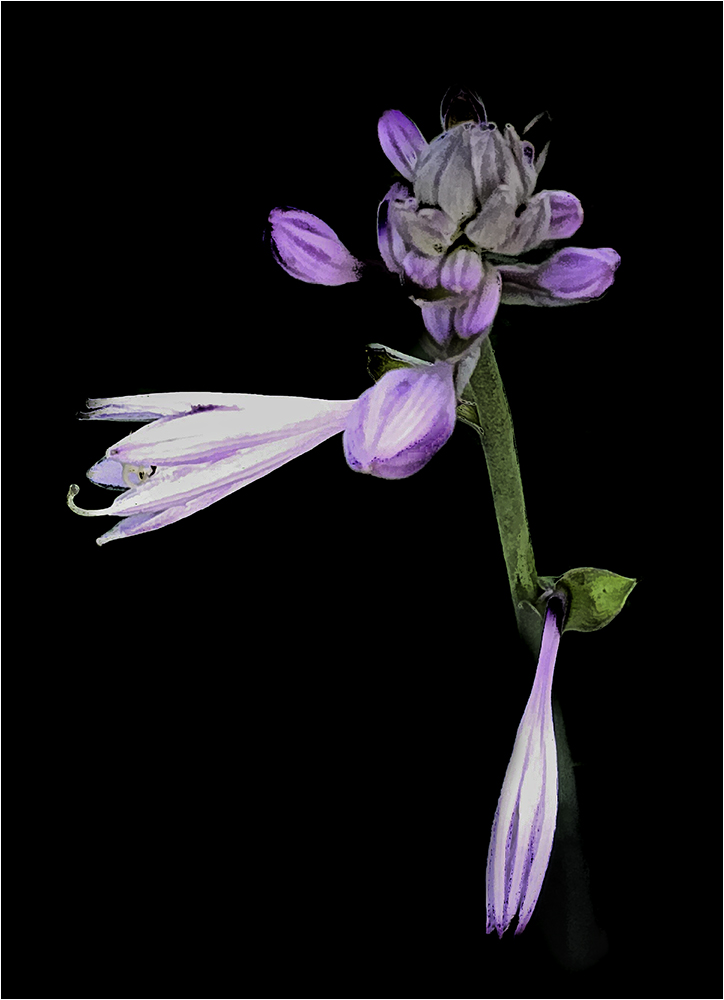
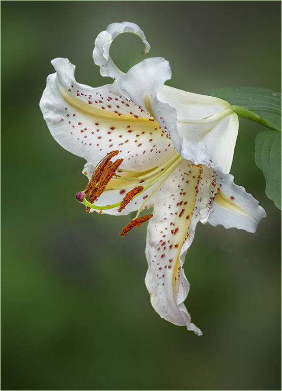
Beautiful image. I like the sharpness of the lily and the softness of the background. I wondered what it would look like if there wasn't so much background. |
Sep 4th |
 |
| 61 |
Sep 22 |
Reply |
Agreed - nice editing.
|
Sep 4th |
| 61 |
Sep 22 |
Reply |
Nicely done. I like the way you removed the highlights I left on the flowers. They may not be as bright but they certainly stand out. |
Sep 4th |
| 61 |
Sep 22 |
Reply |
Thanks Linda. More room does help. |
Sep 1st |
| 61 |
Sep 22 |
Reply |
Better - I still like the original background better. :) |
Sep 1st |
| 61 |
Sep 22 |
Comment |
I am having the same issue as Donna. The background colors on the original are more muted than the final where the yellow and oranges are brighter or at least more prominent. Perhaps this comes from Color Efex?
I love the concept of the dreamy look. Gives me some ideas for future shoots. Good job. |
Sep 1st |
| 61 |
Sep 22 |
Comment |
I rather agree with Donna. To me, the flower itself seems a little soft for the rest of the image and the one petal touches the right side. Other than the petal, I like the composition of the image. |
Sep 1st |
| 61 |
Sep 22 |
Comment |
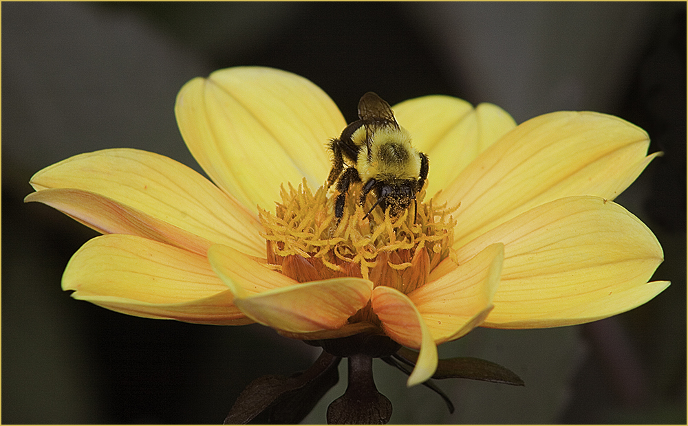
Very nice post-processing. I like the way you have accentuated the flowers with both deepening the colors and sharpening the image. To me, the bee breaks up the back and forth of the two flowers together. Great job! |
Sep 1st |
| 61 |
Sep 22 |
Comment |
Definitely one to crop. Interesting capture as there are only the two of them in the original image. You did a nice job of taking a "record shot" and turning it into a much better image.
I went a little farther to take the flower off center and burned in the background. |
Sep 1st |
 |
| 61 |
Sep 22 |
Comment |
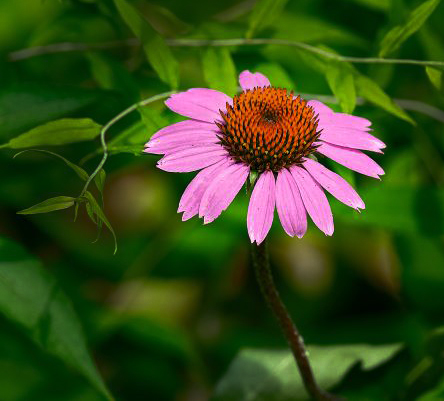
To me, the two flowers work ok as they are on different levels so my eye doesn't go as much back and forth. Randall has a good suggestion about getting lower.
In my rework, I selected Subject in PS and it did a good job I think. Then I Gaussian blurred the background to make the flowers pop more.
Not sure how the others will feel but a botanist photographer friend of mine told me to always find the best flower. In this image a few of the petals are browning, indicating the flower is on it's way out.
Overall it's a nice shot though. |
Sep 1st |
 |
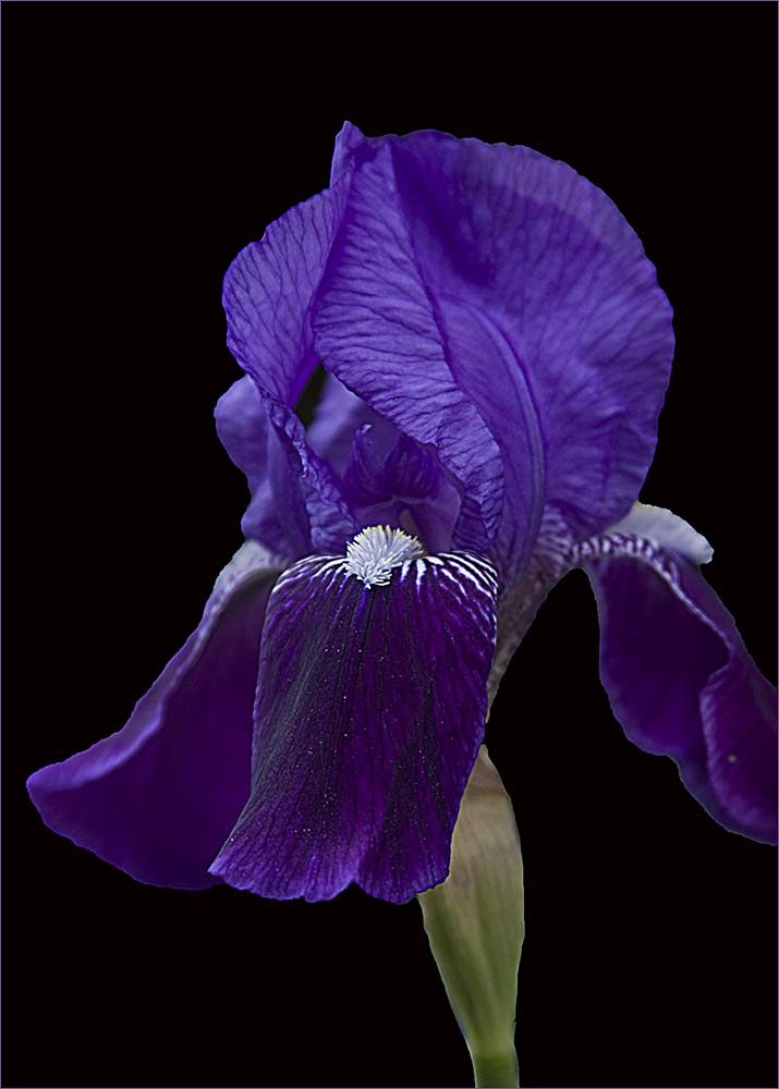
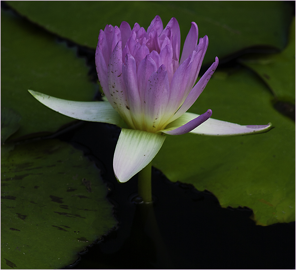
| 61 |
Sep 22 |
Comment |
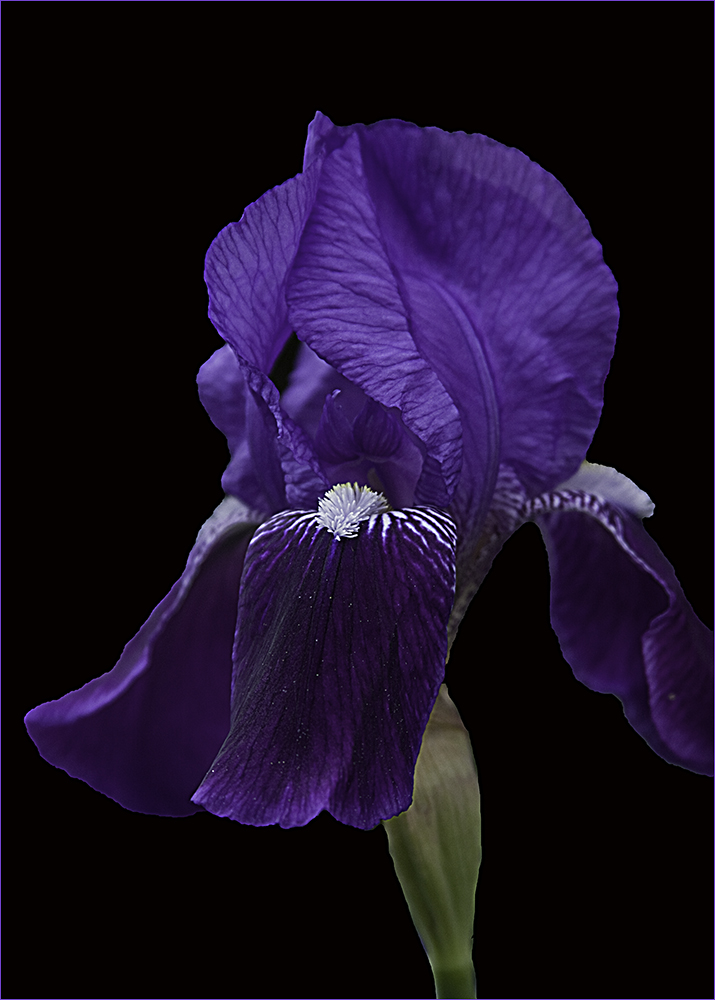
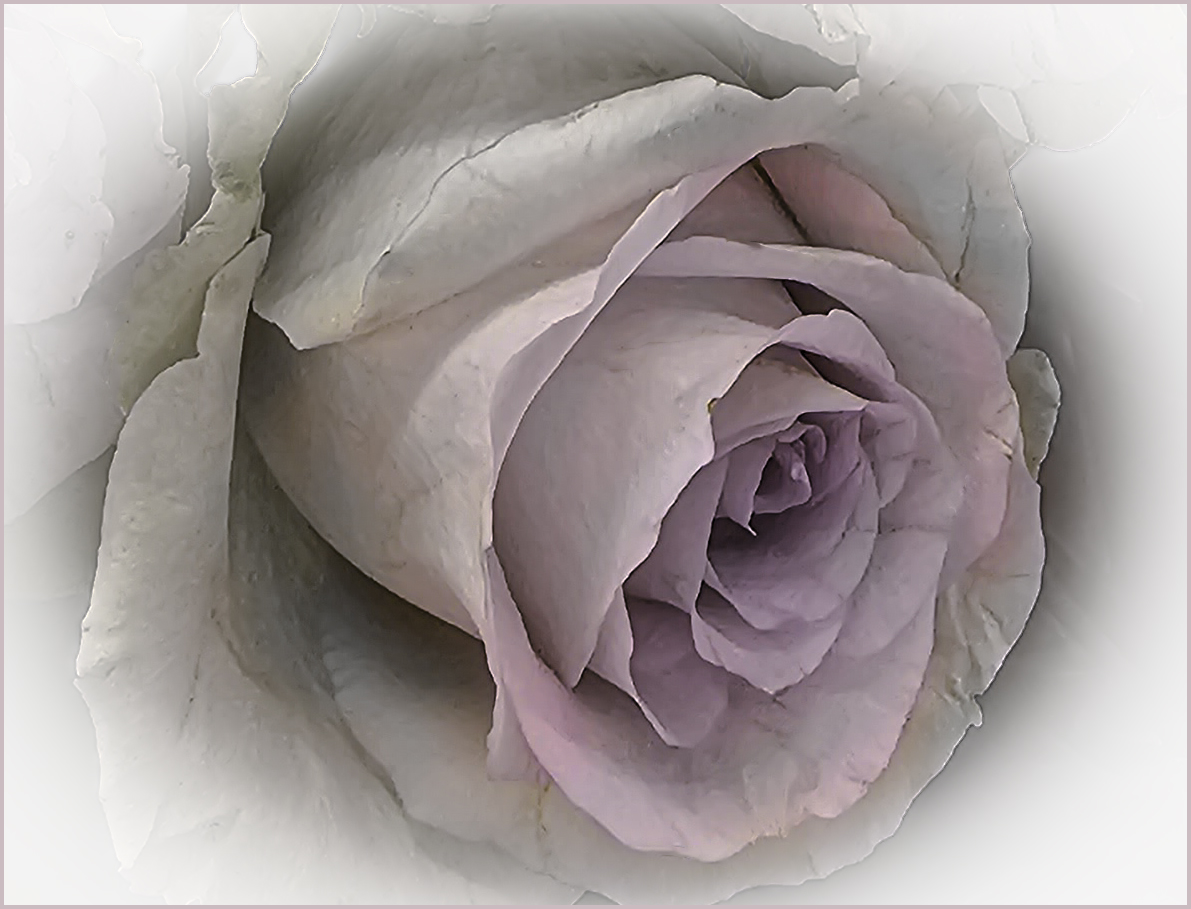
Thank you all for your comments. The image (when viewed when you click on it) shows the stroke which I don't see on the main page.
Regarding the black - I created a New File in Photoshop and filled it with black. Then I selected the flower and moved it over to the black layer, keeping the black layer on the bottom. |
Sep 1st |
8 comments - 8 replies for Group 61
|
| 86 |
Sep 22 |
Reply |
I like Gene's rendition as well though going back and forth between the two, I rather like that pink cast as it seems less stark and more peaceful and seems to reflect the time of day better. |
Sep 12th |
| 86 |
Sep 22 |
Comment |
Very interesting. At first I wasn't sure what to think but after studying it more I see what appears to be the black doorway. The large balls in the front tapering back to the small ones gives me a sense of movement toward that door. It must be amazing to be in that room. |
Sep 8th |
| 86 |
Sep 22 |
Comment |
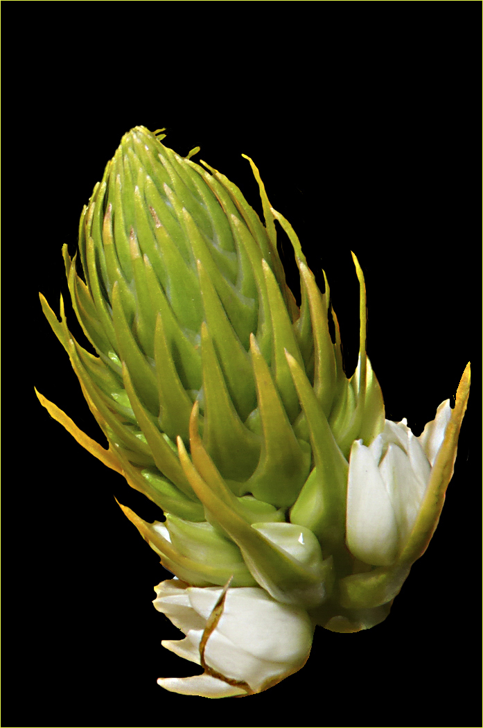
Hi Pat - I like the way you have brought out the colors in the flower. On the other hand, I'm a little put off by the haze that appears on the final. Perhaps (to be picky) the dead pieces could have been removed before shooting? |
Sep 8th |
| 86 |
Sep 22 |
Comment |
There isn't anything I would change with this one. It's stark and as you say, somber. I thought about perhaps making the footprints, or whatever they are, a little darker but then I think it would detract from the small plant that anchors the whole picture. Very nice image. |
Sep 8th |
| 86 |
Sep 22 |
Comment |
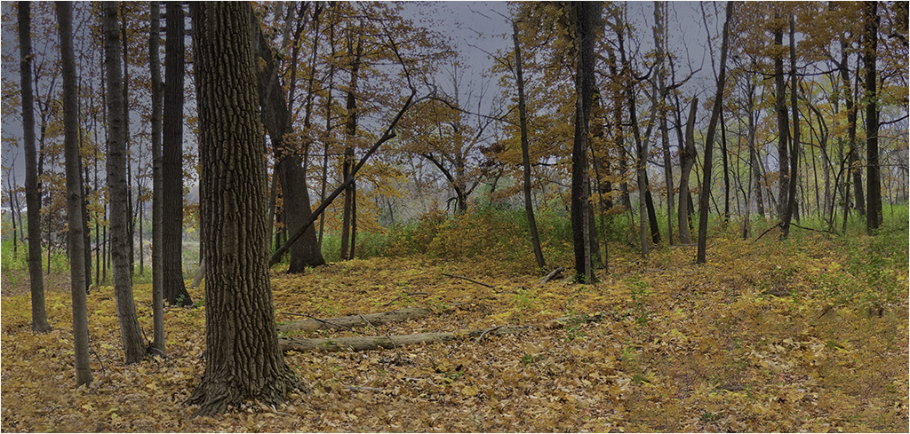
Pardon my barging in...I'm going to disagree with Bob on this one. To me, the subject is the clouds and I like the way you've framed them with the trees. This image stuck out to me when looking at the round in total - though all of you have good images. |
Sep 8th |
| 86 |
Sep 22 |
Comment |
Beautiful. I agree with Bob's comments. The crash of the wave and the dark sky really tells the story of that incoming storm. |
Sep 8th |
| 86 |
Sep 22 |
Comment |
The phone did do a good job on the stitching. I like the reflection in the water and I feel the story is with the girl in the water. Your final is more appealing than the original but I feel perhaps cloning out the people on the beach or cropping might put her more as the subject. |
Sep 8th |
| 86 |
Sep 22 |
Comment |
I have a hard time looking at this one as I'm afraid of heights and this puts me right in the picture at the edge of the cliff. The detail is superb. I would leave the sky alone as the tones in the rocks go along with a cloudy sky. Picking a different sky might throw the lighting off some. Very impressive image. |
Sep 8th |
7 comments - 1 reply for Group 86
|
21 comments - 12 replies Total
|