|
| Group |
Round |
C/R |
Comment |
Date |
Image |
| 22 |
Aug 22 |
Comment |
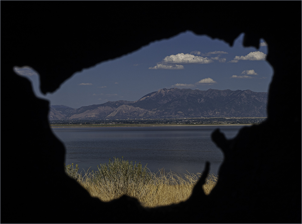
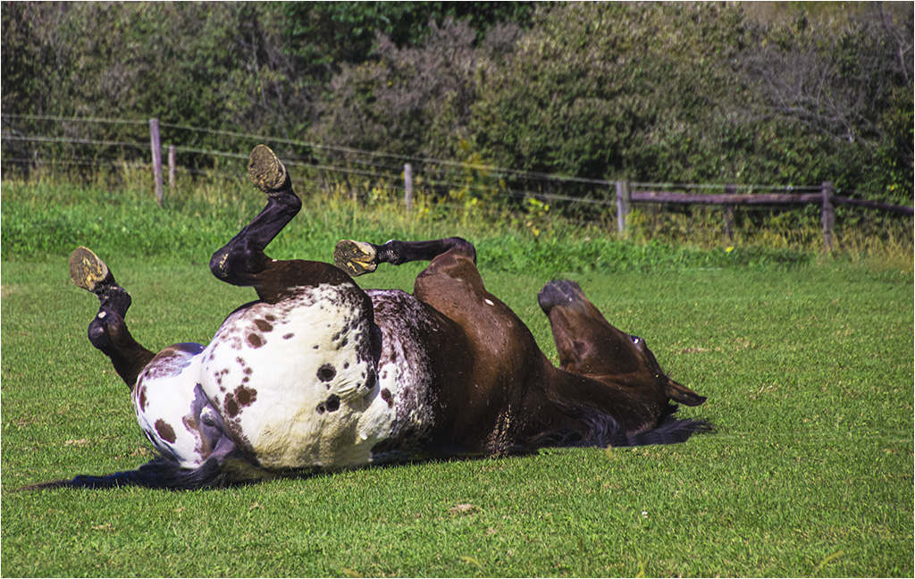
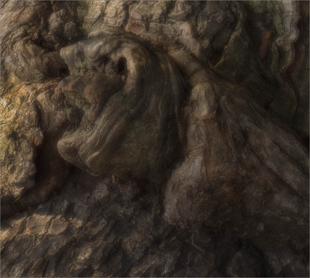
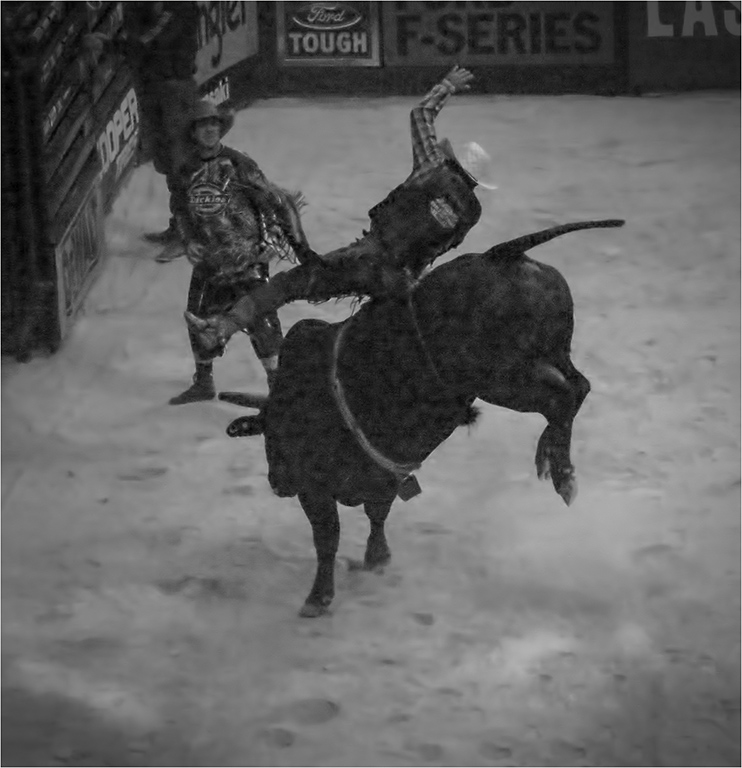
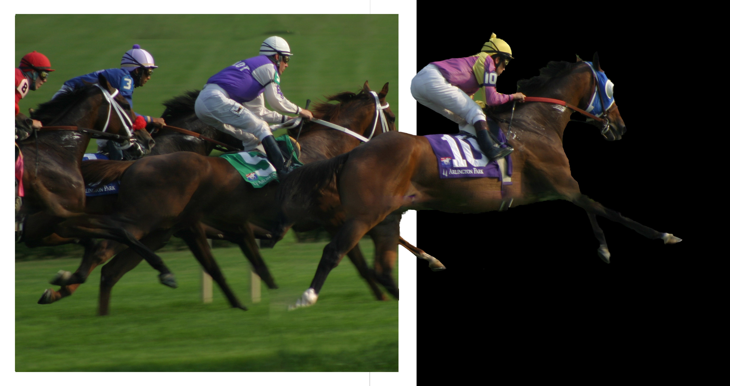
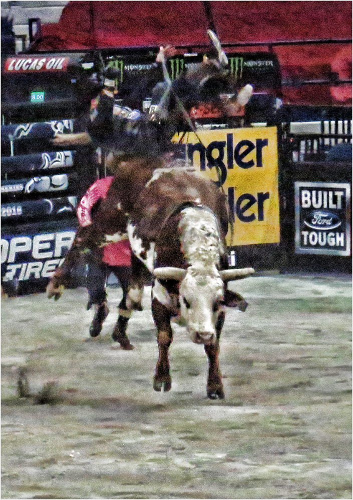
As a horse person, the first thing I notice is the large head of the horse. To avoid this, the best thing is to shoot from a distance with a telephoto lens.
Also another item that caught my eye was the corrections made to the horse's eye. It seems to be much more prominent than the original and kind of distracting to me.
That being said, the photo does tell the story and is an interesting photojournalistic image. |
Aug 24th |
| 22 |
Aug 22 |
Comment |
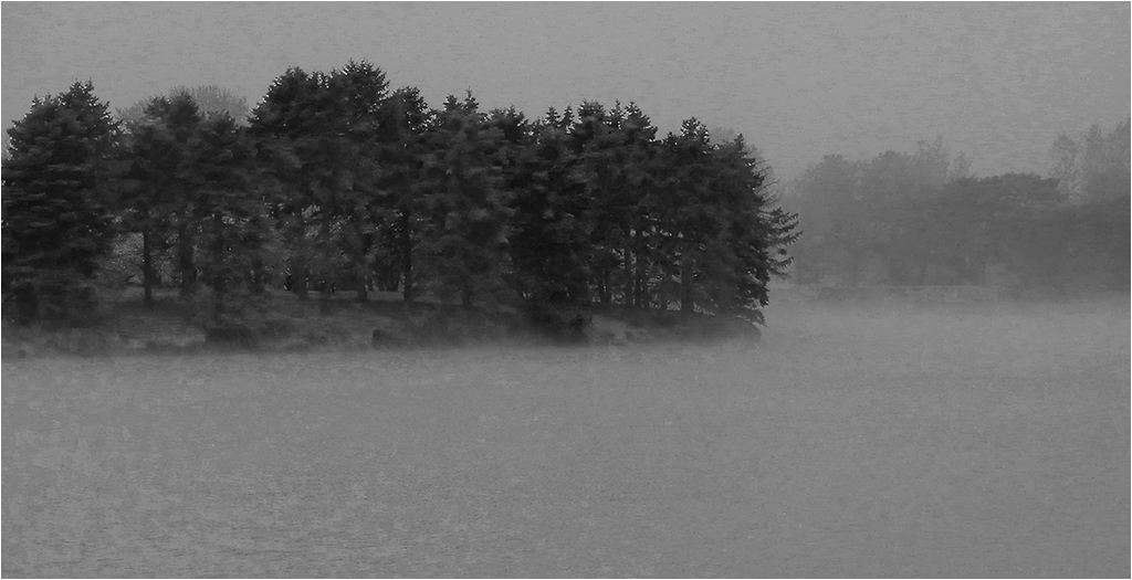
I'm going to disagree with cropping this as I like the composition. Perhaps the sky is the center of interest. Either way, I like what you've done with this. Good job. |
Aug 16th |
| 22 |
Aug 22 |
Comment |
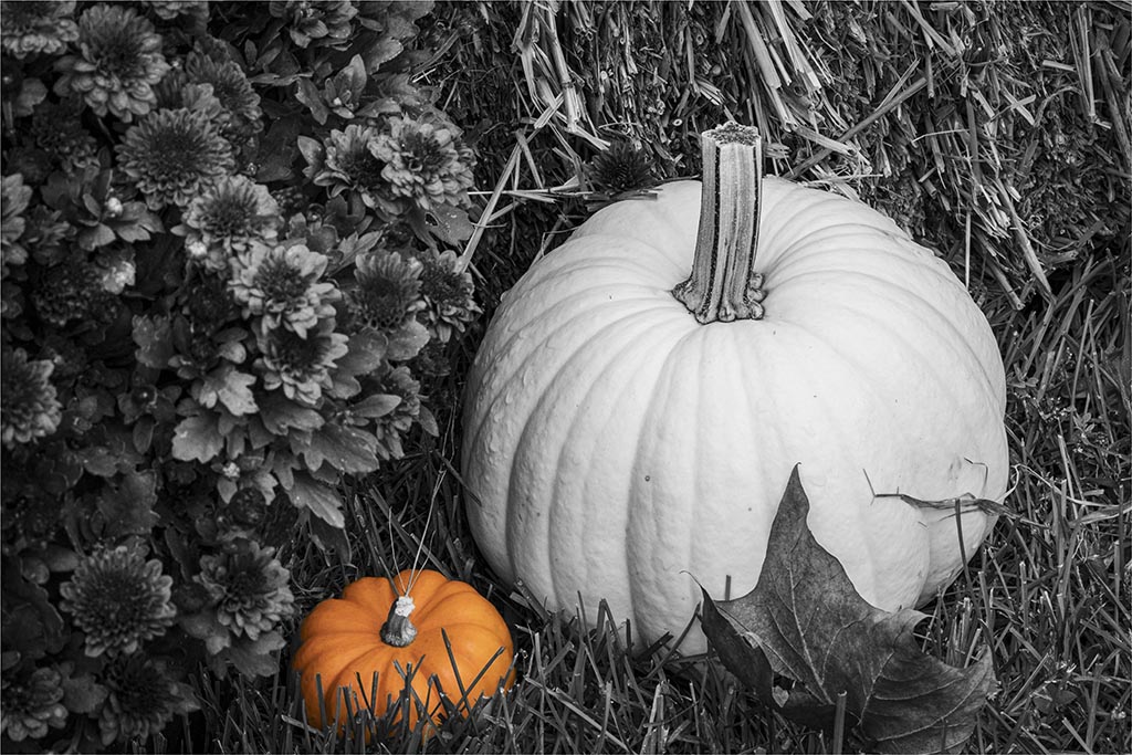
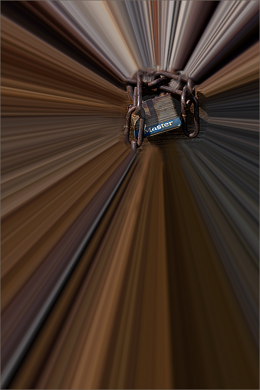
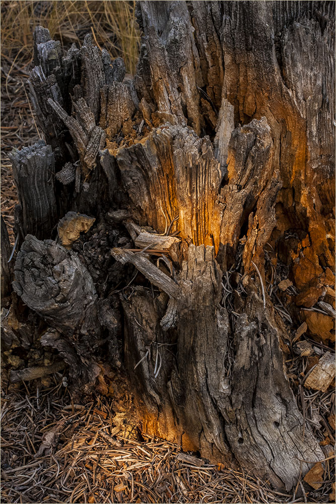
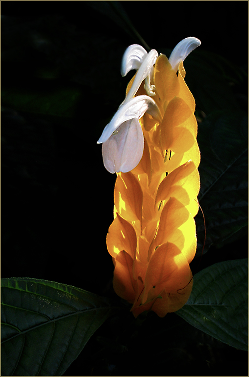
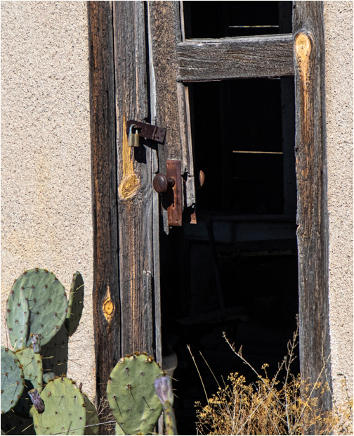
I agree with Jerry about the heavy weighting on the bottom. I tried cropping some to keep a bit of the cactus but focus a little more on the lock. It does tell a story. Good capture. |
Aug 9th |
 |
| 22 |
Aug 22 |
Reply |
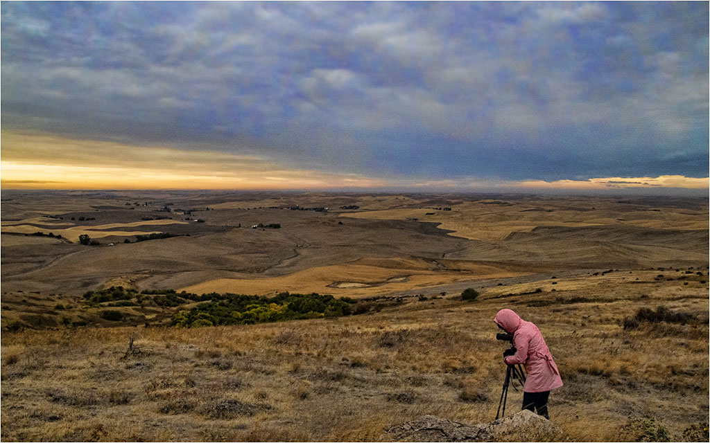
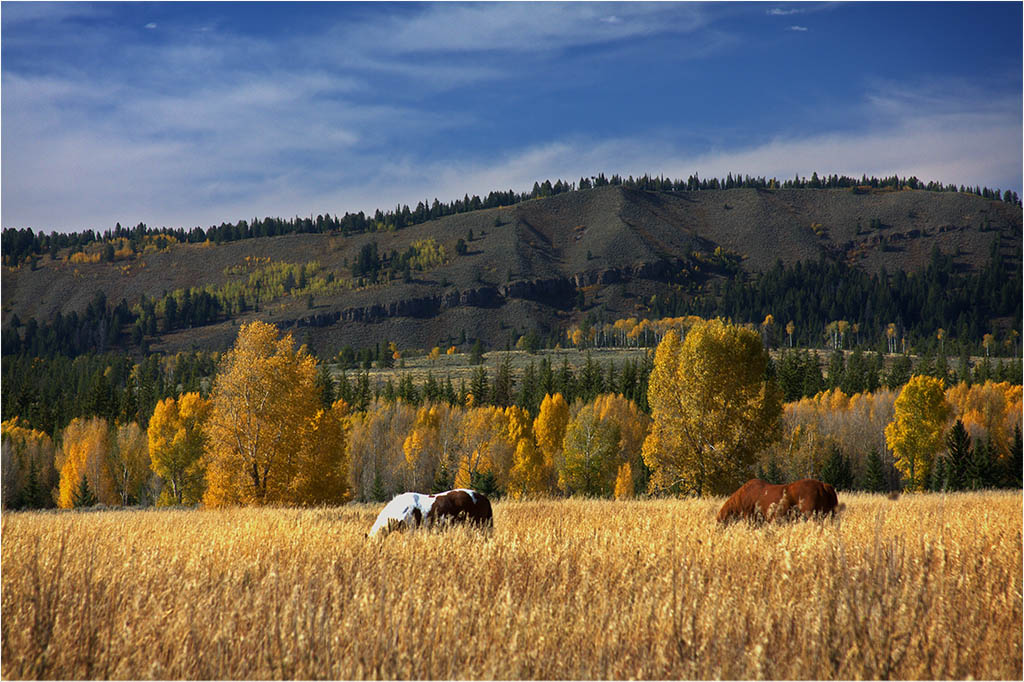
Thanks Al. It wasn't the best that day. I, too, was hoping for the rolling hills and more sun. Well, have to work with what you get I guess. |
Aug 6th |
| 22 |
Aug 22 |
Comment |
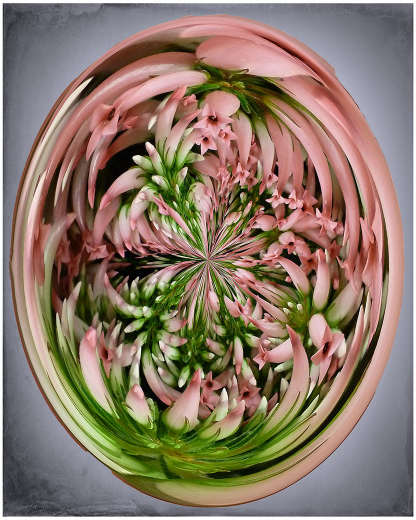
Joe - you mentioned doing Polar 5 times. Which one did you start with and were they all alternating? Thanks.
|
Aug 6th |
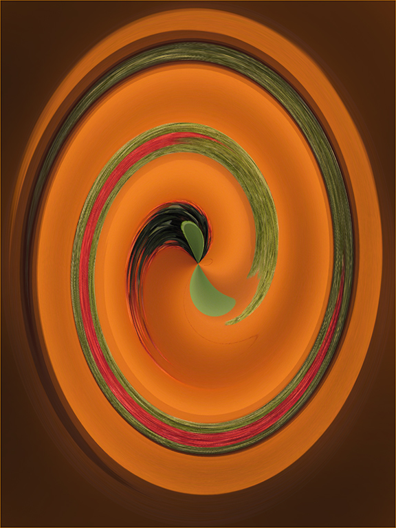
| 22 |
Aug 22 |
Comment |
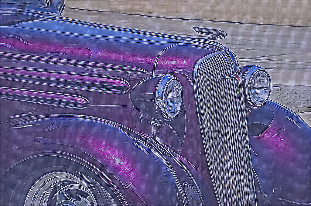
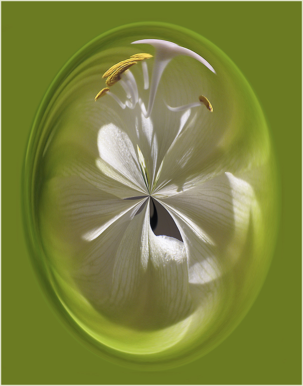
Very interesting. Kind of a combination of sad face, happy face (in the black). Polar coordinates is fun to work with. Nice job.
|
Aug 5th |
| 22 |
Aug 22 |
Reply |
Thanks Peggy. It actually is a sunrise but the light quickly went away as the rain moved in.
I'll see what I can do about the noise. I wasn't too fond of the sky or hills myself. |
Aug 4th |
| 22 |
Aug 22 |
Comment |
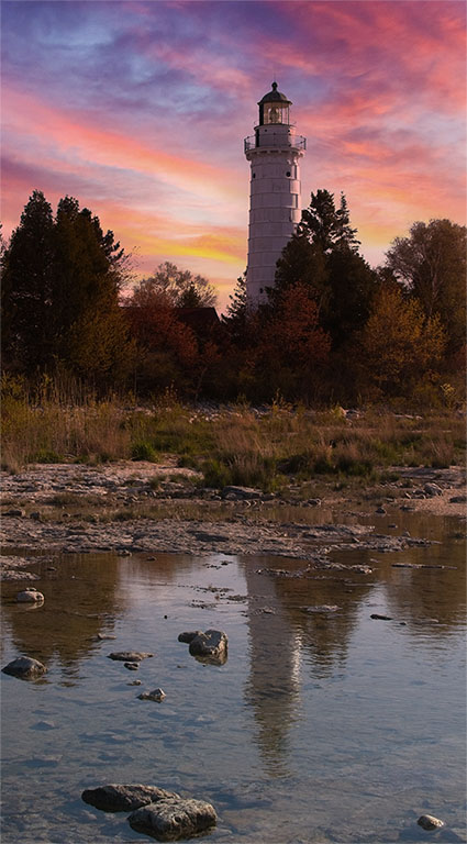
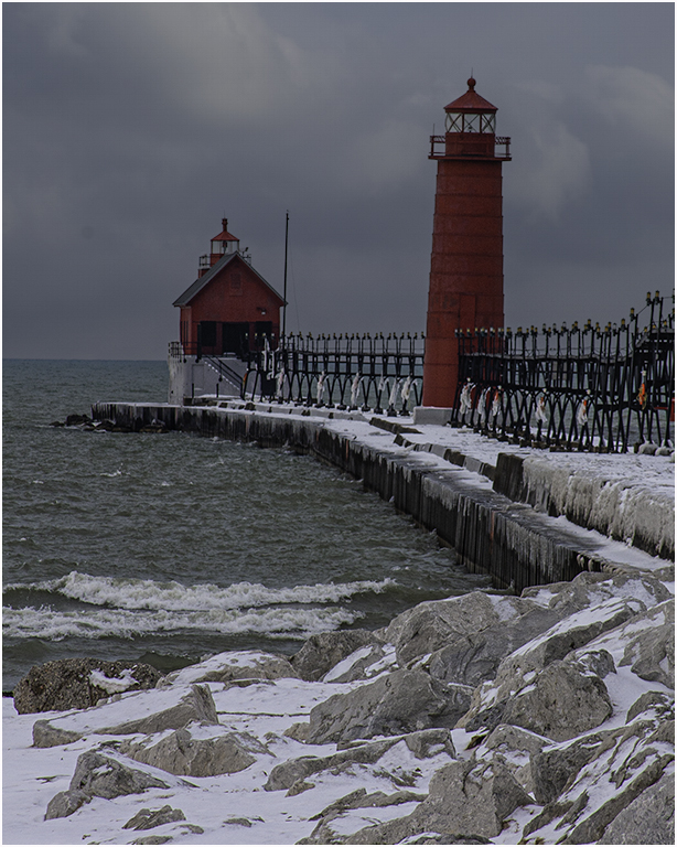
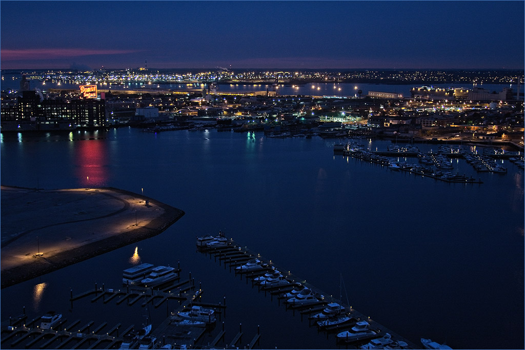
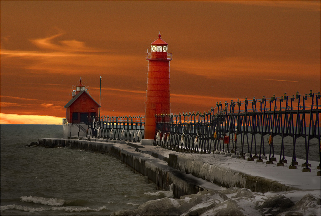
Isn't it amazing what we can do with photos now. You've turned an average lighthouse image into a stunning one. I like the way you have brought out the reflections on the pier and made the people stand out more. The change in the sky really makes it even better. Great job. |
Aug 3rd |
| 22 |
Aug 22 |
Comment |
Very nice work, Al. I would imagine it would be great on a canvas. I like the way my eye goes from his head and curves down his back and then into the reflection. You have taken a decent image of the heron and turned it into an art masterpiece. |
Aug 3rd |
7 comments - 2 replies for Group 22
|
| 61 |
Aug 22 |
Reply |
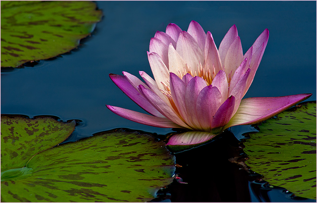
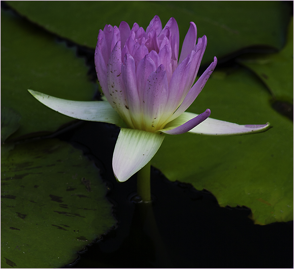
I'm kind of mixed on those white spots - assuming you mean the ones on the pads. I didn't notice them until I went back to look and yes, they can draw your eye away from the subject. However I also felt that they added something to the pads and made them more of the picture. |
Aug 7th |
| 61 |
Aug 22 |
Reply |
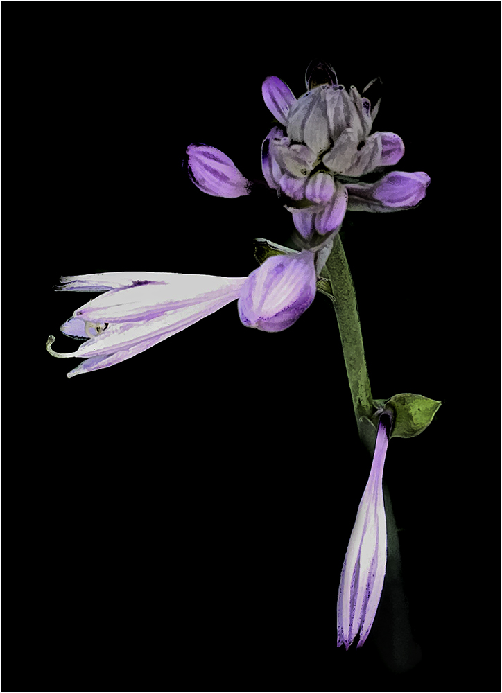
Thanks for your comments, Linda. I sort of feel by taking the stem and leaves out that the flower appears to be floating. I can see the leaves when I select the image but not the small version in the comment box. |
Aug 5th |
| 61 |
Aug 22 |
Comment |
I agree with Donna about the blades of grass. To me, the original is better in a way if cropped. However, the final here could make a good wall hanging.
I took what Donna and I liked about the grass and cropped it some. |
Aug 3rd |
 |
| 61 |
Aug 22 |
Comment |
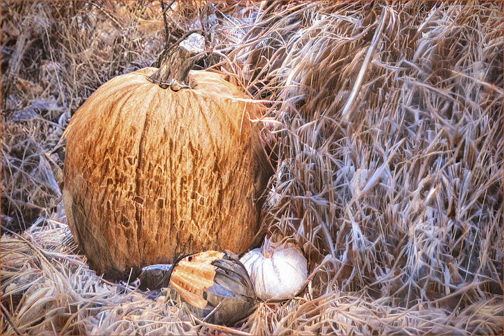
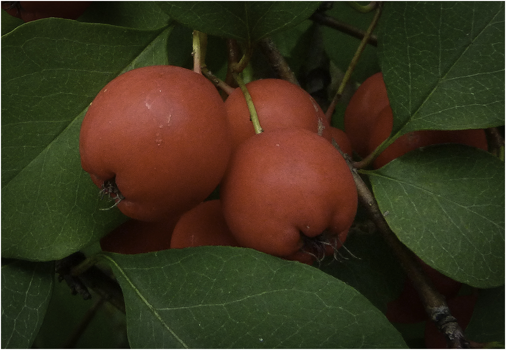
I use mostly Photoshop and Lightroom and occasionally the Topaz products and On1. Here I used PS to bright the berries and crop a little more. David is right about the focus on the berries. |
Aug 3rd |
 |
| 61 |
Aug 22 |
Comment |
I agree with your comment, David. The cropped version would be good for showing off the insect and both versions are well done. I do feel the crop doesn't display the flower as well. Good job on your main entry. |
Aug 2nd |
| 61 |
Aug 22 |
Comment |
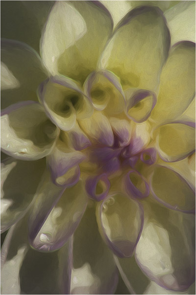
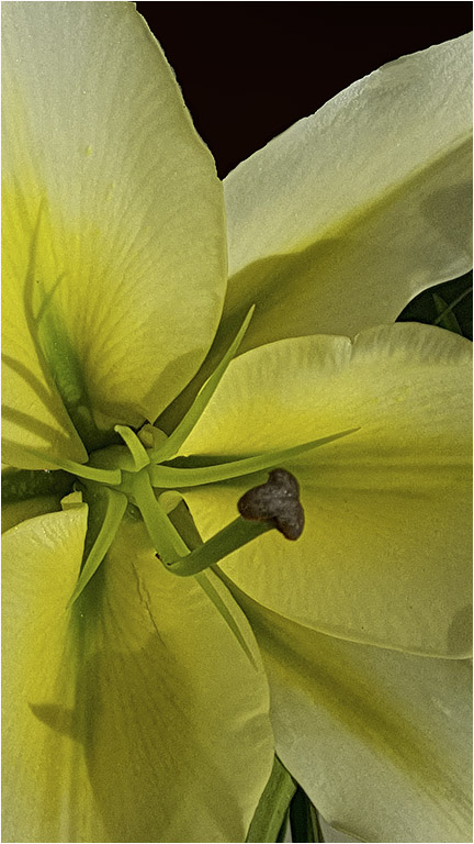
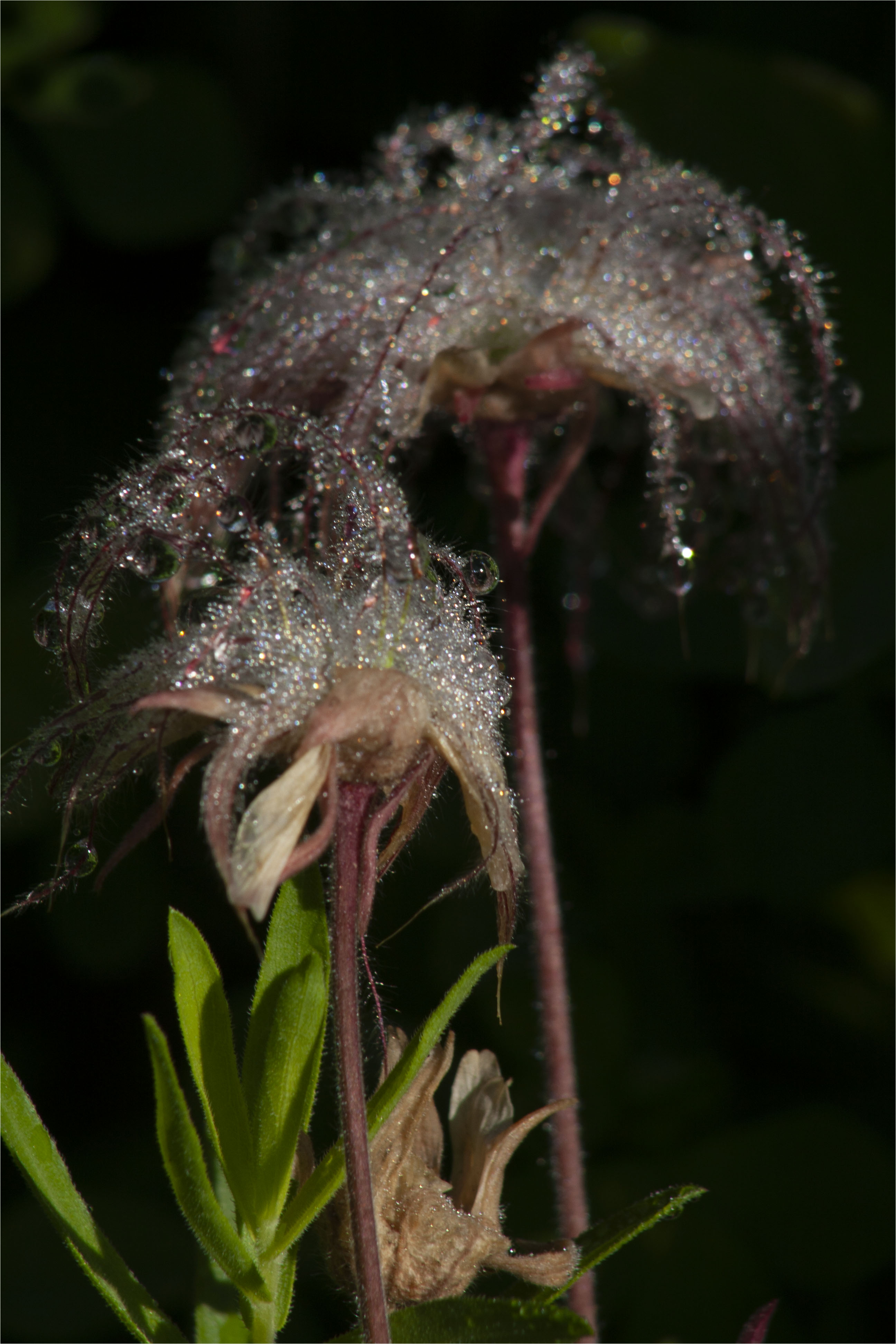
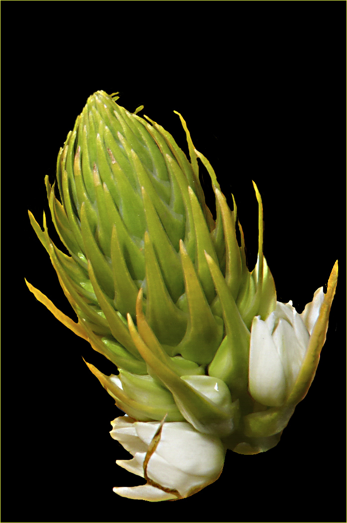
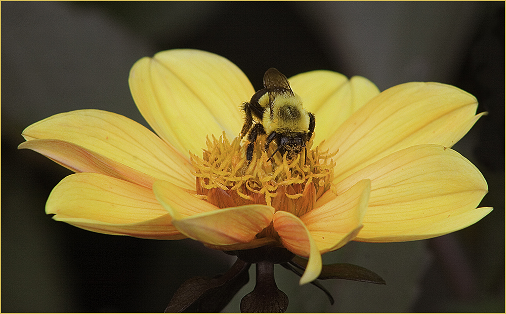
Good capture for a windy day! While the background is better than the original, to me it competes with the flower. In the original, is the light part at the bottom the stem? The flower seems to be floating to me. Overall it's a pleasing image. |
Aug 2nd |
| 61 |
Aug 22 |
Comment |
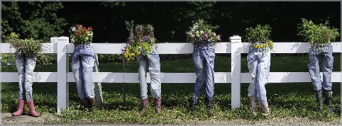
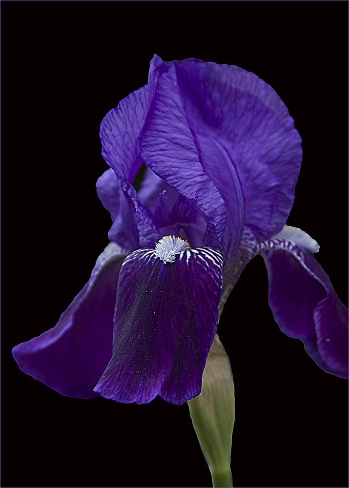
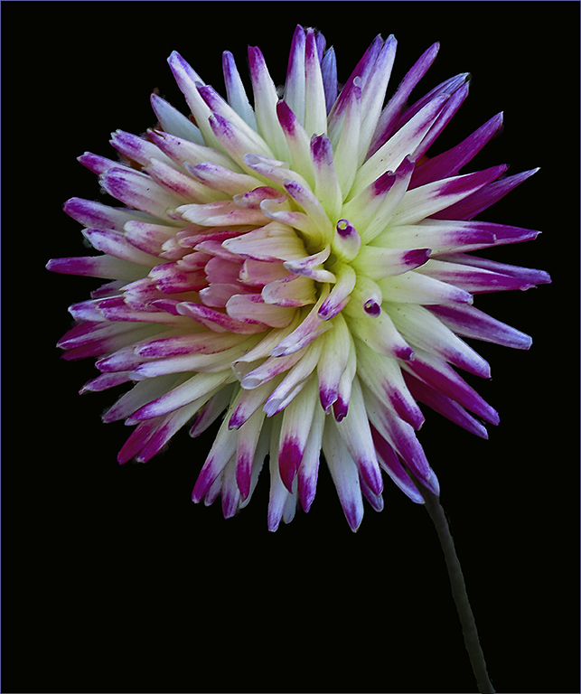
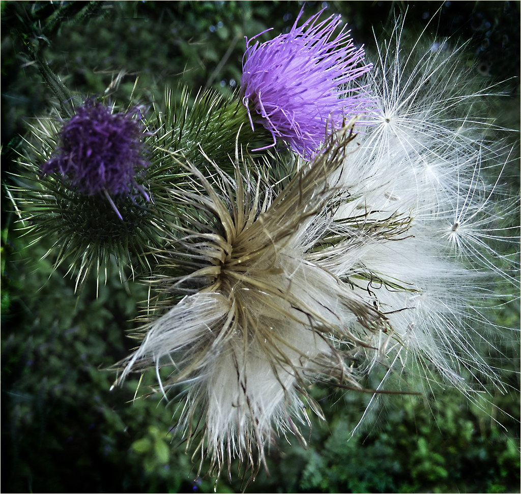
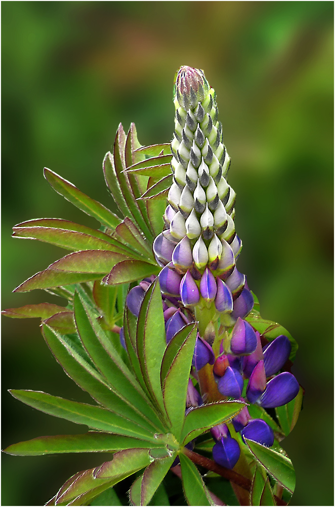
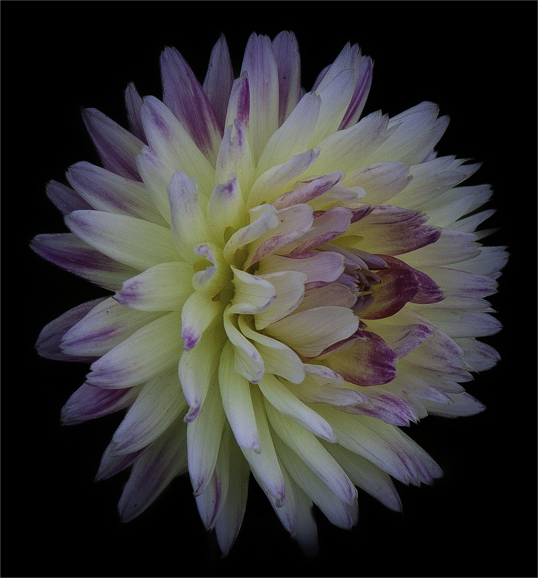
I know rules are made to be broken so I kind of went half way on my version. For me, having two bright flowers makes my eyes go back and forth. For this reason, it's best to have odd numbers of items. What I did was to burn in the smaller flower to put more importance on the larger one. I also added a stroke especially since the background is dark. I feel this helps to keep the focus inside the frame. Overall it's a nice capture of a pretty flower. |
Aug 2nd |
 |
| 61 |
Aug 22 |
Reply |
I used David's advice and put this into Topaz Sharpen AI and here was the result. They almost look the same but if you open each, you can see the sharpening is quite noticeable. |
Aug 2nd |
 |
| 61 |
Aug 22 |
Comment |
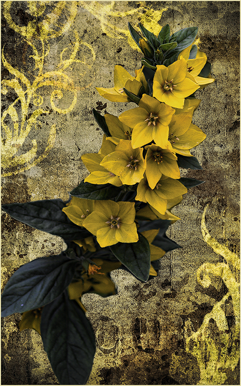
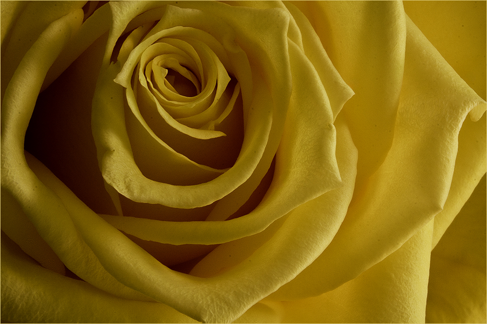
I like the basic image - very pretty. My only comment (to be the picky person I am) - I feel the brown (orange?) outside frame could be smaller. Perhaps even the tan and orange could be reversed? |
Aug 2nd |
| 61 |
Aug 22 |
Comment |
I use mostly Photoshop and Lightroom and occasionally the Topaz products and On1. Here I used PS to bright the berries and crop a little more. David is right about the focus on the berries. |
Aug 2nd |
 |
| 61 |
Aug 22 |
Reply |
Hi Donna - it's not about leagues...If there is something you like or dislike, feel free to say it. That's the way we learn. It's not just about what's "wrong" with an image. People also learn by what others think is "right" with images. |
Aug 2nd |
| 61 |
Aug 22 |
Reply |
Thanks David - perhaps like this? |
Aug 2nd |
 |
7 comments - 5 replies for Group 61
|
| 65 |
Aug 22 |
Reply |
Very nice! |
Aug 7th |
| 65 |
Aug 22 |
Comment |
I agree with Melanie - the bottlebrush is nicely enhanced. The angle of the plant makes for a good composition and the frame is an added compliment. Good job. |
Aug 2nd |
| 65 |
Aug 22 |
Comment |
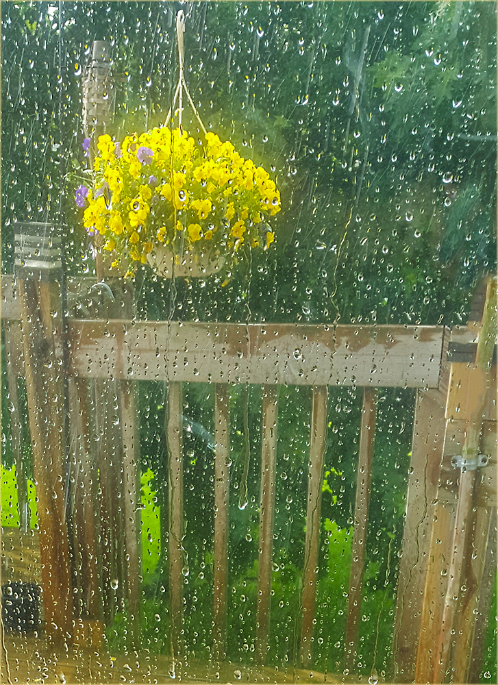
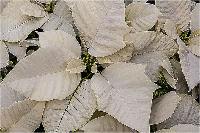
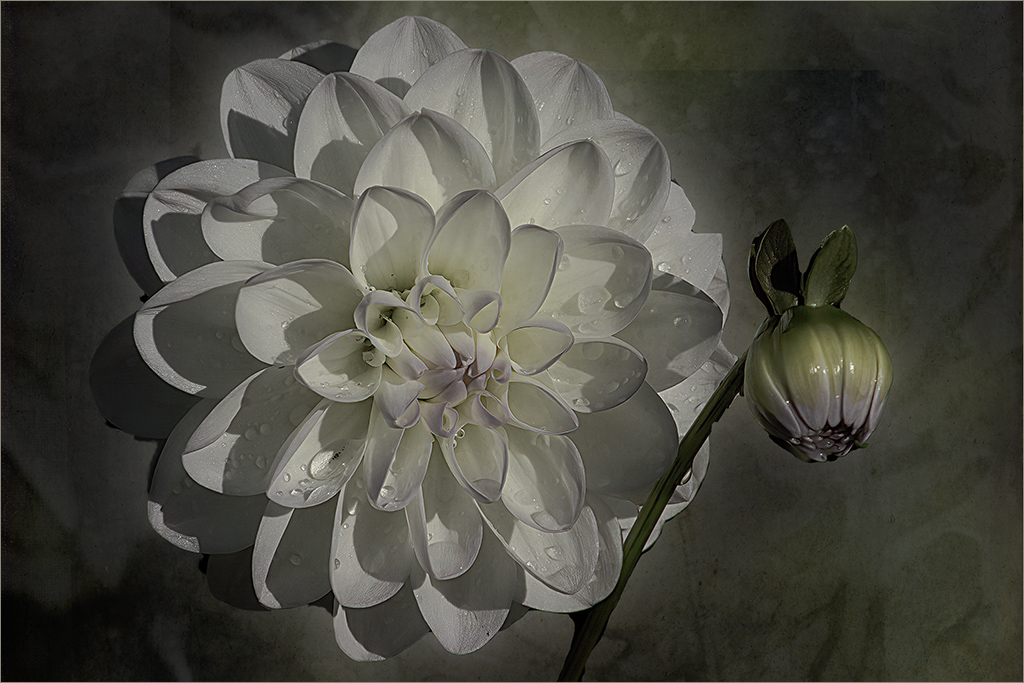
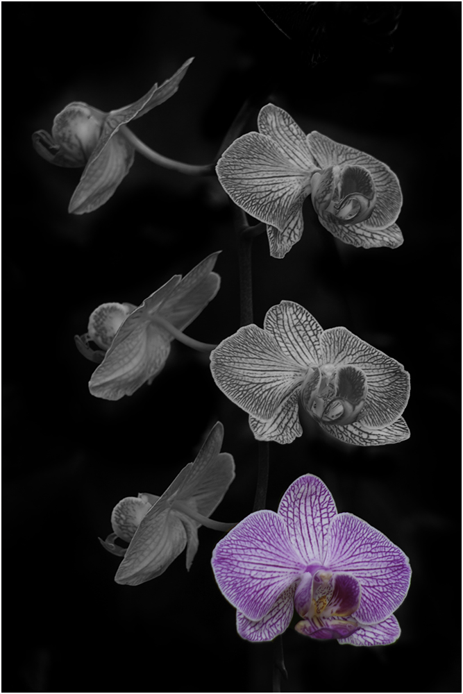
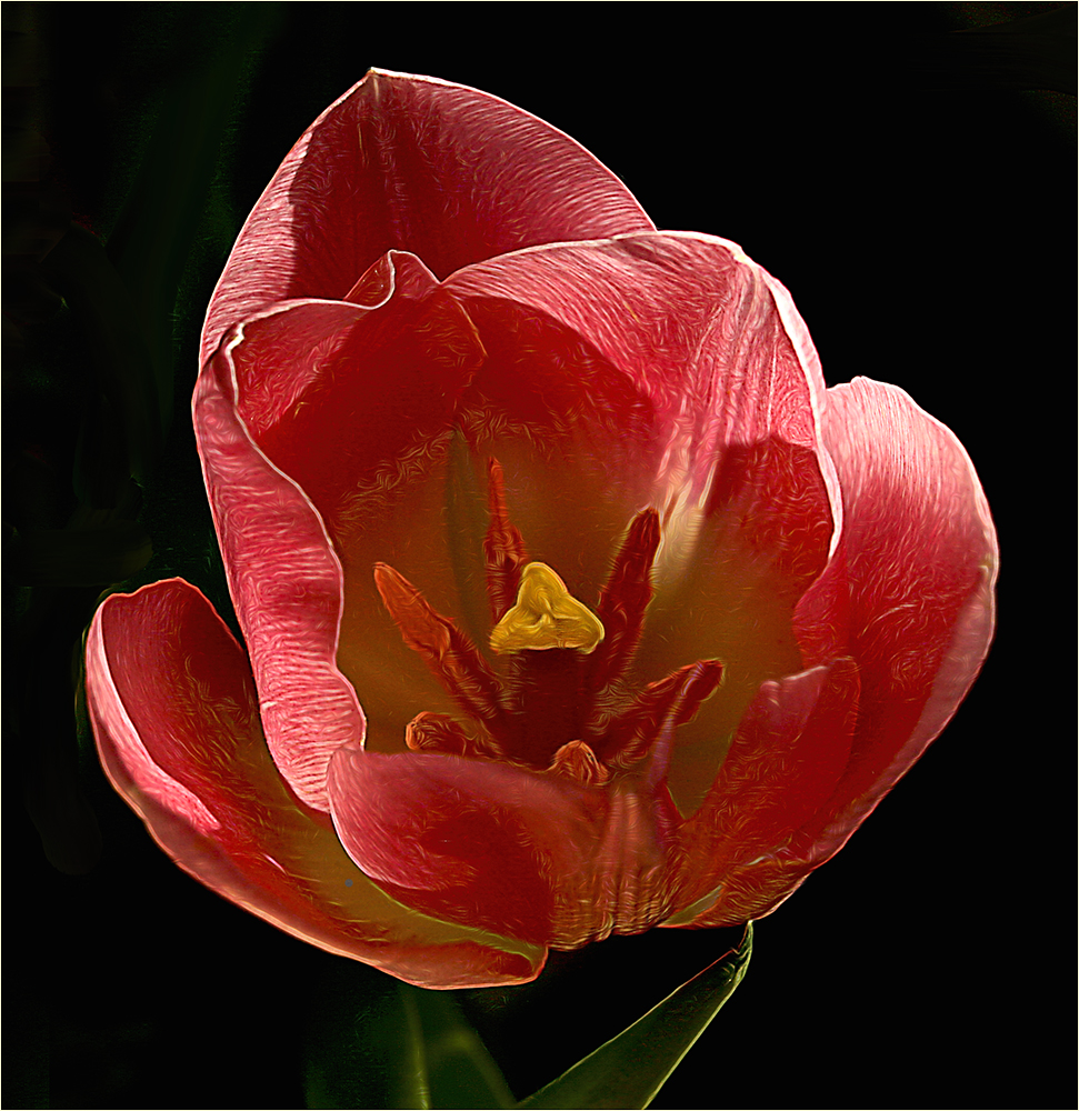
I agree with Melanie the background and dreamy quality make this a nice image. To be picky, I would use the healing brush or clone tool to remove some of the artifacts in the background and also the brown spots at the base of the flower.
Just an FYI - if you enter in competitions, your name would not be permitted on the image. I put mine on a separate layer so I can add it or remove it at will. |
Aug 2nd |
| 65 |
Aug 22 |
Comment |
I agree - well done. The crop takes the eye a little off-center which improves the composition for me. |
Aug 2nd |
| 65 |
Aug 22 |
Comment |
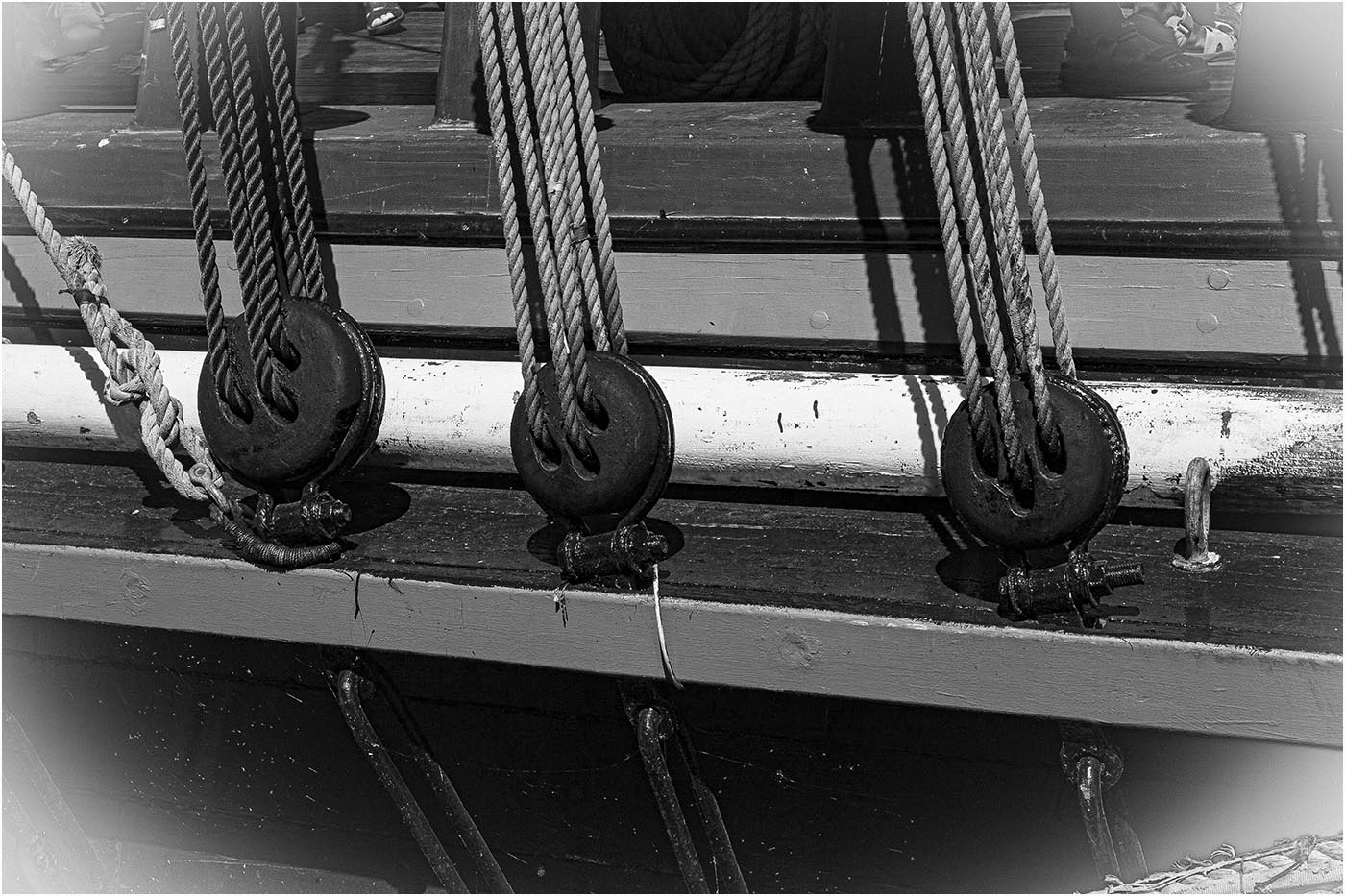
While the color version is very nice, for me the black and white is outstanding. It gives me a peaceful feeling. Well done. |
Aug 2nd |
| 65 |
Aug 22 |
Comment |
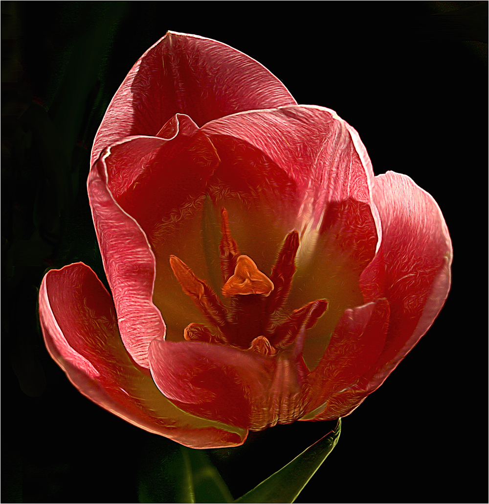
Hi Al: Congrats on being an admin. I know you like to work with the textured effects but for me, the background is a little distracting. I prefer the original with its stark background making the tulips pop out. |
Aug 2nd |
5 comments - 1 reply for Group 65
|
19 comments - 8 replies Total
|