|
| Group |
Round |
C/R |
Comment |
Date |
Image |
| 22 |
Mar 21 |
Comment |
This one gets better every time I look at it. Stunning image. |
Mar 25th |
| 22 |
Mar 21 |
Reply |
Even when using Topaz to sharpen, there might be different levels you would use depending on whether printing or displaying digitally. Prints tend to need more sharpening than digital images. By using layers for each one, you can turn a layer on or off depending on whether you want to print or show digitally. I keep the PSD file and then turn the print sharpening off to make a competition digital entry, flatten it, and save as a JPG. The when I close the PSD file I don't save it - unless changes I want to keep are made. |
Mar 25th |
| 22 |
Mar 21 |
Reply |
No reply or description is too long-winded. :)
In fact, there is big discussion among the admins right now about getting more discussion going in the groups. I feel we have a pretty good group here as we give our likes and dislikes, show how we would "improve" an image, and share ideas and tips we find.
If any of you have comments you wish to share on what you would like to see (or not see) in the group, please let me know and I'll share it with the other admins. Thanks! |
Mar 12th |
| 22 |
Mar 21 |
Comment |
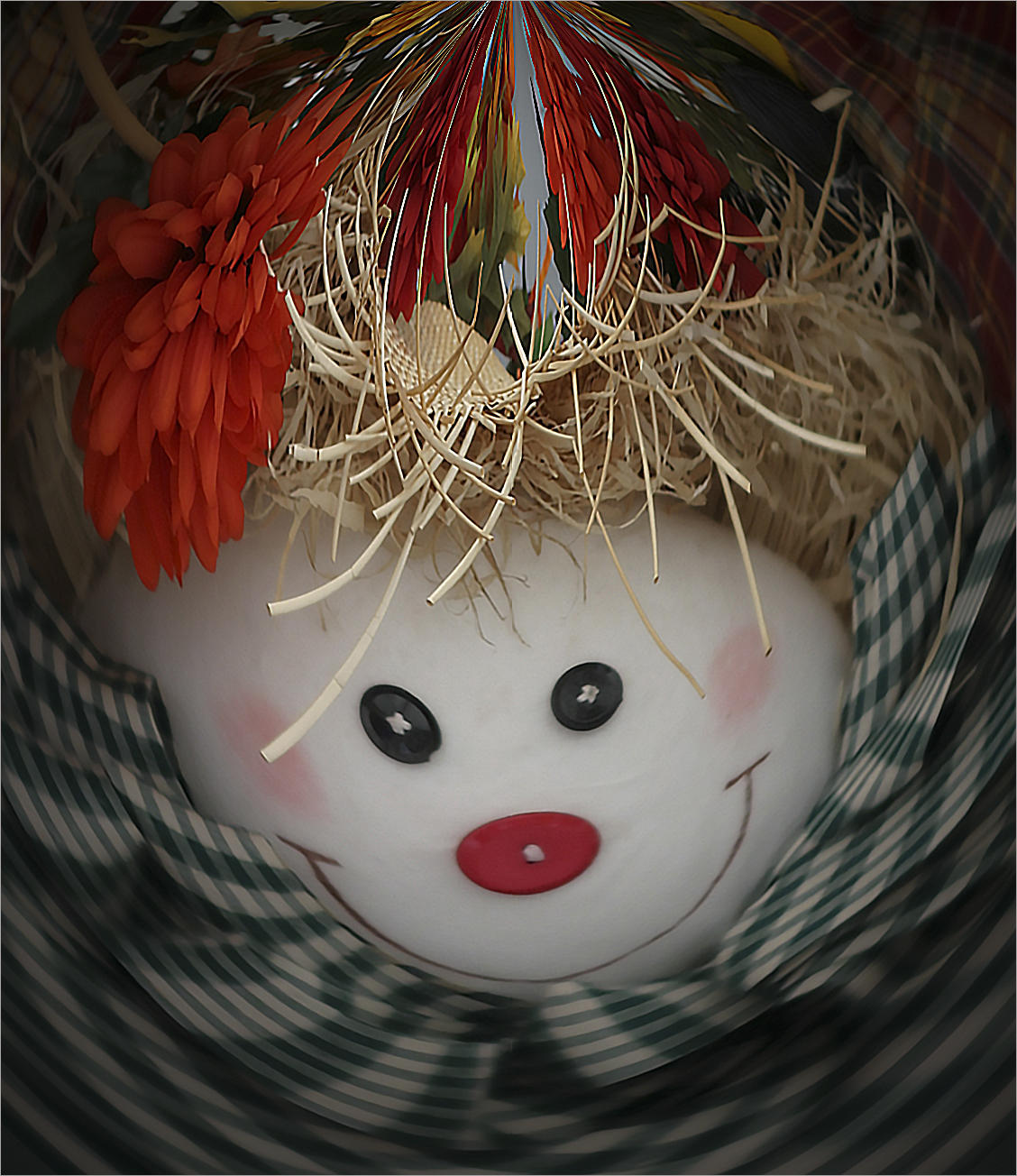
Nice use of Liquify. To make it even spookier, perhaps enlarge the owl's eyes? |
Mar 9th |
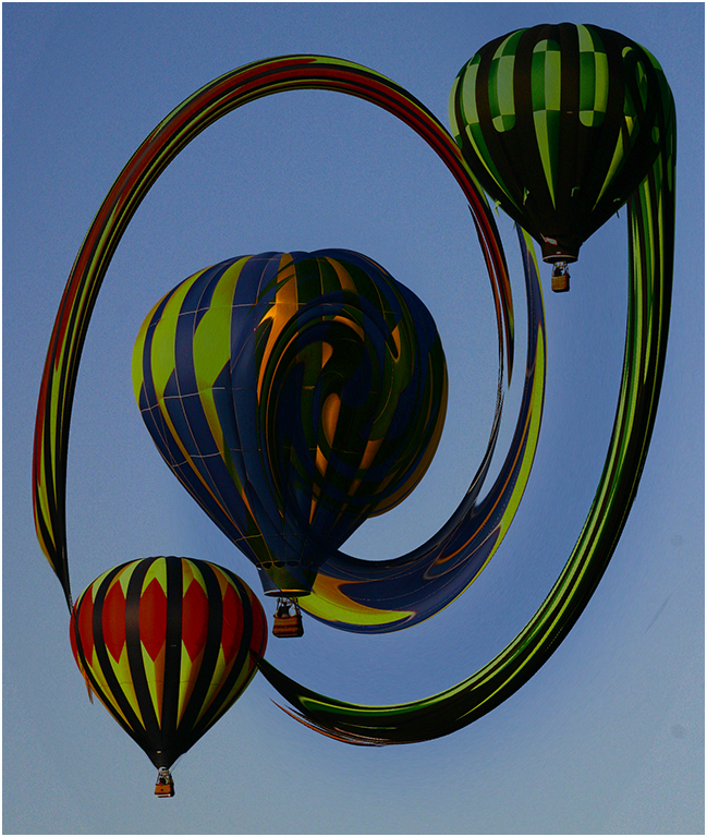
| 22 |
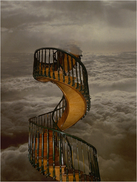
Mar 21 |
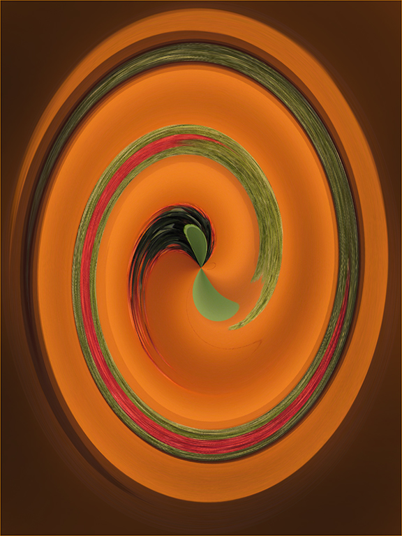
Comment |
I'm going to go in the opposite direction of Joe and say that I feel the straight lines create a border that holds the twirl in place. Like the colors too. Very nice creation - good work. |
Mar 9th |
| 22 |
Mar 21 |
Reply |
I'll put that up for next year. We did do something similar a year or two ago where we took a "record shot" image from another member and found something to create out of it. |
Mar 9th |
| 22 |
Mar 21 |
Reply |
It's all about moving the center and cropping to try different views. :) |
Mar 6th |
| 22 |
Mar 21 |
Reply |
Found the answer - Preferences > Tools > check Show Reference Point if the crosshairs or center point doesn't show.
This way you can pick the color for the background by moving the center point. |
Mar 6th |
| 22 |
Mar 21 |
Reply |
Nice, Al! |
Mar 6th |
| 22 |
Mar 21 |
Reply |
One other thing - if you move the center point and crop, you can change the side coloring - as well as the design. I used to see the center point on the crop but it doesn't show now - any ideas on why? What am I missing? |
Mar 6th |
| 22 |
Mar 21 |
Reply |
Jerry's right...I just used layers to try different filters and then turn them on and off depending on what I want to use at the time. |
Mar 6th |
| 22 |
Mar 21 |
Comment |
From this one. |
Mar 4th |
 |
| 22 |
Mar 21 |
Reply |
It's amazing what you can get out of a "nothing" image. |
Mar 4th |
 |
| 22 |
Mar 21 |
Comment |
I agree with Al - it is a spectacular image. I will say that normally it is not acceptable to use someone else's work. However, this was an exercise with filters - but I don't see any filter work listed in your description.
That said, I love the starkness of this image and the way the footsteps seem to head out into oblivion. It is a work of art. Hope your brother likes it. :) |
Mar 4th |
| 22 |
Mar 21 |
Comment |
Very nice improvement on the original. As Al mentioned, it does keep the eye inside where the original expands out to the borders. |
Mar 4th |
| 22 |
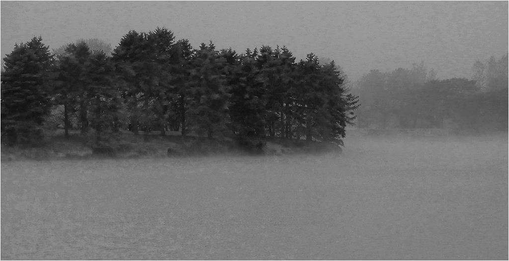
Mar 21 |
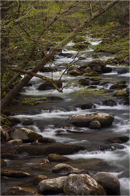
Comment |
I'm going to disagree with Al on the bottom crop as I see it as the line between the ground and the fog. I'd like to see a little more detail (contrast?) in it as well - especially in the trees. |
Mar 4th |
| 22 |
Mar 21 |
Reply |
Thanks Al. Hope you are feeling better. I think if I cropped off the right it would center it more. As far as layers, take a look at the Adobe training. I've been looking at the Beginners tutorials (about 4-5 mins each) and learn something new each time. There are also advanced tutorials that probably go into layers in more detail. Something to play around with. :) |
Mar 4th |
| 22 |
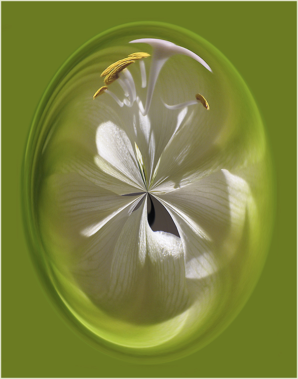
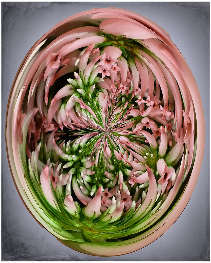
Mar 21 |
Comment |
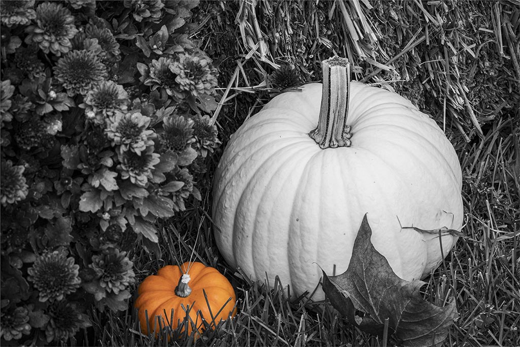
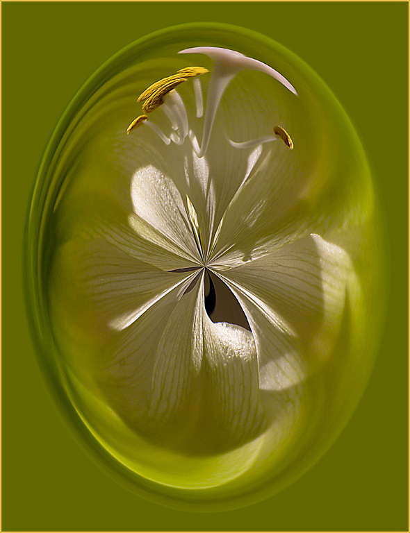
I have done many of these. This one turned out very nice.
You can adjust the edge color (and design) by cropping also. I created an action for it and put it on my F12 key so before I just delete an image I think isn't worthy, I try a "warp" on it.
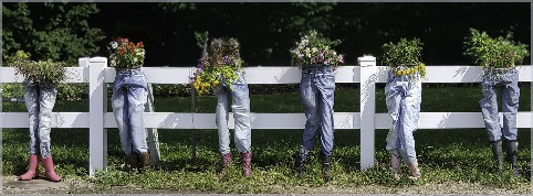
Okay - so I'm a little wacko today but I see a person's head with the green being the neck and the top being the brain and the left side of the flower being a hand slapping the forehead. :) |
Mar 3rd |
8 comments - 10 replies for Group 22
|
| 48 |
Mar 21 |
Reply |
You're welcome. :) |
Mar 15th |
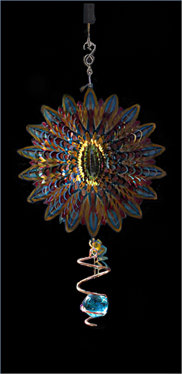
| 48 |
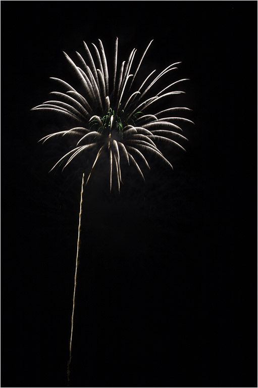
Mar 21 |
Reply |
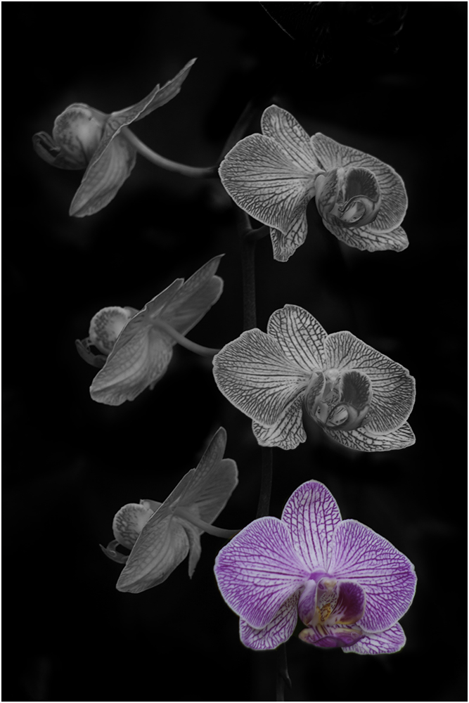
I finally got Photoshop to work. Seems the latest update has trouble as was supposed to be a trial version so if anyone has error messages when they try to use PS, go back to the previous version (it's 22.2 instead of 22.3)
Anyway - here is what I proposed. The stroke is very light against the gray but if you click on it you'll see it against the black background. |
Mar 15th |
 |
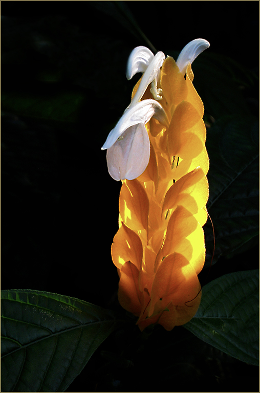
| 48 |
Mar 21 |
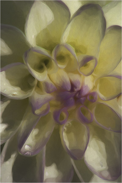
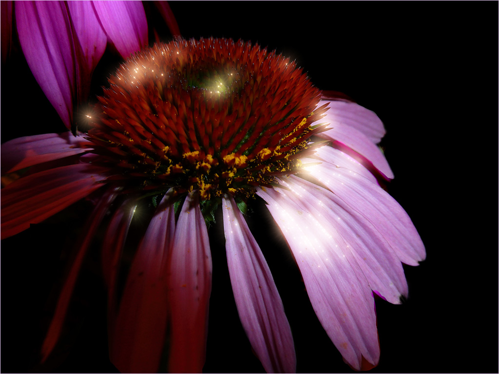
Comment |
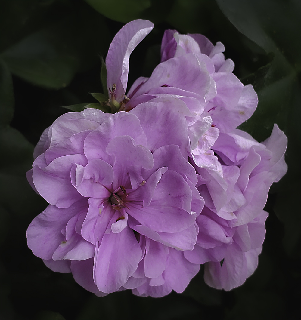
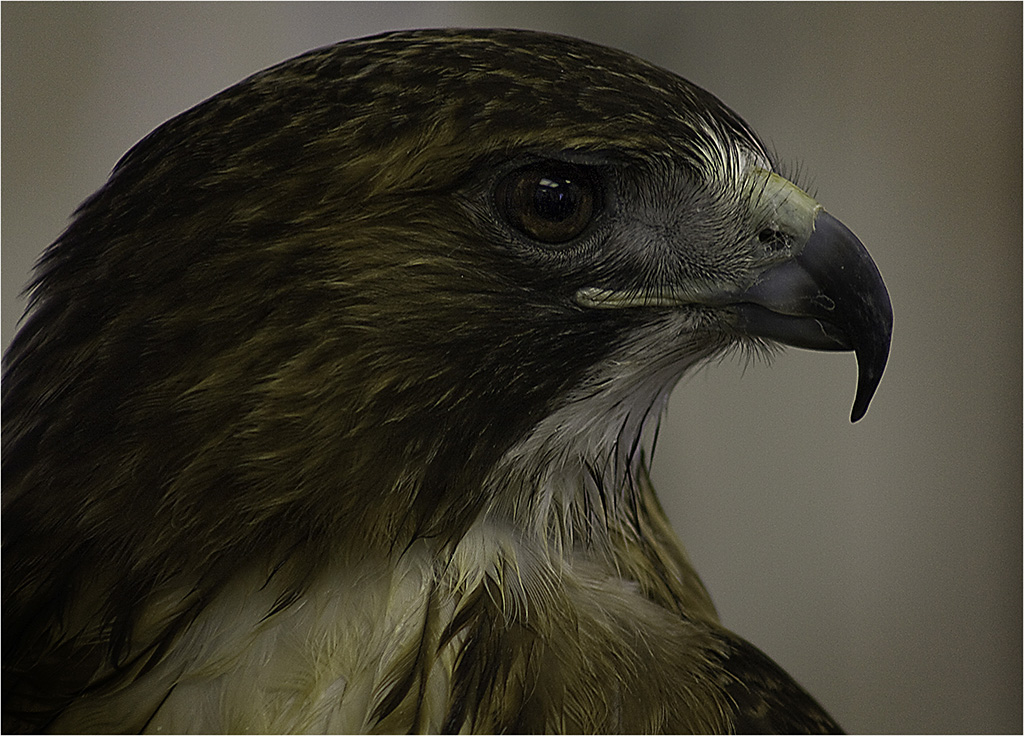
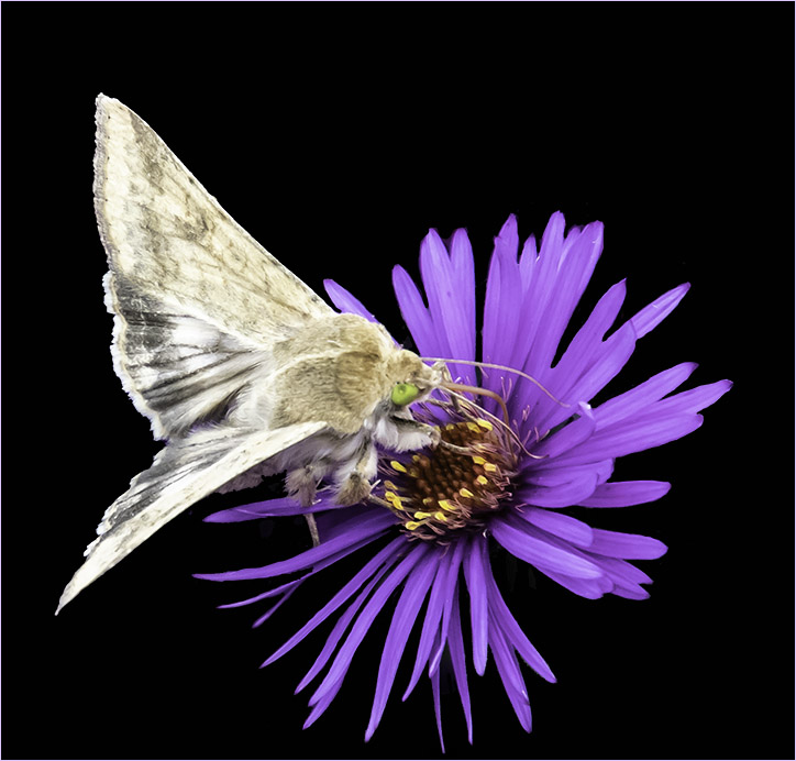
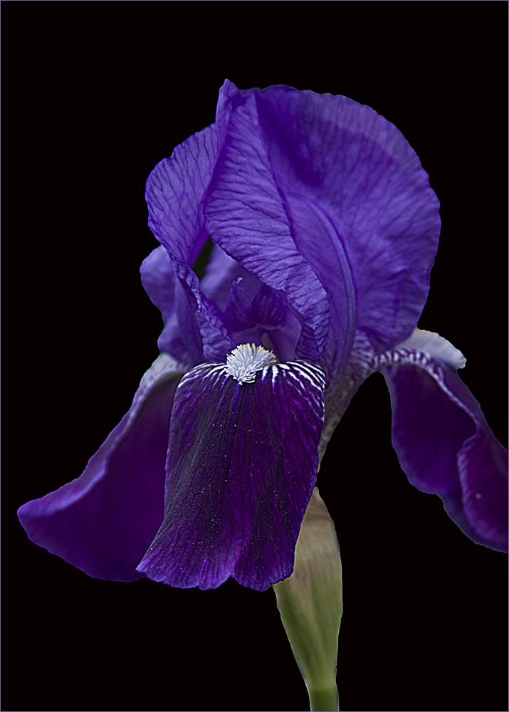
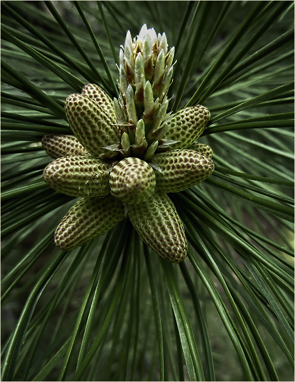
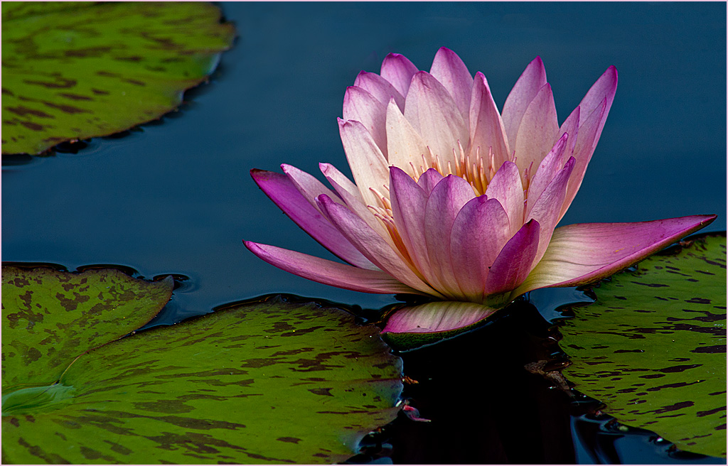
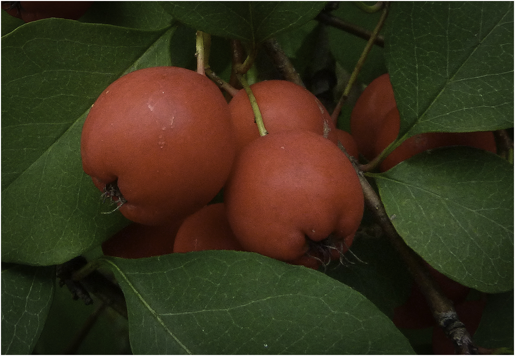
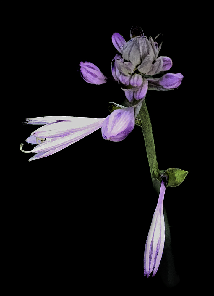
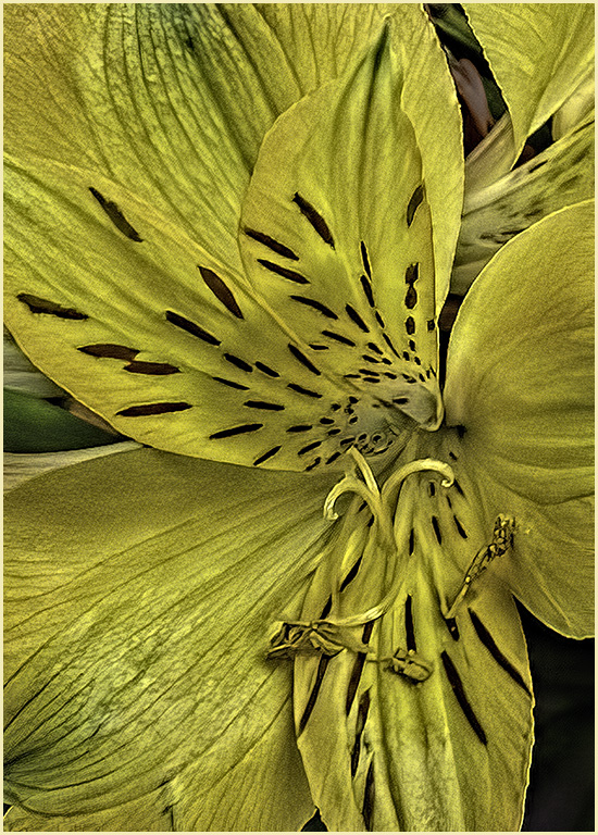
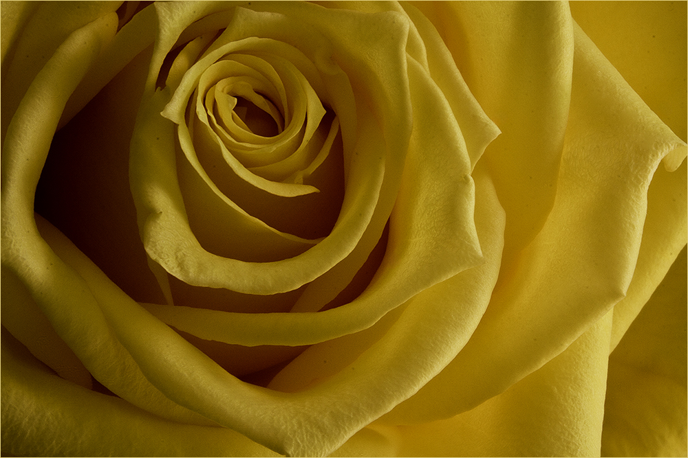
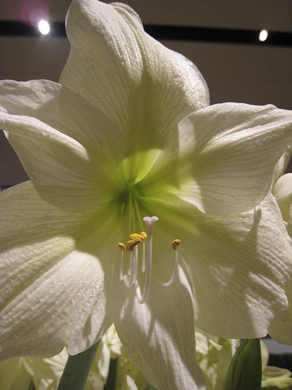
Beautiful image and so sharp overall. I'd sort of like to see the background branches blurred a little more but that's being pretty picky. I like the composition with the placement of the flower. Good job. |
Mar 14th |
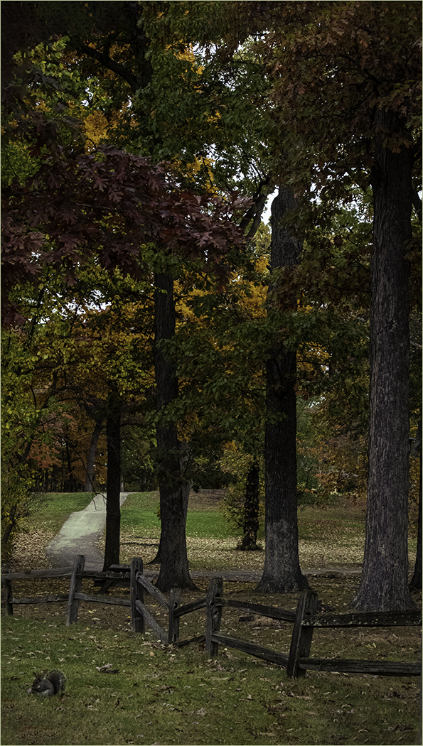
| 48 |
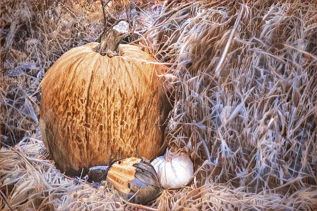
Mar 21 |
Comment |
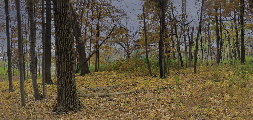
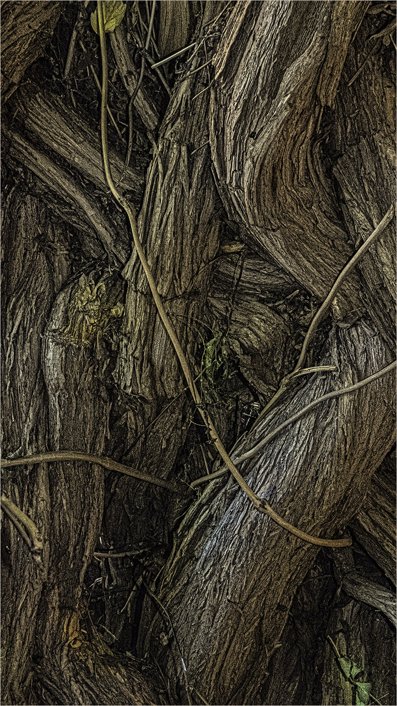
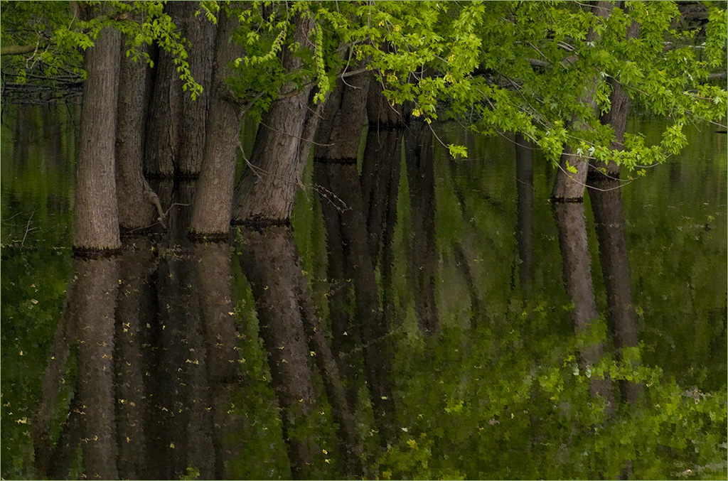
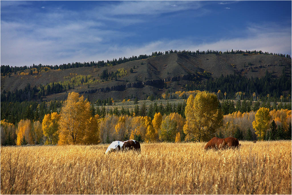
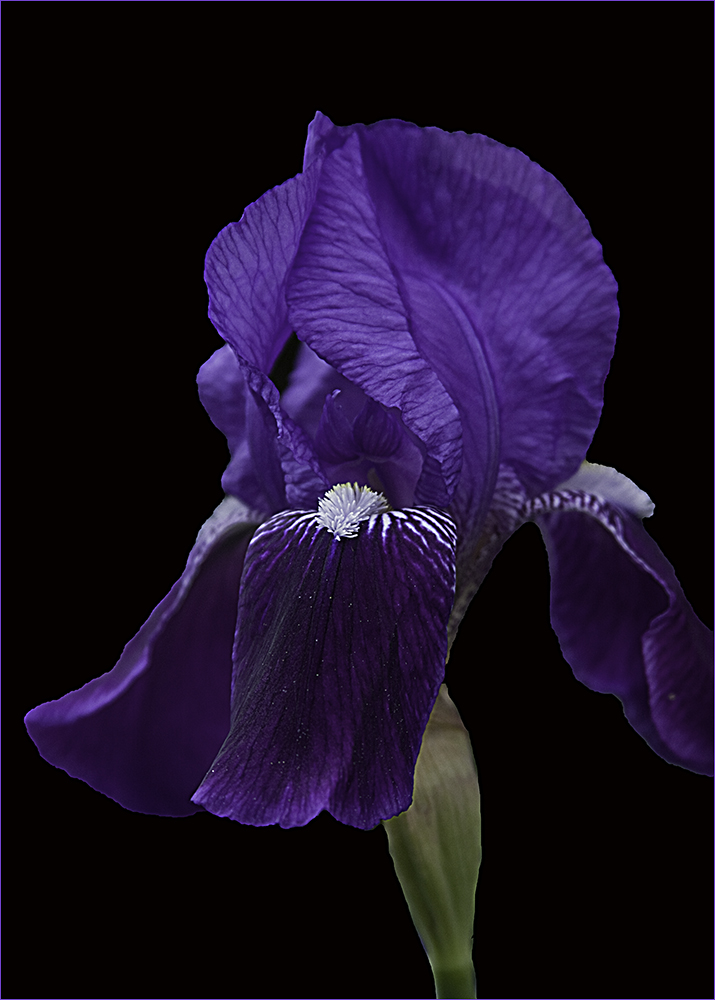
Fall scenes are always nice. At first I felt the scene was a little too busy and distracted from the tree but the more I looked at it, the more I liked the overall scene. I like Jamie's rendition especially taking the blurred foreground out. Is that really a maple? Leaves don't look quite like maple but it's hard to tell. Keep up the good work. |
Mar 13th |
| 48 |
Mar 21 |
Comment |
Touching image (no pun intended) :)
I like what Beverly did to the background. I think your background could have been blurred a little more and perhaps darkened as I found it rather distracting. I wish the baby were a little more in focus. Perhaps the increased depth of field and then masking out the background and working on it separately would have worked? Good capture though. |
Mar 13th |
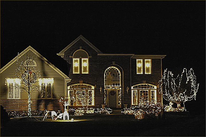
| 48 |
Mar 21 |
Comment |
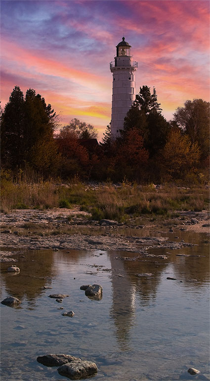
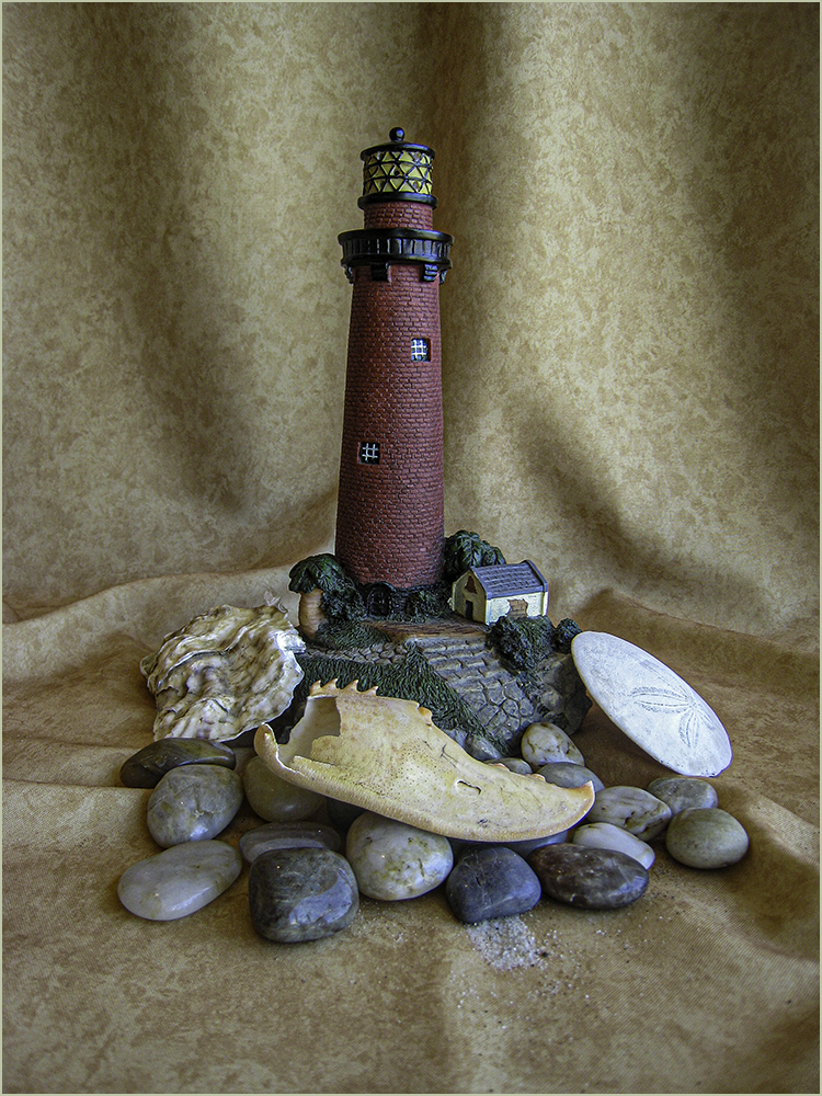
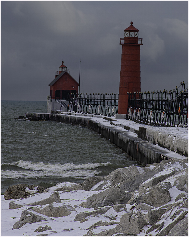
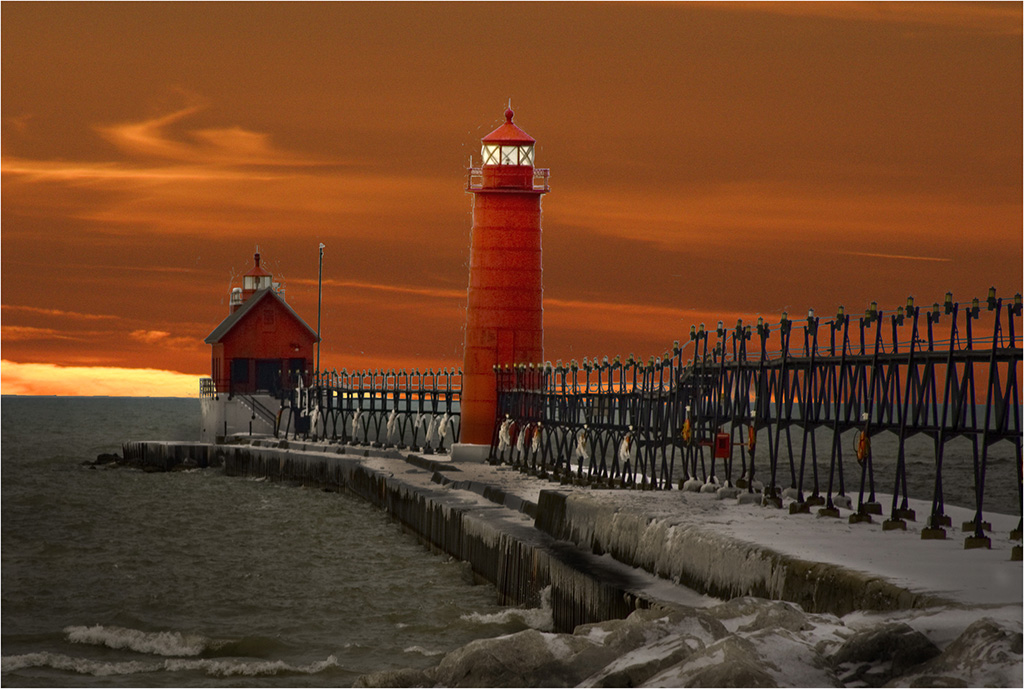
Nice composition and colors. It seems to me that the original color on the house was whiter than the final? Wish I was closer to NY - I love photographing lighthouses. Good job. |
Mar 13th |
| 48 |
Mar 21 |
Comment |
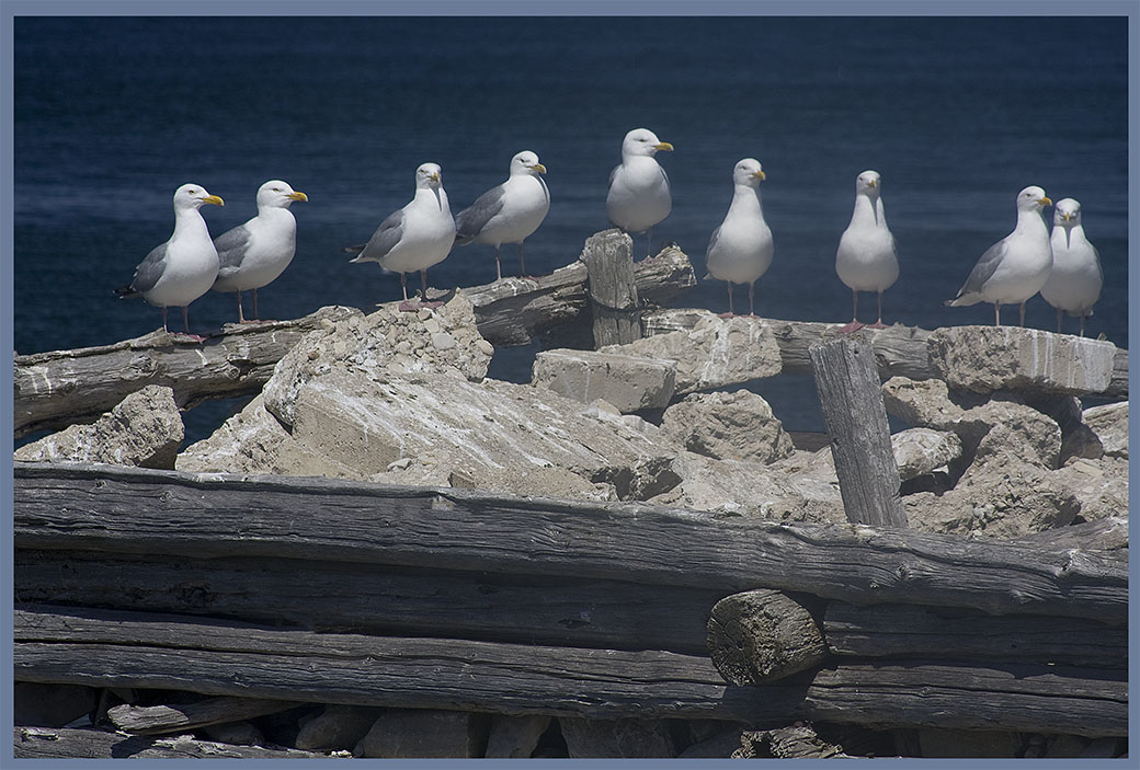
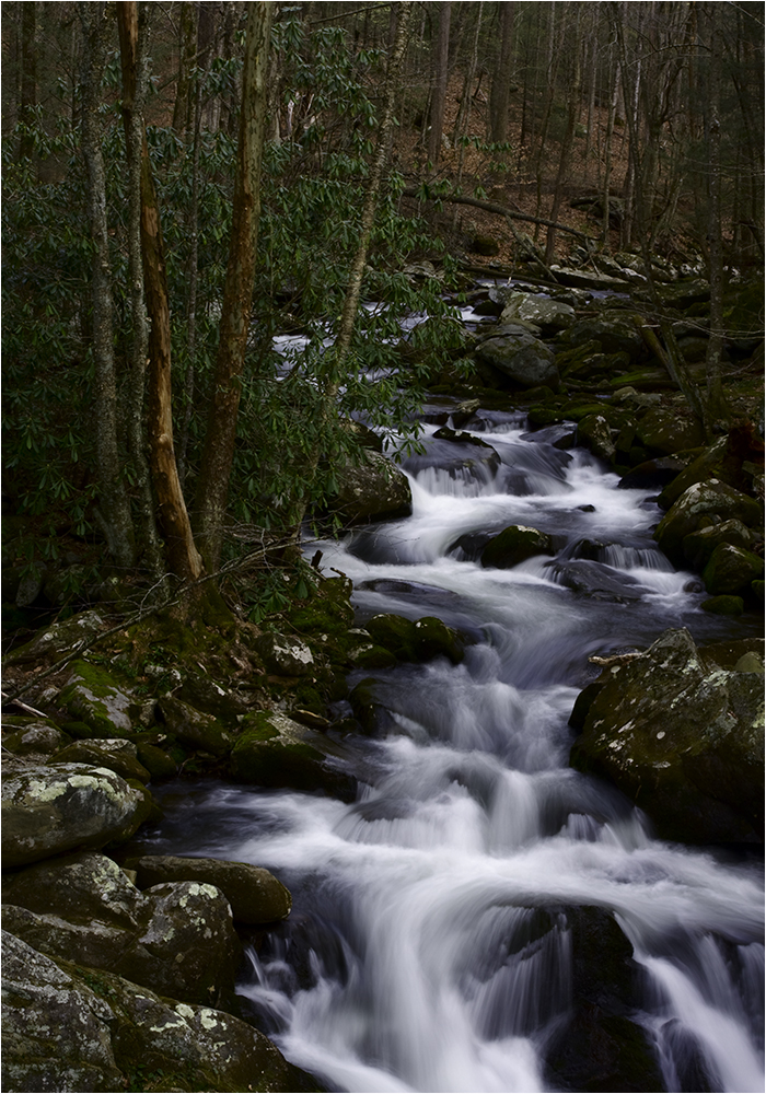
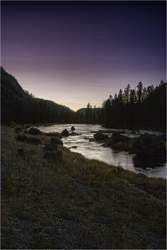
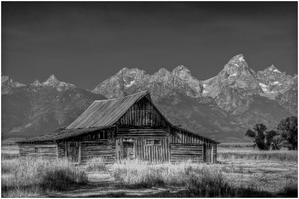
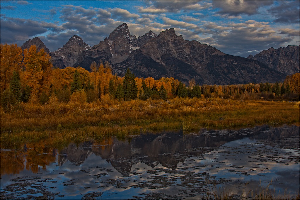
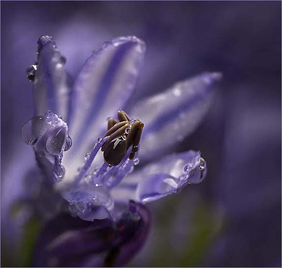
Hard to find a bad photograph in Yellowstone. :) This one shows me a nice contrast with the deep sky and the rock. I'm going to agree with Nilmini about the sky. The clouds are headed out of the image. Might be a good one to try Sky Replacement? Was the rock leaning? If not, the Free Transform would be good. I wonder about a little saturation in the grass around the rock to give it a little pop of color? Overall though it's a nice image. |
Mar 13th |
| 48 |
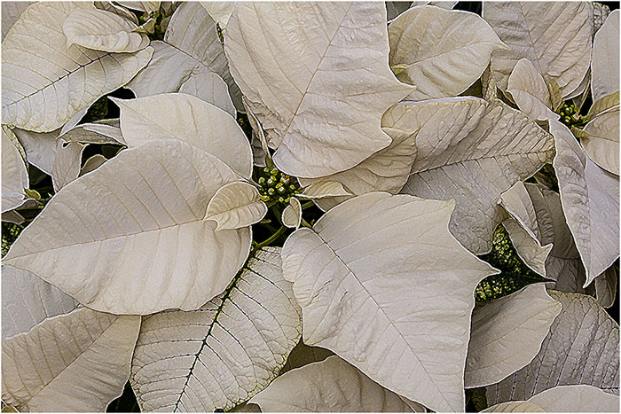
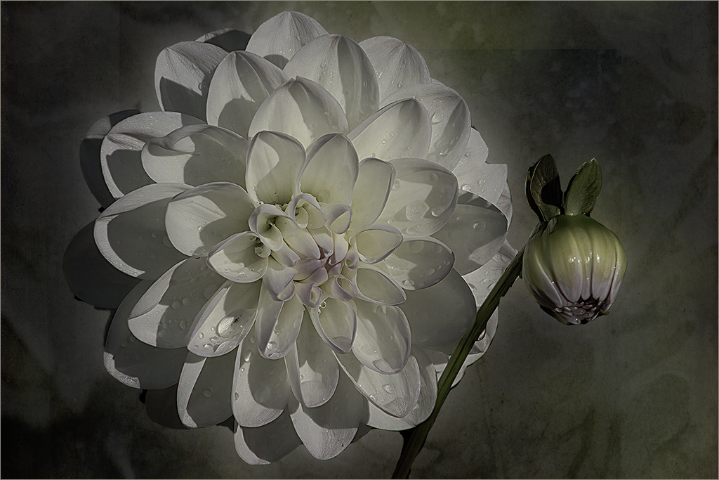
Mar 21 |
Comment |
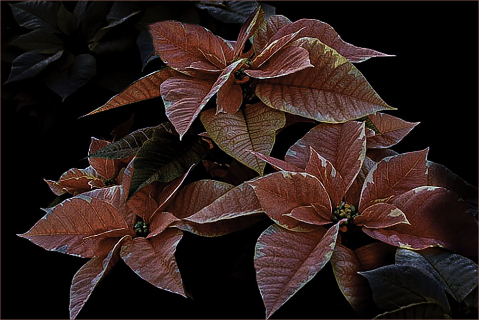
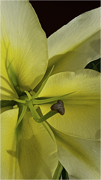
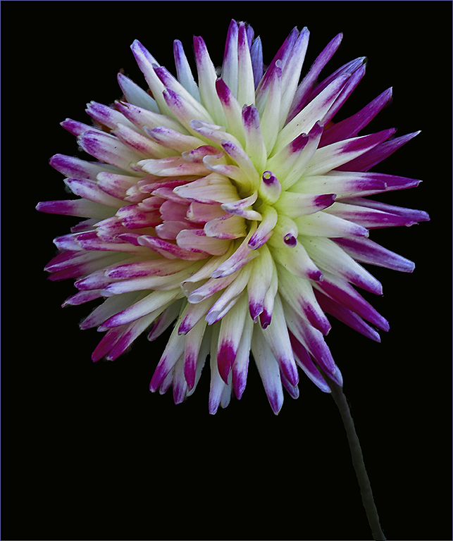
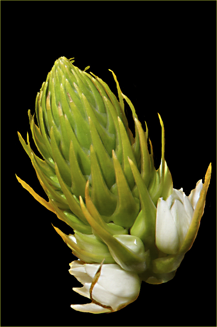
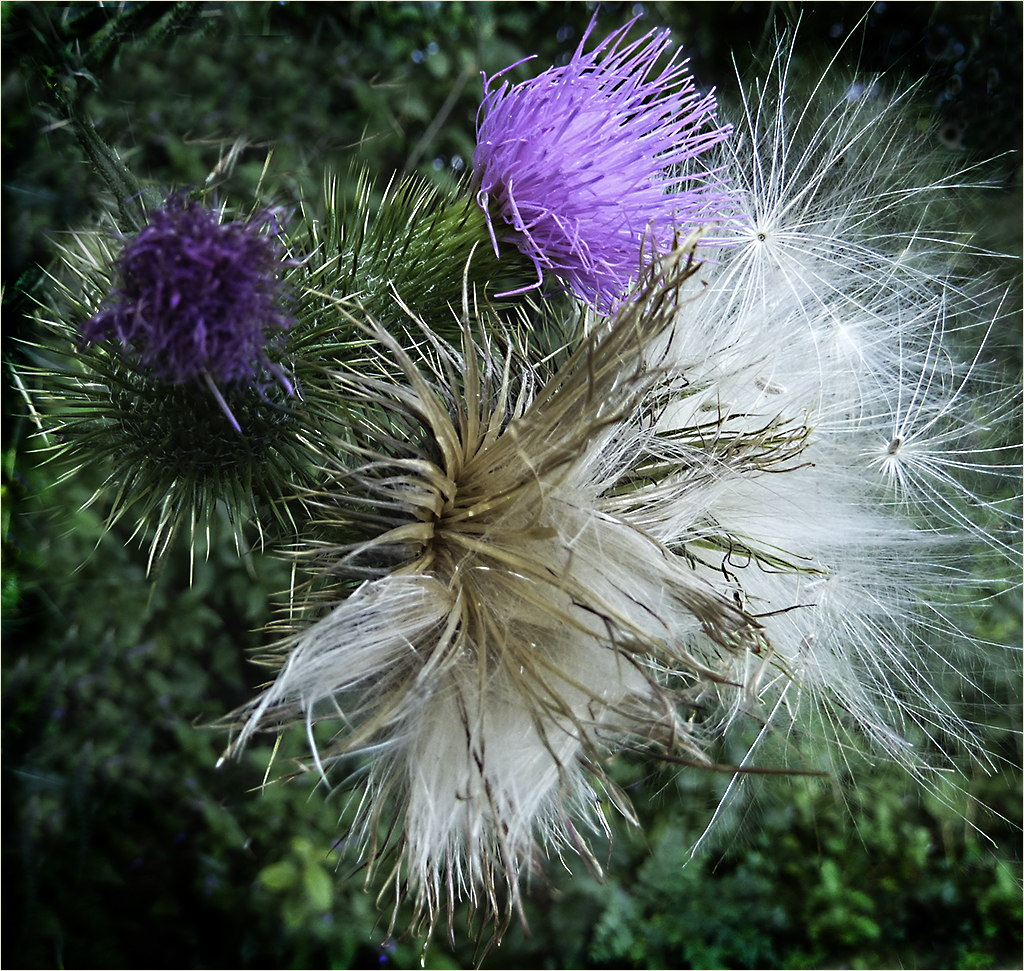
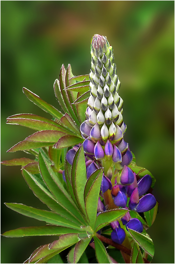
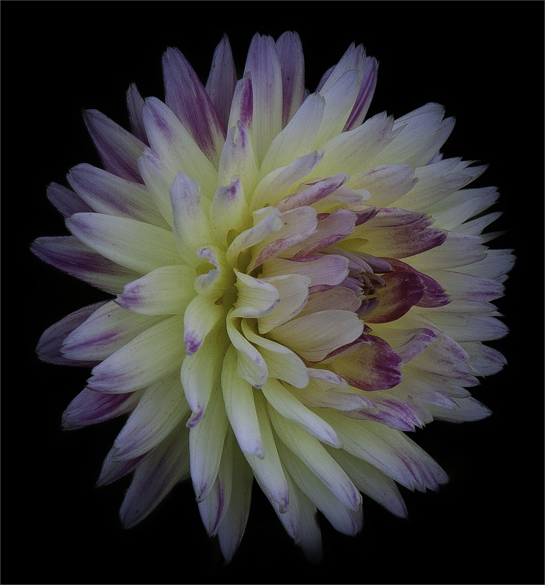
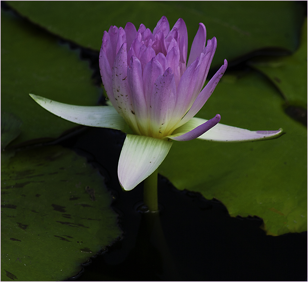
Beautiful image. My only comments would be that I'd like to see that bud in the lower right either cropped out or blurred more. To me, it's a little distracting. Also a light stroke might help keep the darker top corners from blending into the black background. |
Mar 13th |
6 comments - 2 replies for Group 48
|
14 comments - 12 replies Total
|