|
| Group |
Round |
C/R |
Comment |
Date |
Image |
| 22 |
May 20 |
Reply |
Thanks Jamie. |
May 20th |
| 22 |
May 20 |
Comment |
Like this? |
May 12th |
 |
| 22 |
May 20 |
Comment |
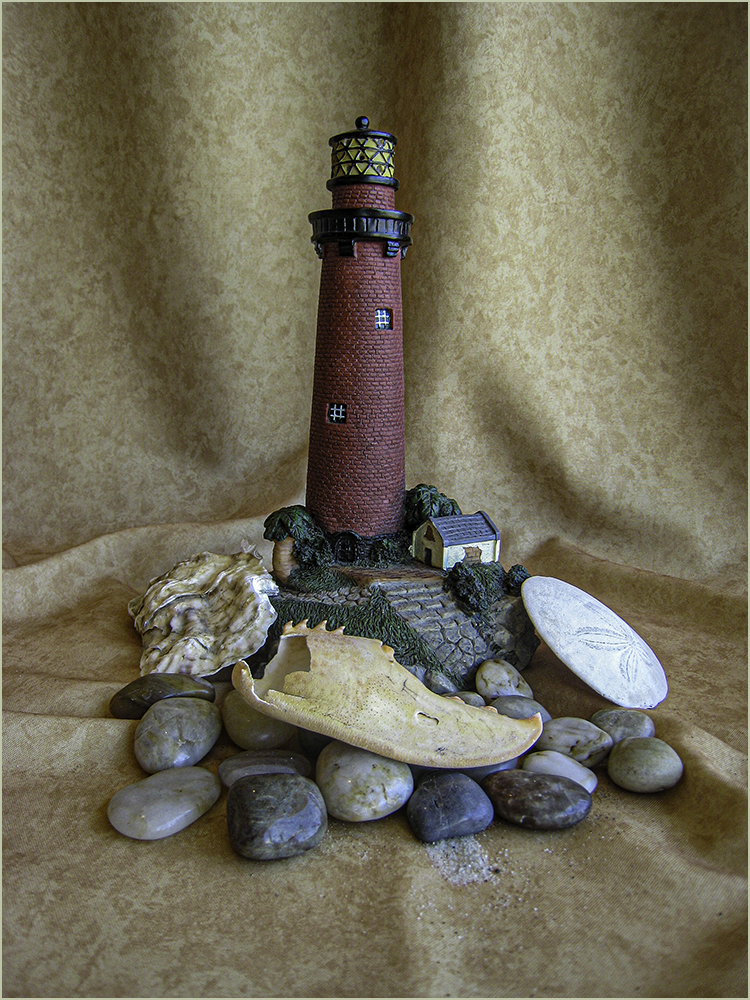
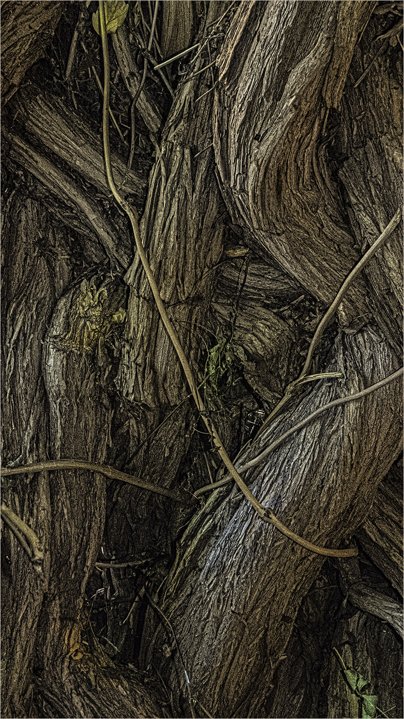
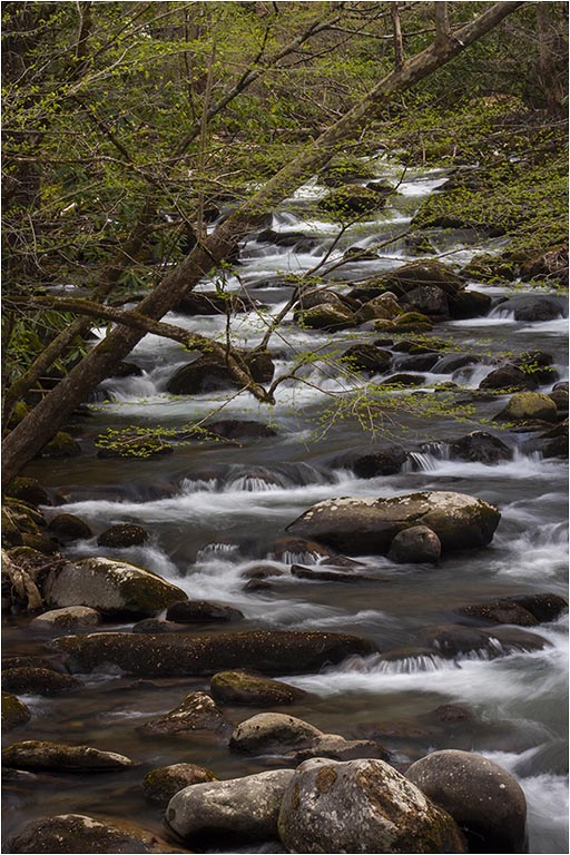
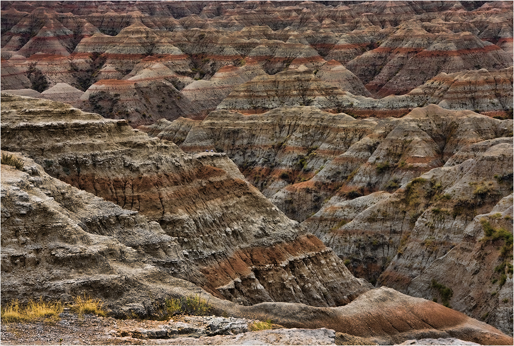
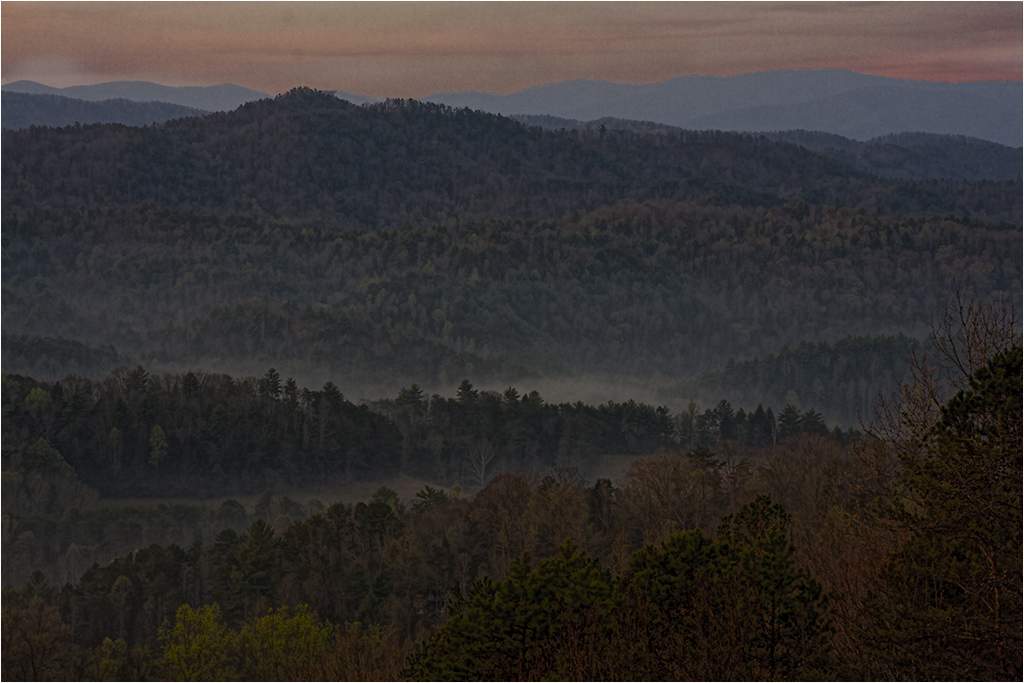
Nicely done, Al. You are doing some really good work lately. I rather like the original because I like the saturation. In Joe's re-work, it seems to lose some of the details in the rocks and plants for me. Perhaps your version with a lighter white vignette? Both are good though. |
May 12th |
| 22 |
May 20 |
Reply |
Very nice...yes. Thanks.
Sharpening looks good to me. |
May 10th |
| 22 |
May 20 |
Comment |
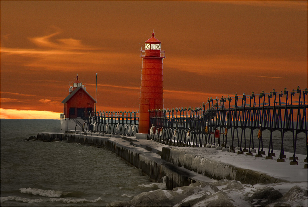
I feel the lighting is what hurts this image in that the golden cast is on everything. If the water could be made a little cooler (bluish) then the wave would perhaps stand out more? I agree with Al - it's a tough one to post process. You gave it a good try. |
May 10th |
| 22 |
May 20 |
Comment |
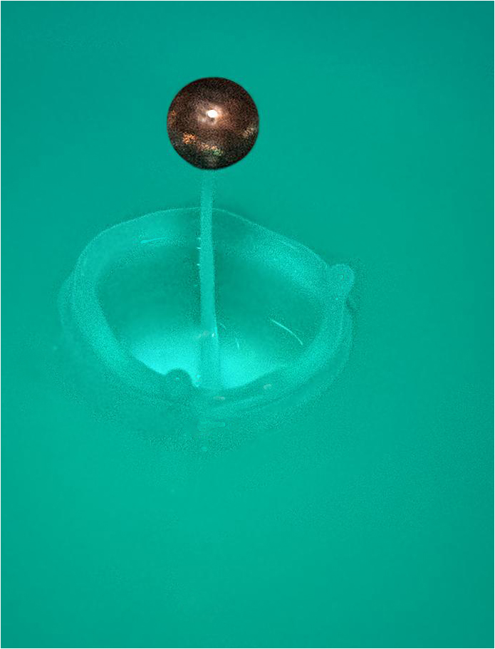
I sort of agree with Jerry - it doesn't do much for me. While it's an interesting abstract for the water, it doesn't really say water to me. |
May 10th |
| 22 |
May 20 |
Reply |
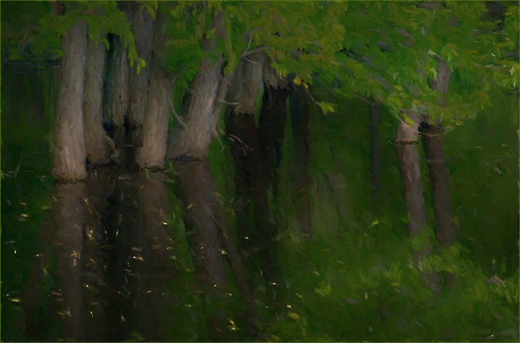
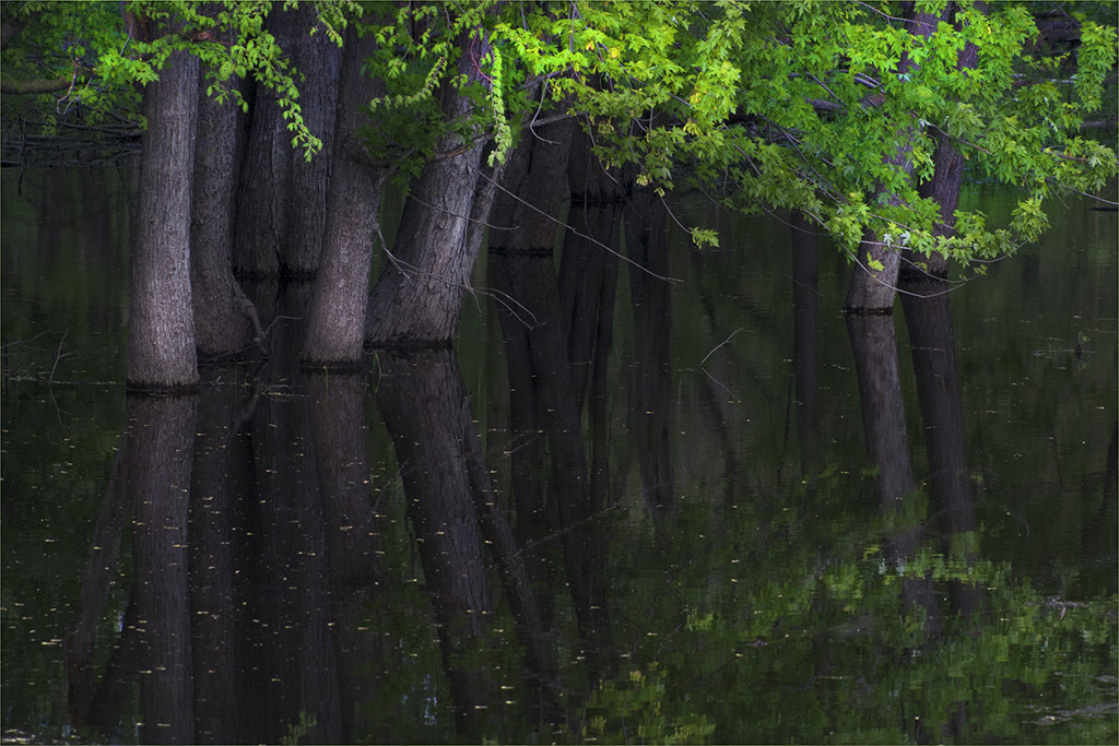
Thanks, Al. Here I took the original and brightened only the trunks and the leaves instead of doing any temperature changes. Water here is as shot. |
May 10th |
 |
| 22 |
May 20 |
Reply |
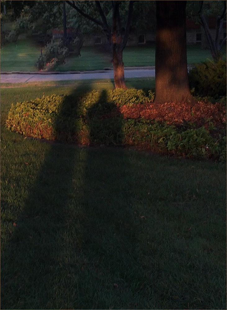
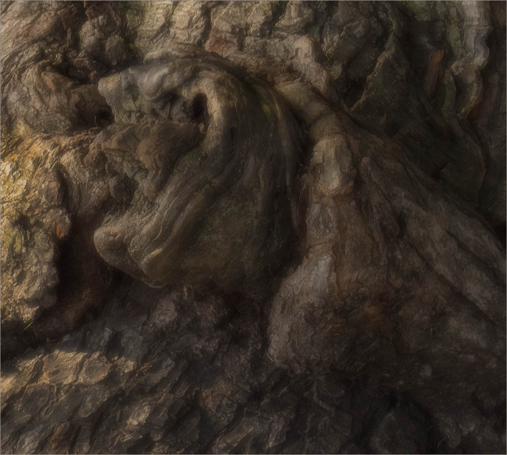
It's interesting how some people notice things...I didn't see the face until I looked after Jerry's comment. I see it now, I think. There might be two - the one in the light rock and the one at the very top just right of the falls? |
May 10th |
| 22 |
May 20 |
Comment |
Very interesting and good job especially for a first try!
I took out some of the white spots and cropped it a little different just to see what would happen.
Keep up the good work! |
May 8th |
 |
| 22 |
May 20 |
Comment |
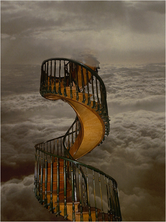
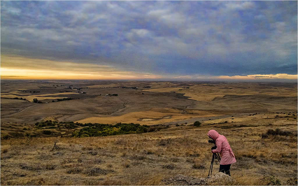
I'm going to agree with Mike. :) I also like the stars and the sky. I think this might be what I call the difference between a competition image and a "fine art" image. Perhaps for competition the waterfall should be more prominent. However, I like the mood that this portrays. Nice work. |
May 5th |
| 22 |
May 20 |
Comment |
I'm going to disagree with Joe - maybe because I'm left-handed? I feel it reads better from left to right in Peggy's version for me as my eye goes from the top of the head down to the right at the bottom.
It's a great capture. Nice work. |
May 4th |
7 comments - 4 replies for Group 22
|
| 48 |
May 20 |
Reply |
Interesting - thanks! |
May 20th |
| 48 |
May 20 |
Reply |
Thanks Jamie. I'm trying to get around to various groups each month. Our Group 22 welcomes outside comments as well. |
May 20th |
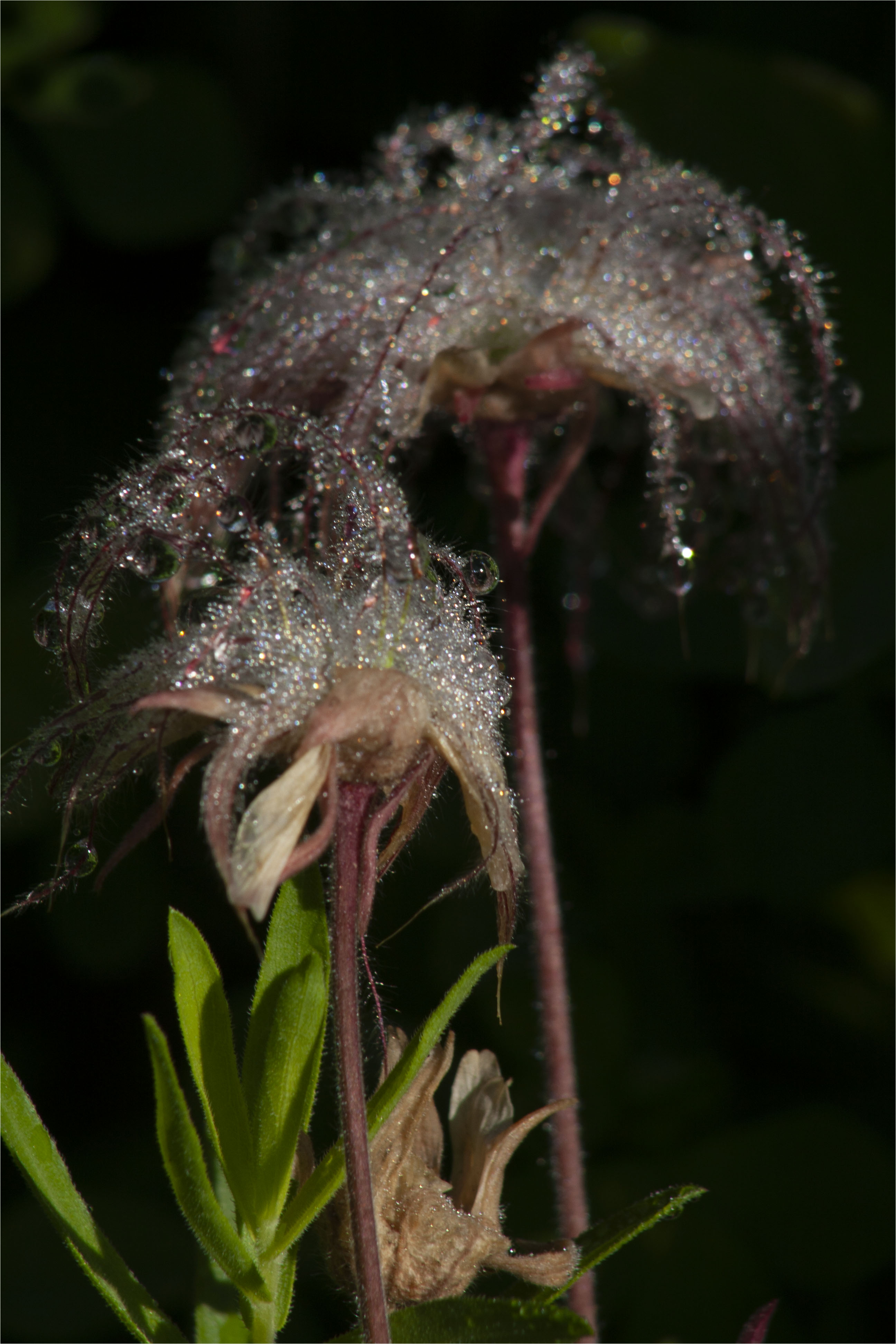
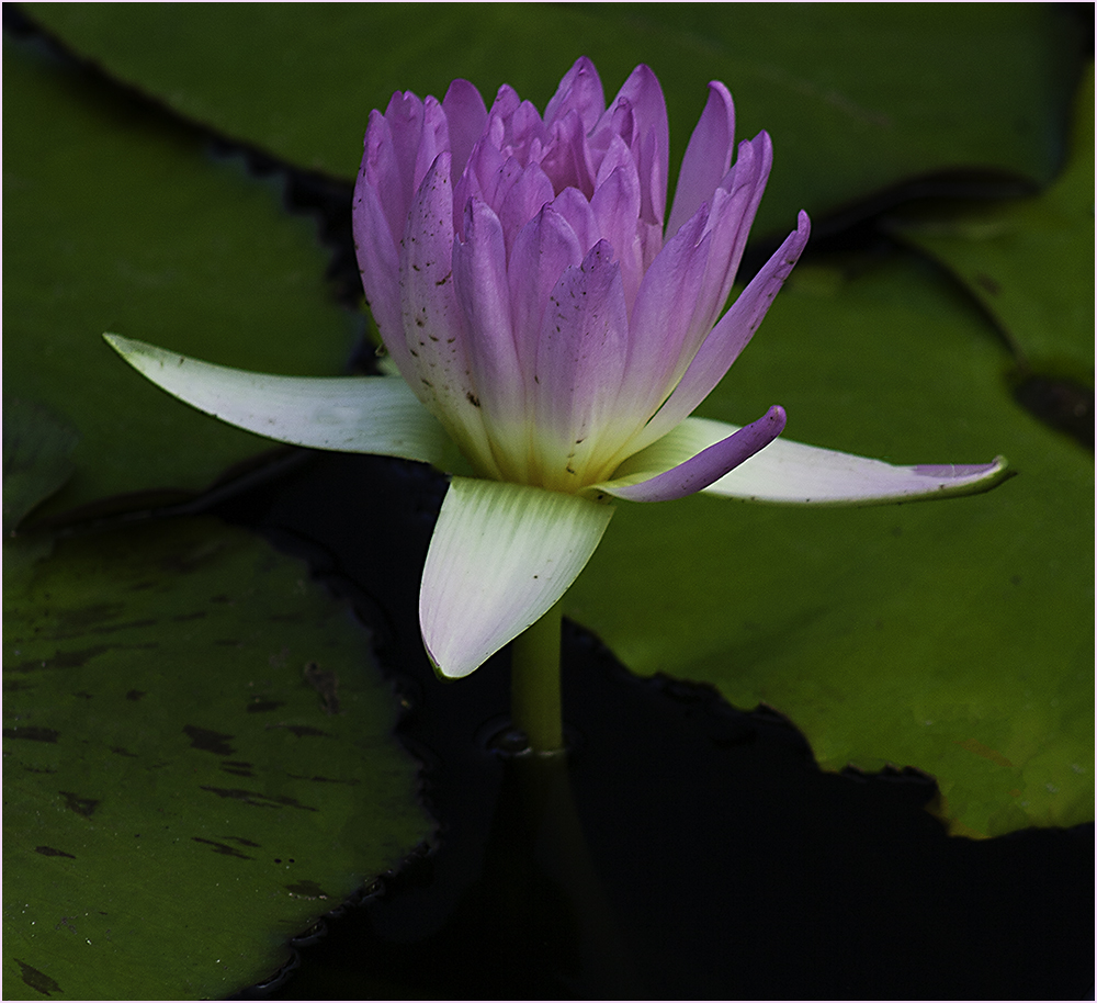
| 48 |
May 20 |
Reply |
Sorry, I probably should have said that the flower should not be dying...not that this one is. Imperfections are okay and that might be what's happened with this one. |
May 20th |
| 48 |
May 20 |
Reply |
Perhaps Content Aware could take them out. |
May 20th |
 |
| 48 |
May 20 |
Comment |
I agree with Emily - the portrait is very pleasing. I also agree about the window - way too bright and distracting. I wasn't sure that was a rifle but I guess it adds to your story of the portrait. Cropping off the right side seemed to put him dead center and removed some of the "ambiance". Very nice on the portrait. |
May 20th |
| 48 |
May 20 |
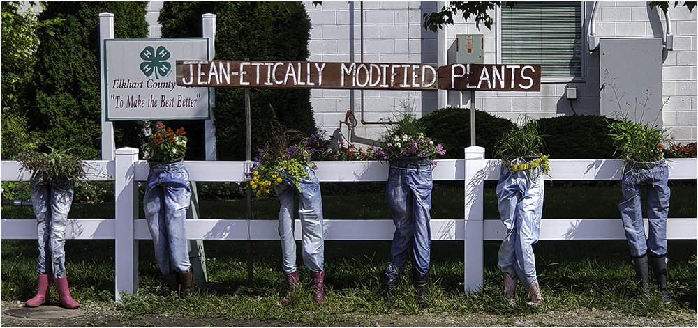
Comment |
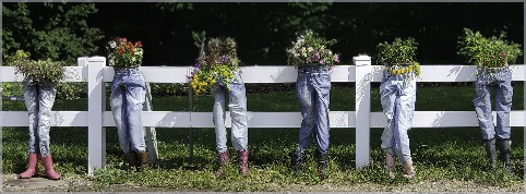
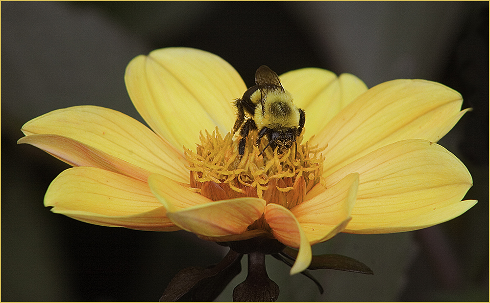
I feel this is an example of how to pick the subject in a photo. Many times people have a "record shot" that could be turned into something much better. I tried cropping down even further than Barbara and used Topaz Adjust AI. This may not be approved for Nature though. Good try for a quick phone shot. |
May 20th |
 |
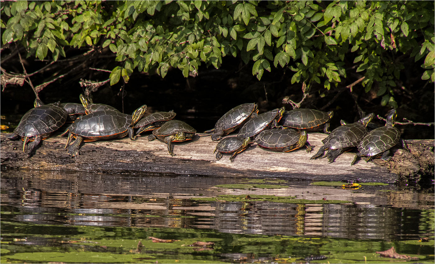
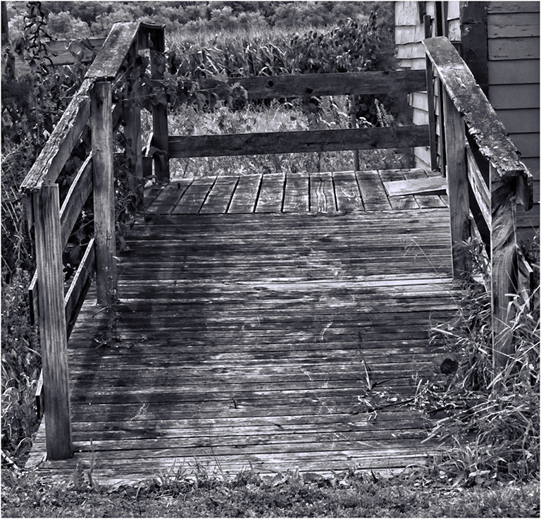
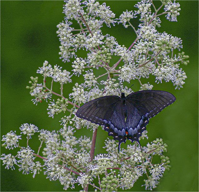
| 48 |
May 20 |
Comment |
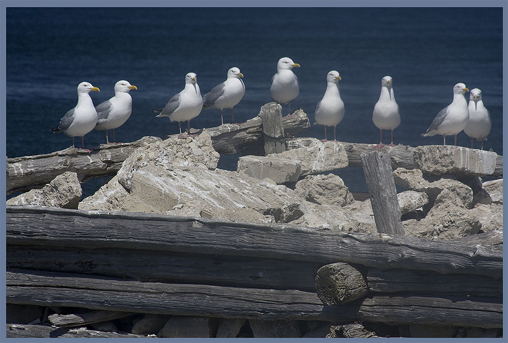
I agree with Beverly about the confusion - wish there weren't quite so many birds in one place. However I think you did a decent job. If it doesn't go into Nature, perhaps cloning the left side bird out would work. |
May 20th |
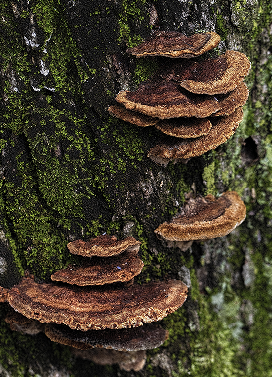
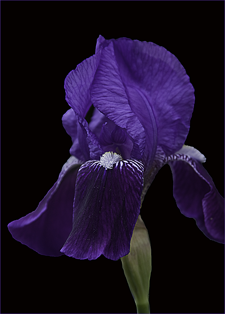
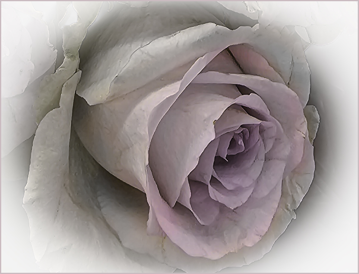
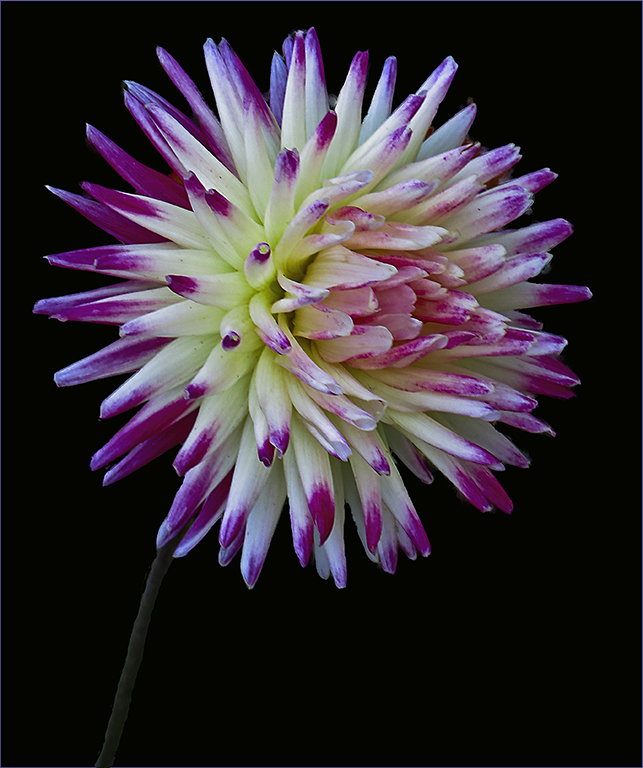
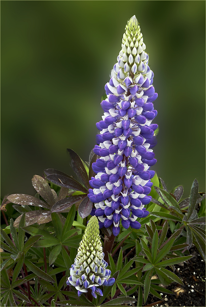
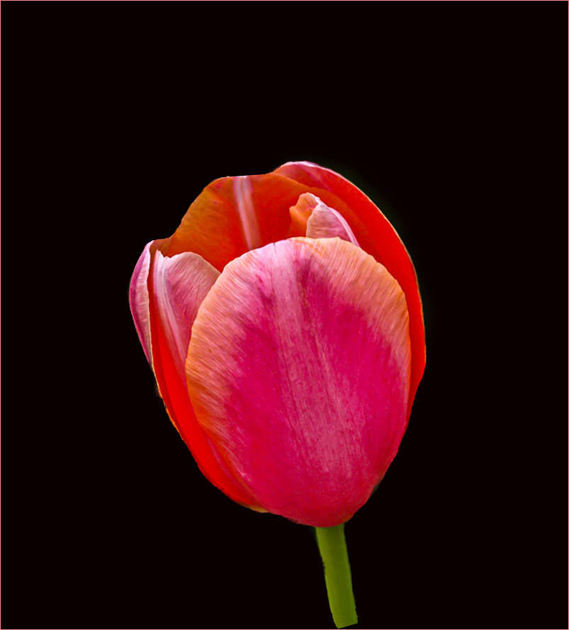
| 48 |
May 20 |
Comment |
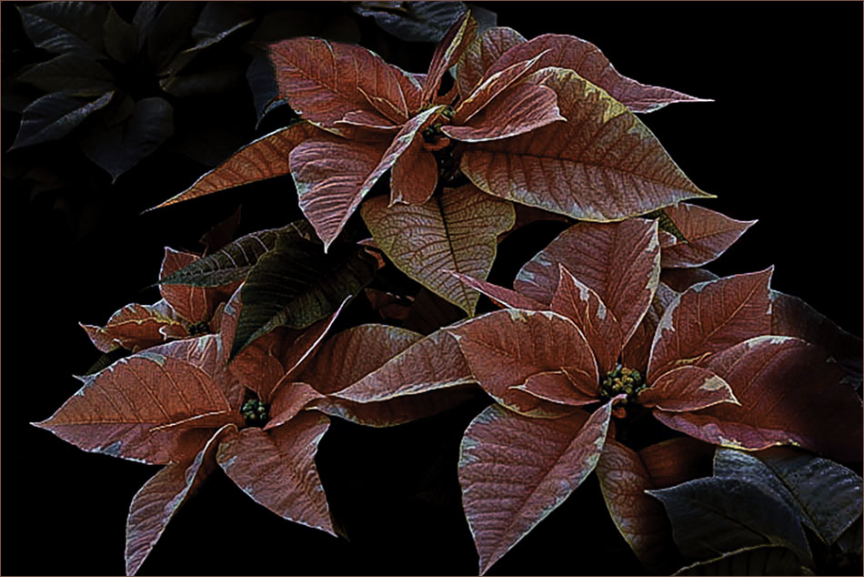
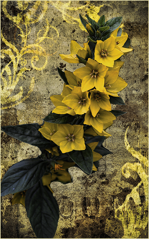
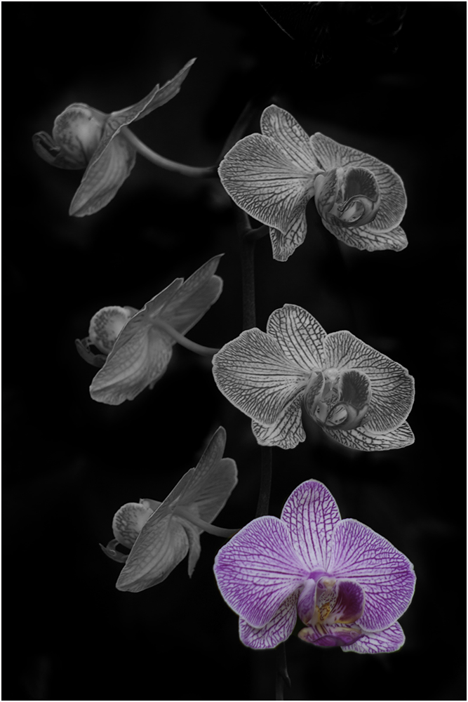
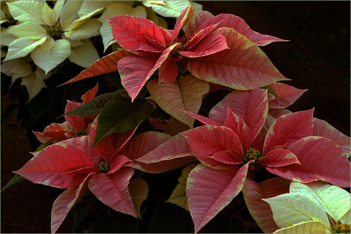
I always like flowers on black backgrounds. Nice job of masking. I thought your final was a little to straight up so I tried rotating it a little. Didn't see your original. I think leaving it in that position would have made it a little less static to me. Overall, very pretty. |
May 20th |
 |
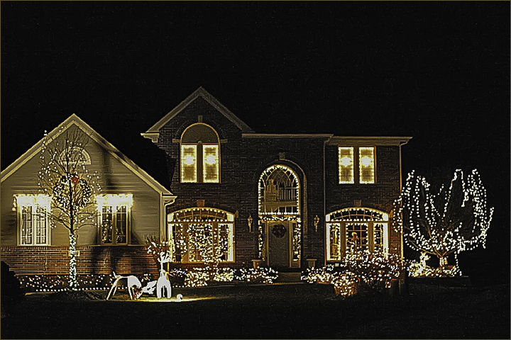
| 48 |
May 20 |
Comment |
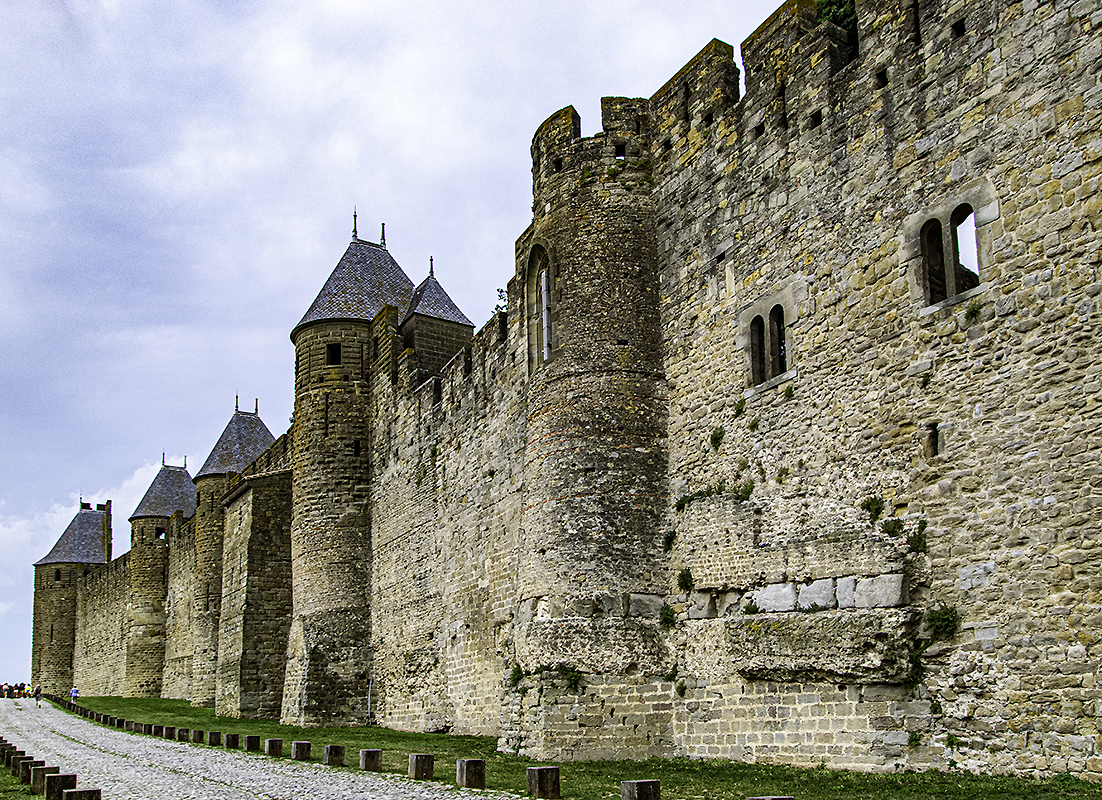
I agree about the people but I'd leave in the single person with the blue shirt. To me, he adds a little perspective as to the size of this wall. The stone textures are great.
I sort of think Beverly's version is a little too saturated - especially the sky though it is nice. Good job. |
May 20th |
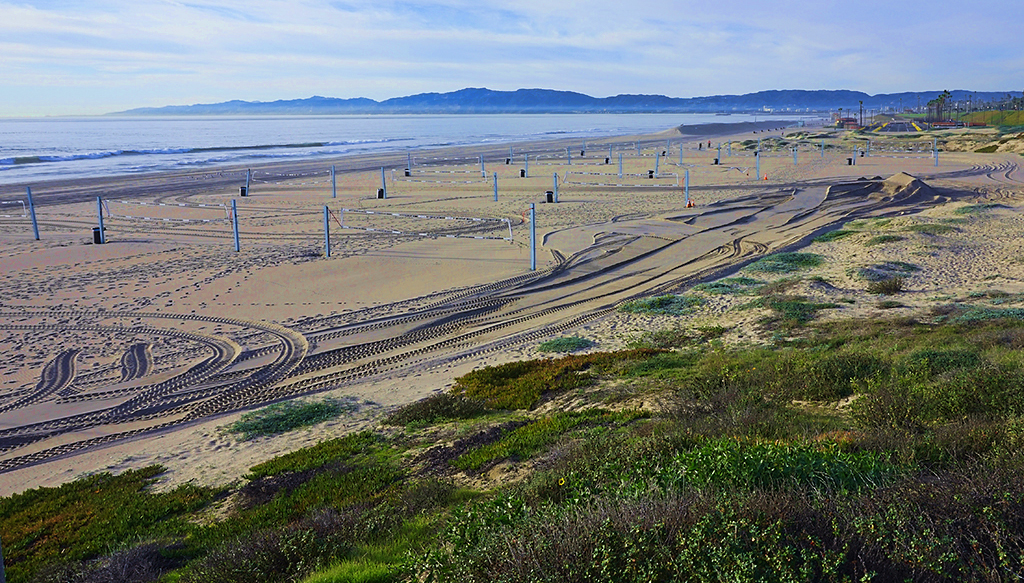
| 48 |
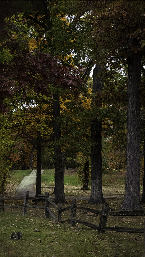
May 20 |
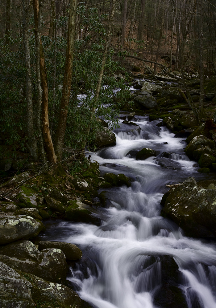
Comment |
I found the tracks quite interesting so I cropped the sky as Barbara mentioned and removed the house and some of the bottom to hopefully bring more attention to the tracks.
I do like W. Neil's rendition as well. |
May 20th |
 |
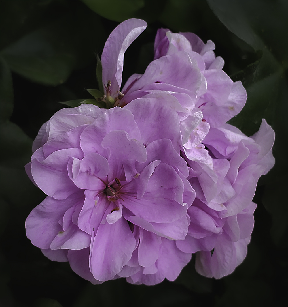
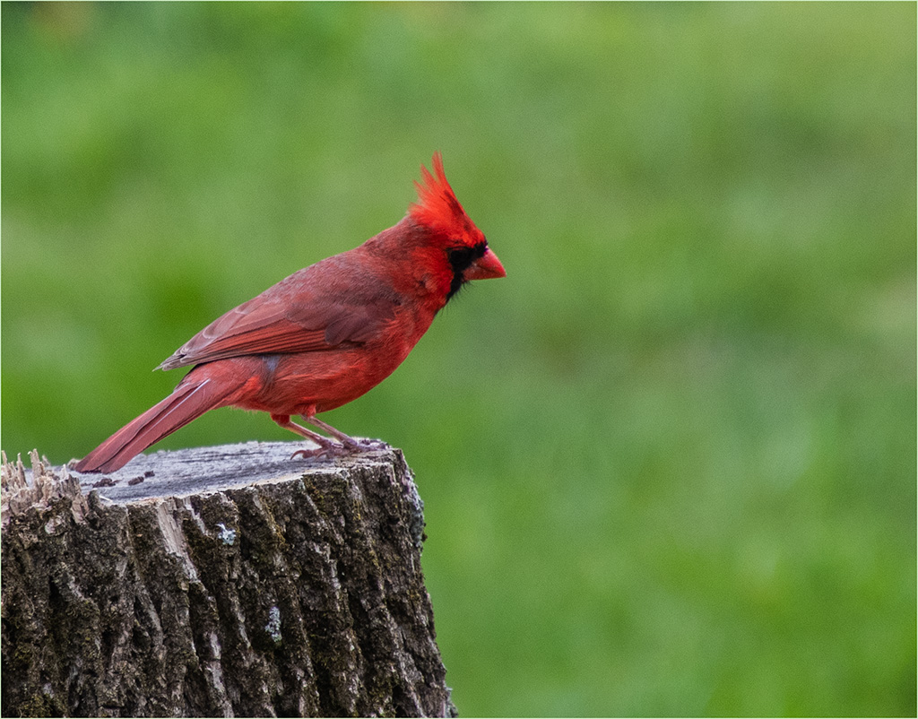
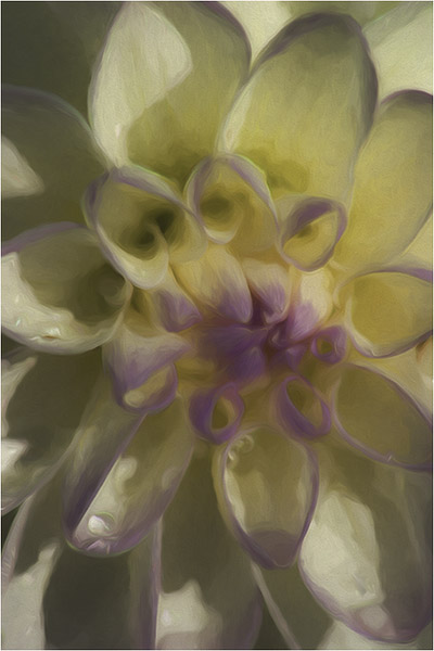
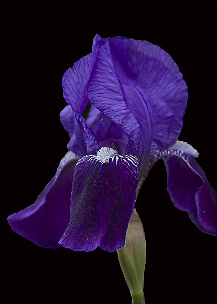
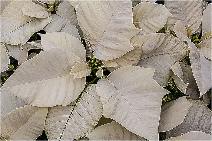
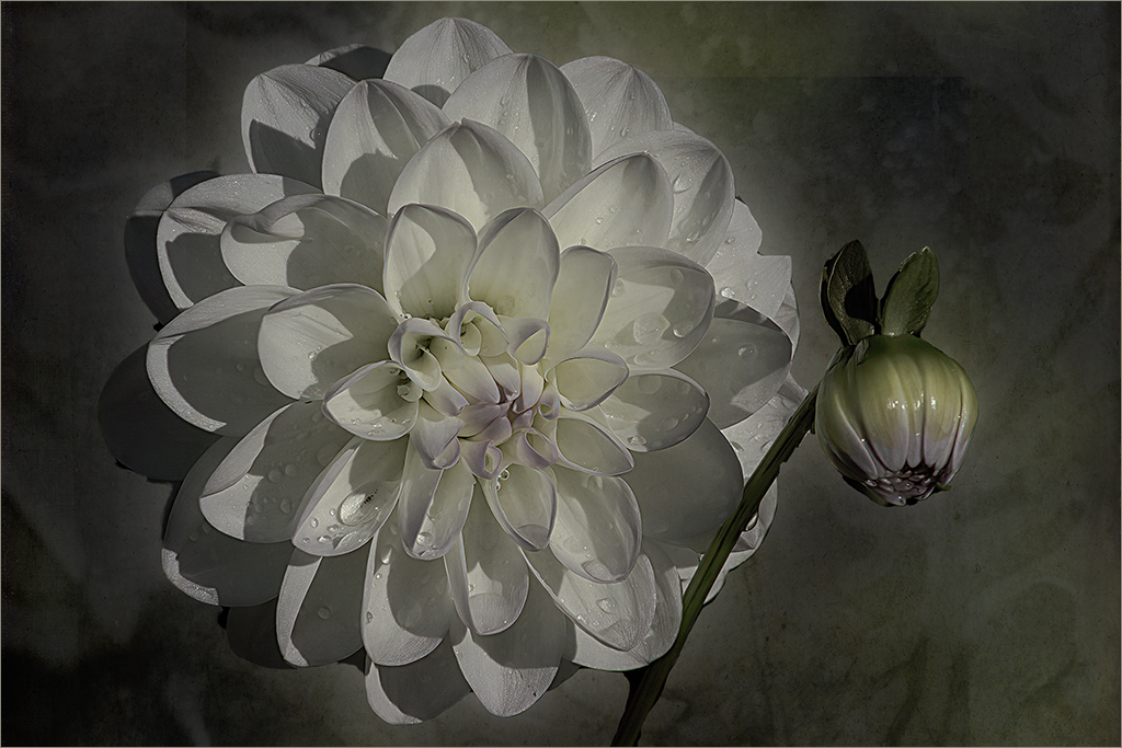
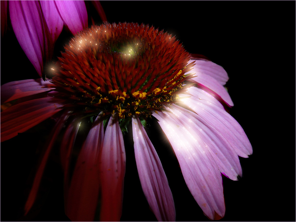
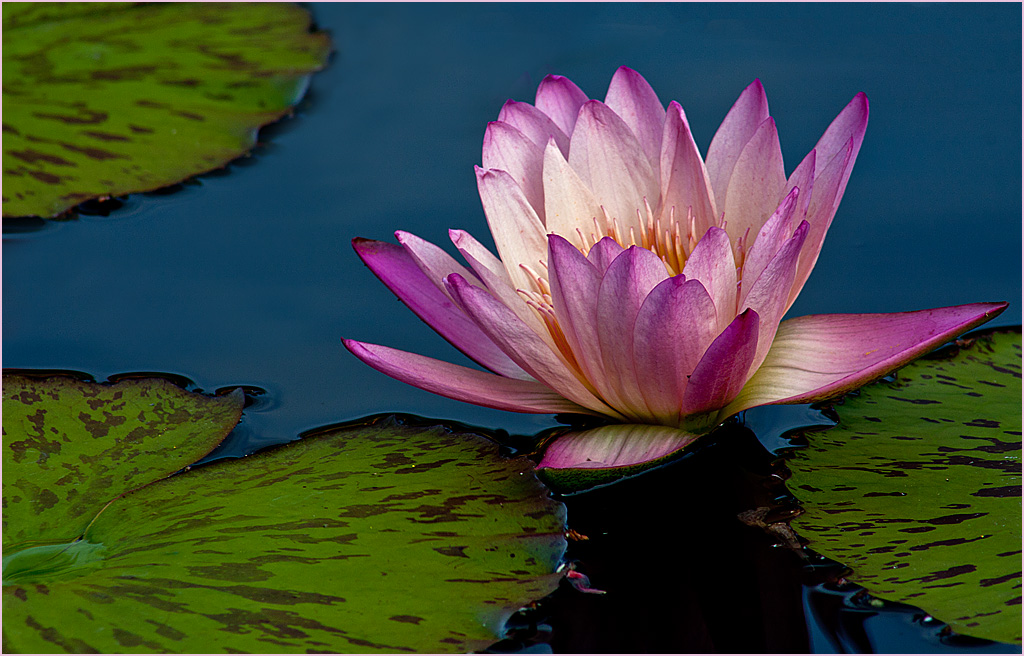
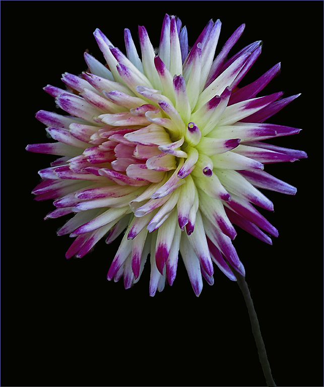
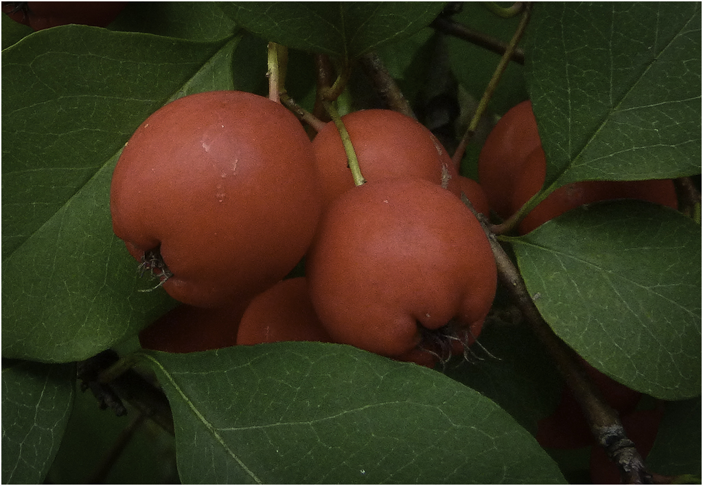
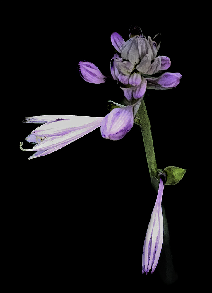
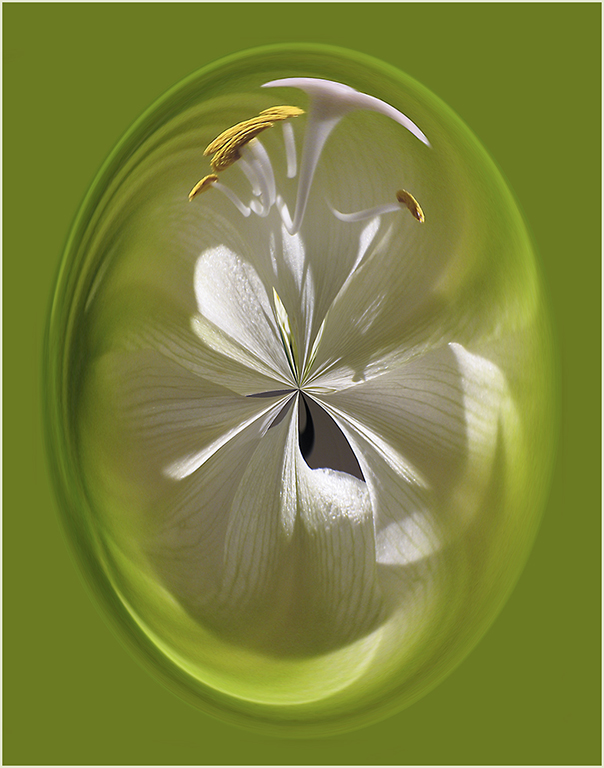
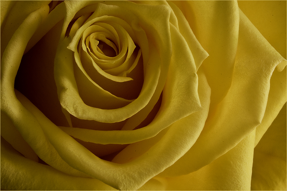
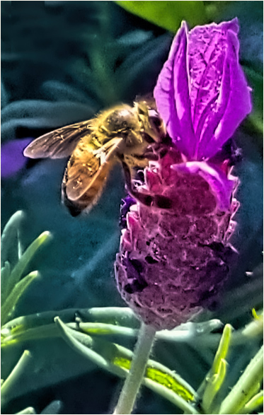
| 48 |
May 20 |
Comment |
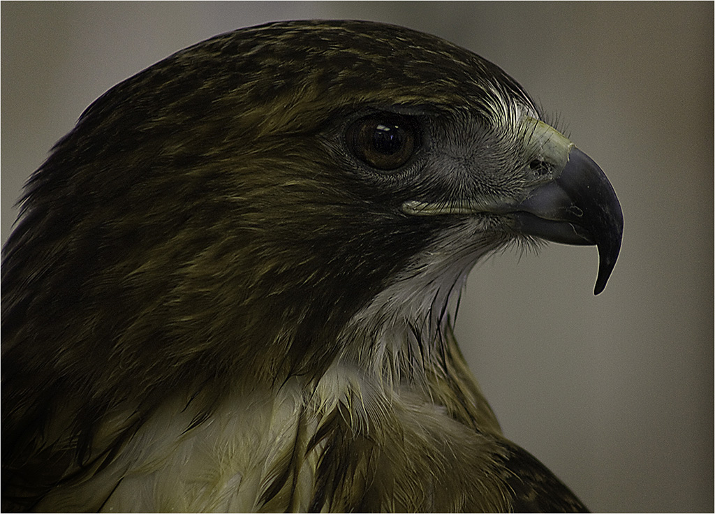
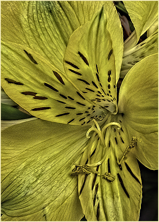
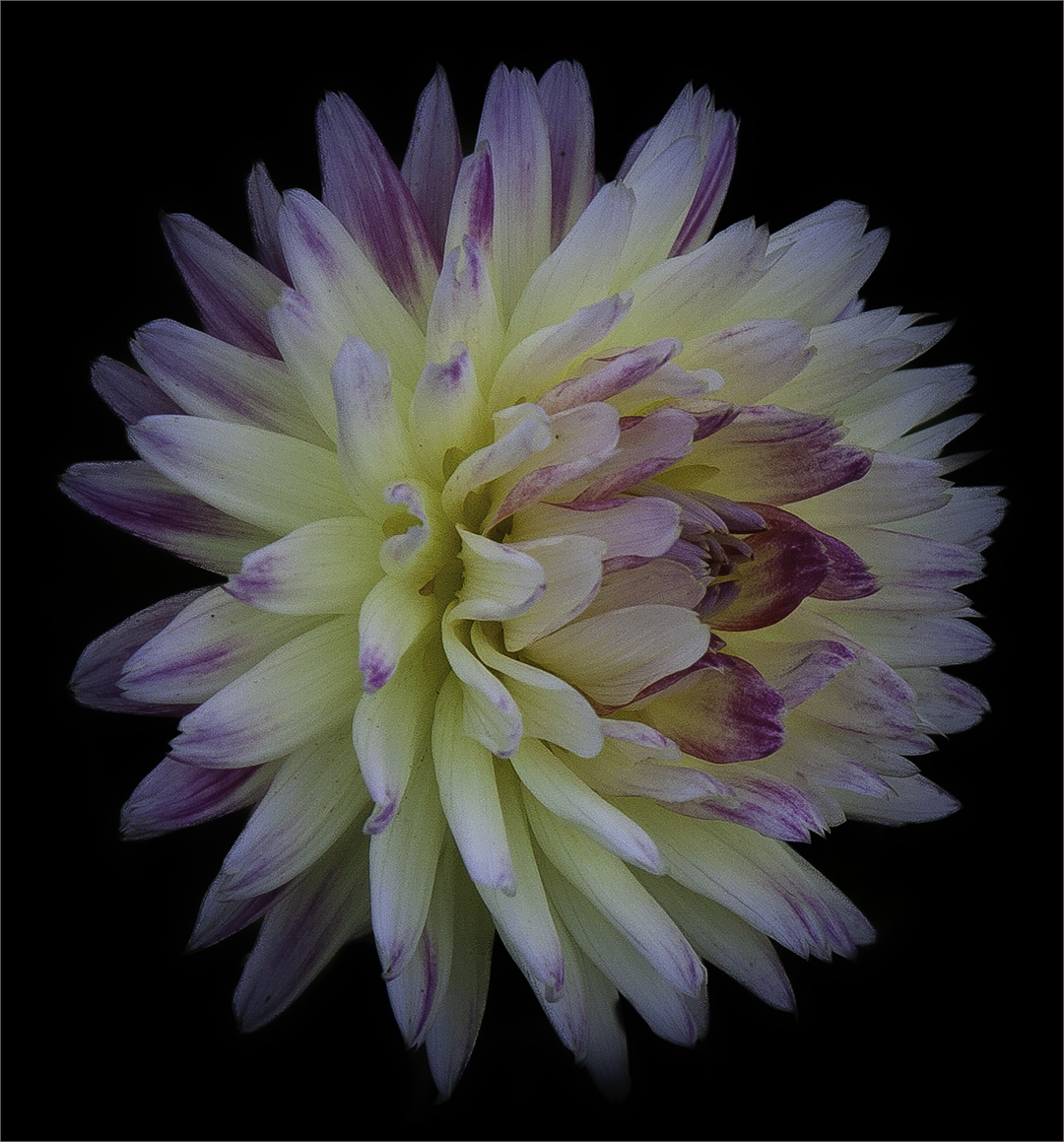
I like the position of the flower and the color. Just to be picky, I'm not sure if this one is in perfect condition. I remember one of my club members saying that you want to pick a perfect specimen. I see a little shrivel on the top petal and some jagged edges on the left side. Perhaps that's normal? I agree with Stuart about the stem and the brightness. It does draw my eye there first. Overall though, I like the image. |
May 20th |
7 comments - 4 replies for Group 48
|
14 comments - 8 replies Total
|