|
| Group |
Round |
C/R |
Comment |
Date |
Image |
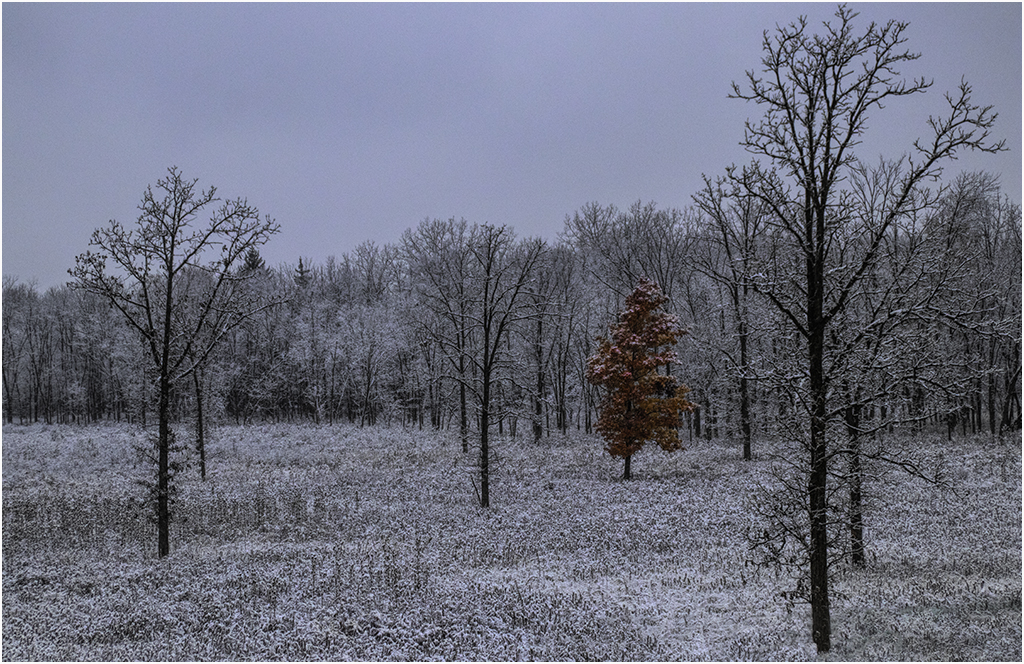
| 22 |
Apr 20 |
Reply |
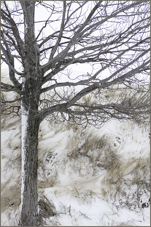
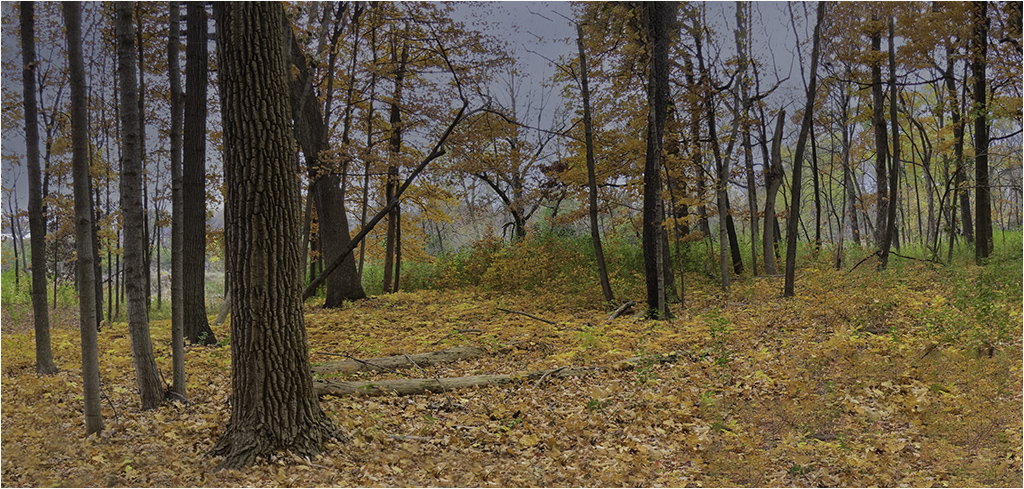
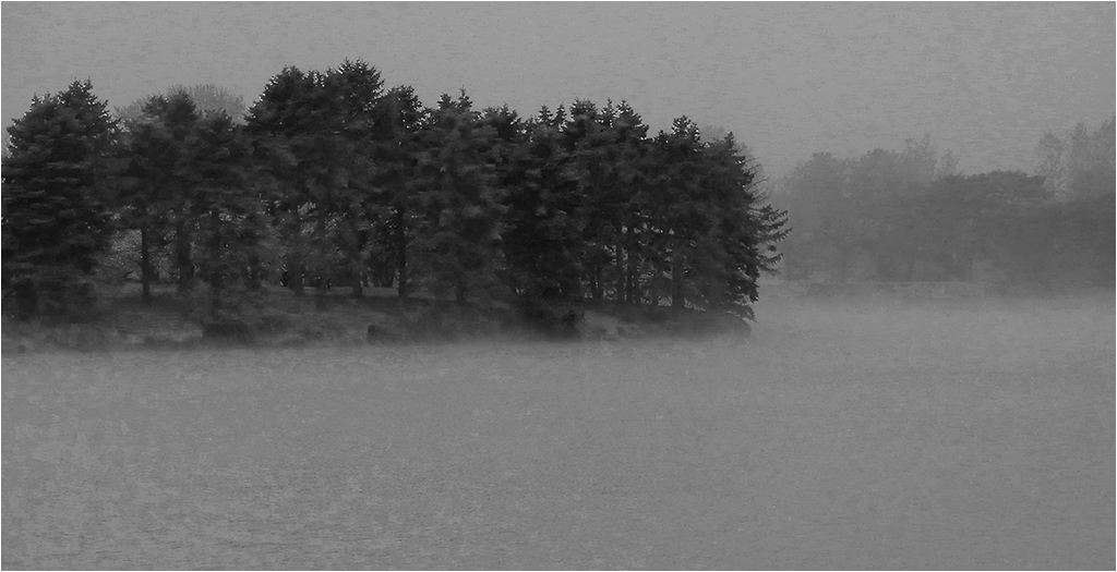
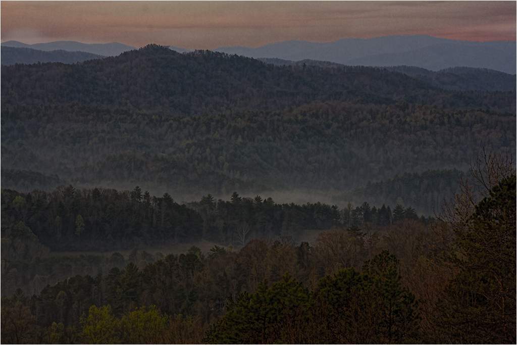
Thanks Al. It was a cool and misty day. Glad it portrays that effect. |
Apr 8th |
| 22 |
Apr 20 |
Reply |
I wanted to keep the sense of depth I had with the fog which is why I wasn't looking to focus on the trees. |
Apr 8th |
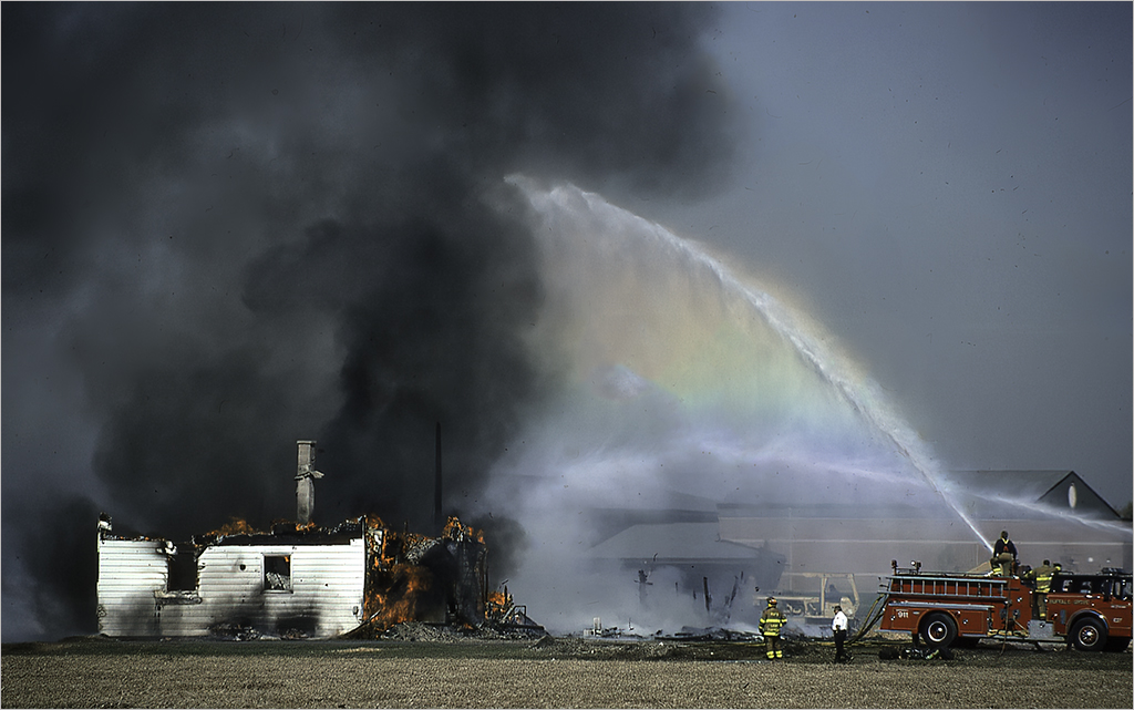
| 22 |
Apr 20 |
Comment |
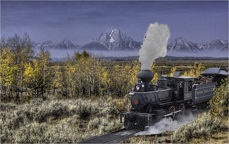
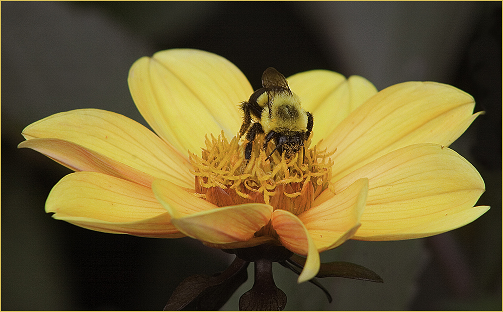
I agree with Al about the background - great job of getting the people out of the way. With what Al said about the engine components, I'm going to disagree with Joe's increasing the saturation on the lights. For me, it takes away from the subject which is the engine. Overall, I like this image. |
Apr 8th |
| 22 |
Apr 20 |
Comment |
Sweet story. I actually like both images as I find two different stories here. To me, in Mike's final, it's the story of the 4 adults looking over the newborn. In the crop that Jerry provided, I see more emphasis on the newborn and his (her) struggle to rise and walk. Very nice capture. |
Apr 8th |
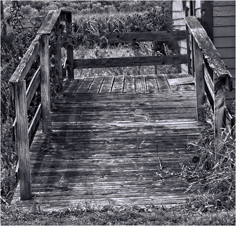
| 22 |
Apr 20 |
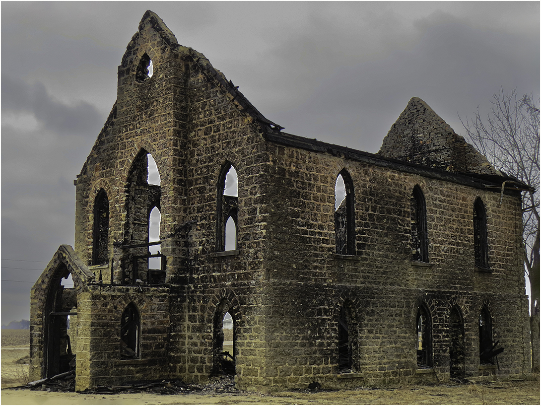
Comment |
I love old buildings like this. Nice job on the B/W. I'm going to disagree with Joe as I think his crop has placed the drawers and cabinet more centered and that is what my eye focused on first. This is a really nice image. Good job! |
Apr 8th |
| 22 |
Apr 20 |
Comment |
I've removed the previous comments so we can just comment on the real image. :) |
Apr 7th |
| 22 |
Apr 20 |
Comment |
I agree with Jerry about liking the original better. The final seems to me to be a little oversharpened or too constrasty. |
Apr 6th |
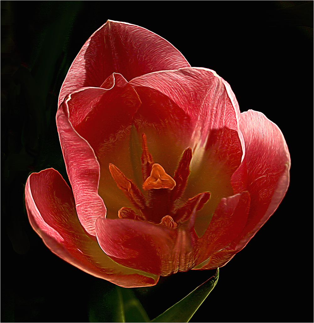
| 22 |
Apr 20 |
Reply |
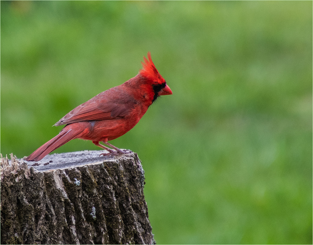
Fooled me! HAHAHA. |
Apr 2nd |
| 22 |
Apr 20 |
Reply |
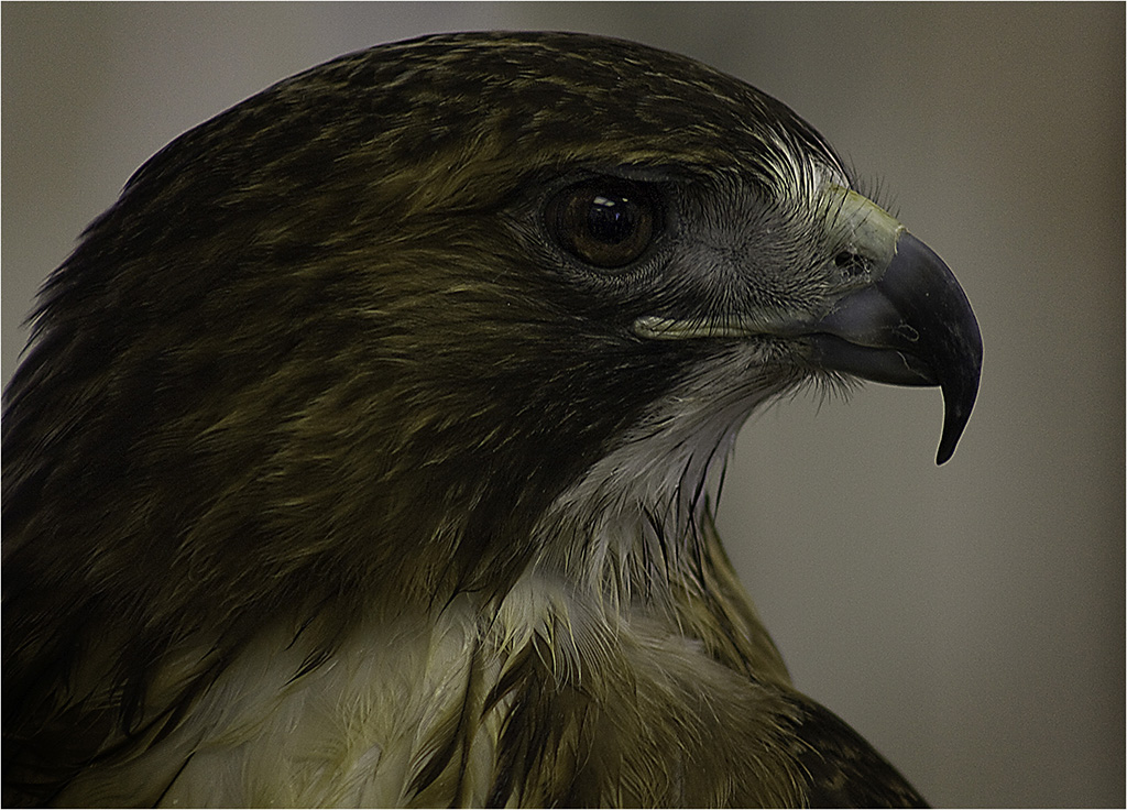
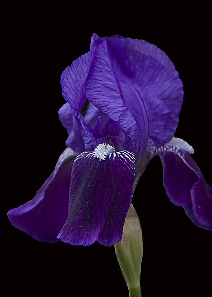
I looked for the bird in the original but didn't see one so I thought it was a spot. |
Apr 2nd |
| 22 |
Apr 20 |
Reply |
Those didn't bother me so much. |
Apr 2nd |
| 22 |
Apr 20 |
Reply |
Thanks Peggy - I think I did add some texture to it. |
Apr 2nd |
| 22 |
Apr 20 |
Reply |
Here is my version. I think Peggy and I were seeing the same spots. I straightened 1 degree and cropped a little off the top. |
Apr 2nd |
 |
| 22 |
Apr 20 |
Reply |
Yeah - we sure do need spring! |
Apr 2nd |
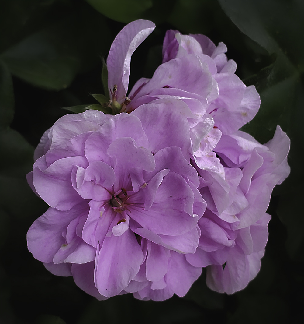
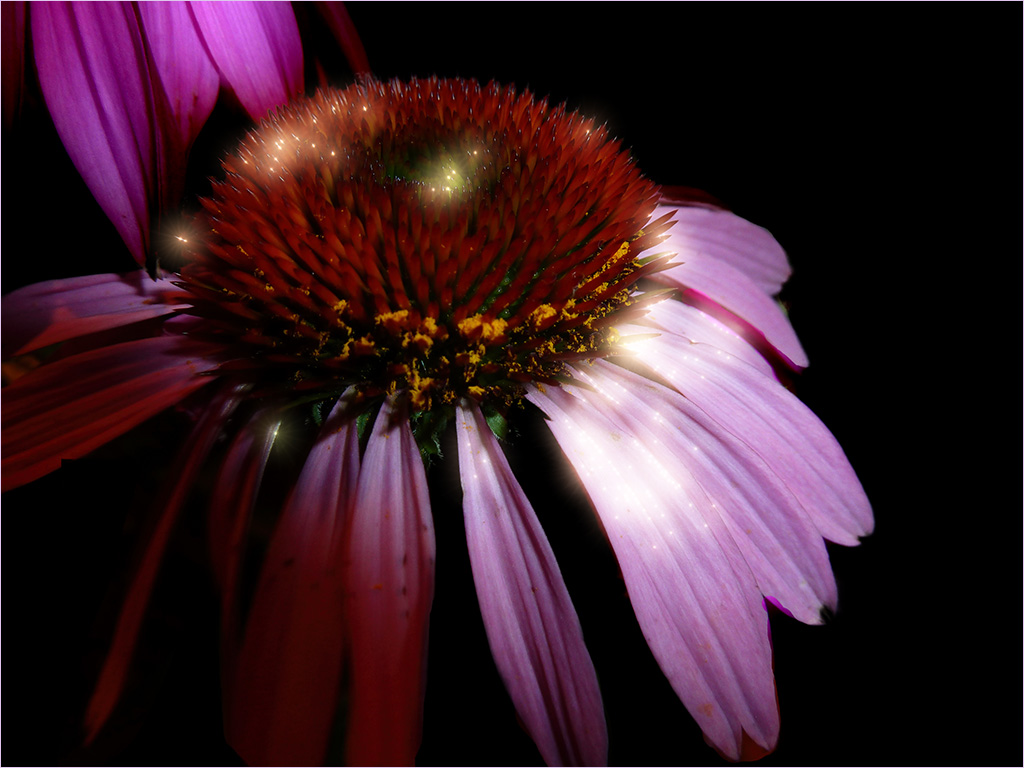
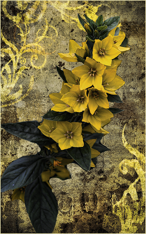
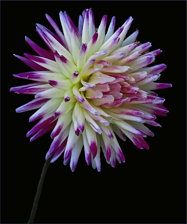
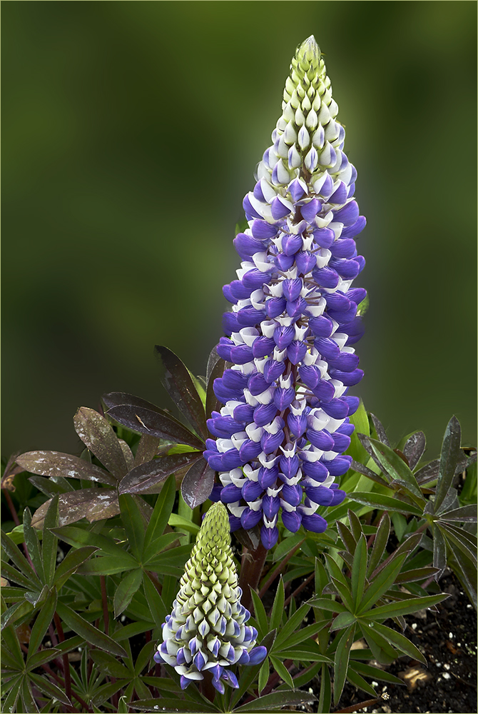
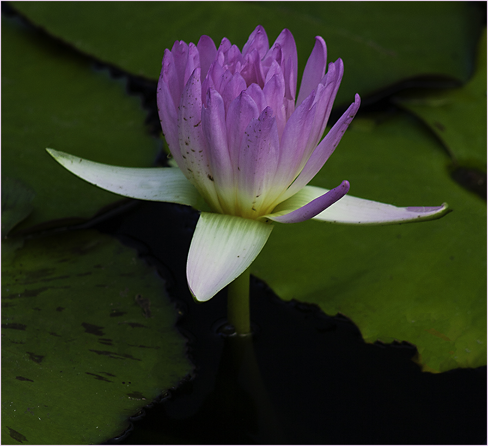
| 22 |
Apr 20 |
Comment |
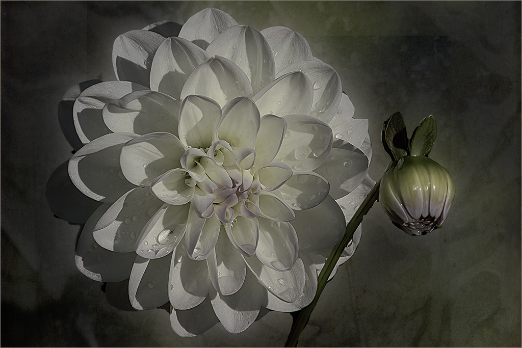
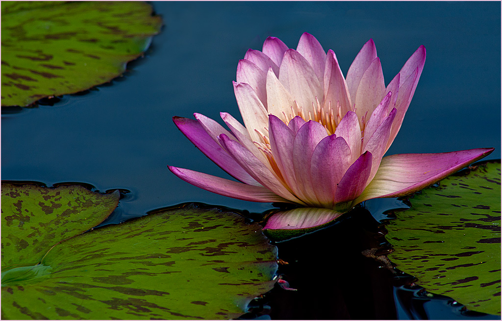
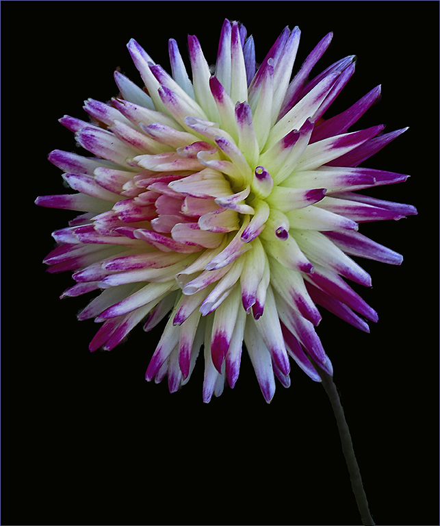
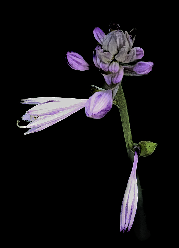
Pretty! I agree with the blue spots Jerry mentioned.
I like the composition and the colors of the flower. Nice job.
I gave it a little different rendition. |
Apr 2nd |
 |
| 22 |
Apr 20 |
Comment |
Very nice work! Great example of taking a "record shot" and turning it into a fine art piece. To be really picky, I'd like to see a little straightening of the mission building and removal of the spot to the left of the cross and the dark spot in the lower left. You're really turning out some good images lately. Keep it up. |
Apr 1st |
7 comments - 8 replies for Group 22
|
| 86 |
Apr 20 |
Comment |
You're welcome. Looks like you have a slot open...maybe I should learn to use my phone more. LOL |
Apr 22nd |
| 86 |
Apr 20 |
Reply |
Thanks. I've only used one "stroke" (in Photoshop). Will give it a try as this looks nice. |
Apr 22nd |
| 86 |
Apr 20 |
Reply |
No, I was referring to the border of the image which appears to have 2 lines..like a frame. |
Apr 21st |
| 86 |
Apr 20 |
Comment |
Nice composite. I agree with Belinda about the cloud taking my eye out of the scene. Perhaps a stroke on the image would help? |
Apr 20th |
| 86 |
Apr 20 |
Comment |
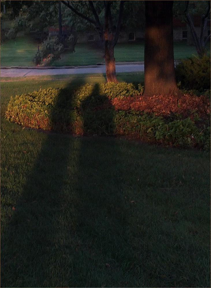
Nice portrait of your daughter-in-law. I like the border you've created here too.
I also have a Galaxy S10+ and though I don't do the majority of my photography with it, I'll have to check the settings. Thanks Phillipa!
|
Apr 20th |
| 86 |
Apr 20 |
Comment |
I agree with Belinda - it's quite creative and definitely represents the times we live in today. You've certainly captured the "prisons" we are all living in right now. Hope you are feeling better each day. |
Apr 20th |
| 86 |
Apr 20 |
Comment |
I like what you've done here - nice job. The symmetry is pleasing to me and the colors are nice. To be very picky - though I like the double stroke, I'm wondering if it would look better in a light green? How did you do the double stroke? |
Apr 20th |
5 comments - 2 replies for Group 86
|
| 93 |
Apr 20 |
Reply |
You're welcome and come visit group 22 anytime. You all are doing great at "digital dialogue". |
Apr 20th |
| 93 |
Apr 20 |
Reply |
It doesn't have to be much. I used a 3 pixel here but sometimes it can be smaller. (You won't see it unless you click on the image.) |
Apr 20th |
 |
| 93 |
Apr 20 |
Reply |
I like Jean's rework as I now see the "subject" being the reflections. To keep your eye inside the frame, have you considered adding a stroke?
It is amazing to see things that other people walk by every day. Keep up the good work. |
Apr 20th |
| 93 |
Apr 20 |
Comment |
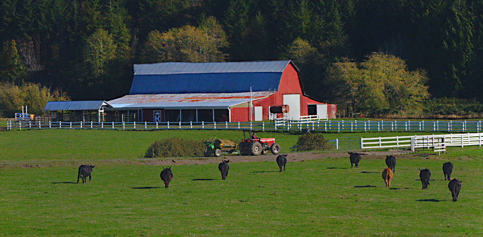
Great comments on the images. I like this scene with the red barn and the cows coming home. I felt the grass seemed a little too green. I gave it a crop and kind of intentionally centered the fence in the center putting the barn in one section and the cows in the other and also toned down the doors as suggested. I noticed the nice shadows of the cows - good lighting. Overall it's a pleasing image. Nice job! |
Apr 20th |
 |
| 93 |
Apr 20 |
Comment |
I agree with Jerry about the right side. I'd like to see a crop up to the large tree which might bring the subject a little off-center. It seems to me that the vignetting is a little strong. Perhaps leaving the top vignetting would make it like storm clouds but not so heavy on the bottom? I like the mood though and your wife certainly makes the image memorable. |
Apr 20th |
| 93 |
Apr 20 |
Reply |
No problem. I'm trying to visit other groups. Yours has lively conversation and that's good. Keep it up. :) |
Apr 20th |
| 93 |
Apr 20 |
Comment |
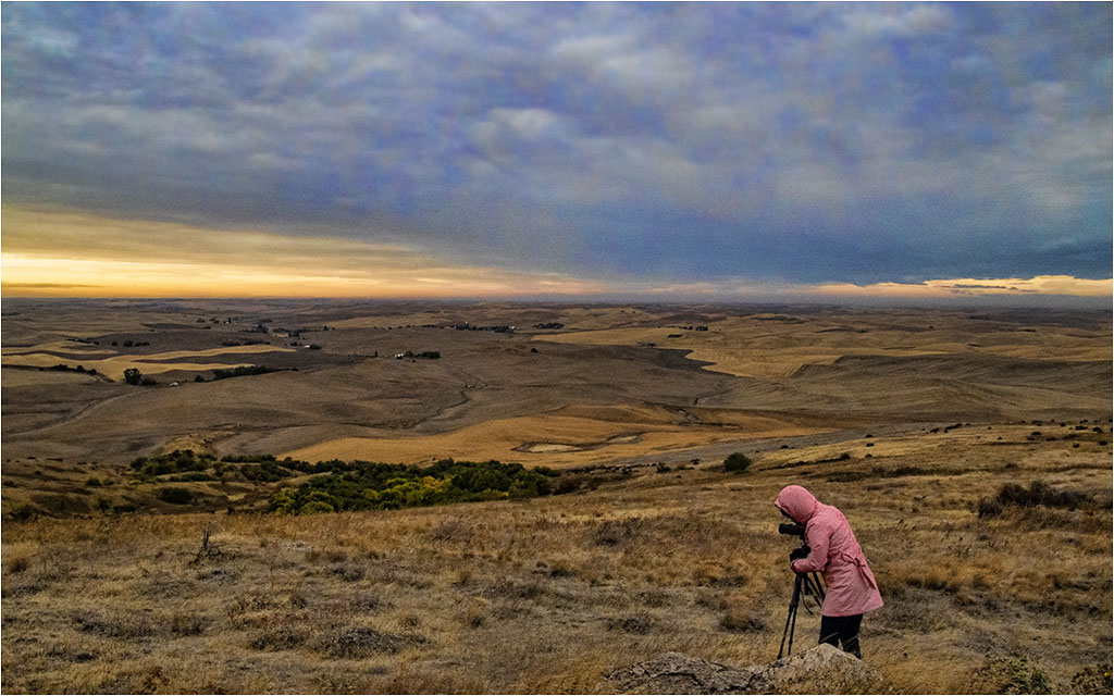
I like the shadows and light created here. I kind of wish the man were on the right or a little more centered. He certainly give the sense of vastness of the scene. Good job. |
Apr 20th |
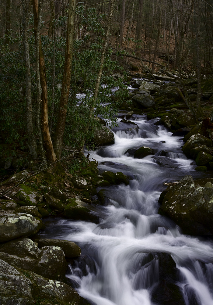
| 93 |
Apr 20 |
Comment |
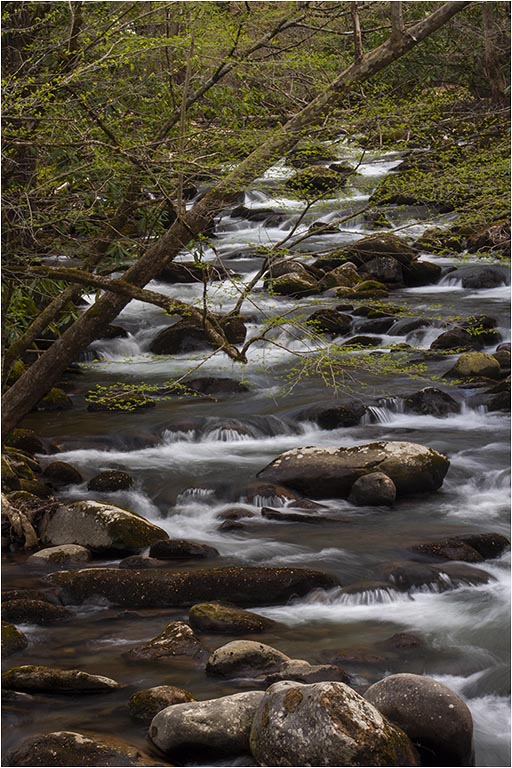
I agree that this would be interesting with the soft water. I'm seeing a lot of tree and brush on both sides of the creek that doesn't really add much. I find the bridge rather interesting and wonder if you shot a vertical with more of the bridge showing and less of the side foliage. |
Apr 20th |
| 93 |
Apr 20 |
Comment |
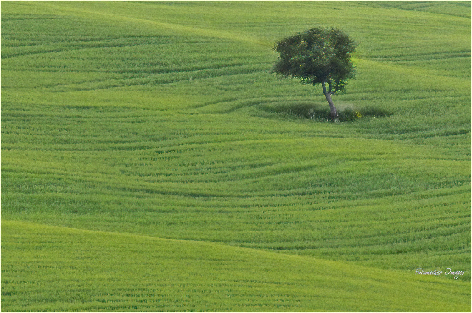
I like this capture. The lonely tree stands out and I feel you've positioned it well in the frame. Hope you don't mind a "rework". I tried using Topaz DeNoise AI and also burned in the tree a little to try and get it to stand out even more. Added a light stroke as well. |
Apr 20th |
 |
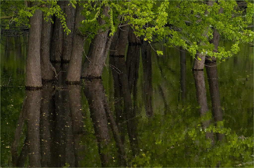
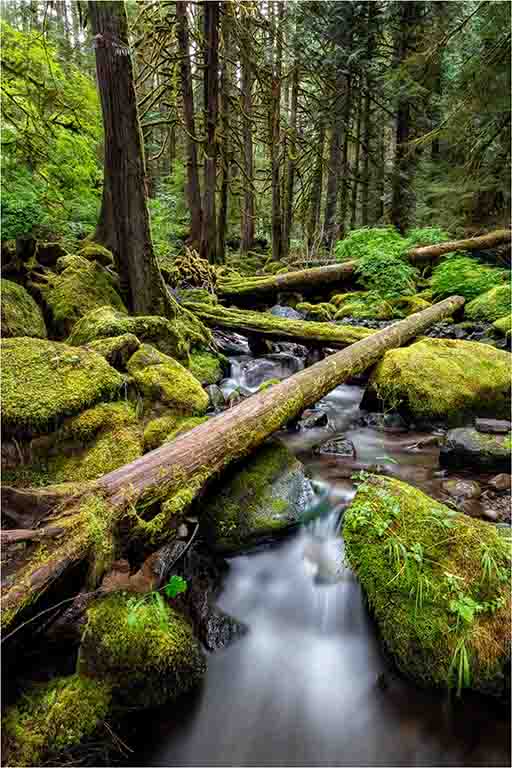
| 93 |
Apr 20 |
Comment |
Just beautiful! I like the angles of the fallen trees, the soft water and the lush greens. I don't see anything I'd like to change other than to perhaps add a light stroke to contain the image. Great job. |
Apr 20th |
6 comments - 4 replies for Group 93
|
18 comments - 14 replies Total
|