|
| Group |
Round |
C/R |
Comment |
Date |
Image |
| 22 |
Feb 19 |
Reply |
Nice re-work, John. I also wanted to see the background darker. |
Feb 19th |
| 22 |
Feb 19 |
Reply |
Hi Mark - thanks for stopping by. If you mean the edges of the extraction, I agree. It wasn't the best - especially when you're in a hurry. :) I still have trouble getting the masking down pat. Seems so easy on the videos. |
Feb 14th |
| 22 |
Feb 19 |
Reply |
I'm going to disagree with Joe. :) I rather like the centeredness (if that's a word) of the image. It gives me that sense of peace with everything being "equal". |
Feb 14th |
| 22 |
Feb 19 |
Reply |
Interesting idea. I'm not a big sepia fan but I like this rendition. Thanks for visiting our group! |
Feb 14th |
| 22 |
Feb 19 |
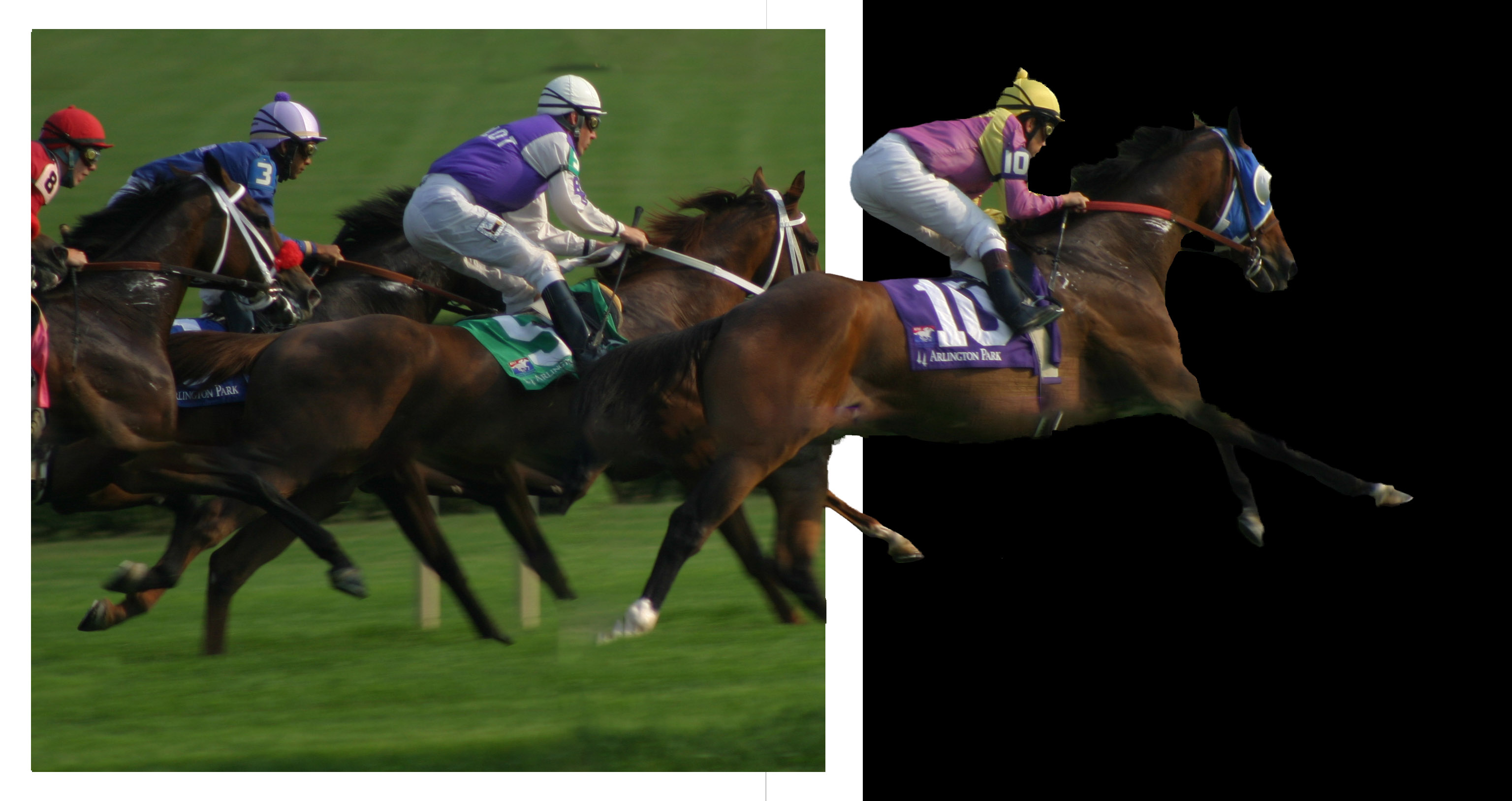
Reply |
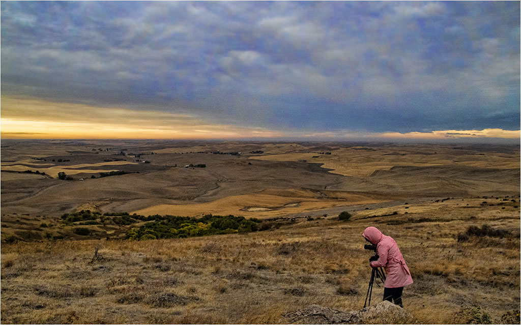
Since the "action" seems to be moving right, I'm not as bothered by the tightness on the left. Mike - do you use multiple bursts (rapid fire) when you shoot? This might be a way of getting the "perfect" shot. |
Feb 10th |
| 22 |
Feb 19 |
Reply |
Thanks Joe. I needed to take more time to get it really right. |
Feb 10th |
| 22 |
Feb 19 |
Reply |
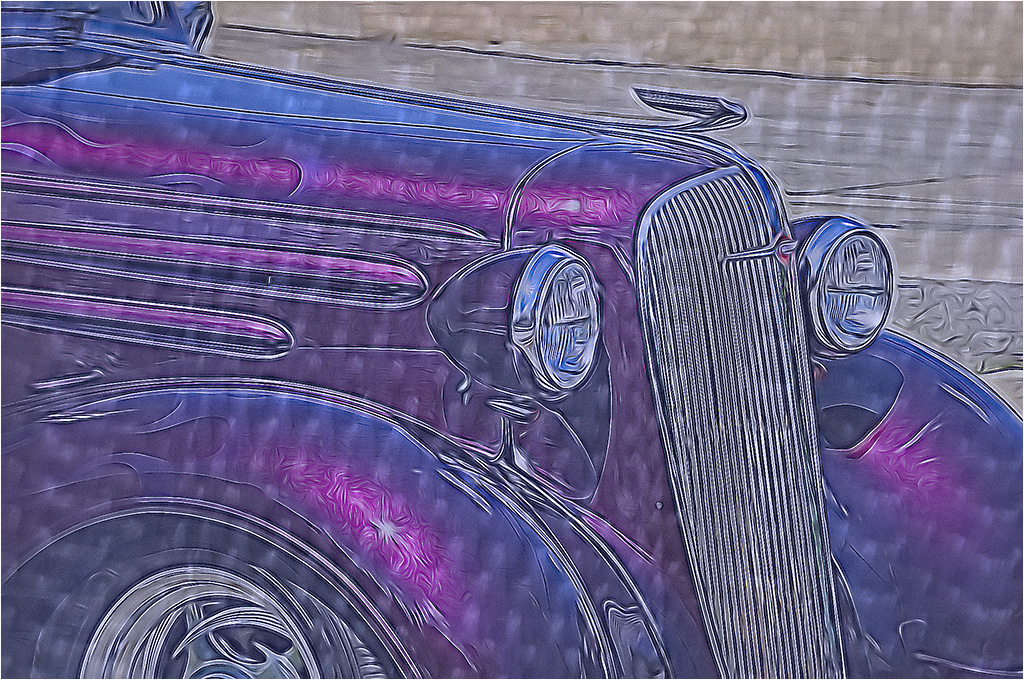
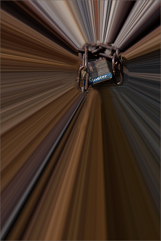
Yes - however is seems there is more edge on the right glass than is shown on the final. |
Feb 10th |
| 22 |
Feb 19 |
Comment |
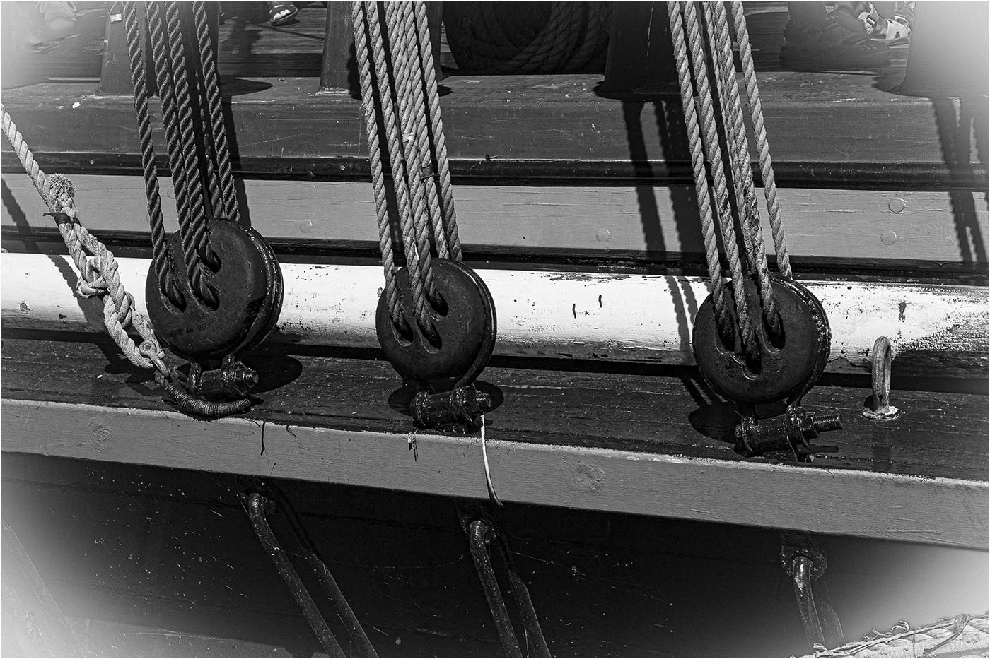
Very interesting and a lot of work. To be picky - I'd like to see the full edge of the right side glass. It sort of looks like the etching is on a black rectangle that goes over the edge of the glass. I like the detail you've brought out on the etching. Good job! |
Feb 8th |
| 22 |
Feb 19 |
Comment |
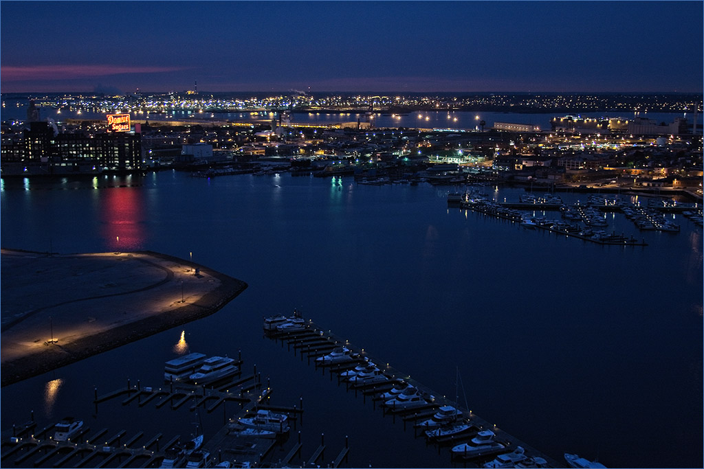
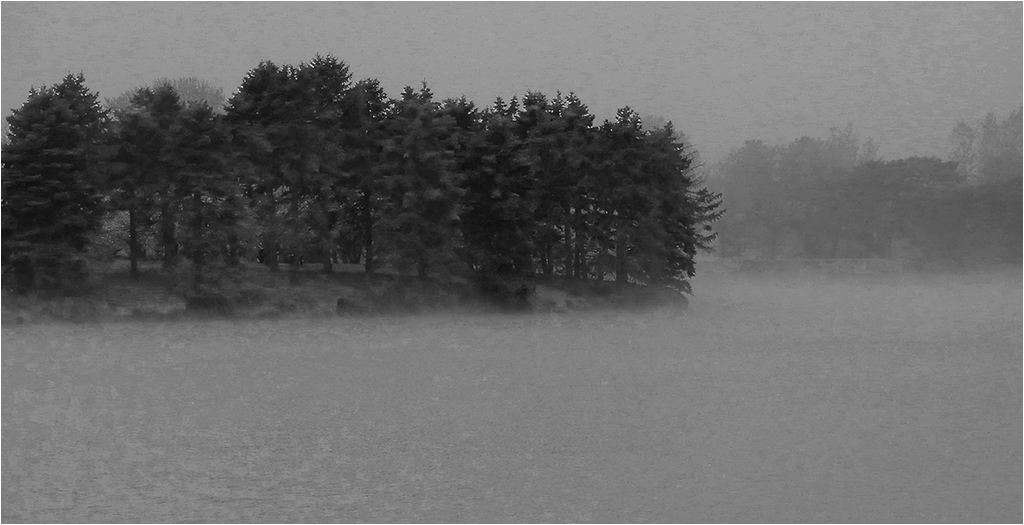
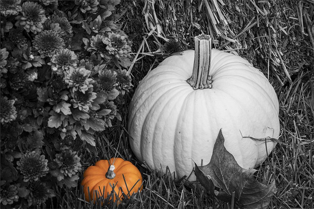
Here is a case where I'd like to see the original color version. If the focus were on the ferris wheel, then I feel the BW would work. However, for me - the title is Garden and I'd like to see color for a "garden". The clouds do come out nicely and perhaps could be cropped some. The lower part of the clouds are the best anyway. While I like Jerry's version for the ferris wheel, if we are looking at the Garden, I feel the tree line on the left needs to stay. |
Feb 8th |
| 22 |
Feb 19 |
Comment |
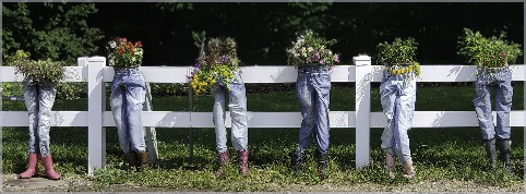
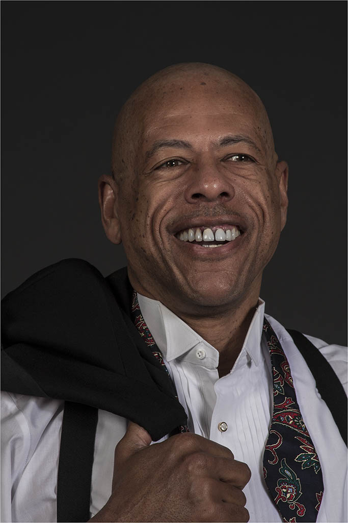
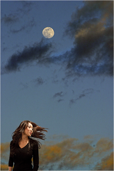
Great human interest image. How did you do your selection? It seems so clean. I agree with Peggy about the yellow shirt. It would be nicer to perhaps have the whole background a little darker. |
Feb 8th |
| 22 |
Feb 19 |
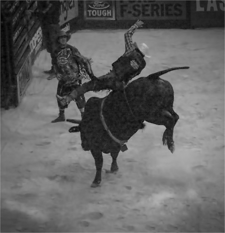
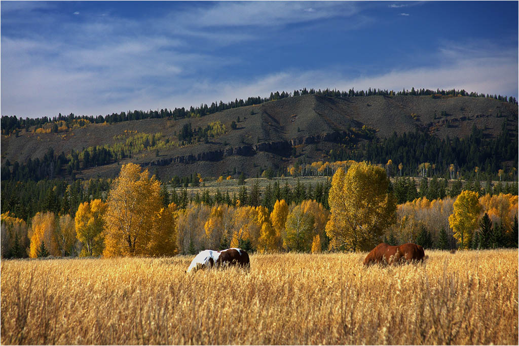
Comment |
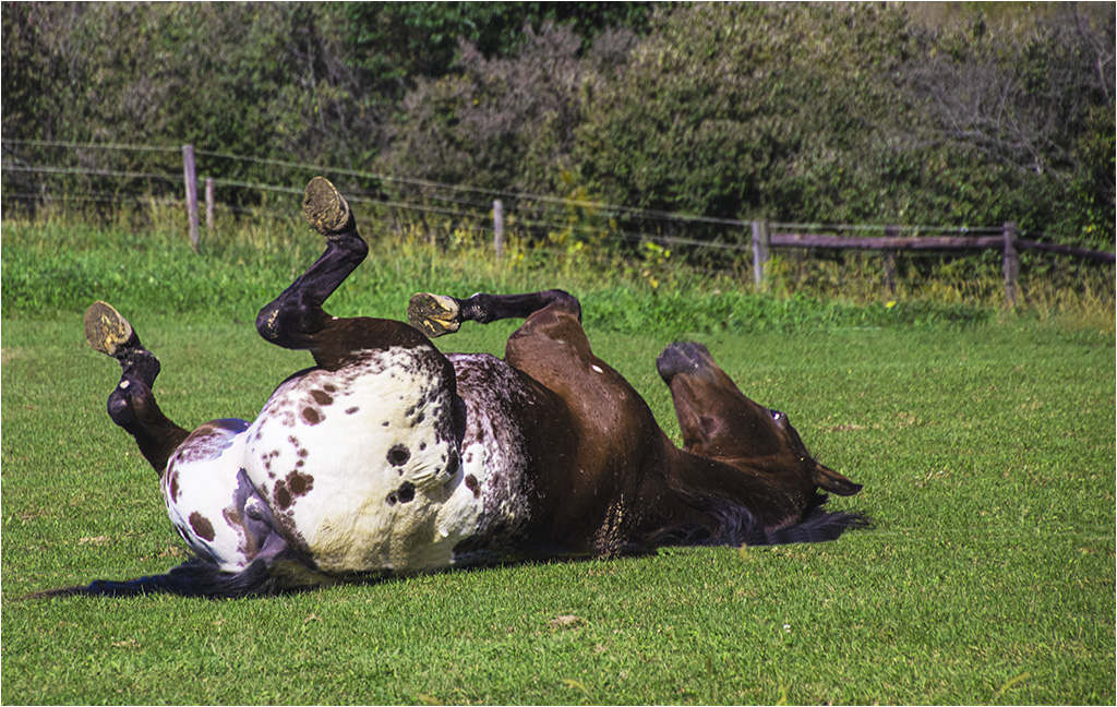
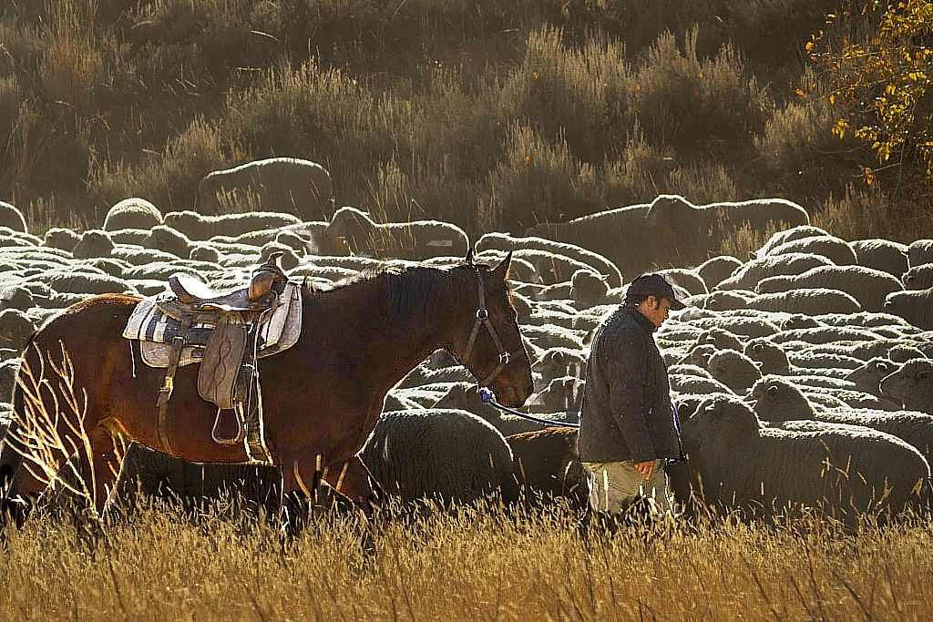
I love the way you brought out the horse and rider. I also like the background of the original. I tried to do a version in On1 Photo Raw of cutting out the horse and rider and making them lighter. I feel it's a little oversharpened though. Overall, I like your version. Good job. |
Feb 8th |
 |
| 22 |
Feb 19 |
Comment |
Jerry made the commment about cropping out the sky - so while I was at it, I gave that idea a try as well. I do like the way you've treated the sky however. |
Feb 8th |
 |
| 22 |
Feb 19 |
Comment |
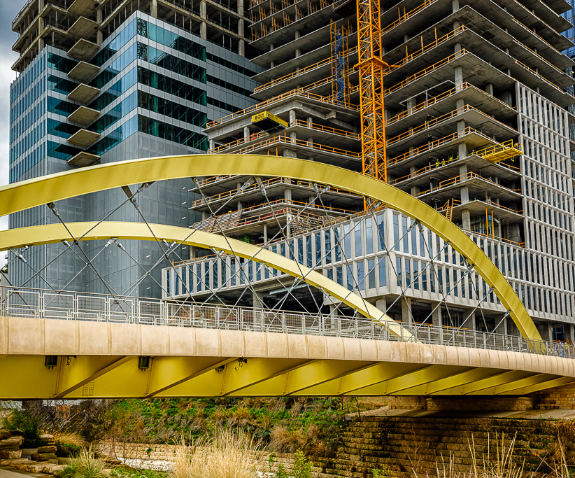
I love the sharpness of the details in this image which works well with architecture. The colors are very good. I did two remakes - this first one which I took out the items that kind of distracted me from the main image - the light pole and the embankment on the left. I cropped out the left side and used the Content Aware Fill to remove the light pole. Overall though, I like your image. |
Feb 8th |
 |
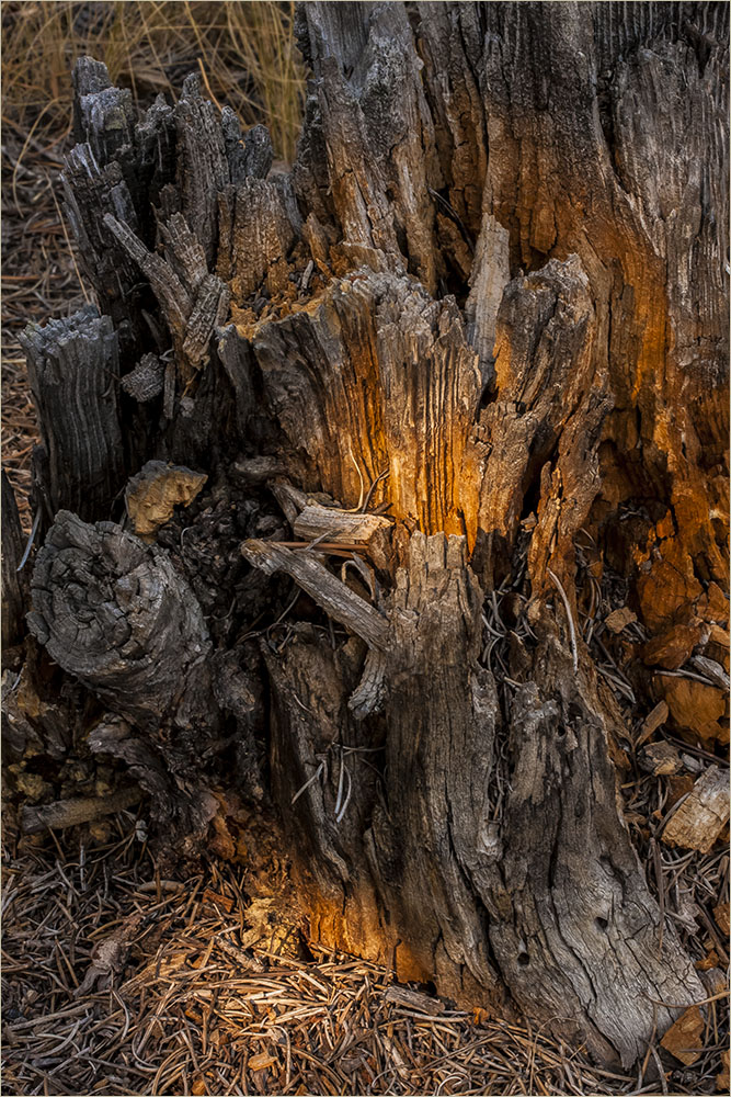
| 22 |
Feb 19 |
Comment |
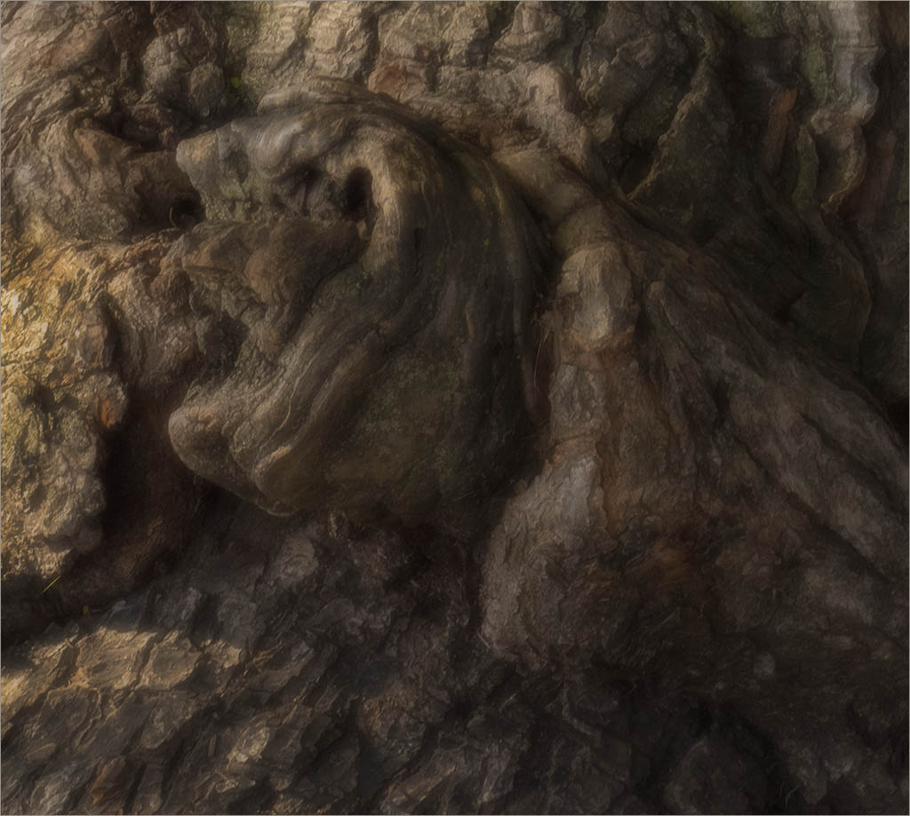
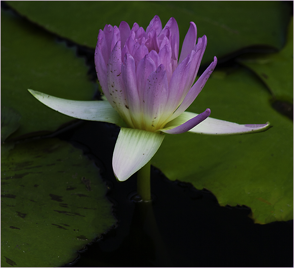
I agree with Jerry - it's quite Zen. It has an "Asian" quality to it. I feel it's simple and almost stark. It caught my eye the minute I uploaded it. Beautiful job! |
Feb 8th |
7 comments - 7 replies for Group 22
|
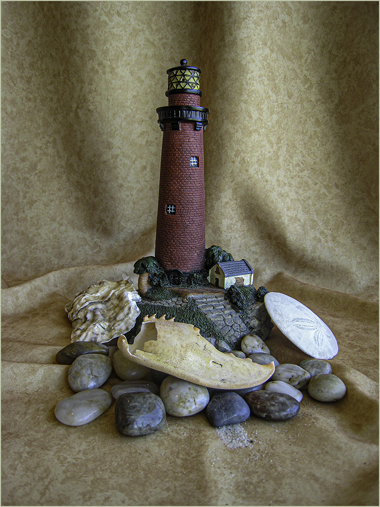
| 49 |
Feb 19 |
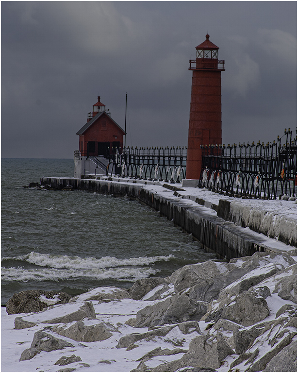
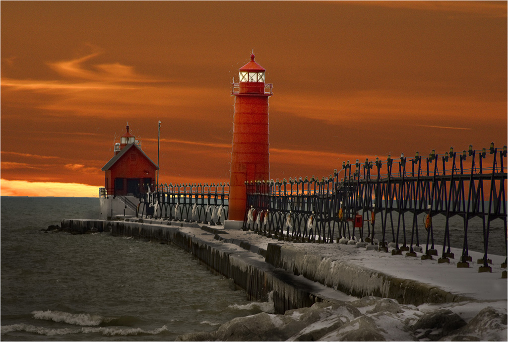
Comment |
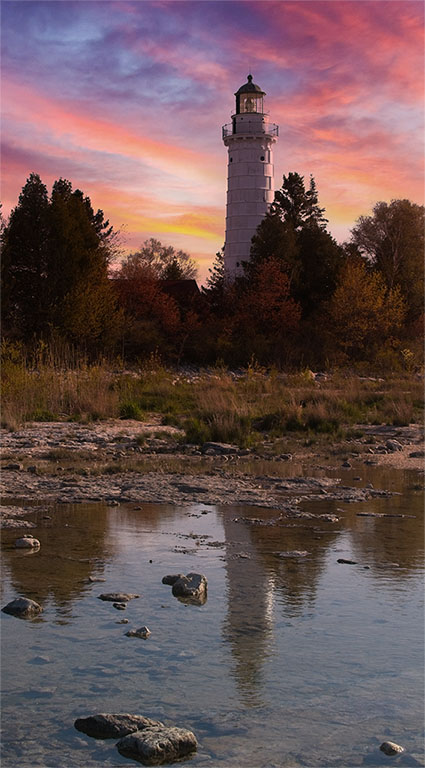
Love the lighting and the way the trees frame the lighthouse. If this was going into an open competition, I'd remove the signs as I find them distracting. I guess it is a true rendition of the scene if a travel shot. Good job! |
Feb 14th |
| 49 |
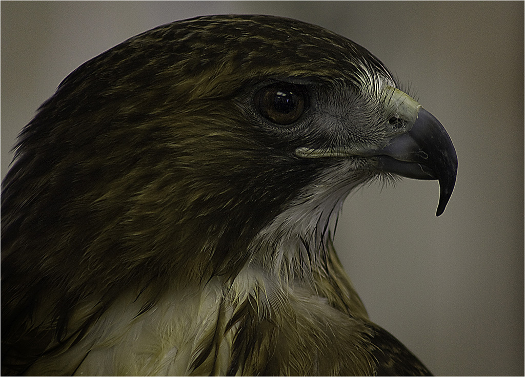
Feb 19 |
Comment |
Love that Topaz! The original is really nice but this image has a lot of color and sharpness. Before looking at the original, I could tell it was an eye but from what. Very interesting. The only thing that bothers me when closing in is the catch light. It seems like a spot that's totally blown out. I wonder if it could be brought down some so it's noticeable but not so prominent. Great job though. |
Feb 14th |
| 49 |
Feb 19 |
Comment |
I feel it's a nice portrait. Flash is always hard for me to work with when doing a portrait. I'd like to see some of the bright spots on her face to be toned down and perhaps the eyes sharpened a little. |
Feb 14th |
| 49 |
Feb 19 |
Comment |
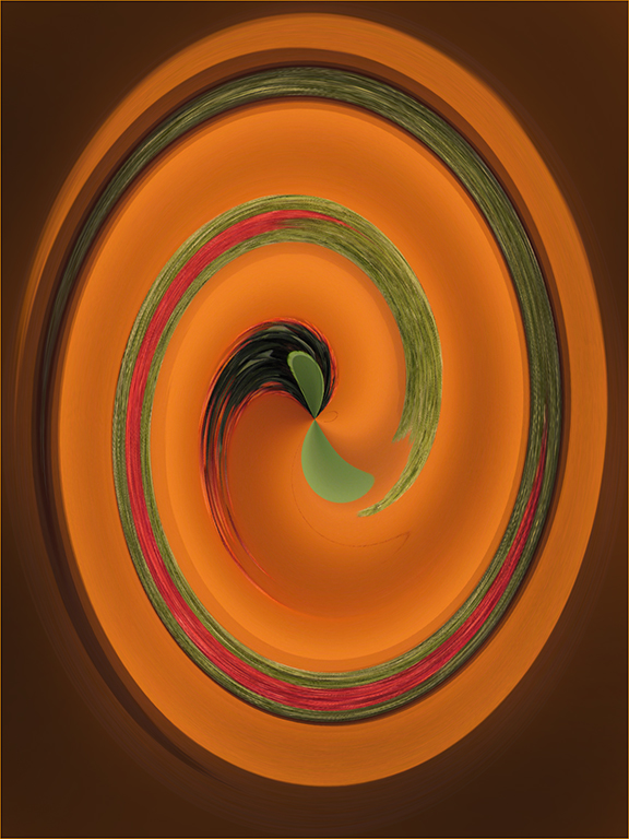
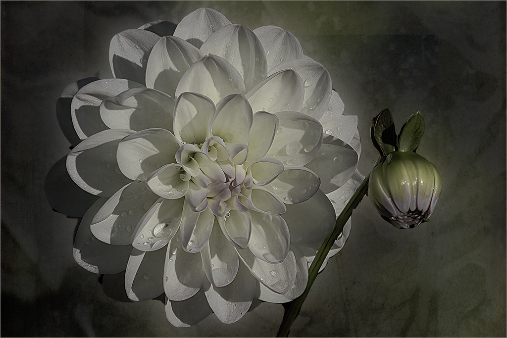
Thank you for letting me visit your group. For me, this image has a kind of reverse vignetting. My eye goes to those light spots but yet they combine to bring me back to the center. Looks like a constellation to me. Interesting capture. |
Feb 14th |
| 49 |
Feb 19 |
Comment |
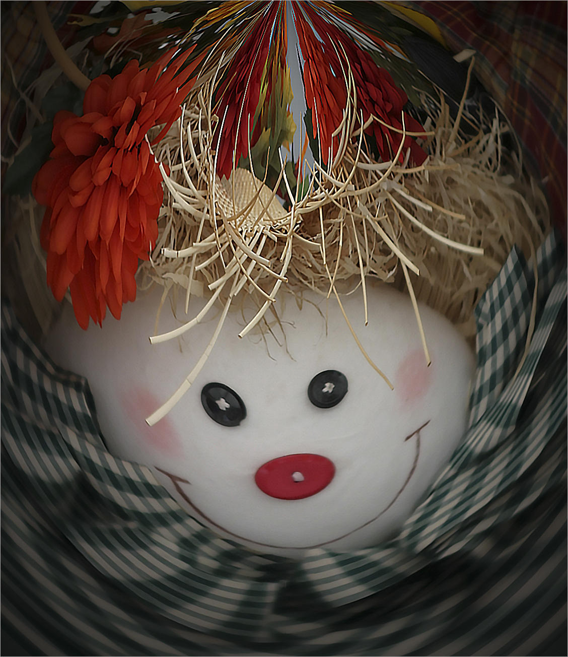
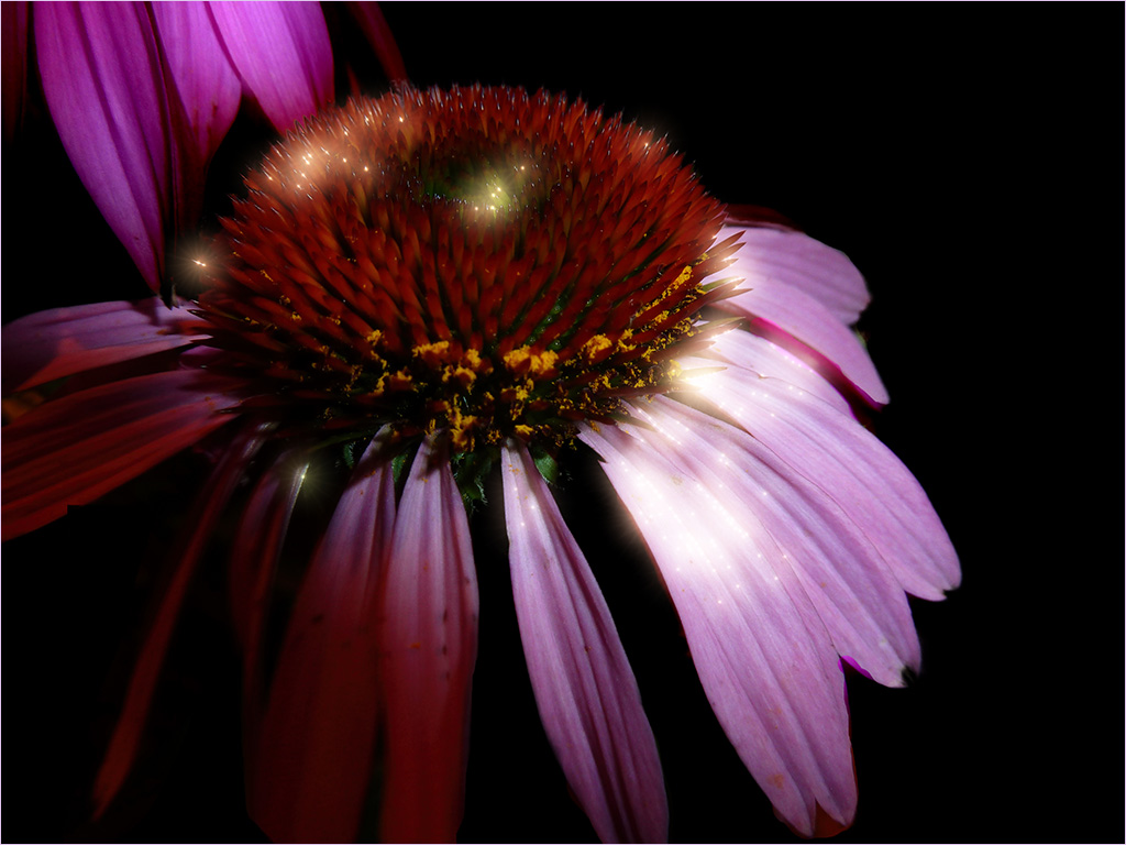
I find this image to be rather spooky. It definitely has drama to it. Normally I like to see a stroke around the edge to contain the image but in this case, I think letting it bleed outside the edges adds to the drama. Nice job. |
Feb 14th |
5 comments - 0 replies for Group 49
|
12 comments - 7 replies Total
|