|
| Group |
Round |
C/R |
Comment |
Date |
Image |
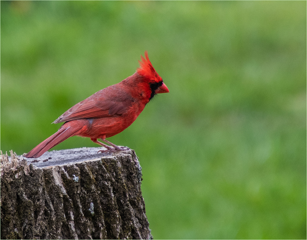
| 5 |
Oct 18 |
Comment |
I agree with the busy background. I don't know how much you cropped but I feel the bird is a little tight in the frame - not much room to fly into. I love the capture - great position and I feel the wing flared out gives the bird a lot of detail and beauty. Good job. |
Oct 27th |
| 5 |
Oct 18 |
Comment |
Very clever - but then your images usually are. :) I'm wondering - who's hand is coming up from behind the sofa? It almost seems ghostly. Oh yes, this is Halloween month isn't it. |
Oct 27th |
| 5 |
Oct 18 |
Comment |
Nice capture of the windmill. I feel the sky sets the tone and the colors of the windmill are not real bright and overbearing. Good to see your use of the border. Are you using a stroke? It appears to me that the border is not quite the same size in the lower left corner. A stroke would make it even all the way around. Also there is something dark on the right side against the frame. Picky comments for a very good image. :) |
Oct 27th |
| 5 |
Oct 18 |
Comment |
I like the intensity of the face. You can see he's worked hard. I'm curious as to the actual color of the man. Only you know the correct shading but to me, it seems like he's lightened up a little too much. I wondered what he would look like keeping most of the original's tone but perhaps just bringing out the eyes? |
Oct 27th |
| 5 |
Oct 18 |
Comment |
Great capture. I'm wondering what the bottom player is thinking as the players are about to land on his head. Good action and coloring. Yes, I agree about the woman in black. Tom's rendition cleans that up nicely. |
Oct 27th |
| 5 |
Oct 18 |
Comment |
I was wondering if it was my eyes because both images looked the same to me as well. I like the texture in the walls and the coloring. Would be nice to see the actual original. :) |
Oct 27th |
| 5 |
Oct 18 |
Comment |
Very cute! Happy Halloween! I was wondering about reversing the bats so they would look like they were flying into the scene rather than out of it. The orange stroke really sets the image off, keeping my eyes inside the frame. Nice job. |
Oct 27th |
7 comments - 0 replies for Group 5
|
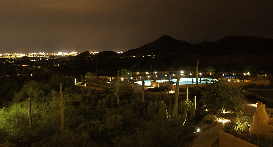
| 8 |
Oct 18 |
Comment |
Very nice. I like the portion of the city in the lower left corner which shows off the size of the mountains. |
Oct 13th |
1 comment - 0 replies for Group 8
|
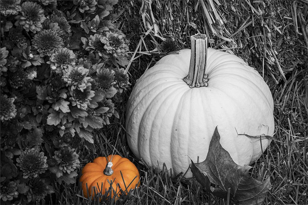
| 22 |
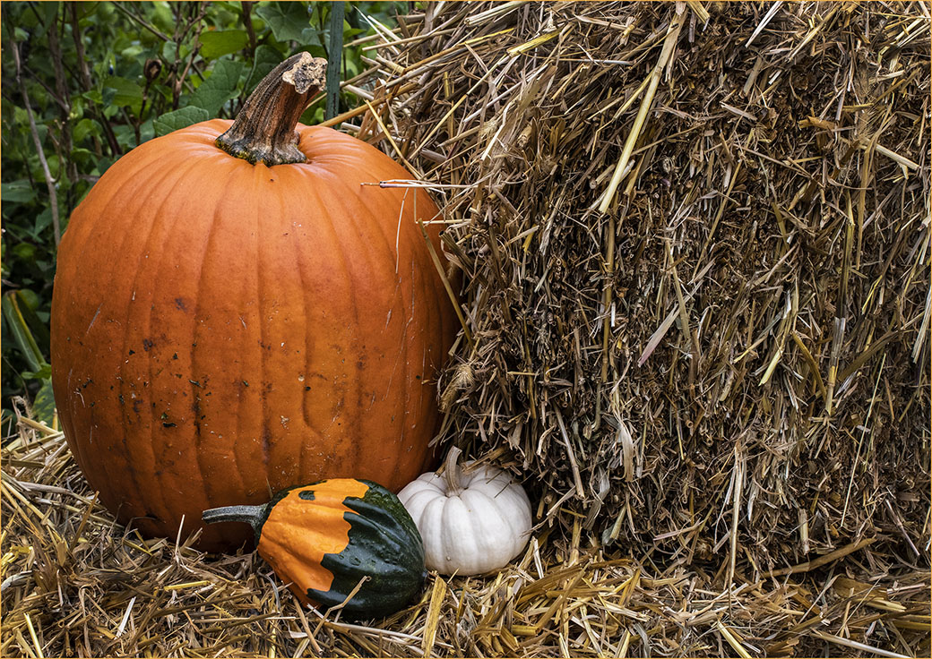
Oct 18 |
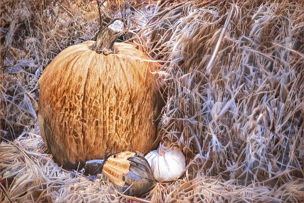
Comment |
Must be the new camera...LOL. I'm rather surprised nobody said I should have removed the dirt from the pumpkin. Oh well, I guess it's just natural. :) |
Oct 22nd |
| 22 |
Oct 18 |
Reply |
I'm going to comment on the "Rule of Thirds" here as I think John has used that rule with the placement of the horizon. While it doesn't exactly hit the four "power points" in the rule, the composition is definitely striking. Peggy is correct in that the Rule of Thirds is only a guideline for composition and like any rule, can be broken effectively. |
Oct 22nd |
| 22 |
Oct 18 |
Comment |
Good capture on the kite boarder. The one thing that bothers me - and there is nothing you can do about it - is that the kite is one subject and the man is the other and my eye goes back and forth between them. I'm first attracted to the color of the kite and then want to find out where it's coming from. This one is a lot better than the ones I've tried to photograph. :) |
Oct 13th |
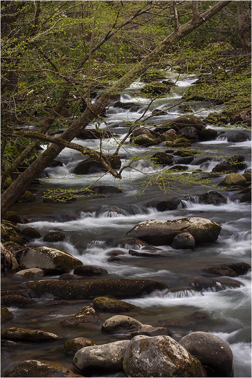
| 22 |
Oct 18 |
Comment |
This really tells a story. Great capture. To be picky, I sort of think the grass is a little darker in the original and seems to be sharper. Maybe it's just my eyes. |
Oct 13th |
| 22 |
Oct 18 |
Comment |
I like the image a lot. Sharp and colorful. I feel the framing is a little uneven - the right side seems thinner than the left. Good experimentation with the border though I feel it kind of detracts from your beautiful picture. |
Oct 13th |
| 22 |
Oct 18 |
Comment |
It does look like a leaf on first glance. I find the upper left part of the wing to be a little out of focus and since it has the three whitish spots on it, it is drawing my eyes to it even more. Perhaps a tad more depth of field? It's a nice capture though. Good job. |
Oct 13th |
| 22 |
Oct 18 |
Reply |
Thanks Mark! How is Florida treating you? :) |
Oct 13th |
| 22 |
Oct 18 |
Comment |
I agree about the eyes. Turning the image into BW and leaving the eyes colored really makes them pop. They rather blend in with the original tiger coloring. Well done! |
Oct 8th |
6 comments - 2 replies for Group 22
|
| 37 |
Oct 18 |
Comment |
I like the composition of this image. What I'd be interested in seeing is what it would look like if the background was blurred out a little more and perhaps burned in some. The bright spot on the rear flower sort of distracts me from the main flower. Overall it's a very pretty picture. |
Oct 22nd |
| 37 |
Oct 18 |
Reply |
I'm going to agree with Gunter about the woman both in closeness and color. With that orange, my eye goes to her and on a secondary look I see the arches and the nice line going to the rear of the image. |
Oct 22nd |
| 37 |
Oct 18 |
Comment |
Nice composition. On my monitor, the bird seems a little "flat"...like it needs a touch of saturation. I'm not sure about the vignetting as it appears to me to make the background too noticeable because of the light circle around the bird. Overall though - good capture...you know how picky I am :) |
Oct 22nd |
| 37 |
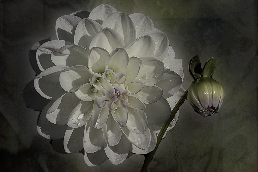
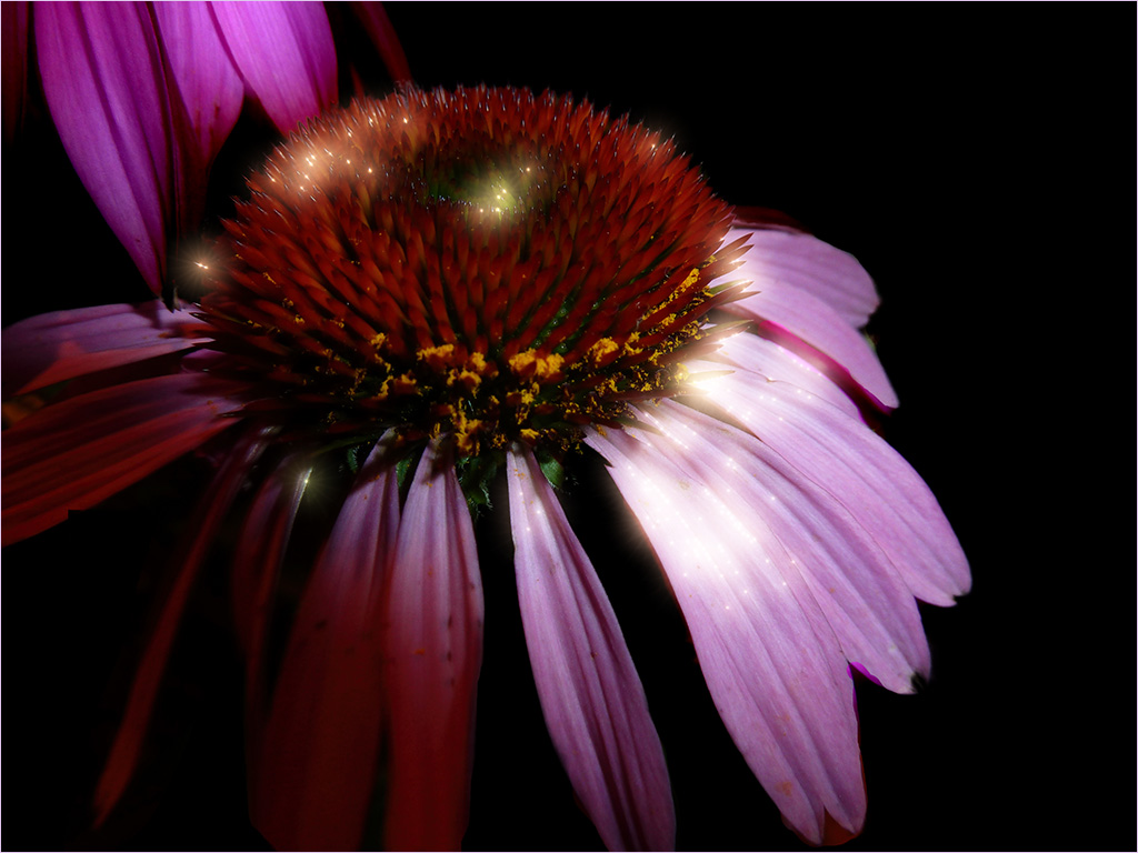
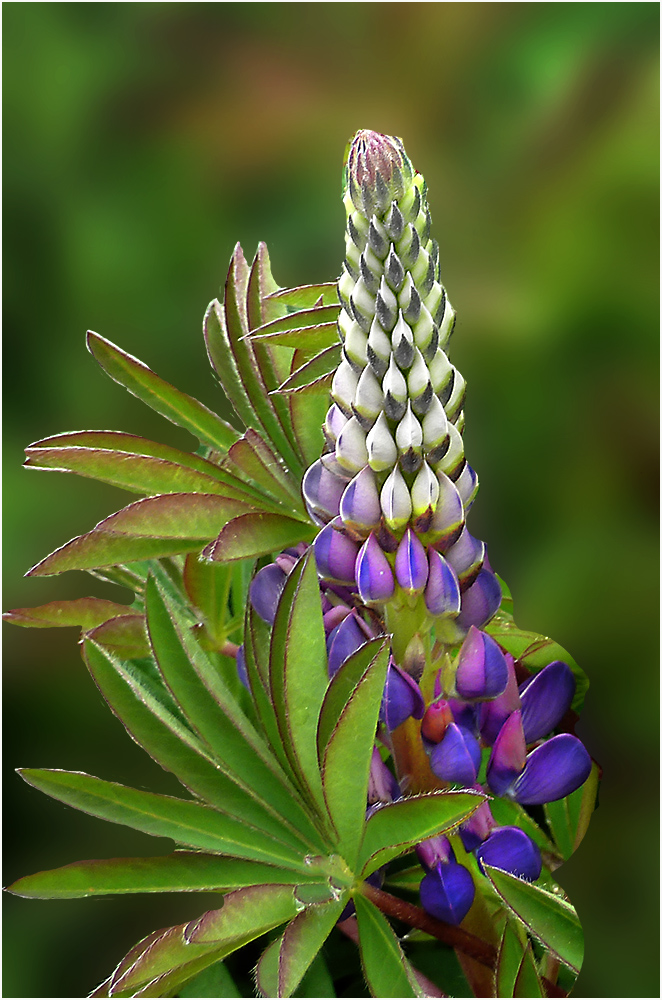
Oct 18 |
Comment |
I find myself agreeing with the black background. The white seems to pale out the poppies to me. There are a few little distractions for me around the upper left flower and the lower right. Perhaps they are seeds but it looks to me like spots that didn't get cleaned up if this was masked. Overall this would make a nice wall print. |
Oct 22nd |
| 37 |
Oct 18 |
Comment |
To me, there seems to be two subjects - the flags on the left and the person on the right. My eye goes back and forth between them. It's hard for me to figure out what's going on here. The colors are good though on my monitor they appear a little over-saturated. |
Oct 22nd |
| 37 |
Oct 18 |
Comment |
Great action. I agree with Gunter about the spray hiding the horses. Would like to have seen the color original - if there was one. |
Oct 22nd |
5 comments - 1 reply for Group 37
|
| 67 |
Oct 18 |
Reply |
Very nice. I think this sets the bird off really well. |
Oct 26th |
| 67 |
Oct 18 |
Comment |
I'm torn between the two images. I think the final is a little too over-saturated and the trees seem to me to be too "HDR-ish". I like the trees and foreground in the original and the details in the rocks (minus a little saturation) in the final. The sky definitely needed to be brought out which you did well in the final. |
Oct 25th |
| 67 |
Oct 18 |
Comment |
Nice macro shot of the Rusty Skimmer. I think I'd like to see more of the top of the left side of the branch - like in the original. To me, it kind of floats out the top corner. Also with a dark background, I like to see a stroke around the image. Not a big one but just enough to contain the image-maybe 1 pixel. |
Oct 25th |
| 67 |
Oct 18 |
Comment |
I agree with Larry about removing the left branch. I'd also like to see the right branch maybe burned in a little to tone it down as these two branches are the brightest items in the image. Wish I could capture birds like this. Very nice. |
Oct 25th |
| 67 |
Oct 18 |
Comment |
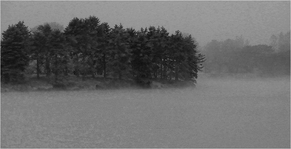
I like your main image better. I agree the remake cuts off the storm clouds which, to me, adds to the image. I like the way you handled the trees and reeds so that some green shows through and they aren't total silhouettes. Also extending the colors of the sunset makes for a beautiful picture. Nice job! |
Oct 25th |
| 67 |
Oct 18 |
Comment |
Your final rendition really shows that even images one might toss out could possibly be salvaged with today's programs. I agree with Isaac's crop from the left but personally would leave the thorns on the right...maybe.
What kind of bothers me is the halo around the frog. If you only work in LR then this suggestion won't work but I'm wondering if you had a layer with the original image and then the lighter image on a layer, you could have the darker layer on top and paint in the lighter frog. I'm not real familiar with LR but perhaps there is the adjustment brush that would work in a similar manner?
Overall it's a very nice image and a great salvage. |
Oct 25th |
5 comments - 1 reply for Group 67
|
| 78 |
Oct 18 |
Comment |
Doing a little "group hopping" this month and saw this image.
Beautiful sunset and I like the composition. As my eye goes to the brightest spot, I'm a little distracted by the white framing. For a print, that type of border would be fine. For competition a slight stroke would be preferable. Nice job though. |
Oct 13th |
1 comment - 0 replies for Group 78
|
25 comments - 4 replies Total
|