|
| Group |
Round |
C/R |
Comment |
Date |
Image |
| 22 |
Jun 18 |
Reply |
Thanks Kaylyn. I might make a pattern out of it. |
Jun 25th |
| 22 |
Jun 18 |
Reply |
Topaz has their new Topaz Studio with a bunch of different effects. They usually have specials every so often. Right now, Studio is free and the Pro Adjustment bundle is 50% off ($317.50). https://topazlabs.com/
|
Jun 25th |
| 22 |
Jun 18 |
Reply |
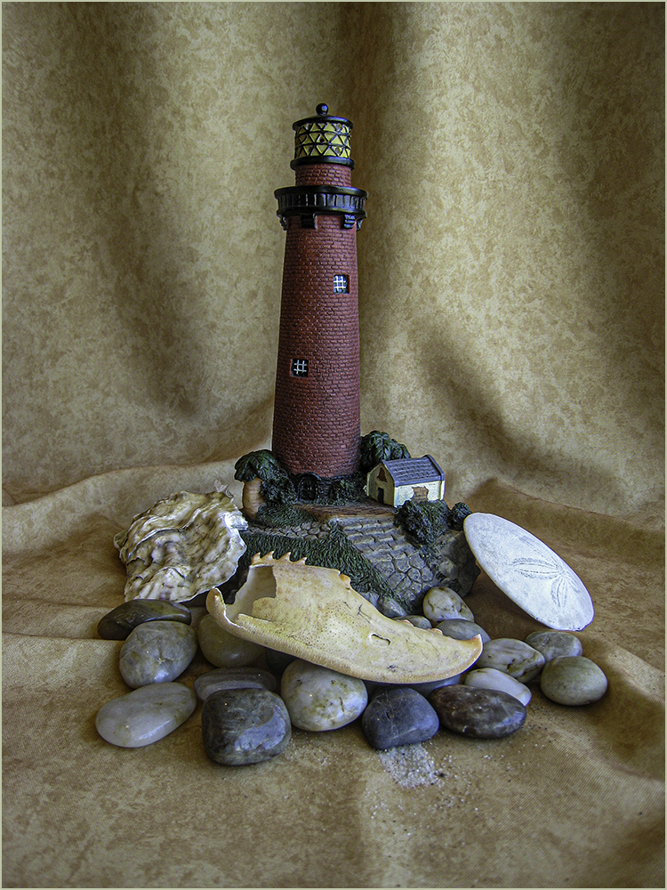
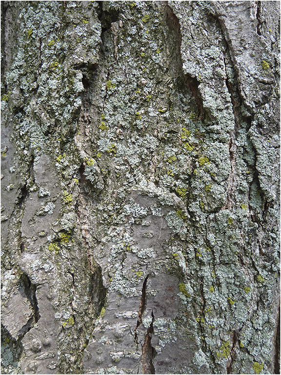
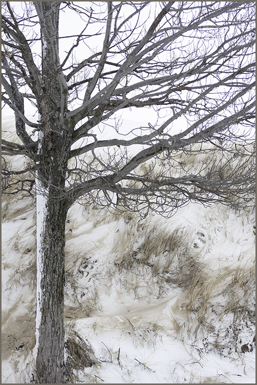
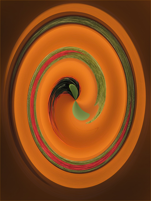
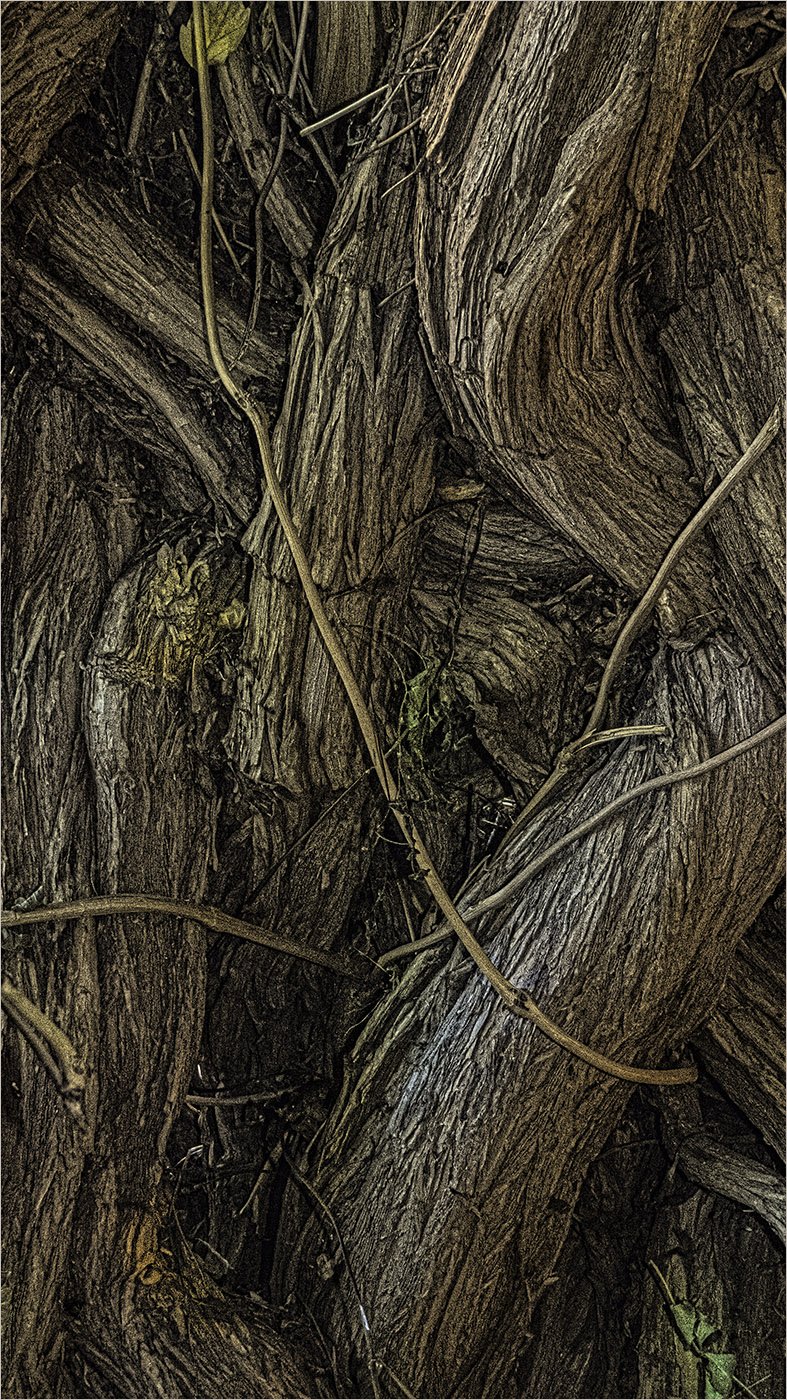
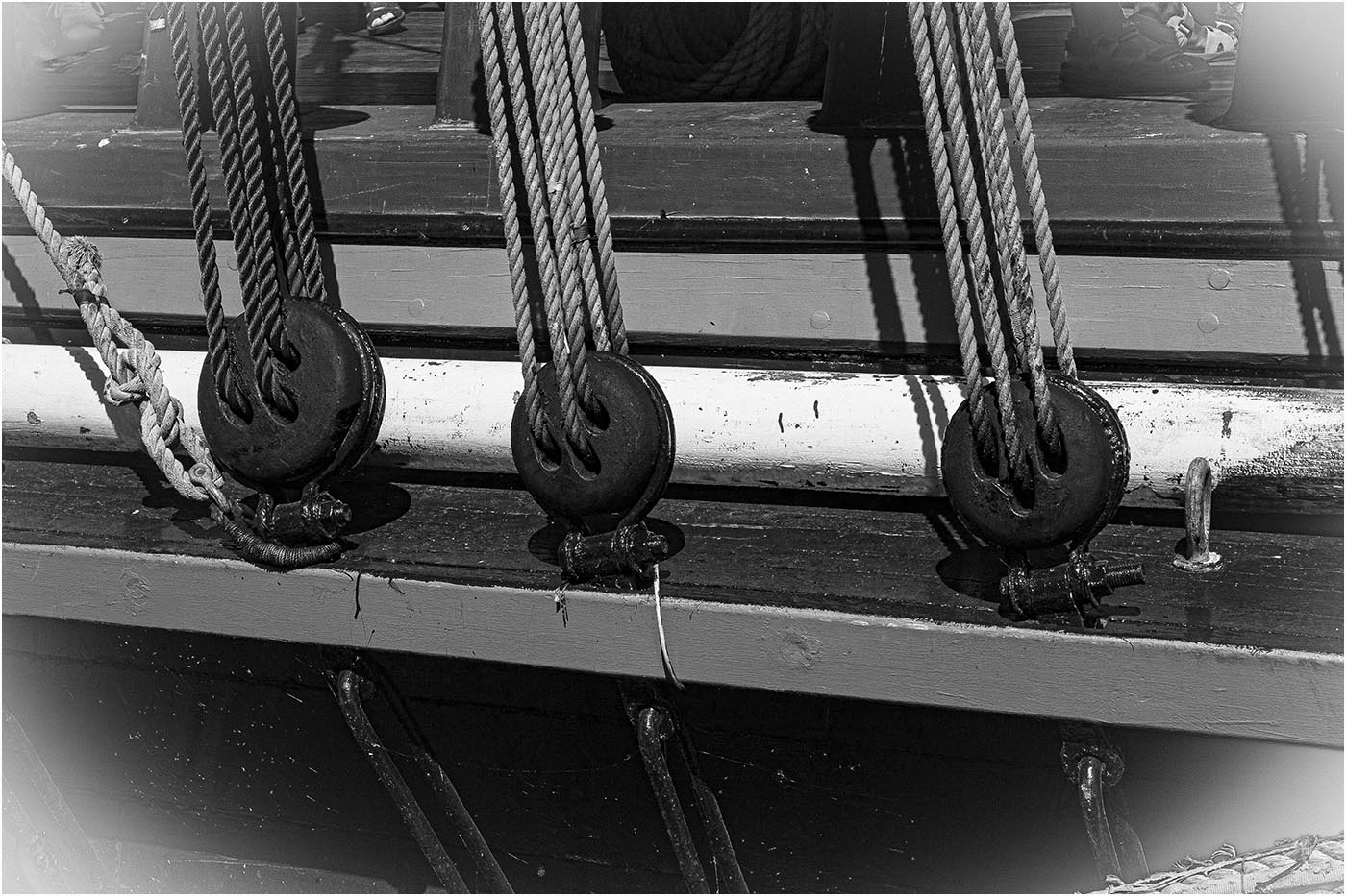
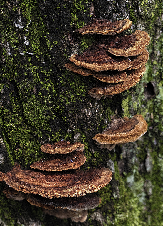
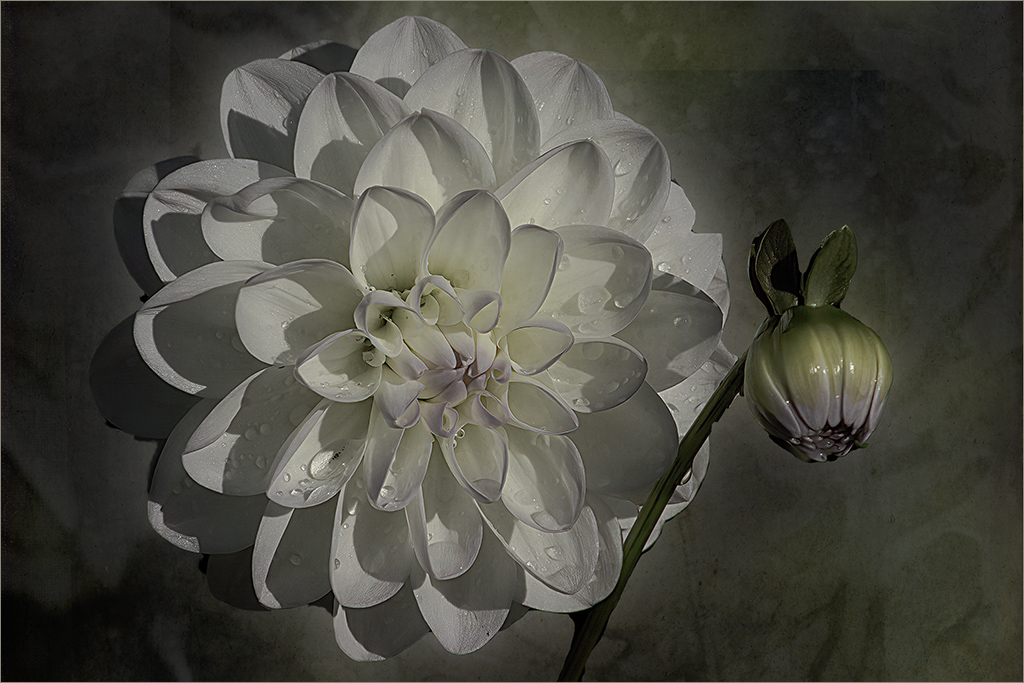
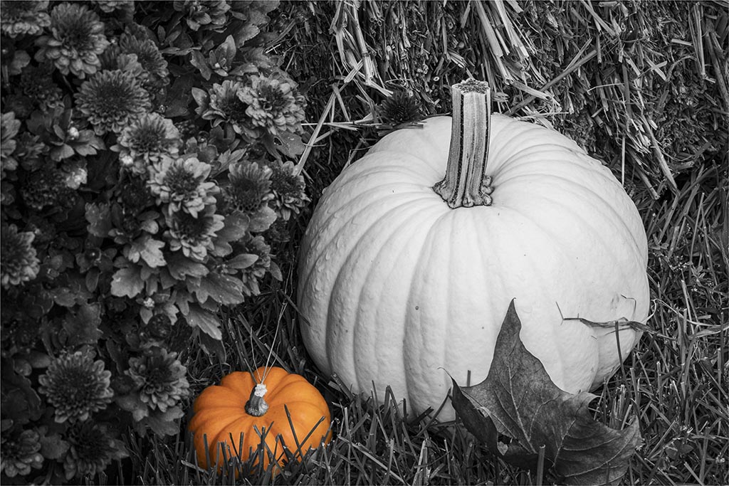
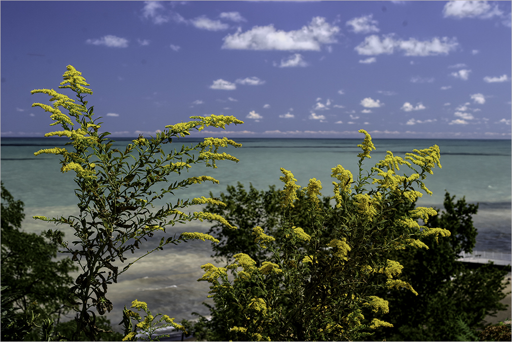
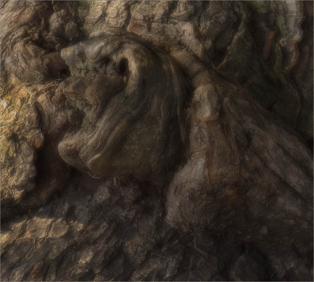
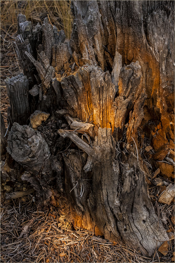
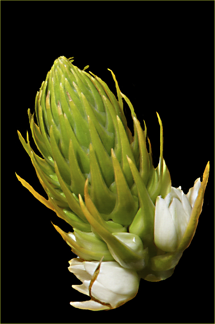
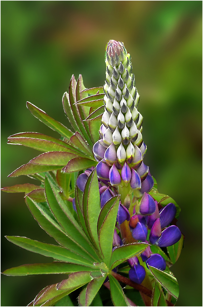
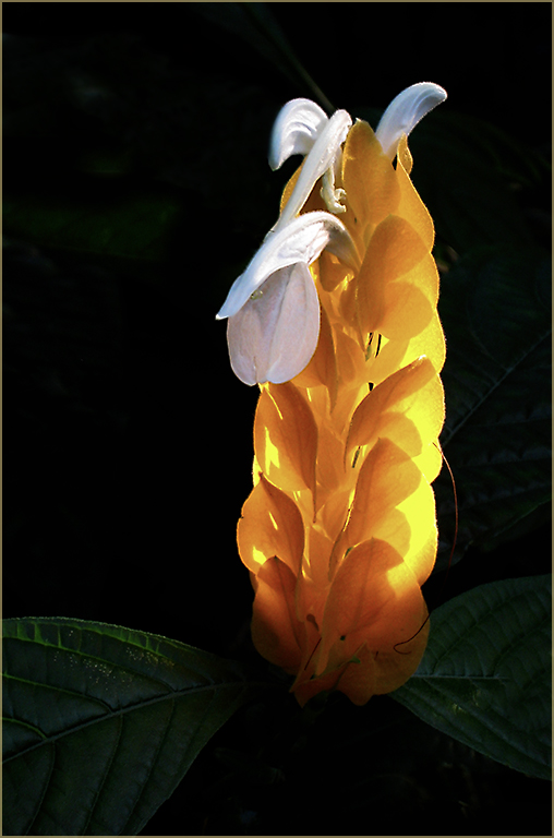
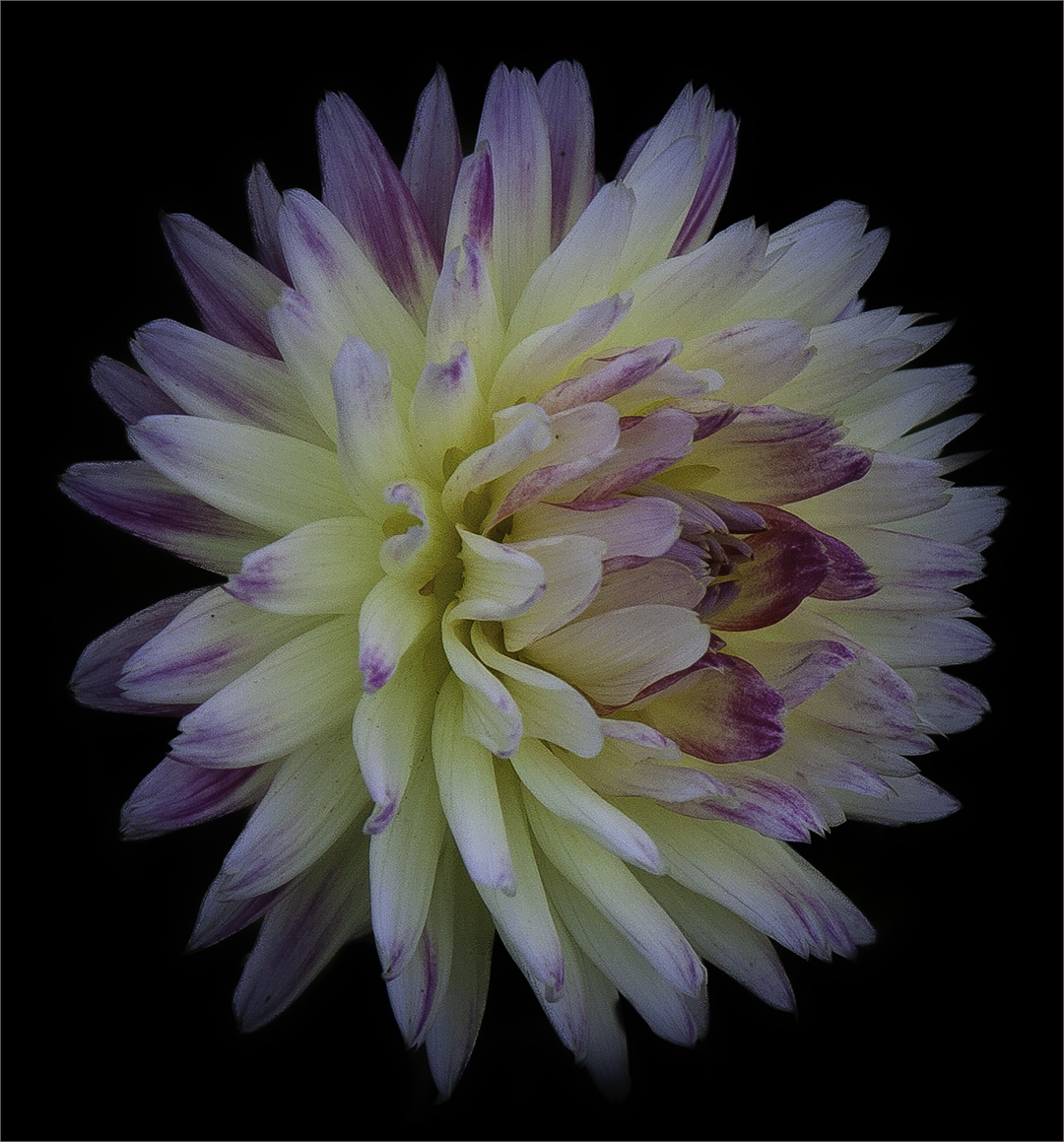
Thanks John. It is bark as you can see on the original. Was working on some macro images. |
Jun 19th |
| 22 |
Jun 18 |
Reply |
Actually, it was the blur that made it more noticeable to me. |
Jun 10th |
| 22 |
Jun 18 |
Reply |
You got it! |
Jun 10th |
| 22 |
Jun 18 |
Reply |
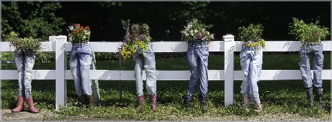
And the legs go on either side of that. :) |
Jun 10th |
| 22 |
Jun 18 |
Comment |
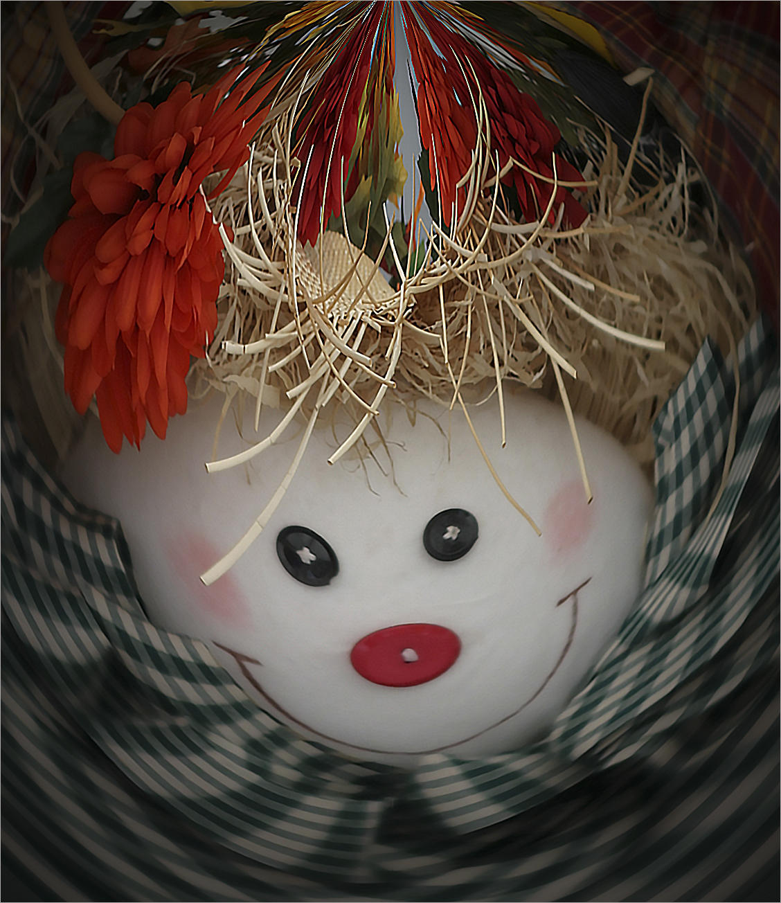
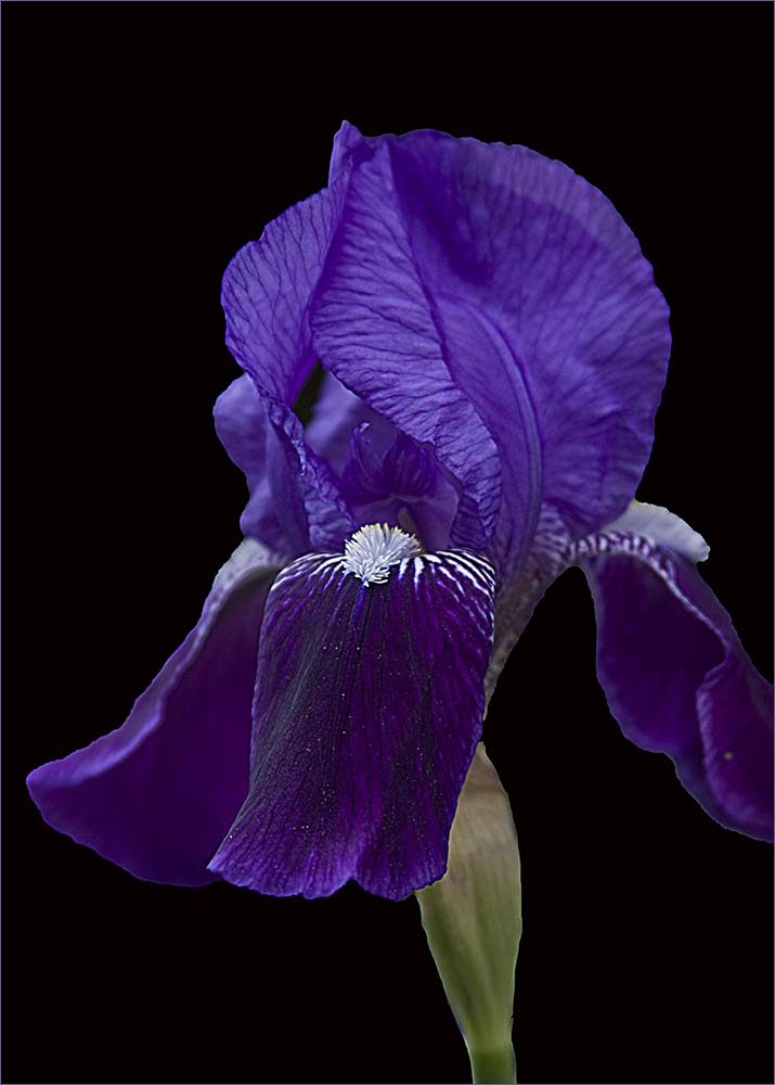
Good job bringing out the details and coloring. Hard to shoot with subjects behind glass. |
Jun 10th |
| 22 |
Jun 18 |
Reply |
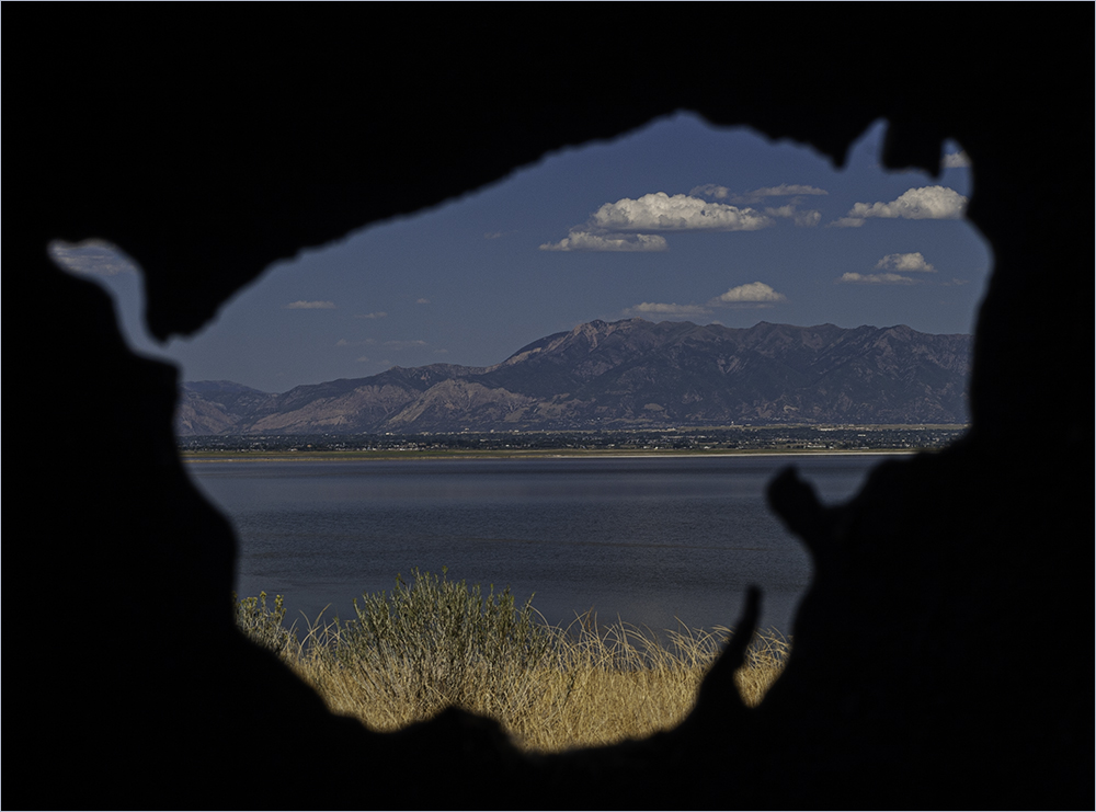
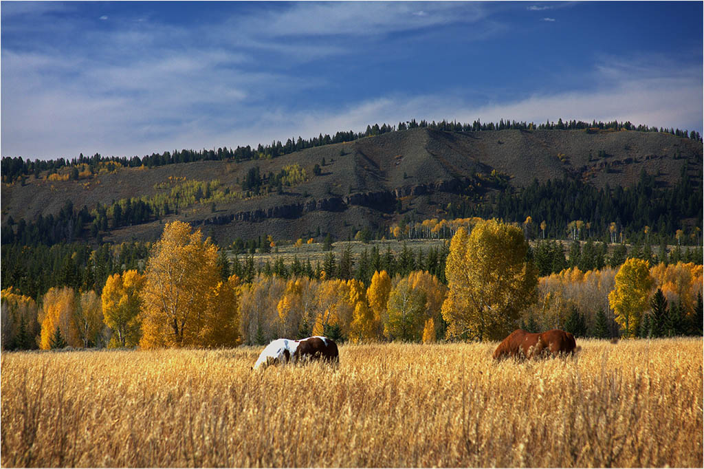
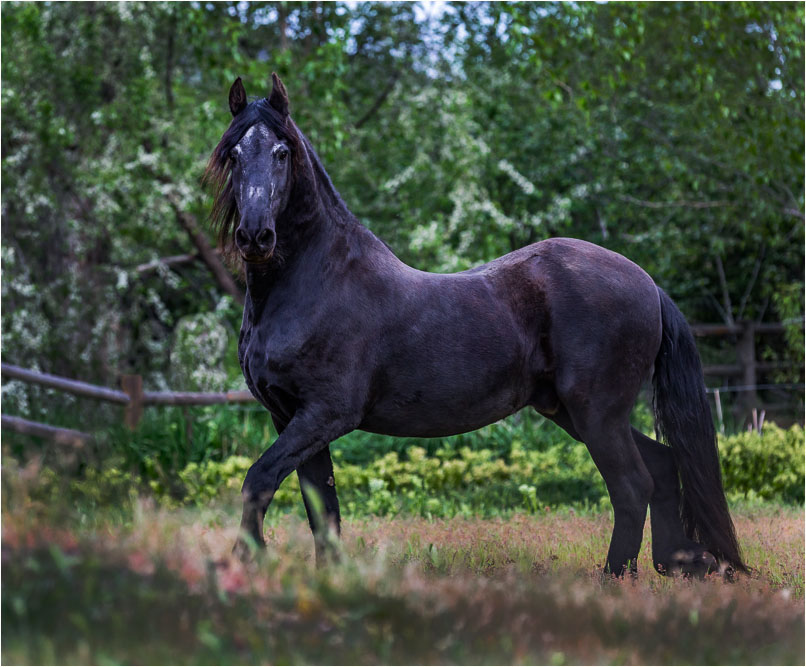
He appeared sway-backed to me as well. I would guess he is an older horse.
I tried cropping tighter and burning in the bottom grasses. |
Jun 10th |
 |
| 22 |
Jun 18 |
Reply |
I commend you though - I've never tried that technique although I might with the upcoming Water and Flowers subject later this year. |
Jun 10th |
| 22 |
Jun 18 |
Reply |
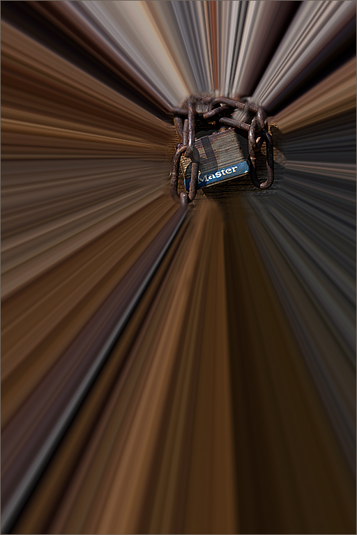
It is tree bark...check the original. :) |
Jun 10th |
| 22 |
Jun 18 |
Reply |
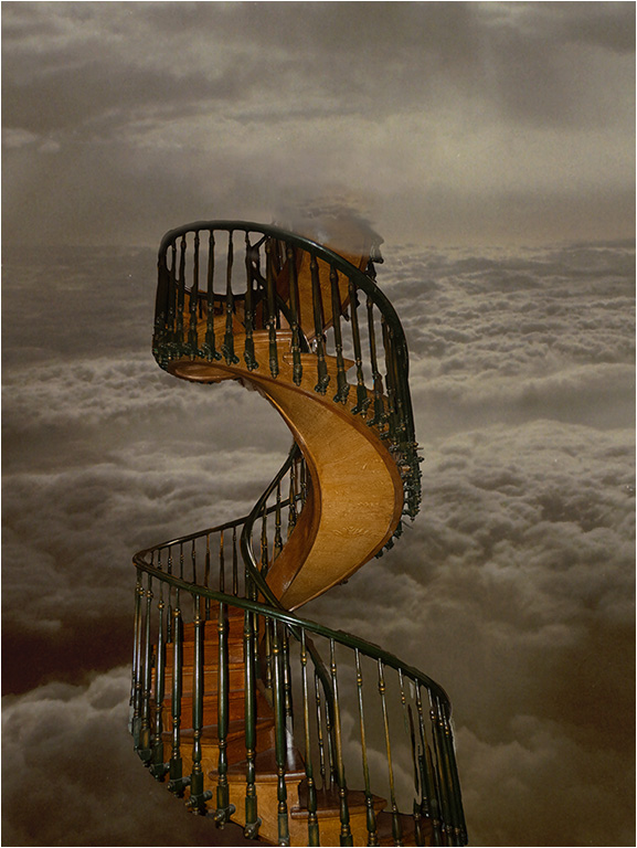
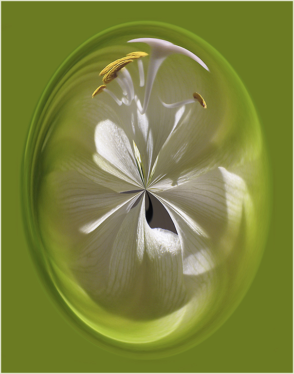
At first I thought of a dragon too. Later on, it looked like a turtle head kind of tucked in with the shell and legs around it. :) |
Jun 10th |
| 22 |
Jun 18 |
Reply |
I used the Diffusion filter to remove the sharpness. :) |
Jun 10th |
| 22 |
Jun 18 |
Comment |
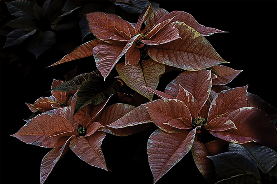
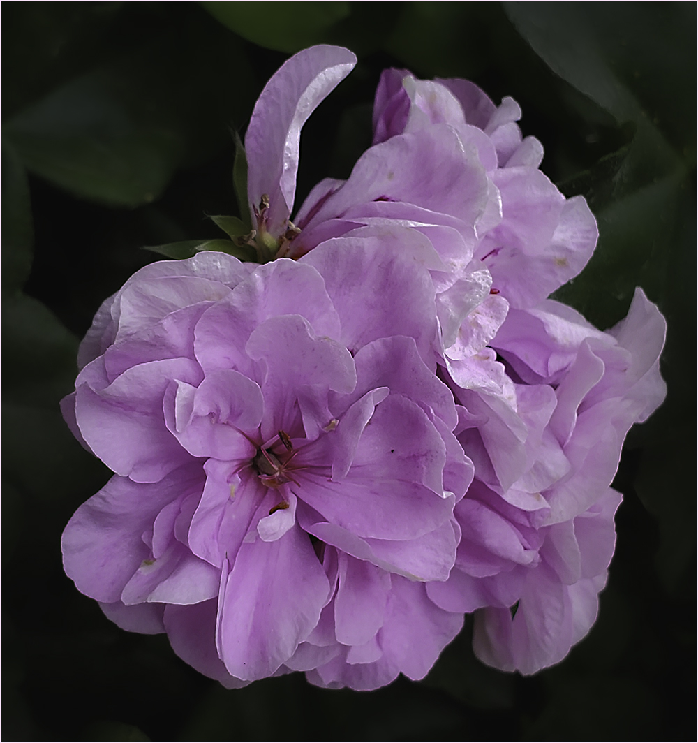
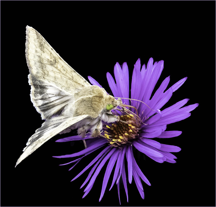
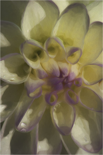
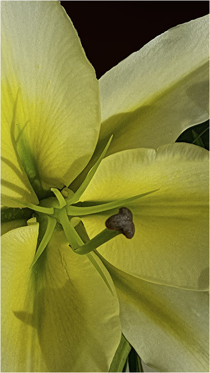
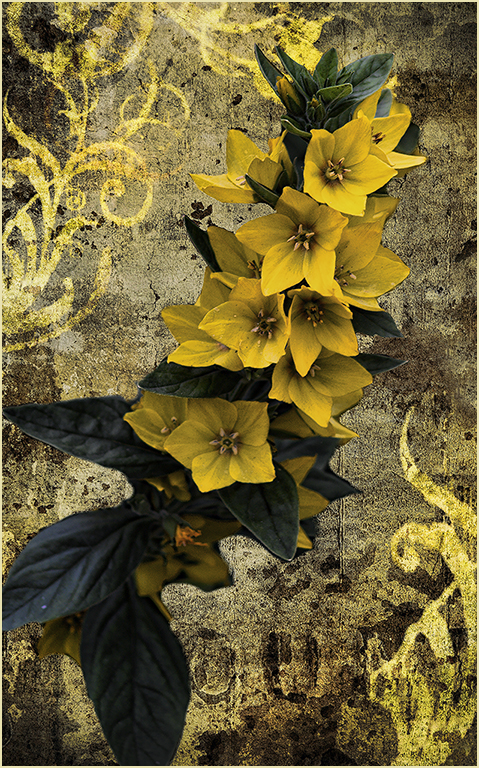
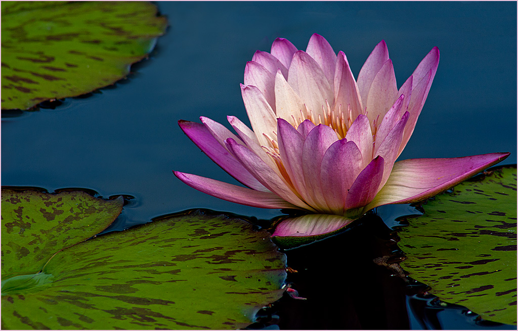
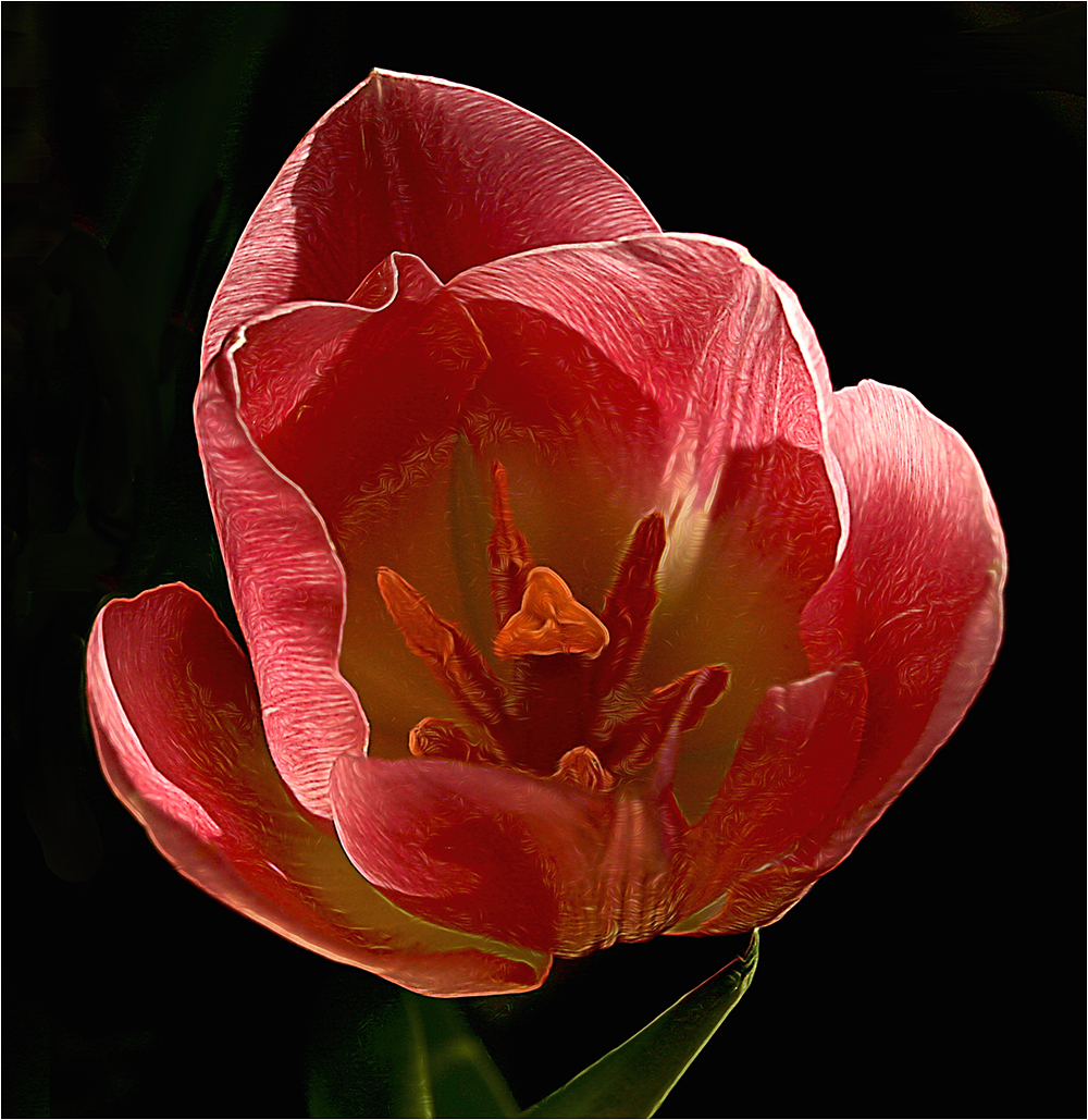
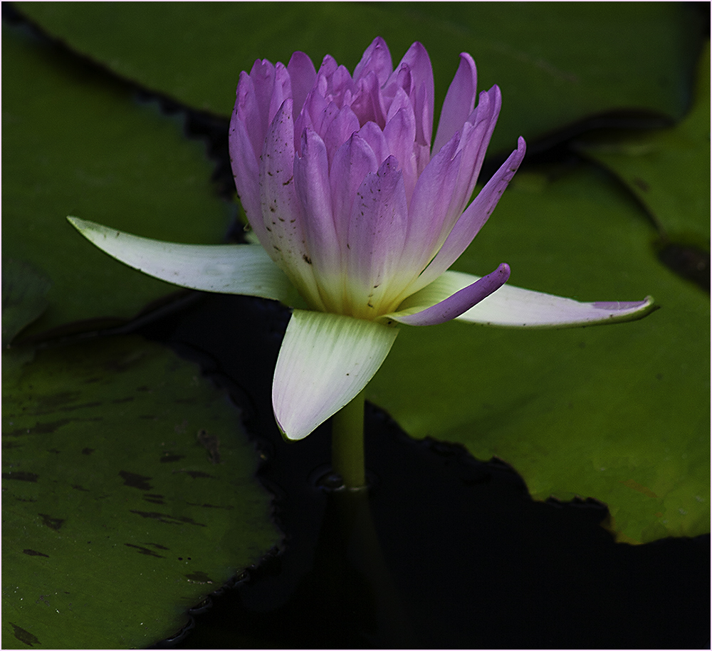
Nice work on replacing the sky and I like the effects on the flower. There is a little haloing around the flower but it's not too bad. I was a little bothered by the out of focus leaves on the left so I tried cropping them out. |
Jun 10th |
 |
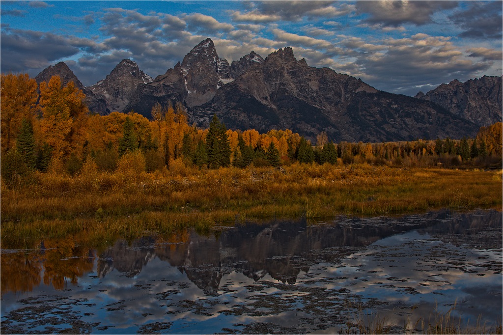
| 22 |
Jun 18 |
Comment |
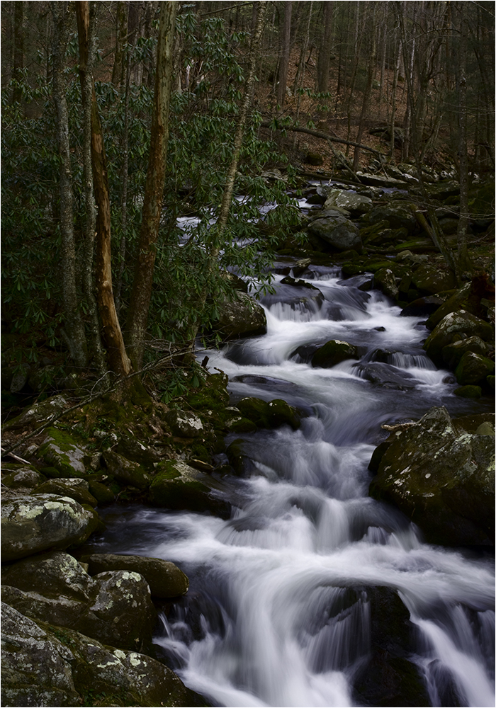
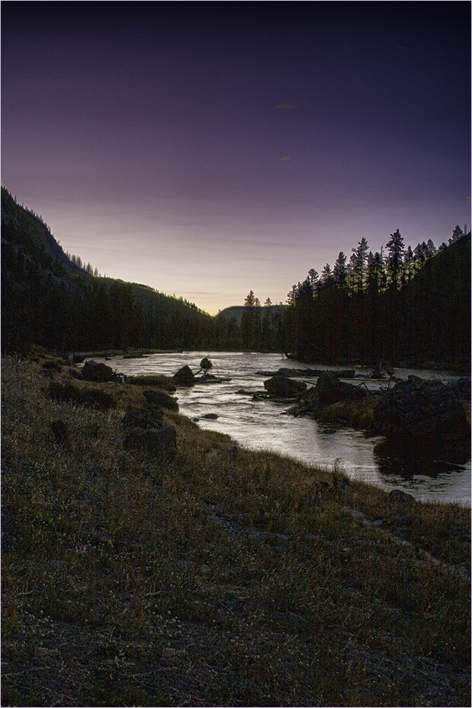
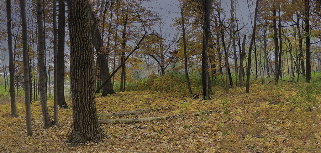
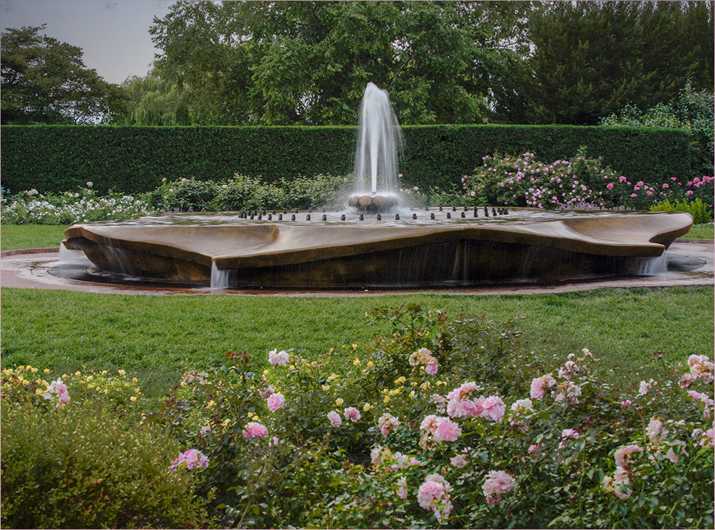
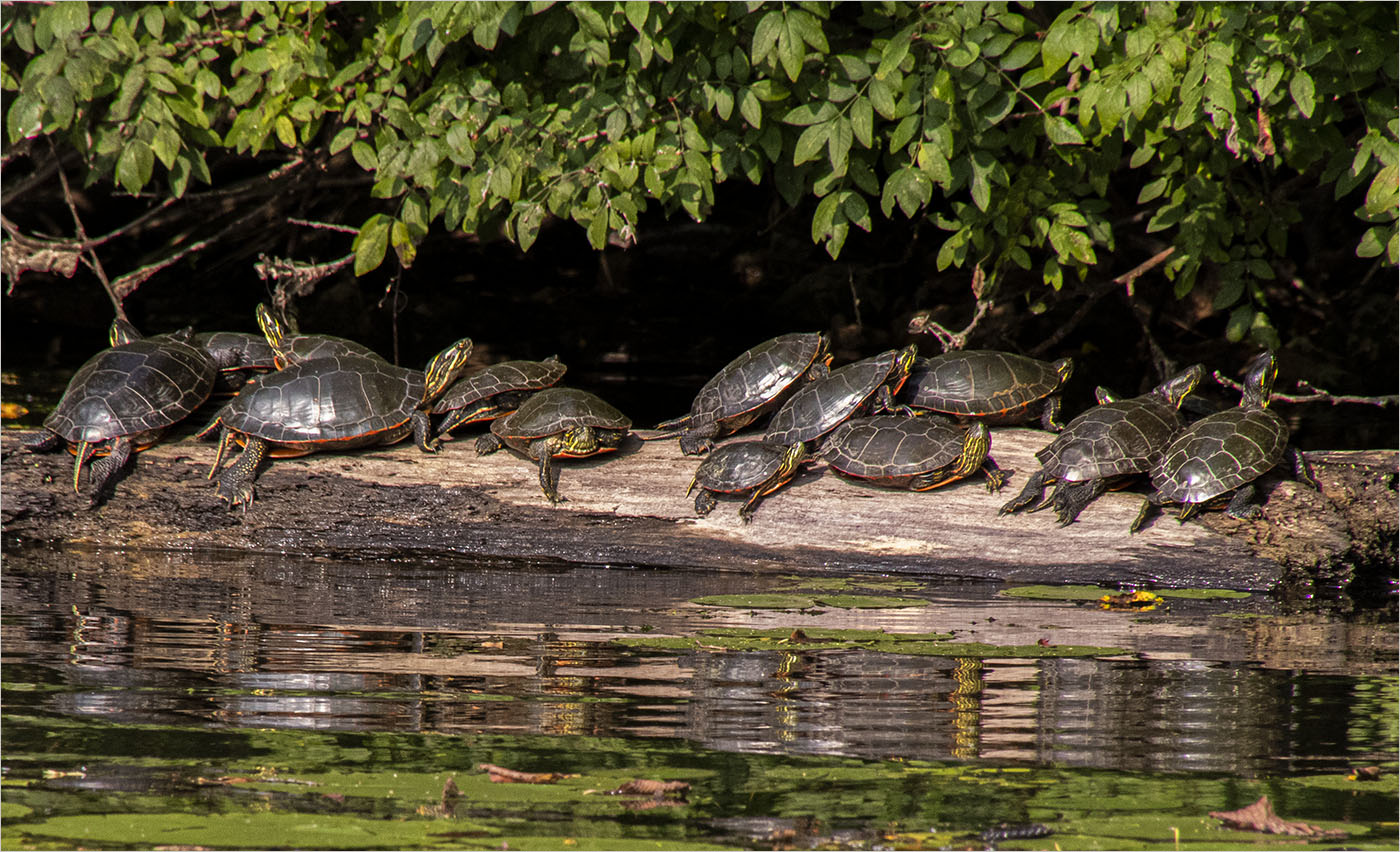
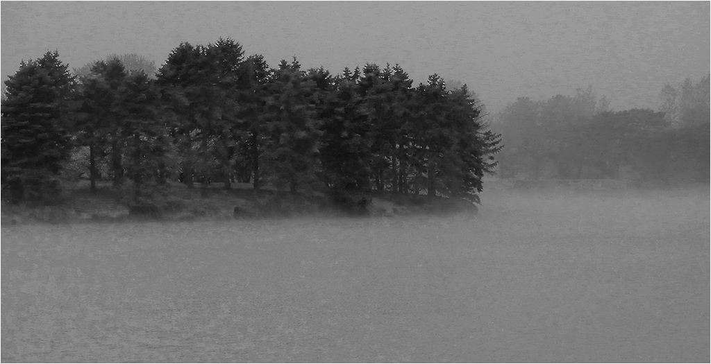
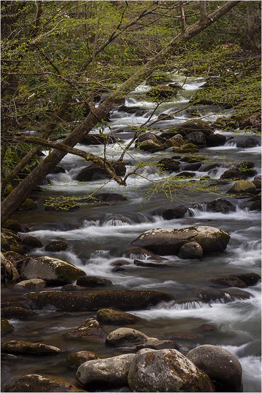
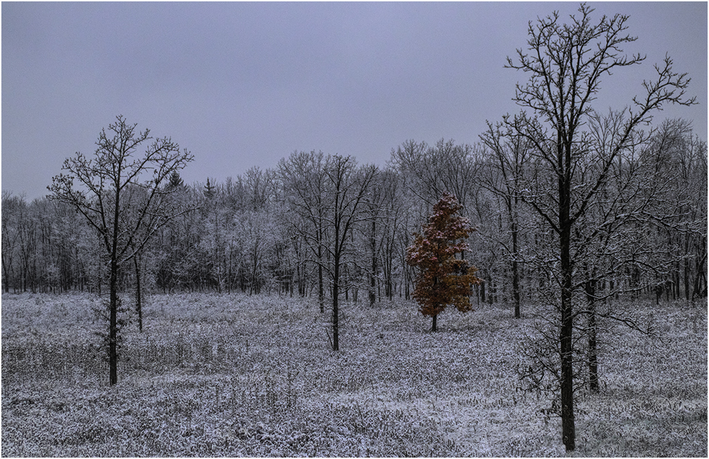
This one has a nice peaceful feel to it. Good job. |
Jun 9th |
| 22 |
Jun 18 |
Comment |
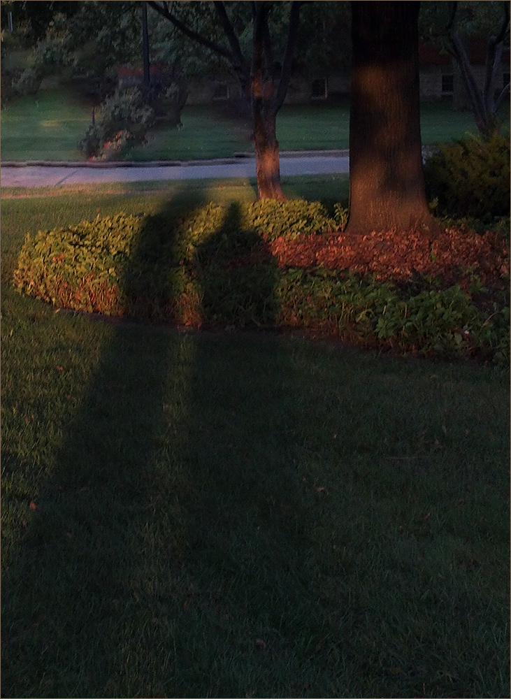
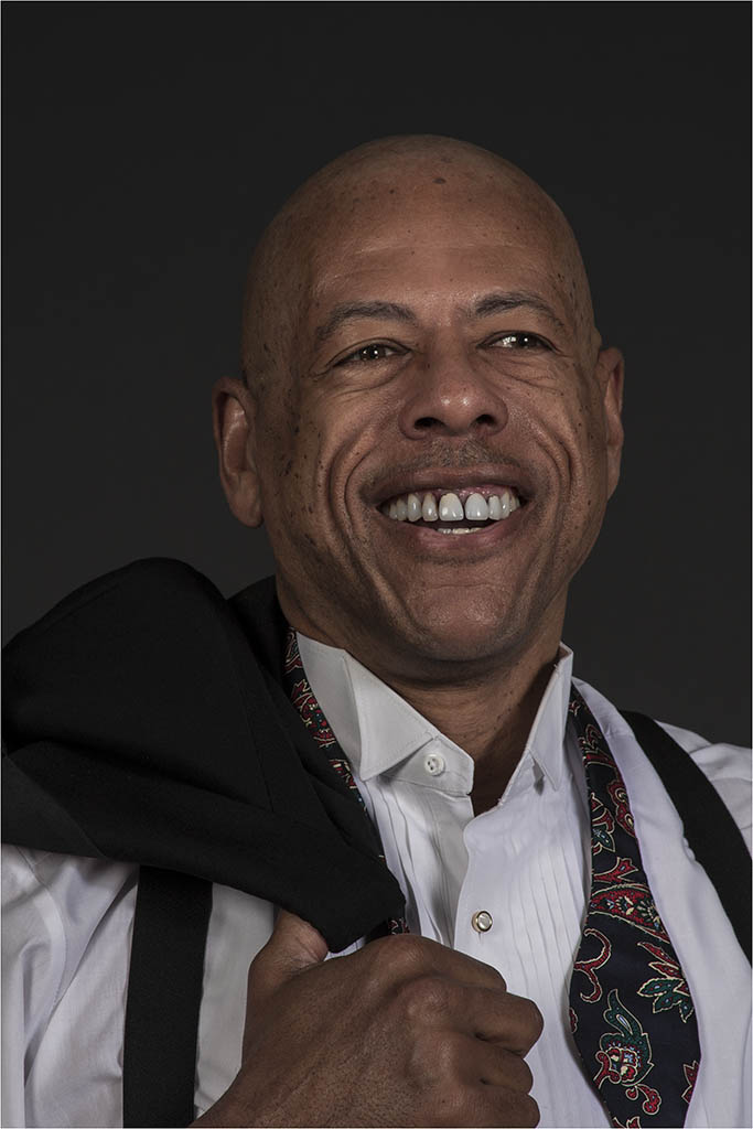
It's a quite unique image, to me. I like the subject and they way you've portrayed it. One thing that bothers me though is that you say this was out of the camera. I'm not sure why I'm seeing haloing around the two men. It's almost as though they were taken from another image and combined with this one. |
Jun 9th |
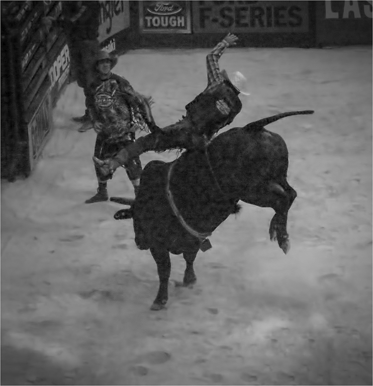
| 22 |
Jun 18 |
Comment |
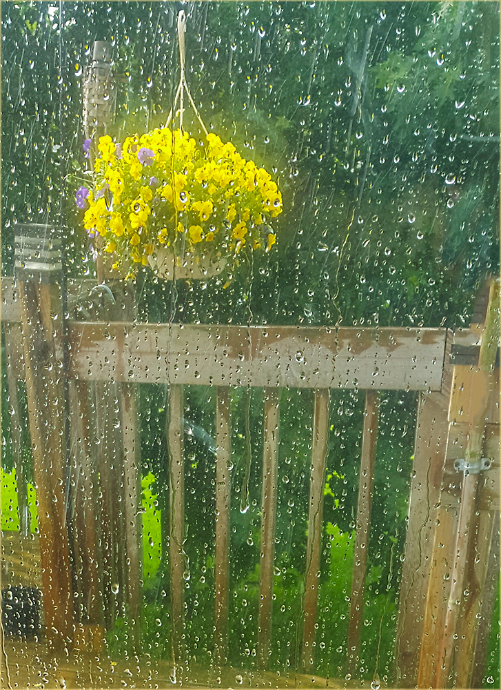
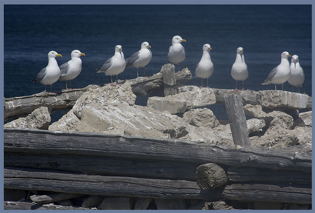
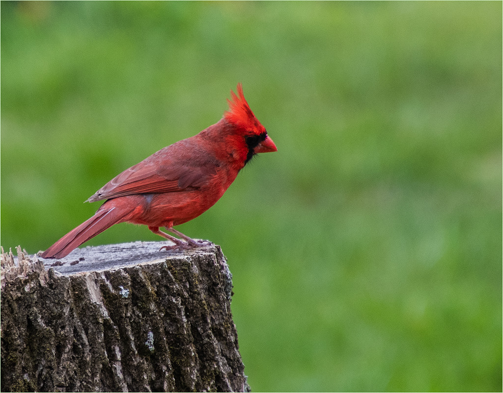
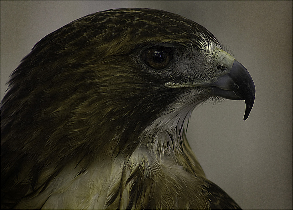
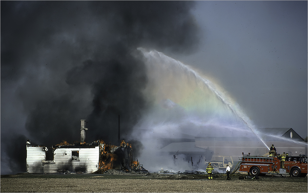
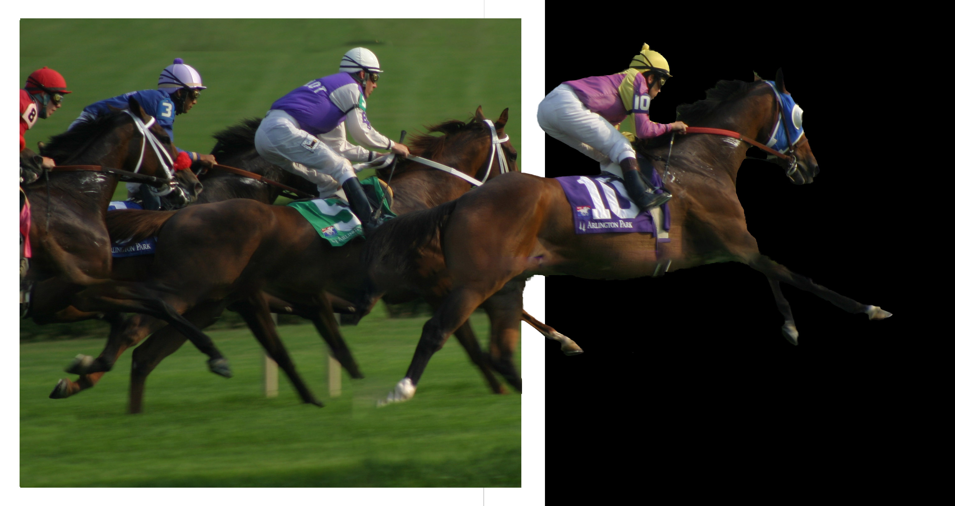
You've done a great job with this image. I like the details in the feathers and the birds heads. I'm finding it a little odd though that all that heavy rain is behind them. Not sure if there is a way to bring a little of the rain in front so it would be looking like they are in the rain. |
Jun 9th |
5 comments - 11 replies for Group 22
|
| 62 |
Jun 18 |
Reply |
You're welcome - and your group is invited to visit Group 22 anytime. We will be on Vacation during August and in September should have an interesting special topic: Common objects in unusual settings. |
Jun 21st |
| 62 |
Jun 18 |
Comment |
The composition creates a nice diagonal line leading toward the couple. I also like the way you've brought out the texture in the walls and floor.
I tend to harp on the people in my group about adding strokes to their images and this is one I feel needs it. Being black on the left side with no stopping point tends to lead me out of the frame wondering what's there. A very slight white or gray stroke would, in my opinion, help to contain the image.
Overall, I like this image especially for the mood it's creating. Nice job. |
Jun 21st |
| 62 |
Jun 18 |
Comment |
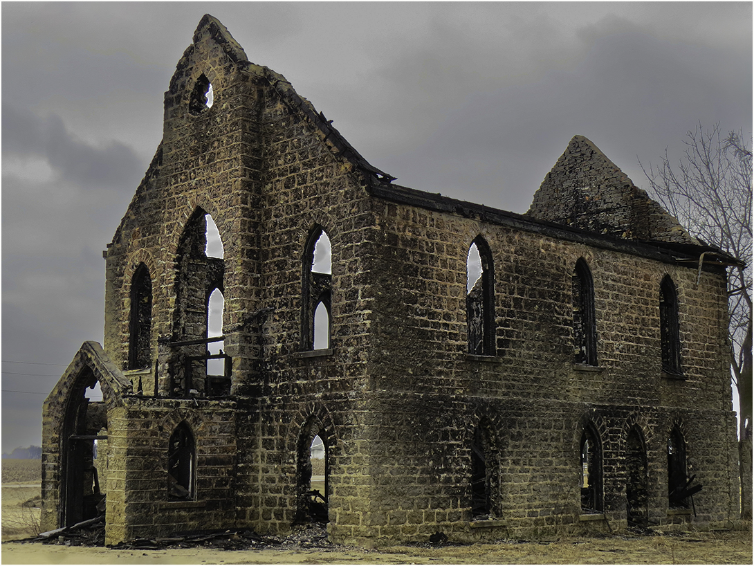
I agree with the wire comments. Without them, I feel the image could stand up in open or monochrome competition. You could have two versions - one for travel and one for open. I think if there had been a pole at one end, it might have made it look less like scratches on the image. However, the image is stunning with the way you brought out the detail and the sky. Nice job. |
Jun 21st |
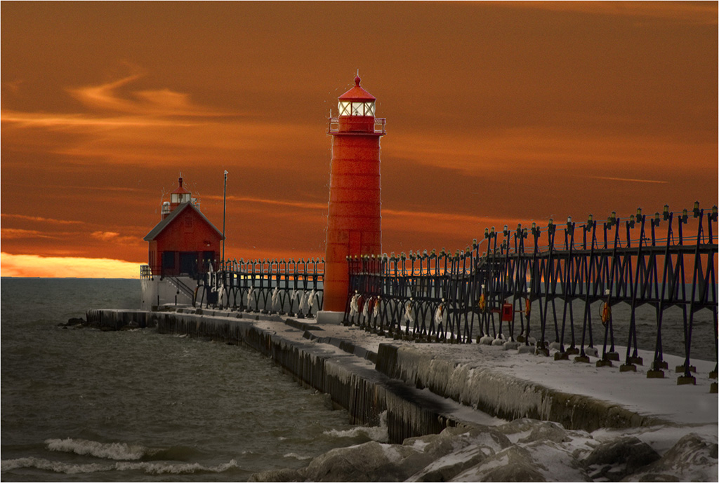
| 62 |
Jun 18 |
Comment |
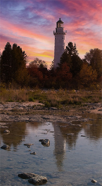
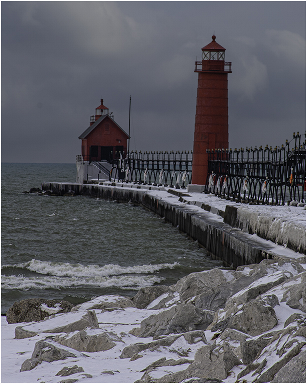
Your subject creates that sense of alone-ness (is that a word?) quite well. I like the lines and angle of the pier. My only picky point would be the sky, which I see as almost totally blown out toward the right. There appear to be some cloud details in the original. If those could be brought out, I feel it might be less distracting. |
Jun 21st |
| 62 |
Jun 18 |
Comment |
I find this one hard to make comments. I think your group has done a good job. I, too, did not see the man until it was brought out. What sort of bothered me was the door handles which seem to be more out of focus than the colored version. It might be due to the colors in the original which caught my eye right away. Overall, for a street photo, it's pretty good. |
Jun 21st |
| 62 |
Jun 18 |
Comment |
It's a very interesting angle. I like how Oliver seemed to darken the pillar slightly. To me, it took a little bit away from the girls. Very nice job. |
Jun 21st |
| 62 |
Jun 18 |
Comment |
Visiting from Group 22. I agree with you that the image works in both formats. The original has a good splash of color. I feel the monochrome has excellent tones and contrast. Good job! |
Jun 21st |
6 comments - 1 reply for Group 62
|
11 comments - 12 replies Total
|