|
| Group |
Round |
C/R |
Comment |
Date |
Image |
| 22 |
Jun 17 |
Reply |
Thanks Vicki. On to our next "difficult" assignment - any ideas? |
Jun 25th |
| 22 |
Jun 17 |
Comment |
Thanks Peggy! |
Jun 18th |
| 22 |
Jun 17 |
Comment |
Peggy - could you elaborate on how you got your angled frame? I'm having difficulty with mine. |
Jun 17th |
| 22 |
Jun 17 |
Reply |
Thanks John. I'm going to see if I can thin down the frame - and maybe turn it as well. |
Jun 17th |
| 22 |
Jun 17 |
Reply |
John's comment is correct - There are a bunch of tools that can be learned from this. Everyone did far greater than I had hoped for. I want to commend all of you for your efforts at this project.
Be thinking of the types of things you want to learn about so when I ask for topics for next year, you'll be ready. :)
Congrats to everyone this month! |
Jun 17th |
| 22 |
Jun 17 |
Reply |
It's that 3D effect that makes the OOB pictures so neat. I hope everyone had as much fun trying this as I've had looking at them. |
Jun 14th |
| 22 |
Jun 17 |
Reply |
Do you have the guitarist in any other images? Maybe one that shows more of the guitar? |
Jun 14th |
| 22 |
Jun 17 |
Comment |
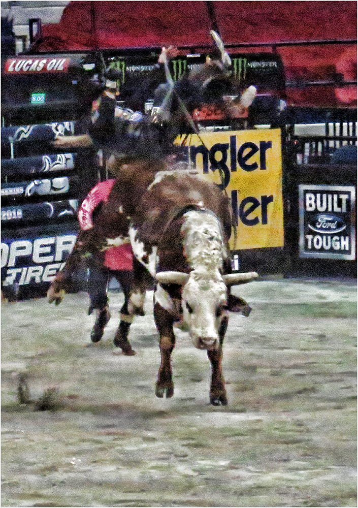
I agree with Mike on the dirt flying out. Great touch. The selection is clean and the subject is good. Very nice! |
Jun 12th |
| 22 |
Jun 17 |
Reply |
They are good in competition if done right...especially PSA competitions. |
Jun 12th |
| 22 |
Jun 17 |
Reply |
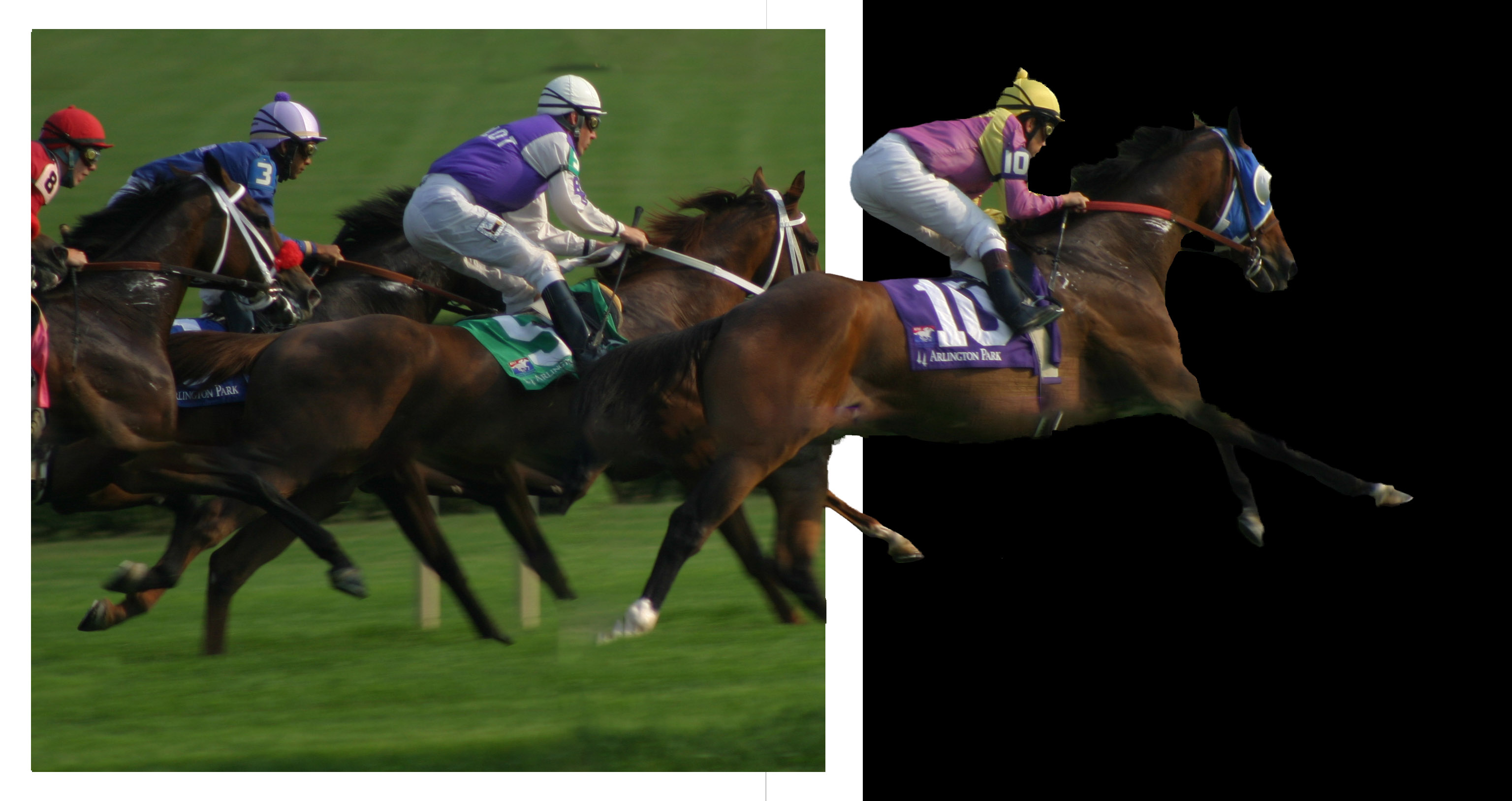
I agree - I wanted to transform the frame to a more angled view so they would appear more realistic. I also think the black background blends in too much with the first horse. |
Jun 9th |
| 22 |
Jun 17 |
Reply |
The arm does look better. Can you bring in a little more of the guitar (and less frame)? Now it looks like he is strumming the picture frame. Do you have any other pictures of him with a full hand that you could borrow for this image? You would need to add some canvas to the bottom of the frame layer so the hand could fit. |
Jun 8th |
| 22 |
Jun 17 |
Reply |
They say there is 10 ways to do the same item in PS - don't be afraid to play, Mike. Make a duplicate copy of your image and just try different things. In the end, if you don't like it, you can just delete it and your original will still be intact.
Feel free to ask questions - that's what we are here for. Our group has sometimes presented questions over email - separate from the monthly image. I'm willing to share what I know and I hope any of our group would be. Some of us probably aren't as well versed in LR as you are and might have questions you can answer. So open invitation to all - email your questions or problems to me. :) |
Jun 8th |
| 22 |
Jun 17 |
Comment |
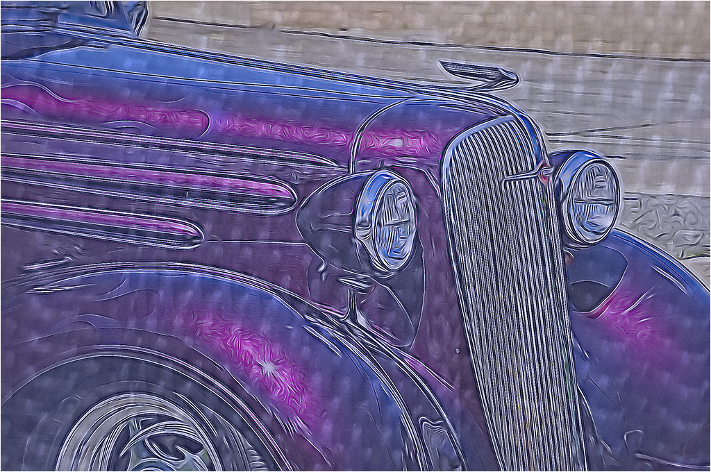
I also saw the white fringe around the wheel. For me, I don't know that the red and green are the best colors but I like the way the gradient makes the background. If staying with the red/green, I would like to see the frame in a different color - maybe a muted white?
I'm not sure what the material is coming from under the car. As in my image, I wish I had extended the grass out of the border as well and I think the same here. It would make the wheel look less like it's floating and more like an extension of coming out of the frame. Also - and I forgot this too - there should be a slight shadow at the bottom or sides (depending on the light source) to make the image appear real.
You did a very nice job with this though. Congrats! |
Jun 8th |
| 22 |
Jun 17 |
Reply |
I agree. I'll see if I can cut it back and tone it down. Thanks. |
Jun 8th |
| 22 |
Jun 17 |
Reply |
Basically, make a layer, fill it with white. Then use the marquee tool to select about a 1/4" inside the boundary. Then Delete the inside. You should be left with the frame. If the frame layer is on top, it will hide the layer below. Probably best to move it below your image layer. Then add a mask to the top layer and with the brush tool, paint with white to reveal the frame below.You might want to transform the frame such as you have here, making it smaller than the size of your background. Hope this helps. :) |
Jun 4th |
| 22 |
Jun 17 |
Comment |
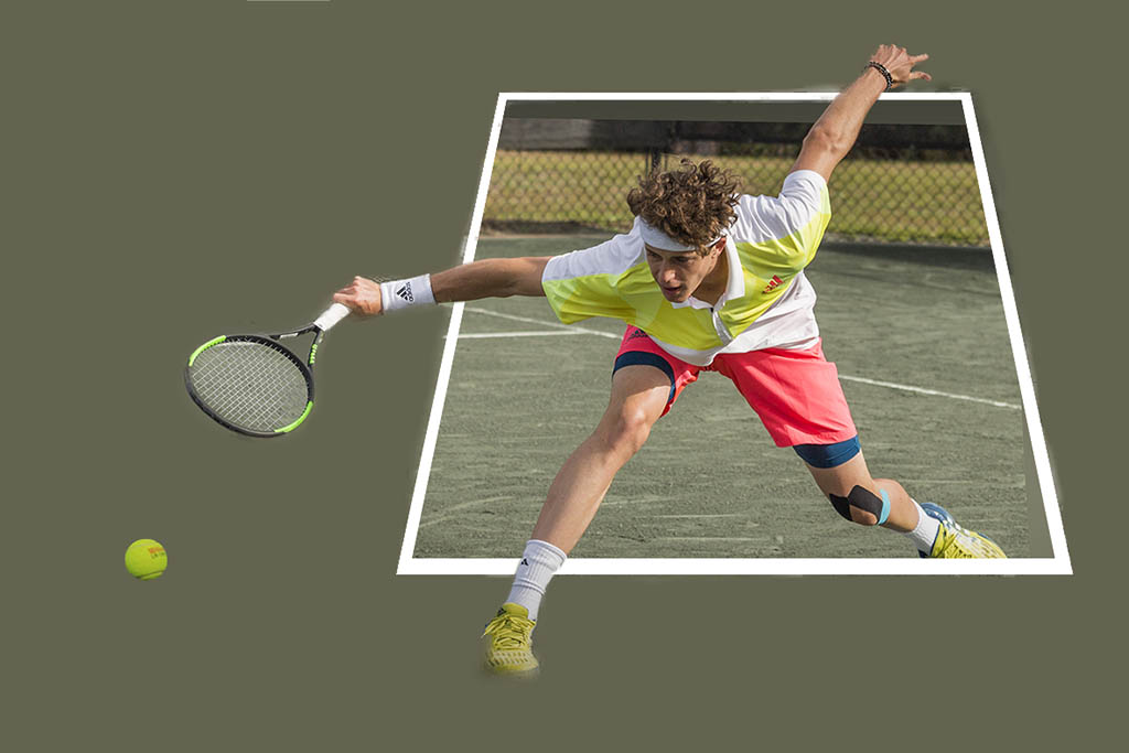
Good action image that makes him appear to be stretching outside the "frame" for the ball. Since I didn't have the image with all the layers, I took a stab at creating a frame for her image. It was difficult since the perspective isn't straight up. Overall, nice job. |
Jun 3rd |
 |
| 22 |
Jun 17 |
Comment |
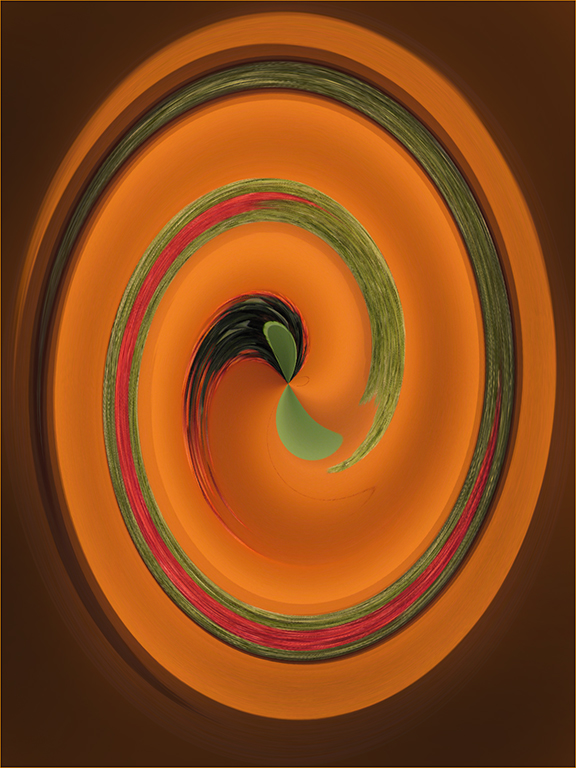
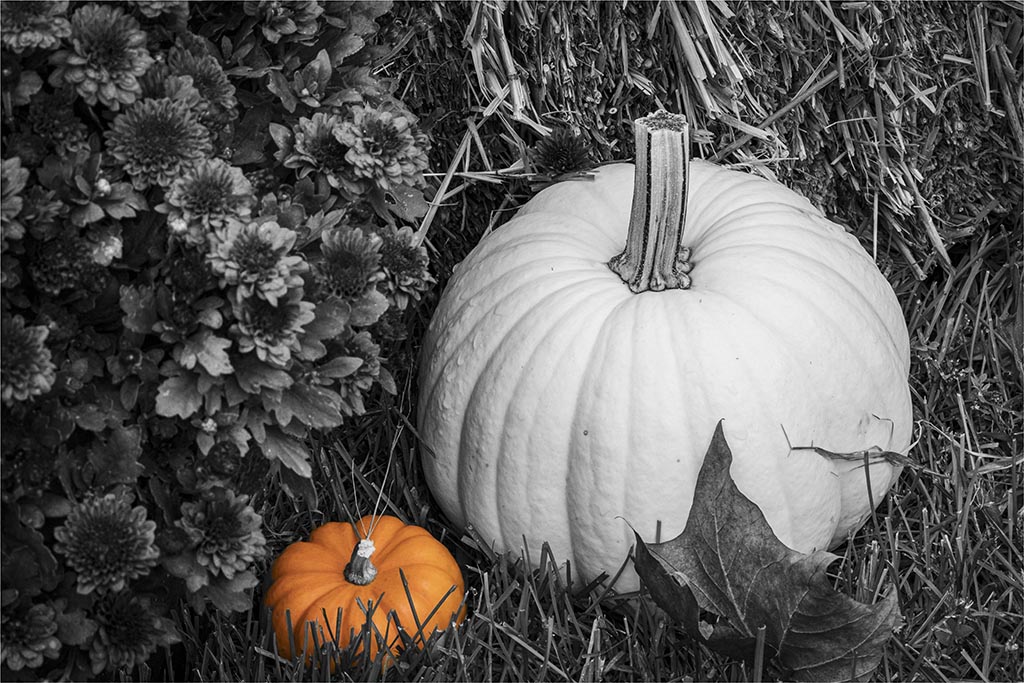
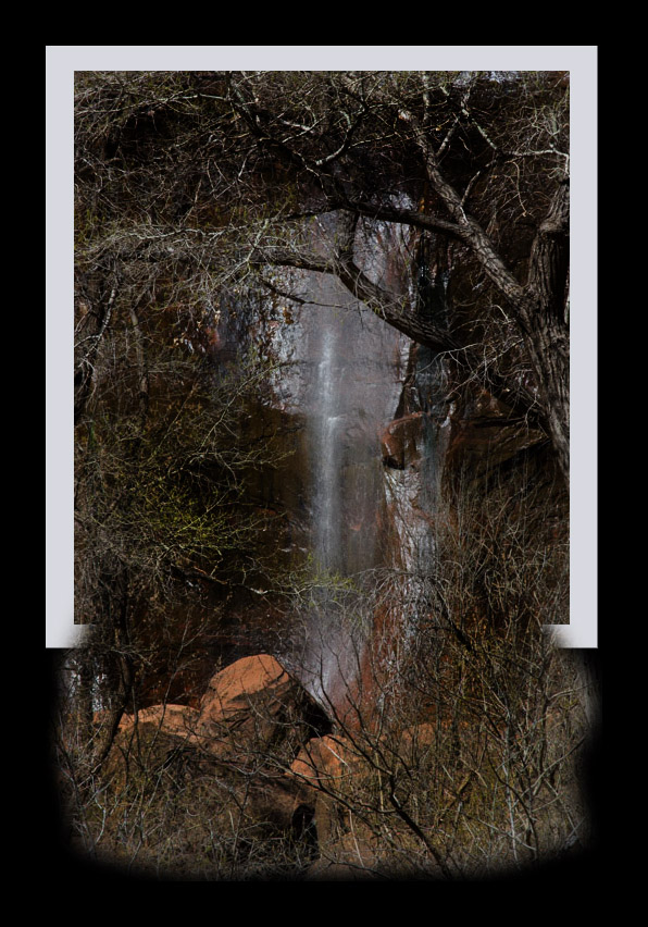
I couldn't resist. This isn't the best image to do an OOB with but it was pretty easy to get this effect. I can send you the details if you want to play with it - or try on another image.
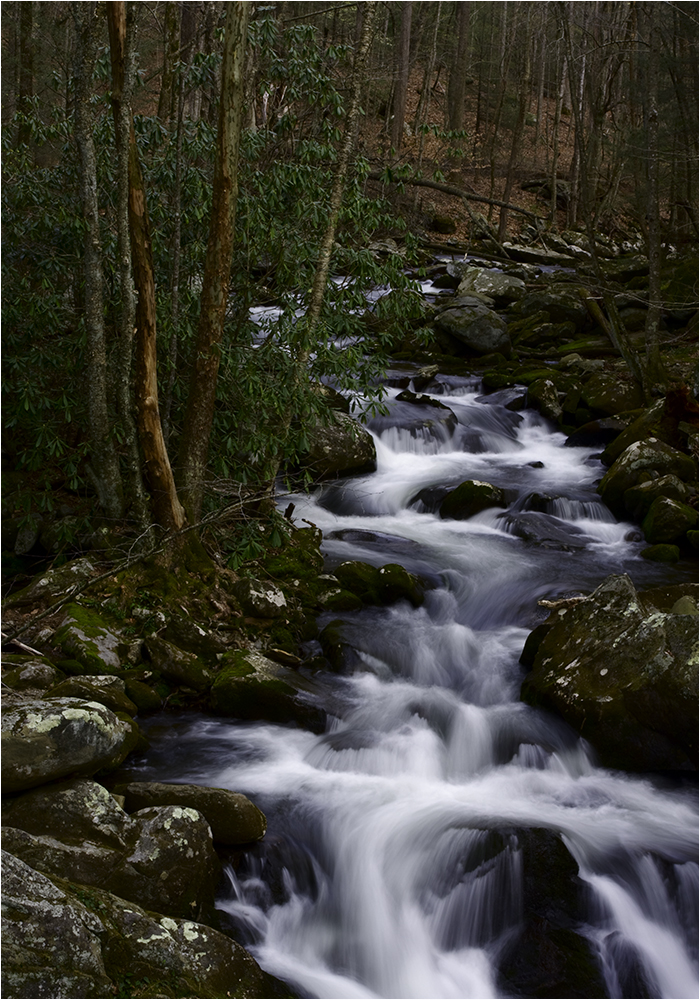
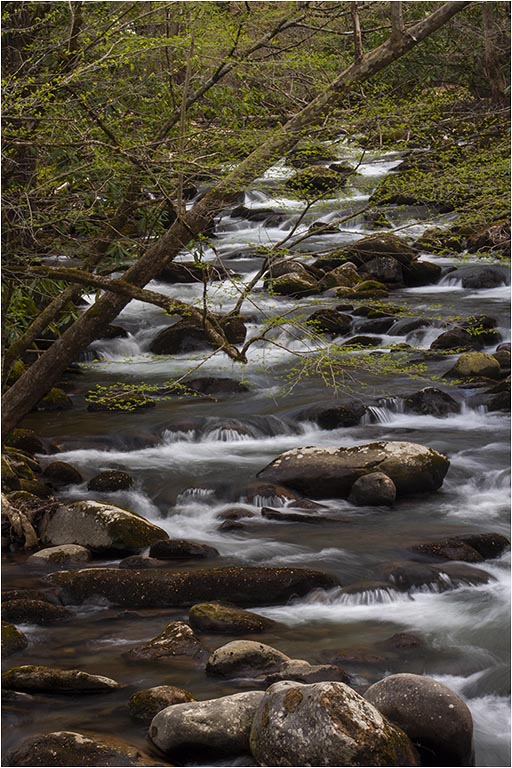
In your final, I feel the water has been highlighted to where it appears blown out to me. There is a lot in this image and I think the waterfall is kind of lost with the branches and the red rocks. |
Jun 3rd |
 |
| 22 |
Jun 17 |
Comment |
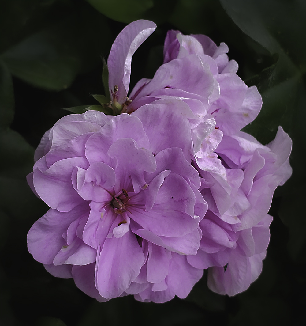
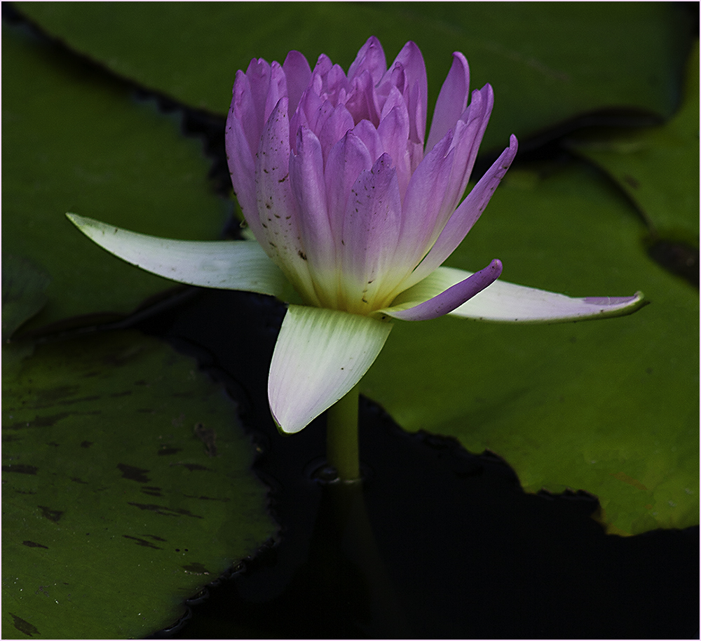
Very nice! The flowers just seem to pop right out of that frame. To be picky, perhaps burning in the background at the top - especially that white-ish part - might set the flowers off even more. |
Jun 3rd |
| 22 |
Jun 17 |
Comment |
I think I would like to see the left side arm a little more natural. The bottom is a distinct straight line as it's the bottom of the image. I would clone a little over that line and extend his arm in a more rounded manner. Also the elbow is cut off. I'm thinking rounding the whole arm off and very slightly removing enough to get it off the edge would help. Otherwise a white stroke so the arm doesn't blend in with the background at the edge. Nice job though. |
Jun 1st |
8 comments - 11 replies for Group 22
|
8 comments - 11 replies Total
|