|
| Group |
Round |
C/R |
Comment |
Date |
Image |
| 7 |
May 24 |
Reply |
Welcome to the group Butch. I like all the comments posted. It is a way for me to learn and see the other alternatives! |
May 31st |
| 7 |
May 24 |
Comment |
I prefer the original image. The background is out of focus and 'clean'. The bird is sharp with colours that stand out against the background. I feel that the branch and flowers add 'something' to the image. |
May 17th |
| 7 |
May 24 |
Comment |
Nice composition.Blurred background which is fine. Sharp subject except for out of focus tail. I like the look of the bird, its visual expression. |
May 17th |
| 7 |
May 24 |
Comment |
Blurring the background has done a good job here: the attention of the viewer is focussed on the alligator's head.However, the rock behind acts as a distraction. A little more space on the right hand side would improve the shot. |
May 14th |
| 7 |
May 24 |
Comment |
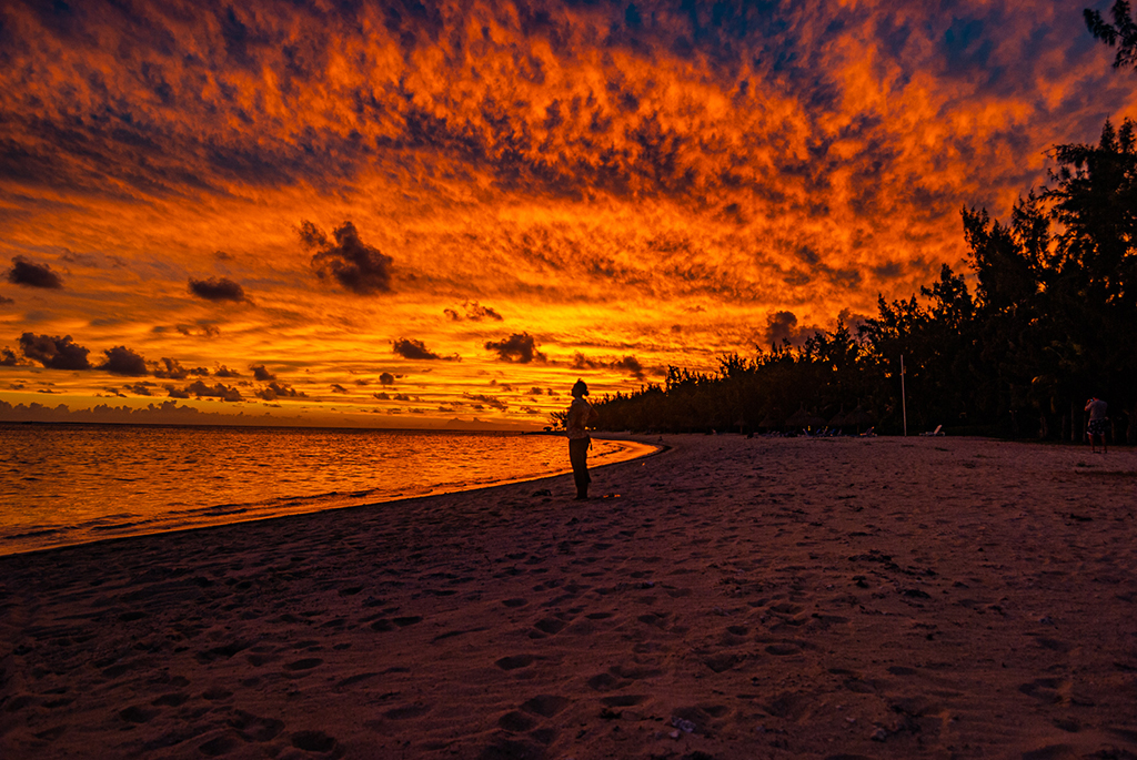
Indeed you are very lucky. A photo that tells a nice story. I find that brightening like Judith has done improve the photo much. |
May 14th |
| 7 |
May 24 |
Comment |
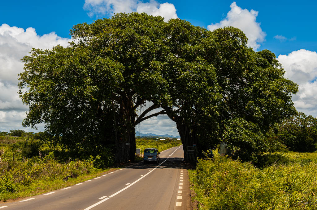
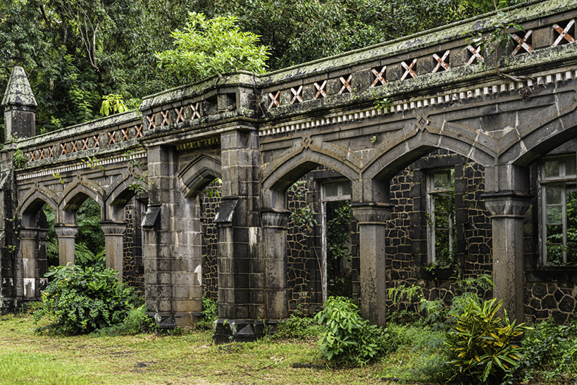
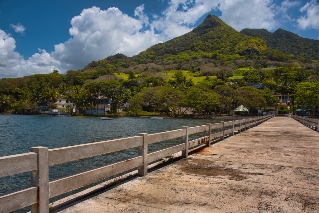
I like the leading line, consisting of the road or alley, leading to the arch in the background and also its symmetry. The blue of sky at the top seems a bit saturated.The architectures on either side of the alley gives a nice touch to the image. Overall, nice shot! |
May 14th |
| 7 |
May 24 |
Reply |
Yes 20s. And midday with the sun shinning. I was experimenting with long exposure shots using the ND 1000. As you mentioned, it seems that the yellow was a bit saturated. |
May 11th |
5 comments - 2 replies for Group 7
|
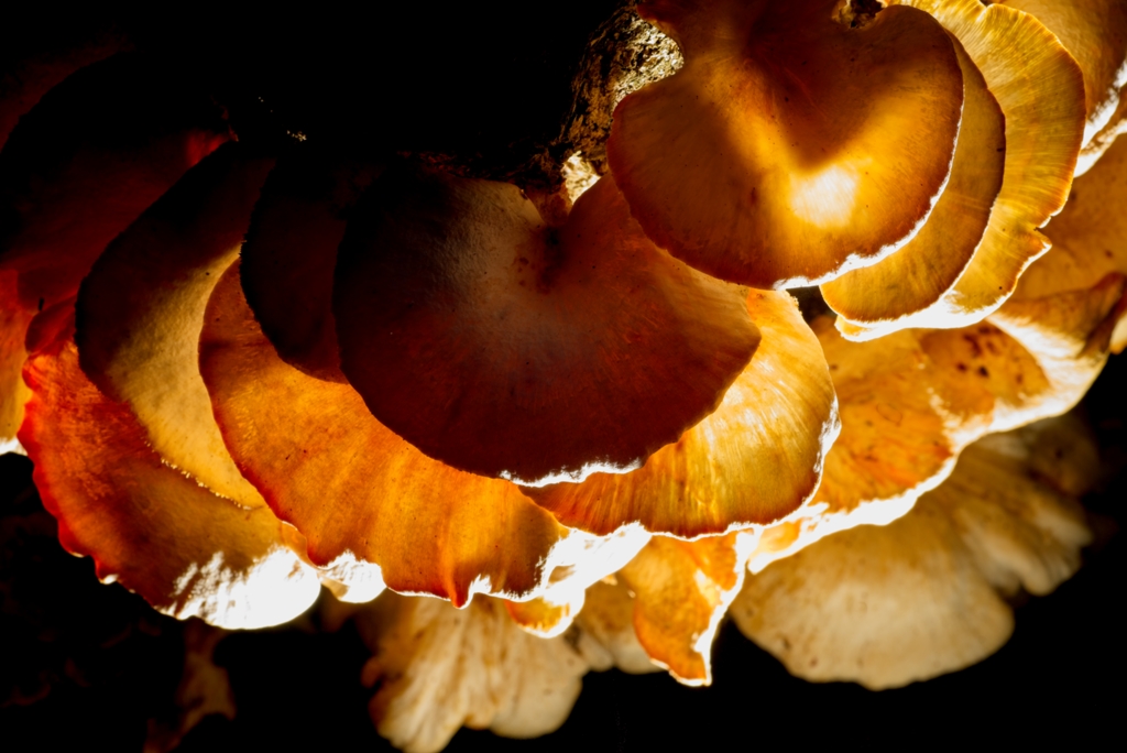
| 75 |
May 24 |
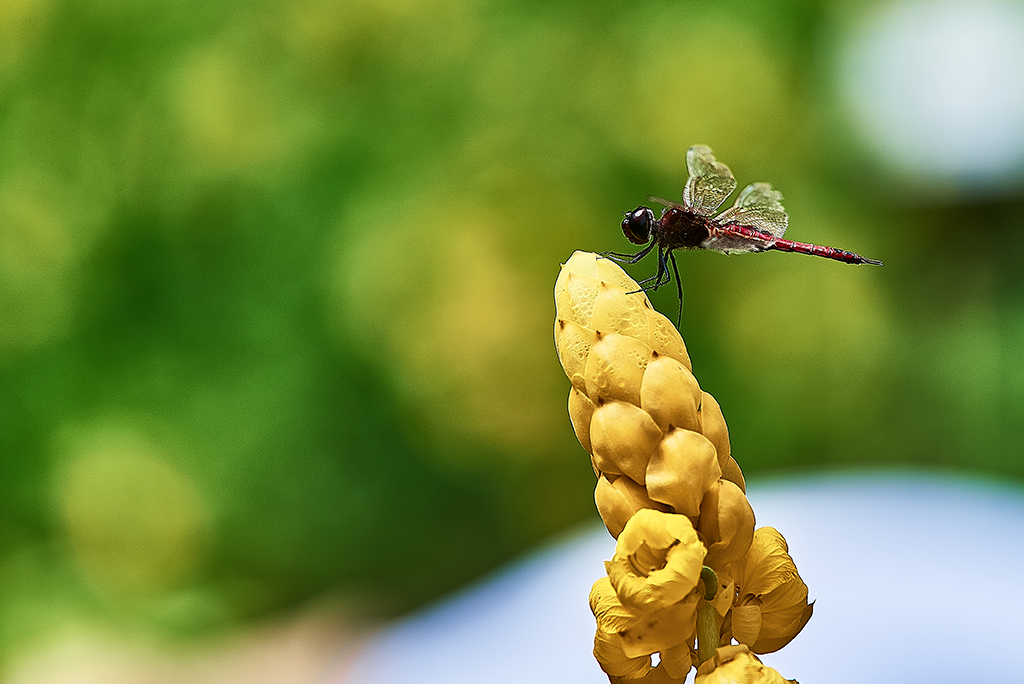
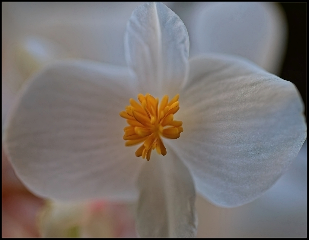
Comment |
Sharp shot.
About odd or even numbers, there is a quote: Rules are meant to be broken.
There are some specks which could have been removed. |
May 15th |
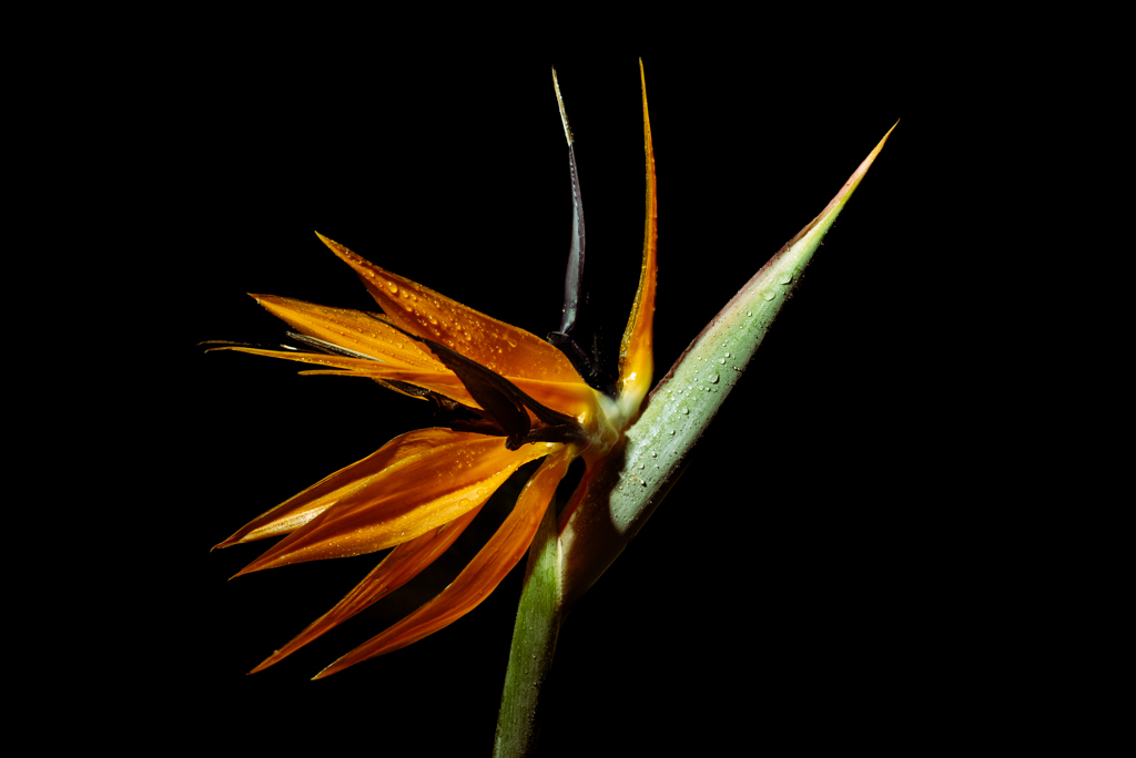
| 75 |
May 24 |
Comment |
Nice shot, good composition, background ok. Not much to say! |
May 15th |
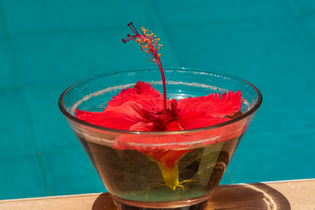
| 75 |
May 24 |
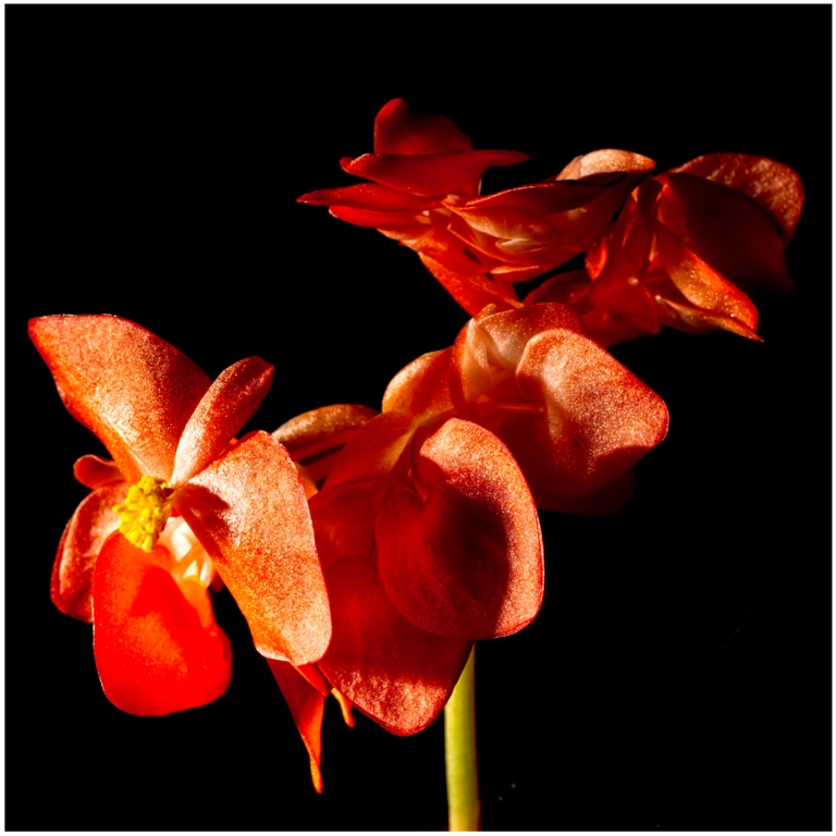
Comment |
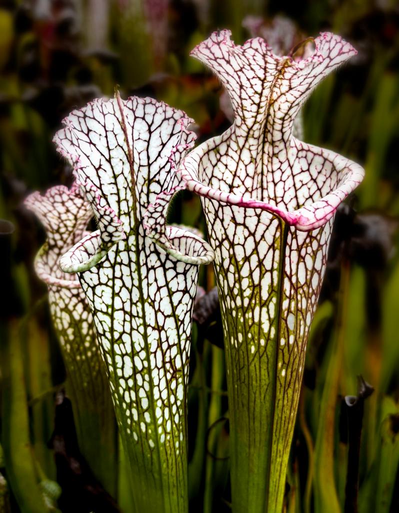
The background is somewhat distracting. I hope you don't mind, I have tried to blur the background and increase the contrast of the flower slightly. |
May 15th |
 |
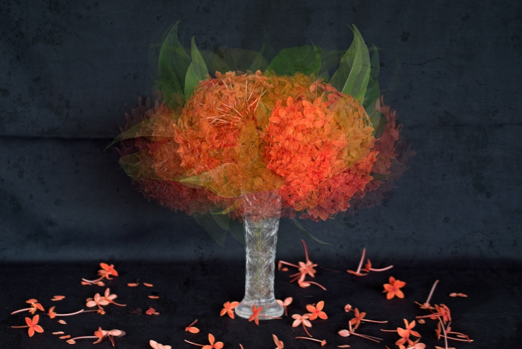
| 75 |
May 24 |
Comment |
It would have been a nice composite without the flaws already mentioned, especially with the top petal. Otherwise, a good try with a pleasant soft background. |
May 15th |
| 75 |
May 24 |
Comment |
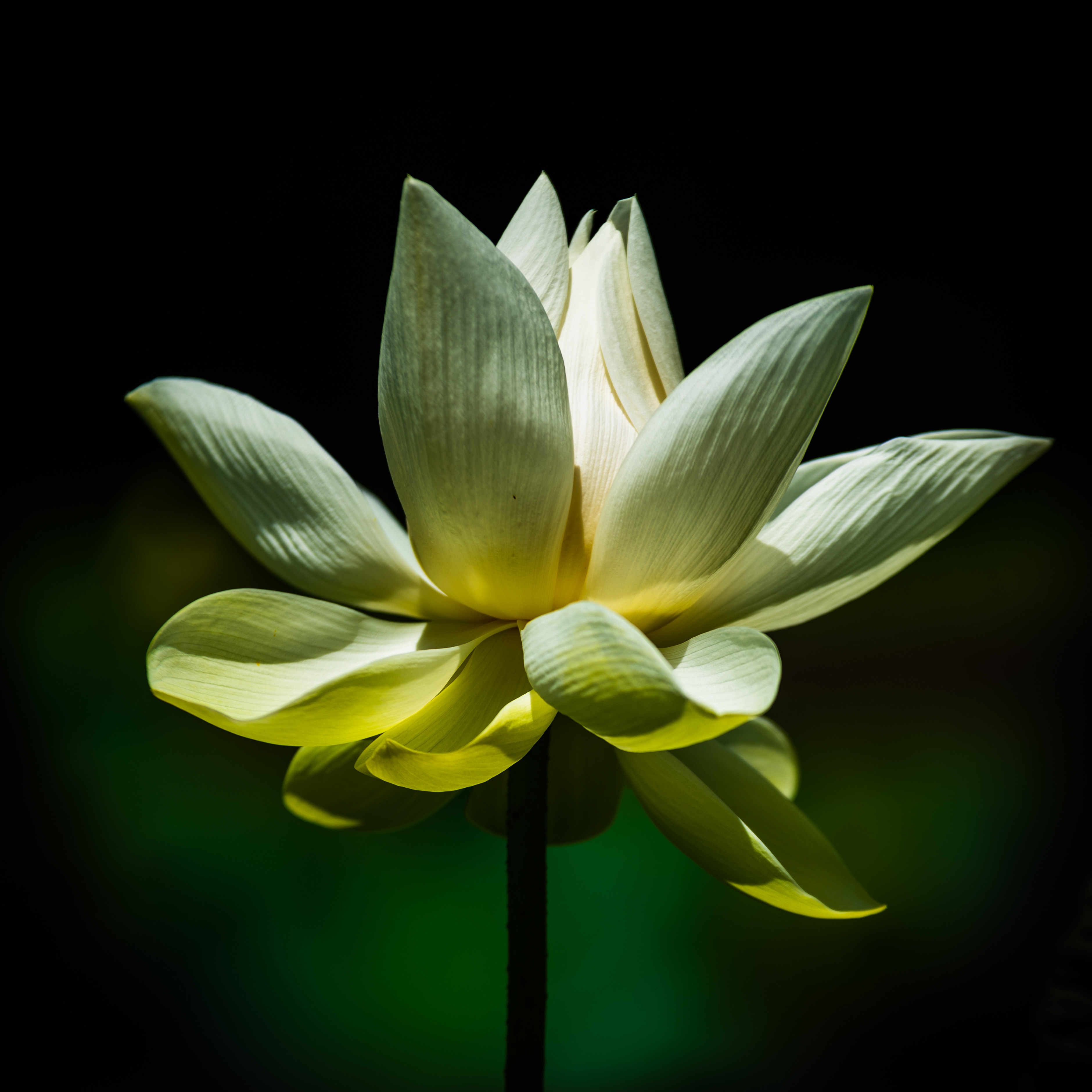
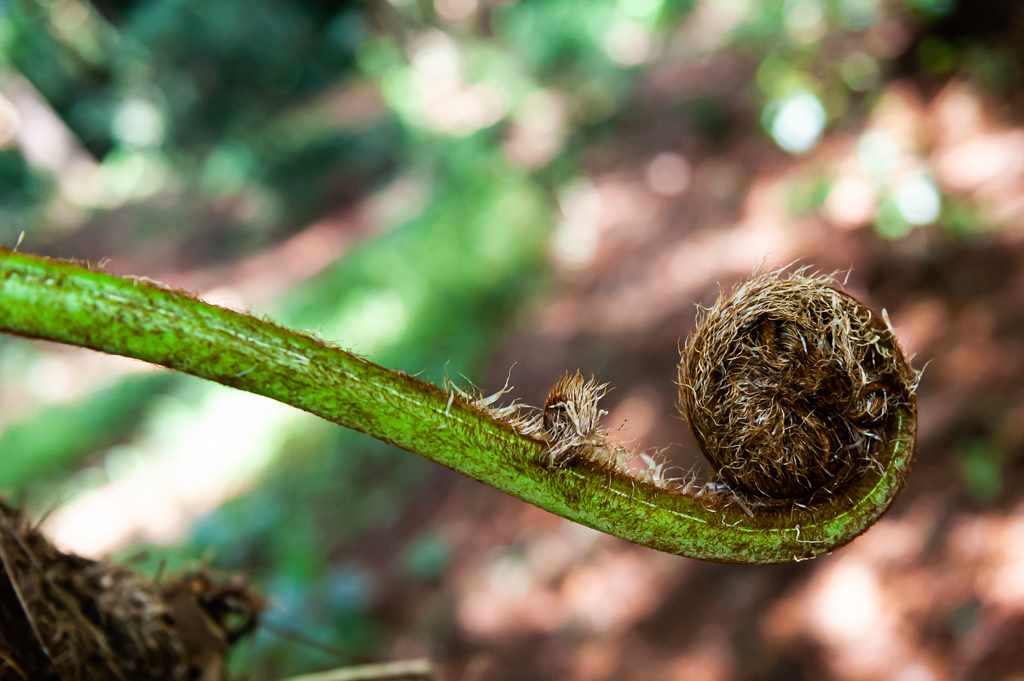
The sharpness of the stem would have been ok, less the somewhat blurry bottom part. The blurry background seems nice, except, as Murphy mentioned, the dark area at the top.There is a good colour contrast between the flower and the background. However, I get the impression that the flower is 'floating' near the stem or held by the web hairs. |
May 15th |
| 75 |
May 24 |
Reply |
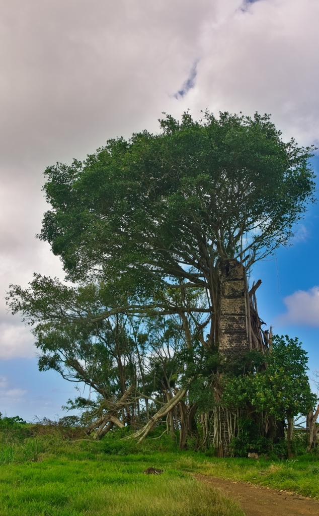
Thanks for providing the name of the tree. |
May 7th |
| 75 |
May 24 |
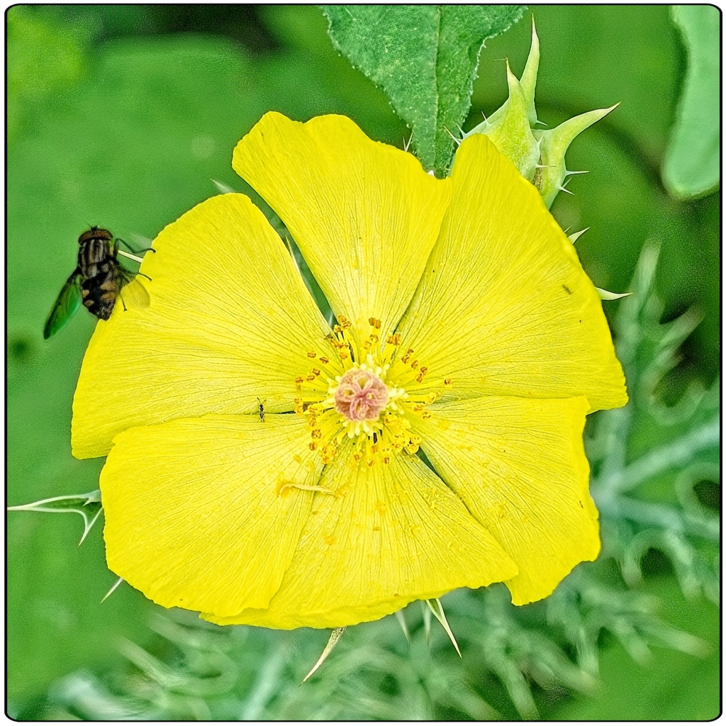
Comment |
Nice to learn different photo techniques every month! |
May 7th |
6 comments - 1 reply for Group 75
|
11 comments - 3 replies Total
|