|
| Group |
Round |
C/R |
Comment |
Date |
Image |
| 7 |
Jan 24 |
Comment |
Thanks a lot Rich! |
Jan 23rd |
| 7 |
Jan 24 |
Comment |
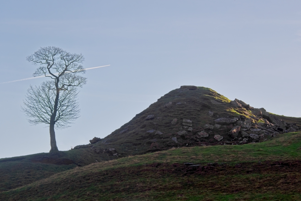
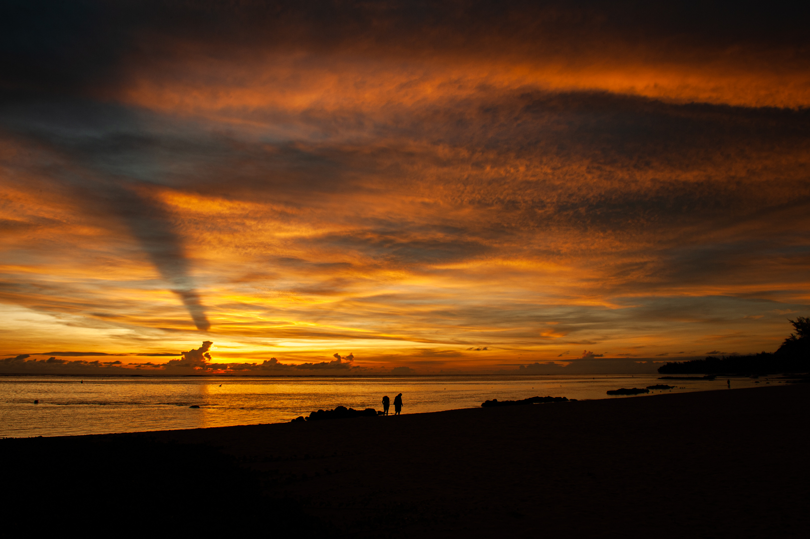
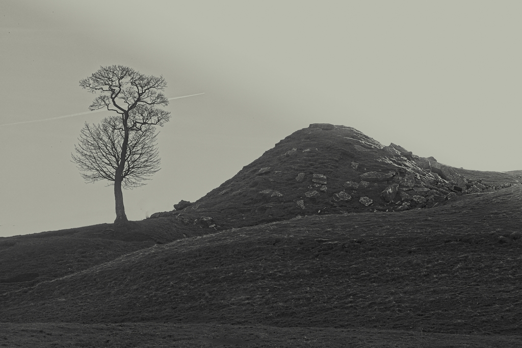
I have tried to do a B/W version of the image. But the contrail does not appear as in the colour image. |
Jan 17th |
 |
| 7 |
Jan 24 |
Comment |
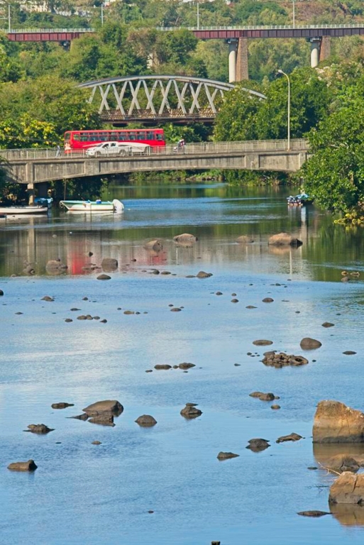
I think that the boat on the left acts a bit as a distraction. What if you would have moved to the right so that the same portions of both are in the photo? |
Jan 17th |
| 7 |
Jan 24 |
Comment |
A good attempt. Horizontal and blurred background. But when the photo is zoomed in, the cyclist face, especially the nose, seems distorted.And the right leg is not perfectly sharp. |
Jan 17th |
| 7 |
Jan 24 |
Comment |
Nice composition. Nice colours. Nice background! |
Jan 17th |
| 7 |
Jan 24 |
Comment |
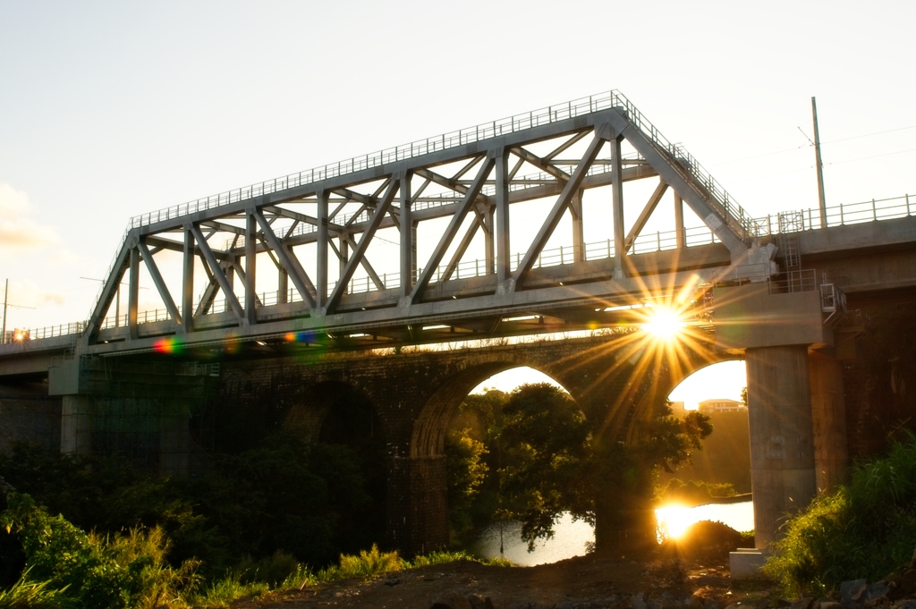
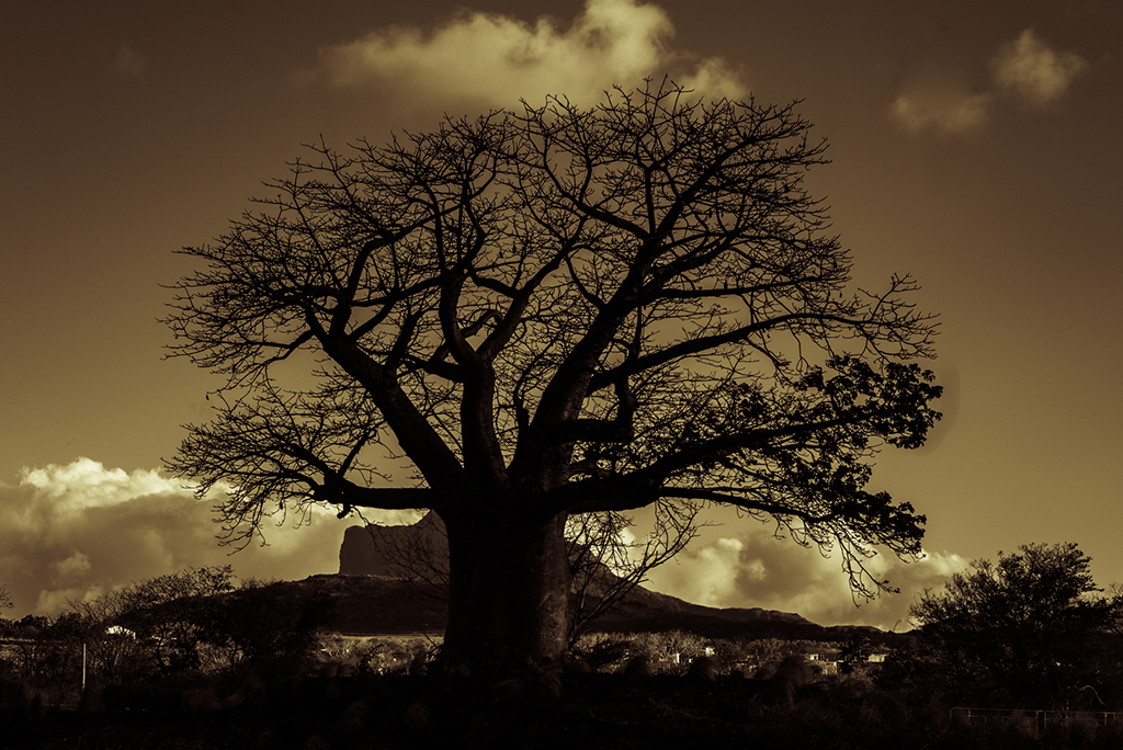
The overall composition is good. However, I find the photo a bit soft, it lacks sharpness. The starburst could have been 'tricked' by some particular software to 'pop' out more, even adding to it a slight golden texture. I thing that a sharp foreground and and a slightly blurry and foggy background, in this case, the mountain and far away trees, would have given more punch to the photo. |
Jan 17th |
| 7 |
Jan 24 |
Comment |
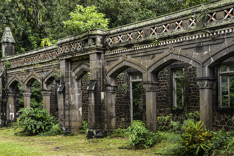
What focal length and aperture did you use? Large depth of field. Perfect symmetry. The bright patches on the wall and pillars spoil a bit the composition.The red sign at the far end could have been removed by PS or another software. |
Jan 17th |
| 7 |
Jan 24 |
Comment |
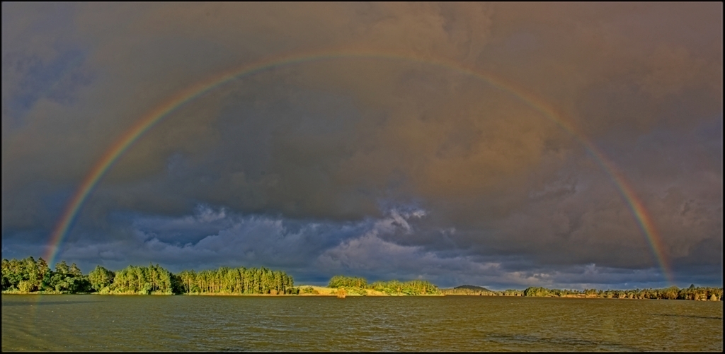
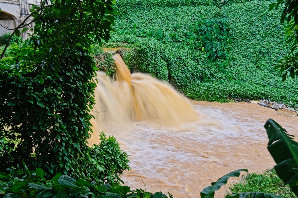
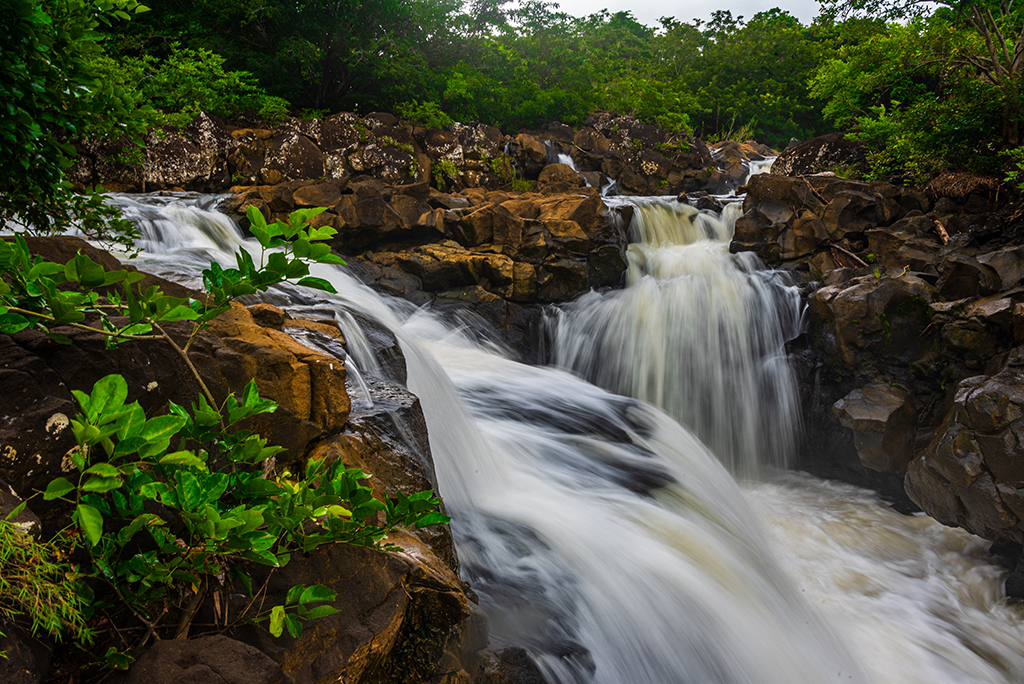
The photo would have been better if the sky had a bit of blue colour in it. The people in the photo give scale to the waterfall and that is nice.The adjustments that Paul and Judith made improves the general tone of the image, especially the green/yellow tone.But if you say that it is springtime colour, so much the better. |
Jan 17th |
| 7 |
Jan 24 |
Comment |
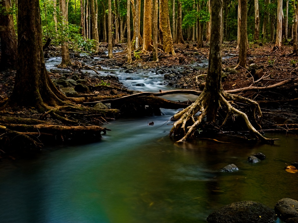
I admit that the colour is a bit dull and as such, convert the photo to black and white would be a better option. I will follow up from what Judith has done. Thanks a lot for the comments! |
Jan 11th |
9 comments - 0 replies for Group 7
|
| 75 |
Jan 24 |
Comment |
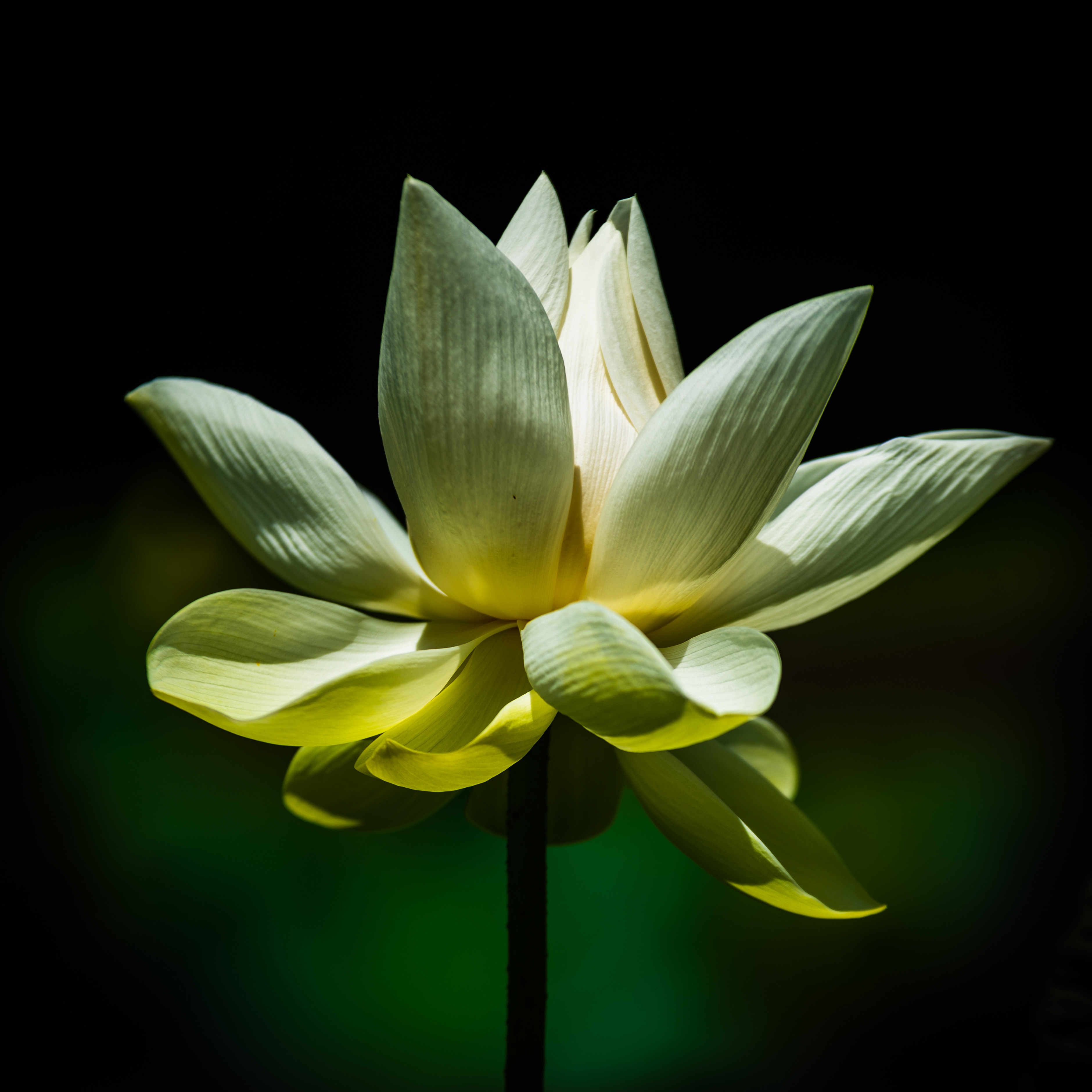
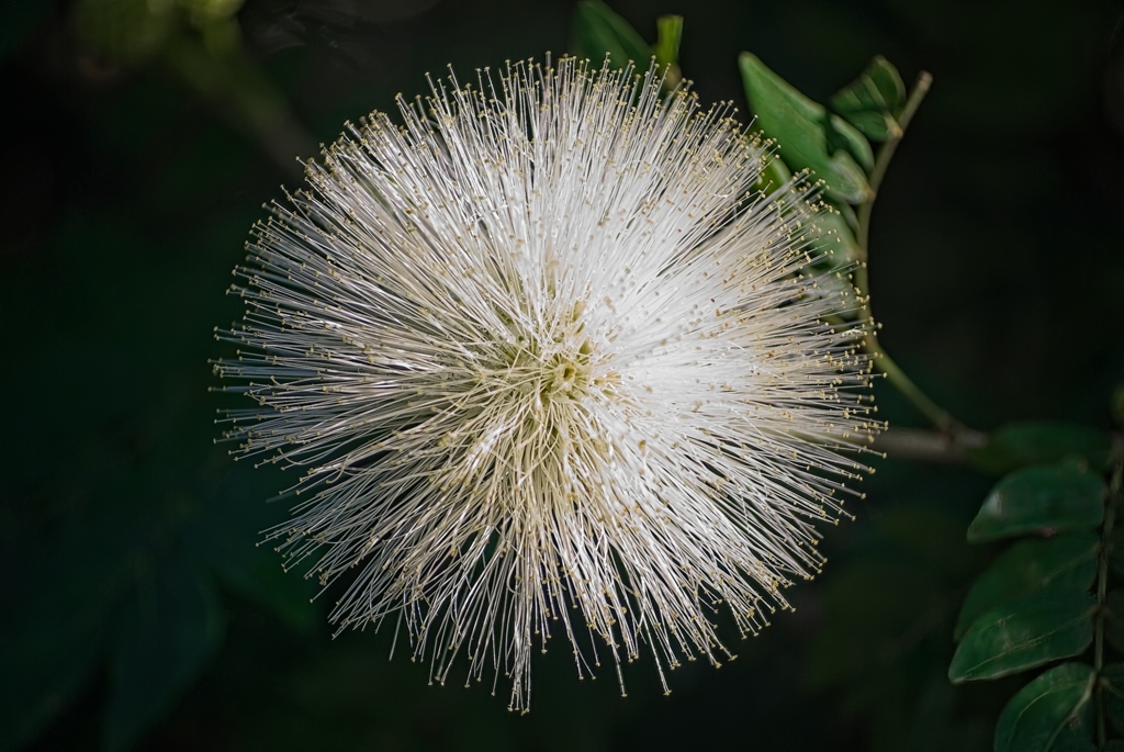
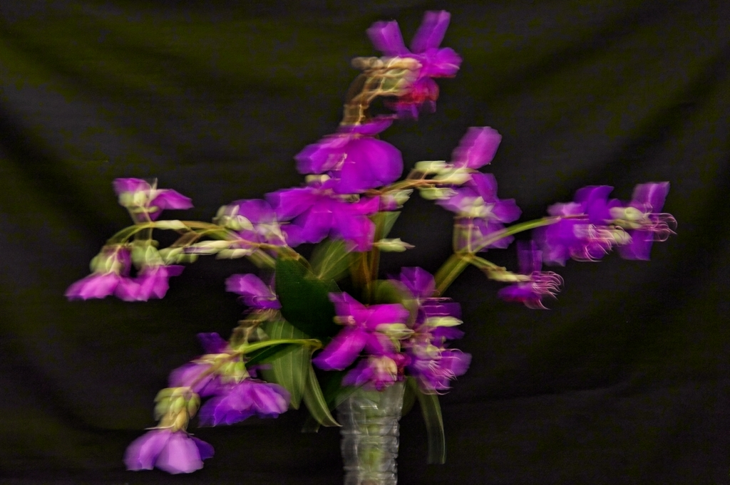
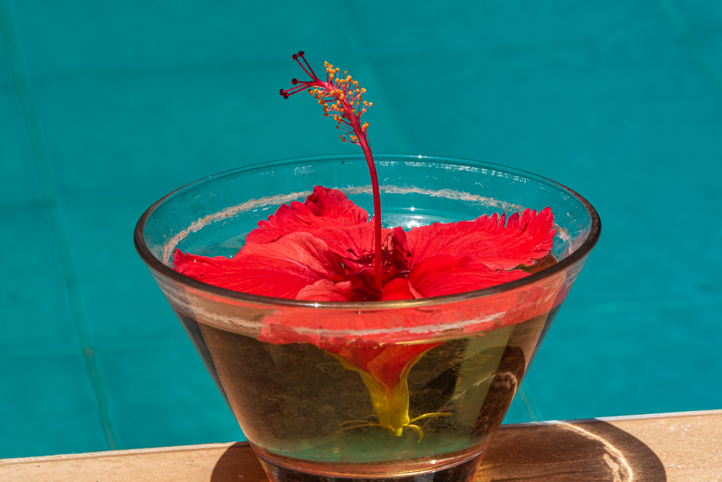
The background is blurred but it is distracting because of the different colours appearing. The main flowers are well shot and are sharp. |
Jan 17th |
| 75 |
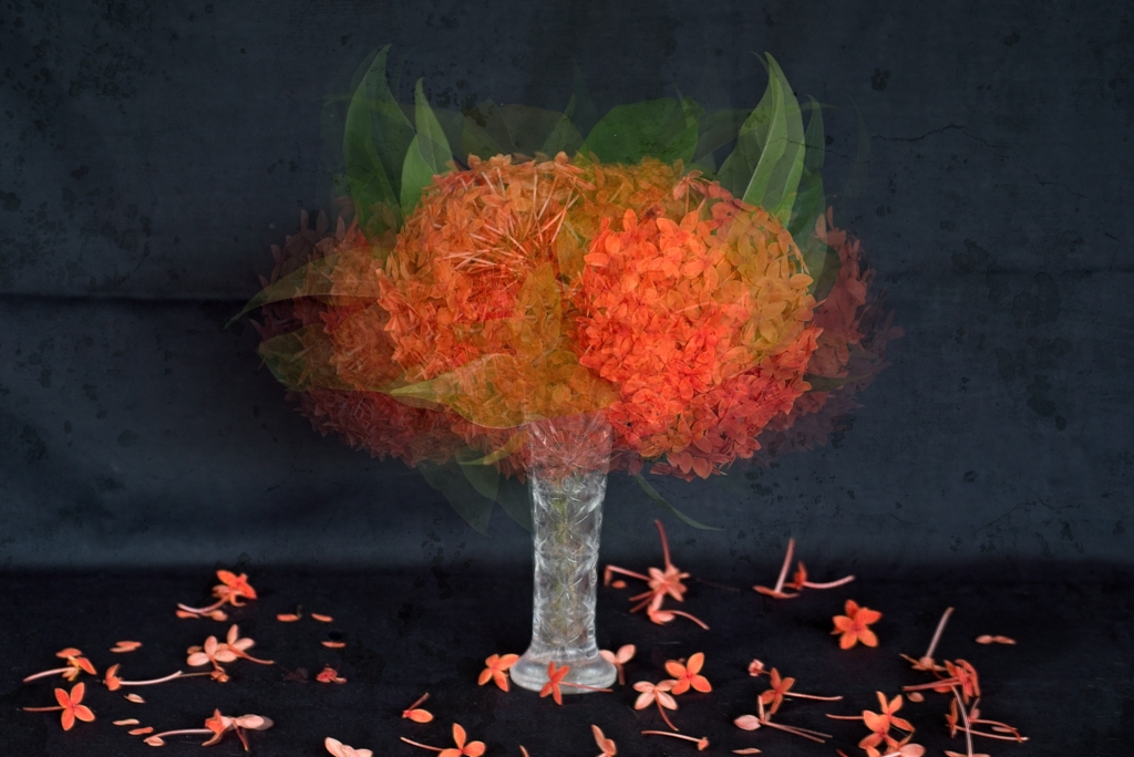
Jan 24 |
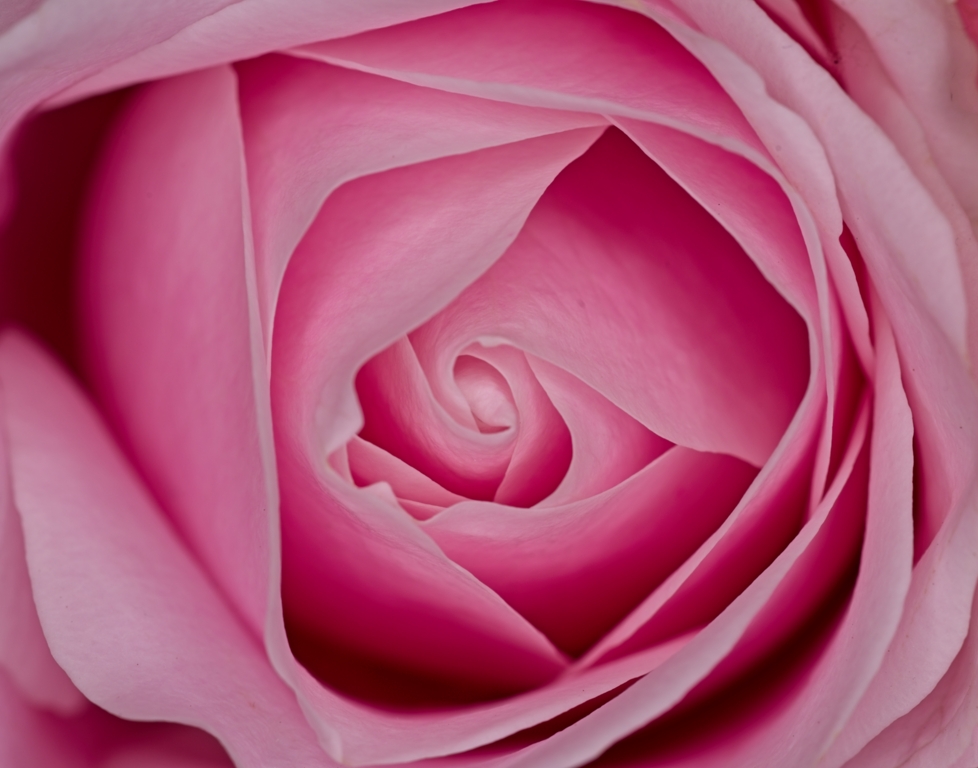
Comment |
Beautiful! Well done. Nice background. Good sharpness. Beautiful colours. Nice complementary colours. |
Jan 17th |
| 75 |
Jan 24 |
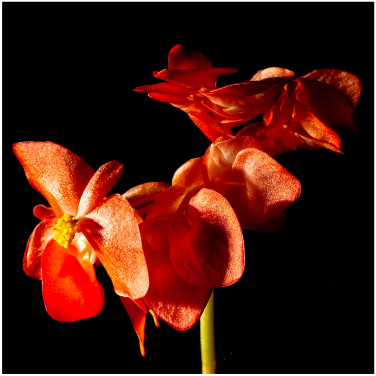
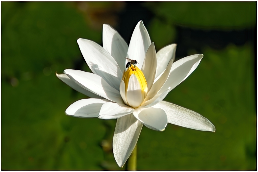
Comment |
The background appears to be a bit distracting.As Raymond mentioned, changing the brightness/contrast of the flower/or background would have made things better. A new technique!! |
Jan 17th |
| 75 |
Jan 24 |
Comment |
I do not see the link between these two objects, except perhaps, they are both "old" , each one its own way : the rose, a few days, the clock, a few decades.
|
Jan 17th |
| 75 |
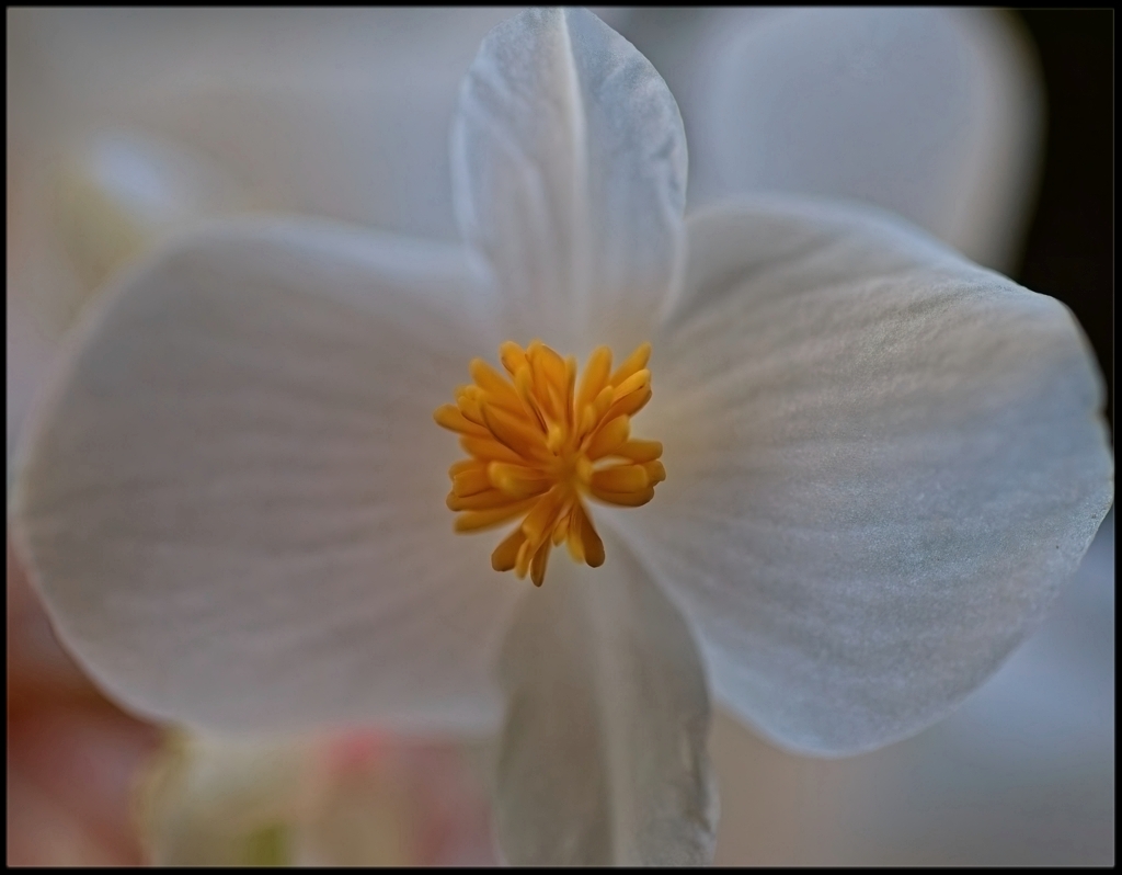
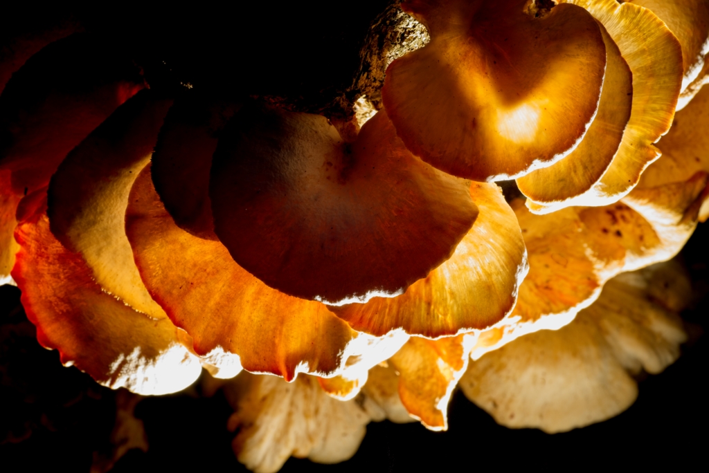
Jan 24 |
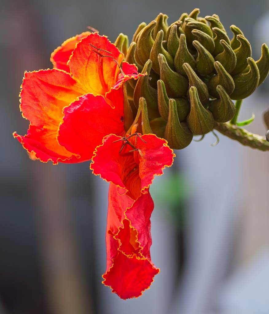
Comment |
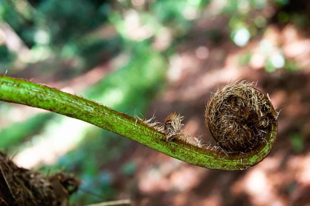
Patience, hard work and the result is there! Sharp image against the black background. And the seed at the lower right just add punch to the photo! |
Jan 17th |
| 75 |
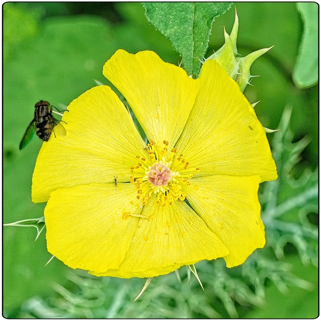
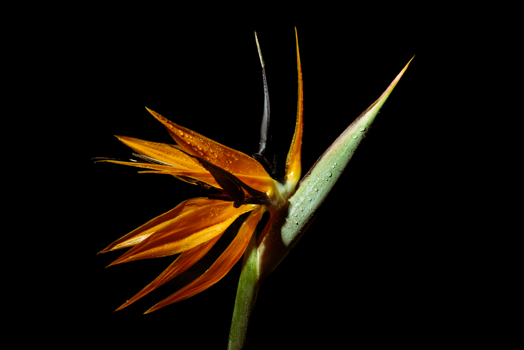
Jan 24 |
Comment |
I see here a new technique to take pictures of flowers. The colours of the flowers match very well with the background. Nice composition except, as Vincent has mentioned, an empty space on the bottom left-hand side. |
Jan 17th |
6 comments - 0 replies for Group 75
|
15 comments - 0 replies Total
|